Although styles are an excellent way to customize components, they can do only so much. If you want to change the color, font, or spacing settings for components, styles are perfect solutions. However, if you want to completely change the appearance of a component so that it uses a different shape, you’ll need to use skins instead of (or in addition to) styles.
Component skins are graphics or classes that you can specify for states
and/or parts of a component that will completely replace the standard
appearance of the component. Every component type will have different
skins that you can set. For example, buttons have skins such as upSkin, overSkin, and downSkin that determine the appearance of the
button in the up, over, and down states. You can use embedded graphics
such as .jpg files or .png files, or you can use programmatic skins.
We’ll discuss both options in the following sections.
You can apply skins in the same ways as you apply styles: using inline skin
settings, setStyle(), CSS, or
StyleManager. Each component type has
skin settings that are treated like styles. The skin styles for each
component type vary. For example, buttons have skin styles such as upSkin, overSkin, and downSkin and text input components have skin styles such as borderSkin.
The values for skin styles must always reference a class. For graphical skins, the value should be a class created by an embedded image (see Chapter 11 for more information about embedding images). For programmatic skins, the value should be a reference to the skin class. We’ll look at the details of both types in the following sections.
Graphical skinning is often the fastest and simplest way to create highly customized component appearances. Graphical skins consist of embedded images or .swf content that is substituted for the default artwork for component states or parts of components. Typically the workflow is to create the artwork for each skin (determined by the available skin styles for the component you want to customize), output that artwork in an embeddable format (.png, .jpg, .swf, etc.), embed the artwork, and set the skin styles to point to the embedded artwork. The format of the artwork you want to embed often depends on what you are trying to achieve as well as the skill set of the designer creating the artwork. As a general rule, bitmap formats will contribute the most to file size and will pixelate when scaled, and vector artwork from .svg or .swf files will contribute the least to file size (assuming the vector artwork is relatively simple) and will scale without pixelating. Furthermore, within the bitmap category, .gif and .png (PNG24) are capable of supporting transparency, and vector formats also support transparency. This is an important consideration if the artwork you want to use for skins requires transparency (e.g., nonrectangular edges/corners).
You can set graphical skins in one of three ways: inline, using
setStyle(), or using CSS.
Inline graphical skins work just like inline styles, except that the value must be a reference to a class for
an embedded graphical element. The most common way to achieve this is
to add an @Embed directive within
the inline value. The @Embed
directive has the following syntax:
@Embed(source='path to asset')
Here’s an example that sets the upSkin, overSkin, and downSkin of a button using this inline
technique to embed the assets:
<mx:Button upSkin="@Embed('/assets/buttonUp.png')"
           overSkin="@Embed('/assets/buttonOver.png')"
downSkin="@Embed('/assets/buttonDown.png')" />When you use setStyle() to
set a skin style, you must reference a class that points to the
embedded asset. The way to achieve that is to embed the asset, point
it to a variable of type Class, and
then use that variable as the value for the setStyle() method. Here’s an example:
[Embed(source="/assets/buttonUp.png")]
private var upSkin:Class;
[Embed(source="/assets/buttonOver.png")]
private var overSkin:Class;
[Embed(source="/assets/buttonDown.png")]
private var downSkin:Class;

private function initialize(event:Event):void {
    button.setStyle("upSkin", upSkin);
    button.setStyle("overSkin", overSkin);
    button.setStyle("downSkin", downSkin);
}You can use external stylesheets or local style definitions to
assign skin styles for graphical skins. When using CSS for this
purpose, you can add an Embed
directive directly to the CSS, and Flex will automatically embed the
asset and use that asset for the specified skin style. Here’s an
example:
.example {
    upSkin: Embed("/assets/buttonUp.png");
    overSkin: Embed("/assets/buttonOver.png");
    downSkin: Embed("/assets/buttonDown.png");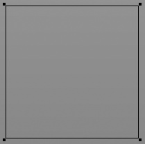
}When you use graphical skins, it’s important to consider
whether the component will need to scale. If so, you’ll frequently
want to use Scale-9 (see Chapter 11 for
more details). This is particularly important when the graphical skin
has corners or edges that will distort when they scale. Figure 8-1 shows an example
of such an image. In the following examples, we’ll use this image as
the background skin for a VBox
to see the difference when Scale-9 is applied.
First, Example 8-15 uses
the image as the background image for a VBox without Scale-9.
Example 8-15. Embedding a skin without Scale-9
<?xml version="1.0" encoding="utf-8"?>
<mx:Application xmlns:mx="http://www.adobe.com/2006/mxml">
    <mx:Style>
        VBox {
            backgroundImage: Embed("vbox_background.png");
            backgroundSize: "100%";
        }
    </mx:Style>
    <mx:VBox height="200" width="200" />
</mx:Application>
Figure 8-2 shows the distortion caused by the preceding code.

Example 8-16 is the same code using Scale-9.
Example 8-16. Embedding a skin with Scale-9
<?xml version="1.0" encoding="utf-8"?>
<mx:Application xmlns:mx="http://www.adobe.com/2006/mxml">
    <mx:Style>
        VBox {
            backgroundImage: Embed("vbox_background.png",
scaleGridTop="5", scaleGridLeft="5", scaleGridBottom="29", scaleGridRight="29");
            backgroundSize: "100%";
        }
    </mx:Style>
    <mx:VBox height="200" width="200" />
</mx:Application>
With the preceding code, the image no longer distorts. Figure 8-3 shows the improvement.
You can embed entire .swf files for use as graphical skins. For example, the following embeds three .swf files to use as button states:
<mx:Button upSkin="@Embed('/assets/buttonUp.swf')"
           overSkin="@Embed('/assets/buttonOver.swf')"
           downSkin="@Embed('/assets/buttonDown.swf')" />
However, you can embed individual symbols from the library of the .swf file by adding the symbol parameter to the directive. For this
to work, you must have exported the .swf file from Flash authoring with the
symbols set to export for ActionScript using linkage identifiers. The
values of the symbol parameters
should be equal to the linkage identifiers for the symbols you want to
embed. The following code embeds the individual symbols from one
.swf file:
<mx:Button upSkin="@Embed('buttonSkins.swf', symbol='buttonUp')"
           overSkin="@Embed('buttonSkins.swf', symbol='buttonOver')"
           downSkin="@Embed('buttonSkins.swf', symbol='buttonDown')" />
Programmatic skinning is far more complex than graphical skinning. However, programmatic skinning does provide advantages. Programmatic skinning allows greater control because you can respond to everything that occurs to the skin during runtime, such as state changes and scaling. Because programmatic skinning uses code rather than graphical assets, it has the potential to require a smaller file size than the graphical equivalent. Furthermore, programmatic skinning allows you to use low-level features such as display object filters (drop shadows, bevels, glows, etc.).
When you want to create a programmatic skin you should create a subclass of one of the following classes:
mx.skins.ProgrammaticSkinMost programmatic skins subclass
ProgrammaticSkin,and this is an appropriate superclass for almost all skins.mx.skins.BorderThe
Borderclass is a subclass ofProgrammaticSkin, and it adds support forborderMetricsfor skins that are borders.mx.skins.RectangularBorderThis class is a subclass of
Border, and it adds support forbackgroundImage.
All programmatic skins must implement the updateDisplayList() method. The updateDisplayList() method is a
protected method that you must override. It expects two numeric
parameters specifying the width and height of the skin, and the method
return type should be void. The
updateDisplayList() method gets
called automatically every time the component needs to draw or redraw
the skin. This is the method where you should place the code that does
the drawing.
Note
See Chapter 19 for more
detailed information regarding updateDisplayList().
Example 8-17 is a simple skin class. This version merely draws a white rectangle.
Example 8-17. A programmatic skin class
package com.oreilly.programmingflex.styles {
    import mx.skins.ProgrammaticSkin;

    public class ButtonSkin extends ProgrammaticSkin {

        public function ButtonSkin() {}

        override protected function updateDisplayList(unscaledWidth:Number,
unscaledHeight:Number):void {
            var backgroundColor:Number = 0xFFFFFF;
            graphics.clear();
            graphics.lineStyle(0, 0, 0);
            graphics.beginFill(backgroundColor, 1);
            graphics.drawRect(0, 0, unscaledWidth, unscaledHeight);
            graphics.endFill();
        }

    }
}
Once you’ve defined the programmatic skin class, you can assign that class as the skin using any of the
techniques you can use for graphical skins: inline, setStyle(), or CSS. The difference, however,
is that in each case you must specify a reference to the programmatic
skin class (see Example 8-18).
Example 8-18. Using a programmatic skin class
<?xml version="1.0" encoding="utf-8"?>
<mx:Application xmlns:mx="http://www.adobe.com/2006/mxml">
    <mx:Script>
        <![CDATA[
            import com.oreilly.programmingflex.styles.ButtonSkin;
        ]]>
    </mx:Script>
    <mx:Button upSkin="{ButtonSkin}" overSkin="{ButtonSkin}" downSkin="{ButtonSkin}"
label="Example" />
</mx:Application>
Note that in Example 8-18,
we use curly braces to evaluate the skin classes in the inline values.
This is required if you want to import the class and reference the class
by its shortened name (e.g., ButtonSkin rather than com.oreilly.programmingflex.styles.ButtonSkin).
However, you can optionally specify the values as strings if you
reference the fully qualified class name each time, as in Example 8-19.
Example 8-19. Using a programmatic skin class by fully qualified name
<?xml version="1.0" encoding="utf-8"?>
<mx:Application xmlns:mx="http://www.adobe.com/2006/mxml">
    <mx:Button upSkin="com.oreilly.programmingflex.styles.ButtonSkin"
               overSkin="com.oreilly.programmingflex.styles.ButtonSkin"
               downSkin="com.oreilly.programmingflex.styles.ButtonSkin"
               label="Example" />
</mx:Application>
Using setStyle(), you
should simply pass a reference to the class as the second
parameter, as in Example 8-20.
Example 8-20. Using a programmatic skin class using setStyle()
<?xml version="1.0" encoding="utf-8"?>
<mx:Application xmlns:mx="http://www.adobe.com/2006/mxml"
initialize="initializeHandler(event)">
    <mx:Script>
        <![CDATA[
            import com.oreilly.programmingflex.styles.ButtonSkin;

            private function initializeHandler(event:Event):void {
                button.setStyle("upSkin", ButtonSkin);
                button.setStyle("overSkin", ButtonSkin);
                button.setStyle("downSkin", ButtonSkin);
            }
        ]]>
    </mx:Script>
    <mx:Button id="button" label="Example" />
</mx:Application>
Using CSS, you must specify the fully qualified class name as a
string wrapped by a ClassReference
directive, as in Example 8-21.
Example 8-21. Using a programmatic skin class using CSS
<?xml version="1.0" encoding="utf-8"?>
<mx:Application xmlns:mx="http://www.adobe.com/2006/mxml">
    <mx:Style>
        Button {
            upSkin:
ClassReference("com.oreilly.programmingflex.styles.ButtonSkin");
            overSkin:
ClassReference("com.oreilly.programmingflex.styles.ButtonSkin");
            downSkin:
ClassReference("com.oreilly.programmingflex.styles.ButtonSkin");
        }
    </mx:Style>
    <mx:Button id="button" label="Example" />
</mx:Application>
You’ll note that in the preceding examples, we set the skins for
all the button states to the same class. Although this is not necessary,
it is possible. Furthermore, it’s possible to code the programmatic skin
class so that it is able to detect the name of the skin to which it is
applied. The ProgrammaticSkin class
defines a name property that you can access from a
subclass. The name property returns a string specifying the name of the
skin. For instance, in the preceding examples, the possible values for
the name property are upSkin,
overSkin, and downSkin. Example 8-22 is a modification to the
ButtonSkin class that uses different settings based on the skin name. This
example also adds a drop-shadow filter to illustrate something you can
achieve with programmatic skins.
Example 8-22. Detecting a programmatic skin name
package com.oreilly.programmingflex.styles {
    import mx.skins.ProgrammaticSkin;
    import flash.filters.DropShadowFilter;

    public class ButtonSkin extends ProgrammaticSkin {

        public function ButtonSkin() {}

        override protected function updateDisplayList(unscaledWidth:Number,
unscaledHeight:Number):void {
            var backgroundColor:Number = 0xFFFFFF;
            var distance:Number = 4;
            switch (name) {
                case "overSkin":
                    backgroundColor = 0xCCCCCC;
                    break;
                case "downSkin":
                    distance = 0;
                    backgroundColor = 0x7F7F7F;
            }
            graphics.clear();
            graphics.lineStyle(0, 0, 0);
            graphics.beginFill(backgroundColor, 1);
            graphics.drawRect(0, 0, unscaledWidth, unscaledHeight);
            graphics.endFill();
            var shadow:DropShadowFilter = new DropShadowFilter(distance);
            filters = [shadow];
        }

    }
}
Another thing that programmatic skins can do is respond to styles.
Up to this point, the programmatic skin has used a hardcoded background
color value. However, using styles we can enable greater flexibility
with this button skin. Rather than the background always having to be
white, we can allow the decision as to background color to be made for
each button instance using styles. To accomplish this, we need only to
retrieve the style value within the programmatic skin class using the
getStyle() method. The getStyle() method requires the name of the
style as a string parameter, and it returns the value. Example 8-23 is the new ButtonSkin class that accepts a backgroundColor style. Note that we also have
to add a method that adjusts luminosity for the background color in the
over and down states.
Example 8-23. Detecting style property values in a programmatic skin class
package com.oreilly.programmingflex.styles {
    import mx.skins.ProgrammaticSkin;
    import flash.filters.DropShadowFilter;

    public class ButtonSkin extends ProgrammaticSkin {

        public function ButtonSkin() {}

        override protected function updateDisplayList(unscaledWidth:Number,
unscaledHeight:Number):void {

              // If the backgroundColor style is defined then use that value.
              // Otherwise, default to 0xFFFFFF.
            var backgroundColor:Number = getStyle("backgroundColor")
? getStyle("backgroundColor") : 0xFFFFFF;
            var distance:Number = 4;
            switch (name) {
                case "overSkin":
                    backgroundColor = setLuminosity(backgroundColor, .8);
                    break;
                case "downSkin":
                    distance = 0;
                    backgroundColor = setLuminosity(backgroundColor, .5);
            }
            graphics.clear();
            graphics.lineStyle(0, 0, 0);
            graphics.beginFill(backgroundColor, 1);
            graphics.drawRect(0, 0, unscaledWidth, unscaledHeight);
            graphics.endFill();
            var shadow:DropShadowFilter = new DropShadowFilter(distance);
            filters = [shadow];
        }

         // The setLuminosity method takes a color value, splits it apart into
         // the red, green, and blue parts, multiplies each part by a value
         // (multiplier should be from 0 to 1), and recombines the parts to
         // make one RGB value. The result is an RGB value that is a luminosity
         // variant of the original color.
        private function setLuminosity(color:Number, percent:Number):Number {
            var red:Number = (color >> 16) * percent;
            var green:Number = (color >> 8 & 0xFF) * percent;
            var blue: Number = (color & 0xFF) * percent;
            return red << 16 | green << 8 | blue;
        }

    }
}
The MXML code in Example 8-24 illustrates how you could apply this style setting.
Example 8-24. Applying a style to a programmatic skin instance
<?xml version="1.0" encoding="utf-8"?>
<mx:Application xmlns:mx="http://www.adobe.com/2006/mxml">
    <mx:Style>
        Button {
            upSkin:
ClassReference("com.oreilly.programmingflex.styles.ButtonSkin");
            overSkin:
ClassReference("com.oreilly.programmingflex.styles.ButtonSkin");
            downSkin:
ClassReference("com.oreilly.programmingflex.styles.ButtonSkin");
            backgroundColor: red;
        }
    </mx:Style>
    <mx:Button id="button" label="Example" />
</mx:Application>Almost universally you’ll want to customize the background of your
Flex application. You can skin the application background using the backgroundImage skin style setting. You can
use graphical skins or programmatic skins for application backgrounds.
Here’s an example that embeds a .png file to use as the application
background:
<?xml version="1.0" encoding="utf-8"?>
<mx:Application xmlns:mx="http://www.adobe.com/2006/mxml"
    backgroundImage="@Embed('/assets/application_background.png')">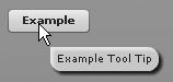
</mx:Application>You can skin tool tips as you would any other component—either
graphically or programmatically. Simply set the value for the ToolTip type selector’s borderSkin style. Example 8-25 is a programmatic skin for
tool tips.
Example 8-25. An example tool tip skin class
package com.oreilly.programmingflex.styles {
    import mx.skins.ProgrammaticSkin;
    import flash.filters.DropShadowFilter;

    public class ToolTipSkin extends ProgrammaticSkin {

        public function ToolTipSkin() {}

        override protected function updateDisplayList(unscaledWidth:Number,
unscaledHeight:Number):void {
            graphics.clear();
            graphics.lineStyle(0, 0, 0);
            graphics.beginFill(0xFFFFFF, .8);
            graphics.drawRoundRectComplex(0, 0, unscaledWidth,
unscaledHeight, 0, 10, 10, 10);
            graphics.endFill();
            filters = [new DropShadowFilter()];
        }

    }
}
You can then apply the customized skin as shown in Example 8-26.
Example 8-26. Using a programmatic tool tip skin class
<?xml version="1.0" encoding="utf-8"?>
<mx:Application xmlns:mx="http://www.adobe.com/2006/mxml">
    <mx:Style>
        ToolTip {
            borderSkin:
ClassReference("com.oreilly.programmingflex.styles.ToolTipSkin");
        }
    </mx:Style>
    <mx:Button label="Example" toolTip="Example Tool Tip" />
</mx:Application>
Figure 8-4 shows what this customized tool tip looks like.