Apart from the ability to programmatically create menus and menu
bar navigator (discussed in the next section), there are two Flex
framework controls that you can use to create pop-up controls: PopUpButton and PopUpMenuButton. Both of these controls allow a
user to display a pop up. PopUpMenuButton allows the user to pop up a
menu, whereas PopUpButton is more
generic, allowing a user to pop up any control.
The PopUpButton control allows
you to associate the button with a pop up. The pop up can be
any other UI component. Typically, you would use a pop-up button to
display a small window or something similar. As you can see in Figure 7-9, the pop up appears
adjacent to the button, appearing and disappearing from the
button.
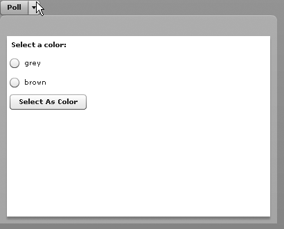
For the example shown in Figure 7-9, we created a simple MXML component that looks like the following:
<?xml version="1.0" encoding="utf-8"?>
<mx:TitleWindow xmlns:mx="http://www.adobe.com/2006/mxml" width="400" height="300">
    <mx:VBox>
         <mx:Label text="Select a color:" />
         <mx:RadioButton groupName="colors" label="grey" />
         <mx:RadioButton groupName="colors" label="brown" />
         <mx:Button label="Select As Color" />
    </mx:VBox>
</mx:TitleWindow>
Assuming we name the component PollWindow (and save it in the root
directory), the code that allows the user to display the window using a
pop-up button is as follows:
<?xml version="1.0" encoding="utf-8"?>
<mx:Application xmlns:mx="http://www.adobe.com/2006/mxml" layout="absolute">
    <mx:Script>
         <![CDATA[
              import com.oreilly.programmingflex.PollWindow;

              private var _poll:PollWindow = new PollWindow();

         ]]>
    </mx:Script>
    <mx:PopUpButton label="Poll" popUp="{_poll}" />
</mx:Application>Flex supports a component called Menu, which allows Flex to display hierarchical menus as pop ups.
Although you can use a PopUpButton to
display a menu component, it is far easier to use the PopUpMenuButton component to display a menu.
Before we can talk about PopUpMenuButton, we need to first talk about how to use a menu
component.
Menus are an instance of mx.controls.Menu. Like tree controls, menu controls require hierarchical
data providers. The following code creates a menu and populates it with
an XMLListCollection data provider.
It also sets the labelField property
as you would when using a hierarchical data provider for a tree
control.
var menu:Menu = new Menu();
var xmlList:XMLList = <items>
<item label="ActionScript">
<item label="Class" />
<item label="Interface" />
</item>
<item label="MXML">
<item label="Application" />
<item label="Component" />
</item>
</items>;
menu.dataProvider = new XMLListCollection(xmlList);
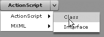
menu.labelField = "@label";The PopUpMenuButton control
simplifies associating a menu with a button by automatically creating the menu when assigning a data
provider to the button, as illustrated in this example:
<mx:PopUpMenuButton labelField="@label">
    <mx:dataProvider>
        <mx:XMLListCollection>
            <mx:XMLList>
                <item label="ActionScript">
                    <item label="Class" />
                    <item label="Interface" />
                </item>
                <item label="MXML">
                    <item label="Application" />
                    <item label="Component" />
                </item>
            </mx:XMLList>
        </mx:XMLListCollection>
    </mx:dataProvider>
</mx:PopUpMenuButton>
Figure 7-10 shows what this example looks like.
Menu controls dispatch itemClick events of type mx.events.MenuEvent every time the user selects a menu item. You can listen for the event directly from the menu using
ActionScript and addEventListener. If
you’re using PopUpMenuButton, you can
listen for the itemClick event
directly from the button. You can even use MXML to listen for the event,
as illustrated in this example that changes the button label each time
the user selects a menu item:
<mx:PopUpMenuButton id="button" labelField="@label"
                    itemClick="button.label = event.label">
    <mx:dataProvider>
        <mx:XMLListCollection>
            <mx:XMLList>
                <item label="ActionScript">
                    <item label="Class" />
                    <item label="Interface" />
                </item>
                <item label="MXML">
                    <item label="Application" />
                    <item label="Component" />
                </item>
            </mx:XMLList>
        </mx:XMLListCollection>
    </mx:dataProvider>
</mx:PopUpMenuButton>