
List-based controls are among the most sophisticated of the standard controls. These are the components that allow the user to select an item or items from a list of options. In the simplest form, a list might be a vertical, scrollable list of text labels from which the user can select. However, list-based controls can be increasingly complex from there, supporting columns, horizontal and grid-based layouts, hierarchical and collapsible structures, and even icons, images, and more. Figure 7-5 shows the list-based controls.

The most fundamental of all the list-based controls is the list. Lists are vertically scrolling, single-column controls. These lists are among the most common types of lists.
Horizontal lists are mostly identical to standard lists except that they scroll horizontally rather than vertically. Horizontal lists are typically useful for scrolling icons and/or images (thumbnails), though you could also use a horizontal list for simple text.
Combo boxes are lists that collapse to a single line when not activated. Users often refer to these types of controls as drop-down menus; they allow the user to select from a vertically scrolling list of options when in an expanded state. Once a value has been selected, the control returns to the collapsed state.
Tile lists are scrollable lists in which the contents are arranged in a grid. Tile lists are useful when you want to display contents in a grid, but you need the grid to scroll.
Data grids are vertically scrolling, multicolumn lists. Data grids are good for displaying data that consists of records of multiple values that a user might need to see at the same time. For example, a data grid would be a good choice for displaying the details of a user’s phone use history where each row displays the time, the duration, and the destination phone number, each in a different column.
Tree controls are hierarchical types of lists. They are very similar to standard lists in that they are vertically scrolling. However, whereas standard lists have linear data models, trees have hierarchical data models where individual elements can expand and collapse to reveal and hide nested elements.
Note
UI components have a data
property as well as a dataProvider
property. Although it is easy enough to initially confuse the two,
they are different properties with different purposes. The dataProvider property allows you to set the
data model for a component. The data
property is used by the Flex framework only when using a component as an
item renderer for a list-based component, as discussed in Chapter 10, though you could
conceivably use the data property in
other contexts to assign data to a custom component.
Flex controls use Model-View-Controller (though not in a strict fashion), a software pattern that differentiates between the display of data and the data itself. This is very evident in the list-based controls. All list-based controls utilize data models. In the language used by these components, the data models are called data providers. Data providers are independent objects that you can associate with a control. The control then uses that object’s data to render its view.
Data providers always implement the mx.collections.ICollectionView
interface. Although you can assign an array or an XML object to the
dataProvider property of most list-based components, Flex converts the object
behind the scenes to a type that implements ICollectionView. That means that arrays get
converted to a type called mx.collections.ArrayCollection and XML and XMLList objects get converted to mx.collections.XMLListCollection. It’s generally best to always explicitly wrap the object
as a collection first before assigning it as the data provider. That way
you are assured of having a reference to the actual data provider
collection rather than the object wrapped by the collection.
There are two basic ways to create collections: using ActionScript and
using MXML. The ActionScript solution involves creating a new collection
type, typically with the constructor. The following ActionScript example
creates a new ArrayCollection object
that wraps an array:
var collection:ICollectionView = new ArrayCollection(["a", "b", "c", "d"]);
Note
The variables in these examples are typed as ICollectionView rather than the concrete
types (e.g., ArrayCollection) so
that polymorphism can be utilized in later examples. In the case of the
preceding example, you could technically type the variable as ArrayCollection.
Likewise, this ActionScript example creates an XMLListCollection that wraps an XMLList object:
var xml:XML = <items><item>a</item><item>b</item>
              <item>c</item><item>d</item></items>;
var collection:ICollectionView = new XMLListCollection(xml.children());
You can create the same collections using MXML. The following
example creates an ArrayCollection
object using MXML:
<mx:ArrayCollection id="collection">
    <mx:Array>
        <mx:String>a</mx:String>
        <mx:String>b</mx:String>
        <mx:String>c</mx:String>
        <mx:String>d</mx:String>
    </mx:Array>
</mx:ArrayCollection>
This creates an XMLListCollection using MXML:
<mx:XMLListCollection id="collection">
    <mx:XMLList id="example">
        <item>a</item>
        <item>b</item>
        <item>c</item>
        <item>d</item>
    </mx:XMLList>
</mx:XMLListCollection>You can use any sort of collection (as long as it implements ICollectionView) with any sort of list-based
control, allowing for versatility of data structures. All you have to do
is set the dataProvider property of
the list-based control to be equal to the collection. For example, the
following uses an ArrayCollection to
populate a list:
var collection:ICollectionView = new ArrayCollection(["a", "b", "c", "d"]);
list.dataProvider = collection;
On the other hand, if the data happens to be in XML format, you
can easily use an XMLListCollection
instead:
var xml:XML = <items><item>a</item><item>b</item>
              <item>c</item><item>d</item></items>;
var collection:ICollectionView = new XMLListCollection(xml.children);
list.dataProvider = collection;
If you’re using MXML to set the data provider, you can simply nest the
collection within the list-based control tag. Because the dataProvider property is the default property
for list-based controls, you don’t need to explicitly state that the
value should be assigned to the dataProvider property. The following example
assigns an ArrayCollection to the
dataProvider for a list:
<mx:List id="list" width="100">
    <mx:ArrayCollection>
        <mx:Array>
            <mx:String>a</mx:String>
            <mx:String>b</mx:String>
            <mx:String>c</mx:String>
            <mx:String>d</mx:String>
        </mx:Array>
    </mx:ArrayCollection>
</mx:List>The preceding examples illustrated how to work with simple list-based controls such as lists, combo boxes, tile lists, and horizontal lists. Data grids inherit from standard lists, and therefore they function in much the same way. However, because data grids are more complex than standard lists, they have behavior that is specific to them. In the following sections, we’ll look at working with data grids.
Data grid data providers are quite similar to standard data providers except that
each element of a data grid data provider should consist of an object
whose properties correspond to the columns of the data grid. The
following example creates a data grid with columns named city, state, and population:
<mx:DataGrid>
    <mx:ArrayCollection>
        <mx:Array>
            <mx:Object city="Los Angeles" state="CA" population="3844829" />
            <mx:Object city="New York" state="NY" population="8143197" />
            <mx:Object city="Chicago" state="IL" population="2842518" />
            <mx:Object city="Philadelphia" state="PA" population="1463281" />
        </mx:Array>
    </mx:ArrayCollection>
</mx:DataGrid>
You can, of course, achieve the same result using ActionScript. Here’s an example that displays the same content using ActionScript:
<?xml version="1.0"?>
<mx:Application xmlns:mx="http://www.adobe.com/2006/mxml"
creationComplete="creationCompleteHandler(event)">
    <mx:Script>
        <![CDATA[
            import mx.collections.ArrayCollection;

            private function creationCompleteHandler(event:Event):void {
                var array:Array = new Array({city: "Los Angeles",
                                             state: "CA",
                                             population: 3844829},
                                            {city: "New York",
                                             state: "NY",
                                             population: 8143197},
                                            {city: "Chicago",
                                             state: "IL",
                                             population: 2842518},
                                            {city: "Philadelphia",
                                             state: "PA",
                                             population: 1463281});
                var collection:ArrayCollection = new ArrayCollection(array);
                grid.dataProvider = collection;
            }

        ]]>
    </mx:Script>
    <mx:DataGrid id="grid" width="500" />

</mx:Application>By default, data grids automatically display columns corresponding to all the properties of the elements of the data provider. The code in the preceding section creates a data grid with three columns with the headings “city,” “state,” and “population”. Although this may be the intended behavior, in many cases it is not very versatile. For this reason, it is possible to explicitly control the columns of a data grid.
You can specify which columns will display within a data grid by
setting the columns property of
the data grid to an array of DataGridColumn objects. Using these column objects, you can filter which columns
get displayed, the widths of the columns, the editability of the
columns, the heading text for the columns, and more. Here’s an example
that displays the city and population values with custom labels, but
does not display the state data:
<mx:DataGrid id="grid" width="500">
    <mx:columns>
        <mx:DataGridColumn headerText="City" dataField="city" />
        <mx:DataGridColumn headerText="Population (within city limits)"
                           dataField="population" />
    </mx:columns>
    <mx:dataProvider>
        <mx:ArrayCollection>
            <mx:Array>
                <mx:Object city="Los Angeles" state="CA" population="3844829" />
                <mx:Object city="New York" state="NY" population="8143197" />
                <mx:Object city="Chicago" state="IL" population="2842518" />
                <mx:Object city="Philadelphia" state="PA" population="1463281" />
            </mx:Array>
        </mx:ArrayCollection>
    </mx:dataProvider>
</mx:DataGrid>
The advanced data grid control (AdvancedDataGrid) is available with the Professional version of Flex Builder
3 and is not part of the standard SDK. However, since the advanced data
grid does represent significant new features above and beyond the
standard data grid, it’s worth taking a look at some of its features and
how you can work with it.
In addition to providing the standard features of the normal data grid, the advanced data grid control can also do the following:
Allow the user to sort on more than one column
Select cells as well as rows
Display hierarchical data (such as an advanced tree control)
In the simplest implementation, you can use an advanced data
grid just as you would a normal data grid. For instance, Example 7-1 creates an
advanced data grid and populates it using an ArrayCollection object of
countries.
Example 7-1. Using an advanced data grid in the simplest way
<?xml version="1.0" encoding="utf-8"?>
<mx:Application xmlns:mx="http://www.adobe.com/2006/mxml" layout="absolute"
creationComplete="creationCompleteHandler();">
    <mx:Script>
        <![CDATA[
            import mx.collections.ArrayCollection;

            [Bindable]
            private var _populations:ArrayCollection;

            private function creationCompleteHandler():void {
                _populations = new ArrayCollection();
                _populations.addItem({country:  "Canada",
                                      continent: "North America",
                                      population: 31612897});
                _populations.addItem({country:  "Venezuela",
                                      continent: "South America",
                                      population: 23054210});
                _populations.addItem({country:  "United States",
                                      continent: "North America",
                                      population: 281421906});
                _populations.addItem({country:  "Brazil",
                                      continent: "South America",
                                      population: 169799170});
            }

        ]]>
    </mx:Script>
    <mx:AdvancedDataGrid id="advancedDataGrid" width="100%" height="100%"
dataProvider="{_populations}" />
</mx:Application>
The result of the code in this example is that the advanced data
grid is almost identical to a standard data grid. The one notable
exception is that the advanced data grid allows the user to sort by
multiple columns. The default behavior is that each column heading has two
clickable regions. The larger clickable region sorts by that column
and only that column. The smaller region adds the column to the chain
of sortable columns. For instance, in the preceding example the
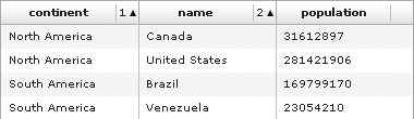
advanced data grid displays three columns: name, continent, and population. As you can see in Figure 7-6, the smaller
portion of the “continent” and “name” column headings designates in
which order those columns will be sorted. In Figure 7-6, the data is
sorted first by the continent
column and then by the name
column.
If you prefer that the column headings not show the sorting
order and instead show only the header text, you can set sortExpertMode to true for the advanced data grid. In expert
mode, the grid is still sortable by multiple columns, but the sorting
requires that the user knows how to use the grid correctly to achieve
the sorting: holding down the Ctrl key while clicking a header will
add it to the sort chain.
With a standard data grid it is possible to select one row or multiple rows. With an advanced data grid you have other options, including:
Selecting one cell
Selecting multiple cells
You can use the selectionMode
property to determine which mode the grid should use. The
possible values are none, singleRow, multipleRows, singleCell, and multipleCells.
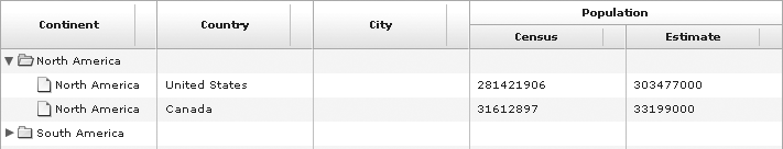
Normally when you work with data in a grid, it's fairly flat and two-dimensional. However, the advanced data grid allows you to group data to create an added dimension to the grid. For example, say we want to group the data set we used earlier by continent, allowing the user to look at only the North America rows or only the South America rows if she wants. The advanced data grid achieves this by using a tree-like interface, as you can see in Figure 7-7.

Grouped data is two-dimensional data that you wrap in an mx.collections.GroupingCollection instance.
The GroupingCollection type allows
you to specify fields on which the data should be grouped. For
example, the data that is displayed in the grid in Figure 7-7 is grouped by
continent. The code for this appears in Example 7-2.
Example 7-2. Working with grouping data
<?xml version="1.0" encoding="utf-8"?>
<mx:Application xmlns:mx="http://www.adobe.com/2006/mxml" layout="absolute"
creationComplete="creationCompleteHandler();">
    <mx:Script>
        <![CDATA[
            import mx.collections.Grouping;
            import mx.collections.GroupingField;
            import mx.collections.GroupingCollection;
            import mx.collections.ArrayCollection;

            [Bindable]
            private var _populations:GroupingCollection;

            private function creationCompleteHandler():void {
                var arrayCollection:ArrayCollection = new ArrayCollection();
                arrayCollection.addItem({country:  "Canada",
                                         continent: "North America",
                                         population: 31612897});
                arrayCollection.addItem({country:  "Venezuela",
                                         continent: "South America",
                                         population: 23054210});
                arrayCollection.addItem({country:  "United States",
                                         continent: "North America",
                                         population: 281421906});
                arrayCollection.addItem({country:  "Brazil",
                                         continent: "South America",
                                         population: 169799170});
                _populations = new GroupingCollection();
                _populations.source = arrayCollection;
                var grouping:Grouping = new Grouping();
                grouping.fields = [new GroupingField("continent")];
                _populations.grouping = grouping;
                _populations.refresh();
            }

        ]]>
    </mx:Script>
    <mx:AdvancedDataGrid id="advancedDataGrid" width="100%" height="100%"
dataProvider="{_populations}">
        <mx:columns>
            <mx:AdvancedDataGridColumn headerText="Continent" dataField="continent" />
            <mx:AdvancedDataGridColumn headerText="Country" dataField="country" />
            <mx:AdvancedDataGridColumn headerText="Population" dataField=
"population" />
        </mx:columns>
    </mx:AdvancedDataGrid>
</mx:Application>
You’ll notice that the GroupingCollection instance in Example 7-2 wraps an ArrayCollection instance,
though it could also wrap XML-based data. You can
specify the data that the GroupingCollection instance should wrap by
way of the source property. Simply
assign the two-dimensional data to the source property as in Example 7-2.
Once you’ve set the source of the GroupingCollection you next need to tell it
how to group the data. You can do that by assigning a Grouping object to the grouping
property. A Grouping object has
fields, which are instances of GroupingField. The fields that you specify are those that are used to
group the data. In the example, we group the data by continent. All
items in the data set with the same continent value are automatically
grouped because we set the grouping
field to continent. Once we set the
grouping property we need to call
the refresh() method of the
GroupingCollection instance to tell
the system that the data has updated. That will notify listeners to
update themselves.
You may also have noticed that in the example we specified
columns for the advanced data grid. We can specify columns using the
columns property, just as we would
for a standard data grid. However, as you can see in the example, the
column instances are instances of AdvancedDataGridColumn rather than simply DataGridColumn. Otherwise, we would set the
same properties as we would for a column of a standard data grid:
headerText and dataField. Setting the columns is required
when using grouping data.
Sometimes data sets have columns of related data, and in these
cases you may want to be able to group those columns when displaying
them in a grid. The advanced data grid allows you to do that by using
AdvancedDataGridColumnGroup
objects. Figure 7-8 shows what
grouped columns look like. In this image, you can see that the census
and estimated population columns are grouped together.
To group columns, follow these guidelines:
Instead of assigning the columns to the
columnsproperty of the grid, assign them to thegroupedColumnsproperty.Wrap all grouped columns in an
AdvancedDataGridColumnGroupobject.
Example 7-3 shows the code used to create the grid shown in Figure 7-8.
Example 7-3. Creating column groups
<?xml version="1.0" encoding="utf-8"?>
<mx:Application xmlns:mx="http://www.adobe.com/2006/mxml" layout="absolute"
creationComplete="creationCompleteHandler();">
    <mx:Script>
         <![CDATA[
              import mx.collections.Grouping;
              import mx.collections.GroupingField;
              import mx.collections.GroupingCollection;
              import mx.collections.ArrayCollection;

              [Bindable]
              private var _populations:GroupingCollection;

              private function creationCompleteHandler():void {
                   var arrayCollection:ArrayCollection = new ArrayCollection();
                arrayCollection.addItem({country: "Canada",
                                         continent: "North America",
                                         censusPopulation: 31612897,
                                         estimatedPopulation: 33199000});
                arrayCollection.addItem({country: "Venezuela",
                                         continent: "South America",
                                         censusPopulation: 23054210,
                                         estimatedPopulation: 23423158});
                arrayCollection.addItem({country: "United States",
                                         continent: "North America",
                                         censusPopulation: 281421906,
                                         estimatedPopulation: 303477000});
                arrayCollection.addItem({country: "Brazil",
                                         continent: "South America",
                                         censusPopulation: 169799170,
                                         estimatedPopulation: 170035512});
                _populations = new GroupingCollection();
                _populations.source = arrayCollection;
                var grouping:Grouping = new Grouping();
                grouping.fields = [new GroupingField("continent")];
                _populations.grouping = grouping;
                _populations.refresh();

              }

         ]]>
    </mx:Script>
    <mx:AdvancedDataGrid id="advancedDataGrid" sortExpertMode="false"
        width="100%" height="100%" dataProvider="{_populations}">
         <mx:groupedColumns>
              <mx:AdvancedDataGridColumn headerText="Continent"
                  dataField="continent" />
              <mx:AdvancedDataGridColumn headerText="Country"
                  dataField="country" />
              <mx:AdvancedDataGridColumnGroup headerText="Population">
                   <mx:AdvancedDataGridColumn headerText="Census"
                       dataField="censusPopulation" />
                   <mx:AdvancedDataGridColumn headerText="Estimate"
                       dataField="estimatedPopulation" />
              </mx:AdvancedDataGridColumnGroup>
         </mx:groupedColumns>
    </mx:AdvancedDataGrid>
</mx:Application>The results of working with grouping data and hierarchical data are very similar, but the starting points are different. As you saw in the previous section, grouping data is the result of taking two-dimensional data such as an array and creating a sense of a third dimension by specifying a field or fields on which to group the data. The result is that the data appears in a tree—data grid hybrid. Hierarchical data is already multidimensional in nature. It does not need to be grouped. An example of hierarchical data is XML data. This data already (potentially) contains three or more dimensions. All that is necessary in such a case is to display the data in a hierarchical fashion. The result is that the data gets displayed in a tree—grid hybrid just as grouped data gets displayed.
When you want to display hierarchical data in an advanced data
grid, you must wrap the data in an mx.collections.HierarchicalData instance.
The HierarchicalData object
needs to know what fields of the data set should be
expandable. By default, all HierarchicalData objects assume the
expandable field is called children. Example 7-4 shows hierarchical data that uses
a property called children to
indicate the expandable field. In this case, the continent objects use the children property to store an array of
country objects.
Example 7-4. Using hierarchical data
<?xml version="1.0" encoding="utf-8"?>
<mx:Application xmlns:mx="http://www.adobe.com/2006/mxml" layout="absolute"
creationComplete="creationCompleteHandler();">
    <mx:Script>
         <![CDATA[
              import mx.collections.HierarchicalData;
              import mx.collections.ArrayCollection;

              [Bindable]
              private var _populations:HierarchicalData;

              private function creationCompleteHandler():void {
                   var unitedStates:Object = {country: "United States",
                                              censusPopulation: 281421906,
                                              estimatedPopulation: 303477000};
                var canada:Object = {country: "Canada",
                                     censusPopulation: 31612897,
                                     estimatedPopulation: 33199000};
                var venezuela:Object = {country: "Venezuela",
                                        censusPopulation: 23054210,
                                        estimatedPopulation: 23423158};
                var brazil:Object = {country: "Brazil",
                                     censusPopulation: 169799170,
                                     estimatedPopulation: 170035512};
                var northAmerica:Object = {continent: "North America",
                                           children: [unitedStates, canada]};
                var southAmerica:Object = {continent: "South America",
                                           children: [venezuela, brazil]};
                _populations =
new HierarchicalData(new ArrayCollection([northAmerica, southAmerica]));
              }

         ]]>
    </mx:Script>
    <mx:AdvancedDataGrid id="advancedDataGrid" sortExpertMode="false"
        width="100%" height="100%" dataProvider="{_populations}">
         <mx:groupedColumns>
              <mx:AdvancedDataGridColumn headerText="Continent"
                  dataField="continent" />
              <mx:AdvancedDataGridColumn headerText="Country" dataField="country" />
              <mx:AdvancedDataGridColumn headerText="City" dataField="city" />
              <mx:AdvancedDataGridColumnGroup headerText="Population">
                   <mx:AdvancedDataGridColumn headerText="Census"
                       dataField="censusPopulation" />
                   <mx:AdvancedDataGridColumn headerText="Estimate"
                       dataField="estimatedPopulation" />
              </mx:AdvancedDataGridColumnGroup>
         </mx:groupedColumns>
    </mx:AdvancedDataGrid>
</mx:Application>
However, it’s not always possible or practical to depend on a
field called children. Instead, it
is far more advantageous to be able to specify the name of the
expandable field. For instance, consider what would happen if the
preceding example didn’t just use generic objects, but also used
custom data types, called Continent
and Country, each specifying
subregions by way of a property called regions. Since the property isn’t called
children, we need to tell Flex how
to locate the correct field to expand. We can do that by setting the
value of the childrenField property
of the HierarchicalData object to
the name of the property:
_populations.childrenField = "regions";
Like data grids, tree controls inherit from standard lists but have specialized behavior. In the case of trees, the specialized behavior is that trees are capable of rendering hierarchical data providers.
Although most lists display a linear list of elements (whether vertically, horizontally, or in grid format), tree controls allow you to render elements that themselves have nested child elements. These sorts of data providers are called hierarchical data providers. The following simple XML snippet demonstrates a hierarchical relationship in which the cities are child elements of states:
<state label="CA">
   <city label="Los Angeles" />
   <city label="San Francisco" />
</state>
<state label="MA">
   <city label="Boston" />
</state>
A tree control can represent this sort of data. Tree controls have two types of elements: branch elements and leaf nodes. When a data provider element has child elements, it's automatically treated as a branch element, meaning it is expandable within the tree. Here’s an example that uses a tree to display state and city data:
<mx:Tree labelField="@label" width="200">
    <mx:XMLListCollection>
        <mx:XMLList>
               <state label="CA">
                   <city label="Los Angeles" />
                   <city label="San Francisco" />
               </state>
               <state label="MA">
                   <city label="Boston" />
               </state>
        </mx:XMLList>
    </mx:XMLListCollection>
</mx:Tree>
You’ll notice that in this example, the tree requires a labelField property value indicating what to use as the label for the
elements. The @label value uses E4X
syntax (see Chapter 4) to indicate that the tree
should use the label attributes of each XML node for the label of the
corresponding tree element.
Although it’s easiest to visualize hierarchical relationships with
XML, you are not restricted to using XML-based data providers for trees.
You can use any sort of collection. For example, you can use an ArrayCollection object as a data provider.
However, when you want to establish hierarchical relationships using
collection types that aren’t intrinsically hierarchical, you must follow
certain rules. Specifically, to add children to an element, you must add
them as an array for a property called children. The following example illustrates
this using the city/state example from before:
<mx:Tree labelField="label" width="200">
    <mx:ArrayCollection>
        <mx:Array>
               <mx:Object label="CA">
                   <mx:children>
                       <mx:Object label="Los Angeles" />
                       <mx:Object label="San Francisco" />
                   </mx:children>
               </mx:Object>
               <mx:Object label="MA">
                   <mx:children>
                       <mx:Object label="Boston" />
                   </mx:children>
               </mx:Object>
        </mx:Array>
    </mx:ArrayCollection>
</mx:Tree>
Of course, you can achieve the same result using ActionScript in every case. First, here’s an example that populates a tree using XML data:
<?xml version="1.0"?>
<mx:Application xmlns:mx="http://www.adobe.com/2006/mxml"
creationComplete="creationCompleteHandler(event)">
    <mx:Script>
        <![CDATA[
            import mx.collections.XMLListCollection;
            import mx.controls.List;

            private function creationCompleteHandler(event:Event):void {
                var xml:XML =         <items>
                                        <item label="CA">
                                            <item label="Los Angeles" />
                                            <item label="San Francisco" />
                                        </item>
                                        <item label="MA">
                                            <item label="Boston" />
                                        </item>
                                      </items>;
                var collection:XMLListCollection = new
XMLListCollection(xml.children());
                tree.dataProvider = collection;
            }

        ]]>
    </mx:Script>
    <mx:Tree id="tree" labelField="@label" width="200" />
</mx:Application>
And here’s an example that achieves the same goal using an array:
<?xml version="1.0"?>
<mx:Application xmlns:mx="http://www.adobe.com/2006/mxml"
creationComplete="creationCompleteHandler(event)">
    <mx:Script>
        <![CDATA[
            import mx.collections.ArrayCollection;
            import mx.controls.List;

            private function creationCompleteHandler(event:Event):void {
                var array:Array = new Array({label: "CA", children: new Array(
                                                {label: "Los Angeles"},
                                                {label: "San Francisco"})},
                                            {label: "MA", children: new Array(
                                                {label: "Boston"})});
                var collection:ArrayCollection = new ArrayCollection(array);
                tree.dataProvider = collection;
            }

        ]]>
    </mx:Script>
    <mx:Tree id="tree" labelField="label" width="200" />
</mx:Application>List-based controls allow for programmatic and user selection of elements. An application may frequently need to be able to detect which item the user has selected. For this purpose, list-based controls have the following properties:
allowMultipleSelectionBy default, lists allow for one selected item at a time. By setting
allowMultipleSelectiontotrue, you allow a user to select more than one item at a time.valueThis is the value of the selected item. The value of the
valueproperty depends on the structure of the data provider. Because it has very strict requirements, to get predictable results it is frequently better not to rely on thevalueproperty.selectedItemThis is the element from the data provider corresponding to the selected item in the list. This is a very predictable property because it will always be a reference rather than an interpretation. That means that if the data provider is a collection of strings, the
selectedItemwill be a string. If the data provider is a collection of XML elements, however, theselectedItemwill be an XML element.selectedItemsThis is an array of elements. This is the multiselect equivalent to
selectedItem.selectedIndexThis is the integer index of the selected item. For all controls using linear data providers, this is a predictable and useful property. If the
selectedIndexproperty of a standard list is0, the first element is selected. This property is complicated only when using hierarchical data providers, because the relationship of the index of a visible element and the data provider depends on the expanded/collapsed state of the rest of the control’s elements.selectedIndicesThis is an array of the indexes of the selected items. This is the multiselect equivalent of
selectedIndex.
Now let’s look at a few examples using these properties. First, here’s an example that sets the selected index of a list based on an index from a numeric stepper:
<mx:VBox>
    <mx:List id="list" width="100" selectedIndex="{stepper.value}">
        <mx:ArrayCollection>
            <mx:Array>
                <mx:String>a</mx:String>
                <mx:String>b</mx:String>
                <mx:String>c</mx:String>
                <mx:String>d</mx:String>
            </mx:Array>
        </mx:ArrayCollection>
    </mx:List>
    <mx:NumericStepper id="stepper" minimum="0" maximum="3" />
</mx:VBox>
Here’s an example that displays the selected values from a data grid when the user selects them:
<mx:VBox>
    <mx:DataGrid id="grid" width="500" change="output.text =
grid.selectedItem.city">
        <mx:columns>
            <mx:DataGridColumn headerText="City" dataField="city" />
            <mx:DataGridColumn headerText="Population (within city limits)"
dataField="population" />
        </mx:columns>
        <mx:ArrayCollection>
            <mx:Array>
                <mx:Object city="Los Angeles" state="CA" population="3844829" />
                <mx:Object city="New York" state="NY" population="8143197" />
                <mx:Object city="Chicago" state="IL" population="2842518" />
                <mx:Object city="Philadelphia" state="PA" population="1463281" />
            </mx:Array>
        </mx:ArrayCollection>
    </mx:DataGrid>
    <mx:TextInput id="output" width="200" />
</mx:VBox>