The Flex framework consists, in large part, of components. Within the framework there are many types of components, from data components to layout components to user interface (UI) components. You can read about each type of component in the appropriate chapters throughout this book. In this chapter, we focus on UI components. UI components are visual components that display something to the user and/or prompt the user to interact with the application.
Although there’s no formal classification for the majority of the UI components in the Flex framework, it is useful to categorize them just for the purposes of discussion. We’ve organized our discussion of the Flex framework UI components based on the categories listed in Table 7-1.
Table 7-1. UI component categories
Category | Components |
|---|---|
| |
| |
| |
| |
| |
| |
| |
| |
| |
|
In this chapter, we will discuss each category of component listed in Table 7-1, with the exception of windows and media and progress containers, which we discuss in Chapter 6 and Chapter 11, respectively. Although you’ll find a lot of good information about how to use UI components in this chapter, you will not find a complete reference for every component and its API. To do that would require a much larger volume than this. Furthermore, the official Flex documentation does a good job of providing this information already. You can read the online version of the Flex documentation at http://livedocs.adobe.com/flex/3/html/index.html. The information in this chapter complements the official documentation in that this chapter explains which components exist, how they are related, and when to use each one.
All UI components (and all layout components) are related because
they inherit from a common superclass called mx.core.UIComponent. This UIComponent class is
part of the Flex framework. The class is abstract, meaning you would never create a
UIComponent instance directly. However,
it’s important to understand UIComponent because it will tell you a lot about
all the components that inherit from it.
The UIComponent class itself
inherits from mx.core.FlexSprite,
which directly inherits from flash.display.Sprite, which is part of the Flash
Player API. This means that all Flex UI components behave very much like
standard Flash display objects because they inherit from the display
object inheritance chain. Figure 7-1 illustrates the
inheritance relationship of UI components, showing only a partial list of
the UI components (Button, ComboBox, DateField, etc.) in the interest of
brevity.
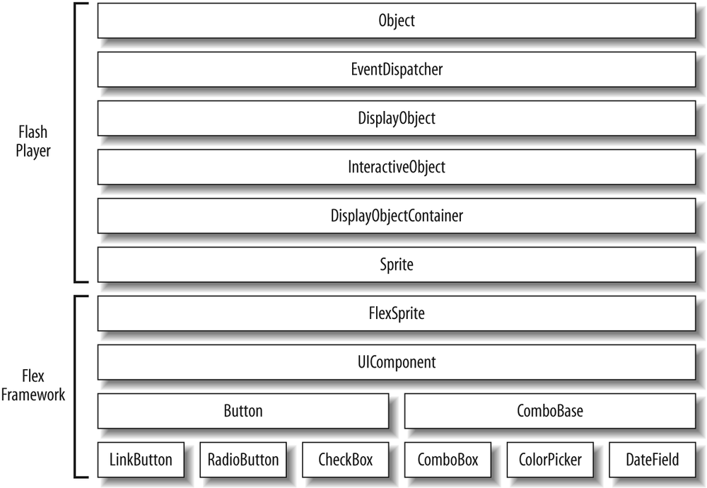
Figure 7-1. A partial list of the UI components and the inheritance relationship of UI components and Flash Player classes
You can create UI component instances either with MXML or with ActionScript. If you use MXML, you should use the tag that has the same name as the component. For example, the following code creates a button instance:
<mx:Button />
When you want to use ActionScript you should use the constructor of the component class in a new statement. The following code creates a button instance using ActionScript:
var button:Button = new Button();
When you create a component using ActionScript, the component is
not automatically added to the display list as it is when you use MXML.
If you want to add the component to the display list so that it is
visible, you must use the addChild()
method of a container:
addChild(button);
You can read more about adding components to containers in Chapter 6.
When you work with UI components, you can always count on certain properties being implemented. Those properties are as follows:
xThe x coordinate of the component relative to its parent container’s content area. You can set the property to move the component, and you can read the property to get the current x coordinate of the component.
yThe y coordinate of the component relative to its parent container. Like the
xproperty, you can both read and write theyproperty.widthThe width of the component in pixels. You can read the property to retrieve the current width, and you can set the property to change the width of the component.
heightThe height of the component in pixels. Like the
widthproperty, you can both read and write theheightproperty.scaleXThe scale of the component in the horizontal direction relative to its original width. The
scaleXandwidthproperties are linked. When you change thescaleX, thewidthchanges as well, yet the opposite is not true. You can both read and write thescaleXproperty. BothscaleXandscaleYvalues are on a scale whereby 0 is 0% and 1 is 100%. For example, settingscaleXto .5 will halve the horizontal scale of a component.scaleYThe scale of the component in the vertical direction relative to its original height. The
scaleYandheightproperties are linked just as thescaleXandwidthproperties are linked. The values forscaleYare on the same range as are those forscaleX. And you can both read and write thescaleYproperty.rotationThe number of degrees of rotation of the component relative to its original orientation. Rotation is always clockwise and is always relative to the origin point of the component’s internal coordinate system. In almost all cases, a component’s origin exists at the upper-left corner. You can both read and write the
rotationproperty.alphaThe opacity of the component. The default value is
1, which means the component is fully opaque. The effective range foralphais from 0 (transparent) to 1 (opaque). You can read and write thealphaproperty.visibleThe visibility of the component. The default value is
true, meaning the component is visible. A value offalsemeans the component is not visible. You can both read and write thevisibleproperty.enabledWhether a component is interactive. For example, if a button is enabled, it can accept mouse clicks. The default value is
true. A value offalsedisables the component. You can both read and write theenabledproperty.parentA reference to the parent container for the component. The
parentproperty is read-only. If you want to change the parent of a component, you must use theremoveChild()method of the parent container to remove the component, or useaddChild()to add the component to a new container.
The preceding list is not intended to be comprehensive by any means. However, it does represent some of the most commonly used properties of all UI components.
You can work with most of these properties both in MXML and in ActionScript (except when a property is read-only, in which case you must use ActionScript to read the value). The following example sets several properties of a button instance using MXML:
<mx:Button id="button" label="Example Button"
    width="200" height="50" enabled="false" />
Here’s the equivalent ActionScript code:
var button:Button = new Button();
button.label = "Example Button";
button.width = 200;
button.height = 50;
button.enabled = false;
addChild(button);
Events are the way in which objects (such as Flex UI components) can communicate with the rest of the application. There are two basic types of events: user events and system events. User events are events that occur directly because of user interaction with the application. For example, when the user clicks a button, a click event occurs, and when the user expands a drop-down menu (a combo box component), an open event occurs. On the other hand, a system event occurs because something happens within the application in response to initialization, asynchronous operations, or other such non-user-driven behavior. For example, when a component is created several events occur during the stages of creation indicating that various aspects of the component are accessible.
When an event occurs, we say the event is
dispatched (or broadcasted).
The object that dispatches an event is called the
target. All Flex UI components are potential event
targets, meaning all UI components dispatch events. The event that gets
dispatched is in the form of an object of type flash.events.Event (or a subtype). The Event instance
provides information about the event, including the type of event
(click, open, etc.) and the target that dispatched the event.
When a component dispatches an event, nothing occurs in response unless something (called a listener) is configured to receive notifications. There are two ways that you can handle events in a Flex application: one uses MXML attributes and the other uses ActionScript.
Note
As you saw in Figure 7-1, all UI
components inherit from the Flash Player EventDispatcher class, meaning that all UI
components are capable of dispatching events to listeners.
When you create a component using MXML, you can add an event handler using an attribute that has
the same name as the event you want to handle. For example, buttons
dispatch click events when the user clicks on them. Therefore, you can
add a click attribute to the
Button tag to handle the click
event. You also can assign ActionScript to the attribute. For example,
the following code lowers the alpha of the button by .1 each time the
user clicks on the button:
<mx:Button id="button" label="Alpha Button" click="button.alpha −= .1" />
Although you can assign ActionScript expressions to event
handler attributes, as in the preceding example, it is more common
(and useful) to assign a function call to the event handler attribute.
This allows you to define more complex functionality in response to
the event. When you call a function/method from an event handler
attribute, you should pass a parameter called event to the function. In MXML, the event parameter will automatically pass
along the event object that the component dispatches:
<mx:Button id="button" label="Alpha Button" click="clickHandler(event)" />
You then need to define the method that is intended to handle
the event. The method should accept a parameter of type Event (or the appropriate subtype). The
following example accomplishes the same thing as the inline expression
did previously. However, in addition it resets the alpha to 1 if and
when the alpha is less than 0:
private function clickHandler(event:MouseEvent):void {
  var target:Button = event.target as Button;
  target.alpha −= .1;
  if(target.alpha < 0) {
    target.alpha = 1;
  }
}
Note
Some event types, such as MouseEvent, contain additional information
beyond what a basic Event object
would contain. For example, a MouseEvent contains information
about whether a mouse button is currently pressed.
As you can see in the preceding code, we can retrieve a
reference to the object that dispatched the event using the target property of the event object. This allows one event listener
to be used with more than one event dispatcher.
You can use ActionScript to add event listeners to a component as an alternative to using MXML event attributes. This is useful for a couple of reasons. First, it is useful to add event listeners using ActionScript when you are creating the component instance using ActionScript as opposed to MXML. Second, when you add event listeners using ActionScript, you can also remove the event listeners later. This is useful if you want to temporarily or permanently stop listening for a specific event for a component.
To register a listener for an event using ActionScript you should use
the addEventListener() method.
This method requires that you pass it at least two
parameters: the name of the event for which you want to listen and the
function to use as the listener. Typically, you should use constants for event names rather than quoted strings to
avoid typos that would introduce bugs that the compiler would not
catch. The event name constants are members of the associated event
class. For example, the Event class
defines OPEN, CLOSE, SCROLL, SELECT, and many other constants. The MouseEvent class
defines CLICK, MOUSE_OVER, and other mouse-related event
constants. The FlexEvent class
defines constants for many of the Flex-specific events such as
ADD, REMOVE, CREATION_COMPLETE, and INITIALIZE. The following code creates a
button and then adds a listener for the click event:
var button:Button = new Button();
button.label = "Click This Button";
button.addEventListener(MouseEvent.CLICK, clickHandler);
addChild(button);
The event listener function is automatically passed an Event object as a parameter:
private function clickHandler(event:MouseEvent):void {
  var target:Button = event.target as Button;
  target.alpha −= .1;
  if(target.alpha < 0) {
    target.alpha = 1;
  }
}The flash.events.Event
class is the base class for all events in Flex applications.
However, many event objects are instances of event subtypes. For
example, events related to mouse behavior (click, mouseOver, etc.) are of type MouseEvent.
Event objects always have a type property indicating the type of event the object represents. For
example, a click event will dispatch an object with a type property of click. Event objects also have target properties that reference the actual
object that dispatched the event. In some cases, the target may not be
the object for which you have registered a listener. This can occur
when the object for which you have registered a listener contains a
child component that also dispatches the same event (and the event
bubbles). If you want to ensure that you are getting a reference to
the object for which the listener is registered to listen for the
event, use the currentTarget
property. The following example illustrates this point:
<?xml version="1.0" encoding="utf-8"?>
<mx:Application xmlns:mx="http://www.adobe.com/2006/mxml" layout="vertical">
    <mx:Script>
        <![CDATA[

            private function clickHandler(event:MouseEvent):void {
                textArea.text = event.target + "
" + event.currentTarget;
            }

        ]]>
    </mx:Script>
    <mx:Canvas id="canvas" click="clickHandler(event);">
        <mx:Button id="button" label="Click This Button" />
    </mx:Canvas>
    <mx:TextArea id="textArea" />
</mx:Application>
If you run this example and click the button, you’ll see that the text area tells you that the target of the event is the button while the current target is the canvas. That is because the button is what actually dispatched the event, but the canvas is the object with which you registered the listener.
Each UI component type may have events that are specific to that type. For example, combo boxes dispatch open events when the menu is expanded. However, all UI components have a set of events in common. Table 7-2 lists these common events.
Table 7-2. Common UI component events
Event | Constant | Description |
|---|---|---|
|
| The component has been added to a container. |
|
| The component has been removed from a container. |
|
| The component has been
made visible (the |
|
| The component has been
made nonvisible (the |
|
| The component dimensions have changed. |
|
| The component has started to initialize, but children haven’t yet been created. |
|
| The component has been constructed, but it has not yet been measured and laid out. |
|
| The component is completely created, measured, and laid out. |
The list of common events in Table 7-2 isn't comprehensive. The
UIComponent class (from which all
UI components inherit) defines many more events. For a comprehensive list, look at the Flex
documentation listing for mx.core.UIComponent. We’ll also discuss many
of the events in this book in the sections where they're most
appropriate (e.g., we’ll discuss drag-and-drop events in the Drag-and-Dropˮ section of Chapter 10).