
7.3. Validating and Scoping the Data
Before starting to understand how the data can help answer the questions raised by the marketing vice president, Rick's first goal is to get a feel for what is actually in his data. Questions such as the following come to mind:
How many sales representatives are there and where do they operate?
How many practices are there?
How many physicians are in each practice?
In his initial review of the data, Rick also wants to look at the general quality of the data, since he has seen problems with this in the past. He is reminded of the old saying, "Garbage in, garbage out."
7.3.1. Preparing the Data Table
Rick decides to do some preliminary preparation of his data table. He will enter descriptions of the variables in each column and then group, exclude, and hide the ID columns. He will save his documented and reorganized data table in a new file called PharmaSales.jmp.
The steps quickly described in this section illustrate some useful features of JMP that can be used for documenting and simplifying your work environment. Although these steps may initially seem like unnecessary overhead, our view is that mistake proofing and a right-first-time approach is useful in any context. Often, the lean nature of these steps is not revealed until later. In this case, imagine a similar request to Rick the following year. But, for a quick analysis, these steps are unnecessary.
With that in mind, if you prefer to skip this section, feel free to proceed directly to the next section, "Dynamic Visualization of Variables One and Two at a Time." If, however, you want to follow along with Rick, please open the file PharmaSales_RawData.jmp.
7.3.1.1. INSERTING NOTES
In order to document the data, Rick inserts a Notes property in each column describing the contents of that column. We will see how he does this for the column Visits with Samples.
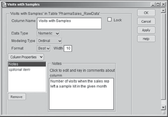
Rick selects the column Visits with Samples by clicking in the column header. Next he selects Cols > Column Info. Alternatively, he can right-click on the header of the Visits with Samples column and choose Column Info (Exhibit 7.4). In the Column Info dialog, Rick chooses Notes from the Column Properties menu (Exhibit 7.5). This opens a Notes text box, where Rick types "Number of visits when the sales representative left a sample kit in the given month" (Exhibit 7.6). He clicks OK to close the Column Info dialog.
Figure 7.4. Column Info Obtained from Right-Click on Column Header

Figure 7.5. Column Properties Menu
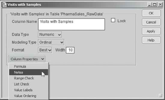
Figure 7.6. Column Info Dialog with Note for Visits with Samples
Following this procedure, Rick inserts notes for all columns.
7.3.1.2. GROUPING COLUMNS
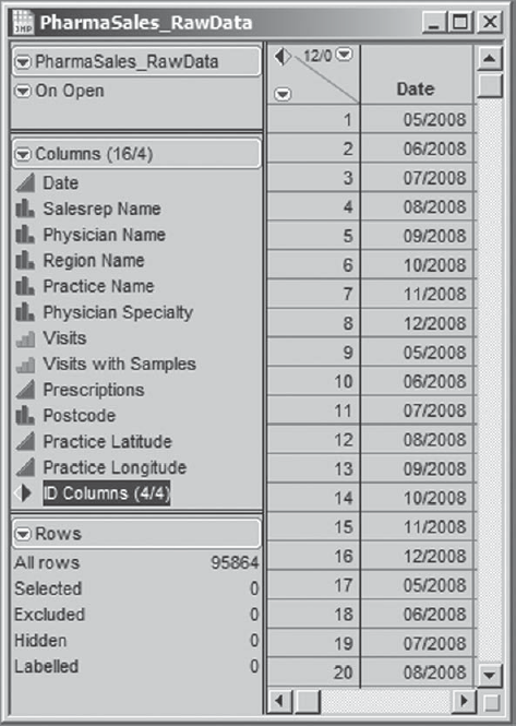
Rick observes that the four ID columns are redundant. He does not want to delete them but would like to hide them so that they do not appear in the data table and to exclude them from variable selection lists for analyses. He does this as follows.
He selects the four ID columns in the columns panel, holding the control key for multiple selections.
He right-clicks in the highlighted area. This opens a context-sensitive menu.
From this menu, he chooses Group Columns (Exhibit 7.7). This groups the four columns as shown in Exhibit 7.8.
Figure 7.7. Context-Sensitive Columns Panel Menu Showing Group Columns Selection

Figure 7.8. Columns Panel Showing Grouped Columns

By double-clicking on the name of the grouping, Rick renames the grouping to ID Columns. Rick then clicks on the disclosure icon next to the ID Columns grouping to reveal the four ID columns. He clicks on ID Columns, selecting the entire grouping. With the ID Columns grouping selected, Rick right-clicks on the selection to open the context-sensitive menu shown in Exhibit 7.7. This time, he chooses Exclude/Unexclude. This places an exclusion icon next to each column in the grouping. He opens the context-sensitive menu once again and chooses Hide/Unhide. This places a mask-like icon next to each column indicating that it is hidden. The ID grouping in the column panel now appears as shown in Exhibit 7.9.
Figure 7.9. Columns Panel with ID Columns Grouped, Excluded, and Hidden

Finally, Rick closes the disclosure icon next to ID Columns. Then, he clicks on ID Columns and, while holding the click, drags that grouping down to the bottom of the columns list, as shown in Exhibit 7.10. Now Rick is happy with the configuration of the data table, and he saves it as PharmaSales.jmp. (If you wish to save the file you have created, please use a different name.)
Figure 7.10. Final Configuration of Columns Panel with ID Columns at Bottom of List
7.3.2. Dynamic Visualization of Variables One and Two at a Time
At this point, you may open PharmaSales.jmp, which is precisely the data table that Rick has prepared for his analysis. You will notice that the table PharmaSales.jmp contains scripts. These will be created or inserted later on in the case study. If you prefer to replicate this work entirely on your own, then continue using the data table that you created based on PharmaSales_RawData.jmp after following the steps in the section "Preparing the Data Table."
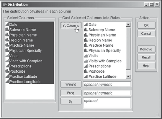
The first thing that Rick does is to run Distribution on all of the variables. He selects Analyze > Distribution and enters all the variables as Y, Columns (see Exhibit 7.11).
Figure 7.11. Distribution Dialog with All Variables Entered
When he clicks OK, he sees the report that is partially shown in Exhibit 7.12. Since some of Rick's nominal variables have many levels, their bar graphs are huge and not very informative, and they cause the default report to be extremely long. Rick notices this for Physician Name, in particular.
Figure 7.12. Partial View of Distribution Report for All Variables
For now, although some of the smaller bar graphs are useful, Rick decides to remove all of the bar graphs. He does this as follows:
He holds down the control key.
While doing so, he clicks on the red triangle next to one of the nominal variable names (he picks Salesrep Name).
He releases the control key at this point.
From the drop-down menu, he selects Histogram Options > Histograms.
This last selection deselects the Histogram option, removing it for Salesrep Name. But, since Rick held the control key while clicking on the red triangle, this command was broadcast to all other nominal and ordinal variables in the report. So, all of the bar graphs have been removed. Rick saves the script for this report to the data table, naming it Distribution for All Variables.
Rick peruses the report. He observes the following:
Date. Rick recalls that JMP stores dates internally as the number of seconds since January 1, 1904. The numbers that he sees under Quantiles and Moments are this internal representation for dates. But the histogram indicates all that Rick needs to know, namely, that eight months of data are represented and there are equal numbers of rows corresponding to each month.
Salesrep Name. Scrolling down to the bottom of the frequency table, Rick sees that there are 103 sales representatives.
Physician Name. Scrolling down to the bottom of the frequency table, Rick sees that there are 11,983 physicians represented and that each has eight records, presumably one for each of the eight months.
Region Name. There are nine regions. Northern England and Midlands have the most records.
Practice Name. There are 1,164 practices.
Physician Specialty. There are 15 specialties represented. There are 376 rows for which this information is missing.
Visits. There can be anywhere from 0 to 5 visits made to a physician in a given month. Typically, a physician receives one or no visits. There are 984 rows for which this information is missing.
Visits with Samples. There can be anywhere from 0 to 5 visits with samples made to a physician in a given month. Typically, a physician receives one or no such visits. There are 62,678 rows for which this information is missing.
Prescriptions. The distribution for the number of prescriptions for Pharma Inc.'s product written by a physician in a given month is right-skewed. The average number of prescriptions written is 7.40, and the number can range from 0 to 58.
Postcode, Practice Latitude, Practice Longitude. There is no missing data (note that, under Moments, N = 95864), and the values seem to make sense.
Now that he has taken a preliminary look at all of his data, Rick is ready to study some of his key descriptive variables more carefully. These key variables include Date, Salesrep Name, Region Name, Practice Name, and Physician Specialty. Given the large number of physicians, he decides not to include Physician Name in this list.
Rick thinks of these variables in two ways. He uses Region Name as an example. First, Region Name will allow him to stratify his data, namely to view it by its layers or values. In other words, he will learn if some regions differ from others; this information will help him develop his understanding of root causes.
However, Rick also thinks of variables such as these as chunk variables.[] Rick likes to use this term because it emphasizes the fact that his descriptive variables are large, indiscriminate, omnibus groupings of very specific root causes. Each of these variables will require further investigation if it turns out to be of interest. For example, a regional difference could be caused by any, or some combination, of the following more specific causes within a region: the educational, financial, or social level of patients; the knowledge level or specialties of physicians; the causes of underlying medical conditions; the hiring practices and management of sales representatives, or their training or attitude; and so on.
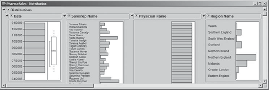
To view distributions for his five key chunk variables, Rick uses Analyze > Distribution. The launch dialog is shown in Exhibit 7.13.
Figure 7.13. Distribution Launch Dialog for Five Descriptive Variables

In the resulting report, Rick closes the disclosure icons for Quantiles and Moments under the Date report, since these are given in seconds since January 1, 1904, and since the histogram gives him all the information he needs. By inspecting the Distribution report and by clicking judiciously on the histogram bars, Rick can immediately see some interesting things. For example, by clicking on the bar for Northern England under Region Name (Exhibit 7.14) he observes:
The names of the sales representatives who work in that region.
The names of the practices located in that region.
The physician specialties represented in that region.
Figure 7.14. Partial View of Distribution Report for Five Descriptive Variables

He continues by selecting other bars for other variables. For example, Rick clicks on the Internal Medicine bar under Physician Specialty and notes that only roughly a third of practices cover that specialty. When he is finished exploring, he saves the script, naming it Distribution for Five Variables. He clears his row selections by selecting Rows > Clear Row States (or by pressing the escape key while the data table is the active window).
Having developed a feeling for some of the variables describing sales operations, Rick now turns his attention to the monthly outcomes data. He begins by obtaining a Distribution report for Visits, Visits with Samples, and Prescriptions. At the top of the report, to better see the layout of the data, he clicks on the red triangle next to Distributions and chooses Stack from the menu. This stacks the histograms and presents each horizontally (Exhibit 7.15). Rick saves the script as Distribution for Three Variables.
Figure 7.15. Distribution Report for Three Outcomes Variables

These distributions show Rick the following, some of which he observed earlier:
The numbers of monthly Visits by sales representatives range from 0 to 5.
About 23 percent of the time a physician is not visited in a given month. About 65 percent of the time a physician receives exactly one visit in a given month. However, about 12 percent of the time, a physician receives two or more visits in a given month.
There are 984 records for which Visits is missing.
There are 62,678 records missing an entry for Visits with Samples. Rick suspects that this could be for locations where the promotion was not run—he recalls being told that the promotion was limited in scope.
For the rows where Visits with Samples was reported, about 37 percent of the time no sample kit was left.
The monthly numbers of Prescriptions written by each physician vary from 0 to 58.
Generally, physicians write relatively few prescriptions for Pharma Inc.'s main product each month. They write 6 or fewer prescriptions 50 percent of the time.
However, when Visits with Samples is one or two, more Prescriptions are written than when it is zero. Rick sees this by clicking on the bars for Visits with Samples.
The number of promotional visits appears to be much smaller than the total number of visits. Rick sees this by looking at the bar graph for Visits while clicking on the bars for Visits with Samples.
Now, Rick arranges the Distribution plots for his chunk variables and the Distribution plots for his outcome measures so that he can see both on his screen. He finds it convenient to deselect the Stack option for his outcome measures (see Exhibit 7.16). Now he clicks in the bars of his chunk variables to see if there are any systematic relationships with the outcome measures. For example, are certain regions associated with larger numbers of visits than others? Or do certain specialties write more prescriptions? Exhibit 7.16 illustrates the selection of Midlands from Region Name. Rick notes that Midlands is associated with a large proportion of the Visits with Samples data and that it has a bimodal distribution in terms of Prescriptions.
All told, though, Rick does not see any convincing relationships at this point. He realizes that he will need to aggregate the data over the eight-month period in order to better see relationships. Meanwhile, he wants to get a better sense of the quality of the data, and then move on to his private agenda, which is to better understand how his sales force is deployed.
Figure 7.16. Arrangement of Five Chunk Variables and Three Outcome Measures

7.3.3. Missing Data Analysis
Having seen that some variables have a significant number of missing values, Rick would like to get a better understanding of this phenomenon. He notices, by browsing the JMP menu bar, that JMP has a platform for missing data analysis, located in the Tables menu. Selecting Tables > Missing Data Pattern, Rick chooses all 12 columns in the Select Columns list and adds them as shown in Exhibit 7.17.
Figure 7.17. Missing Data Launch Dialog

Clicking OK gives him a summary table. This eight-row table is partially shown in Exhibit 7.18. Rick saves the script as Missing Data Pattern.
Figure 7.18. Partial View of Missing Data Pattern Table

In the Missing Data Pattern table, Rick considers the columns from Date to Practice Longitude. Each of these columns contains the values 0 or 1, with a 0 indicating no missing data, while a 1 indicates missing data. He observes that the Patterns column is a 12-digit string of 0s and 1s formed by concatenating the entries of the columns Date to Practice Longitude. A 0 or 1 is used to indicate if there are missing data values in the column corresponding to that digit's place.
The table has eight rows, reflecting the fact that there are eight distinct missing data patterns. For example, row 1 of the Count column indicates that there are 33,043 rows that are not missing data on any of the 12 variables. Row 2 of the Count column indicates that there are 61,464 rows where only the eighth variable, Visits with Samples, is missing. Row 3 indicates that there are 349 records where only the two variables Visits and Visits with Samples are missing. Rick decides that he needs to follow up to find out if data on Visits with Samples was entered for only those locations where the promotion was run.
Rick thinks that a Pareto plot showing the eight missing data patterns and their frequencies might be useful as a visual display. But he notices that a Tree Map script is included in the Missing Data Pattern table and recalls that a tree map is analogous to a Pareto plot, but that it tiles the categories into a rectangle, permitting a more condensed display when one has many categories. Selecting Run Script from the red triangle next to Tree Map, Rick sees the display in Exhibit 7.19.
Figure 7.19. Tree Map for Missing Data Pattern Analysis
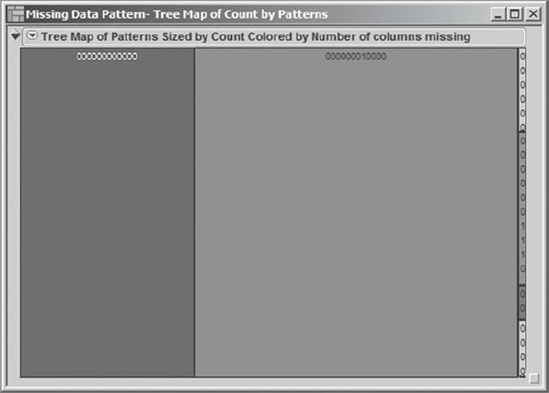
The areas of the rectangles and the legends within them show the pattern of the layout of the data relative to missing values. The large rectangle to the left represents the rows that have no missing data. The second rectangle from the left—the largest—represents the 61,464 records where Visits with Samples is the only variable that is missing data. The small area to the right consists of the six rectangles that correspond to rows 3 to 8 of the Missing Data Pattern table. Two of these are barely visible, corresponding to rows 7 and 8, which have one and two entries, respectively.
Rick views these smaller rectangles with no concern. They account for very little of the total available data. Note, however, that for some specific detailed analyses Rick might want assurance that there is no systematic pattern associated with missing data, even for small rectangles. For example, if he were interested in comparing sales representatives across practices and if the missing data for Prescriptions were associated with a few select practices, this would be cause for concern.
Consequently, Rick is primarily concerned with the missing data for Visits with Samples. Rick returns to his PharmaSales.jmp data table and runs the script Distribution for Five Variables. Then, back in the Missing Data Pattern table, he selects those rows, rows 1 and 5, for which Visits with Samples is not missing. This selects the corresponding rows in the main data table, and these rows are now highlighted in the Distribution graphs. Rick scans the distributions for patterns (see Exhibit 7.20). He notes that Region Name shows a pattern: Bars for exactly three regions are highlighted, and they are almost entirely highlighted.
Rick speculates that the promotion was run in only these three regions. He makes a few phone calls and finally connects with the IT associate who was responsible for coordinating and entering the data from the promotion. She confirms that the promotion was run in only three regions: Southern England, Northern Ireland, and Midlands. Further, she confirms that for those six regions where the promotion was not run the Visits with Samples field was left empty. She also confirms that in the three regions where the promotion was run, missing values appear when the sales representative did not report whether a sample kit was left on a given visit (this happened fairly rarely, as seen in Exhibit 7.20).
Rick feels much better upon hearing this news. He sees no other missing data issues that need to be addressed at this point. He selects Window > Close All Reports to close all the reports that he has opened. Then he closes the Missing Data Pattern table as well. He is left with PharmaSales.jmp as his only open window. Here, he deselects the selected rows by selecting Rows > Clear Row States; alternatively, he could have clicked in the lower triangle at the upper left of the data grid, or pressed the escape key.
Figure 7.20. Distributions for Four Descriptive Variables Indicating Where Visits with Samples Is Not Missing

7.3.4. Dynamic Visualization of Sales Representatives and Practices Geographically
From the Distribution reports, Rick knows that most of the sales representative activity is in Northern England and the Midlands. He is anxious to see a geographical picture showing the practices assigned to his sales representatives and how these are grouped into regions. To get this geographical view, Rick selects Graph > Bubble Plot and assigns column roles as shown in Exhibit 7.21.
Figure 7.21. Launch Dialog for Bubble Plot

When he clicks OK, he obtains the plot in Exhibit 7.22. Although this is a pretty picture, it is not what Rick envisioned. The colors (on screen) help him see where the various practices are, but he would like to see these bubbles overlaid on a map of the United Kingdom. He saves this initial script as Bubble Plot.
Figure 7.22. Bubble Plot Showing Practice Locations Colored by Region Name

Then he calls his golfing buddy, who refers him to someone who has written a JMP graphics script that draws a U.K. map. Rick is able to obtain that script and adds it to the bubble plot script that he has saved. He saves this new script to PharmaSales.jmp, calling it UK Map and Bubble Plot. When he runs the adapted script, he obtains the plot in Exhibit 7.23.
Figure 7.23. Bubble Plot Showing Practice Locations Colored by Region Name Overlaid on Map of the United Kingdom

To make the regions easier to identify, Rick constructs a legend window. To do this, he selects Rows > Color or Mark by Column. He chooses Region Name and checks the Make Window with Legend box, as shown in Exhibit 7.24. For later use, he also selects Standard from the Markers list. (The colors and markers, but not the legend window, can be obtained by running the script Color and Mark by Region.)
When he clicks OK, a small window showing the color legend appears on his screen. He places this window so that he can simultaneously view both it and his plot of the United Kingdom. When Rick clicks on a Region Name in the legend window (Northern Ireland is selected in Exhibit 7.25), the names of the sales representatives assigned to the corresponding practices appear in the plot of the United Kingdom. By doing this for each region, Rick identifies the sales representatives and locates the practices for each of the nine regions.
Figure 7.24. Dialog for Color or Mark by Column

Figure 7.25. Bubble Plot Showing Practice Locations with Legend Window

By hovering with the arrow tool over the bubble indicated in the plot on the left in Exhibit 7.26, Rick sees that this apparently strange, wet territory belongs to Yvonne Taketa. But by selecting that bubble and clicking the Split button at the bottom, Rick sees her assigned practices (see the plot to the right in Exhibit 7.26).
Figure 7.26. Bubble Plots Showing Yvonne Taketa's Practices


This makes it clear to Rick what is happening—Yvonne's practices just happen to have a mean location that falls in the North Sea. Selecting the Combine button makes the display on the right in Exhibit 7.26 revert to the display on the left. Using the display on the left, Rick can see the geographical center of each sales representative's activities.
To remove the selection of Yvonne Taketa, Rick clicks elsewhere in the plot. Next, he selects Split All from the red triangle at the top of the report. This shows the location of all the practices in the United Kingdom. Selecting Combine All causes the display to revert to the initial display. With this background, Rick feels that he has a good sense of where his sales force and their practices are located. He closes his open reports and the legend window.
7.3.5. Dynamic Visualization of Sales Representatives and Practices with a Tabular Display
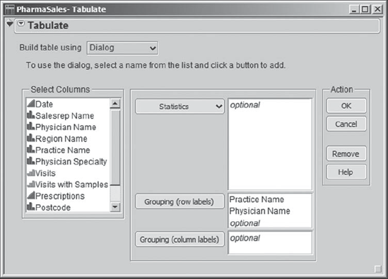
At this point, Rick wants to see a list of each sales representative's practices and physicians. To do this, he selects Tables > Tabulate, choosing to Build table using a Dialog and entering first Practice Name and then Physician Name in the Grouping list, as shown in Exhibit 7.27.
Figure 7.27. Dialog for Tabulate
The resulting table is partially shown in Exhibit 7.28. Rick saves this work in a script called Tabulate. Rick expects this tabulation to be quite large, and the vertical scroll bar in the report window confirms this. Incidentally, the fact that each row of the tabulation consists of 8 values (note the N = 8 column) confirms that Rick does have the eight-month prescribing record for each physician.
Figure 7.28. Table Showing All Practices and Physicians

To make the tabulation more manageable, Rick selects Rows > Data Filter. He then selects the Salesrep Name column under Add Filter Columns and clicks the Add button. He unchecks Select and checks Show and Include, in order to show the rows for a selected sales representative. Choosing Show hides all rows in the data table not selected by the Data Filter settings and choosing Include excludes these rows as well.
Rick arranges the Data Filter report and the Tabulate report side-by-side. Now, when he clicks on a Salesrep Name in the Data Filter window, the Tabulate report shows the Practice Names and associated information for only that Salesrep Name. This is illustrated for Alona Trease in Exhibit 7.29.
Figure 7.29. Linking of Data Filter to Tabulate Report, Illustrated for Alona Trease

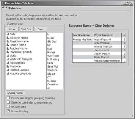
But to see this information more easily, Rick selects the Animation command from the red triangle in the Data Filter, resulting in the view shown in Exhibit 7.30. He saves this work in a script called Data Filter.
Figure 7.30. Settings for Data Filter for Animation of Tabulate Report

In the Data Filter, he clicks the blue arrow to begin the animation. This causes JMP to loop in turn over all the values of Salesrep Name, updating the tabulation report to reflect the current choice as it does so. As he watches the animation, Rick sees that there are some sales representatives calling on just a very few physicians, whereas some are calling on very many. He assumes this is due to some sales representatives working part time and makes a note to check this with the human resources department. See, for example, Exhibit 7.31, showing Cleo Delancy, who works with only one practice comprised of seven physicians.
Figure 7.31. Tabulate Report for Cleo Delancy
Once he is finished, Rick presses the Clear button in the Data Filter window to remove the row states applied by the Data Filter. Then he closes the Data Filter along with the Tabulate report.
At this point, Rick concludes that he has a clean set of data and that he has a good grasp of its content. He also feels that he has fulfilled his private agenda, which was to learn about the distribution of his sales force. The visual and dynamic capabilities provided by JMP have been extremely helpful to him in this pursuit—he has very quickly learned things he could never have learned using a spreadsheet. Now, finally, he is ready to roll up his sleeves and address the business questions posed by his manager.