Skill 3.4: Describe monitoring tools in Azure
We’ve covered a lot of ground related to managing and governing resources. However, a proper discussion would be incomplete without covering monitoring your resources once they’re deployed.
Azure offers numerous tools for monitoring your resources and ensuring they are compliant, healthy, and operating as expected.
Azure Advisor
Managing your Azure resources doesn’t just include creating and deleting resources. It also means ensuring that your resources are configured correctly for high availability and efficiency. Figuring out exactly how to do that can be a daunting task. Entire books have been written on best practices for cloud deployments. Fortunately, Azure can notify you about problems in your configuration so you can avoid problems. It does this via Azure Advisor.
Azure Advisor can offer advice about high availability, security, performance, and cost. To access Azure Advisor, log in to the Azure portal and click Advisor in the menu on the left. Figure 3-55 shows Azure Advisor in the Azure portal.

FIGURE 3-55 Azure Advisor
To review details on a recommendation, click the tile. In Figure 3-56, we have clicked the Security tile, and you can see a recommendation to enable MFA (multifactor authentication) and add another owner to my subscription.
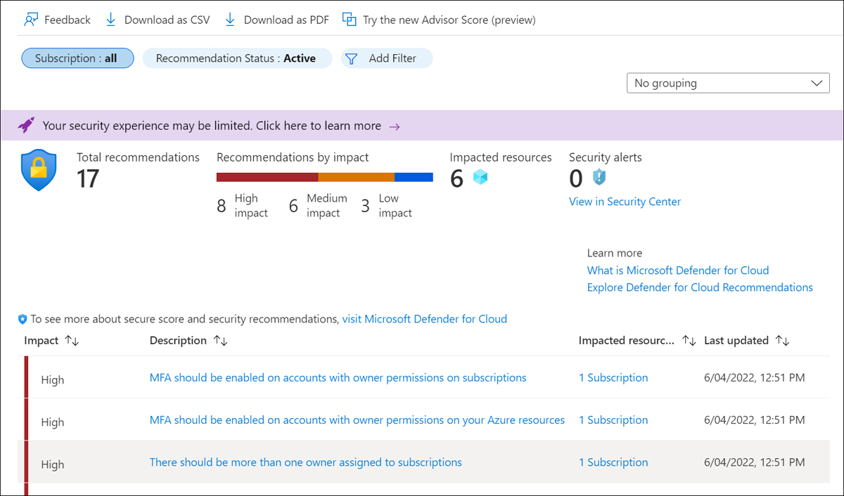
FIGURE 3-56 Advisor recommendations
You can click on a recommendation to get more details, including the steps you should take to remediate the issue. In some situations, Advisor can fix the issue for you. In Figure 3-57, I can select one or more of my VMs and let Advisor fix the issue for me by simply clicking the Fix button.

FIGURE 3-57 Acting on a recommendation
If you have many recommendations, or if you’re not the right person to act on the recommendations, you can download Azure Advisor recommendations as either a comma-separated values file or a PDF. Click Download As CSV or Download As PDF, as shown previously in Figure 3-56.
Azure Service Health
Microsoft operates an Azure Status web page where you can view the status of Azure services in all regions where Azure operates. While it is a helpful view of overall Azure health, the enormous scope of the web page doesn’t make it the most effective way to get an overview of the health of your specific services. Azure Service Health can provide you with a view specific to your resources.
To access Service Health, search for it in the Search bar in the Azure portal, as shown in Figure 3-58.

FIGURE 3-58 Azure Service Health
Figure 3-59 shows the Service Issues blade showing the health and status of the resources. The map shown has six green dots representing the health of the six Azure regions where my resources are deployed. (These dots might be difficult to see in print.) By clicking the pin icon, you can have a quick reference of Azure health for just the regions where you have resources.
You can also view any upcoming planned maintenance that might affect you by clicking Planned Maintenance in the menu on the left. By clicking Health Advisories, you can see health information that might be related to your own configuration and not a problem somewhere in Azure.

FIGURE 3-59 The Service Issues blade in Service Health
When a service issue is affecting you, you’ll see details on the issue, as shown in Figure 3-60. In addition to the full details of the incident, you also see a link that refers to details on the incident. You can also download a PDF that contains an official Microsoft notice of the incident.

FIGURE 3-60 Azure Service Health incident
Azure Monitor
Azure Monitor aggregates metrics for Azure services and exposes them in a single interface. You can also create alerts that will notify you or someone else when there are concerns you might want to address.
To access Azure Monitor, click Monitor in the Azure portal to display the Azure Monitor blade, as shown in Figure 3-61. Azure Monitor is customizable, so you can see exactly what interests you the most. For that reason, it doesn’t show any metrics until you configure them. To view metrics, click Metrics and then select a scope.

FIGURE 3-61 Azure Monitor
In Figure 3-62, a VM in the az-900 resource group has been selected for monitoring.

FIGURE 3-62 Selecting a resource to monitor
Once you select a resource, you are presented with a list of metrics related to that resource. Metrics for VMs are shown in Figure 3-63.

FIGURE 3-63 Metrics for VMs
When you select a metric, the chart updates to show a graph of that metric. You can add additional metrics to your chart by clicking Add Metric, as shown in Figure 3-64.

FIGURE 3-64 Monitoring VM disk usage
When adding multiple metrics, you’ll want to include only those metrics that share a common unit of measurement. For example, if you were to add a CPU metric to the chart shown in Figure 3-64, it wouldn’t make a lot of sense because the Percentage CPU is measured as a percentage, and disk units are measured in bytes.
In Figure 3-65, we’ve added Disk Read Bytes to the chart. Azure Monitor color codes each metric automatically to distinguish between them. We’ve also selected Area Chart as the type of chart to see the patterns more clearly.
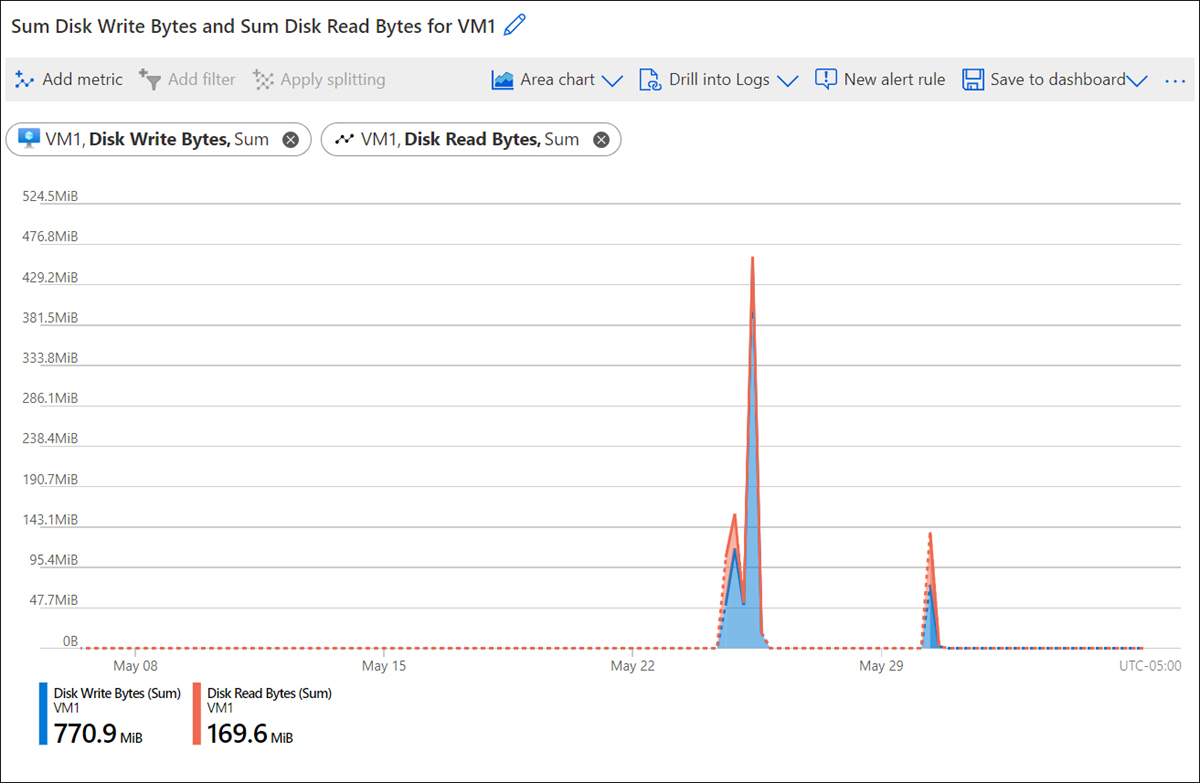
FIGURE 3-65 Chart showing disk usage
By default, charts are shown for the past 24-hour period, and the real-time value is shown at the right edge of the chart. However, you can customize the timeframe that is shown by clicking the timeframe and adjusting it as you like, as shown in Figure 3-66.
Once you have a chart that you find useful, you can pin that chart to the portal dashboard by clicking Save To Dashboard. As shown in Figure 3-67, you can pin your chart to a portal dashboard, pin it to Grafana (an extensible third-party metrics dashboard platform), or send it to an Azure Monitor Workbook. (Workbooks allow you to analyze data in an attractive, visual way that is sourced from multiple sources across Azure.)

FIGURE 3-66 Changing the chart timeframe

FIGURE 3-67 Saving to a dashboard
When certain conditions are met, Azure Monitor Alerts can notify you or others with an email or SMS text message, run a Logic App flow, call a Function App, make a request to a webhook, and more. Alerts are based on rules that you define. When a rule’s condition is met, an alert performs the action you specify.
You can create an alert rule that is automatically configured for the metrics you’ve selected in your chart by clicking New Alert Rule at the top of your chart. You can also start from scratch by clicking Alerts in the menu for Azure Monitor, clicking Create, and clicking Alert Rule, as shown in Figure 3-68.

FIGURE 3-68 Creating an alert rule
To start your rule, click the Filter By Resource Type dropdown, enter the resource type, and select the resource for which you want to configure an alert. In Figure 3-69, a VM is selected for a new alert rule. When you’ve selected the desired resources, click the Done button.
Next, you’ll need to specify the condition for your alert. Click the Condition tab, and then select the signal you want to monitor for your alert. In Figure 3-70, an alert has been configured based on the Percentage CPU signal of the VM.

FIGURE 3-69 Selecting a resource for an alert

FIGURE 3-70 Configuring a condition
Once you select a signal, the logic for the signal is configured. As shown in Figure 3-71, Monitor displays an interactive graph of the signal you’ve chosen, which helps you get a feel for how your resource has been performing historically. By default, this shows the last six hours, although you can adjust the chart period. You can specify an operator, aggregation type, and threshold, or you can click Done to create the logic for the alert.

FIGURE 3-71 Alert rule logic
Note Multiple Conditions
An alert rule can consist of multiple conditions. For example, you can have a rule that only triggers if CPU averages above 70 percent and disk usage is also high. The choice is yours.
When an alert is triggered, it performs an action that you specify using an action group. An action group contains notifications and actions to take when an alert is triggered. To create a new action group, click the Actions tab and click Create Action Group, as shown in Figure 3-72.

FIGURE 3-72 Creating an action group
In Figure 3-73, we are creating a notification to notify the IT director. In this case, the notification will send a text message to the IT director, and it will also send a push notification using the Azure mobile app.

FIGURE 3-73 Creating a notification
You can add an action to your action group by clicking on the Actions tab and selecting an action from the Action Type dropdown, as shown in Figure 3-74. In this case, an action to call a webhook is being configured.

FIGURE 3-74 Adding another action
Azure Monitor includes a feature called Application Insights that provides a dashboard of metrics for your Azure web apps and VMs with only minimal configuration. When you create a web app, you have the option of enabling Application Insights automatically. If you want to use Application Insights with a VM, you can enable it easily from the Insights blade in the portal.
Application Insights monitors a range of metrics automatically. In web apps, it monitors request rates and response times, errors (exceptions), page views and load times, user and session counts, and more. In VMs, it monitors performance counters, diagnostic logs, and more.
There are numerous ways you can view data from Application Insights. You can view VM data using the Insights menu when viewing the VM in the portal. Figure 3-75 shows the CPU utilization and available memory over time for a VM.
To view Application Insights data for a web app, open the Application Insights resource in the portal. In Figure 3-76, metrics for a web app are shown, including Server Response Time and the number of requests (Server Requests).

FIGURE 3-75 Insights on a VM in the portal
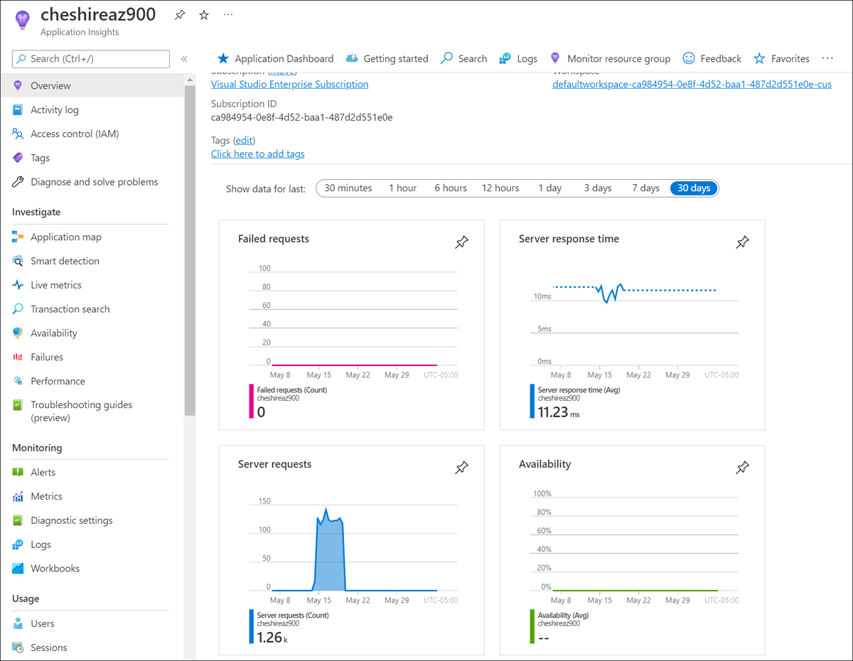
FIGURE 3-76 Application Insights for a web app
Data from Application Insights is also stored in a Log Analytics workspace. Log Analytics is an Azure feature for aggregating data from Azure Monitor and making it available via queries. Log Analytics queries are written using the Kusto Query Language (KQL), but you can also choose from a collection of queries included with Log Analytics.
Note KQL and Log Analytics
KQL and Log Analytics are optimized for querying enormous amounts of data. In fact, Microsoft uses both to analyze the vast amounts of data from the Azure infrastructure. Also, Microsoft support staff use KQL when troubleshooting complex issues in Azure.
To access Log Analytics, click Logs from your Application Insights resource. As shown in Figure 3-77, a list of existing queries is displayed. You can click the category of query to scroll to queries for that category. When you find the query you are interested in, click the Run button to run that query in Log Analytics. You can also hover over the query and click Load To Editor to load the query into the editor without running it. This is useful if the query might be long-running, and you prefer to edit it before running it.

FIGURE 3-77 Log Analytics
In Figure 3-78, you see the Request Count Trend query results in the Log Analytics editor. At the top of the screen, you see the KQL query text, and the bottom part of the screen shows the results. In this case, the results are rendered as a line graph (called a timechart in KQL) so that you can visualize the results of the query.

FIGURE 3-78 Results of a query
The KQL in the Log Analytics editor is editable, so you can tweak the query if necessary to get to the data you need. Once you’ve got the query you want, you can save it by clicking the Save button. You can also export the query results by clicking the Export button.
More Info KQL Reference
If you’re interested in learning more about using KQL, you can find the KQL reference at https://bit.ly/az900-kql.