
When you converted list_item_crime.xml to use ConstraintLayout, Android Studio automatically added the constraints it thinks will replicate the behavior of your old layout. However, to learn how constraints work you are going to start from scratch.
Select the top-level view in the component tree, labeled linearLayout. Why does it say linearLayout, when you converted your view to a ConstraintLayout? That is the ID the ConstraintLayout converter supplied. linearLayout is, in fact, your ConstraintLayout. You can check the XML version of your layout if you want to confirm this.
With linearLayout selected in the component tree, click the Clear All Constraints button (shown in Figure 11.8) and confirm your intentions in the pop-up. You will immediately see red warning flags, including one at the top right of the screen. Click it to see what that is all about (Figure 11.9).

When views do not have enough constraints, ConstraintLayout cannot know exactly where to put them. Your TextViews have no constraints at all, so they each have a warning that says they will not appear in the right place at runtime.
In the preview, the views look the same as they did when you were using a LinearLayout. But – as the errors indicate – the positioning you see in the preview is not what you would see if you ran the app. The preview allows you to position your views anywhere on the canvas to make it easier to add your constraints, but these positions are only valid in the preview, not at runtime.
As you go through the chapter, you will add constraints to fix those warnings. In your own work, keep an eye on that warning indicator to avoid unexpected behavior at runtime.
You need to make some room to work in the layout editor. Your two TextViews are taking up the entire area, which will make it hard to wire up anything else. Time to shrink those two views.
Select crime_title in the component tree and look at the attributes window on the right (Figure 11.10). If this window is not open for you, click the Attributes tab on the right to open it.

The vertical and horizontal sizes of your TextView are governed by the height setting and width setting, respectively.
There are three setting types for height and width (shown in Figure 11.11 and summarized in Table 11.1), each of which corresponds to a value for layout_height or layout_width.

Table 11.1 View size setting types
|
Setting type |
Setting value |
Usage |
|---|---|---|
|
fixed |
|
Specifies an explicit size (that will not change) for the view.
The size is specified in |
|
wrap content |
|
Assigns the view its “desired” size. For a TextView, this means that the size will be just big enough to show its contents. |
|
match constraint |
|
Allows the view to stretch to meet the specified constraints. |
Both the title and date TextViews are set to a large fixed width, which is why they are taking up the whole screen. Adjust the width and height of both views. With crime_title still selected in the component tree, click the width setting until it cycles around to the wrap content setting (or use the drop-down menu to choose the setting). If necessary, adjust the height setting until the height is also set to wrap content (Figure 11.12).

Repeat the process with the crime_date view to set its width and height.
Now the two views are the correct size (Figure 11.13).

This change has not fixed the errors in your layout, because your views still have no constraints. You will add constraints to correctly position your TextViews and get rid of the errors later. First, you will add the third view you need in your layout.
With your other views out of the way, you can add the handcuffs image to your layout. Add an ImageView to your layout file. In the palette, find ImageView in the Common category (Figure 11.14). Drag it into your component tree as a child of the ConstraintLayout, just underneath crime_date.

In the dialog that pops up, scroll to the CriminalIntent.app.main section and choose ic_solved as the resource for the ImageView (Figure 11.15). This image will be used to indicate which crimes have been solved. Click OK.

(The “ic” is short for “icon,” by the way. Just as fragment layout files begin with the “fragment_” prefix and activity layout files begin with the “activity_” prefix, it is a convention to prefix your icons with the “ic_” prefix. That allows you to easily organize your various drawables.)
The ImageView is now a part of your layout, but it has no constraints. So while the layout editor gives it a position, that position does not really mean anything.
Click your ImageView in the preview. (You may want to zoom the preview in to get a better look. The zoom controls are in the toolbar in the lower right of the canvas.) You will see circles on each side of the ImageView (Figure 11.16). Each of these circles represents a constraint handle.

You want the ImageView to be anchored on the right side of the view and centered vertically. To accomplish this, you need to create constraints from the top, right, and bottom edges of the ImageView.
Before adding constraints, drag the ImageView to the right and down to move it away from the TextViews (Figure 11.17). Do not worry about where you place the ImageView. This placement will be ignored once you get your constraints in place.

Time to add some constraints. First, you are going to set a constraint between the top of the ImageView and the top of the ConstraintLayout. In the preview, drag the top constraint handle from the ImageView to the top of the ConstraintLayout. The handle will display an arrow and turn solid blue (Figure 11.18).
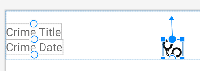
Watch for the constraint handle to turn blue, then release the mouse to create the constraint (Figure 11.19).

Be careful to avoid dragging one of the square handles in the corner of the image view – this will resize it instead. Also, make sure you do not inadvertently attach the constraint to one of your TextViews. If you do, click the constraint handle to delete the bad constraint, then try again.
When you let go and set the constraint, the view will snap into position to account for the presence of the new constraint. This is how you move views around in a ConstraintLayout – by setting and removing constraints.
Verify that your ImageView has a top constraint connected to the top of the ConstraintLayout by hovering over the top constraint handle with your mouse. You should see an animated box around the constraint layout, with the top edge blue to show where the constraint handle is connected (Figure 11.20).

Do the same for the bottom constraint handle, dragging it from the ImageView to the bottom of the root view (Figure 11.21), again taking care to avoid attaching it to the TextViews.

(The squiggly lines you see in the preview represent constraints that are stretching.)
Finally, drag the right constraint handle from the ImageView to the right side of the root view. That should set all the constraints for the image view. Your constraints should look like Figure 11.22.

Any edits that you make to constraints with the layout editor are reflected in the XML behind the scenes. You can still edit the raw ConstraintLayout XML, but the layout editor will often be easier for adding the initial constraints. ConstraintLayout is more verbose than other ViewGroups, so adding the initial constraints manually can be a lot of work. On the other hand, working directly with the XML can be more useful when you need to make smaller changes to the layout.
Switch to the code view to see what happened to the XML when you created the three constraints on your ImageView:
    <androidx.constraintlayout.widget.ConstraintLayout
            ... >
        ...
        <ImageView
            android:id="@+id/imageView"
            android:layout_width="wrap_content"
            android:layout_height="wrap_content"
            app:layout_constraintBottom_toBottomOf="parent"
            app:layout_constraintEnd_toEndOf="parent"
            app:layout_constraintTop_toTopOf="parent"
            app:srcCompat="@drawable/ic_solved" />

    </androidx.constraintlayout.widget.ConstraintLayout>
(You will still see errors related to the two TextViews. Do not worry – you will fix them shortly.)
All the views are direct children of the single ConstraintLayout – there are no nested layouts. If you had created the same layout using LinearLayout, you would have had to nest one inside another. As we said earlier, reducing nesting also reduces the time needed to render the layout, and that results in a quicker, more seamless user experience.
Take a closer look at the top constraint on the ImageView:
app:layout_constraintTop_toTopOf="parent"
This attribute begins with layout_.
All attributes that begin with layout_ are known as layout parameters.
Unlike other attributes, layout parameters are directions to that view’s parent, not the view itself.
They tell the parent layout how to arrange the child element within itself.
You have seen a few layout parameters so far, like layout_width and layout_height.
The name of the constraint is constraintTop.
This means that this is the top constraint on your ImageView.
Finally, the attribute ends with toTopOf="parent".
This means that this constraint is connected to the top edge of the parent.
The parent here is the ConstraintLayout.
Whew, what a mouthful. Time to leave the raw XML behind and return to the layout editor.
(The layout editor’s tools are useful, especially with ConstraintLayout. But not everyone is a fan. You do not have to choose sides – you can switch back and forth between the layout editor and directly editing XML. After this chapter, use whatever approach you prefer to create the layouts in this book – XML, layout editor, or some of each.)
Your ImageView is almost positioned correctly. Since the parent view is larger than the image and the image is centered vertically, it looks good on the vertical axis. However, the image is flush against the right side of the parent view. This looks a little off.
With the image still selected in the preview, check out the attributes window to the right. Because you added constraints to the top, bottom, and right of the ImageView, drop-down menus appear to allow you to select the margin for each constraint (Figure 11.23). You do not need to add margins to the top or bottom, but select 16dp for the right margin.

Notice that Android Studio offers you margin values in increments of 8dp. These values follow Android’s material design guidelines. You can find all the Android design guidelines at developer.android.com/design/index.html. Your Android apps should follow these guidelines as closely as possible.
With that taken care of, let’s move on to the text. Start with the position and size of the title TextView.
First, select Crime Date in the preview and drag it out of the way (Figure 11.24). Remember that any changes you make to the position in the preview will not be represented when the app is running. At runtime, only constraints remain.

Now, select crime_title in the component tree. This will also highlight Crime Title in the preview.
You want Crime Title to be at the top left of your layout, positioned to the left of your ImageView. That requires three constraints:
-
from the left side of your view to the left side of the parent
-
from the top of your view to the top of the parent
-
from the right of your view to the left side of the ImageView
Modify your layout so that all these constraints are in place (Figure 11.25). If a constraint does not work as you expected, press Command-Z (Ctrl-Z) to undo and try again.

Now you are going to add margins to the constraints on your TextView. With Crime Title still selected in the preview, check out the attributes window to the right. Because you added constraints to the top, left, and right of the TextView, drop-down menus appear to allow you to select the margin for each constraint (Figure 11.26). Select 16dp for the left and top margins and 8dp for the right margin.

Verify that your constraints look like Figure 11.27.

Now that the constraints are set up, you can restore the width of the title TextView to its full glory.
Adjust its horizontal view setting to 0 dp (match constraint) to allow the TextView to fill all the space available within its constraints.
Make the vertical view setting wrap_content, if it is not already, so that the TextView will be just tall enough to show the title of the crime.
Verify that your settings match those shown in Figure 11.28.

Now, add constraints to the date TextView. Select crime_date in the component tree. Repeat the steps from the title TextView to add three constraints:
-
from the left side of your view to the left side of the parent, with a
16dpmargin -
from the top of your view to the bottom of the crime title, with an
8dpmargin -
from the right of your view to the left side of the ImageView, with an
8dpmargin
After adding the constraints, adjust the properties of the TextView. You want the width of your date TextView to be match_constraint and the height to be wrap_content, just like the title TextView. Verify that your settings match those shown in Figure 11.29.

Your layout in the preview should look similar to Figure 11.1, at the beginning of the chapter. Up close, your preview should match Figure 11.30.

Switch to the code view in the editor tool window to review the XML resulting from the changes you made in the layout editor. Red underlines no longer appear under the TextView tags. This is because the TextView views are now adequately constrained, so the ConstraintLayout that contains them can figure out where to properly position the views at runtime.
Two yellow warning indicators remain related to the TextViews, and if you explore them you will see that the warnings have to do with their hardcoded strings. These warnings would be important for a production application, but for CriminalIntent you can disregard them. (If you prefer, feel free to follow the advice to extract the hardcoded text into string resources. This will resolve the warnings.)
Additionally, one warning remains on the ImageView, indicating that it does not have a content description. For now, you can disregard this warning as well. You will address this issue when you learn about accessibility in Chapter 19. In the meantime, your app will function, although the image will not be accessible to users utilizing a screen reader.
Run CriminalIntent and verify that you see all three components lined up nicely in each row of your RecyclerView (Figure 11.31).
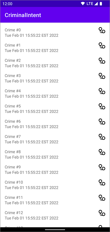
Now that the layout includes the correct constraints, update the ImageView so that the handcuffs are only shown on crimes that have been solved.
First, update the ID of your ImageView. When you added the ImageView to your ConstraintLayout, it was given a default name. That name is not very descriptive. In the design view, select your ImageView and, in the attributes window, update the ID attribute to crime_solved (Figure 11.32).

You will be asked whether Android Studio should update all usages of the ID; select Refactor.
Next, Android Studio will warn you that you are already using the ID crime_solved (Figure 11.33).

The crime_solved ID is used in both the list_item_crime.xml and fragment_crime_detail.xml layouts.
You might think that reusing an ID would be a problem, but in this case it is not.
Layout IDs only need to be unique in the same layout.
Since your IDs are defined in different layout files, there is no problem using the same ID in both.
Click Continue to ignore this warning.
With a proper ID in place, you are ready to update your code. Open CrimeListAdapter.kt. In CrimeHolder, add an ImageView instance variable and toggle its visibility based on the solved status of the crime.
Listing 11.1 Updating handcuff visibility (CrimeListAdapter.kt)
class CrimeHolder(
    private val binding: ListItemCrimeBinding
) : RecyclerView.ViewHolder(binding.root) {
    ...
    fun bind(crime: Crime) {
        ...
        binding.root.setOnClickListener {
            Toast.makeText(
                binding.root.context,
                "${crime.title} clicked!",
                Toast.LENGTH_SHORT
            ).show()
        }

        binding.crimeSolved.visibility = if (crime.isSolved) {
            View.VISIBLE
        } else {
            View.GONE
        }
    }
    ...
}
Run CriminalIntent and verify that the handcuffs now appear on every other row. (Check CrimeListViewModel if you do not recall why this would be the case.)