
Chapter 25
Customizing the ribbon to run macros
In this chapter, you will:
Learn where to add ribbon code: the customui folder and file
Add controls to a ribbon
Understand the RELS file
Use images on buttons
Troubleshoot error messages
Learn other ways to run a macro
Unlike the command bars of old, a ribbon isn’t designed via VBA code. Instead, if you want to modify the ribbon and add your own tab, you need to modify the Excel file itself, which isn’t as impossible as it sounds. The new Excel file is actually a zipped file, containing various files and folders. All you need to do is unzip it, make your changes, and you’re done. Okay, it’s not that simple—a few more steps are involved—but it’s not impossible.
Before beginning, go to the File tab and select Options, Advanced, General and select Show Add-In User Interface Errors. This allows error messages to appear so that you can troubleshoot errors in your custom toolbar.
 Note
Note
See the “Troubleshooting error messages” section later in this chapter for more details.
 Caution
Unlike when programming in the VB Editor, you won’t have any assistance with automatic correction of letter case—and the XML code, which is what the ribbon code is, is very particular. Note the case of the XML-specific words; for example, for id, using ID will generate an error.
One thing to keep in mind is that with the change to the single-document interface (SDI) that was made to Excel 2013 (and later versions), the custom ribbon tab attached to a workbook is visible only when that workbook is active. When you activate another workbook, the tab will not appear on the ribbon. The exception is with an add-in; its custom ribbon is visible on any workbook open after the add-in is opened.
Note
See Chapter 26, “Creating Excel add-ins,” for more information on creating an add-in.
Note
The original CommandBars object in legacy Excel still works, but the customized menus and toolbars are now all placed on the Add-Ins tab.
Where to add code: The customui folder and file
Create a folder called customui. This folder contains the elements of your custom ribbon tab. Within the folder, create a text file and call it customUI14.xml, as shown in Figure 25-1. Open the XML file in a text editor; either Notepad or WordPad works.
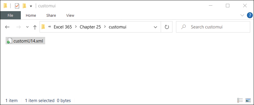
FIGURE 25-1 Create a customuUI14.xml file within a customui folder.
 Tip
Tip
My favorite text editor is Notepad ++ by Don Ho (see www.notepad-plus-plus.org). Like the VB Editor, it colors XML-specific syntax after you choose XML as the language you’re typing. It also has a lot of other useful tools.
Insert the basic structure for the XML code, shown here, into your XML file. For every opening tag grouping, such as <ribbon>, there must be a closing tag, </ribbon>:
<customUI xmlns="http://schemas.microsoft.com/office/2009/07/customui">
 <ribbon startFromScratch="false">
  <tabs>

    <!-- your ribbon controls here -->

  </tabs>
 </ribbon>
</customUI>
startFromScratch is optional and has a default value of false. You use it to tell the code the other tabs in Excel will not be shown; only yours will be shown. true means to show only your tab; false means to show your tab and all the other tabs.
Caution
Note the case of the letters in startFromScratch—the small s at the beginning followed by the capital F in From and capital S in Scratch. It is crucial that you not deviate from this.
The <!-- your ribbon controls here --> you see in the previous code is commented text. Just enter your comments between <!-- and -->, and the program ignores the line when it runs.
Note
If you’re creating a ribbon that needs to be Excel 2007 compatible, you need to use the following schema: http://schemas.microsoft.com/office/2006/01/customui. Also, where you see customUI14, use customUI.
Creating a tab and a group
Before you can add a control to a tab, you need to identify the tab and group. A tab can hold many different controls, which you can group together, like the Font group on the Home tab.
Name your tab My First Ribbon and add a group called My Programs to it, like this (see Figure 25-2):
<customUI xmlns="http://schemas.microsoft.com/office/2009/07/customui">
 <ribbon startFromScratch="false">
   <tabs>
    <tab id="CustomTab" label="My First Ribbon">
      <group id="CustomGroup" label="My Programs">

      <!-- your ribbon controls here -->

     </group>
    </tab>
   </tabs>
  </ribbon>
</customUI>
id is a unique identifier for the control (in this case, the tab and group). label is the text you want to appear on your ribbon for the specified control.
Adding a control to a ribbon
After you’ve set up the ribbon and group, you can add controls. Depending on the type of control, there are different attributes you can include in your XML code. (Refer to Table 25-1 for more information on various controls and their attributes.)
The following code adds a normal-sized button with the text Click to Run to the Reports group and runs the sub HelloWorld when the button is clicked (see Figure 25-2):
<customUI xmlns="http://schemas.microsoft.com/office/2009/07/customui">
 <ribbon startFromScratch="false">
   <tabs>
    <tab id="CustomTab" label="My First Ribbon">
      <group id="CustomGroup" label="My Programs">

       <button id="button1" label="Click to run"
         onAction="Module1.HelloWorld" size="normal"/>

     </group>
    </tab>
   </tabs>
  </ribbon>
</customUI>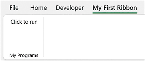
FIGURE 25-2 Run a program with a click of a button on your custom ribbon.
The properties of the button include id, a unique identifier for the control button, and label, which holds the text you want to appear on your button. size, which is the size of the button, has a default value of normal; the other option is large. onAction is the sub, HelloWorld, to call when the button is clicked. The sub, shown here, goes in a standard module, Module1, in the workbook:
Sub HelloWorld(control As IRibbonControl)
MsgBox "Hello World"
End Sub
Notice the argument control As IRibbonControl. This is the standard argument for a sub, and it is called by a button control via the onAction attribute. Table 25-2 lists the required arguments for other attributes and controls.
Table 25-1 Ribbon control attributes
Attribute | Type or Value | Description |
|---|---|---|
| String | Specifies description text displayed in menus when the |
|
| Specifies whether the control is enabled. |
| Callback | Retrieves XML content that describes a dynamic menu. |
| Callback | Gets the description of a control. |
| Callback | Gets the enabled state of a control. |
| Callback | Gets the image for a control. |
| Callback | Gets a built-in control’s icon by using the control ID. |
| Callback | Gets the number of items to be displayed in a combo box, drop-down menu, or gallery. |
| Callback | Gets the ID for a specific item in a combo box, drop-down menu, or gallery. |
| Callback | Gets the image of a combo box, drop-down menu, or gallery. |
| Callback | Gets the label of a combo box, drop-down menu, or gallery. |
| Callback | Gets the screentip for a combo box, drop-down menu, or gallery. |
| Callback | Gets the enhanced screentip for a combo box, drop-down menu, or gallery. |
| Callback | Gets the keytip for a control. |
| Callback | Gets the label for a control. |
| Callback | Gets a value that indicates whether a toggle button is pressed or not pressed. Gets a value that indicates whether a check box is selected or cleared. |
| Callback | Gets the screentip for a control. |
| Callback | Gets the ID of the selected item in a drop-down menu or gallery. |
| Callback | Gets the index of the selected item in a drop-down menu or gallery. |
| Callback | Gets a value that specifies whether to display the control image. |
| Callback | Gets a value that specifies whether to display the control label. |
| Callback | Gets a value that specifies the size of a control (normal or large). |
| Callback | Gets a value that specifies the enhanced screentip for a control. |
| Callback | Gets the text to be displayed in the edit portion of a text box or edit box. |
| Callback | Gets the text to be displayed (rather than a horizontal line) for a menu separator. |
| Callback | Gets a value that specifies whether the control is visible. |
| String | Acts as a user-defined unique identifier for the control (and is mutually exclusive with |
| Control id | Acts as a built-in control ID (and is mutually exclusive with |
| Qualified id | Acts as a qualified control ID, prefixed with a namespace identifier (and is mutually exclusive with |
| String | Specifies an image for the control. |
| Control id | Specifies an identifier for a built-in image. |
| Control id | Specifies the identifier for the built-in control after which to position this control. |
| Qualified id | Specifies the identifier of a control whose |
| Control id | Specifies the identifier for the built-in control before which to position this control. |
| Qualified id | Specifies the identifier of a control whose |
|
| Specifies the size for the items in a menu. |
| String | Specifies the keytip for the control. |
| String | Specifies the label for the control. |
| Callback | Called when the user clicks the control. |
| Callback | Called when the user enters or selects text in an edit box or combo box. |
| String | Specifies the control’s screentip. |
|
| Specifies whether the control’s image is shown. |
|
| Specifies whether to show the image in a combo box, drop-down menu, or gallery. |
|
| Specifies whether to show the label in a combo box, drop-down menu, or gallery. |
|
| Specifies whether the control’s label is shown. |
|
| Specifies the size for the control. |
| String | Indicates the width for the control by specifying a string, such as “xxxxxx.” |
| String | Specifies the enhanced screentip for the control. |
| String | Specifies user-defined text. |
| String | Specifies the text to be displayed, rather than a horizontal line, for a menu separator. |
|
| Specifies whether the control is visible. |
TABLE 25-2 Required arguments for other attributes and controls
Control | Callback Name | Signature |
|---|---|---|
Various controls |
|
|
|
| |
|
| |
|
| |
|
| |
|
| |
|
| |
|
| |
|
| |
|
| |
|
|
|
|
| |
|
| |
|
|
|
|
| |
|
|
|
|
| |
|
| |
|
| |
|
| |
|
| |
|
| |
|
| |
|
|
|
|
| |
|
|
|
|
| |
|
| |
|
| |
|
| |
|
| |
|
| |
|
| |
|
| |
|
|
|
|
|
|
|
| |
|
|
|
|
| |
|
| |
|
| |
|
| |
|
| |
|
| |
|
| |
|
| |
|
| |
|
| |
|
|
|
|
|
|
|
|
Accessing the file structure
Excel files are actually zipped files that contain various files and folders to create the workbook and worksheets you see when you open the workbook. To view this structure, rename the file, adding a .zip extension to the end of the file name. For example, if your file name is Chapter 25 - Simple Ribbon.xlsm, rename it Chapter 25 - Simple Ribbon.xlsm.zip. You can then use your zip utility to access the folders and files within.
Copy into the zip file your customui folder and file, as shown in Figure 25-3. After placing them in the .xlsm file, you need to let the rest of the Excel file know that they are there and what their purpose is. To do that, you need to modify the RELS file, as described in the next section.
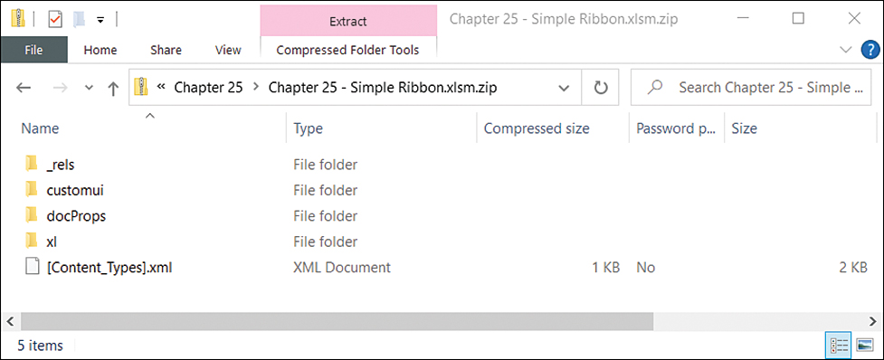
FIGURE 25-3 Using a zip utility, open the .xlsm file and copy in the customui folder and file.
Understanding the RELS file
The RELS file, found in the _rels folder, contains the various relationships of an Excel file. Extract this file from the zip file and open it using a text editor.
The file already contains existing relationships that you do not want to change. Instead, you need to add one for the customui folder. Scroll all the way to the right of the <Relationships line and place your cursor before the </Relationships> tag, as shown in Figure 25-4. Insert the following code:
<Relationship Id="rAB67989"
Type="http://schemas.microsoft.com/office/2007/relationships/ui/_
extensibility"
Target="customui/customUI14.xml"/>
Id is any unique string to identify the relationship. If Excel has a problem with the string you enter, it might change it when you open the file. Target is the customui folder and file. Save your changes and add the RELS file back to the zip file.
Note
See the section “Found a problem with some content” later in this chapter for more information.
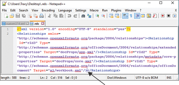
FIGURE 25-4 Place your cursor in the correct spot for entering your custom ribbon relationship.
Caution
Even though the previous code appears as four lines in this book, it should appear as a single line in the RELS file. If you want to enter it as three separate lines, do not separate the lines within the quoted strings and do not use a continuation character as you would in VBA. The preceding examples are correct breaks (not including the line break with the continuation character). The following would be an example of an incorrect break of the fourth line:
Target = "customui/
customUI14.xml"
Renaming an Excel file and opening a workbook
Rename the Excel file back to its original name by removing the .zip extension. Open your workbook.
Note
If any error messages appear when you open the Excel file, see “Troubleshooting error messages” later in this chapter.
It can be a little time-consuming to perform all the steps involved in adding a custom ribbon, especially if you make little mistakes and have to keep renaming your workbook, opening the zip file, extracting your file, modifying, adding it back to the zip, renaming, and testing. To aid in this, check out the Custom UI Editor tool, which you download at https://bettersolutions.com/vba/ribbon/custom-ui-editor.htm. This tool updates the RELS file, helps with using custom images, and has other useful aids to customizing the ribbon. Another tool I like to use is the RibbonX Visual Designer by Andy Pope, available at www.andypope.info/vba/ribboneditor_2010.htm.
Using images on buttons
The image that appears on a button can be either an image from the Microsoft Office icon library or a custom image you create and include in the workbook’s customui folder. With a good icon image, you can hide the button label but still have a friendly ribbon with images that are self-explanatory.
Using Microsoft Office icons on a ribbon
Microsoft has made it fairly easy to reuse Microsoft’s button images in custom ribbons. Select File, Options, Customize Ribbon. Place your mouse pointer over any menu command in the list, and a screentip displays, providing more information about the command. Included at the very end, in parentheses, is the image name, as shown in Figure 25-5.
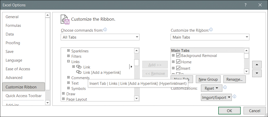
FIGURE 25-5 Placing your pointer over a command, such as Hyperlink, brings up the icon name, HyperlinkInsert.
To place an image on your button, you need to go back into the customUI14.xml file and tell Excel what you want. The following code uses the HyperlinkInsert icon for the HelloWorld button and makes it large, as shown in Figure 25-6. (Note that the icon name is case sensitive.)
<customUI xmlns="http://schemas.microsoft.com/office/2009/07/customui">
 <ribbon startFromScratch="false">
   <tabs>
    <tab id="CustomTab" label="My First Ribbon">
      <group id="CustomGroup" label="My Programs">

        <button id="button1" label="Click to run"
          onAction="Module1.HelloWorld"
          imageMso="HyperlinkInsert" size="large"/>

     </group>
    </tab>
   </tabs>
 </ribbon>
</customUI>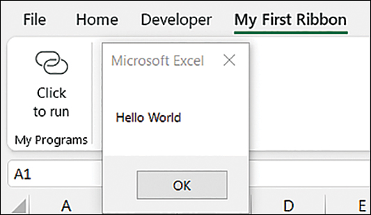
FIGURE 25-6 You can apply the image from any Microsoft Office icon to your custom button.
You aren’t limited to just the icons available in Excel. You can use the icon for any installed Microsoft Office application. You can download a Word document from Microsoft with two galleries showing the icons available (and their names) from http://www.microsoft.com/en-us/download/details.aspx?id=21103.
Adding custom icon images to a ribbon
What if the icon library just doesn’t have the icon you’re looking for? You can create your own image file and modify the ribbon to use it. Follow these steps:
Create a folder called images in the customui folder. Place your image in this folder.
Create a folder called _rels in the customui folder. Create a text file called customUI14.xml.rels in this new folder, as shown in Figure 25-7. Place the following code in the file (and note that the
Idfor the image relationship is the name of the image file,helloworld_png):<?xml version="1.0" encoding="UTF-8" standalone="yes"?> <Relationships xmlns="http://schemas.openxmlformats.org/package/2006/_ relationships"><Relationship Id="helloworld"_ Type="http://schemas.openxmlformats.org/officeDocument/2006/ _ relationships/image" Target="images/helloworld.png"/></Relationships>
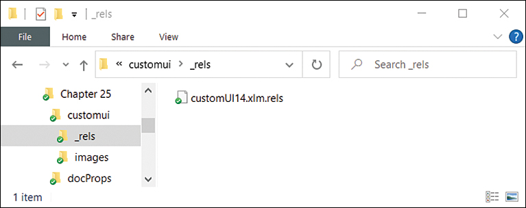
FIGURE 25-7 Create a _rels folder and an images folder within the customui folder to hold files relevant to your custom image.
Open the customUI14.xml file and add the image attribute to the control, as shown here, before you save and close the file:
<customUI xmlns="http://schemas.microsoft.com/office/2009/07/customui">
 <ribbon startFromScratch="false">
    <tabs>
     <tab id="CustomTab" label="My First Ribbon">
       <group id="CustomGroup" label="My Programs">

         <button id="button1" label="Click to run"
           onAction="Module1.HelloWorld" image="helloworld"
           size="large"/>

     </group>
    </tab>
   </tabs>
 </ribbon>
</customUI>
Open the [Content_Types].xml file and add the following at the very end of the file but before
</Types>:< Default Extension="png" ContentType="image/.png"/>
NoteIf your image is a jpg, you would use the following:
<Default Extension="jpg" ContentType="application/octet-stream"/>
Save your changes, rename your folder, and open your workbook. The custom image appears on the button, as shown in Figure 25-8.

FIGURE 25-8 With a few more changes to your customui folder, you can add a custom image to a button.
Troubleshooting error messages
To be able to see the error messages generated by a custom ribbon, go to File, Options, Advanced, General and select the Show Add-In User Interface Errors option.
The attribute “Attribute Name” on the element “customui ribbon” is not defined in the DTD/schema
As noted in the section “Where to add code: The customui folder and file” earlier in this chapter, the case of attributes is very particular. If an attribute is “mis-cased,” the error shown in Figure 25-9 might occur.
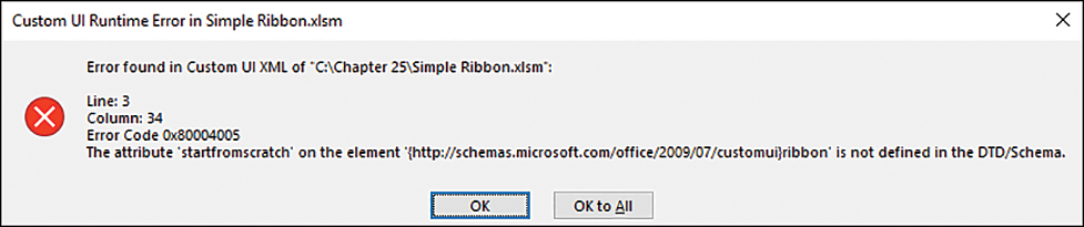
FIGURE 25-9 Mis-cased attributes can generate errors. Read the error message carefully; it might help you trace the problem.
The code in the customUI14.xml file that generated the error had the following line:
<ribbon startfromscratch="false">
Instead of startFromScratch, the code contained startfromscratch (all lowercase letters). The error message even helps you narrow down the problem by naming the attribute with which it has a problem.
Illegal qualified name character
For every opening <, you need a closing >. If you forget a closing >, the error shown in Figure 25-10 might appear. The error message is not specific at all, but it does provide a line and column number to indicate where it’s having a problem. Still, it’s not the actual spot where the missing > would go. Instead, it’s the beginning of the next line. You have to review your code to find the error, but you have an idea of where to start.
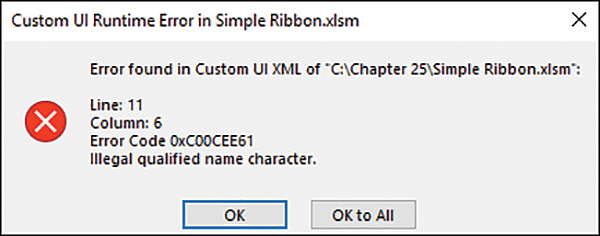
FIGURE 25-10 For every opening <, you need a closing >.
The following code in the customUI14.xml file generated the error:
<tab id="CustomTab" label="My First Ribbon">
 <group id="CustomGroup" label="My Programs"
   <button id="button1" label="Click to run"
    onAction="Module1.HelloWorld" image="helloworld_png"
    size="large"/>
Note the missing > for the group line (the second line of code). The line should have been this:
<group id="CustomGroup" label="My Programs">
Element “customui Tag Name” is unexpected according to content model of parent element “customui Tag Name”
If your structure is in the wrong order, such as the group tag placed before the tab tag, as shown here, a chain of errors appears, beginning with the one shown in Figure 25-11.
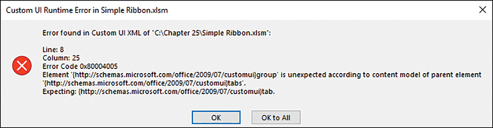
FIGURE 25-11 An error in one line can lead to a string of error messages because the other lines are now considered out of order.
<group id="CustomGroup" label="My Programs">
  <tab id="CustomTab" label="My First Ribbon">
Found a problem with some content
Figure 25-12 shows a generic catchall message for different types of problems Excel can find. If you click No, the workbook doesn’t open. If you click Yes, you then receive the message shown in Figure 25-13. While creating ribbons, though, I found it appearing most often when Excel doesn’t like the Relationship ID I have assigned to the customui relationship in the RELS file. What’s nice is that if you click Yes in the “Found a Problem” dialog box, Excel assigns a new ID, and the next time you open the file, the error should not appear.
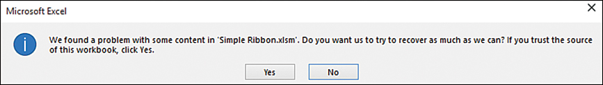
FIGURE 25-12 This rather generic message could appear for many reasons. Click Yes to try to repair the file.
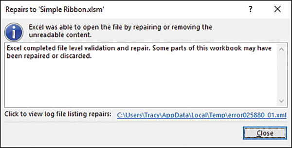
FIGURE 25-13 Excel lets you know whether it has succeeded in repairing the file.
Here’s the original relationship:
<Relationship Id="rId3"
Type="http://schemas.microsoft.com/office/2007/relationships/ui/ _
extensibility"
Target="customui/customUI14.xml"/>
Here’s the Excel-modified relationship:
<Relationship Id="rE1FA1CF0-6CA9-499E-9217-90BF2D86492F"
Type="http://schemas.microsoft.com/office/2007/relationships/ui/ _
extensibility"
Target="customui/customuUI14.xml"/>
In the RELS file, the error also appears if you split the relationship line within a quoted string. You might recall that you were cautioned against this in the “Understanding the RELS file” section, earlier in this chapter. In this case, Excel could not fix the file, and you must make the correction yourself.
Wrong number of arguments or invalid property assignment
If there is a problem with the sub being called by a control, you might see the error message in Figure 25-14 when you try to run code from your ribbon. For example, the onAction of a button requires a single IRibbonControl argument, such as the following:
Sub HelloWorld(control As IRibbonControl)
It would be incorrect to leave off the argument, as shown here:
Sub HelloWorld()
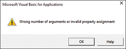
FIGURE 25-14 It’s important for the subs being called by your controls to have the proper arguments. Refer to Table 25-2 for the various control arguments.
Invalid file format or file extension
The error message shown in Figure 25-15 looks rather drastic, but it could be deceiving. You could get it if you’re missing quotation marks around an attribute’s value in the RELS file. For example, look carefully at the following line, and you’ll see that the Type value is missing its quotation marks:
Type=http://schemas.microsoft.com/office/2007/relationships/ui/extensibility
The line should have been this:
Type="http://schemas.microsoft.com/office/2007/relationships/ui/extensibility"
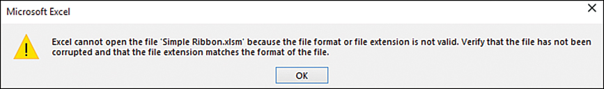
FIGURE 25-15 A missing quotation mark can generate a drastic message, but it’s easily fixed.
Nothing happens
If you open your modified workbook and your ribbon doesn’t appear, but you don’t get an error message, double-check your RELS file. It’s possible that you forgot to update it with the required relationship to your customUI14.xml file.
Other ways to run a macro
Using a custom ribbon is the most elegant way to run a macro; however, if you have only a couple of macros to run, it can be a bit of work to modify the file. You could have the client invoke a macro by going to the View tab, selecting Macros, View Macros, and then selecting the macro from the Macros dialog box and clicking the Run button, but this is a bit unprofessional—and tedious. Other options are discussed in the following sections.
Using a keyboard shortcut to run a macro
The easiest way to run a macro is to assign a keyboard shortcut to it. Open the Macro dialog box by selecting the Developer or View tab and clicking Macros or by pressing Alt+F8. Then select the macro and click Options. Assign a shortcut key to the macro. Figure 25-16 shows the shortcut Ctrl+Shift+H being assigned to the RunHello macro. You can now conspicuously post a note on the worksheet, reminding the client to press Ctrl+Shift+H to clean the first column.
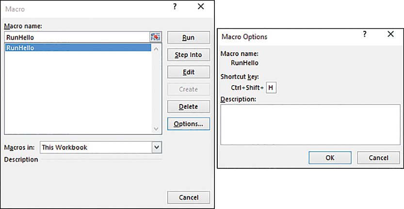
FIGURE 25-16 The simplest way to enable a client to run a macro is to assign a shortcut key to the macro. Ctrl+Shift+H now runs the RunHello macro.
Caution
Be careful when assigning keyboard shortcuts. Many of the keys are already mapped to important Windows shortcuts. If you would happen to assign a macro to Ctrl+C, for example, anyone who uses this shortcut to copy the selection to the Clipboard will be frustrated when your application does something else in response to this common shortcut. The letters J, M, and Q are usually good choices because as of Excel 365, they had not yet been assigned to Excel’s menu of “Ctrl+” shortcut combinations. Ctrl+L and Ctrl+T used to be available, but these are now used to create tables.
Attaching a macro to a command button
Two types of buttons can be embedded in a sheet: the traditional button shape that you can find in the Form Controls section and an ActiveX command button. (You can access both on the Developer tab under the Controls, Insert option.)
To add a form control button with a macro to your sheet, follow these steps:
On the Developer tab, click the Insert button and select the button control from the Form Controls section of the drop-down, as shown in Figure 25-17.
Place your cursor in the worksheet where you want to insert the button and then click and drag to create the shape of the new button. When you release the mouse button, the Assign Macro dialog box displays.
In the Assign Macro dialog box, select a macro to assign to the button and click OK.
Highlight the text on the button and type new meaningful text.
To change the font, text alignment, and other aspects of the button’s appearance, right-click the button and select Format Control from the pop-up menu.
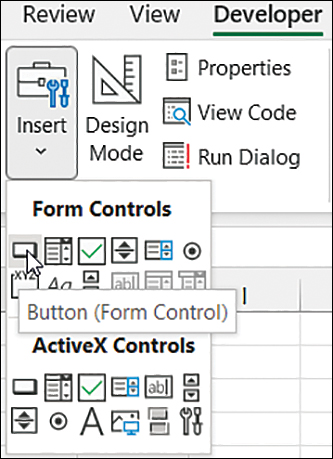
FIGURE 25-17 The form controls are found under the Insert icon on the Developer tab.
To reassign a new macro to the button, right-click the button and select Assign Macro from the pop-up menu.
Attaching a macro to a shape
The previous method assigned a macro to an object that looks like a button. You can also assign a macro to any drawing object on the worksheet. To assign a macro to an Autoshape (which you get by selecting Insert, Illustrations, Shapes), right-click the shape and select Assign Macro, as shown in Figure 25-18.
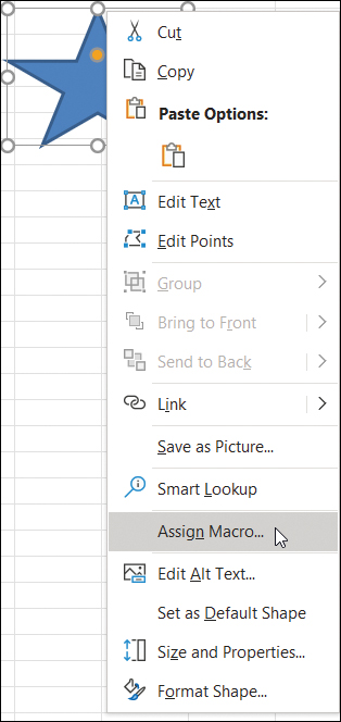
FIGURE 25-18 Macros can be assigned to any drawing object on the worksheet.
This method is useful because you can easily add a drawing object with code and use the OnAction property to assign another macro to the object. There is one big drawback to this method: If you assign a macro that exists in another workbook, and the other workbook is saved and closed, Excel changes the OnAction for the object to be hard-coded to a specific folder.
Attaching a macro to an ActiveX control
ActiveX controls are newer than form controls and slightly more complicated to set up. Instead of simply assigning a macro to a button, you have a button_click event where you can either call another macro or have the macro code actually embedded in the event. Follow these steps:
On the Developer tab, click the Insert button and select the Command Button icon from the ActiveX Controls section.
Place your cursor in the worksheet where you want to insert the button, and then click and drag to create the shape of the new button.
To format the button, right-click the button and select Properties or select Controls, Properties from the Developer tab. You can now adjust the button’s caption and color in the Properties window, as shown in Figure 25-19. If nothing happens when you right-click the button, enter Design mode by clicking the Design Mode button on the Developer tab.
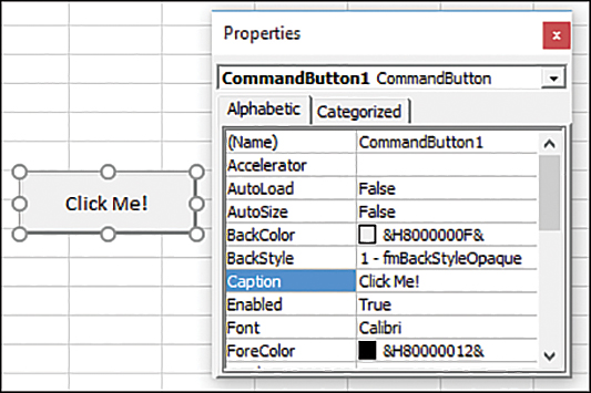
FIGURE 25-19 Use the Properties window to adjust aspects of the ActiveX button.
To assign a macro to the button, right-click it and select View Code. This creates the header and footer for the
button_clickevent in the code window for the current worksheet. Type the code you want to have run or the name of the macro you want to call.
Note
There is one annoying aspect of this Properties window: It is huge and covers a large portion of your worksheet. Eventually, if you want to use the worksheet, you’re going to have to resize or close this Properties window. When you close the Properties window, it is also hidden in the VB Editor. I would prefer to be able to close this Properties window without affecting my VB Editor environment.
Running a macro from a hyperlink
There is a trick you can use to run a macro from a hyperlink. Because many people are used to clicking a hyperlink to perform an action, this method might be the most intuitive for your clients.
The trick is to set up placeholder hyperlinks that simply link back to themselves. Select the cell with the text you want to link to, and from the Insert tab, select Links, Link, Insert Link (or press Ctrl+K). In the Insert Hyperlink dialog, click Place In This Document. Figure 25-20 shows a worksheet with four hyperlinks. Each hyperlink points back to its own cell.
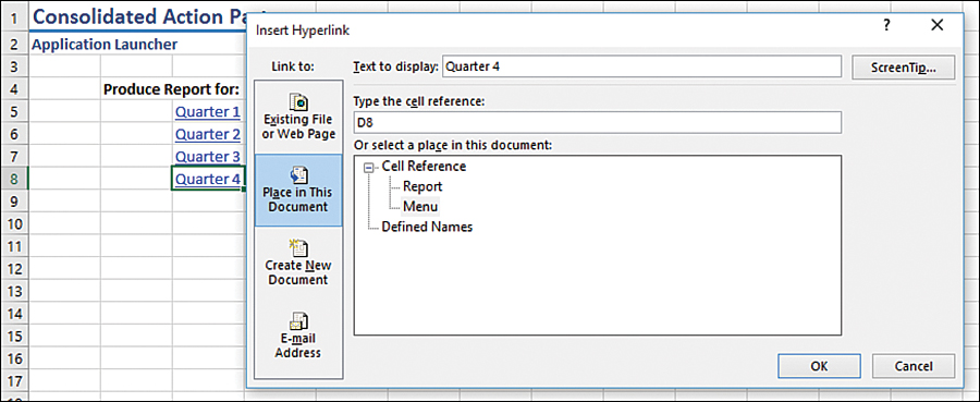
FIGURE 25-20 To run a macro from a hyperlink, you must create placeholder hyperlinks that link back to their cells. Then, using an event handler macro in the worksheet’s code module, you can intercept the hyperlink and run any macro.
When a client clicks a hyperlink, you can intercept this action and run any macro by using the FollowHyperlink event. Enter the following code in the code module for the worksheet:
Private Sub Worksheet_FollowHyperlink(ByVal Target As Hyperlink)
Select Case Target.TextToDisplay
  Case "Quarter 1"
    RunQuarter1Report
  Case "Quarter 2"
    RunQuarter2Report
  Case "Quarter 3"
    RunQuarter3Report
  Case "Quarter 4"
    RunQuarter4Report
End Select
End Sub
Next steps
From custom ribbons to simple buttons or hyperlinks, there are plenty of ways to ensure that your clients never need to see the Macro dialog box. In Chapter 26, you find out how to package your macros into add-ins that you can easily distribute to others.