
Chapter 15
Creating charts
In this chapter, you will:
Use
.AddChart2to create a chartUnderstand chart styles
Format a chart
Create a combo chart, map chart, and waterfall chart
Export a chart as a graphic
Consider backward compatibility
Two new chart types have been introduced since Excel 2016. The filled map chart and the funnel chart join the six chart types that were added to Excel 2016.
More importantly, the macro bug that prevented Excel 2016 from creating the new charts has been fixed. Whether you are creating a new Ivy chart or a legacy chart, you can use this code:
Dim CH As Chart
Set CH = ActiveSheet.Shapes _
  .AddChart2(-1, xlRegionMap).Chart
CH.SetSourceData Source:=Range("D1:E7")
' Settings specific to xlRegionMap:
With CH.FullSeriesCollection(1)
 .GeoMappingLevel = xlGeoMappingLevelDataOnly
 .RegionLabelOption = xlRegionLabelOptionsBestFitOnly
End With
Traditionally, the goal of VBA is to never select anything in the worksheet. Thus, you first create a chart by using the .AddChart2 method, and then you assign the data to the chart by using the .SetSourceData method. If you have co-workers who are still using the Perpetual version of Excel 2016, you will have to create the new charts using this code instead:
.Range("A1:B7").Select
ActiveSheet.Shapes.AddChart2(-1, xlWaterfall).Select
The alternative code would be needed for any of the Ivy chart types:
xlBoxWhiskerxlFunnelxlHistogramxlParetoxlRegionMapxlSunburstxlTreeMapxlWaterfall
Using .AddChart2 to create a chart
Excel 2013 introduced a streamlined .AddChart2 method. With this method, you can specify a chart style, type, size, and location, as well as a property introduced in Excel 2013: NewLayout:=True. When you choose NewLayout, you can avoid having a legend in a single-series chart.
The .AddChart2 method enables you to specify the chart style, chart type, left, top, width, height, and new layout. This code takes the data from A3:G6 and creates a chart to fill B8:G20:
Sub CreateChartUsingAddChart2()
'Create a Clustered Column Chart in B8:G15 from data in A3:G6
Dim CH As Chart
Range("A3:G6").Select
Set CH = ActiveSheet.Shapes.AddChart2( _
 Style:=201, _
 XlChartType:=xlColumnClustered, _
 Left:=Range("B8").Left, _
 Top:=Range("B8").Top, _
 Width:=Range("B8:G20").Width, _
 Height:=Range("B8:G20").Height, _
 NewLayout:=True).Chart
End Sub
The values for Left, Top, Width, and Height are in pixels. Here you don’t have to try to guess that column B is 27.34 pixels from the left edge of the worksheet because the preceding code finds the .Left property of cell B8 and uses that as the Left of the chart.
Figure 15-1 shows the resulting chart.
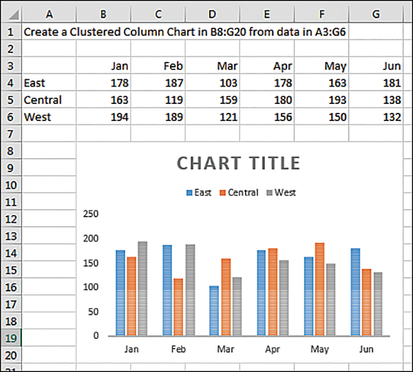
FIGURE 15-1 Create a chart to fill a specific range.
Understanding chart styles
Excel 2013 introduced professionally designed chart styles that are shown in the Chart Styles gallery on the Design tab of the ribbon. These innovative designs use combinations of properties that have been in Excel for years, but they allow you to apply a group of properties in a single command. The AddChart2 method enables you to specify the style number to use when creating the chart. Unfortunately, the style numbering system is fairly complex.
Figure 15-2 shows the Chart Styles gallery for a clustered column chart.
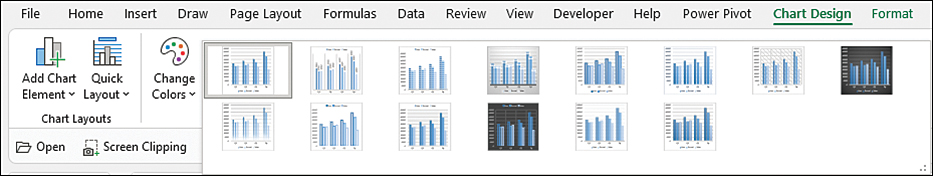
FIGURE 15-2 Apply a chart style to quickly format a chart.
In Figure 15-2, the chart styles are numbered 201 through 215. However, if you switch to a bar chart, the similar chart styles are numbered 216 to 230.
The styles for the old chart types run from 201 to 353. Styles 354 to 497 are for the eight new chart types.
Follow these steps to learn the style number associated with your favorite style:
Create a chart in the Excel user interface.
Open the Chart Styles gallery on the Design tab and choose the chart style you want to use. Keep the chart selected before moving to Step 3.
 Caution
You might have a tendency to click away from the chart to admire the newly selected style. If you do unselect the chart, be certain to re-select the chart before continuing with the following steps.
Switch to VBA by pressing Alt+F11.
Open the Immediate window by pressing Ctrl+G.
Type ? ActiveChart.ChartStyle in the Immediate window and press Enter. The resulting number shows you the value to use for the
.Styleargument in the.AddChart2method.If you don’t care what chart style you will get, specify
-1as the.Styleargument. This gives you the default style for that chart type.
It is strange that the .AddChart2 method uses an argument called Style:=201, but if you want to change the chart style later, you have to use the .ChartStyle property. Both Style and ChartStyle refer to the chart styles introduced in Excel 2013.
Table 15-1 lists the ChartType argument values.
TABLE 15-1 Chart types for use in VBA
Chart Type | Enumerated Constant |
|---|---|
Clustered column |
|
Stacked column |
|
100% stacked column |
|
3-D clustered column |
|
Stacked column in 3-D |
|
100% stacked column in 3-D |
|
3-D column |
|
Waterfall |
|
Tree map |
|
Sunburst |
|
Histogram |
|
Pareto |
|
Box and whisker |
|
Funnel |
|
Filled Region Map |
|
Line |
|
Stacked line |
|
100% stacked line |
|
Line with markers |
|
Stacked line with markers |
|
100% stacked line with markers |
|
Pie |
|
Pie in 3-D |
|
Pie of pie |
|
Exploded pie |
|
Exploded pie in 3-D |
|
Bar of pie |
|
Clustered bar |
|
Stacked bar |
|
100% stacked bar |
|
Clustered bar in 3-D |
|
Stacked bar in 3-D |
|
100% stacked bar in 3-D |
|
Area |
|
Stacked area |
|
100% stacked area |
|
3-D area |
|
Stacked area in 3-D |
|
100% stacked area in 3-D |
|
Scatter with only markers |
|
Scatter with smooth lines and markers |
|
Scatter with smooth lines |
|
Scatter with straight lines and markers |
|
Scatter with straight lines |
|
High-low-close |
|
Open-high-low-close |
|
Volume-high-low-close |
|
Volume-open-high-low-close |
|
3-D surface |
|
Wireframe 3-D surface |
|
Contour |
|
Wireframe contour |
|
Doughnut |
|
Exploded doughnut |
|
Bubble |
|
Bubble with a 3-D effect |
|
Radar |
|
Radar with markers |
|
Filled radar |
|
Excel supports a few other chart types that misrepresent your data, such as the cone and pyramid charts. For backward compatibility, these are still in VBA, but they are omitted from Table 15-1. If your manager forces you to create those old chart types, you can find them by searching for xlChartType enumeration in your favorite search engine.
Formatting a chart
After creating a chart, you will often want to add or move elements of the chart. The following sections describe code to control the myriad chart elements.
Referring to a specific chart
The macro recorder has an unsatisfactory way of writing code for chart creation. The macro recorder uses the .AddChart2 method and adds a .Select to the end of the line to select the chart. The rest of the chart settings then apply to the ActiveChart object. This approach is a bit frustrating because you are required to do all the chart formatting before you select anything else in the worksheet. The macro recorder does this because chart names are unpredictable. The first time you run a macro, the chart might be called Chart 1. But if you run the macro on another day or on a different worksheet, the chart might be called Chart 3 or Chart 5.
For the most flexibility, you should assign each new chart to a Chart object. Since Excel 2007, the Chart object has existed inside a Shape object.
Ignoring the specifics of the AddChart2 method for a moment, you could use this coding approach, which captures the Shape object in the SH object variable and then assigns SH.Chart to the CH object variable:
Dim WS as Worksheet
Dim SH as Shape
Dim CH as Chart
Set WS = ActiveSheet
Set SH = WS.Shapes.AddChart2(...)
Set CH = SH.Chart
You can simplify the preceding code by appending .Chart to the end of the AddChart2 method. The following code has one object variable fewer:
Dim WS as Worksheet
Dim CH as Chart
Set WS = ActiveSheet
Set CH = WS.Shapes.AddChart2(...).Chart
If you need to modify a preexisting chart—such as a chart that you did not create—and there is only one shape on the worksheet, you can use this line of code:
WS.Shapes(1).Chart.Interior.Color = RGB(0,0,255)
If there are many charts, and you need to find the one with the upper-left corner located in cell A4, you can loop through all the Shape objects until you find one in the correct location, like this:
For each Sh in ActiveSheet.Shapes
  If Sh.TopLeftCell.Address = "$A$4" then
    Sh.Chart.Interior.Color = RGB(0,255,0)
  End If
Next Sh
Specifying a chart title
Every chart created with NewLayout:=True has a chart title. When the chart has two or more series, that title is “Chart Title.” You should plan on changing the chart title to something useful.
To specify a chart title in VBA, use this code:
ActiveChart.ChartTitle.Caption = "Sales by Region"
If you are changing the chart title of a newly created chart that is assigned to the CH object variable, you can use this:
CH.ChartTitle.Caption = "Sales by Region"
This code works if your chart already has a title. If you are not sure that the selected chart style has a title, you can ensure that the title is present first with this:
CH.SetElement msoElementChartTitleAboveChart
Although it is relatively easy to add a chart title and specify the words in the title, it becomes increasingly complex to change the formatting of the chart title. The following code changes the font, size, and color of the title:
With CH.ChartTitle.Format.TextFrame2.TextRange.Font
.Name = "Rockwell"
.Fill.ForeColor.ObjectThemeColor = msoThemeColorAccent2
.Size = 14
End With
The two axis titles operate the same as the chart title. To change the words, use the .Caption property. To format the words, use the Format property. Similarly, you can specify the axis titles by using the Caption property. The following code changes the axis title along the category axis:
CH.SetElement msoElementPrimaryCategoryAxisTitleHorizontal
CH.Axes(xlCategory, xlPrimary).AxisTitle.Caption = "Months"
CH.Axes(xlCategory, xlPrimary).AxisTitle. _
Format.TextFrame2.TextRange.Font.Fill. _
ForeColor.ObjectThemeColor = msoThemeColorAccent2
Applying a chart color
Excel 2013 introduced a ch.ChartColor property that assigns 1 of 26 color themes to a chart. Assign a value from 1 to 26, but be aware that the order of the colors in the Chart Styles fly-out menu (see Figure 15-3) has nothing to do with the 26 values.
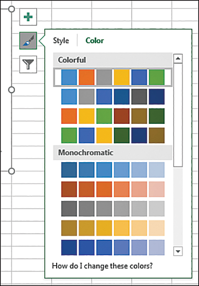
FIGURE 15-3 Color schemes in the menu are called Color 1, Color 2, and so on but have nothing to do with the VBA settings.
To understand the ChartColor values in VBA, consider the color drop-down menu shown in Figure 15-4. This drop-down menu offers 10 columns of colors: Background 1, Text 1, Background 2, Text 2, and then Theme 1 through Theme 6.
Here is a synopsis of the 26 values you can use for ChartColor:
VBA
ChartColor 1,9, and20use grayscale colors from column 3 of Figure 15-4. AChartColorvalue of1starts with a dark gray, then a light gray, and then a medium gray. AChartColorvalue of9starts with a light gray and moves to darker grays. AChartColorvalue of20starts with three medium grays, then black, then very light gray, and then medium gray.VBA
ChartColor2uses the six theme colors in the top row of Figure 15-4, from left to right.VBA
ChartColorvalues3through8use a single column of colors. For example,ChartColor = 3uses the six colors in Theme 1, from dark to light.ChartColorvalues of4through8correspond to Themes 2 through 6.ChartColorvalue10repeats value2but adds a light border around the chart element.Values
11through13are the most inventive. They use three theme colors from the top row combined with the same three theme colors from the bottom row. This produces light and dark versions of three different colors.ChartColor 11uses the odd-numbered themes (1, 3, and 5).ChartColor 12uses the even-numbered themes.ChartColor 13uses Themes 4, 5, and 6.ChartColorvalues14through19repeat values3through8but add a light border.ChartColorvalues21through26are similar to values3through8, but the colors progress from light to dark.
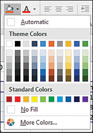
FIGURE 15-4 ChartColor combinations include a mix of colors from the current theme.
The following code changes the chart to use varying shades of Themes 4, 5, and 6:
ch.ChartColor = 13
Filtering a chart
In real life, creating charts from tables of data is not always simple. Tables frequently have totals or subtotals. The table in Figure 15-5 has quarterly total columns intermixed with monthly values. When you create a chart from this data, the total columns create a bad chart.
To filter a row or column in VBA, you set the new .IsFiltered property to True. The following code removes the total columns:
CH.ChartGroups(1).FullCategoryCollection(4).IsFiltered = True
CH.ChartGroups(1).FullCategoryCollection(8).IsFiltered = True
CH.ChartGroups(1).FullCategoryCollection(12).IsFiltered = True
CH.ChartGroups(1).FullCategoryCollection(16).IsFiltered = True
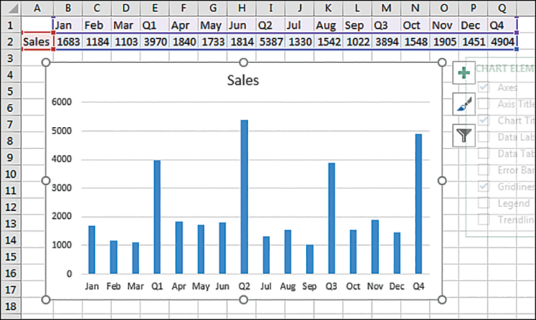
FIGURE 15-5 The subtotals in this table cause a bad-looking chart.
Using SetElement to emulate changes from the plus icon
When you select a chart, three icons appear to the right of the chart. The top icon is a plus sign. All the choices in the first- and second-level fly-out menus use the SetElement method in VBA. Note that the Add Chart Element drop-down menu on the Design tab includes all these settings, plus Lines and Up/Down Bars.
![]() Note
Note
SetElement does not cover all of the choices in the Format task pane that often appears. See the “Using the Format method to micromanage formatting options” section later in this chapter to change those settings.
If you do not feel like looking up the proper constant in this book, you can always quickly record a macro.
The SetElement method is followed by a constant that specifies which menu item to select. For example, if you want to choose Show Legend At Left, you can use this code:
ActiveChart.SetElement msoElementLegendLeft
Table 15-2 shows all the available constants you can use with the SetElement method. These constants are in roughly the same order in which they appear in the Add Chart Element drop-down menu.
TABLE 15-2 Constants available with SetElement
Element Group | SetElement Constant |
|---|---|
Axes |
|
Axes |
|
Axes |
|
Axes |
|
Axes |
|
Axes |
|
Axes |
|
Axes |
|
Axes |
|
Axes |
|
Axes |
|
Axes |
|
Axes |
|
Axes |
|
Axes |
|
Axes |
|
Axes |
|
Axes |
|
Axes |
|
Axes |
|
Axes |
|
Axes |
|
Axes |
|
Axes |
|
Axes |
|
Axes |
|
Axes |
|
Axes |
|
Axes |
|
Axes |
|
Axes |
|
Axes |
|
Axis Titles |
|
Axis Titles |
|
Axis Titles |
|
Axis Titles |
|
Axis Titles |
|
Axis Titles |
|
Axis Titles |
|
Axis Titles |
|
Axis Titles |
|
Axis Titles |
|
Axis Titles |
|
Axis Titles |
|
Axis Titles |
|
Axis Titles |
|
Axis Titles |
|
Axis Titles |
|
Axis Titles |
|
Axis Titles |
|
Axis Titles |
|
Axis Titles |
|
Axis Titles |
|
Axis Titles |
|
Axis Titles |
|
Axis Titles |
|
Axis Titles |
|
Axis Titles |
|
Axis Titles |
|
Axis Titles |
|
Chart Title |
|
Chart Title |
|
Chart Title |
|
Data Labels |
|
Data Labels |
|
Data Labels |
|
Data Labels |
|
Data Labels |
|
Data Labels |
|
Data Labels |
|
Data Labels |
|
Data Labels |
|
Data Labels |
|
Data Labels |
|
Data Labels |
|
Data Table |
|
Data Table |
|
Data Table |
|
Error Bars |
|
Error Bars |
|
Error Bars |
|
Error Bars |
|
GridLines |
|
GridLines |
|
GridLines |
|
GridLines |
|
GridLines |
|
GridLines |
|
GridLines |
|
GridLines |
|
GridLines |
|
GridLines |
|
GridLines |
|
GridLines |
|
GridLines |
|
GridLines |
|
GridLines |
|
GridLines |
|
GridLines |
|
GridLines |
|
GridLines |
|
GridLines |
|
Legend |
|
Legend |
|
Legend |
|
Legend |
|
Legend |
|
Legend |
|
Legend |
|
Lines |
|
Lines |
|
Lines |
|
Lines |
|
Lines |
|
Trendline |
|
Trendline |
|
Trendline |
|
Trendline |
|
Trendline |
|
Up/Down Bars |
|
Up/Down Bars |
|
Plot Area |
|
Plot Area |
|
Chart Wall |
|
Chart Wall |
|
Chart Floor |
|
Chart Floor |
|
![]() Note
Note
If you attempt to format an element that is not present, Excel returns a -2147467259 Method Failed error.
Using SetElement enables you to change chart elements quickly. As an example, charting gurus say that the legend should always appear to the left or above the chart. Few of the built-in styles show the legend above the chart. I also prefer to show the values along the axis in thousands or millions, when appropriate. This is better than displaying three or six zeros on every line.
The following code handles these settings after you create the chart:
Sub UseSetElement()
Dim WS As Worksheet
Dim CH As Chart

Set WS = ActiveSheet
Range("A1:M4").Select
Set CH = WS.Shapes.AddChart2(Style:=201, _
    XlChartType:=xlColumnClustered, _
    Left:=[B6].Left, _
    Top:=[B6].Top, _
    NewLayout:=False).Chart

' Set value axis to display thousands
CH.SetElement msoElementPrimaryValueAxisThousands

' move the legend to the top
CH.SetElement msoElementLegendTop
End Sub
Using the Format tab to micromanage formatting options
The Format tab offers icons for changing colors and effects for individual chart elements. Although many people call the Shadow, Glow, Bevel, and Material settings “chart junk,” there are ways in VBA to apply these formats.
Excel includes an object called the ChartFormat object that contains the settings for Fill, Glow, Line, PictureFormat, Shadow, SoftEdge, TextFrame2, and ThreeD. You can access the ChartFormat object by using the Format method on many chart elements. Table 15-3 lists a sampling of chart elements you can format using the Format method.
TABLE 15-3 Chart elements to which formatting applies
Chart Element | VBA to Refer to This Chart Element |
|---|---|
Chart Title |
|
Axis Title–Category |
|
Axis Title–Value |
|
Legend |
|
Data Labels For Series 1 |
|
Data Labels For Point 2 |
|
Data Table |
|
Axes–Horizontal |
|
Axes–Vertical |
|
Axis–Series (Surface Charts Only) |
|
Major Gridlines |
|
Minor Gridlines |
|
Plot Area |
|
Chart Area |
|
Chart Wall |
|
Chart Back Wall |
|
Chart Side Wall |
|
Chart Floor |
|
Trendline For Series 1 |
|
Droplines |
|
Up/Down Bars |
|
Error Bars |
|
Series(1) |
|
Series(1) DataPoint |
|
The Format method is the gateway to settings for Fill, Glow, and so on. Each of those objects has different options. The following sections provide examples of how to set up each type of format.
Changing an object’s fill
The Shape Fill drop-down menu on the Format tab enables you to choose a single color, a gradient, a picture, or a texture for the fill.
To apply a specific color, you can use the RGB (red, green, blue) setting. To create a color, you specify a value from 0 to 255 for levels of red, green, and blue. The following code applies a simple blue fill:
Dim cht As Chart
Dim upb As UpBars
Set cht = ActiveChart
Set upb = cht.ChartGroups(1).UpBars
upb.Format.Fill.ForeColor.RGB = RGB(0, 0, 255)
If you would like an object to pick up the color from a specific theme accent color, you use the ObjectThemeColor property. The following code changes the bar color of the first series to accent color 6, which is an orange color in the Office theme (but might be another color if the workbook is using a different theme):
Sub ApplyThemeColor()
Dim cht As Chart
Dim ser As Series
Set cht = ActiveChart
Set ser = cht.SeriesCollection(1)
ser.Format.Fill.ForeColor.ObjectThemeColor = msoThemeColorAccent6
End Sub
To apply a built-in texture, you use the PresetTextured method. The following code applies a green marble texture to the second series. However, you can apply any of the 20 textures:
Sub ApplyTexture()
Dim cht As Chart
Dim ser As Series
Set cht = ActiveChart
Set ser = cht.SeriesCollection(2)
ser.Format.Fill.PresetTextured msoTextureGreenMarble
End Sub
![]() Note
Note
When you type PresetTextured followed by a space, the VB Editor offers a complete list of possible texture values.
To fill the bars of a data series with a picture, you use the UserPicture method and specify the path and file name of an image on the computer, as in the following example:
Sub FormatWithPicture()
Dim cht As Chart
Dim ser As Series
Set cht = ActiveChart
Set ser = cht.SeriesCollection(1)
MyPic = "C:PodCastTitle1.jpg"
ser.Format.Fill.UserPicture MyPic
End Sub
You can apply a pattern by using the .Patterned method. Patterns have a type such as msoPatternPlain, as well as foreground and background colors. The following code creates dark red vertical lines on a white background:
Sub FormatWithPicture()
Dim cht As Chart
Dim ser As Series
Set cht = ActiveChart
Set ser = cht.SeriesCollection(1)
With ser.Format.Fill
.Patterned msoPatternDarkVertical
.BackColor.RGB = RGB(255,255,255)
.ForeColor.RGB = RGB(255,0,0)
End With
End Sub
![]() Caution
Caution
Code that uses patterns does not work with Excel 2007. Patterns were removed from Excel 2007, but they were restored in Excel 2010 due to outcry from fans of patterns.
Gradients are more difficult to specify than fills. Excel provides three methods that help you set up the common gradients. The OneColorGradient and TwoColorGradient methods require that you specify a gradient direction, such as msoGradientFromCorner. You can then specify one of four styles, numbered 1 through 4, depending on whether you want the gradient to start at the top left, top right, bottom left, or bottom right. After using a gradient method, you need to specify the ForeColor and the BackColor settings for the object. The following macro sets up a two-color gradient using two theme colors:
Sub TwoColorGradient()
Dim cht As Chart
Dim ser As Series
Set cht = ActiveChart
Set ser = cht.SeriesCollection(1)
ser.Format.Fill.TwoColorGradient msoGradientFromCorner, 3
ser.Format.Fill.ForeColor.ObjectThemeColor = msoThemeColorAccent6
ser.Format.Fill.BackColor.ObjectThemeColor = msoThemeColorAccent2
End Sub
When using the OneColorGradient method, you specify a direction, a style (1 through 4), and a darkness value between 0 and 1 (0 for darker gradients to 1 for lighter gradients).
When using the PresetGradient method, you specify a direction, a style (1 through 4), and the type of gradient, such as msoGradientBrass, msoGradientLateSunset, or msoGradientRainbow. Again, as you are typing this code in the VB Editor, the AutoComplete tool provides a complete list of the available preset gradient types.
Formatting line settings
The LineFormat object formats either a line or the border around an object. You can change numerous properties of a line, such as the color, arrows, and dash style.
The following macro formats the trendline for the first series in a chart:
Sub FormatLineOrBorders()
Dim cht As Chart
Set cht = ActiveChart
With cht.SeriesCollection(1).Trendlines(1).Format.Line
.DashStyle = msoLineLongDashDotDot
.ForeColor.RGB = RGB(50, 0, 128)
.BeginArrowheadLength = msoArrowheadShort
.BeginArrowheadStyle = msoArrowheadOval
.BeginArrowheadWidth = msoArrowheadNarrow
.EndArrowheadLength = msoArrowheadLong
.EndArrowheadStyle = msoArrowheadTriangle
.EndArrowheadWidth = msoArrowheadWide
End With
End Sub
When you are formatting a border, the arrow settings are not relevant, so the code is shorter than the code for formatting a line. The following macro formats the border around a chart:
Sub FormatBorder()
Dim cht As Chart
Set cht = ActiveChart
With cht.ChartArea.Format.Line
.DashStyle = msoLineLongDashDotDot
.ForeColor.RGB = RGB(50, 0, 128)
End With
End Sub
Creating a combo chart
Sometimes you need to chart series of data that are of differing orders of magnitude. Normal charts do a lousy job of showing smaller series. Combo charts can save the day.
Consider the data and chart in Figure 15-6. Here you want to plot the number of sales per month and also show two quality ratings. Perhaps this is a fictitious car dealer that sells 80 to 100 cars a month, and the customer satisfaction usually runs in the 80% to 90% range. When you try to plot this data on a regular line chart, the column for 90 cars sold dwarfs the column for 80% customer satisfaction.
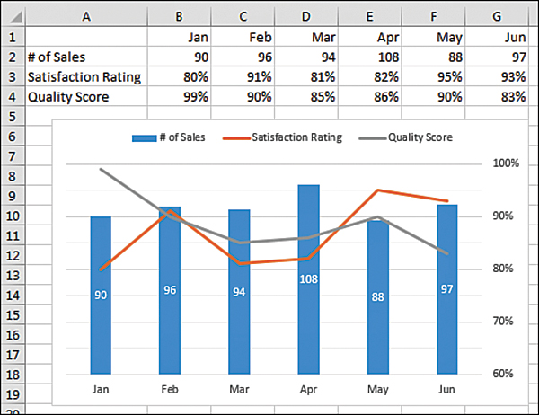
FIGURE 15-6 The two small series are moved to a secondary axis.
Creating map charts
The new filled map chart offers some settings unique to map charts. Say that you have data for six states in the southeast United States. By default, the map chart shows 48 of the 50 states. Set the .GeoMappingLevel to xlGeoMappingDataOnly to limit the map to only states with data, as shown in Figure 15-8:
Sub RegionMapChart()
    Dim CH As Chart
    Set CH = ActiveSheet.Shapes.AddChart2(-1, xlRegionMap).Chart
    CH.SetSourceData Source:=ActiveSheet.Range("A1:B7")
    ' the following properties are specific to filled map charts
    With CH.FullSeriesCollection(1)
      .GeoMappingLevel = xlGeoMappingLevelDataOnly
      .RegionLabelOption = xlRegionLabelOptionsBestFitOnly
    End With
End Sub
Note that Mississippi is not labeled in the chart in Figure 15-8. This is because RegionLabelOption is set to xlRegionLabelOptionsBestFitOnly. To force all labels to appear, use xlRegionLabelOptionsShowAll instead.
You can export any chart to an image file on your hard drive. The ExportChart method requires you to specify a file name and a graphic type. The available graphic types depend on graphic file filters installed in your Registry. It is a safe bet that JPG, BMP, PNG, and GIF work on most computers.
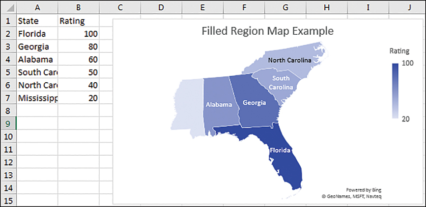
FIGURE 15-8 Limit the filled map chart to only regions with data.
Creating waterfall charts
Waterfall charts are often used to show profit on a sale or cash flow over the course of a year. A waterfall chart is composed of floating columns that raise or lower from the previous column. However, some points will be marked as Totals, such as the Net Price column in Figure 15-9. Use the .IsTotal property to force a column to not float:
Sub WaterfallChart()
Dim CH As Chart
Set CH = ActiveSheet.Shapes.AddChart2(-1, xlWaterfall).Chart
CH.SetSourceData Source:=ActiveSheet.Range("A1:B7")
' Mark certain points as totals
With CH.FullSeriesCollection(1)
    .Points(1).IsTotal = True
    .Points(3).IsTotal = True
    .Points(7).IsTotal = True
End With
End Sub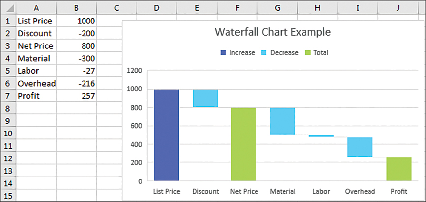
FIGURE 15-9 Any column marked as a total will touch the x-axis.
One of the frustrations with the new Ivy charting engines is this: It is often difficult to figure out how to change the colors. In the waterfall chart in Figure 15-9, there are colors for Increase, Decrease, and Total. The only way to format those colors is to do the following:
Click the legend to select the legend.
Click the Increase legend entry to select that one single legend entry.
Right-click to see a menu with a choice to change the fill for Increase.
The equivalent VBA often crashes Excel. This might be a temporary bug, and it might be fixed by the time you are reading this:
Sub FormatWaterfall()
  Dim cht As Chart
  Dim lg As Legend
  Dim lgentry As LegendEntry
  Dim iLegEntry As Long

  Set cht = ActiveChart
  Set lg = cht.Legend
  For iLegEntry = 1 To lg.LegendEntries.Count
    Set lgentry = lg.LegendEntries(iLegEntry)
    lgentry.Format.Fill.ForeColor.ObjectThemeColor =_
      msoThemeColorAccent1 + iLegEntry - 1
  Next
End Sub![]() Note
Note
Thanks to charting legend Jon Peltier for discovering this obscure way to change the waterfall fill colors. Jon’s awesome website is PeltierTech.com.
Exporting a chart as a graphic
You can export any chart to an image file on your hard drive. The ExportChart method requires you to specify a file name and a graphic type. The available graphic types depend on graphic file filters installed in your Registry—usually JPG, BMP, PNG, and GIF.
For example, the following code exports the active chart as a GIF file:
Sub ExportChart()
Dim cht As Chart
Set cht = ActiveChart
cht.Export Filename:="C:Chart.gif", Filtername:="GIF"
End Sub
Considering backward compatibility
The .AddChart2 method works in Excel 2013 and newer. For Excel 2007 and 2010, you have to revert to using the .AddChart method, as shown here:
Sub CreateChartIn20072010()
'Create a Clustered Column Chart in B8:G15 from data in A3:G6
Dim CH As Chart
Range("A3:G6").Select
Set CH = ActiveSheet.Shapes.AddChart( _
 XlChartType:=xlColumnClustered, _
 Left:=Range("B8").Left, _
 Top:=Range("B8").Top, _
 Width:=Range("B8:G15").Width, _
 Height:=Range("B8:G15").Height).Chart
End Sub
With this method, you can specify neither a Style nor a NewLayout.
Next steps
In Chapter 16, “Data visualizations and conditional formatting,” you’ll find out how to automate data visualization tools such as icon sets, color scales, and data bars.