5. Typographic Systems
Typography is an art of finding and shaping relationships between elements, from largest to smallest and smallest to largest. Now that you understand the technical and aesthetic sides of evaluating typefaces, let’s zoom out a little more and talk about how typography’s smaller building blocks come together as a communication system. In the next two chapters, we’ll explore how content elements within a design affect one another and how the nature of the medium itself shapes our designs.
Like any good system, typography provides a method to accomplish a task. A typographic system establishes hierarchy, meaning it helps us prioritize content based on individual elements and relationships between them. It also helps our readers easily scan chunks of information and understand what they’re looking at. When done right, a typographic system feels intuitive, like an unspoken set of instructions. Without any internal logic in place, our content may look like a monolithic block, essentially stranding readers in a dark room without so much as a match.
Luckily, we have some powerful tools at our disposal to help our typography form a strong foundation. And some of our most potent tools are also our most basic: size, space, color, and proximity. Together, they give us an infinite number of possibilities for crafting our messages in effective, readable ways.
Hierarchy and Contrast
On the surface, hierarchy may seem like a simple visual translation in which the most important items are the biggest and the least important are the smallest, but it’s far more nuanced than that.
Size is one way to achieve hierarchy, but you could also do so with color or placement; the real heavy lifting happens when you combine two or more of these properties. The most important things don’t always have to be the largest; they just need to be more distinguished than other elements. In other words, they need more contrast.
Contrast is, in my humble opinion, the most crucial tenet of graphic design. It instantly forges connections and distinctions between elements and, when used in concert with other tools like a grid, it helps our viewers discern what’s vital, what’s related, and what’s not. That information gives readers the ability to navigate our designs efficiently. Without contrast, everything on a page may appear similar in size and importance, leaving a viewer the choice of either reading and decoding every bit of information or bouncing away to look at adorable cat GIFs.
A new order
Hierarchy applies a systemic approach to grouping similar items and distinguishing dissimilar ones. We express hierarchy both semantically (in the underlying HTML markup) and visually (in our design). For instance, if you look at the default browser stylings for things like an h1 or a paragraph, you’ll see a baked-in hierarchy: h1s are bigger than h2s and h3s, and are distinct from a paragraph’s style.
The best way to create a hierarchical typographic system is to first audit your website’s basic elements. You can break down these elements in a variety of ways. Sometimes it’s based on what the elements are semantically, as with headlines like h1 and h2 and so on; other times it’s based on what those elements need to do, as in the case of very small type like captions or specialized text like block quotes. Understanding the subtle distinctions helps you make your type more readable and efficient—and ensures that your type suits an element’s purpose.
One more note: since hierarchy is a system, be sure to keep it consistent. For instance, you may determine that headings and subheadings are always red and all caps, with supplementary text (like captions) set in Georgia at 12 pixels with a color of #666. Whatever you decide, once you’ve established those traits, deviating from the rules for similar kinds of content weakens your design and can confuse readers. To see what I mean, let’s look at some of the key elements we commonly encounter.
Paragraphs
Ah, the humble paragraph, the basic building block for most web pages. Paragraphs come in many shapes, sizes, and categories, but for now, let’s talk about the kinds you commonly see for running text in articles.
Paragraphs are where we spend the most time when we read, so we need to be certain we’re using a typeface that is comfortable for a long stay. This isn’t too difficult a task; it’s more a matter of not making something uncomfortable to read. Luckily, we have a lot of leeway: choosing a sturdy typeface and setting it well will get you there almost every time. Typefaces with less flourish and a uniform shape make for pleasing reading experiences, as they fade into the background and let the text take center stage.
As we saw in the last chapter, picking paragraph typefaces means looking closely at the letterforms in action. Less is usually more—we’re not looking to impress anyone with our paragraph styles.
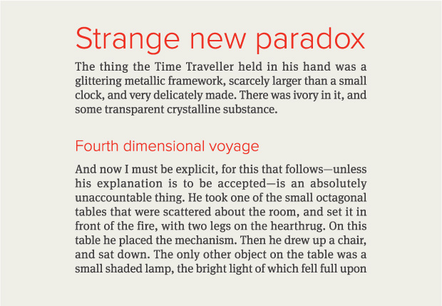
FIG 5.1 shows a fine start for paragraph styling. We have a good type size, a simple typeface choice of Chaparral, sufficient contrast with the background color, and decent spacing between the lines. Where we eventually end up with our paragraph style depends on other factors like intended use, device size, alignment, and more. We’ll look at those considerations in Chapter 6.

Type size
So, what’s a good font size? Is there a universal sweet spot, or is everything circumstantial? As we learned with the em box, numerical sizes can be deceiving since they don’t always reflect what a typeface actually looks like.
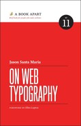
The best way to approach sizing is to consider the reader and the reading distance. Most people sit about 18–24 inches away from their screens when it comes to a desktop; for mobile devices, it’s a bit less (FIG 5.2). Put simply: the farther we are from our device, the larger the affordance of type size.
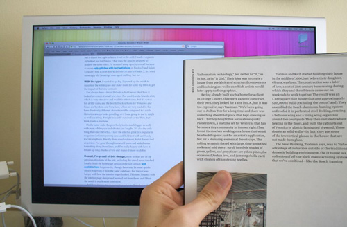
FIG 5.2: The reading distance and type sizes from a desktop monitor are roughly comparable to those of a magazine held at arm’s length. Photograph courtesy of Wilson Miner (http://bkaprt.com/owt/48/).
Considering the typical distance and common text sizes in printed matter—about 10 points or roughly 13 pixels, which reflects shorter reading distances—I tend to make my base type size 16 or 18 pixels, or 1–1.2 ems. I’ve listed fixed pixel units so we have a shared understanding of roughly how big the body text should be. In your own work, however, it’s still best to use ems, rems (root em, whose value is relative to the html element), or percentages—all of whose relative sizes let you better respond to a gamut of devices and viewports. You can still use pixels when your elements require a specific size. Otherwise, relative units give the greatest control over keeping your sizing flexible while allowing users to resize text and pages within their browsers. For more on ems and rems, check out Jeremy Church’s article on the topic (http://bkaprt.com/owt/49/).
In general, I would rather err on the side of making something too large than risk it being too small. When in doubt, make it bigger. This is true few times in design, but I’ve often found it to be the case in designing for the screen. Don’t tell your clients though.
Measure and line-height
Conventional wisdom is to aim for a 45–75 character measure (the length of a line of text) on average in your running text, depending on the particular font, size, and setting. While you can go above or below that range—some news websites capably accommodate measures in the 80s—it’s a good yardstick. That range exists because of the motion an eye makes from the end of one line to the start of the next. As lines contain more characters and grow longer, it’s harder for a reader’s eyes to successfully make the trip.
If you do need to use a longer measure, you’ll want to balance it out by increasing the amount of space between lines (line-height). The extra spacing gives the reader’s eyes room to make the trip and reduces the chance of losing their place along the way (FIG 5.3).

Similarly, if you’re on the shorter end of the spectrum, you can get away with less line-height, since the distance from line end to line beginning is a shorter trip (FIG 5.4).
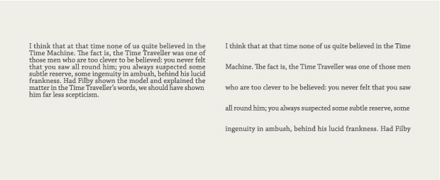
FIG 5.4: Line spacing that’s too tight makes text feel dense and congested, while line spacing that’s too loose makes the lines feel like disconnected elements.
Awareness of line-height is especially important when dealing with responsive websites. As blocks of content expand and contract, you may need to adjust line-height values along with the font-size to ensure the type remains at a comfortable measure. We’ll touch on responsive design and the effects on measure and line-height in the next chapter.
A true ideal line-height doesn’t exist, because every type-face is different. You need to take into account the design of the typeface as well as the typesetting. Is this a wide or decorative typeface? You may need more space between lines to let the details breathe. Is this a narrow text column, as you might see in hanging captions in an article’s margins? You could use a smaller type size and keep the line-height tighter than the article text next to the caption. By observing these factors, you can judge what a particular setting requires.
A good starting point with line-height is about 1.2–1.8. It’s best to omit units for line-height, as its values can get messy by dint of CSS’s cascading properties (see CSS Tricks’ Almanac for specifics (http://bkaprt.com/owt/50/). It takes some trial and error to see what’s right for a given typeface at a given size in a given situation. I find it useful to declare a line-height and see how it feels to read text at that setting. Do letter ascenders and descenders crash into one another or run a little too close between lines? If so, more line-height is needed. Are the spaces between the lines more prominent than the lines themselves? If so, try reducing the line-height. When you find an appropriate line-height, the text will seem to fall into a natural rhythm, feeling neither too far apart nor too close.
Indents and blank lines
There are several ways to denote a new paragraph, from out-dented first lines to actual paragraph marks (¶), called pilcrows. On the web, these approaches skew toward either a blank line between paragraphs or an indent of the first line (FIG 5.5). While there is no right way to mark a new paragraph—it’s largely based on personal preference or house style—it’s a solid idea to reinforce common patterns, because people know what they mean.
FIG 5.5: Two common ways to denote paragraphs: a blank line between paragraphs or an indent of the first line.
Writing on the web tends to be more “chunked,” where each paragraph holds a complete thought—as opposed to something like fiction, where a full line break may disrupt dialogue—so paragraphs can stand farther apart. As a bonus, these bite-sized chunks prove useful for skimming content.
If you use a blank line, make it equal to your type size or a touch smaller. For a first-line indent, it’s customary to indent about 1 em. Again, this falls to personal preference. The crucial thing is making the distinction of the new paragraph apparent.
I like to think of paragraphs as akin to the underlying drum-beat in a song. They lay the groundwork for other kinds of content. Building outward, let’s talk about a common paragraph companion: the headline.
Headlines
Headlines are the attention grabbers. People skim them to decide whether or not to keep reading. Headlines come in a variety of forms, from straightforward article headings and subheadings to big marketing taglines and everything in between.
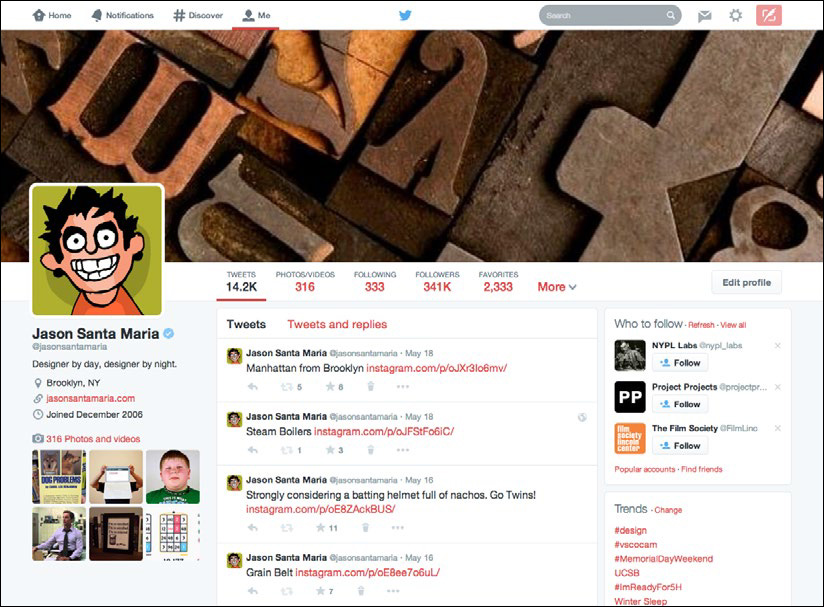
The headline marks the starting line for a text. It orients readers and serves as a kind of handshake and smile. It’s your first chance to make an impression (FIG 5.6). A headline should not only distinguish itself from other text on the page (so as not to confuse the eye), but also help anchor the page as a whole. For the most part, headlines appear as larger text, but you can also opt to emphasize them through weight, spacing, alignment, or color. A small headline can flatten your hierarchy and stunt one of your visual system’s strongest tools. But a sturdy headline welcomes readers and guides them through the text.

FIG 5.6: Headlines on Trent Walton’s website (http://bkaprt.com/owt/51/).
A headline is typically set at some ratio larger than the body text. I usually work in simple math, doubling or tripling the body text size to find a potential headline size. So, I may try a body text size of 12 pixels and a headline size of 32 pixels. We can even split some of the difference to get a subhead size of 16 pixels. Take these numbers as rough starters; you always need to scrutinize how they look when typeset (FIG 5.7).
Once you have your base headline size, you can establish relationships between headings and subheadings. A reader should be able to distinguish, even at a glance, the role of one element from another. The visual prominence of an element may not always reflect its semantic value, but key elements will often have greater visual weight than other page content. Happily, many of the visual relationships on the web come prebuilt, thanks to semantic markup: h1, h2, and so on. Your visual styling should reinforce those roles, which often means moving from the highest semantic element (h1) downward. That gives the reader a pathway through your content. If you set your h2 the same size as your h1, a reader may rightly think they’ve started a new article rather than a subsection.
In the last example (FIG 5.7), you can see that the headline is at the top, followed by some text, a subhead, and then more text. The difference in heading sizing provides enough contrast to set up this relationship. A reader can assume that the largest text is important because it appears first in the reading flow, and because it’s so big. Also, the paragraphs are related not only because they both fall under the headings, but also because they’re the same size. This is a subtle visual exchange, one that we encounter enough in life as to be ingrained in us.
Contrasts like those are shorthand methods for creating visual hierarchy and building a typographic system in your designs, which in turn will imbue your work with variety and structure. They may seem simple, but don’t mistake simple for obvious.
Once I understand the general relationships between elements, I look at how my typeface choices can support them. For instance, if I need a typeface for headlines, I like to find something that both looks good large, to let the details of the typeface shine, and holds up against fluctuating word lengths.
For a typical news site with numerous articles, you need to be able to deal with headlines of varying lengths, names that may require punctuation or accented characters, cited works set in italics, and more. Your typeface choice must handle these with grace. A slightly condensed face can work well in these situations, because you can fit more characters on each line and avoid awkward line breaks. For instance, FF Meta Serif is a somewhat narrow face, which accommodates a couple more characters per line than a wider serif like Georgia does (FIG 5.8).

Many folks, myself included, tend to use sans serifs for headlines. It comes down to simple geometry: most sans serifs can be packed in tighter than serifs because the letters take up less space. This allows for more characters per line and a larger type size. As you see in FIG 5.9, FF Meta takes up a little less room than its serif counterpart at the same type size. It’s a small gain, but it’s enough to keep a word from wrapping to a new line and gives us a bit more space to make our headlines bigger.

FIG 5.9: Sans serif typefaces work well for headlines, because they often take up less horizontal space than serifs.
Another kind of headline is more of an offshoot—it doesn’t always accompany paragraphs and is sometimes quite large or decorative. It’s a bit of an outlier and has more leeway to shake things up. I lump this into a category I like to call big type.
Big type
While big type is a kind of headline, it may not be atop an article. We often see these on homepages and splash pages for marketing sites.
Type this large is best considered in the same way you might a photograph: a picture of type that anchors a layout or creates the sort of mood you might spot on a movie poster or book cover.
On Siteleaf (http://bkaprt.com/owt/52/), the headline is a large focal point for the page (FIG 5.10). It not only informs the reader, but also sets an open and welcoming atmosphere alongside the image. The big type complements the large screenshot through its proximity and color, creating a unified visual. Snappy headlines like these are the hallmarks of marketing design.

The same approaches for headlines apply here, with a couple of extra caveats. If you’ve been eyeing a decorative typeface, a one-off use here may be just the right amount of personality. Similarly, any errors in your text like incorrect punctuation (mind your smart quotes!) or bad line breaks will only be more apparent because they’re larger. With responsive designs, it’s also a good idea to tailor your line breaks. Visitors come to your site via all sorts of screen sizes, so consider customizing the type size and line breaks to keep the headline organized.
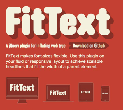
Go the extra mile and take care of how your headlines respond to varying screen sizes and conditions, rather than letting a browser handle the reflow. Some good ways to approach that level of detail are the jQuery plugins FitText and Lettering by Paravel or Font-to-Width by Nick Sherman and Chris Lewis.
FitText (http://bkaprt.com/owt/53/) allows an element’s type size to increase or decrease in relation to its container so that it completely fills the width. This additional control is especially handy when working responsively: your big, important headline is always full-width (FIG 5.11).
Font-to-Width (http://bkaprt.com/owt/54/) builds on similar concepts, but takes advantage of large type families by letting you specify a different typeface weight to fill a container’s width instead of changing the type size. Both are useful in different situations: FitText changes your type’s size, while Font-to-Width changes the actual font.
Lettering (http://bkaprt.com/owt/55/) wraps the individual letters of a specified element so that you can access them with CSS, allowing for some quick adjustments to kerning (the space between individual letters), colors of particular letters, or anything else you think up (FIG 5.12). Unlike in desktop applications for print design, we don’t have much built-in control over kerning in CSS, as those settings mostly reside with the type designer. For limited use like a big headline, it’s helpful to have more control over the way letters lock up, especially in difficult letter pairings that typically end up with extra space (e.g., most anything involving a capital A or T).
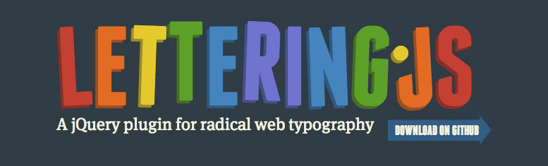
FIG 5.12: Lettering is a jQuery plugin that appends dynamic classes to a given piece of text; you can style the classes individually with cSS.
Obviously, you wouldn’t want to use any of these plugins for a large amount of text. But for a crucial homepage headline, these methods give you the flexibility of a prepared image while retaining all the advantages of live text (as we saw in Chapter 2).
Some great new CSS values are also rolling out in browsers to support viewports, like vw (1vw = 1% of viewport width) and vh (1vh = 1% of viewport height), which let you achieve similar results without the need for JavaScript. Browser support for these values is still scarce, but it’s on the rise. For more on this, check out Chris Coyier’s article “Viewport Sized Typography” (http://bkaprt.com/owt/56/).
Small Type
Small type is comprised of an unassuming variety of supporting elements. Interface, which we’ll cover shortly, is a common kind of small type, but article-specific categories like captions, footnotes, and asides are also important to distinguish.
First, realize that small type serves a specific purpose. It marks a visual contrast and shift in tone—a separate point of information from a text’s main stream. The change in size is equivalent to a change in the tone or volume of your voice when speaking. You’re still the speaker, but this is something worth saying differently. A change in type size (which may be as simple as 80% of our base type size) signals that shift (FIG 5.13).
FIG 5.13: A simple caption treatment on Liz Danzico’s site, Bobulate (http://bkaprt.com/owt/57/).
As this type is smaller, you need to be extra aware of your typeface choice. Test your type in context to make sure it remains legible and clean under your sizing conditions. You can use the same typeface as your body text if it holds up well to the smaller sizing, or choose something better suited to small sizes. Picking a separate caption typeface gives you the added ability to visually signal a change in voice—as when a side note comes from an editor instead of the author.
Another example of small type is the line of contact information, which can be important even if infrequently accessed (FIG 5.14). It doesn’t need much prominence and, luckily, it’s an accepted convention that contact information appears at the bottom of a page, so people know where to find it. As a result, the type can be small and understated if that serves your design.

One last note on small type: if we’re talking about more than a few lines, small type may not be the way to go. Prolonged reading of small text gets cumbersome really fast. For quick asides and captions, though, it’s perfect.
Other Notable Types
For the rest of the common elements you may encounter, you can mix and match the approaches we’ve already looked at. Elements like blockquote, code, status messages in modal windows, and anything else outside the norm pop up from time to time. The biggest thing to remember with any other element is to evaluate its purpose, its importance, and where it appears in context.
In the case of a blockquote, some small-text principles apply (though it’s less about size). A blockquote is a bit of text quoted outside of an article’s main text. It’s common to set a blockquote apart visually from the normal text to mark this change in voice, and this can be a good opportunity to switch from a serif to a sans serif (or vice versa, depending on your body typeface). In print, quotes are typically distinguished with indented text and italics, but on the web, the patterns can be more stylized. You can mark quotes with italics, a change in type size, a change in typeface, the addition of larger open and close quotation marks, a change in color or border, or any combination of the above.
In the case of pull quotes, you may even take an ornamental approach by setting the blockquote larger to add interest. These can be particularly effective in running text to add some variety to type and imagery (FIG 5.15). Pull quotes serve as a nice visual anchor and draw readers into the article.
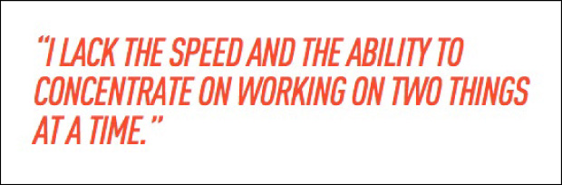
FIG 5.15: A stylistic pull quote treatment grabs a skimming reader’s attention (http://bkaprt.com/owt/58/).
Some of these styles are fine for a quote here or there, but if you’re doing lots of quoting, a more subtle style (as we often see in print) is probably a better choice to keep the article text and the quotes from fighting each other.
On Jason Kottke’s website (FIG 5.16), you see probably the most common blockquote style, which makes the type a little smaller than the base type and lighter in color. This works well, because it’s a simple visual change that marks a shift in voice while still feeling tied to the rest of the text.

FIG 5.16: A simple blockquote style on kottke.org (http://bkaprt.com/owt/59/).
So now we’ve got multiple ways to handle text-heavy content. But that’s only one facet of the web. What about the elements that we not only read, but also click, tap, and otherwise interact with? That’s right, cue interfaces!
Interface
User interface (UI) refers to elements that enable actions and give context within a website or app (FIG 5.17). Common UI components include site navigation, buttons, form elements and labels, status messages, account links, and anything in between.
These elements serve a dual purpose: like paragraphs, they’re content, but like headlines, they may be set large to nab attention or anchor a layout. For instance, the text in a button may be bigger or smaller than our base text size, depending on its purpose and place on the page. A button that supports a headline or call to action requires a more prominent visual style, whereas a button for compulsory secondary actions (log out, search, etc.) may figure smaller (FIG 5.18).
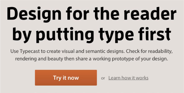
FIG 5.18: Typecast’s homepage features a bright, prominent button and a less prominent secondary link in gray text (http://bkaprt.com/owt/60/).
Because websites have various layers of UI elements depending on their function, we must gauge the visual weight needed to convey an element’s idea and the hierarchy required for its purpose. Important UI elements like navigation may need more visual prominence than less frequently accessed elements like a logout button. That isn’t to say they aren’t both important, but we can visually rank these elements based on their use.
Even with a variety of uses and kinds, some conventions for these items do emerge. Many web apps tend to make UI text smaller so they can squeeze a lot of elements into a limited space. Keep the text legible above all else. What use is an important button if I can’t read it?
Because of how quickly a header can become crowded with options (especially after signing into a site where more options are revealed), I favor sans serif typefaces for UI. As we saw earlier, they can be set smaller and a little tighter than serifs. And in these situations, every bit of space counts, especially if you need to translate your navigation labels into other languages.
There’s no accepted size or styling for UI, because it depends on its purpose and importance. But no matter what kind of interface element we’re talking about, we need to make it legible and recognizable to a user.
Putting It All Together
Once you have your building blocks accounted for, you can assemble your typographic system and then focus on hierarchical relationships. Which elements are most important? What relationships do elements share? To figure this out, you can look at the markup and see what the semantic structure looks like. An h1 is likely our biggest and most important text, and then down the line to h2, h3, and so on.
That’s fine for text, but what about navigational elements, images, and other kinds of content that need to fit in? Always think about your intent—the things you want a visitor to do—and use that to influence your visual styling.
If you want someone to read an article, focus your efforts on styling the text. Make sure it’s nice and readable, with a clear entry point—like a big, appealing headline that shepherds readers into the article.
If you want someone to watch a video or register for an account, focus on making those elements shine. They don’t need to be the biggest items on the page, but they should have enough heft and visual prominence through placement and color to draw attention.
Let’s look at a content-heavy website like the New York Times and examine some of the decisions that give the design structure and flow (FIG 5.19).

Right off the bat, we see a few different kinds of content: past the masthead and navigation, we have a big headline and excerpt at the top left, some text with an accompanying large image in the middle, and some smaller articles listed on the top right. Using what we learned in the last chapter, you can pick up on the ways the site distinguishes various elements:
• On the top left, the large headline—set in italics for further distinction—quickly grabs a reader’s attention and provides an entry point.
• Because of contrast, it’s even more likely that a reader’s eye is drawn to the middle image; its size and placement set it apart.
• Other text may be big, too, like secondary headlines, but that central, lone image is the page’s focal point.
So, if mammoth type or images are surefire ways to pull in a reader, why don’t we stuff our pages with them? If you think about it, that type and image are so alluring because they’re unique. If we bombarded the page with more images and an army of big headlines, each would bear the same weight and cancel out any contrast. Without contrast, we don’t have hierarchy, and without hierarchy, the typography feels indistinguishable and our readers are left without a map.
On the New York Times site, contrasts in type size, style, and placement apply structure to its content and set up relationships. When we first glance at something, we tend to seek patterns; we mentally group similar elements and try to uncover a pecking order.
Titles on the New York Times homepage are set large, with key headlines closer to the top. Subheadings and bylines tie into the headline at smaller sizes but remain visually distinct from paragraphs. This styling underscores that the subheading is part of the same system as the headline, while establishing that the subheading is hierarchically less important. The paragraph excerpts tap into this same hierarchical system; while their type size is even smaller than that of the subheading, the paragraphs are set and styled the same as one another. This consistency means readers quickly understand that these chunks are similar kinds of content.
I’ve noted simple arrangements here, but, together, they form the backbone of a strong typographic system built on relationships. All of typography is based upon a reflexive relationship: the small things inform the big things, and the big things inform the small things. The sum of this give and take means the difference between beautiful and forgettable.
We’ve covered the most important typographic considerations you can make at the micro level. But what about the other end of the spectrum: the page? How do larger elements, like the browser window or grid systems, affect our lovingly crafted paragraphs and headlines? Let’s look at the big picture.