3. Evaluating Typefaces
Type is a tool. You need to understand the components of a typeface family to evaluate its potential. When it comes to designing for various screen sizes, internet connections, and browser capabilities, the importance of the decisions you make is compounded. Having a working knowledge of how a typeface fits into those considerations as a design asset will help you make decisions beyond what you see on the surface.
In this chapter, we’ll look at some of the structural patterns in typefaces and see how they’re grouped and sorted. Then, we’ll examine what makes typefaces look the way they do from a visual and a technical perspective. But first, we need to talk about terminology.
Font Versus Typeface
Two common terms you’ll see thrown around when talking about typography are typeface and font. Typeface is the name for the design in full, whether it’s a style or family of styles. For example, Helvetica is a typeface. Font refers to the format or storage mechanism for that design. Helvetica.ttf is a font.
Typefaces can be made up of numerous font files. No matter how many files there are, it’s still one typeface. Nick Sherman gave us a great analogy to remember the distinction: a typeface is to a font as a song is to an mp3 (http://bkaprt.com/owt/5/).
How much does this distinction matter in day-to-day conversation? It depends on whom you ask. Most people use the two terms interchangeably. A friend might call me and ask, “What’s a good font to use for the recipe I want to send my sister?” What they really mean is “typeface,” but that’s not the important thing here. The important thing is that my friend is talking about typography.
That’s a huge step in getting people more comfortable with type! Does that mean you should let imperfect uses of “font” slide? Sometimes, yes. But since you know the difference between the two, you can also use it as an opportunity for teaching, not correcting (type lovers who spend the day swooning over typefaces have a hard enough time convincing others that we totally know how to party, thank you very much). Helping collaborators understand what’s behind your choices lays the groundwork for better design discussions.
Classifications
All typefaces fall into some sort of classification. Unlike the scientific organization of the animal kingdom, however, there has been little consensus on one scheme to rule them all. We struggle with these systems, because typefaces are thoroughly dynamic works diverse in visual structure, intent, influences, and historical context. Defining a classification system that comfortably accommodates typefaces from 500 years ago as well as five months ago—and getting everyone to agree on it—is not an enviable task. Fortunately, a foundation has settled enough for us to build on.
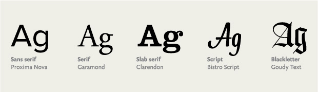
You’re probably familiar with these classifications in a casual capacity. Groupings like serif, sans serif, and script are well known (FIG 3.1). More descriptive subclassifications exist to reference a particular set of physical traits or time periods. For instance, some common subclassifications for serif are Old Style (e.g., Bembo) and Modern (e.g., Bodoni).
When thinking about typefaces for use in my designs, I mentally sort them into a few common groups: serif, sans serif, slab serif, script, monospace, and decorative (which is mostly made up of anything that doesn’t fit into those other categories). Obviously, these groups don’t represent all typefaces, but they work for the majority. Understanding the most basic classifications helps you filter the vast number of typefaces out there, and can be handy for searching on the web when you have a rough idea of the look or feel you’re after.
While each classification evokes a kind of feeling, it’s rarely something you can grab hold of because of how broad the classifications are. Two given typefaces may belong to the same class but spark very different responses, depending on their intended use or when they were made. Look to the typefaces themselves to support a feeling or mood in your design.
While not comprehensive, these working classifications help me sort typefaces against a mix of physical attributes and usage. For example, decorative isn’t just a synonym for fancy type; it describes the context for using a typeface. A decorative typeface could have serifs or be a script or monospaced, but its overriding characteristics likely prevent it from everyday use.
Thinking of typefaces this way lets me slice my work into smaller chunks. If I’m designing a website that has articles, I’m generally looking at typefaces for running text. Most of what I’m after will fall in the serif and sans serif classifications, as typefaces in other groupings will be too distracting for long stretches of text. Along those lines, if I’m looking for a typeface to set my new tagline across the top of a website, I may look at more decorative or distinct typefaces first.
Beyond the traditional classifications, there is another category of typefaces: icon fonts. Icon fonts have characters filled with symbols other than letters (FIG 3.2). Pictograms in font form—also known as dingbat, symbol, picture, or pi fonts—have been around for a long time, but the urge to use them online is rising. There are clear, practical benefits: a scalable version of your logo or a shopping cart icon that you can size and color with CSS, while keeping the icons bundled as a single loaded asset. The benefits compound with responsive web design, since your icons can always scale up and down to the right size to suit a range of screens and resolutions.
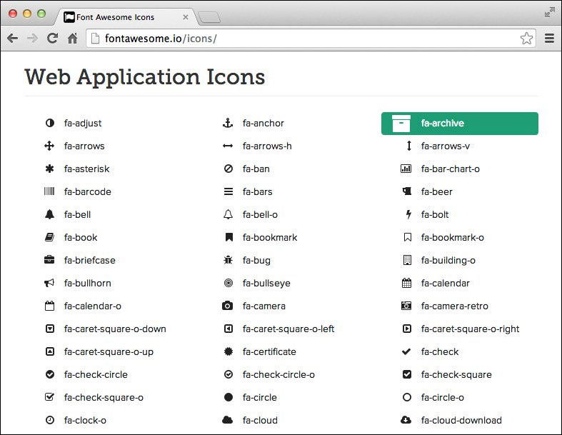
FIG 3.2: An example of an icon font from Font Awesome (http://bkaprt.com/owt/6/).
But icon fonts can run into trouble online. Some of them remap individual letters to pictures, leaving little regard for someone using a screen reader, which may read the letter e aloud while displaying an icon of an envelope onscreen. For examples of icon fonts and best practices, check out Filament Group’s handy article “Bulletproof Accessible Icon Fonts” (http://bkaprt.com/owt/7/). I have found, however, that the cons of icon fonts outweigh the pros, and I tend to agree with Chris Coyier and his article “Inline SVG vs Icon Fonts [Cagematch]” (http://bkaprt.com/owt/8/)—SVG is the more flexible solution.
Classifications, whether your own personal divisions or ones from an established system, can be a rabbit hole of information and history. And while they’re interesting—especially when you want to geek out on type—you don’t necessarily need to discern the minutiae of time periods and serif brackets to do your job. Classifications are helpful in the same way knowing about the history of jazz or rock ’n’ roll can make you a better musician: they allow you to sort typefaces across criteria and find aesthetic and mental connections to help communicate your design. Sometimes these links are interesting juxtapositions or cultural references. Indra Kupferschmid covers classifications in detail and proposes a more flexible system for the future in “Type Classifications Are Useful, But the Common Ones Are Not” (http://bkaprt.com/owt/9/). Knowing about classifications makes you a better designer, because you can traverse these connections and use them to your advantage.
Physical Traits
Classification is only one facet of why a typeface may look and feel a certain way. But what causes some typefaces to appear larger than others when set at the same size? What causes them to feel lighter or heavier? And what makes the same letter look different from one typeface to another? The answers to these questions will help you understand the visual differences between typefaces. Understanding these traits lets you trace the varied ways typefaces approach and solve the same problems.
Typefaces are specialized tools, but they’re also the expressive creation of a typeface designer. Some of the choices those designers make when creating a typeface may be based on a personal preference or technical reason. The sum of these choices influences the features we judge when choosing a typeface: legibility, flexibility, contrast, and more. Similar to classifications, a working knowledge of these traits gives you the power to speak confidently about typography—and helps you make mental connections between typefaces that share traits.
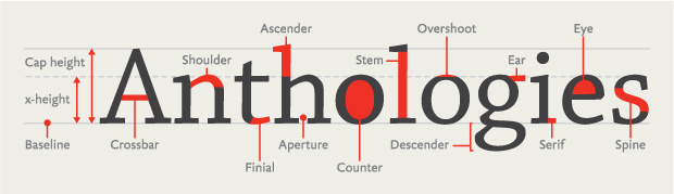
You’re probably familiar with the basics of type: uppercase and lowercase letters, numbers, punctuation, and some special characters. Like any rich visual art form, typography has a vast depth of terminology to describe the diverse parts of letterforms. While you could fill another book discussing type anatomy—like Stephen Coles’s The Anatomy of Type: A Graphic Guide to 100 Typefaces—I’d like to point out the most common parts of letters you’ll encounter.
All letterforms are made up of a variety of strokes, a general term for most parts of a letter (FIG 3.3). Typefaces whose strokes vary in width to several degrees, from hairline thin to very broad, are known as high-contrast. Typefaces whose stroke widths are consistent throughout are monoline designs. Some strokes are straight and long, like the stem on a lowercase h or the descender on a p, while others are short and curved, like the neck and ear on a two-story g. Some strokes resolve in serifs, while others, as you sometimes see in the top hook of an f, can end in a bulbous shape as a ball terminal or a teardrop shape as a lachrymal terminal. Some strokes encase whitespace in what’s called a counter, like the inside of an o.
Understanding the vocabulary of type helps you discover why a typeface looks the way it does, when or where it comes from, and its intended purpose. And greater knowledge of your tools means you’re better equipped to make good decisions. Later in this chapter, we’ll take a closer look at two familiar typefaces, Helvetica and Georgia, to see how we can extend this vocabulary to new typefaces.
In addition, a strong vocabulary for type is excellent when you’re critiquing work. For instance, when you see inconsistent strokes or when something within a design feels off balance, you can point to a specific piece by name, rather than saying something like “that wiggly bit.” That precision results in more productive discussions. For more information on why letters look the way they do, check out Tim Brown’s article “Drawing Letters” (http://bkaprt.com/owt/10/).
Em Box
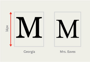
Aside from the anatomical differences, typefaces also vary in physical size, and much of that variance depends on the relative size of the em. Despite the name, em does not refer to the size of the capital letter M in a given font. Rather, an em is a relative unit of measurement that’s equal to your font size. So, if your text is set at 16 pixels, 1 em is equal to 16 pixels. This relative nature of the em is why it’s so useful for responsive web design instead of fixed pixel measurements.
With ems, as far as the font is concerned, each character exists within a bounding box whose height is always 1 em (in this case, 16 pixels tall) but whose width varies (FIG 3.4).
That part is easy to grasp, but what many folks find troublesome is that the em is merely the available height of each character’s canvas, and no rules state how much space a character can take up inside that box. We get this invisible box from a time when a type designer quite literally had a physical block upon which to design each letter—when fonts were tools made of metal and wood (FIG 3.5).

FIG 3.5: Some metal type. The physical dimensions of the metal around the letter make up the em canvas.
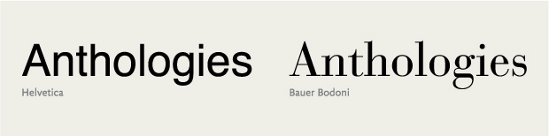
If you’ve ever set text in one font, changed it to another, and then noticed the text got smaller or larger even though you’re using the same numerical font size, it’s because of the difference in how large the glyphs were drawn in relation to the em (FIG 3.6). The font you switched to is designed to be smaller—a decision that resides with the type designer.

FIG 3.6: Setting the same text in two separate fonts at the same font-size can result in two visually different sizes.
When it comes to web fonts, a type designer’s intent has big implications for your design. Each web font you choose means a little more wait time for users as browsers load the font file. Some browsers handle that wait by displaying content as assets are still loading. When that happens, you may briefly see page content in a default font and then see it redrawn in the correct font when it’s ready. The effect is a FOUT, or flash of unstyled text.
The more your web font veers in size or look from the browser’s default font or your fallback font, the more noticeable the FOUT. The worst case is if your font fails to load entirely. If your layout depends heavily on the precise size of a font, it may break in unpredictable ways.
We do have methods to handle these issues, namely tools like Web Font Loader, which we’ll look at later in this chapter. What’s important to understand is that you need to consider the relative sizing of a typeface from a visual standpoint, not by numbers alone.
Typeface Contrast
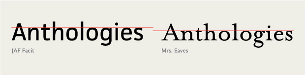
The contrast of a typeface refers to the differences in the thick and thin strokes of its characters. A monoline typeface has the absolute least amount of contrast. A typeface with low contrast has some, but relatively little, variation in the thickness of its strokes. For instance, Helvetica features consistent stroke widths. Compare that to a high-contrast typeface like Bodoni, whose strokes vary from beefy to delicate, all in one letter (FIG 3.7).
Higher-contrast typefaces tend to be useful in small bursts or headlines, because the extreme variation in stroke width is burdensome in long text. Our eyes are attracted to the exceptions—the stuff that looks different from everything else. Contrast is not only a duality of thicks and thins in the typeface, but it also involves the whitespace between and inside the letters. That variance adds up. I find I’m more likely to stop or slow down and notice the letters, rather than read, when my eye encounters that kind of modulation.
A typeface with less contrast can create a smooth, welcoming rhythm for reading. Most typefaces intended for long-form text have medium to low contrast, which creates less interplay between the individual letters and words. This gives text a steadier visual rhythm as your eyes move across a line, which in turn aids readability. When we aren’t distracted by the exceptions, we can focus on the act of reading itself. On the other hand, too little contrast in stroke or distinction between letterforms, as in the case of Helvetica, can be unsuitable for long stretches of text because the letterforms appear too uniform, reducing legibility. Like most things in design, it’s about finding the right balance.
Weights and Styles
Many typeface families have at least four basic styles: regular (sometimes called roman or book), italic, bold, and bold italic. A style’s weight refers to the thickness of its strokes, or their boldness. Posture refers to an alteration of the letter’s skeleton, like the difference between regular and italic. However, variations in style aren’t limited to weight and posture; they can include different optical sizes, numeral sets, and many other kinds of structural and stylistic alternates.
On the web, we commonly employ numerical CSS font-weight values. These currently range from 100 to 900—nine in total, each on the whole hundred value—with the lightest weight at 100 and the heaviest at 900. Not all fonts include every weight (some may only have a single weight), but this serves as a framework. While some typefaces deviate a little up or down the spectrum, most fonts place their normal or book weight at 400 and their bold at 700. Since these names and numbers aren’t absolutely prescriptive, it’s best to make your judgment visually to be certain you have the weight you want.
The four basics are a standard minimum set of family members, especially for text faces, but some typefaces are part of massive families. Take Titling Gothic by Font Bureau, the condensed sans serif used on the covers and chapter openings of the A Book Apart series. The style used for headlines is regular condensed, but it is only one of fifty-eight styles (!) that make up the Titling Gothic family. Family members range from very thin and condensed to very heavy and wide (FIG 3.8).
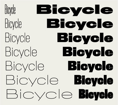
Many families include condensed and expanded widths, which are what they sound like: condensed and compressed widths feature narrower letterforms, while extended and expanded ones have wider letterforms (FIG 3.9).
Why would anyone need so many styles? It depends on what you’re designing. Flexibility is often one of my biggest considerations when choosing a typeface. If I can create a good level of contrast by using different styles within a typeface family, it accomplishes a few important things. For one, it lets me stay stylistically consistent within my design. I can use different styles for headlines, subheads, and maybe even text, and they will all share a common background throughout the piece. That flexibility helps me establish a clear hierarchy while keeping the visual language simple.
I find that the more typefaces I use in a design, the weaker the design becomes. Many people say not to use more than one or two typefaces at the most. Though obviously not a rule, this can be a good guideline as it puts some constraints on your visual palette (FIG 3.10). Having a variety of typefaces can create a cacophony of mixed styles and messages. But when you work from a smaller pool of options, you allow yourself to rely on typographic attributes like size and color to create distinction. And those elements will naturally feel like they belong together, because they come from the same place.
FIG 3.10: Liz danzico’s personal site uses a single type family but still achieves design diversity among different kinds of content (http://bkaprt.com/owt/11/).
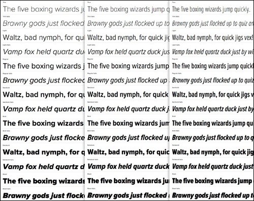
Pay close attention to the members of a type family on the web, especially where browsers may try to fill in for a missing style. When text is set to bold or italic in CSS, the browser will first look for the appropriate font to render it. If that font is absent, the browser will try to formulate an italic or bold by artificially skewing or beefing up the letterforms from the existing font.
We call these pseudo or faux italics and bolds, and they’re the typographic equivalent of mistakenly tucking your shirt into your underwear (FIG 3.11). Italics are not merely slanted letters, but instead have different shapes adapted from the typeface’s normal upright style. Notice how the correct italic and bold seem tailored for their form? In this typeface, the italic letters develop a slant and some trailing strokes, and some letters change drastically, like the lowercase a morphing from a two-story to a one-story letter. Now look at the faux italic. It’s literally a skewed version of the normal style. Some of the letters’ thinner bits look squished, and the counters appear misshapen.
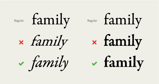
Moving to the faux bold, the letters are a bit blobby, like someone spilled water on paper and the ink started to bleed. The letters’ serifs crowd together because the spacing wasn’t created with these mutated letterforms in mind. Proper bold weights feel heavier than normal weights, but they may not have a uniform increase in their body size. In this example, the correct bold is thicker in the areas that were already heavy, but the thinner strokes and serifs remain largely unchanged. Small details like this allow the visual weight of the typeface style to increase, but keep parts like counters from filling in. Choose typefaces that have the styles your text needs to display properly, or you will be laughed right off the web. Okay, maybe not, but it’s an ugly misstep you can easily avoid.
X-Height
A typeface’s x-height refers to the height of its lowercase letters from the baseline (the implied line that the letters rest on) to the top of an uppercase letter (FIG 3.12). Just as an em has little to do with the letter M, x-height does not specifically refer to the height of the lowercase x. But because we’re talking about the height of lowercase letters, the two are usually equal.
Like the relative size of a typeface’s body, the x-height can be as large or small as the type designer wishes. Some typefaces have very low x-heights, which can communicate elegance, as in the case of some script typefaces. A low x-height can also create an interesting tension between letterforms, as the contrast is more pronounced between upper and lower cases.
When considering text faces, a high x-height is usually ideal; more space for the letterform means more information to help the reader. This is true of typefaces for print or web, but is of utmost importance where interfaces or wayfinding are a concern. A typeface with healthy strokes and tall x-height can mean the difference between sparse text and one that fills out the space comfortably.
But a high x-height isn’t always the winning choice. The larger the x-height in a text face, the less room for other distinctive characteristics. For example, the letters a and d, or n and h, can become difficult to distinguish as the x-height increases (FIG 3.13).

FIG 3.13: As x-height increases, a typeface’s letters can be confused. Image courtesy of Ralf Herrmann (http://bkaprt.com/owt/12/).
Just as important to readability are the spaces and openings inside the letters: counters and apertures. Counters are a letter’s interior space. Counters can be enclosed, like the middle of the letter o, or open, like the middle of the letter c. An aperture is the actual opening of the counter, like the space between the ends of the letter c. Typefaces with a high x-height usually have large counters, and their letters take up more of the em box. That translates into more information as to what distinguishes a specific letter, but finding the proper x-height is a balancing act. While a higher x-height may mean larger space for counters and apertures, it’s a tradeoff. Too big and you might diminish the recognizability of a letter. Too small and you might diminish the legibility of your text. Thankfully, we have a good deal of wiggle room. The easiest way to see if a typeface has the right mixture of attributes is to set some text and give it a read. If you get tripped up on some letters and letter combinations, it’s probably best to keep looking.
Numbers, Punctuation, and Special Characters
Strive to use typefaces that support numbers, correct punctuation, and special characters, especially if you’re presenting your text in a variety of languages.
Numeral sets come in a few varieties (FIG 3.14). Uppercase numerals (sometimes also called lining or titling figures) have the same height and contrast as capital letters. Lowercase numerals, also known as text or old style figures, are designed for running text. Lowercase numerals act like lowercase letters, some with ascenders (6, 8), some with descenders (3, 4, 5, 7, 9), and some that reside at x-height (0, 1, 2), allowing them to blend in with text and cause less visual disruption than uppercase numerals. As you can see in FIG 3.15, uppercase numerals in text can call a lot of attention to themselves, while lowercase numerals continue the flow of text and read more evenly.
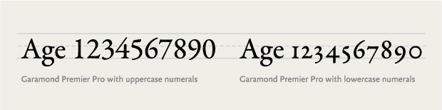
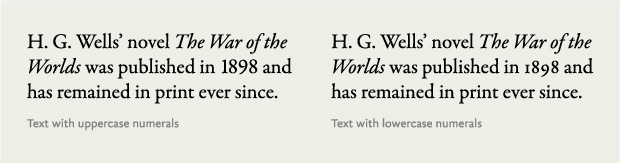
FIG 3.15: uppercase numerals (left) can call too much attention to themselves in running text, but lowercase numerals (right) fit right in.
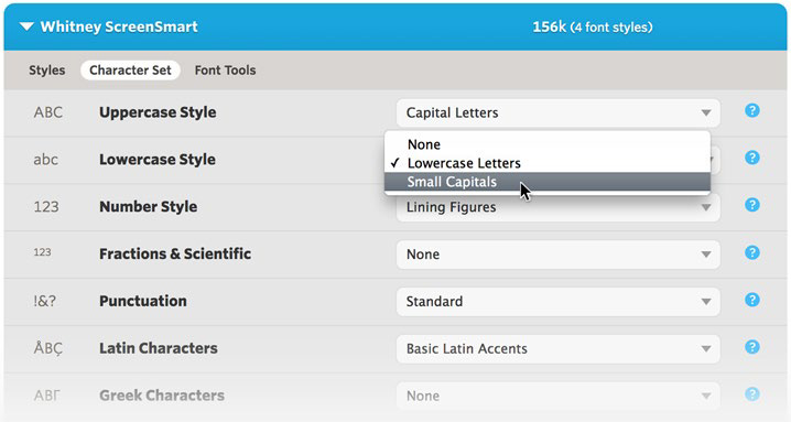
While many fonts might have only one numeral set, typefaces can contain multiple sets. This is sometimes a stylistic choice by the type designer—but it can also add to the size of your font files. If you’re working with a typeface that has multiple numeral sets, you can access them with specific CSS rules for OpenType. Browser support for OpenType features is still gaining traction, but you can find a good browser-support matrix at CanIUse.com (http://bkaprt.com/owt/13/). Alternatively, some web font solutions, like Cloud.typography from Hoefler & Co. (http://bkaprt.com/owt/14/), let you select a numeral set or special character set to customize your font (FIG 3.16).
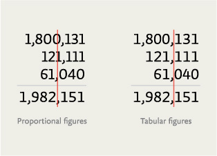
Tabular figures are numbers designed with fixed spacing for use in tables (FIG 3.17). Tabular figures keep your numbers lined up nicely in vertical columns, making data in things like tables and spreadsheets easier to scan.
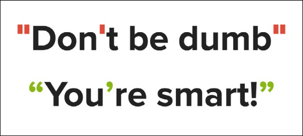
For punctuation, make sure your fonts contain the basic forms you’ll need for sentences (period, question mark, etc.), a set of dashes (hyphen, en dash, and em dash), and proper quotation marks (not straight quotes) (FIG 3.18).

Proper quotation marks are often overlooked, but it’s important to know the difference. Curly quotes, usually called smart quotes, commonly look like filled-in 6s and 9s. Straight quotes, often called dumb quotes, are usually straight and vertical (FIG 3.19). Curly quotes are the correct punctuation for quoted text and dialogue. Dumb quotes are called as such because they are not only incorrect, but are also an instant sign of sloppy typography. Use of improper quotation marks shows a designer who either hasn’t learned the right way to signify quoted text, or didn’t spend enough time looking for a font with full punctuation support.
Punctuation is a system. That’s why proper quotation marks and apostrophes look like they’re part of the same family as commas, periods, colons, semicolons, and more, whereas straight quotes don’t.
Straight quotes stem from the time of typewriters when keyboard real estate was at a premium, so reducing open and closing quotes to one key was economical. Unfortunately, this same choice of economy was copied to the computer keyboard and proliferated in the days of desktop publishing. Unless the software you’re using corrects them, the default result when typing a quotation mark from your keyboard may be straight quotes. On the web, due to lazy implementations or force of habit, we’re still plagued with dumb quotes.
Luckily, it’s easier than ever to get proper quotes and apostrophes on your web pages, by either using the raw characters and specifying UTF-8 encoding or using HTML entities. Better still, use one of the many CMS plugins out there to automatically convert dumb quotes to proper quotation marks. Any of those methods is better than resorting to a claw-handed key combination to type them out.
I made a single-serving site called Smart Quotes for Smart People to show how easy it can be (http://bkaprt.com/owt/15/). For more info on quotes and dashes, check out Jessica Hische’s excellent site Quotes and Accents (http://bkaprt.com/owt/16/).
One last thing to note in the realm of quotation marks: primes. Primes look like italicized straight quotes and signify things like feet and inches, minutes and seconds, and coordinates on a map. Primes are not the same as dumb quotes; they’re a different set of punctuation marks altogether (FIG 3.20).

FIG 3.20: Primes bear a resemblance to quotation and apostrophe marks, but are unique marks in their own right.
It’s not uncommon for free fonts to be incomplete or have mismatching punctuation. Most decent typefaces have the whole lot, but it’s always a good idea to check before licensing a font or deciding to use a typeface.
Small Caps and Ligatures
Some fonts contain alternate styles or characters like small caps and ligatures. Small caps are capital letters that are slightly taller than the x-height and often used for acronyms. It’s important to note that these are not shrunken-down capital letters, but smaller capitals specifically designed to work alongside normal capital letters. Just as we saw with lowercase numerals, small caps have proportions that adapt the same stroke widths and contrasts in normal letters to maintain the text’s visual flow. If you were to simply shrink down normal caps, the strokes would feel thin compared to the regular text, thus creating undue contrast (FIG 3.21).
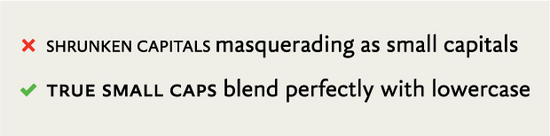
FIG 3.21: Shrunken capital letters usually look too thin next to text, while real small capitals keep a consistent weight with the text.
Using small caps on the web usually means specifying a separate font file with just the small caps. In some cases, the additional weight of another asset may deter you from using small caps, but it can really look stunning. Small caps aren’t just an aesthetic decision, but aid readability by reducing the distraction of acronyms and other all-caps words in running text.
A ligature combines two or more characters to create a joined letterform. The most common ligatures solve for letterforms that unappealingly crash into each other. For example, in the fi ligature, the dot of the i would normally crash into the f and create a blobby mess. But by combining the letters, the dot of the i is removed and the top of the f extends over the base of the i (FIG 3.22).

FIG 3.22: Some letters commonly crash into each other, but this pitfall is easily avoided with ligatures.
Ligatures are useful in large text in which colliding letters create an unsavory disturbance, but they make running text feel smooth as well.
Web support for ligatures is getting better too. The CSS3 Fonts Module has several options for standard ligatures (such as ff, fi, ffi) and discretionary ligatures (st, Th), as well as options for small caps, text figures, and swashes (http://bkaprt.com/owt/17/).
Language Sets
Many professionally designed typefaces have the characters you need to set text in dozens of languages. Even better, a massive and realized family like Hoefler & Co.’s Gotham, designed by Tobias Frere-Jones, can support text in over 140 languages (FIG 3.23).
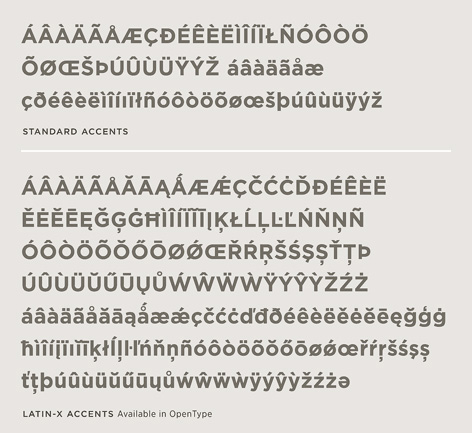
FIG 3.23: Hoefler & co.’s typeface Gotham with default accented characters and Latin-X accents (http://bkaprt.com/owt/18/).
Choosing typefaces that accommodate the languages you’re designing for is essential. When a browser needs to render a word and your font doesn’t support the needed characters, the browser will cascade its way through your CSS font stack until it reaches a font that does, or worse, it will display the notdef character: an empty rectangle. This happens most often with special and accented characters. Don’t undercut your beautifully set type with odd characters in a system font. It’s a careless mistake that you can easily avoid by researching your type choices and testing them in the browser. For this reason, it’s good to ensure that your font stack is ordered as best as you can manage so that if fallback fonts are needed, you have a font that almost matches the web font you’re using (FIG 3.24). Of course, this isn’t always possible, especially with more decorative fonts. In those cases, it’s best to make sure your font has what you need.
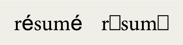
FIG 3.24: The word résumé is set in one font, but the accented e falls back to a default font or undefined character box.
Optical Sizes
Some typefaces have family members that suit a specific size range, called optical sizes. These variants harken back to the days of metal type, when different sizes of a typeface were cut independently to accommodate different sizes of output. For instance, an optical size intended for headlines was cut thinner than one for text, because it would be uncomfortably heavy if you just scaled the outlines up.
Most digital typefaces inspired by metal type are based on medium-sized fonts, so using them to set large type results in unbalanced and heavy typography. Similarly, using them to set small type results in crowded or harder-to-read typography. Type families like Adobe’s Garamond Premier Pro are designed with alternate sizes like caption, text, and display (mostly meant for headlines) for this very purpose. Typefaces with optical sizes can be especially useful for screen typography, because you can pick tailored fonts for the size and output you wish to use (FIG 3.25).

Captions can get pretty small in print at around 6–8 points, but on the web, type that small would likely be illegible. On screen, captions work better at around 12 pixels, depending on the typeface you use and the environment it’s rendered in. Some higher-resolution screens are more forgiving, because more pixels are devoted to rendering the text. We’ll examine setting type at text and display sizes later in the book.
The rise of web fonts brings us more typefaces specifically designed for the medium of the screen. Font Bureau has released their Reading Edge series (http://bkaprt.com/owt/19/), a collection of typefaces “designed to function reliably at 9px–18px.” Many of these families correspond to other existing optical styles. For instance, Benton Modern RE pairs with Benton Modern and Benton Modern Display.
Now that we have the vocabulary to talk about type, let’s look at a few specific typefaces.
Historical Context
Just as we can pick typefaces suited to our intended output and content, we can also work with typefaces throughout history to piggyback on their historical connotations. Every typeface was created at a certain time and place; some were created with specific uses in mind or in response to the conditions of their use, as we saw with Bell Centennial. Even if a typeface is reminiscent of a time and place, looks can deceive. Remakes and revivals are common, like Hollywood movies—though revisiting typefaces usually yields far more pleasing results.
Classic typefaces
Even if you’re not typographically inclined, you probably know the names of some popular typefaces, either by merit of having them on your computer or by hearing about them in public. Names like Helvetica, Garamond, Futura, Caslon, and Gotham may ring some bells.
Using “classic” typefaces can be a big time-saver, because they’ve generally proven themselves to be sturdy and inoffensive. But keep a couple of things in mind when considering a tried-and-true typeface:
Typography is inextricably tied to time. Styles come and go, and type fluctuates along with them. Many designs benefit from contemporary typefaces. Just because a typeface is classic or revered doesn’t mean it has a place on a website. For instance, Caslon is a beautiful book face. Printers used to say, “When in doubt, use Caslon,” because it was so dependable. But Caslon originated in the 1700s as a response to the low quality of paper and inks at the time. Those constraints don’t exist on screen. As beautiful as it is, I have trouble recommending Caslon over more contemporary typefaces like Chaparral or FF Meta Serif, which better suit the screen.
Remakes and revivals
As you get more familiar with typefaces, you may start to notice variations or editions of the same typeface. In the same way popular songs make comebacks from time to time, so do typefaces. Because the original metal matrices or printings for these typefaces are often outside the realm of copyright, designers can revisit past works and digitally reinterpret them. As of this writing, more than a dozen versions of Garamond are out there (FIG 3.26).
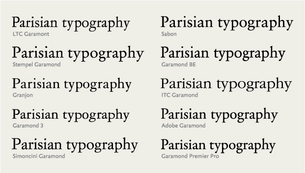
Some of these Garamonds are based on the drawings and work of a 15th-century Italian printer named—you guessed it—Claude Garamond. Some Garamonds are based on the metal cuts of letters in Garamond’s original work, while others are based on Jean Jannon’s work that was misattributed to Garamond (http://bkaprt.com/owt/20/). Others are based on the phototypesetting fonts based on the metal cuts based on the original work. Still others are based on all of those things, with a bit of something extra thrown in. And on and on.
That doesn’t even count the numerous Garamond revivals like Sabon, which seek to extend or sometimes “correct” earlier editions. How the hell can you determine which is the right one to use?
Each of these Garamonds is actually a different typeface. Some are technically better crafted than others; some are nearly identical; others are quite different. If you were set on using some form of Garamond on a project, you would first need to gather them up and evaluate their qualities.
Evaluating these interpretations can make your head spin. Do you judge a typeface based on how closely it adheres to the source material or in the context of its own design? Because I’m often more concerned with how well a typeface will perform than with its historical correctness, I prefer the latter. For example, Garamond Premier Pro (Robert Slimbach’s 2005 revival) is based on different optical sizes of cast metal meant to support varied contexts. The typeface includes regular, caption, subhead, and display sizes, each crafted for optimal display within those uses. Such flexibility in size and weight makes this version especially versatile.
On the other hand, many designers consider ITC Garamond a particularly bad adaptation. Just ask Michael Beirut, who regretfully refused to read a book after discovering it was set in ITC Garamond (http://bkaprt.com/owt/21/). From its almost comically large x-height to the way some strokes seem to push and pull at odd angles, ITC Garamond may retain its namesake, but it takes enough liberties with the source material to reduce it to a mere Garamond-like substance. Its presence feels campy and retro in all the wrong ways.
Then we have Sabon (named for Jacques Sabon, a student of Claude Garamond), a Garamond revival that sought to modernize the classic design. Created by typographer Jan Tschichold, it was prominently featured in the design system that made Penguin Books famous. Sabon is a beautiful, flexible reinterpretation of Garamond. Its success is due in part to Tschichold’s addition of italics based on the work of Robert Granjon, a Garamond contemporary. Tschichold designed the weights and styles to take up the same space when typeset so that compositors could use the same measurements to estimate the type fit, regardless of using regular, italics, or bolds. I bet Tschichold’s collaborators threw him a parade for this wonderfully efficient solution.
Do you need to know all this information about Garamonds or any other typeface? Well, it pays to do your homework. It’s one thing to choose a suitable typeface, but you can make a design even stronger by choosing one that matches the content and the context.
Revivals can be a mixed bag. They sometimes make great strides forward in design and in technical features for modern use. But they can just as easily make missteps, contorting the best parts of their predecessors. It’s not always easy to tell the difference, but if you find a revival typeface you want to use, spend time reading up on its background. Getting well acquainted will make spotting a typeface’s strengths and weaknesses seem like second nature.
Finding Alternatives
The rewards of typographic knowledge are cumulative. If you already know a typeface well, you can build on that knowledge to find other typefaces. To do so, let’s look at some specific visual attributes of a typeface. By scrutinizing a typeface, we can quickly determine if it suits our needs. Let’s start with something we all recognize as an example: Helvetica.
Now, Helvetica is about as pervasive as a typeface gets; it’s used on everything from logos to public signage around the globe. But is Helvetica the best choice for all of these uses? What are the visual attributes that make Helvetica Helvetica (FIG 3.27)? Let’s take a closer look:
• Helvetica has very little stroke contrast; the lines are basically the same weight.
• It has a generous x-height.
• The letters are based on simple geometric forms.
• The apertures, or openings inside of the letters, are nearly closed. Helvetica hugs that space tightly.
• The terminals, or ends of the strokes, are at right angles.

From these attributes, we can deduce a few things: Helvetica is clear and geometric, but not always very legible. Since the letterforms carry so little variation, it can be easy to confuse some letterforms for others. If we need a typeface for small type or long-form content, we may need to keep looking.
Staunch devotees of Helvetica may decry any criticism of the typeface. Some people see it as the ultimate typeface for design, because it’s basically a blank slate. They think you can throw anything at Helvetica and it will look just fine, because Helvetica brings little baggage and few connotations.
I feel the opposite. Helvetica is technically a beautiful face, but it’s also so overused that I have trouble feeling any response when I see it. To me Helvetica has become a generic default. People use it as a safe choice rather than face the fear of making a bad choice. They’d rather say nothing than risk saying the wrong thing.
Take a stronger stance. Since we already broke down some of Helvetica’s attributes, you can seek out typefaces that share similar traits (FIG 3.28). And don’t worry if you aren’t sure where to start looking—we’ll cover some good resources for finding typefaces in the next chapter.

To start, let’s look at FF Dagny. FF Dagny has similar proportions and counters, but it’s slightly more compact without the perpendicular terminals. FF Dagny also feels more diminutive than Helvetica, and not so machined. Another option is Pragmatica Slabserif, which shares many of Helvetica’s physical attributes but adds serifs, making it feel more academic. Either is a good option if you’re familiar with Helvetica but want something a little different.
Let’s try another example: Matthew Carter’s darling of early web typography, Georgia. Used widely across the internet, Georgia is a modern workhorse for onscreen type. As we saw in the last chapter, Carter not only designed it for the screen, but he built Georgia to stand up to some of the least hospitable rendering environments. Can we find typefaces that embody that same durability but aren’t as omnipresent? First, we need to break down what makes Georgia Georgia (FIG 3.29).
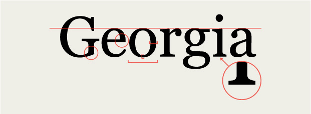
Let’s take a closer look:
• Georgia features a moderate stroke contrast.
• It has a generous x-height, counters, and spacing across letters.
• It has some sharp and pointy angles, as if it were elbowing its way through a crowded room.
• It has beefy, almost slab-like serifs.
We gravitate toward a few key things. Due to its spacing, high x-height, and lower stroke contrast, Georgia is a great candidate for setting long swaths of text. And it’s true: Georgia is a comfy typeface to sit back and read with. Because of the lower contrast, the letterforms carry a good rhythm, so text set in Georgia seems to flow. Georgia also has a mild heft to it—it’s not quite a slab serif, but not a delicate flower either. With these traits in mind, we can track down typefaces that share similar attributes (FIG 3.30).
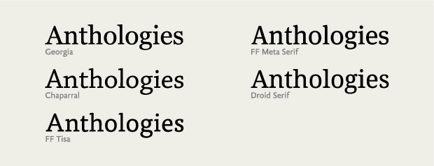
Take Chaparral (a personal favorite). It has some of the same traits that make Georgia so legible, like its x-height and openness, but with softer angles that evoke a more restrained elegance. Or look at FF Tisa—a sure option for running text with more modern serifs and even less stroke contrast. Lastly, Droid Serif takes Georgia’s angularity a step further as a pointier, boxier cousin, almost as if it’s sucking in a small paunch to impress someone.
Comparing type like this is one of my favorite exercises because you can clearly see the lines between typefaces. We don’t need to match every trait of a typeface we like to an alternate. The important thing is to recognize the traits that make the typeface unique. Playing off of that knowledge is extremely useful, because you can apply many of the same typographic methods as you would to the original typeface. Most important, building on that knowledge saves you time and makes you more proficient with type.
Now that you’ve learned how to look at and understand type’s anatomy, let’s see how we translate those traits to the screen, along with some considerations for bringing new assets to our websites.
Technical Considerations
Every typeface or typeface family consists of one or more font files. Fonts are individual files that contain the outlines of all the characters (i.e., the letters’ actual shapes as vectors) and information from the designer to space and render the type.
Fonts are software. Chances are you’ve seen these files before. They’re commonly TrueType (.ttf) or the newer standard, OpenType (.otf). OpenType fonts can contain outlines from either PostScript or TrueType fonts, but they’re bundled in a common wrapper. OpenType fonts work for Mac and Windows systems, while older fonts and formats may only support one or the other. As a major bonus, OpenType fonts can support more characters, more languages, and special features, like small caps and ligatures, all in one file.
In 2009, the Web Open Font Format (.woff) was introduced to promote a single format that could work across all browsers. WOFF is essentially a wrapper that contains a TrueType or OpenType font, but significantly compresses the files for website visitors. These advantages make WOFF the best choice when it’s available, and browser support is only increasing.
Loaded assets
All non-system web fonts are assets that need to download from a server for a page to render. While the trend is for file sizes to get smaller and connections to grow faster, you should keep the number of fonts you use to a minimum to keep your page weight as low as possible. Limiting your palette will help you maintain a coherent visual system and make sure your page load time is snappy.
Loading your fonts in CSS is the most basic way to get them onto your website, whether from your own server, a content delivery network (CDN), or a web font service. Depending on the size of your font file and the browser that’s loading it, visitors may not see text in your font right away. They may see a page rendered in system fonts instead. But there are ways to orchestrate the loading process and have more control over what a visitor sees first.
Web Font Loader
Some browsers display content before all assets are loaded, while others wait until they have every asset to render the page. In the first case, a visitor will experience FOUT and briefly see content in a default system font before it snaps into the web font after the file loads.
A great way to deal with FOUT is by using Web Font Loader, a framework codeveloped by the engineers at Typekit and Google (http://bkaprt.com/owt/22/). It provides custom webhooks—callback events via CSS and JavaScript—so you can tell your page to use different CSS rules as fonts load, after they load, or if they fail to load.
Having more control is useful in a variety of circumstances. You could specify default fonts for your page and override those with web fonts after they load. Web Font Loader also lets you adjust sizes and styles before and after loading, so your page looks balanced in either scenario. For example, condensed fonts can take up less horizontal space and often need to be set a bit larger than other fonts at the same size.
Even if you’re using Web Font Loader, you should still tailor your font stack to use the best fallback fonts for the situation. Fallback fonts are rendered when your web fonts fail to load, or are still loading. They’re your best bet to having good typography shine through in your web fonts’ absence.
Fallback fonts are the system fonts found on a visitor’s device. Depending on the platform and operating system they’re using, these fonts can vary. Code-wise, it’s the same approach we’ve been using with CSS stacks for years, but with our web font added to the front, like so:
font-family: chaparral-pro, Georgia, "Times New »
Roman", Times, serif;
Here, I’m loading the font Chaparral with common serif system fonts as my fallbacks. Depending on the browser, the first fallback font may be used to render my design until Chaparral’s file has loaded.
You can also use Web Font Loader to hide your content with the CSS attribute display: none; until your web fonts load, and thereby avoid FOUT altogether. But use caution: hiding your content also means a visitor won’t see any text for a potentially long time, especially if your fonts have large files or take more than a few seconds to load. Further, if your web fonts don’t load, content will stay hidden until your browser stops trying and times out, rendering the page in system fonts.
Some designers consider FOUT more of a feature than a bug, and I tend to agree. With reading and browsing happening on unknown connection speeds (like flaky cell connections), seeing content first can be a very good thing, even if it’s not in your ideal typeface. The thing I try to avoid most in my designs is not FOUT but a jarring shift in the layout when a web font finishes loading. This shift is usually due to sizing discrepancies between your layout in system fonts and your chosen web font.
Because of these potential drawbacks, I prefer to approach web typography using system fonts (my fallback fonts) and save web fonts as a progressive visual enhancement partnered with Web Font Loader. This way, my pages load and render with nice typography even if JavaScript is disabled or some other unforeseen circumstance occurs. When the web fonts do load, Web Font Loader ensures that my CSS will switch over to the values appropriate for the fonts I’m using. But the fallback fonts are key. They’re like the alt attribute for fonts, and they ensure that no matter what, your site can still be read.
With a little extra effort, you can use Web Font Loader to load your fonts asynchronously, or separately from the rest of the page and its assets. This means that if the files are large or slow to transfer, they won’t block the page from displaying. Sean McBride’s article on the topic outlines a few different patterns, along with potential benefits and drawbacks (http://bkaprt.com/owt/23/).
Rendering
Browsers and operating systems use a variety of technologies to display, or render, a font on a web page. As a result, a font can appear different in different situations. In some cases, a font that looks crisp and clear in one browser will look pixelated and ugly in another.
Fortunately, rendering problems like these are a temporary issue. Browsers are evolving and self-updating faster than ever, and as they do they’re incorporating new, better rendering engines. Likewise, high-resolution screens—such as the Retina displays on the latest Apple devices—mean that some older rendering concerns are falling by the wayside.
That said, rendering quality is a factor we need to consider. Legacy browsers are still out there in large numbers, and they’re often the worst affected. Even though rendering engines are improving, there are enough differences that we need to take them into account.
The two latest and best rendering engines are Core Text (used by Mac OS X and present on all iOS devices) and DirectWrite (used on the latest version of Windows). Both render text very well, but they do so very differently (http://bkaprt.com/owt/24/). Core Text adheres closer to the intended design, but it has a heavier hand with anti-aliasing that can make letters feel beefy or soft; DirectWrite, meanwhile, favors the screen’s pixel grid, which can make the letterforms very crisp, but also spindly (FIG 3.31).
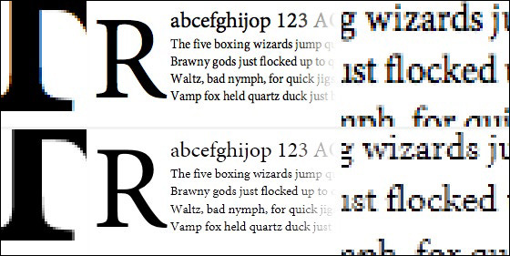
FIG 3.31: Examples of the same typeface and how it’s rendered by core Text (top) and directWrite (bottom).
Neither approach is wrong; they’re two ways to tackle the same problem. When people look at text on the opposite platform than they are used to, it can feel weird to them. When Safari for Windows introduced Core Text rendering to Windows users, many people were repulsed by the fuzzy text (http://bkaprt.com/owt/25/). How we react to font rendering often comes down to what we’re familiar with, not which approach is right.
With the level of fragmentation across platforms and devices, it’s crucial to test our designs for proper typographic rendering and fidelity.
For more information on rendering type on the web, check out Tim Brown’s articles, “CSS Properties That Affect Type Rendering” (http://bkaprt.com/owt/26/) and “Type Rendering on the Web” (http://bkaprt.com/owt/27/).
Soon, though never soon enough, rendering will be even less of a concern. Take heed, though; it still won’t mean you can use any old typeface. But the conversation will shift toward appropriateness and technical acuity—that is, the design—and away from the display performance. For in-depth information about rendering and screen optimizing, see Peter Bi ak’s article “Font Hinting” (http://bkaprt.com/owt/28/).
We’ve gone through the gritty details on why typefaces look the way they do. Now, let’s look at how to select and combine typefaces.