
13. Using Power View to Create Reports
In This Chapter
• Create charts you can scroll through.
• Highlight a specific item in multiple reports with one click.
• Apply a single filter to multiple reports at the same time.
• Place your data on a map.
Dashboard is a word you hear a lot when it comes to Excel reports. A dashboard is a sheet with multiple charts and tables that provide various ways of interpreting data. Depending on the number of charts and tables, it can take time to build and update. And it would take a bit of knowledge to make a dashboard you can filter or sort, or quickly focus on a particular item with a click. In Excel 2013, Microsoft has made creating dynamic dashboards a lot easier (and cooler!) with Power View. With Power View, you can create a sheet with multiple tables, charts, and maps. With a few clicks, you can filter, sort, or focus all the visualizations on one or more selected records. The downside, though, is that you cannot share the workbooks with pre-Excel 2013 users.
Power View Requirements
Power View is a COM add-in in the Professional Plus Office version of Excel available on PCs. The add-in must be enabled before you can use the tool. See the “COM Add-Ins and DLL Add-Ins” section in Chapter 1, “Understanding the Microsoft Excel Interface,” to enable the Power View add-in.
Power View requires Microsoft Silverlight to be installed, and if it’s not, it prompts you the first time you try to create a report, as shown in Figure 13.1. Click the Install Silverlight link in the message bar and follow the prompts to download and install the program. When the installation is complete, return to Excel and click the Reload button in the message bar to continue with the creation of your report.
Figure 13.1. You are prompted to install Silverlight if it’s not already installed.
Creating Reports
Creating a Power View report is simple. Make sure the data table is properly set up with no blank rows or columns, and each column must have a unique heading. Select a cell in the data table and go to Insert, Reports, Power View. A new sheet is added with the Power View template, as shown in Figure 13.2.

Figure 13.2. You start your Power View report with a blank template that you build visualizations on.
Once you have the template, open the group (Range in Figure 13.2) and choose the report fields by selecting them from the field list (select the check box, not the field name) or dragging them down to the Fields list box below the listing. Select the fields in the order you want them to appear from left to right in a table. As you select fields, a table is created in the report area, as shown in Figure 13.3. This table is just one of the data visualizations available. See the section “Changing Data Visualizations” for information on how to change the data visualization to another type, such as a bar chart.
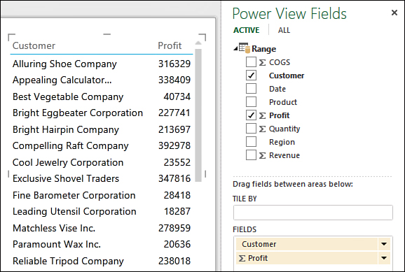
Figure 13.3. As you select fields, they’re added to a table, the default visualization.
Changing the Values Field Calculation
When Excel identifies a field in the Values area as numeric, it automatically sums the data. If it cannot identify the field as numeric, it counts the data. No matter which calculation type Excel appoints to a value field, it can be changed by clicking the arrow to the right of the field and selecting the desired calculation type, as shown in Figure 13.4.
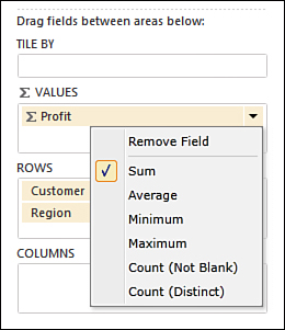
Figure 13.4. You can apply a variety of calculations, such as Sum and Average, to the data.
Moving and Resizing a Visualization
Once you’ve added a visualization, you can move it around the report and resize it. To select a visualization, click on it and sizing handles appear in all four corners and in the center of each side, as shown in Figure 13.5. To resize the visualization, place your cursor on a handle. When it turns into a double-headed arrow, click and drag to resize. To move the visualization, place your cursor along the frame of the visualization until you see a dotted frame line and the cursor turns into a hand, as shown in Figure 13.5. Click and drag the visualization to a new location on the template.

Figure 13.5. Proper placement of the cursor is required to be able to drag and move a visualization.
 Note
Note
Unlike normal charts and tables, the visualizations have scrollbars as part of their frames. So, you don’t have to size a visualization to show all the data. Size it to fit your report and you can scroll to specific data, or filter it, as discussed in the “Filtering” section.
Undoing Changes to a Report
To undo a change to a visualization, such as resizing, use the Undo button found on the Power View tab in the Undo/Redo group. The undo/redo buttons in the Quick Access toolbar are disabled while on a Power View sheet.
Inserting and Formatting a Report Title
To add a title to the report, click where it says “Click Here to Add a Title” and enter your title. When the cursor is in the title area, the Text tab appears to the right of the Power View tab. Highlight the title and use the options on the Text tab to change the font style or size and text alignment.
Note
The formatting options on the Home tab are not available for formatting the title.
Changing Data Visualizations
The default data visualization is a table, but it can be changed to other types of tables, to charts, or even to maps. To change the visualization, select it, go to Design, Switch Visualization, and select the desired data visualization. Depending on the visualization selected, different options are available on the Design and Layout tabs.
 Tip
Tip
If you find a data visualization unavailable, try switching back to the default Table visualization. Some options, such as Tiles, are only available from one of the Table visualization options.
Inserting Table Data Visualizations
The Table drop-down has three options to choose from: Table, Matrix, and Card. Figure 13.6 shows those three options and also another option: Table with Tiles. Each option groups and summarizes data in a different way, allowing you to choose the layout that works best for your data. For example, the Matrix option grouped the regions together by company, allowing the user to see, at a glance, how a company is doing across the regions.
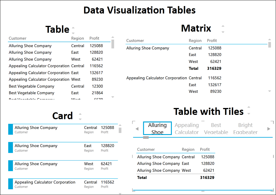
Figure 13.6. You can choose from several table visualizations to best represent your data.
Table is the default report type. The selected fields are displayed from left to right in a table format. Matrix is similar to a pivot table, where you have row, column, and value fields, as shown in Figure 13.7. You can change the layout of the matrix by selecting and dragging the fields between the areas in the task pane. Card creates mini reports, summarizing the selected data.
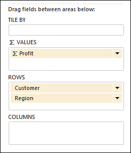
Figure 13.7. Creating a matrix visualization is similar to setting up a pivot table—they both have row and column fields.
Note
See the section “Adding Tiles to a Visualization” to learn how the visualization Table with Tiles in Figure 13.6 was created.
Inserting Chart Data Visualizations
Although the charts available in Power View don’t offer as many formatting and layout options as normal charts, they do have functionality other charts do not have. Power View charts can be scrolled through, filtered, and viewed as multiple mini charts (see Figure 13.8).
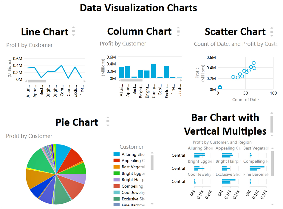
Figure 13.8. You can choose from several chart visualizations to display your data in the best way.
There are five chart types available. Bar and Column charts each have their own buttons with the following options: Stacked, 100% Stacked, and Clustered. Line, Scatter, and Pie are found in the Other Chart drop-down and do not have additional options.
You can change the layout of the charts by selecting and dragging the fields between the areas in the task pane. In addition to standard chart areas, like Values and Axis, there are areas for Vertical Multiples and Horizontal Multiples. These areas are used to make mini charts like the bar chart with vertical multiples in Figure 13.8. That chart was created by placing the Customer field in the Vertical Multiples area in the task pane.
Note
See the section “Adding Tiles to a Visualization” for information about the Tile By area in the task pane.
Inserting Map Data Visualizations
Power View uses Bing Maps to plot your data to a map. If you have a table with location information, such as the city and state or longitude and latitude, and the value you want plotted, a bubble is placed on a map, its size based on value relative to the other data being mapped. For example, the map in Figure 13.9 shows company profit in Rapid City, South Dakota; Pierre, South Dakota; and Sioux Falls, South Dakota. You can tell from the size of the bubble that Rapid City had the lowest profit margin of the three cities.
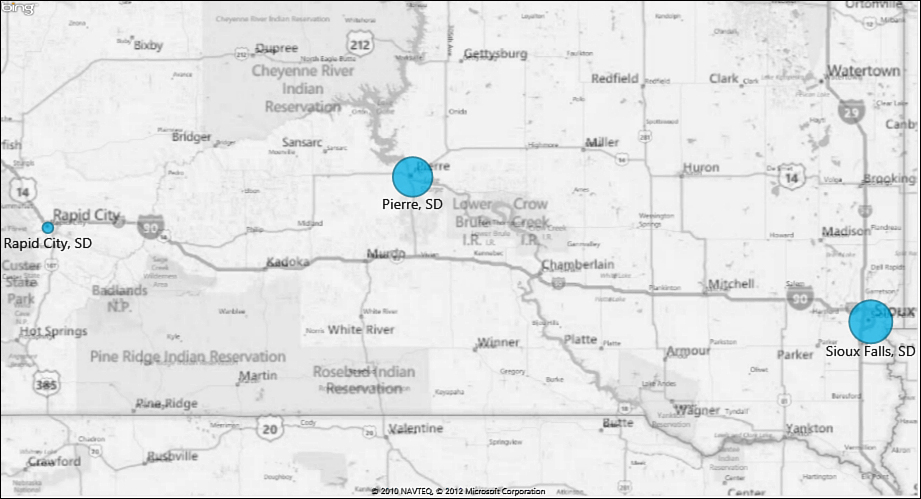
Figure 13.9. Use a map to compare values between cities. The larger the bubble, the larger the value.
When you select the Map visualization, you have at least two areas you must fill in—the Size and either Locations or Longitude or Latitude. Size is the field that controls the size of the bubbles. Locations or Longitude or Latitude control where on the map the bubble is placed.
Note
The first time you place a field in the Locations area, you may get the prompt shown in Figure 13.10. Select Enable Content to allow the data to be sent to Bing.
Figure 13.10. Allow Excel to send location information to Bing so it can map your data.
For different-colored bubbles, place the field used to define the differences in the Color area. If each bubble is equivalent to only one value, then the bubble will only have one color. For example, the three locations in the sample map are equivalent to West, Central, and East regions in the data. If the Region field is placed in the Color field, then each bubble will be a different color. But if the Customer field is placed in the Color field, each bubble will be like a pie, each slice being a different color to represent a different company being summarized in the profit.
Adding Tiles to a Visualization
Tiles add a dynamic navigation strip to the top of a visualization, filtering the visualization to show only values selected from the strip, as shown in the Table with Tiles visualization in Figure 13.6. The Design, Tiles, Tiles option is only available in the ribbon when you have a table visualization selected, but you can add a tile to any visualization by dragging a field down to the Tile By area in the task pane.
Tip
If the Tile Type drop-down isn’t enabled after adding a tile to a visualization, make a selection from the tile. The drop-down should become active.
To remove tiles from a visualization, select the field in the Tile By area and drag it up to the field listing or click the arrow to the right and select Remove Field.
Combining Multiple Visualizations
You aren’t limited to a single visualization or only certain fields in a report. You can mix visualizations and fields, as shown in Figure 13.11 where we have a profit by customer chart, a region and profit by customer matrix, and a profit by product card.
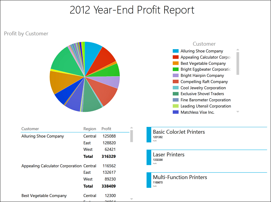
Figure 13.11. You can create multiple visualizations that can update together.
To create extra visualizations, after creating your first, click elsewhere on the template so the first visualization is no longer selected. Then, create your new one. Power View places it where it finds an empty space.
When you have multiple visualizations on a report, they are all linked, even if they use different fields, because they come from the same data set. You can apply a filter that affects them all at the same time (see the section “Filtering” for more information).
To delete a visualization, select it and press Delete on the keyboard or right-click on the visualization and select Cut.
Changing Colors
To change the colors in a chart, you have to apply a theme to the report, which affects all of its visualizations and any other Power View sheets in the workbook. You cannot select a single visualization on a multivisualization report or a single series on a chart and change just its colors.
Themes are found in the Themes group of the Power View tab. Click on the Themes drop-down and it opens to show a variety of themes available. Each theme consists of a color and font palette. You do not get a preview when you place your cursor over an option. Instead, you must select an option and update your report to see how it looks.
If you decide you like a color but not the font type, you can select a new font from the Font drop-down. Again, this affects all the visualizations in the active report. You can also change the Text Size.
For more information about themes, see the section “Using Themes to Ensure Uniformity in Design” in Chapter 4, “Formatting Sheets and Cells.”
Sorting
Most visualizations can be sorted by value or category in ascending or descending order. For example, you can show the largest profit makers at the top of a table by sorting the profit value in descending order.
To sort a table visualization, click on the column header and an arrow appears on the far right of the column, showing the sort order. Only one column at a time can be sorted in a table.
Matrix visualizations can be sorted by one or more nonvalue columns. Click on the column header and an arrow appears on the far-right side of the column. If you sort by a value header, then any previous sort selections are lost.
Chart sort options appear in the upper-left corner of a chart when you place your cursor over it. Pie, bar, and column charts can be sorted by selecting the sort field from the category drop-down, as shown in Figure 13.12. Click Asc or Desc to change the sort order.
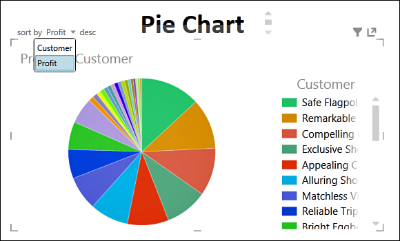
Figure 13.12. Charts that can be sorted have the sorting options in the upper-left corner.
Cards, line charts, scatter charts, and visualizations with tiles cannot be sorted. The exception for line charts and scatter charts is if they have been designed as multiples. In that case, the sort options are available.
Filtering
You can filter the data used by the visualizations to show one or more categories. If you have multiple visualizations in a report, you can apply a filter that affects them all, or filter a single visualization.
If the Filters area isn’t visible, go to Power View, View, Filters Area and the area appears to the right of the report. Depending on your selection in the template area, you see a View option and possibly another, such as Chart. Selecting the View option allows you to click and drag fields from the field listing to the Filters area for filtering. Applying a filter in this way filters all the visualizations on that template, as shown in Figure 13.13 where all the visualizations only show data pertaining to Alluring Shoe Company.
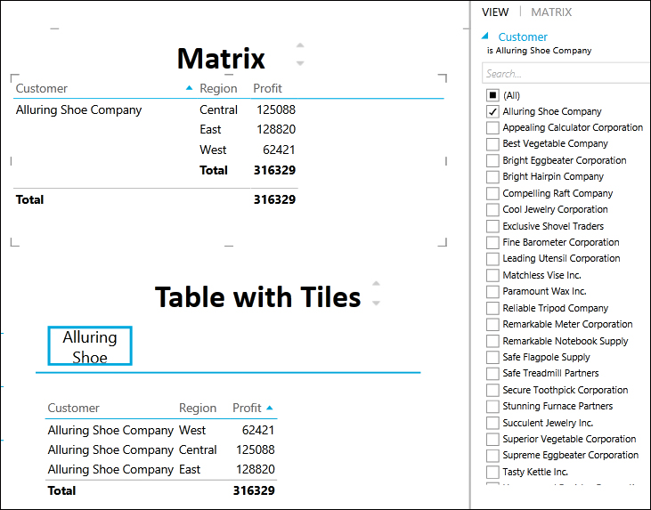
Figure 13.13. Setting up a filter in the View option filters all the visualizations on the report.
If you select a specific visualization, such as a matrix table, then a second filter option, Matrix, appears. Select that option to see and filter the fields used for that visualization. This filters only the selected visualization, as shown in Figure 13.14.
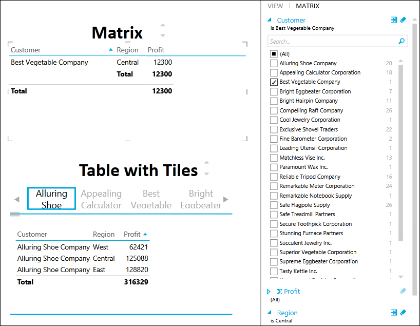
Figure 13.14. You can filter a specific visualization by selecting it then choosing its option in the Filters area.
Note
You can only filter visualizations with tiles using the View option. Such visualizations do not allow specific visualization filtering.
To select the items to include in the filter, click the field in the Filters area. This opens and shows all the items in the field. If you want to filter by only one item, you can select the item name. But if you want to filter by multiple items, you must select the check box.
You can also type text in the search field and press Enter to return matching values from the filter list. The search is additive. That is, if you select the check box of the results and perform another search and selection, the first item remains selected.
You can directly access the filter specific to a visualization by clicking the funnel you see in the upper-right corner when you place the cursor over the visualization.
To clear a filter, click the eraser-like icon to the right of the field name. To delete a filter from View mode, click the X icon to the right of the field name.
Advanced Filter Mode
If you have a long list of items to scroll, it might be easier to filter by a range or logic value. When filtering all the visualizations (in the View option), you have the Advanced Filter Mode. To access this option, click the icon with an arrow, shown in Figure 13.15. If you’re filtering a text field, you toggle between two options: List Filter Mode (the original mode) and Advanced Filter Mode. If you’re filtering a value field, you toggle between three options: List Filter Mode, Advanced Filter Mode, and Range Filter Mode.
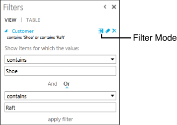
Figure 13.15. Select the Filter Mode icon to toggle through the different filter modes, including the Advanced Filter Mode, which allows you to use logic items to filter your data.
Advanced Filter Mode allows you to select a logic option, such as Contains or Does Not Contain, and then enter the value you want to compare the data with. For example, in Figure 13.15, the list was filtered for all customer names that contain the word Shoe or Raft. Press Enter or click Apply Filter to update the visualizations with the results.
Range Filter Mode gives you a slider bar where you can move the ends to define a value range. Figure 13.16 shows the data filtered for revenue records greater than or equal to 10,504.

Figure 13.16. Use the slider bar to narrow down a range to filter a value field by.
Highlighting
If you have a chart on a report, you can use that chart like a filter to highlight a specific item in all visualizations in the report. To do this, click on the series in the chart, such as a pie slice, that represents the item you want to filter by. This updates all the tables to show only records for the selected item and all series in the charts dim, except for the selected series. To highlight multiple series, hold down the Ctrl key as you select them.
To return the visualization to normal, select any selected item again.
Using Slicers
Just like the slicers in pivot tables, slicers in Power View allow you to filter a report, but in a more user-friendly way. To create a slicer, create a table visualization with the field you want to filter by, then go to Design, Slicer, Slicer. You can then select items from the slicer to filter the other visualizations on the report. To select multiple items, hold down the Ctrl key as you make your selections. To quickly clear all selections, click the eraser-like icon in the upper-right corner of the slicer.
Sharing Power View Reports
Currently, Power View reports created in Excel 2013 can only be shared with other Excel 2013 users. If you send it to someone using an earlier version of Excel, a generic picture with Power View across the top will be in place of the reports.