
12. PivotTables and Slicers
In This Chapter
• Create a PivotTable.
• Sort and filter a PivotTable.
• Group dates in a PivotTable.
• Insert slicers to help users filter a PivotTable.
PivotTables can summarize one million rows with five clicks of the mouse button. For example, if you have sales data broken up by company and product, you can quickly summarize the sales by company then product or, with a few clicks, reverse the report and summarize by product then company. Or, you’re in charge of all the local kids soccer leagues and you want to create a report showing the number of boys versus girls, grouped by age. A PivotTable can do all this and more.
They’re so powerful with so many options that this chapter cannot cover it all. This chapter provides you with the tools to create straightforward, but useful, PivotTables. For even more details, refer to PivotTable Data Crunching: Microsoft Excel 2013 (ISBN 978-0-7897-4875-1) by Bill Jelen and Michael Alexander.
There is an advanced version of PivotTables called PowerPivot that this book does not review. PowerPivot is a powerful data analysis tool for working with very large amounts of data. For information on PowerPivot, refer to PivotTable Data Crunching: Microsoft Excel 2013 (ISBN 978-0-7897-4875-1) by Bill Jelen and Michael Alexander.
Preparing Data for Use in a PivotTable
To take full advantage of a PivotTable’s capabilities, your data should adhere to a few basic formatting guidelines:
• There should be no blank rows or columns.
• If a column contains numeric data, don’t allow blank cells in the column. Use zeros instead of blanks.
• Each row should be a complete record.
• There shouldn’t be any Total rows.
• There should be a unique header above every column.
• Headers should be in only one row; otherwise Excel will get confused, unable to find the header row on its own.
Figure 12.1 shows a data set properly formatted for working with PivotTables. Figure 12.2 shows a data set not suitable for PivotTables. Instead, the dates should all be in one column. And although a person might understand that all the data shown is relevant to the Central region, Excel does not.

Figure 12.1. This data is great for PivotTables.
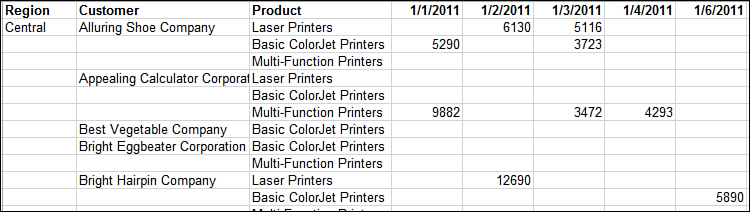
Figure 12.2. This data set is not suitable for a PivotTable.
PivotTable Limitations
As incredibly powerful as PivotTables are, they do have a few limitations:
• You cannot add a calculated item to a grouped field.
• If a field is grouped by days, grouping by months, quarters, or years will undo the group by days.
• Changing the source data does not automatically update the PivotTable. You must click the Refresh button.
• Blank cells confuse Excel. A single blank cell in a numeric column will make Excel think the column contains text values, changing the default behavior for that column.
• You cannot insert rows or columns in a PivotTable.
PivotTable Compatibility
PivotTable compatibility between Excel 2013 and the legacy versions is a bit tricky:
• If you open an .xlsx file with a converter in a legacy version, the PivotTables will not work.
• If you create PivotTables in an .xlsx file (file type used by Excel 2007 and newer) and then save the file as an .xls file (file type used by legacy Excel), the PivotTables will not work. The Compatibility Checker dialog box will open when you save the file, warning of the incompatibilities, such as Show Values As.
• To get a PivotTable created in 2013 to work in legacy Excel, save the file as an .xls file before creating the PivotTable. Close and reopen the file, and then create the PivotTable. Any options not compatible with older versions of Excel, such as slicers (which you can read more about later in this chapter), will not be available. Strangely enough, you can apply Show Values As and save the file. Excel will not warn of compatibility issues and the PivotTable will open fine in legacy versions.
PivotTable Field List
There are two parts to a PivotTable report—the PivotTable itself and the PivotTable Field List, which appears only when a cell in the PivotTable is selected. The PivotTable Field List consists of a list of the column headers in the data set (the fields) and the four areas of a PivotTable.
Figure 12.3 shows a basic PivotTable, using all four areas of a PivotTable to summarize product profit by year and quarter on a regional basis. The four areas are as follows:
• Filters—Limits the report to a specific criteria; in this case, we are looking at only the Central region’s revenue. Instead of creating a separate report for each region, use the Report filter to view the desired region.
• Columns—The headers going across the top of the PivotTable—in this case, the breakdown by year and quarter.
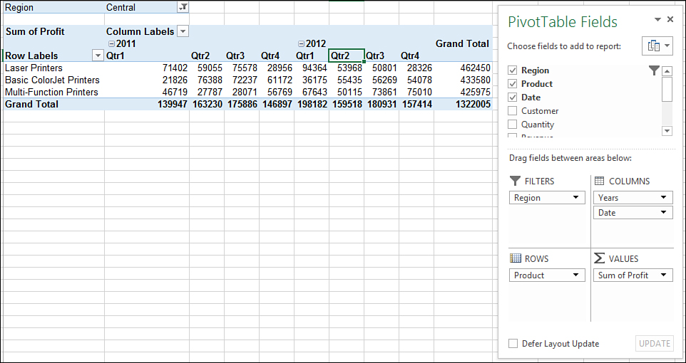
Figure 12.3. A basic PivotTable using all fields to summarize 2011 and 2012 quarterly product sales for the Central region.
• Rows—The headers going down the left side of the PivotTable—in this case, the Products. If there is more than one field, the fields will appear in a hierarchical view, with the second field under the first field.
• Values—The data being summarized—in this case, Profit. The data can be summed, counted, and many other calculation types.
Not all four areas must be used. Each area can have more than one field.
Creating a PivotTable
There are three ways to create a PivotTable. With two of the methods—Quick Analysis tool and Recommended PivotTables—you pick from a group of PivotTables Excel has selected for you. You can still customize the report after it’s placed on the sheet—Excel just offers a place to start. The third method allows you to design a report from scratch.
Using the Quick Analysis Tool
The Quick Analysis tool is a quick way to create a PivotTable. When you select data on the sheet, the Quick Analysis tool appears in the lower-right corner of the selection. When you click on the icon and select Tables, Excel suggests different PivotTables based on its analysis of the selected data. Placing your cursor over a PivotTa... icon opens a preview window, as shown in Figure 12.4. If you click the icon, Excel creates the PivotTable on a new sheet. If none of the previews show what you want, select the More icon to open the Recommended PivotTables dialog box.
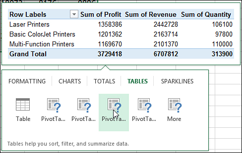
Figure 12.4. Use the Quick Analysis tool to bring up a list of suggested PivotTables.
You don’t have to select the entire data set. As long as your data is set up properly, Excel will be able to extrapolate the table from the selection of two cells.
Viewing Recommended PivotTables
As long as your data is set up properly, you don’t have to select the entire table before viewing Excel’s recommendations. You must have at least one cell in the source data selected, and then go to Insert, Tables, Recommended PivotTables and the Recommended PivotTables dialog box shown in Figure 12.5 opens.
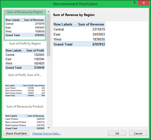
Figure 12.5. Excel recommends PivotTables based on its interpretation of your data.
On the left side of the dialog box are Excel’s recommended PivotTables. Click on a PivotTable and a larger version appears on the right side of the dialog box. When you see one you like, select it and then click OK. The PivotTable is created on a new sheet.
If you don’t see a PivotTable you like, click the Blank PivotTable button to create your own PivotTable. See the following section, “Creating a PivotTable from Scratch,” for more information.
Creating a PivotTable from Scratch
Creating a PivotTable is simple if the data set is suitable for PivotTables. Once you’ve told Excel what the data source is, it can be quickly created by selecting the desired fields in the field list. Based on the data in a field, Excel places the selected field in the area it thinks it should go. Text fields are placed in the Rows area. Numeric fields are placed in the Values area and summed.
When you select fields in the field list and add them to an area that already contains fields, the new fields are placed below the existing fields. The up/down layout in the area corresponds to a left/right layout of the fields in the PivotTable, except for the Filters area, which also goes up/down.
The order of the fields and the area in which they’re located can be changed by clicking the field and dragging it to a new location. You can also drag fields from the field list to an area, instead of selecting them and letting Excel choose their locations.
The PivotTable in Figure 12.6 summarizes product quantity and profit by customer. It also allows users to filter by region.
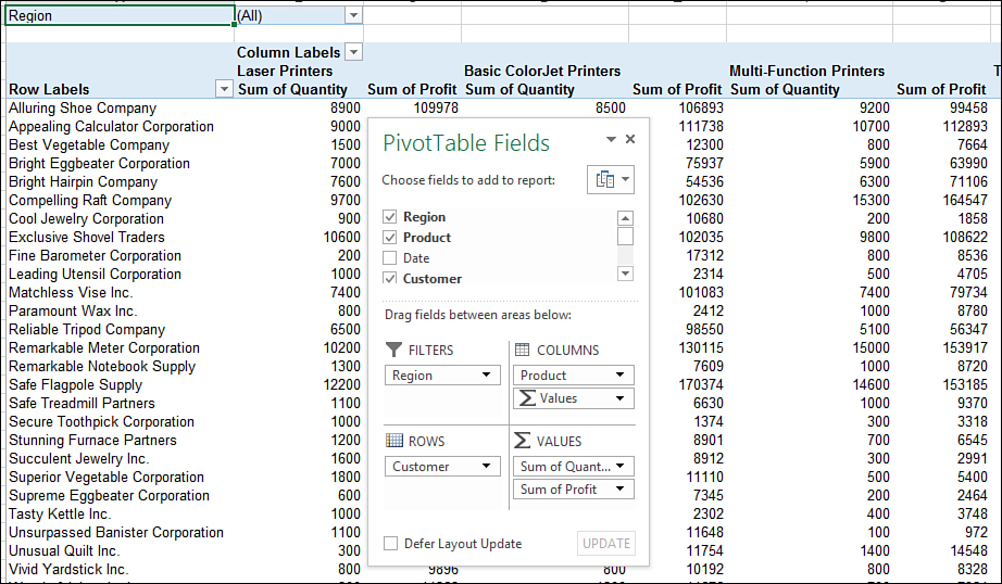
Figure 12.6. You aren’t limited to PivotTable reports Excel thinks would be useful. Design your own or customize one from Excel’s suggestions.
To create this report, follow these steps:
1. Make sure the data set is set up properly, as explained in the section “Preparing Data for Use in a PivotTable.”
2. Select a cell in the data set.
3. Go to Insert, Tables, and click the PivotTable button (not the drop-down arrow).
4. The Create PivotTable dialog box, shown in Figure 12.7, opens and Excel selects the data set. The address is shown in the Table/Range field. If the selection is correct, continue to step 5. If the selection is not correct, return to step 1.
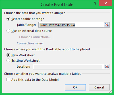
Figure 12.7. Use the Create PivotTable dialog box to identify the source data and where the PivotTable should be created.
 Caution
You could correct Excel’s selection, but if Excel didn’t select the data set properly, then there is likely something wrong with its layout, which could affect the PivotTable created.
5. Select the location where the PivotTable is to be placed. The default location is always a new sheet. If using an existing sheet, ensure there is enough room on the sheet for the PivotTable’s rows and columns.
6. Click OK. The PivotTable template and field list appear on a new sheet (or on an existing sheet, if that is what you selected), as shown in Figure 12.8.
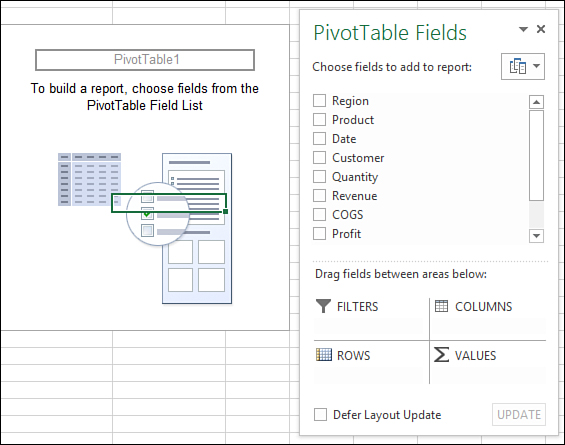
Figure 12.8. Once the PivotTable template and field list appear, you can start designing the report.
7. Select the fields that should be the row labels, Customer. If there needs to be more than one field for the row labels, select them in the order they need to appear in, left to right, on the report.
8. Select the fields the report should summarize, Quantity and Profit. Notice that when you select two or more fields to summarize, Excel adds a Values field to the Columns area.
9. Add a column label, Product, by clicking and dragging the field from the list to the Columns area.
10. Click and drag the Region field from the list to the Filters area.
Removing a Field
To remove a field from a PivotTable, deselect it from the field list or click it in the area and select Remove Field. You can also click and drag the field from the area to the sheet until an X appears by the cursor. When the X appears, release the mouse button.
Renaming a Field
You can rename a field as it appears in the PivotTable by typing a new name directly in the cell. The name must be unique and cannot be the same as the field’s original name before it was placed in the PivotTable.
Caution
Do not double-click on a PivotTable cell to edit it as this command is often reserved for the drill downs. For more information on drill downs, see the section “Viewing the Records Used to Calculate a Value.”
Changing the Calculation Type of a Field Value
When Excel identifies a field as numeric, it automatically sums the data. If it cannot identify the field as numeric, it will count the data. No matter which calculation type Excel appoints to a value field, it can be changed by selecting the field in the PivotTable; going to PivotTable Tools, Analyze, Active Field, Field Settings; and selecting an option from the Summarize Values By list in the Value Field Settings dialog box. You can also open the Value Field Settings dialog box by right-clicking on a value in the PivotTable and selecting Value Field Settings.
Changing How a PivotTable Appears on a Sheet
There are three ways the PivotTable report will appear, as shown in Figure 12.9. The view can be changed by going to PivotTable Tools, Design, Report Layout, and selecting the desired layouts from the drop-down:
• Compact—This is the default configuration for .xlsx, .xlsm, and .xlsb files. All the fields in the row labels area share the same column. The Total, such as the West Total, appears in the same row as the field.
• Outline—The fields in the row labels area each have their own column. The Total, such as the West Total, appears in the same row as the field.
• Tabular—This is the default configuration for an .xls file. The fields in the row labels area each have their own column. The Total, such as the West Total, appears in its own row beneath its group.
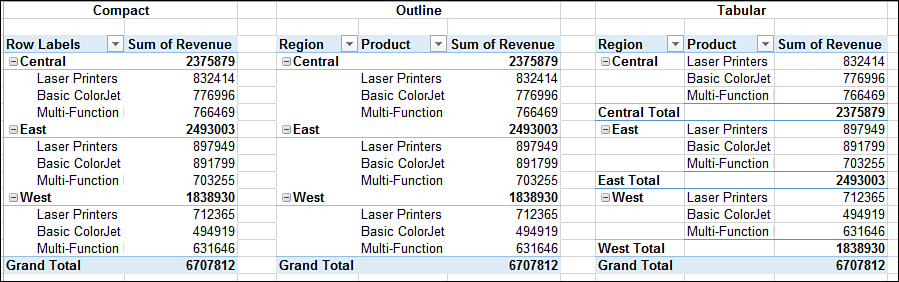
Figure 12.9. Excel offers three ways of viewing and working with a PivotTable report.
If you have either Outline or Tabular applied, you can choose to repeat the item labels by selecting Repeat All Item Labels from the Report Layout drop-down.
PivotTable Sorting
Excel automatically sorts text data alphabetically when building a PivotTable. Any row label, column label, or record can be dragged to a new location. To reset the table back to its default state, remove the affected field from the area, refresh the table, then put the field back.
Another option is to sort using one of the methods in the following sections. When a sort is applied in a PivotTable, it remembers the settings, so as you pivot the table, the sort sticks.
PivotTable Quick Sort
The quick sort buttons offer one-click access to sorting cell values. There are four entry points to the quick sort buttons:
• On the Home tab, select Editing, Sort & Filter, Sort A to Z or Sort Z to A.
• Go to Data, Sort & Filter; select either the AZ or ZA quick sort buttons to sort the active field.
• Right-click a cell in the PivotTable, select Sort, and choose from Sort A to Z or Sort Z to A.
• From a pivot label drop-down, select Sort A to Z or Sort Z to A.
 Note
Note
The actual button text may change depending on the type of data in the cell. For example, if the column contains only values, the text will be Sort Smallest to Largest. If the column contains text, it will be Sort Z to A.
Unlike sorting outside PivotTables, it doesn’t matter if you have more than one cell selected during the sort. Excel automatically sorts the entire PivotTable. If multiple columns are selected, Excel sorts by the leftmost column in the selection.
To quickly sort a field, select a cell in the field you want to sort by or a label to sort by labels. Apply the desired quick sort method outlined previously. The data re-sorts based on the selection. The Sort dialog box, discussed in the following section, is updated for the selected field.
Caution
A downside of using the quick sort buttons on the Home and Data tabs is that if you continue to pivot the table, Excel forgets the sort settings. However, if you use the PivotTable sort options, Excel remembers the sort settings.
Sort Text Columns with Sort (Fieldname) Dialog Box
The Sort (Fieldname) dialog box provides advanced options for sorting text columns, such as sorting the selected column based on the total of another field. For example, you could sort customers by the sum of all profit. To bring up the dialog box shown in Figure 12.10, select a cell containing text and use one of the following methods:
• Select a cell in the desired field, go to the Home tab, and then select Editing, Sort & Filter, Custom Sort.
• Select a cell in the desired field, and then go to Data, Sort & Filter, Sort.
• Right-click a cell in the desired field in the PivotTable, select Sort, and select More Sort Options.
• From a pivot label drop-down, select More Sort Options. You can select the field to sort at the top of the drop-down.
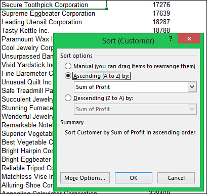
Figure 12.10. Use the Sort (Fieldname) dialog box for advanced sorting options of text columns.
The Sort (Fieldname) dialog box provides the following additional sorting options, which the PivotTable will remember as the table layout is changed:
• Manual—This option is the default sort, which clears, but doesn’t undo, any previous settings.
• Ascending/Descending—These options sort the selected column based on the original field or a value field selected from the drop-down.
If sorting a text column, a More Options button is available in the dialog box. Clicking the button reveals the following options:
• AutoSort—Select to have the sort updated when the PivotTable is updated.
• First Key Sort Order—Available when AutoSort is deselected, allowing the field to be sorted by a custom list.
• Sort by Grand Total—Available when either Ascending or Descending is selected with another field; this option sorts the data using the Grand Totals.
• Sort by Values in Selected Column—Available when either Ascending or Descending is selected with another field; this option sorts the data using the column of the selected cell.
Sort Rows or Columns by Value
When you right-click on a calculated value cell and select Sort, More Sort Options, the Sort By Value dialog box opens. With this dialog box, you can sort the report by the selected value’s row or column.
To sort by column, select Top to Bottom from the Sort Direction options. This is similar to sorting using the quick sort buttons. To sort by the value’s row, select Left to Right. This sorts all the value columns by the values in the selected row. For example, Figure 12.11 is sorted left to right, largest to smallest by row 6. This reorganizes the columns so that the Laser Printers are the leftmost column, because it contains the largest value in row 6. If you select a cell in row 7 and perform the same sort, Multi-Function Printers will move to become the leftmost column because the largest value in that row is in the Multi-Function Printers group.
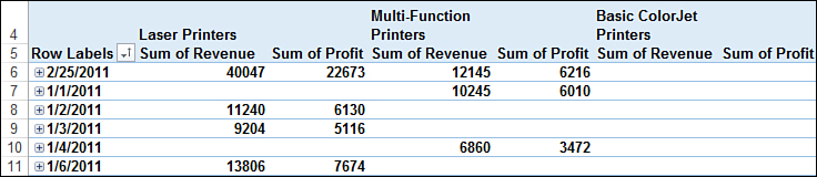
Figure 12.11. Sort columns left to right based on a specific record.
Expanding and Collapsing Fields
If the rows area contains multiple fields, row labels appear in groups that can be quickly expanded and collapsed by clicking the + and - icons. Additional methods, including the capability to expand or collapse all the groups in a field are the following:
• Select a cell in the field and go to Data, Outline, Show Detail or Hide Detail, which affects all the groups in the field.
• Select a cell in the field and go to PivotTable Tools, Analyze, Active Field, Expand Field or Collapse Field, which affects all the groups in the field.
• Right-click a cell in the field and from the Expand/Collapse submenu, choose one of the following:
• Expand or Collapse—Affects the selected group.
• Expand Entire Field or Collapse Entire Field—Affects all the groups in the field.
• Collapse to (Fieldname) or Expand to (Fieldname)—One or more menu options, depending on the number of grouped fields available, affects the selected group.
If you try to expand a data item instead of a field, Excel opens a Show Detail dialog box allowing you to add a new field within the selected data item. If you try to expand a calculated value, Excel inserts a new sheet and shows the records that were used to calculate the value. This is known as drilling down. See the following section, “Viewing the Records Used to Calculate a Value,” for more information.
Viewing the Records Used to Calculate a Value
Double-clicking a data item, or right-clicking and selecting Show Details, creates a new sheet with a table showing the records from which the data item was derived. This is known as drilling down and can be useful if you notice a value in the PivotTable that stands out and you need to investigate it in more detail.
The new table is not linked to the original data or the PivotTable. If you need to make corrections to the data, make them to the original source and refresh the PivotTable. You can then delete the sheet that was created for the drill down.
Grouping Dates
A common issue with PivotTables occurs when someone tries to group a date field and receives the error “Cannot group that selection.” The reason may be that the dates are not real dates, but instead text that looks like dates. If that’s the case, see the “Using Text to Columns to Convert Text to Numbers” section in Chapter 3, “Getting Data onto a Sheet,” to convert the text dates to real dates (because real dates are numbers).
The Grouping dialog box allows dates to be grouped by number of days, months, quarters, and years. When dates are grouped into more than one type, such as month and year, virtual fields are added to the PivotTable field list, which can be used just like the regular fields.
To access the Grouping dialog box, do one of the following:
• Right-click a date and select Group.
• Select a date cell and go to PivotTable Tools, Analyze, Group, Group Selection or Group Field.
• Select a date and go to Data, Outline, Group.
When grouping dates, if Months is the only selection, multiple years will be combined into the month. To get the months grouped into their respective years, also select Years from the dialog box, like this:
1. Select a cell in the PivotTable with a date value.
2. Go to PivotTable Tools, Analyze, Group, Group Field. If you receive the error “Cannot group that selection,” see the “Using Text to Columns to Convert Text to Numbers” section in Chapter 3 to convert the text dates to real dates. Otherwise, continue to step 3.
3. The date range found by Excel appears in the Group dialog box, as shown in Figure 12.12. Make changes if needed.

Figure 12.12. When dates are grouped, the new field, such as Years, is added to the field list.
4. Select Months and Years from the list box.
5. Click OK. The data is grouped into months and years, and a Years field is added to the field list.
To return the dates to normal, you have to ungroup the field. Unselecting the original or virtual field will not ungroup the dates. To ungroup the dates, do one of the following:
• Right-click a grouped date and select Ungroup.
• Select a date cell and go to PivotTable Tools, Analyze, Options, Group, Ungroup.
• Select a date and go to Data, Outline, Ungroup.
 Tip
Tip
At first glance, there doesn’t appear to be a way of creating a weekly report as there is no Weeks option in the Grouping dialog box. But by using the Days option in the Group dialog box, seven days can be grouped together to create a week, 14 days for a biweekly report, and so on. Excel will group the selected number of days based on the range in the dialog box, so if the weeks need to represent a normal week, such as Sunday to Saturday, change the starting date to be a Sunday that will include the first date in the data set.
Filtering Data in a PivotTable
Filtering allows you to view only the data you want to see. Unlike Excel’s AutoFilter (see Chapter 8, “Filtering and Consolidating Data”), filtering a PivotTable doesn’t hide the rows. Instead, the rows are removed from the report. An icon that looks like a funnel replaces the drop-down arrow of the labels that have had a filter applied to them. This section reviews several filtering methods available for viewing only specific records. These methods can be accessed with one of the following steps:
• In the PivotTable Field List, highlight a field and click the drop-down arrow to open the filter listing.
• In the PivotTable, click the label drop-down.
• Right-click a label in the PivotTable and select Filter.
Filtering for Listed Items
The filter listing is probably the most obvious filter tool when you open the drop-down. If the PivotTable is formatted in Compact form (the default) and the selected area contains more than one field, a Select Field drop-down will appear at the top, allowing another field to be selected if the incorrect one is active, as shown in Figure 12.13. All items in the filter listing will be selected, because they are all visible the first time you open the drop-down, but you can select just the items that should appear in the data. Any item that no longer bears a check mark will be hidden.
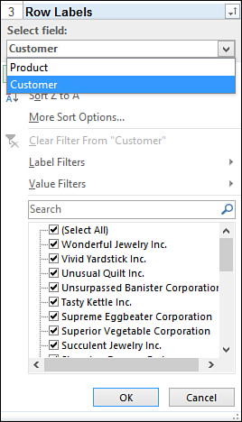
Figure 12.13. A drop-down at the top of the filter window allows the correct field to be selected if the area has more than one field and the report is in Compact form.
Tip
For instruction on how to search for items to include or exclude from the filter, see the section “Using the Search Function to Filter for or Exclude Items” in Chapter 8.
If you have a long list of items and only want to hide or show a few, it might be easier to select a few items directly on the sheet, then right-click, select Filter, and then select Keep Only Selected Items or Hide Selected Items.
Using Label, Value, and Date Special Filters
Special filters are available in the Filter drop-down and also by right-clicking a label and selecting Filter. If the selected field is a date field, Date Filters will appear. If the selected field is anything other than a date, Label Filters will appear, as shown in Figure 12.14. In both cases, Value Filters will be included. All the special filters, except for ones that take action immediately, open a Filter dialog box in which specifics for the filter are entered.
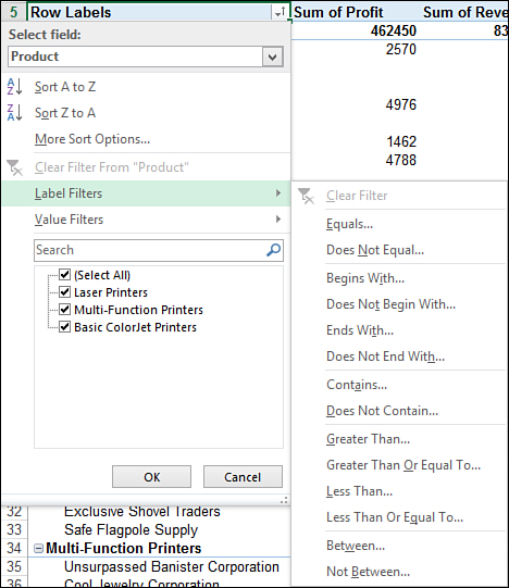
Figure 12.14. Numerous methods are available in the Label Filters option.
Selection of any of the Label Filters opens the Label Filter (Fieldname) dialog box in which text can be entered. Wildcards can also be used in the text fields. Use an asterisk (*) to replace multiple characters or a question mark (?) to replace a single character.
Value Filters include various options that will bring up the Value Filter (Fieldname) dialog box in which values can be entered. There is also a Top 10 option, described in more detail in the section “Top 10 Filtering.”
Date Filters offer a wide selection of options, including additional options under All Dates in the Period. The Custom Filter (Fieldname) dialog box for dates includes calendars to aid in date entry. The options dealing with quarters refer to the traditional quarter of a year, January through March being the first quarter, April through June being the second quarter, and so on.
The report in Figure 12.15 contains data for two years, 2011 and 2012. To show only the fourth quarter profit for both years, first group the data by quarter, month, and year, and then apply the fourth quarter filter, like this:
1. Right-click over a date cell and select Group.
2. From the Grouping dialog box, select Months, Quarters, Years.
3. Click OK and the data will be grouped by year. Within each year, it will be grouped by quarter, and within each quarter, it will be grouped by month.
4. Open the Row Labels drop-down. Go to Date Filters, All Dates in the Period and select Quarter 4. The PivotTable updates, showing only the fourth quarter records for 2011 and 2012 by month.

Figure 12.15. Compare the fourth quarters of multiple years with a few clicks of the mouse.
Top 10 Filtering
The Top 10 option has a flexible dialog box allowing you to specify the top or bottom items, percentages, or sums to view. For example, you could choose to view the bottom 15% or the top 7 items. The Top 10 option is available under the Value Filters listing and also by right-clicking a specific label and selecting Filter, Top 10.
The original report shown in Figure 12.16 originally listed 27 companies. Using the Top 10 option, you can filter the list down to the top companies that have helped bring in $2,500,000 in revenue. To filter for those records, follow these steps:
1. Right-click over a customer name and select Filter, Top 10.
2. From the first drop-down, select Top.
3. In the second field, enter the value to sum for, 2,500,000. The actual summed value may surpass this.
4. Select Sum from the third drop-down.
5. Select the value field to sum, Revenue.
6. Click OK. The PivotTable filters to the companies that meet the entered criteria.
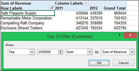
Figure 12.16. Use the Top 10 option to create a report of top customers who account for a specific amount of revenue.
Clearing Filters
To clear all filters applied to a PivotTable, go to PivotTable Tools, Analyze, Actions, Clear, Clear Filters.
You can use two ways to clear a filter from a specific field:
• Right-click the field, go to Filter, and select Clear Filter from (Fieldname).
• Open the label’s Filter drop-down, select the field from the drop-down at the top (if more than one field in the area), and select Clear Filter from (Fieldname).
Creating a Calculated Field
A calculated field is a field you create by building a formula using existing fields and constants. For example, the report shown in Figure 12.17 includes fields for revenue and profit, but not for the price of the items sold. You could create a formula outside the report, but when the table is updated, the formula may be overwritten. Instead, create a calculated field to calculate the average price.
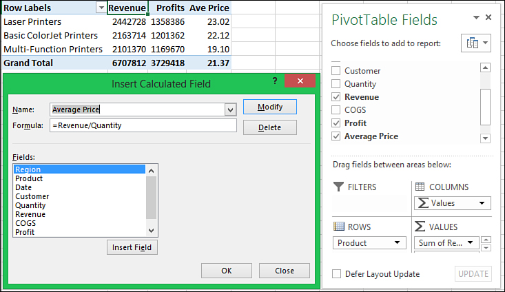
Figure 12.17. Create calculated fields to add calculations that will become part of the PivotTable.
Go to PivotTable Tools, Analyze, Calculations, Fields, Items, & Sets, and select Calculated Field from the drop-down. The entry fields in the dialog box, shown in Figure 12.17, are the following:
• Name—The unique name you assign the new field.
• Formula—The formula for the field. It should consist of one or more selections from the Fields listing, operators, and constants.
• Fields—A list of all available fields.
Creating the formula isn’t that different from building one in the formula bar, but instead of cell references, use the fields. Double-click or highlight and select Insert Field to insert a field in the formula. When the formula is complete, click Add to accept it. When you return to the PivotTable, the new field will appear in the field list and can be used in the same way as the existing fields.
To create the average price field discussed previously, follow these steps:
1. Go to PivotTable Tools, Options, Calculations, Fields, Items, & Sets and select Calculated Field.
2. In the Name field, enter the name of the field, Average Price, as it will appear in the field list.
3. Highlight the 0 in the Formula field.
4. Enter the formula in the Formula field. Double-click or highlight and click Insert Field to insert fields into the formula. Type any operators, constants, or parentheses as needed directly in the Formula field. In this example, the formula is Revenue/Quantity.
5. Click Add to accept the formula.
6. Click OK. The new field is added to the field list and can now be arranged and formatted as needed in the PivotTable.
Hiding Totals
By default, subtotals and grand totals are automatically added to the PivotTable as the fields are arranged. To hide grand totals, do one of the following:
• Right-click a specific grand total field and select Remove Fieldname.
• Right-click the header of a specific grand total field and select Remove Grand Total.
• Right-click the PivotTable and select PivotTable Options or go to PivotTable Tools, Analyze, PivotTable, Options. From the dialog box that opens, go to the Totals & Filters tab and deselect Show Grand Totals for Rows and Show Grand Totals for Columns.
• Go to PivotTable Tools, Design, Layout, and click the Grand Totals drop-down. From there, you can turn all grand totals on or off, or turn on only row grand totals or column grand totals.
To hide subtotals:
• Right-click a specific subtotal field and select Subtotal Fieldname.
• Select a cell in the specific field. Go to PivotTable Tools, Analyze, Active Field, Field Settings. From the Field Settings dialog box that opens, on the Subtotals & Filters tab, select None.
• Go to PivotTable Tools, Design, Layout, and click the Subtotals drop-down. From there, you can turn all subtotals off or choose where they appear in respect to their data.
Formatting Values
If you right-click a cell in a PivotTable, select Format Cells, and apply formatting to the cell, only the one cell will be formatted. To apply formatting to an entire field, the formatting must be applied through the PivotTable’s Format Cells dialog box. The dialog box is similar to the normal Format Cells dialog box, except only the Number tab is available. To access this dialog box, do one of the following:
• Right-click a cell in the field and select Number Format.
• Right-click a cell in the field and select Value Field Settings. From the dialog box that opens, click the Number Format button.
• Select a cell in the field and go to PivotTable Tools, Analyze, Active Field, Field Settings. From the dialog box that opens, click the Number Format button.
Note
Refer to the section “Applying Number Formats with Format Cells” in Chapter 4, “Formatting Sheets and Cells,” for details on the various number formats.
Slicers
Slicers allow you to filter a PivotTable, but in a much more user-friendly way. Unlike the filter drop-downs, slicers are always visible and you can change their dimensions to better fit your sheet design, as shown in Figure 12.18. There are three filters—Region, Product, and Customer—in the figure.
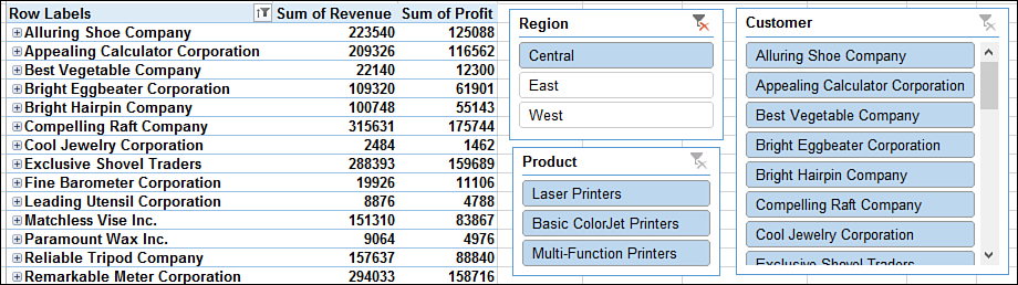
Figure 12.18. Slicers offer a more visually pleasing and user-friendly way of filtering PivotTables.
To insert a slicer, go to PivotTable Tools, Analyze, Filter, Insert Slicer. The Insert Slicers dialog box opens, listing all fields except calculation fields. The field for which a slicer is added does not need to be visible in the PivotTable. Slicers can be sized and placed as needed. Use the Slicer Tools tab, available when you select a slicer, to modify many settings, such as changing the look of the slicers and attaching the slicer to multiple PivotTables.
Note
For an in-depth look at slicers, refer to PivotTable Data Crunching: Microsoft Excel 2013 (ISBN 978-0-7897-4875-1) by Bill Jelen and Michael Alexander.