
15. Creating Charts
In This Chapter
Understanding the Global Settings
Creating a Chart in Various Excel Versions
Exporting a Chart as a Graphic
Charting in Excel 2013
Charting gets a major makeover in Excel 2013, and this creates a host of new charting methods and properties in Excel 2013 VBA.
The process of creating a chart introduces a streamlined .AddChart2 method. With this method, you can specify a chart style, a chart type, and a new property: NewLayout:=True. When you choose NewLayout, you will finally avoid a legend for single-series charts.
After you select a chart, three icons appear to the right of the chart. (See Figure 15.1.)
Figure 15.1. Three new icons appear to the right of the chart.
Two of the three icons lead to new methods or properties:
• The first icon is a plus sign. It offers a new way to change old settings. Rather than using the Layout tab or Format dialog box as you did with Excel 2010, you can, with the plus sign, access all of those settings from a small fly-out menu and a task pane. Other than some data label improvements, all the VBA to control the settings under the plus sign icon remain the same as in Excel 2010.
• The second icon is the paintbrush icon. This leads to a menu for Style and Color. You get two new VBA properties here. The .ChartStyle property supports new values from 201 to 353 to correspond to the options available in the Style menu. The .ChartColor property is new. It supports values from 1 to 26, which correspond to various combinations from the Theme colors. The .ChartStyle property enables you to select a professionally designed chart template. Everything in that template was available in Excel 2010; now, one line of code in Excel 2013 replaces 35 individual settings required in Excel 2010.
• The third icon is the funnel. You can use this to filter rows or columns from the chart source data out of the chart. A new .IsFiltered property is added to replicate changes made in the funnel icon.
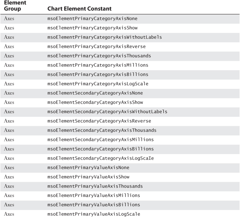
Excel 2007 had introduced a series of .SetElement values to replicate choices on the old Layout tab of the ribbon. A new msoElementDataLabelCallout value enables you to specify that the data labels should appear in a callout balloon.
The final new trick in Excel 2013 is getting the text for data labels from a range of cells. A new .InsertChartField method enables you to specify a formula that points to a range of cells that contain the data labels.
Considering Backward Compatibility
These new chart methods are great if you have Excel 2013 and everyone who uses your macro also has Excel 2013. Because it generally takes two years for a majority of people to upgrade to a new version of Office, you will most likely have to code for Excel 2010 until sometime in 2015. That means using the .AddChart method instead of the .AddChart2 method. There is even a chance you will run into someone using Excel 2003, in which charts were created using Charts.Add.
This chapter includes examples of creating charts for Excel 2003, Excel 2007–2010, and Excel 2013.
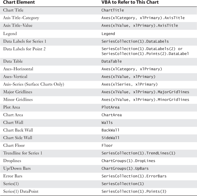
Referencing the Chart Container
If you go back far enough in Excel history, you will find that all charts used to be created as their own chart sheets. VBA was less complex then. To reference a chart, you simply referred to the chart sheet name:
Sheets("Chart1").ChartArea.Interior.ColorIndex = 4
Then, in the mid-1990s, Excel added the amazing capability to embed a chart right onto an existing worksheet. This allowed a report to be created with tables of numbers and charts all on the same page, something we take for granted today. Up through Excel 2003, a macro would use the .ChartObjects as a container for a chart. Here is code to change the color of the chart area in Excel 2003:
Worksheets("Jan").ChartObjects("Chart 1"). _
Chart.ChartArea.Interior.ColorIndex = 4
In Excel 2007 through Excel 2013, a chart is a member of the Shapes collection. The equivalent code for referencing a chart in Excel 2013 is as follows:
Worksheets("Jan").Shapes("Chart 1"). _
Chart.ChartArea.Interior.ColorIndex = 4
Although it is less common to see standalone chart sheets today, you need to understand that you have a different way of referring to a chart depending on whether the chart is embedded or standalone, and whether the code is running in a version of Excel before Excel 2007.
Understanding the Global Settings
Although the charting interface has changed in Excel 2007 and Excel 2013, there are a few major concepts that have applied to every chart since Excel 97. It does not matter whether you are writing code for Excel 2003, Excel 2007, or Excel 2013; you need to understand the 73 chart types, size, position, and how to refer to a chart.
Specifying a Built-in Chart Type
Although the charting interface has evolved over the years, Excel has offered the same 73 chart types ever since Excel 97. Each method for creating a chart includes a ChartType property. You use one of the constant values shown in the second column of Table 15.1.
Table 15.1. Chart Types for Use in VBA
What if you need to mix a column chart and a line chart? This is more complicated. See the “Creating a Combo Chart” section, later in this chapter.
Table 15.1 lists the 73 chart type constants that you can use to create various charts. The sequence of the table matches the sequence of the charts in the All Charts tab of the Insert Chart dialog.
Specifying Location and Size of the Chart
For each method, you have an opportunity to specify the chart type, chart location, and size of the chart.
Chart location is controlled by specifying the .Top and .Left of the top-left corner of the chart in pixels. This is admittedly a really strange measurement. I can look at a cell and guess inches, but I can never remember how many pixels per inch or the dot pitch. Plus, if I want the chart to appear in cell S17, how do I even begin estimating the number? One approach is to randomly guess.
Figure 15.2 shows a chart created by a macro in which I randomly guessed the .Top at 170 and the .Width at 1400. I was shooting for S17 and I ended up in AA12. With a little more research, I discovered that a default row is 15 pixels tall and the default width is 71 pixels. Perhaps a better estimate would have been 16*15+1 for the top and 18 columns * 71 pixels + 1 to arrive in Column S.
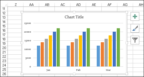
Figure 15.2. Guessing the number of pixels to arrive at S17 Is an imperfect science.
But wait. Before you even type =16*15+1 into a cell in Excel to calculate the .Top and .Left, this estimate fails if someone has specified a different theme or different default font, or if they have changed any column widths from A:R.
The better solution is to set the .Top and .Left of the chart to the .Top and .Left of the cell where you want the chart to appear. If you want the chart to appear in cell S17, then specify this:
.Top = Range("S17").Top, .Left = Range("S17").Left
You can shorten this code by using [S17] as a shorter way to refer to Range("S17").
.Top = [S17].Top, .Left = [S17].Left
How about the length and width of the chart? Again, you could guess for .Height and .Width, or you can set these properties to the .Height and .Width of a known range. If you want the chart to fill S17:Y32, you could use
.Height = [A17:A32].Height, .Width = [S1:Y1].Left
Referring to a Specific Chart
The macro recorder has an unsatisfactory way of writing code for the chart creation. The macro recorder uses the .AddChart2 method and adds a .Select to the end of the line in order to select the chart. The rest of the chart settings then apply to the ActiveChart object. This approach is a bit frustrating, because you are required to do all the chart formatting before you select anything else in the worksheet.
The macro recorder does this because chart names are unpredictable. The first time you run a macro, the chart might be called Chart 1. But if you run the macro on another day or on a different worksheet, the chart might be called Chart 3 or Chart 5.
For the most flexibility, you should assign each new chart to a Chart object. This is a bit strange to do. Remember that a chart exists inside a container. Starting in Excel 2007, that container is a Shape object. You cannot simply refer to Worksheets("Sheet1").Charts("Chart 1"). This results in an error.
Ignoring the specifics of the AddChart2 method for a moment, you could use this coding approach, which captures the Shape object in the SH object variable and then assigns the Sh.Chart to the CH object variable:
Dim WS as Worksheet
Dim SH as Shape
Dim CH as Chart
Set WS = ActiveSheet
Set SH = WS.Shapes.AddChart2(...)
Set CH = SH.Chart
You can simplify the preceding code by appending .Chart to the end of the AddChart2 method. The following code has one less object variable:
Dim WS as Worksheet
Dim CH as Chart
Set WS = ActiveSheet
Set CH = WS.Shapes.AddChart2(...).Chart
If you need to modify a preexisting chart—such as a chart that you did not create—and there is only one shape on the worksheet, you can use this line of code:
WS.Shapes(1).Chart.Interior.Color = RGB(0,0,255)
If there are many charts, and you need to find the one with the upper-left corner located in cell A4, you can loop through all the Shape objects until you find one in the correct location, like this:
For each Sh in ActiveSheet.Shapes
If Sh.TopLeftCell.Address = "$A$4" then
Sh.Chart.Interior.Color = RGB(0,255,0)
End If
Next Sh
 Creating a Chart in Various Excel Versions
The following sections show the code for creating a chart. All the code samples work in Excel 2013. If your code needs to run in Excel 2010 or even Excel 2003, you need to change the method used for creating the chart.
Using .AddChart2 Method in Excel 2013
Excel 2013 introduces the new .AddChart2 method. This method is very flexible and easy to use. But it does not work in Excel 2010.
When you select a chart in Excel, three icons appear to the right of the chart. The paintbrush icon leads to a variety of professionally designed chart styles. For a clustered column chart, there are a total of 15 chart styles defined in Excel 2013. The various styles offer a mix of effects. The effects range from rotated data labels to gradients, dark backgrounds, patterns, and more. Figure 15.3 shows the 15 chart styles designed for clustered column charts.
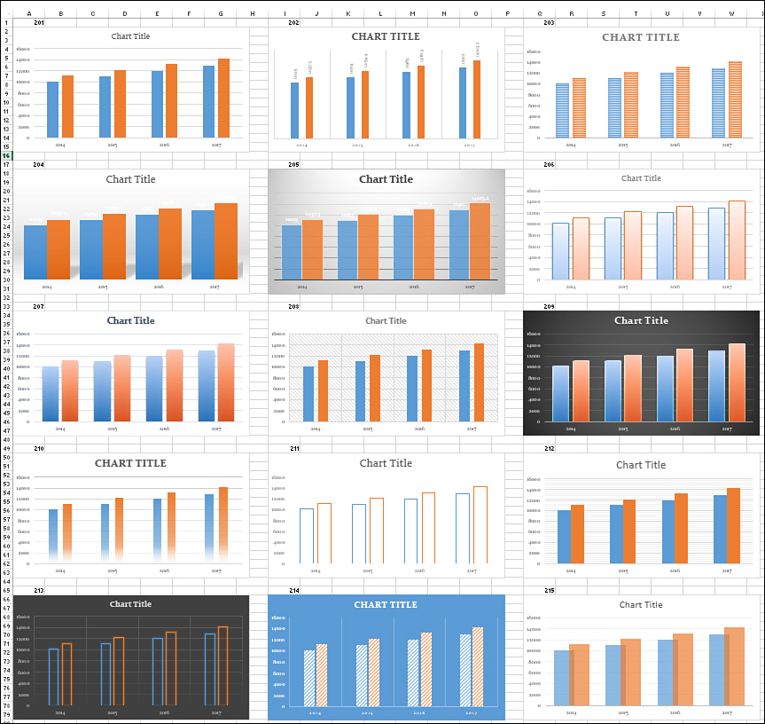
Figure 15.3. These professionally designed templates combine as many as 20 adjustments to formatting in a chart.
The .AddChart2 method lets you specify a ChartStyle. The valid values for ChartStyle are 201 through 353. Although only chart styles 201 through 215 were designed with the Clustered Column chart in mind, you can actually apply any of the 153 styles to any chart.
The easiest way to discover the correct chart style number is to turn on the macro recorder, select a chart, and then choose the desired style from the paintbrush icon.
The .AddChart2 method requires you to specify a .ChartStyle (201 through 353), a chart type from Table 15.1, the location and size for the chart, and then an interesting parameter called NewLayout.
People using Excel have long complained about this typical chart in Excel 2010. In prior versions of Excel, a default chart always had a legend. The default chart has a title only when there is a single data series. The title repeats the single legend entry as the title, leading to the redundant title and legend in a single-series chart. (See Figure 15.4.)
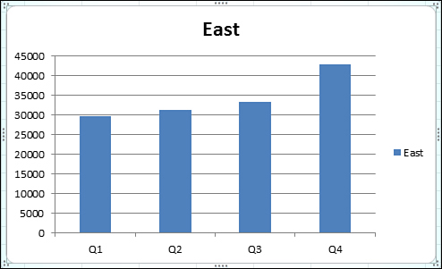
Figure 15.4. Do you think this chart is about the East region?
If you specify NewLayout:=False, you continue to get the chart with a legend and title for a single series chart. When you instead specify NewLayout:=True, your single-series chart does not have a legend. All charts have a title, even if that title is the useless “Chart Title.” The theory is that when people see “Chart Title,” they are forced to click the title and change it. Of course, with VBA, you can change the chart title.
The following code produces the chart shown in Figure 15.5:
Sub CreateChartExcel2013()
Dim WS As Worksheet
Dim ch As Chart
Set WS = ActiveSheet
' Select the data for the chart
Range("A1:E4").Select
' Define the chart,
' use style 202 for rotated data labels
Set ch = WS.Shapes.AddChart2( _
Style:=202, _
XlChartType:=xlColumnClustered, _
Left:=[A6].Left, _
Top:=[A6].Top, _
Width:=[A6:G6].Width, _
Height:=[A6:A20].Height, _
NewLayout:=True).Chart
' Adjust the title
ch.ChartTitle.Text = "2015 Sales by Region"
End Sub
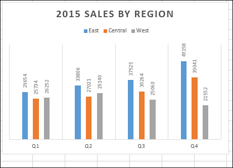
Figure 15.5. Chart style 202 provides the rotated data labels in lieu of vertical axis labels.
The preceding code required you to select the chart data before creating the chart. Good VBA code avoids selecting anything. You can avoid selecting the data by letting VBA create a blank chart and then specifying the source data with this code:
ch.SetSourceData Source:=Range("Data!$A$1:$E$4")
Two other features introduced in Excel 2013 are the 26 .ChartColor values and the capability to get chart data labels from a range of cells, as discussed later in the chapter.
Creating Charts in Excel 2007–2013
The AddChart2 method works only in Excel 2013. If you need to have your code work in Excel 2010 or Excel 2007, you have to use the AddChart method instead. This method enables you to specify a chart type, location, and size. You don’t have access to chart styles or the NewLayout setting.
The following code works in Excel 2007 and newer. It creates the bar chart shown in Figure 15.6.
Sub CreateChartExcel2007()
' Works in Excel 2007 & Newer
Dim WS As Worksheet
Dim ch As Chart
Set WS = ActiveSheet
' Define the chart,
Set ch = WS.Shapes.AddChart( _
XlChartType:=xlBarClustered, _
Left:=[A6].Left, _
Top:=[A6].Top, _
Width:=[A6:G6].Width, _
Height:=[A6:A20].Height).Chart
ch.SetSourceData Source:=Range("Data!$A$1:$E$4")
End Sub
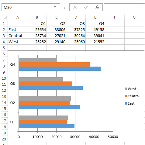
Figure 15.6. After using the older .AddChart method, you usually have to customize the chart.
Creating Charts in Excel 2003–2013
Prior to Excel 2007, you needed to use Charts.Add to create a chart. This resulting chart is a new chart on a standalone chart sheet. Just as you can refer to the active worksheet with ActiveSheet, you can refer to the active chart sheet as ActiveChart. After specifying the chart type and source data, you move the ActiveChart to a worksheet, creating an embedded chart.
At this point, you cannot refer to ActiveChart anymore, but the newly created chart is still selected. The Excel 2003 code to assign the chart to an object variable requires you to Set CH = Selection.Parent.
Use this macro to create a chart if that chart has to be compatible with Excel 2003:
Sub Chart2003()
Dim CH As Chart
' Add a chart as a ChartSheet
Charts.Add
ActiveChart.SetSourceData Source:=Worksheets("Sheet1").Range("A1:E4")
ActiveChart.ChartType = xlColumnClustered
' Move the chart to a worksheet
ActiveChart.Location Where:=xlLocationAsObject, Name:="Sheet1"
' You cannot refer to ActiveChart anymore
' The chart is still selected
Set CH = Selection.Parent
CH.Top = Range("B6").Top
CH.Left = Range("B6").Left
End Sub
Customizing a Chart
The AddChart and AddChart2 methods enable you to specify a chart type, location, and size for your chart. You will probably need to customize additional items in the chart. The chart customizations fall into three broad categories:
• Customizing a global chart, such as changing the chart style or color theme in the chart. In the Excel Interface, these are changes on the Design tab of the ribbon or in the paintbrush icon to the right of the selected chart.
• Adding or moving a chart element, such as adding a chart title or moving the legend to a new location. In the Excel interface, the first and second-level fly-out menus from the Plus icon to the right of the chart control the chart elements.
• Micro-managing the formatting for one specific series, point, or chart element. These are settings from the Format tab of the ribbon or the Format task pane.
However, given that the new charting interface is going to be creating a lot of charts with the unhelpful words “Chart Title” at the top of every chart, you should start with the code for changing the chart title to something useful.
Specifying a Chart Title
Every chart created with NewLayout:=True has a chart title. When the chart has two or more series, that title is “Chart Title.” You are going to have to plan on changing the chart title to something useful.
To specify a chart title in VBA, use this code:
ActiveChart.ChartTitle.Caption = "Sales by Region"
Assuming that you are changing the chart title of a newly created chart that is assigned to the CH object variable, you can use this:
CH.ChartTitle.Caption = "Sales by Region"
This code works if your chart already has a title. If you are not sure that the selected chart style has a title, you can ensure that the title is present first with
CH.SetElement msoElementChartTitleAboveChart
Although it is relatively easy to add a chart title and specify the words in the title, it becomes increasingly complex to change the formatting of the chart title. The following code changes the font, size, and color of the title:
With CH.ChartTitle.Format.TextFrame2.TextRange.Font
.Name = "Rockwell"
.Fill.ForeColor.ObjectThemeColor = msoThemeColorAccent2
.Size = 14
End With
The two axis titles operate the same as the chart title. To change the words, use the .Caption property. To format the words, you use the Format property. Similarly, you can specify the axis titles by using the Caption property. The following code changes the axis title along the category axis:
CH.SetElement msoElementPrimaryCategoryAxisTitleHorizontal
CH.Axes(xlCategory, xlPrimary).AxisTitle.Caption = "Months"
CH.Axes(xlCategory, xlPrimary).AxisTitle. _
Format.TextFrame2.TextRange.Font.Fill. _
ForeColor.ObjectThemeColor = msoThemeColorAccent2
Quickly Formatting a Chart Using New Excel 2013 Features
Excel 2013 offers new chart styles, color settings, filtering, and the capability to create data labels as captions that come from selected cells. All of these features are excellent additions, but the code works only in Excel 2013 and is not backward compatible with Excel 2010 or older.
Specifying a Chart Style
Excel 2013 introduces new chart styles that quickly apply professional formatting to a chart. You can see the chart styles in the large Chart Style gallery on the Design tab.
The chart style concept is not new in Excel 2013. Excel 2007 offered 48 chart styles. The difference is that the chart styles in Excel 2013 are interesting and offer variability between the styles. In Excel 2007–2010, the 48 chart styles were boring variations on four styles: monochrome, colorful, single-color, and dark background.
If you create your chart using the AddChart2 method, you can specify a chart style as the first parameter of that method. If you do not specify a chart style or later want to change a chart style, use this code:
ch.ClearToMatchStyle
ch.ChartStyle = 339
Valid chart styles are 201 through 353. The fastest way to learn the chart style is to select a chart, turn on the macro recorder, select a style from the gallery on the Design tab, and then stop recording.
Caution
The ToolTip that appears in the Chart Styles gallery does not convert to the chart style value.
As an experiment, create a clustered column chart. Copy that chart and paste it three times, changing the chart type to a line, stacked area, and stacked bar. Turn on the macro recorder. Select each chart and choose the last dark style from the Chart Styles gallery. You might notice that the ToolTip is different when you select the style. When you look at the recorded code, the .ChartStyle value is dramatically different for each chart. See the ToolTip and the ChartStyle value in the title of each chart in Figure 15.7.
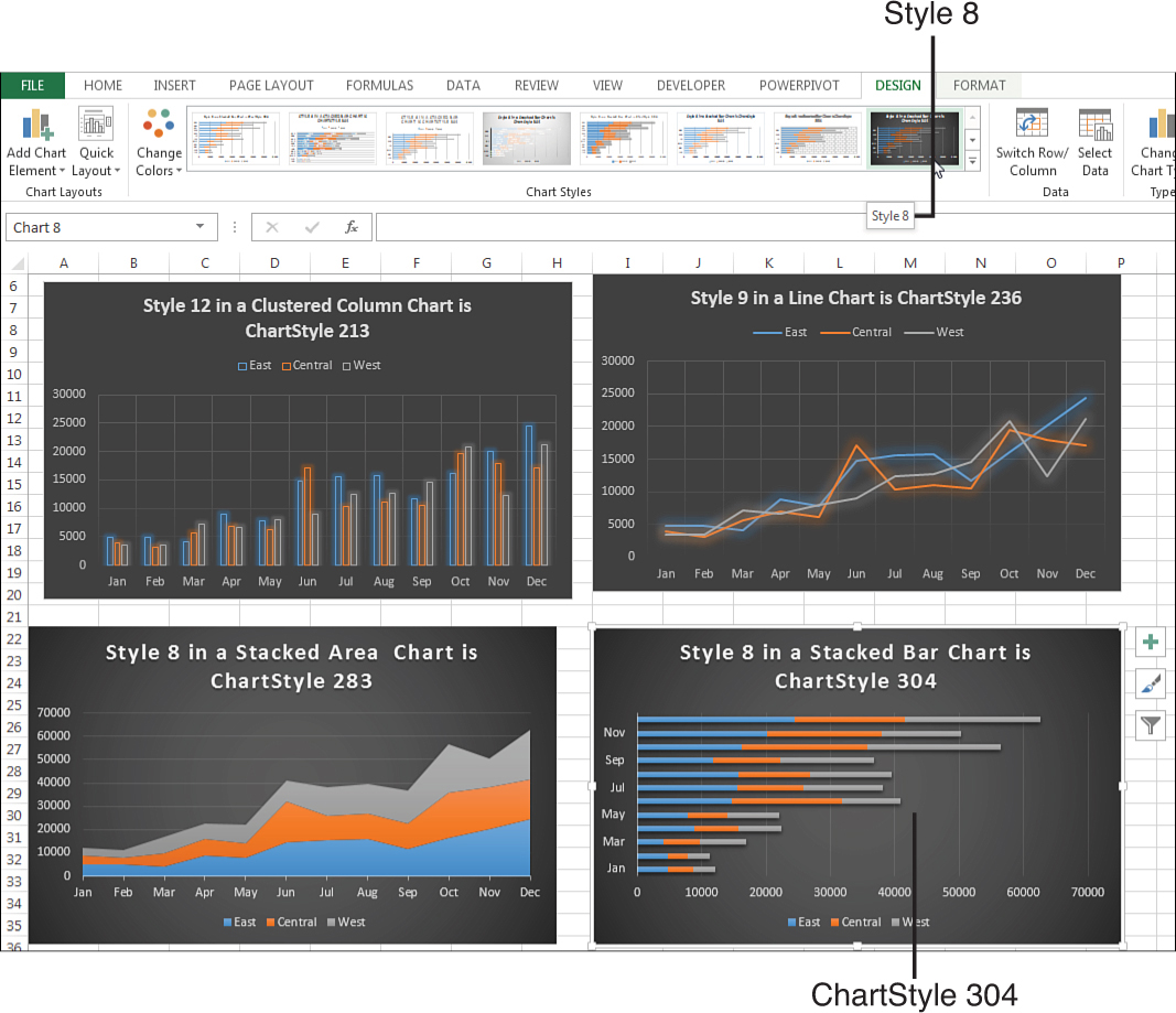
Figure 15.7. The ToolTip says Style 8, but the .ChartStyle varies.
Although the chart styles look alike in the various Chart Style galleries, they are really different chart styles.
Using VBA, you are able to apply any of the 153 new chart styles to any type of chart. Although it works, it might not look as good as if you applied the style designed for that type of chart.
Rather than randomly selecting a chart style, use the macro recorder to learn the correct style.
Tip
Choose a chart type before choosing a chart style.
Say that you create an area chart and apply Style 8 from the Chart Styles gallery. In the background, Excel applies .ChartStyle =283 to the chart. If you later change the chart type to a clustered column chart, Excel does not convert the .ChartStyle back to the correct value of 213. The chart style stays as 283.
Figure 15.8 shows the four charts from Figure 15.7 after they were converted back to a clustered column chart. Each chart looks a little different. Vertical gridlines do not appear on some charts. The legend moves from the top to the bottom. Glow, Fill, and Overlap are different in the various charts.
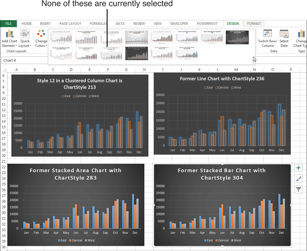
Figure 15.8. If you change the chart type after choosing a style, you see subtle differences.
When you open the Chart Styles gallery, none of the thumbnails appears as the chosen style. This is because the current ChartStyle of 304 is no longer shown in the gallery.
The old chart style values of 1 through 48 continue to work. Try 1 for Monochrome, 2 for colorful, 3 for shades of blue, and 42 for a dark background that works well with PowerPoint.
In the sample files for this book, open 15-TestAllStyles.xlsm to see a clustered column chart represented in all 153 styles.
Applying a Chart Color
Excel 2013 also introduces a ch.ChartColor property that assigns one of 26 color themes to a chart. Assign a value from 1 to 26, but be aware that the order of the colors in the Chart Styles fly-out menu (see Figure 15.9) has nothing to do with the 26 values.
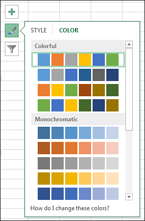
Figure 15.9. Color schemes in the menu are called Color 1, Color 2, and so on, but have nothing to do with the VBA settings.
To understand the ChartColor values, consider the color drop-down shown in Figure 15.10. This drop-down offers 10 columns of colors: Background 1, Text 1, Background 2, Text 2, and then Theme 1 through Theme 6.
Figure 15.10. ChartColor combinations include a mix of colors from the current theme.
Here is a synopsis of the 26 values you can use for ChartColor:
• ChartColor 1, 9, and 20 use grayscale colors from column 3. A ChartColor value of 1 starts with a dark gray, then a light gray, then medium gray. A ChartColor value of 9 starts with light gray and moves to darker grays. A ChartColor value of 20 starts with three medium grays, then black, very light gray, then medium gray.
• Value 2 uses the six theme colors in the top row from left to right.
• Values 3 through 8 use a single column of colors. For example, ChartColor = 3 uses the six colors in Theme 1, from dark to light. ChartColor values of 4 through 8 correspond to Themes 2 through 6.
• Value 10 repeats value 2 but adds a light border around the chart element.
• Values 11 through 13 are the most inventive. They use three theme colors from the top row combined with the same three theme colors from the bottom row. This produces light and dark versions of three different colors. ChartColor 11 uses the odd-numbered themes (1, 3, and 5). ChartColor 12 uses the even-numbered themes. ChartColor 13 uses Themes 6, 5, and 4.
• Values 14 through 19 repeat values 3 through 8, but add a light border.
• Values 21 through 26 are similar to values 3 through 8, but the colors progress from light to dark.
The following code changes the chart to use varying shades of Themes 6, 5, and 4:
ch.ChartColor = 13
In Excel 2007 and 2010, the ChartColor property causes an error. For backward compatibility, use a .ChartStyle value from 1 to 48. These correspond to the order of the colors in the old Chart Styles gallery in Excel 2007 and Excel 2010.
Filtering a Chart in Excel 2013
In real life, creating charts from tables of data is not always simple. Tables frequently have totals or subtotals. The table in Figure 15.11 has quarterly total columns intermixed with the monthly values. Rows 5, 9, and 10 contain totals of various regions. When you create a chart from this data, the total columns and rows create a bad chart. The scale of the chart is wrong because of the $5.3 million grand total cell.
Figure 15.11. The subtotals in this table cause a bad-looking chart.
In previous versions of Excel, you could attempt to select the eight noncontiguous regions before creating the chart. For example, A1:D4, F1:H4, ..., N6:P8.
The new paradigm in Excel 2013 is to select the whole range, create the horrible-looking chart, and then use the Funnel icon to the right of the chart to remove the total rows and total columns.
To filter a row or column in VBA, you set the new .IsFiltered property to True. The following code removes the total columns and total rows to produce the chart shown in Figure 15.12:
Sub FilterChart()
Dim CH As Chart
Dim WS As Worksheet
Set WS = ActiveSheet
Set CH = WS.Shapes.AddChart2(Style:=239, _
XlChartType:=xlLine, _
Left:=[B12].Left, _
Top:=[B12].Top, _
NewLayout:=False).Chart
CH.SetSourceData Source:=Range("Sheet1!$A$1:$R$10")
' Hide the rows containing totals from row 5, 9, 10
CH.FullSeriesCollection(4).IsFiltered = True
CH.FullSeriesCollection(8).IsFiltered = True
CH.FullSeriesCollection(9).IsFiltered = True
' Hide the columns containing quarters and total
CH.ChartGroups(1).FullCategoryCollection(4).IsFiltered = True
CH.ChartGroups(1).FullCategoryCollection(8).IsFiltered = True
CH.ChartGroups(1).FullCategoryCollection(12).IsFiltered = True
CH.ChartGroups(1).FullCategoryCollection(16).IsFiltered = True
CH.ChartGroups(1).FullCategoryCollection(17).IsFiltered = True
' Reapply style 239; it applies markers with <7 series
CH.ChartStyle = 239
End Sub
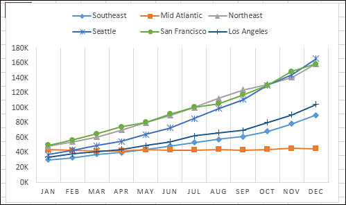
Figure 15.12. Filter the total rows and columns to have monthly data by region on the chart.
Caution
The .IsFiltered property is not backward compatible with Excel 2010 or earlier.
Note: Chart Style 239 is supposed to include markers on the line. When the original chart contained nine series, the markers were deleted. Reapplying the chart style 239 at the end of the macro brings the markers back to the resulting six-series chart.
Using Cell Formulas as Data Label Captions in Excel 2013
Excel 2013 introduces the capability to caption a data point using a callout that is based on a cell in the worksheet. You now have the flexibility to calculate data captions on the fly.
In Figure 15.13, the sales figures in Row 2 are random numbers that change every time the worksheet is calculated. You never know which month is going to be the best or the worst month.
Figure 15.13. A formula generates the caption that displays on the chart.
Row 5 contains a somewhat complex formula to build a dynamic caption for the month. If the sales for the month match the maximum sales for all the months, the caption reads “Best month with $x.” If the sales match the minimum sales, the caption says it was the worst month. For all the other months, the caption is blank. The formula in B5 is
=IF(B2=MAX($B2:$M2),"Best month with $"&B2,"")&
IF(B2=MIN($B2:$M2),"Worst month with $"&B2,"")
To specify that the data labels should appear as a callout, use this new argument in Excel 2013:
CH.SetElement (msoElementDataLabelCallout)
You can then specify the range that contains the labels for an individual series. The InsertChartField method is applied to the TextRange property of the TextFrame2.
' Specify a range for the data labels for Series 1
Dim Ser as Series
Dim TF as TextFrame2
Set Ser = CH.SeriesCollection(1)
Set TF = Ser.DataLabels.Format.TextFrame2
TF.TextRange.InsertChartField _
ChartFieldType:=msoChartFieldFormula, _
Formula:="=Sheet1!$B$5:$M$5", _
Position:=xlLabelPositionAbove
Ser.DataLabels.ShowRange = True
The chart in Figure 15.14 is created with the following code.
Sub LabelCaptionsFromRange()
Dim WS As Worksheet
Dim CH As Chart
Dim Ser As Series
Dim TF As TextFrame2
Set WS = ActiveSheet
Set CH = WS.Shapes.AddChart2(Style:=201, _
XlChartType:=xlColumnClustered, _
Left:=[B7].Left, _
Top:=[B7].Top, _
NewLayout:=True).Chart
CH.SetSourceData Source:=Range("Sheet1!$A$1:$M$2")
' Apply Labels as a Callout
CH.SetElement (msoElementDataLabelCallout)
' Specify a range for the data labels for Series 1
Set Ser = CH.SeriesCollection(1)
Set TF = Ser.DataLabels.Format.TextFrame2
TF.TextRange.InsertChartField _
ChartFieldType:=msoChartFieldFormula, _
Formula:="=Sheet1!$B$5:$M$5", _
Position:=xlLabelPositionAbove
' New in Excel 2013
Ser.DataLabels.ShowRange = True
' Turn off the category name and value
' This has to be done after ShowRange = True
' If you turn off all first, the label is deleted
Ser.DataLabels.ShowValue = False
Ser.DataLabels.ShowCategoryName = False
' Vary colors by points
CH.ChartGroups(1).VaryByCategories = True
' Make columns wider by making gaps narrower
CH.ChartGroups(1).GapWidth = 77
End Sub
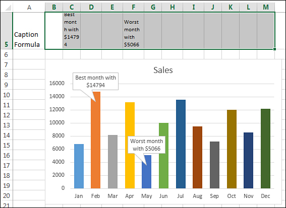
Figure 15.14. The callouts dynamically appear on the largest and smallest points.
Using SetElement to Emulate Changes from the Plus Icon
When you select a chart, three icons appear to the right of the chart. The top icon is a plus sign. All the choices in the first- and second-level fly-out menus use the SetElement method in VBA. Note that the Add Chart Element drop-down on the Design tab includes all of these settings, plus Lines and Up/Down Bars.
Note
SetElement does not cover the choices in the Format task pane that often appears. See the “Using the Format Method to Micromanage Formatting Options” section later in this chapter to change those settings.
If you do not feel like looking up the proper constant in this book, you can always quickly record a macro.
The SetElement method is followed by a constant that specifies which menu item to select. For example, if you want to choose Show Legend at Left, you can use this code:
ActiveChart.SetElement msoElementLegendLeft
Table 15.2 shows all the available constants you can use with the SetElement method. These constants are in roughly the same order in which they appear in the Add Chart Element drop-down.
Table 15.2. Constants Available with SetElement
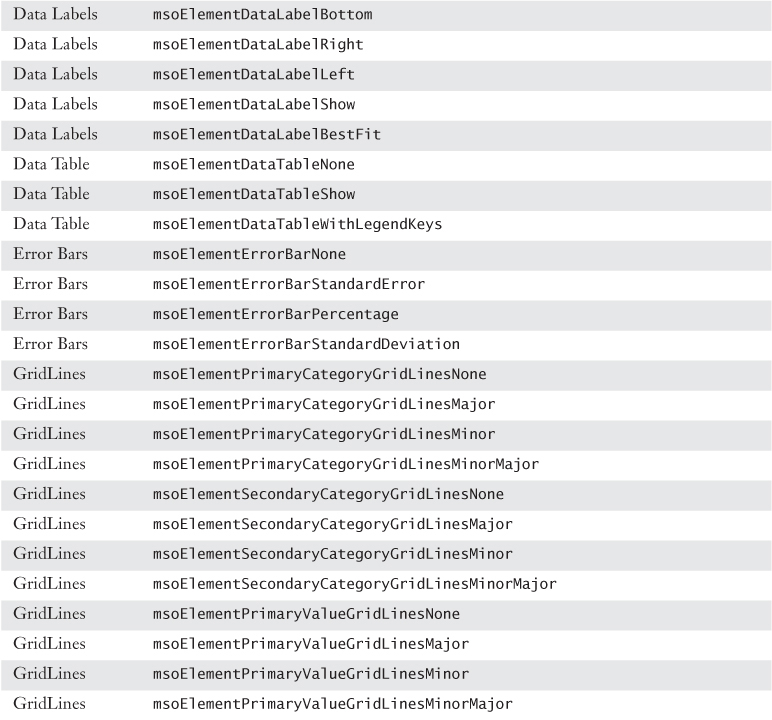
Note
If you attempt to format an element that is not present, Excel will return a -2147467259 Method Failed error.
Using SetElement enables you to change chart elements quickly. As an example, charting gurus say that the legend should always appear to the left or above the chart. Few of the built-in styles show the legend above the chart. I also prefer to show the values along the axis in thousands or millions when appropriate. This is better than displaying three or six zeros on every line.
Two lines of code handle these settings after creating the chart:
Sub UseSetElement()
Dim WS As Worksheet
Dim CH As Chart
Set WS = ActiveSheet
Set CH = WS.Shapes.AddChart2(Style:=201, _
XlChartType:=xlColumnClustered, _
Left:=[B6].Left, _
Top:=[B6].Top, _
NewLayout:=False).Chart
CH.SetSourceData Source:=Range("Sheet1!$A$1:$M$4")
' Set value axis to display thousands
CH.SetElement msoElementPrimaryValueAxisThousands
' move the legend to the top
CH.SetElement msoElementLegendTop
End Sub
Using the Format Method to Micromanage Formatting Options
The Format tab offers icons for changing colors and effects for individual chart elements. Although many people call the Shadow, Glow, Bevel, and Material settings “chart junk,” there are ways in VBA to apply these formats.
Excel 2013 includes an object called the ChartFormat object that contains the settings for Fill, Glow, Line, PictureFormat, Shadow, SoftEdge, TextFrame2, and ThreeD. You can access the ChartFormat object by using the Format method on many chart elements. Table 15.3 lists a sampling of chart elements you can format using the Format method.
Table 15.3. Chart Elements to Which Formatting Applies
The Format method is the gateway to settings for Fill, Glow, and so on. Each of those objects has different options. The following sections provide examples of how to set up each type of format.
Changing an Object’s Fill
The Shape Fill drop-down on the Format tab enables you to choose a single color, a gradient, a picture, or a texture for the fill.
To apply a specific color, you can use the RGB (red, green, blue) setting. To create a color, you specify a value from 0 to 255 for levels of red, green, and blue. The following code applies a simple blue fill:
Dim cht As Chart
Dim upb As UpBars
Set cht = ActiveChart
Set upb = cht.ChartGroups(1).UpBars
upb.Format.Fill.ForeColor.RGB = RGB(0, 0, 255)
If you would like an object to pick up the color from a specific theme accent color, you use the ObjectThemeColor property. The following code changes the bar color of the first series to accent color 6, which is an orange color in the Office theme. However, this might be another color if the workbook is using a different theme.
Sub ApplyThemeColor()
Dim cht As Chart
Dim ser As Series
Set cht = ActiveChart
Set ser = cht.SeriesCollection(1)
ser.Format.Fill.ForeColor.ObjectThemeColor = msoThemeColorAccent6
End Sub
To apply a built-in texture, you use the PresetTextured method. The following code applies a green marble texture to the second series. However, you can apply any of the 20 textures:
Sub ApplyTexture()
Dim cht As Chart
Dim ser As Series
Set cht = ActiveChart
Set ser = cht.SeriesCollection(2)
ser.Format.Fill.PresetTextured msoTextureGreenMarble
End Sub
Note
When you type PresetTextured followed by a space, the VB Editor offers a complete list of possible texture values.
To fill the bars of a data series with a picture, you use the UserPicture method and specify the path and filename of an image on the computer, as in the following example:
Sub FormatWithPicture()
Dim cht As Chart
Dim ser As Series
Set cht = ActiveChart
Set ser = cht.SeriesCollection(1)
MyPic = "C:PodCastTitle1.jpg"
ser.Format.Fill.UserPicture MyPic
End Sub
Microsoft removed patterns as fills from Excel 2007. However, this method was restored in Excel 2010 because of the outcry from customers who used patterns to differentiate columns printed on monochrome printers.
In Excel 2013, you can apply a pattern using the .Patterned method. Patterns have a type such as msoPatternPlain, as well as a foreground and background color. The following code creates dark red vertical lines on a white background:
Sub FormatWithPicture()
Dim cht As Chart
Dim ser As Series
Set cht = ActiveChart
Set ser = cht.SeriesCollection(1)
With ser.Format.Fill
.Patterned msoPatternDarkVertical
.BackColor.RGB = RGB(255,255,255)
.ForeColor.RGB = RGB(255,0,0)
End With
End Sub
Note
Code that uses patterns works in every version of Excel except Excel 2007. Therefore, do not use this code if you will be sharing the macro with co-workers who use Excel 2007.
Gradients are more difficult to specify than fills. Excel 2013 provides three methods that help you set up the common gradients. The OneColorGradient and TwoColorGradient methods require that you specify a gradient direction such as msoGradientFromCorner. You can then specify one of four styles, numbered 1 through 4, depending on whether you want the gradient to start at the top left, top right, bottom left, or bottom right. After using a gradient method, you need to specify the ForeColor and the BackColor settings for the object. The following macro sets up a two-color gradient using two theme colors:
Sub TwoColorGradient()
Dim cht As Chart
Dim ser As Series
Set cht = ActiveChart
Set ser = cht.SeriesCollection(1)
ser.Format.Fill.TwoColorGradient msoGradientFromCorner, 3
ser.Format.Fill.ForeColor.ObjectThemeColor = msoThemeColorAccent6
ser.Format.Fill.BackColor.ObjectThemeColor = msoThemeColorAccent2
End Sub
When using the OneColorGradient method, you specify a direction, a style (1 through 4), and a darkness value between 0 and 1 (0 for darker gradients or 1 for lighter gradients).
When using the PresetGradient method, you specify a direction, a style (1 through 4), and the type of gradient such as msoGradientBrass, msoGradientLateSunset, or msoGradient-Rainbow. Again, as you are typing this code in the VB Editor, the AutoComplete tool provides a complete list of the available preset gradient types.
Formatting Line Settings
The LineFormat object formats either a line or the border around an object. You can change numerous properties for a line, such as the color, arrows, and dash style.
The following macro formats the trendline for the first series in a chart:
Sub FormatLineOrBorders()
Dim cht As Chart
Set cht = ActiveChart
With cht.SeriesCollection(1).Trendlines(1).Format.Line
.DashStyle = msoLineLongDashDotDot
.ForeColor.RGB = RGB(50, 0, 128)
.BeginArrowheadLength = msoArrowheadShort
.BeginArrowheadStyle = msoArrowheadOval
.BeginArrowheadWidth = msoArrowheadNarrow
.EndArrowheadLength = msoArrowheadLong
.EndArrowheadStyle = msoArrowheadTriangle
.EndArrowheadWidth = msoArrowheadWide
End With
End Sub
When you are formatting a border, the arrow settings are not relevant, so the code is shorter than the code for formatting a line. The following macro formats the border around a chart:
Sub FormatBorder()
Dim cht As Chart
Set cht = ActiveChart
With cht.ChartArea.Format.Line
.DashStyle = msoLineLongDashDotDot
.ForeColor.RGB = RGB(50, 0, 128)
End With
End Sub
Creating a Combo Chart
Sometimes you need to chart series of data that are of differing orders of magnitude. Normal charts do a lousy job of showing the smaller series. Combo charts can save the day.
Consider the data and chart in Figure 15.15. You want to plot the number of sales per month and also show two quality ratings. Perhaps this is a fictitious car dealer where they sell 80 to 100 cars a month and the customer satisfaction is represented and usually runs in the 80% to 90% range. When you try to plot this data on a chart, the columns for 90 cars sold dwarfs the column for 80% customer satisfaction. (I won’t insult you by reminding you that 90 is 112.5 times larger than 80%!)
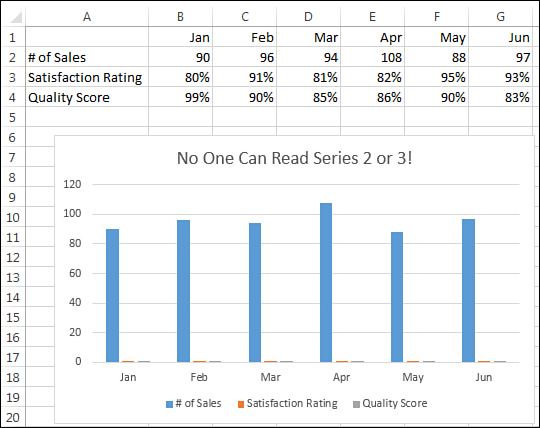
Figure 15.15. The values for two series are too small to be visible.
The solution in the Excel interface is to use the new interface for creating a combo chart. You move the two small series to the secondary axis and change their chart type to a line chart. (See Figure 15.16.)
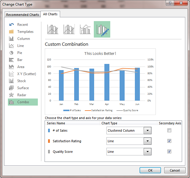
Figure 15.16. A combo chart solves the problem.
The following case study shows you the VBA needed to create a combo chart.
Case Study: Creating a Combo Chart
Dim WS As Worksheet
Dim CH As Chart
Dim Ser1 As Series
Dim Ser2 As Series
Dim Ser3 As Series
Set WS = ActiveSheet
Set CH = WS.Shapes.AddChart2(Style:=201, _
XlChartType:=xlColumnClustered, _
Left:=[B6].Left, _
Top:=[B6].Top, _
NewLayout:=False).Chart
CH.SetSourceData Source:=Range("Sheet1!$A$1:$G$4")
' Move Series 2 to secondary axis as line
Set Ser2 = CH.FullSeriesCollection(2)
With Ser2
.AxisGroup = xlSecondary
.ChartType = xlLine
End With
' Move Series 3 to secondary axis as line
Set Ser3 = CH.FullSeriesCollection(3)
With Ser3
.AxisGroup = xlSecondary
.ChartType = xlLine
End With
' Set the secondary axis to go from 60% to 100%
CH.Axes(xlValue, xlSecondary).MinimumScale = 0.6
CH.Axes(xlValue, xlSecondary).MaximumScale = 1
' Labels every 10%, secondary gridline at 5%
CH.Axes(xlValue, xlSecondary).MajorUnit = 0.1
CH.Axes(xlValue, xlSecondary).MinorUnit = 0.05
CH.Axes(xlValue, xlSecondary).TickLabels.NumberFormat = "0%"
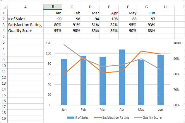
Figure 15.17. Close, but the gridlines are annoying when compared to the right axis.
' Turn off the gridlines for left axis
CH.Axes(xlValue).HasMajorGridlines = False
' Add gridlines for right axis
CH.SetElement (msoElementSecondaryValueGridLinesMajor)
CH.SetElement (msoElementSecondaryValueGridLinesMinorMajor)
' Hide the labels on the primary axis
CH.Axes(xlValue).TickLabelPosition = xlNone
' Replace axis labels with a data label on the column
Set Ser1 = CH.FullSeriesCollection(1)
Ser1.ApplyDataLabels
Ser1.DataLabels.Position = xlLabelPositionCenter
' Data Labels in white
With Ser1.DataLabels.Format.TextFrame2.TextRange.Font.Fill
.Visible = msoTrue
.ForeColor.ObjectThemeColor = msoThemeColorBackground1
.Solid
End With
' Legend at the top, per Gene Z.
CH.SetElement msoElementLegendTop
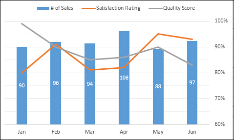
Figure 15.18. The final chart conveys information about three series.
Creating Advanced Charts
In Charts & Graphs for Microsoft Excel 2013 (Que, ISBN 07897486621), I include some amazing charts that do not look as though they can possibly be created using Excel. Building these charts usually involves adding a rogue data series that appears in the chart as an XY series to complete some effect.
The process of creating these charts manually is very tedious, which ensures that most people never resort to creating such charts. However, if the process is automated, the creation of the charts starts to become feasible.
The next sections explain how to use VBA to automate the process of creating these rather complex charts.
Creating True Open-High-Low-Close Stock Charts
If you are a fan of stock charts in the Wall Street Journal or finance.yahoo.com, you will recognize the chart type known as Open-High-Low-Close (OHLC) chart. Excel does not offer such a chart. Its High-Low-Close (HLC) chart is missing the left-facing dash that represents the opening for each period. You might think that HLC charts are close enough to OHLC charts. However, one of my personal pet peeves is that the WSJ can create better-looking charts than Excel can.
In Figure 15.19, you can see a true OHLC chart.
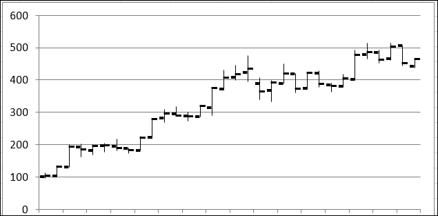
Figure 15.19. Excel’s built-in High-Low-Close chart leaves out the Open mark for each data point.
Note
In Excel 2013, you can specify a custom picture that you can use as the marker in a chart. Given that Excel has a right-facing dash but not a left-facing dash, you need to use Photoshop to create a left-facing dash as a GIF file. This tiny graphic makes up for the fundamental flaw in Excel’s chart marker selection.
In the Excel user interface, you indicate that the Open series should have a custom picture and then specify LeftDash.gif as the picture. In VBA code, you use the UserPicture method, as shown here:
ActiveChart Cht.SeriesCollection(1).Fill.UserPicture "C:leftdash.gif"
To create a true OHLC chart, follow these steps:
1. Create a line chart from four series; Open, High, Low, Close.
2. Change the line style to none for all four series.
3. Eliminate the marker for the High and Low series.
4. Add a High-Low line to the chart.
5. Change the marker for Close to a right-facing dash, which is called a dot in VBA, with a size of 9.
6. Change the marker for Open to a custom picture and load LeftDash.gif as the fill for the series.
The following code creates the chart in Figure 15.19:
Sub CreateOHCLChart()
' Download leftdash.gif from the sample files for this book
' and save it in the same folder as this workbook
Dim Cht As Chart
Dim Ser As Series
ActiveSheet.Shapes.AddChart(xlLineMarkers).Select
Set Cht = ActiveChart
Cht.SetSourceData Source:=Range("Sheet1!$A$1:$E$33")
' Format the Open Series
With Cht.SeriesCollection(1)
.MarkerStyle = xlMarkerStylePicture
.Fill.UserPicture ("C:leftdash.gif")
.Border.LineStyle = xlNone
.MarkerForegroundColorIndex = xlColorIndexNone
End With
' Format High & Low Series
With Cht.SeriesCollection(2)
.MarkerStyle = xlMarkerStyleNone
.Border.LineStyle = xlNone
End With
With Cht.SeriesCollection(3)
.MarkerStyle = xlMarkerStyleNone
.Border.LineStyle = xlNone
End With
' Format the Close series
Set Ser = Cht.SeriesCollection(4)
With Ser
.MarkerBackgroundColorIndex = 1
.MarkerForegroundColorIndex = 1
.MarkerStyle = xlDot
.MarkerSize = 9
.Border.LineStyle = xlNone
End With
' Add High-Low Lines
Cht.SetElement (msoElementLineHiLoLine)
Cht.SetElement (msoElementLegendNone)
End Sub
Creating Bins for a Frequency Chart
Suppose that you have results from 3,000 scientific trials. There must be a good way to produce a chart of those results. However, if you just select the results and create a chart, you end up with chaos (see Figure 15.20).
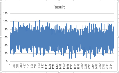
Figure 15.20. Try to chart the results from 3,000 trials and you have a jumbled mess.
The trick to creating an effective frequency distribution is to define a series of categories, or bins. A FREQUENCY array function counts the number of items from the 3,000 results that fall within each bin.
The process of creating bins manually is rather tedious and requires knowledge of array formulas. It is better to use a macro to perform all the tedious calculations.
The macro in this section requires you to specify a bin size and a starting bin. If you expect results in the 0 to 100 range, you might specify bins of 10 each, starting at 1. This would create bins of 1–10, 11–20, 21–30, and so on. If you specify bin sizes of 15 with a starting bin of 5, the macro creates bins of 5–20, 21–35, 36–50, and so on.
To use the following macro, your trial results should start in Row 2 and should be in the rightmost column of a dataset. Three variables near the top of the macro define the starting bin, the ending bin, and the bin size:
' Define Bins
BinSize = 10
FirstBin = 1
LastBin = 100
After that, the macro skips a column and then builds a range of starting bins. In cell D4 in Figure 15.21, the 10 is used to tell Excel that you are looking for the number of values larger than the 0 in D3, but equal to or less than the 10 in D4.
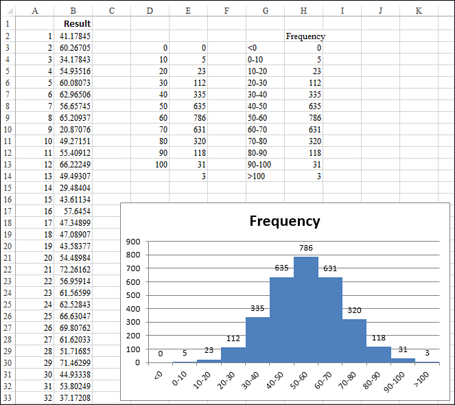
Figure 15.21. The macro summarizes the results into bins and provides a meaningful chart of the data.
Although the bins extend from D3:D13, the FREQUENCY function entered in Column E needs to include one extra cell, in case any results are larger than the last bin. This single formula returns many results. Formulas that return more than one answer are called array formulas. In the Excel user interface, you specify an array formula by holding down Ctrl+Shift while pressing Enter to finish the formula. In Excel VBA, you need to use the FormulaArray property. The following lines of the macro set up the array formula in Column E:
' Enter the Frequency Formula
Form = "=FREQUENCY(R2C" & FinalCol & ":R" & FinalRow & "C" & FinalCol & _
",R3C" & NextCol & ":R" & _
LastRow & "C" & NextCol & ")"
Range(Cells(FirstRow, NextCol + 1), Cells(LastRow, NextCol + 1)). _
FormulaArray = Form
It is not evident to the reader whether the bin indicated in Column D is the upper or lower limit. The macro builds readable labels in Column G and then copies the frequency results over to Column H.
After the macro builds a simple column chart, the following line eliminates the gap between columns, creating the traditional histogram view of the data:
Cht.ChartGroups(1).GapWidth = 0
The macro to create the chart in Figure 15.21 follows:
Sub CreateFrequencyChart()
' Find the last column
FinalCol = Cells(1, Columns.Count).End(xlToLeft).Column
' Find the FinalRow
FinalRow = Cells(Rows.Count, FinalCol).End(xlUp).Row
' Define Bins
BinSize = 10
FirstBin = 0
LastBin = 100
'The bins will go in row 3, two columns after FinalCol
NextCol = FinalCol + 2
FirstRow = 3
NextRow = FirstRow - 1
' Set up the bins for the Frequency function
For i = FirstBin To LastBin Step BinSize
NextRow = NextRow + 1
Cells(NextRow, NextCol).Value = i
Next i
' The Frequency function has to be one row larger than the bins
LastRow = NextRow + 1
' Enter the Frequency Formula
Form = "=FREQUENCY(R2C" & FinalCol & ":R" & FinalRow & "C" & FinalCol & _
",R3C" & NextCol & ":R" & _
LastRow & "C" & NextCol & ")"
Range(Cells(FirstRow, NextCol + 1), Cells(LastRow, NextCol + 1)). _
FormulaArray = Form
' Build a range suitable for a chart source data
LabelCol = NextCol + 3
Form = "=R[-1]C[-3]&""-""&RC[-3]"
Range(Cells(4, LabelCol), Cells(LastRow - 1, LabelCol)).FormulaR1C1 = _
Form
' Enter the > Last formula
Cells(LastRow, LabelCol).FormulaR1C1 = "="">""&R[-1]C[-3]"
' Enter the < first formula
Cells(3, LabelCol).FormulaR1C1 = "=""<""&RC[-3]"
' Enter the formula to copy the frequency results
Range(Cells(3, LabelCol + 1), Cells(LastRow, LabelCol + 1)).FormulaR1C1 = _
"=RC[-3]"
' Add a heading
Cells(2, LabelCol + 1).Value = "Frequency"
' Create a column chart
Dim Cht As Chart
ActiveSheet.Shapes.AddChart(xlColumnClustered).Select
Set Cht = ActiveChart
Cht.SetSourceData Source:=Range(Cells(2, LabelCol), _
Cells(LastRow, LabelCol + 1))
Cht.SetElement (msoElementLegendNone)
Cht.ChartGroups(1).GapWidth = 0
Cht.SetElement (msoElementDataLabelOutSideEnd)
End Sub
Creating a Stacked Area Chart
The stacked area chart shown in Figure 15.22 is incredibly difficult to create in the Excel user interface. Although the chart appears to contain four independent charts, this chart actually contains nine series:
• The first series contains the values for the East region.
• The second series contains 1,000 minus the East values. This series is formatted with a transparent fill.
• Series 3, 5, and 7 contain values for Central, Northwest, and Southwest.
• Series 4, 6, and 8 contain 1,000 minus the preceding series.
• The final series is an XY series used to add labels for the left axis. There is one point for each gridline. The markers are positioned at an X position of 0. Custom data labels are added next to invisible markers to force the labels along the axis to start again at 0 for each region.
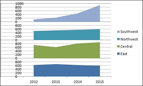
Figure 15.22. A single chart appears to hold four different charts.
To use the macro provided here, your data should begin in Cell A1.
The macro adds new columns to the right of the data and new rows below the data, so the rest of the worksheet should be blank.
Two variables at the top of the macro define the height of each chart. In the current example, leaving a height of 1000 allows the sales for each region to fit comfortably. The LabSize value should indicate how frequently labels should appear along the left axis. This number must be evenly divisible into the chart height. In this example, values of 500, 250, 200, 125, or 100 would work:
' Define the height of each area chart
ChtHeight = 1000
' Define Tick Mark Size
' ChtHeight should be an even multiple of LabSize
LabSize = 200
The macro builds a copy of the data to the right of the original data. New “dummy” series are added to the right of each region to calculate 1,000 minus the data point. In Figure 15.23, this series is shown in G1:O5.
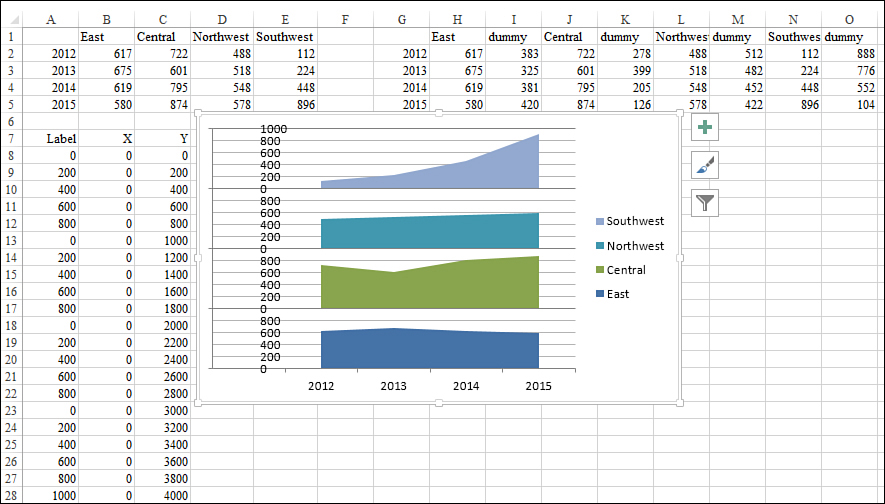
Figure 15.23. Extra data to the right and below the original data are created by the macro to create the chart.
The macro then creates a stacked area chart for the first eight series. The legend for this chart indicates values of East, dummy, Central, dummy, and so on. To delete every other legend entry, use this code:
' Delete series from legend
For i = FinalSeriesCount To 2 Step -2
Cht.Legend.LegendEntries(i).Delete
Next i
Similarly, the fill for each even numbered series in the chart needs to be set to transparent:
' Fill the dummy series with no fill
For i = FinalSeriesCount To 2 Step -2
Cht.SeriesCollection(i).Interior.ColorIndex = xlNone
Next i
The trickiest part of the process is adding a new final series to the chart. This series will have far more data points than the other series. Range B8:C28 contains the X and Y values for the new series. You will see that each point has an X value of 0 to ensure that it appears along the left side of the plot area. The Y values increase steadily by the value indicated in the LabSize variable. In Column A next to the X and Y points are the actual labels that will be plotted next to each marker. These labels give the illusion that the chart starts over with a value of 0 for each region.
The process of adding the new series is actually much easier in VBA than in the Excel user interface. The following code identifies each component of the series and specifies that it should be plotted as an XY chart:
' Add the new series to the chart
Set Ser = Cht.SeriesCollection.NewSeries
With Ser
.Name = "Y"
.Values = Range(Cells(AxisRow + 1, 3), Cells(NewFinal, 3))
.XValues = Range(Cells(AxisRow + 1, 2), Cells(NewFinal, 2))
.ChartType = xlXYScatter
.MarkerStyle = xlMarkerStyleNone
End With
Finally, code applies a data label from Column A to each point in the final series:
' Label each point in the series
' This code actually adds fake labels along left axis
For i = 1 To TickMarkCount
Ser.Points(i).HasDataLabel = True
Ser.Points(i).DataLabel.Text = Cells(AxisRow + i, 1).Value
Next i
The complete code to create the stacked chart in Figure 15.23 is shown here:
Sub CreatedStackedChart()
Dim Cht As Chart
Dim Ser As Series
FinalRow = Cells(Rows.Count, 1).End(xlUp).Row
FinalCol = Cells(1, Columns.Count).End(xlToLeft).Column
OrigSeriesCount = FinalCol - 1
FinalSeriesCount = OrigSeriesCount * 2
' Define the height of each area chart
ChtHeight = 1000
' Define Tick Mark Size
' ChtHeight should be an even multiple of LabSize
LabSize = 200
' Make a copy of the data
NextCol = FinalCol + 2
Cells(1, 1).Resize(FinalRow, FinalCol).Copy _
Destination:=Cells(1, NextCol)
FinalCol = Cells(1, Columns.Count).End(xlToLeft).Column
' Add in new columns to serve as dummy series
MyFormula = "=" & ChtHeight & "-RC[-1]"
For i = FinalCol + 1 To NextCol + 2 Step -1
Cells(1, i).EntireColumn.Insert
Cells(1, i).Value = "dummy"
Cells(2, i).Resize(FinalRow - 1, 1).FormulaR1C1 = MyFormula
Next i
' Figure out the new Final Column
FinalCol = Cells(1, Columns.Count).End(xlToLeft).Column
' Build the Chart
ActiveSheet.Shapes.AddChart(xlAreaStacked).Select
Set Cht = ActiveChart
Cht.SetSourceData Source:=Range(Cells(1, NextCol), Cells(FinalRow, _
FinalCol))
Cht.PlotBy = xlColumns
' Clear out the even number series from the Legend
For i = FinalSeriesCount - 1 To 1 Step -2
Cht.Legend.LegendEntries(i).Delete
Next i
' Set the axis Maximum Scale & Gridlines
TopScale = OrigSeriesCount * ChtHeight
With Cht.Axes(xlValue)
.MaximumScale = TopScale
.MinorUnit = LabSize
.MajorUnit = ChtHeight
End With
Cht.SetElement (msoElementPrimaryValueGridLinesMinorMajor)
' Fill the dummy series with no fill
For i = FinalSeriesCount To 2 Step -2
Cht.SeriesCollection(i).Interior.ColorIndex = xlNone
Next i
' Hide the original axis labels
Cht.Axes(xlValue).TickLabelPosition = xlNone
' Build a new range to hold a rogue XY series that will
' be used to create left axis labels
AxisRow = FinalRow + 2
Cells(AxisRow, 1).Resize(1, 3).Value = Array("Label", "X", "Y")
TickMarkCount = OrigSeriesCount * (ChtHeight / LabSize) + 1
' Column B contains the X values. These are all zero
Cells(AxisRow + 1, 2).Resize(TickMarkCount, 1).Value = 0
' Column C contains the Y values.
Cells(AxisRow + 1, 3).Resize(TickMarkCount, 1).FormulaR1C1 = _
"=R[-1]C+" & LabSize
Cells(AxisRow + 1, 3).Value = 0
' Column A contains the labels to be used for each point
Cells(AxisRow + 1, 1).Value = 0
Cells(AxisRow + 2, 1).Resize(TickMarkCount - 1, 1).FormulaR1C1 = _
"=IF(R[-1]C+" & LabSize & ">=" & ChtHeight & _
",0,R[-1]C+" & LabSize & ")"
NewFinal = Cells(Rows.Count, 1).End(xlUp).Row
Cells(NewFinal, 1).Value = ChtHeight
' Add the new series to the chart
Set Ser = Cht.SeriesCollection.NewSeries
With Ser
.Name = "Y"
.Values = Range(Cells(AxisRow + 1, 3), Cells(NewFinal, 3))
.XValues = Range(Cells(AxisRow + 1, 2), Cells(NewFinal, 2))
.ChartType = xlXYScatter
.MarkerStyle = xlMarkerStyleNone
End With
' Label each point in the series
' This code actually adds fake labels along left axis
For i = 1 To TickMarkCount
Ser.Points(i).HasDataLabel = True
Ser.Points(i).DataLabel.Text = Cells(AxisRow + i, 1).Value
Next i
' Hide the Y label in the legend
Cht.Legend.LegendEntries(Cht.Legend.LegendEntries.Count).Delete
End Sub
Note
The websites of Andy Pope (http://www.andypope.info) and Jon Peltier (http://peltiertech.com) are filled with examples of unusual charts that require extraordinary effort. If you find that you will regularly be creating stacked charts or any other chart like those on their websites, taking the time to write the VBA eases the pain of creating the charts in the Excel user interface.
Exporting a Chart as a Graphic
You can export any chart to an image file on your hard drive. The ExportChart method requires you to specify a filename and a graphic type. The available graphic types depend on graphic file filters installed in your Registry. It is a safe bet that JPG, BMP, PNG, and GIF work on most computers.
For example, the following code exports the active chart as a GIF file:
Sub ExportChart()
Dim cht As Chart
Set cht = ActiveChart
cht.Export Filename:="C:Chart.gif", Filtername:="GIF"
End Sub
Since Excel 2003, Microsoft has supported an Interactive argument in the Export method. Excel Help indicates that if you set Interactive to TRUE, Excel asks for additional settings depending on the file type. However, the dialog that asks for additional settings never appears—at least not for the four standard types of JPG, GIF, BMP, and PNG. To prevent any questions from popping up in the middle of your macro, set Interactive:=False.
Creating Pivot Charts
A pivot chart is a chart that uses a pivot table as the underlying data source. Unfortunately, pivot charts do not have the cool “show pages” functionality that regular pivot tables have. You can overcome this problem with a quick VBA macro that creates a pivot table and then a pivot chart based on the pivot table. The macro then adds the customer field to the filters area of the pivot table. It then loops through each customer and exports the chart for each customer.
In Excel 2013, you first create a pivot cache by using the PivotCache.Create method. You can then define a pivot table based on the pivot cache. The usual procedure is to turn off pivot table updating while you add fields to the pivot table. Then you update the pivot table to have Excel perform the calculations.
It takes a bit of finesse to figure out the final range of the pivot table. If you have turned off the column and row totals, the chartable area of the pivot table starts one row below the PivotTableRange1 area. You have to resize the area to include one fewer row to make your chart appear correctly.
After the pivot table is created, you can switch back to the Charts.Add code discussed earlier in this chapter. You can use any formatting code to get the chart formatted as you desire.
The following code creates a pivot table and a single pivot chart that summarizes revenue by region and product:
Sub CreateSummaryReportUsingPivot()
Dim WSD As Worksheet
Dim PTCache As PivotCache
Dim PT As PivotTable
Dim PRange As Range
Dim FinalRow As Long
Dim ChartDataRange As Range
Dim Cht As Chart
Set WSD = Worksheets("Data")
' Delete any prior pivot tables
For Each PT In WSD.PivotTables
PT.TableRange2.Clear
Next PT
WSD.Range("I1:Z1").EntireColumn.Clear
' Define input area and set up a Pivot Cache
FinalRow = WSD.Cells(Application.Rows.Count, 1).End(xlUp).Row
FinalCol = WSD.Cells(1, Application.Columns.Count). _
End(xlToLeft).Column
Set PRange = WSD.Cells(1, 1).Resize(FinalRow, FinalCol)
Set PTCache = ActiveWorkbook.PivotCaches.Create(SourceType:= _
xlDatabase, SourceData:=PRange.Address)
' Create the Pivot Table from the Pivot Cache
Set PT = PTCache.CreatePivotTable(TableDestination:=WSD. _
Cells(2, FinalCol + 2), TableName:="PivotTable1")
' Turn off updating while building the table
PT.ManualUpdate = True
' Set up the row fields
PT.AddFields RowFields:="Region", ColumnFields:="Product", _
PageFields:="Customer"
' Set up the data fields
With PT.PivotFields("Revenue")
.Orientation = xlDataField
.Function = xlSum
.Position = 1
End With
With PT
.ColumnGrand = False
.RowGrand = False
.NullString = "0"
End With
' Calc the pivot table
PT.ManualUpdate = False
PT.ManualUpdate = True
' Define the Chart Data Range
Set ChartDataRange = _
PT.TableRange1.Offset(1, 0).Resize(PT.TableRange1.Rows.Count - 1)
' Add the Chart
WSD.Shapes.AddChart.Select
Set Cht = ActiveChart
Cht.SetSourceData Source:=ChartDataRange
' Format the Chart
Cht.ChartType = xlColumnClustered
Cht.SetElement (msoElementChartTitleAboveChart)
Cht.ChartTitle.Caption = "All Customers"
Cht.SetElement msoElementPrimaryValueAxisThousands
' Excel 2010 only. Next line will not work in 2007
Cht.ShowAllFieldButtons = False
End Sub
Figure 15.24 shows the resulting chart and pivot table.
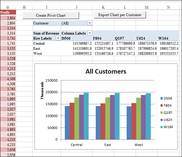
Figure 15.24. VBA creates a pivot table and then a chart from the pivot table. Excel automatically displays the PivotChart Filter window in response.
Next Steps
In Chapter 16, you find out how to automate the data visualization tools such as icon sets, color scales, and data bars.