President Obama believes that he was dealt a bad hand and that he inherited the worst economy since the Great Recession. However, the data shows that there are three other administrations that faced similar or higher unemployment rates than the Obama administration. We compare the Obama administration’s performance to these three other administrations, as well as to those of the last 8 decades. Our criteria is simple: the average performance and average improvements of the Misery Index and the stock market returns. The former we use as a proxy for the impact of the policies on labor income and the latter on the returns on capital. The results are surprising. While the Obama administration ranks quite favorable to the other administrations, it does not fare as well as the Reagan administration. This leads one to wonder whether the differences in results are due to the differences in policies between the two administrations. This interpretation of the results suggests that the differences in real GDP growth may be attributable to the differences in fiscal policies. The results are surprising, as they suggest that the “failed policies” of the past may have performed better than President Obama suggested.
Keywords
economic performance
Humphrey-Hawkins
Misery Index
Obamanomics
top income tax rates
transformational change
The election of Barack Obama as President of the United States was a historic event. Many hoped that he would fulfill his campaign promise and become a transformational figure as opposed to a partisan politician. Yet not everyone shared this view of the president-elect. Some Obama opponents feared that the economic program advocated by then candidate Obama would lead to income redistribution that could degenerate in class warfare. The views and economic platform of candidate Obama had political implications regarding the menu of policy options that he would pursue. To put these views in perspective and the results produced by his economic program, we must contrast them with the economic views, policies enacted, and results produced by the policies of the different administrations during most of the last 8 decades.
Comparing the economic performances of the different administrations is potentially a controversial issue; one must choose a measuring rod by which to compare and measure the performance of the different administrations. Then one has to decide how much of the economic performance during an administration is due to the policies of the previous administrations. In what follows, we make the following simplifying assumption: we hold the administrations responsible for whatever happens under their watch. But we also allow for some of the possible effects of the previous administration policies may have on subsequent administrations by taking into account the initial conditions. We calculate and compare to other administrations, the improvements and/or deterioration of key economic variables that we use to evaluate the absolute and relative performance of the Obama administration.
Was President Obama Dealt a Bad Hand?
President Obama certainly thinks so. On this issue, here is what he said while campaigning for Senator Harry Reid’s reelection.
And let me tell you, when we took office amid the worst economy since the Great Depression, we needed Harry’s fighting spirit. We had lost nearly three million jobs during the last six months of 2008. Over 750,000 jobs in January 2009 alone – the consequence of a decade of misguided economic policies; a decade of stagnant wages; a decade of falling incomes.
President Barack H. Obama at UNLV on July 8th, 2010
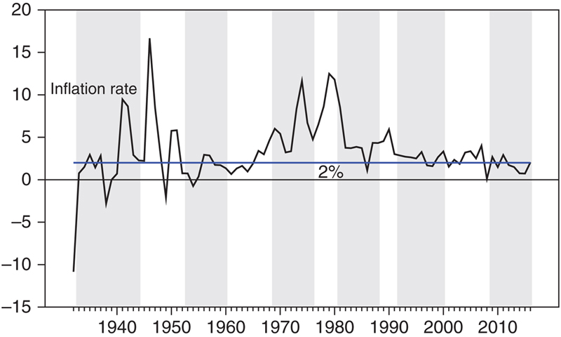
In this speech, President Obama made the claim that he inherited the worst economy since the Great Depression. It was immensely popular with members of his administration and supporters. His speech suggested that he was dealt a terrible hand. Whether that is true or not depends on the indicator used to define the economy. The president indicated the loss of employment as evidence substantiating his statement. While the loss in employment may have been the largest since the Great Depression, so was the size of the economy at the time. Hence to make comparisons across time, we need to normalize the economic variables. One clear indicator that normalizes for the size of the economy while remaining true to the spirit of the president’s indicator is the unemployment rate. We are willing to give the president the benefit of the doubt, and his indicator suggests that he is not too far from the truth. Since the Great Depression, the United States has averaged a 10% unemployment rate for a whole year only twice. The unemployment rate averaged 10.8% in 1982 and 10% in 2009 (Fig. 42.1). Looking at the monthly rates, the unemployment rate hit the 10% mark during only three years: 1982, 1983, and 2009. Thus, a literal reading of the data suggests that as far as the unemployment rate is concerned, only President Reagan faced a situation just as bad as or even worse than President Obama. More importantly, the case for who faced the worst economic condition is not as clear cut as President Obama makes it out to be. President Reagan inherited a much higher inflation rate than President Obama (Fig. 42.2).
Figure 42.1US unemployment rate 1926–2010.
Figure 42.2US inflation rate 1926–2010.
The Misery Index
The unemployment rate is too narrow an indicator; a broader and perhaps better measure is the so-called Misery Index, the sum of the unemployment rate and the inflation rate. The Misery Index has been part of the policy landscape for the last 40 years. It is an outgrowth of the Full Employment and Balanced Growth Act of 1978, also known as the Humphrey–Hawkins legislation, which directed the Fed to promote effectively the goals of maximum employment and stable prices. In passing this act, Congress declared that it would monitor the Federal Reserve Board’s actions. The Fed chairman was commissioned to testify before Congress each February and July, first to the House Banking Committee, and then followed by the Senate Banking Committee. During the Congressional testimony, the chairman is to set target ranges for various economic variables that depicted growth/unemployment and inflation. The Humphrey–Hawkins legislation expired in the late 1990s. Even though the Fed is no longer required to testify, the semi-annual testimony continues. The Humphrey–Hawkins legislation provides a simple framework from which to evaluate policy initiatives and the economic environment.
During his run for the presidency, President Reagan kept asking the American people whether they were better off than they were four years earlier. The Misery Index was the key indicator cleverly used by his political campaign to answer his rhetorical question. When then-candidate Reagan asked the question, he knew the answer. The Misery Index had deteriorated during the Carter administration. The Reagan campaign successfully cemented the Misery Index as a key indicator for the working people to gage improvements in their well-being.
Now on to President Obama’s claim. Viewed from the policy and historical perspective, the Misery Index may provide a better perspective of the economic well-being of the American economy at different points in time during the last century. This broader definition of the well-being of the economy further weakens the president Obama’s argument. While the economic situation inherited by President Obama was bad in terms of the Misery Index, we have seen worse at least a couple of times during the post-war era, just look at Fig. 42.3. Again, the data in Fig. 42.3 shows that President Roosevelt, President Carter, and President Reagan confronted worse Misery Indices when they took office. However, as the Misery Index was also higher when President Carter left office, an argument can be made that the Carter administration’s policies resulted in an economic deterioration. The index was lower in Roosevelt and Reagan’s cases, suggesting that their policies improved economic well-being. The deterioration of the Misery Index disqualifies the Carter administration as a model of a successful economic policy to be compared to the Obama administration.
Figure 42.3US Misery Index 1926–2010.
The Misery Index data suggests a couple of interesting issues. The first one is that President Obama may have overstated his case somewhat. The second one is how does the Obama administration’s overall performance stack up against those of the administrations that preceded it, in particular FDR and Reagan’s? The third and perhaps more interesting question is whether the divergence in economic performance among the different administration was the result of the policy mixes adopted by those administrations? If the answer is in the affirmative, then what were the policy differences and how can we benefit from their experiences.
The Ranking of the Economic Performance
The Misery Index while popular as an indicator, is best interpreted as a measure of the economic well-being of labor income. As such it does not provide direct information regarding other factors of production in the economy, that is, the real rate of return on capital. Hence the Misery Index does not provide a complete picture of the changes in economic well-being thus a better indicator or a complement to the Misery Index is needed. One easily obtainable indicator that may be used as a proxy for the economy’s rate of return on capital is the rate of change of the stock market. The combination of Misery Index and stock returns not only provides a picture of the economic well-being, it also provides information about the improvements in well-being of labor and capital separately. In turn, these two indicators will allow us to make inferences about the distribution of income between labor and capital, a topic that has become a hot political issue in recent years.
The average performance of the Misery Index, the stock returns during the different administrations as FDR is reported in Table 42.1. The last of the data shows that during the Obama administration the Misery Index averaged 8.4% and the stock market gains averaged 14.9%. A respectable performance by any account and President Obama should be proud of the economic accomplishments during his administration.
Table 42.1
The Misery Index, Stock Returns, and Size Effects During the Different Administrations
President
Term
Party affiliation
Misery Index
Large cap returns
Large cap average returns minus small cap average returns
Herbert C Hoover
1929–1932
Republican
12.5%
−21.2%
6.2%
Franklin D Roosevelt
1933–1944
Democrat
14.3%
14.5%
−13.7%
Harry S Truman
1945–1952
Democrat
8.9%
16.6%
4.9%
Dwight D Eisenhower
1953–1960
Republican
6.3%
16.9%
−0.2%
John F Kennedy
1961–1963
Democrat
6.8%
13.7%
3.8%
Lyndon B Johnson
1963–1968
Democrat
7.6%
10.8%
−18.4%
Richard M Nixon
1969–1974
Republican
11.8%
−2.1%
15.0%
Gerald R Ford
1974–1976
Republican
13.4%
30.5%
−11.3%
James E Carter Jr.
1977–1980
Democrat
17.0%
12.6%
−4.8%
Ronald W Reagan
1981–1988
Republican
10.9%
14.8%
5.0%
George H W Bush
1990–1992
Republican
10.0%
16.6%
4.9%
William J Clinton
1993–2000
Democrat
7.1%
18.2%
7.9%
George W Bush
2001–2008
Republican
7.8%
−0.7%
−5.2%
Barack H Obama
2009–2016
Democrat
8.4%
14.9%
−1.0%
Donald J Trump
2017–
Republican
The administration’s performance by itself does not provide answers to a few interesting questions. The first one is how does the Obama economic performance compare to those of other administrations? The second question we find more interesting: Are the differences in performance policy-related? If so what have we learned and how can US policy improve?
One simple way to answer the first question is to look at the rankings of the Obama administration relative to the US administrations going back to FDR. That information is contained in Table 42.2. The data compiled shows that the Obama administration ranks 6 in terms of both categories, the Misery Index and stock returns. Based on these numbers alone, the Obama administration ranks slightly above average when compared to its peers. Not too shabby.
Table 42.2
Misery Index and Stock Returns Rankings
Improvement in
President
Term
Party affiliation
Misery Index
Stock returns
Misery Index
Stock returns
Herbert C Hoover
1929–1932
Republican
11
14
Franklin D Roosevelt
1933–1944
Democrat
13
8
11
1
Harry S Truman
1945–1952
Democrat
7
5
2
5
Dwight D Eisenhower
1953–1960
Republican
1
3
4
8
John F Kennedy
1961–1963
Democrat
2
9
6
10
Lyndon B Johnson
1963–1968
Democrat
4
11
9
9
Richard M Nixon
1969–1974
Republican
10
13
13
11
Gerald R Ford
1974–1976
Republican
12
1
10
2
James E Carter Jr.
1977–1980
Democrat
14
10
12
12
Ronald W Reagan
1981–1988
Republican
9
7
1
4
George H W Bush
1990–1992
Republican
8
4
5
6
William J Clinton
1993–2000
Democrat
3
2
3
7
George W Bush
2001–2008
Republican
5
12
8
13
Barack H Obama
2009–2016
Democrat
6
6
7
3
Donald J Trump
2017–
Republican
A follow up question of interest is to ask how did the other two administrations that faced a 10% unemployment rate or higher when they took office compares to the Obama administration performance? Earlier when we began our analysis and solely focused on the unemployment rate, we identified four different administrations that had confronted a 10% or worse unemployment rate: FDR, Carter, Reagan, and Obama. We know from looking at Fig. 42.3 that the Misery Index was in fact higher at the end of the 4 years of the Carter administration. In terms of the overall ranking the data reported in Table 42.1 shows that the Carter administration ranks 14th or dead last in terms of the Misery Index and 10th in terms of the stock returns. All of this makes obvious the answer to the question that President Reagan was asking during his run for the White House. The voters were not better off and President Carter lost his reelection bid to Candidate Ronald Reagan.
The elimination of the Carter administration from the comparison leaves us with two competitors who faced a higher than 10% unemployment rate at the beginning of their terms: FDR and Ronald Reagan. At the time of President Obama’s election, the press believed that President Obama could be a transformational president along the lines of FDR. That belief was partly fueled by the philosophical affinity of the policies of the two presidents, hence it is fitting to compare their performance. Notice that FDR ranks 13th in the Misery Index scale and 8th on the stock return scale. In the context of these two indicators, one may be tempted to give the nod to the Obama administration.
The final one-to-one comparison is that of an administration that had a very different perspective and economic orientation: the Reagan administration. In fact, presumably it was the administration that popularized the so-called “failed policies” that President Obama railed against. Looking at the data reported in Table 42.1, the Reagan administration is ranked 9th and 7th in terms of the Misery Index and stock returns, respectively. They were slightly below average on the Misery Index and average in terms of the stock returns. Nothing to write home about. Therefore in the context of the average performance, the Obama administration easily beats the close competitors that we identified.
But there is more to this analysis. The average performance of the Misery Index and the stock returns during an administration is a good first step, yet it may not provide an accurate picture. While one may disagree as to whether President Obama was handed the worst economy since the Great Depression, there is a larger point in his statement. Initial conditions matter. In addition to just paying attention to the average performance during the term in office, one should also pay attention to the economic improvements in the average performance generated by the policies enacted by an administration.
Improvement Over the Initial Economic Conditions
We have calculated the average changes of these two variables during the different administrations and the rankings are also reported in Table 42.1. The data shows that with a 7th place, the gains in the Misery Index are slightly below average while the 3rd place ranking in stock returns gains put the Obama administration well above average. The Obama administration was slightly above average as far as the labor income is concerned and well above average as far as the rate of return on capital is concerned. The results are in line what other economic data, such as the deterioration of the distribution of income experienced during the Obama administration, a slow economic recovery, and a strong stock market.
When all is said and done, one can argue that the Obama policies were average at worst when compared to its peers since the FDR administration. Not only that, the performance compares quite favorably with some of the administrations that faced a higher than 10% unemployment rate. For example, the Carter administration ranks 12th in both the changes to the Misery Index and stocks returns. The combined score puts the Carter administration in a neck-to-neck or virtual tie with the Nixon administration as the worst performers.
The FDR administration ranks 11th as far as improvements in the Misery Index is concerned, suggesting a slow recovery and a slow decline in the unemployment rate. However, as far as the stock returns is concerned, the FDR administration ranks 1st. There is some commonality in these results. Both the FDR and Obama administrations experienced a slow unemployment recovery, suggesting a slow economic recovery and a strong stock returns recovery. The irony of this result should not go unnoticed. Both administrations expanded the social safety net, adopted income redistribution policies, as well as other social and economic policies aimed at improving the lot of the working man. Yet the result reported in Table 42.1 suggests that these policies ended up benefiting capital much more than labor. The result being a deterioration of the distribution of income.
In contrast to the FDR and Obama administrations’ results, the Reagan administration ranks 1st as far as improvement in the Misery Index goes and 4th as far as improvement in the stock returns go. These results compare quite favorably with those of the Obama and FDR administrations. More importantly, viewed from the perspective of the two indicators, there is some irony in these results. The Reagan administration, which was supposed to be pro-capital, implemented a neutral policy that did not favor capital or labor. If anything, they tilt a bit toward labor rather than capital.
Transformational Change or Trickle up Economics
Most people agree that Reaganomics meant low tax rates, strong defense, and a strong dollar. The defeat of the Evil Empire was another major plank of Reaganomics. On domestic spending, Reaganomics did not say much. The Gramm–Rudman–Hollings law defined that the Reagan administration limited spending and remained true to conservative principles. While critics derided the supply-side policies, the lower tax rates delivered the goods. In contrast, President Obama pretty much campaigned on a reversal of Reagan’s economic principles. President Obama is quite fond of talking about the failed policies of the past. Perhaps incorrectly, former President Bush’s economic policies are linked to those of President Reagan. Thus, it seems reasonable to conclude that a repudiation of the Bush administration led to a repudiation of the Reagan policies. This phenomenon is quite common during political turning points. The perfect example of this is the former Soviet Union satellites. Once they freed themselves, they made a 180 degree turn in economic policies moving away from collectivist, redistributionist, and dirigiste policies to free market economics. During the 2008 election cycle, the market debacle led many to question free market capitalism and endorse a greater degree of regulation and government control of the economy, an environment perfect for President Obama’s economic views and philosophy.
But were proponents of the Obama administration correct when they attributed the financial crisis to the failures of low tax rates and free market capitalism? What if the administration was wrong in its linking of Bush policies to Reaganomics? In the process of repealing the Bush policies, were Reaganomics components also eliminated? Here we need to give credit and high marks to the Clinton administration, which started going down the path of more government intervention and when defeated at the midterm election, it changed paths and delivered the economic goods. Contrasting that behavior with that of President Bush, we get a much different perspective. Some say that President Bush was stubborn and a big spender. In many ways, the same and more can be said about President Obama. Not only was he a big spender, he was also a big redistributionist and regulator. The budget deficit and other budget considerations did limit the magnitude of the changes President Obama had in mind after suffering a defeat at the midterms. But unlike President Clinton, President Obama doubled down on his policies. The president intensified trickle up economic policies to achieve its objectives faster.
Put together, the different figures suggest that if one is to select an administration for comparison based on the level of the unemployment rate at the beginning of the term and the improvement in the index at the end of the years in office, then the Reagan administration should be the one to compare if one adheres to President Obama’s view that they inherited the worst economy since the Great Depression. The Obama administration experienced a slower improvement in the real economy or Misery Index than the Reagan years, while both experienced significant improvements in the stock returns. The question is what accounts for the differences in Misery Index and the similarity in stock returns ranking? Can the fiscal and monetary policy mix explain these rankings? The next few paragraphs give it a try.
If President Obama was a transformational candidate, as some of his supporters believed that he was, his election this could be a turning point not seen since the election of FDR. Especially if the Trump administration turns out to be infective in reversing many of the Obama policies. It is quite possible that we have seen the end in low tax rates for decades to come. Table 42.3 lends support to this view. The crash of 1929 led to a reversal of many of the policies enacted earlier in the decade. We passed incredibly protectionist legislation such as Smoot-Hawley, as well as reversed the Mellon tax rate cuts as a new democratic administration initiated a secular trend of tax rate increases that continued under both Democratic and Republican administrations. Interestingly, it was a Democratic administration, that of JFK, who reversed the secular trend.
Table 42.3
Top Tax Rates
President
Term
Party affiliation
Year
Personal income(Labor income)
Corporate income
Capital gains
Herbert C Hoover
1929–1932
Republican
1930
25
12
12.5
1931
63
13.75
12.5
Franklin D Roosevelt
1933–1944
Democrat
1936
78
15
22.5
1938
78
19
15
1940
80
31
15
1941
88
40
25
1942
88
40
25
1944
94
40
25
Harry S Truman
1945–1952
Democrat
1946
86.5
38
25
1948
82.1
38
25
1950
91
50.75
25
1951
91
52
26
1952
91
52
26
Dwight D Eisenhower
1953–1960
Republican
1954
91
52
25
John F Kennedy
1961–1963
Democrat
1963
91
50
25
Lyndon B Johnson
1963–1968
Democrat
1964
70
48
25
1965
70
48
25
1967
75.3
52.8
26.9
1968
77
52.8
27.5
Richard M Nixon
1969–1974
Republican
1969
50
49.2
30.2
1970
50
48
32.5
1971
50
48
35
Ronald W Reagan
1981–1988
Republican
1981
50
46
20
1987
28
34
28
1988
28
35
28
George H W Bush
1990–1992
Republican
1990
31.9
35
28
William J Clinton
1993–2000
Democrat
1993
40.8
35
28
George W Bush
2001–2008
Republican
2004
36.1
35
15
2009
35
35
15
Barack H Obama
2009–2016
Democrat
2012
44.6
35
25
In spite of a prolonged economic downturn, the FDR administration remained popular and was able to implement its agenda and FDR became a transformational figure. We now know that some of the policies enacted at the time were responsible for prolonging the economic malaise. Amity Shlaes’ book provides an interesting account of the period consistent with our interpretation [1]. Yet FDR’s popularity remained very high. We attribute this in large part to FDR’s ability of successfully, and perhaps unfairly, blaming the economic failures on the policies of his predecessor. The story here is that as President Bush’s personal popularity was hurt, if Obama could shift the blame of any economic malaise to the Bush administration, then he could continue implementing his agenda even as the economy recovered slowly. Yet there is one important point that we need to make. While there is a great difference in the Misery Index performance of the various administrations, the Obama economic performance—as far as the Misery Index was concerned—was either above average or its improvement was slightly below average. On the stock return front, the performance was well above average. So, if people vote their pocket, there was really no compelling reason to change the top of the ticket. Viewed from this perspective, his reelection was consistent with the economic performance delivered by his administration.
An important issue to discuss is the explanation of the differences in results produced by the Reagan and Obama administrations in the context of the economic policy mix pursued by the two administrations. On the fiscal policy side, the differences could not be greater. Regulations and the top marginal tax rates declined during the Reagan administration, while the Obama administration increased the top marginal tax rates (Table 42.3), as well as significantly increasing the regulatory burden. Given our views that the economic agents respond to incentives, we would expect the lower tax rate and lower regulations to unleash the “animal spirits,” hence an increase in economic activity is to be expected once the tax rate cuts take effect. The experience of the Reagan administration is consistent with this view. In contrast, even if one assumes that the economy has a tendency toward equilibrium in the aftermath of an adverse shock and thus it would tend to recover; higher tax rates and regulations would slow down the recovery process. Again, this interpretation is consistent with the Obama’s slow recovery.
Next let’s tackle the valuation and the stock market returns using a simple valuation model that capitalizes the earnings of the economy. The slow recovery implies also a slow rate of increase in corporate profits and, as such, it cannot account for the above average rate of stock market appreciation, which is the above average stock returns. This process of elimination leaves a declining discount factor as the one possible source for a higher valuation. So, the entity that controls the discount factor is in effect the dominant player in the increase in valuation and the higher rate of return and that player is none other than the Federal Reserve. If we are correct that the Fed—and not fiscal policy—is responsible in large part for the above average stock returns during the Obama administration, then this result is quite different than during the Reagan period. The Fed, under the leadership of Paul Volcker, changed its operating procedure and switched to a price rule. As the inflation rate was declining, the nominal interest rate topped 15.84% and the real interest rate rose to double digit levels. The discount factor unambiguously increased during the early years of the Reagan administration, yet valuation increased. This means that the denominator of the valuation formula, that is, earnings and its future earnings expectations, increased by an amount larger than the increase in the discount factor. This is a very different explanation for the increase in valuation than the case of the Obama administration, where we contend that the source was a decline in the discount factor.
Additional evidence in favor of our hypothesis is that for three of the four administrations that faced a better than 10% unemployment rate during their term in office, the small-caps outperformed the larger capitalization stocks. The exception being the Reagan administration. The common elements of the three administrations—FDR, Carter, and Obama—is either the top tax rates increased or the regulatory burden increased. In the past we have argued that the smaller-caps are more adept at inflation hedging, tax avoidance, and regulatory skirting than their large-cap counterparts. For that reason, we argue that in an environment of rising tax rates and an increased regulatory burden, the smaller-cap stocks would outperform. We also know that of the four administrations, only one reduced tax rates and the regulatory burden. It is during this administration that the large cap outperformed as expected (Table 42.1).
Our interpretation of the data suggests that the Obama administration owes a portion of its above average stock market performance to the Fed. But the data also shows that while the Fed may take credit for the valuation increase, its policy failed to generate a normal recovery. Given that we attribute the slow recovery to the fiscal policy side of the equation, we end up with the traditional monetarist conclusion regarding the assignment of policy instruments. Monetary policy should be focused on price stability, while fiscal policy should be focused on the real economy. Interjecting the Fed on the real economy does not add much. In fact, we believe that the expansion of the Fed portfolio has resulted in a policy that has reduced the bank credit creation and that, in turn, contributed to the slow recovery.