
4. Layout Controls
Unlike print books and magazines, which tend to have a constant page size from one copy to another, digital publications can morph from one size to another depending on the device the reader is using.
Consider the different sizes of iPads, Kindle Fires, Nooks, Android tablets, and smartphones. Each one needs its own layout size. To add to those sizes, those devices may allow the reader to rotate the device from vertical to horizontal layout. Suddenly there are quite a number of different layout sizes and orientations to handle. This is where the layout tools for working with page sizes and designs come into play. Fortunately, they’re also helpful for the occasional print layouts that change size.
Alternate Layout is a set of commands that means that one document can have several different page sizes and orientations within the file. It also means that elements from one layout are linked to elements in the other layouts. So if you change the text on the vertical layout, it updates on the horizontal one.
Liquid Layout is an intelligence that you can specify for a page. It causes the elements on that page to automatically change their shape and/or move into new positions to fit the new layout when you change the size and orientation of the InDesign page.
You also can use various tools and commands to further control how text and images are modified as their frames change size and orientation. These are Auto-Fit options for images, Auto-Size for text frames, and Flexible Width for columns.
Setting Page Sizes
When you design for print, you need to know the size of the paper your document will be printed on. Similarly, when you design for digital publications, you need to know the size of the device that your document will be viewed on. This isn’t as simple as working in print.
The “page size” (size of the screen) is different for the iPad versus the Kindle Fire or the Android devices. You need to know which device your application is going to be used on and set the screen size accordingly.
Finding tablet and smartphone sizes
Most manufacturers list two different sizes for their devices. The device size is the size of the entire tablet, including the frame and any hardware around the screen. The screen dimensions are the number of pixels of the actual area of the screen. The manufacturer will often also list the resolution of the device. Just as with a computer screen, the higher the resolution, the more detail there is on the device screen. You need to enter the screen dimensions when designing digital publications.
When you create tablet applications for the iPad or for Android devices, you will want to create individual page sizes for the various screen dimensions of those devices. (We cover the details of creating DPS apps in Chapter 5, “Tablet Applications.”)
Fortunately, Adobe ships InDesign with page sizes for some common tablets. When you choose Digital Publishing from the Intent menu in the New Document dialog box, the Page Size menu displays the sizes, in pixels, for the iPhone, iPad, Kindle Fire/Nook, and Android 10″ devices. The Android 10″ label denotes tablets from many different manufacturers that all use the same Android operating system and screen dimensions.
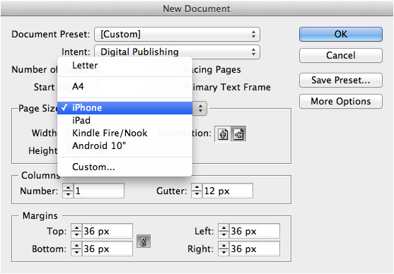
The Page Size menu of the New Document dialog box shows a few of the most common devices for digital publishing.
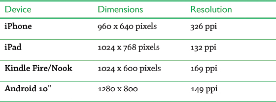
These are the dimensions of the four default tablet sizes in the New Document dialog box:
It’s highly possible that by the time this book is printed there will be new tablets on the market with different screen dimensions. Go to the manufacturer’s website to get the size of the specific device you’re designing for.
Understanding resolution
The glass screen of an iPhone 4S is 3.5 inches (diagonal). The glass screen of an iPad is 9.5 inches (diagonal). The iPad’s screen is almost three times bigger than the iPhone ’s screen. But the screen dimensions of the iPhone are about 80 percent of the iPad’s dimensions. How can something one-third the size be almost the same screen dimensions?
The answer is that the original iPad and the iPad 2 have a resolution of 132 ppi, while the iPhone has a much denser resolution of 326 ppi. This means that while the iPad has a larger screen, there is more detail available for zooming on the iPhone.
Apple recently came out with a new iPad. The glass screen of this new iPad (2012) is exactly the same size as the screen of the iPad 2. But the screen dimensions of the iPad (2012) are 2048 × 1536 — twice the size of the iPad 2. This is because the resolution of the iPad (2012) is 264—twice the resolution of the iPad 2. So how should you design one application for the two different iPads?
Fortunately, you don’t have to worry about designing for the two different types of iPad screens. As long as the aspect ratios are the same — and they are — you can design for the original iPad screen and its lower resolution.
Understanding aspect ratio
When you are designing for digital devices, it helps to know the aspect ratio of the device. This is the relationship of one side to another. This is very important if you want to modify a layout to be used on a different device.
The greater the difference in the aspect ratio, the longer one side will be than the other. For instance, if the aspect ration is 1:1, then the screen is a square. The aspect ratio for the iPad is 4:3. This is close to a square, but one side is slightly longer than the other. 4:3 is similar to the aspect ratio of a standard television screen.
The aspect ratio for the Fire and the Nook is 16:9. This means that one side is much longer than the other. This aspect ratio happens to be the one used by widescreen television shows. So those videos fit the screen of a Fire better than they do an iPad.
So what happens if you design an application for one device and then port it over to a tablet with a different aspect ratio? The application will shrink or expand to fit the new screen area. But since the new screen has a different aspect ratio, there will be empty space around the application.
You’re probably familiar with this effect from watching television. When a TV show that was shot in the widescreen format is shown on a widescreen television, the image fits perfectly. But if a movie or show has a different aspect ratio from the television, black bands are added to the outside of the image area.
The same thing happens when magazines or apps that are designed for just one aspect ratio and are ported over to a device with a different aspect ratio. There will be empty space on the outside of the image. This is the important reason why you need different designs for the various aspect ratios of devices.
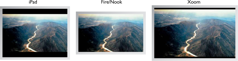
A comparison of the aspect ratios of three tablet devices playing a widescreen television show. The video fits perfectly on a Fire or a Nook. The iPad has noticeable letterboxing bands. But the letterboxing on the Xoom is less noticeable because its aspect ratio is closer to the aspect ratio for a widescreen show.
Setting and saving custom page sizes
If your device is not listed in the New Document dialog box, use the Height and Width fields to enter its dimensions in pixels. (The unit of measurement automatically changes to pixels when you choose the Digital Publishing intent.)
You don’t have to calculate the aspect ratio for a specific screen size. As soon as you enter the screen dimensions, you have automatically set the correct aspect ratio.
As new tablets enter the market, you will most likely want to save those sizes as custom pages. Enter the width and height measurements, and then choose Custom from the Page Size menu. This opens the Custom Page Size dialog box, where you can name the custom page. In addition to creating page sizes for new devices, you may also want to create custom page sizes for the horizontal or vertical orientations. That way, you won’t have to click the orientation icons to change from horizontal to vertical pages.
Deselect Facing Pages when creating layouts for digital publications. There are no left- or right-hand pages on a screen.

The Custom Page Size dialog box lets you define and store screen dimensions for devices that are not listed in the New Document dialog box.
Working with Alternate Layouts
The ability to create different-sized pages within a single InDesign document was introduced in InDesign CS5. It was, however, a bit of a hassle to quickly create new sets of pages with a different layout size and orientation. With the Alternate Layout feature, introduced in CS6, you have easier ways of creating the new page sizes as well as managing the layouts in the Pages panel.
Setting up the Pages panel
There are three different views for the Pages panel: Horizontally, Vertically, and By Alternate Layout. The Horizontally and Vertically settings are used primarily for print layouts. By Alternate Layout is used for working with digital publications. It allows you to see the alternate layouts in the document side by side in the Pages panel.
When you choose Digital Publishing from the Intent menu for a document, the Pages panel is automatically set to the By Alternate Layout display. The panel is also changed to By Alternate Layout when you choose Digital Publishing from the Workspace menu. Or you can change the setting by going to the Pages panel menu and choosing View Pages > By Alternate Layout.

The Pages panel, set to View Horizontally (left) and View Vertically (right). Although the different-sized pages are shown, these settings do not label the alternate layouts with the devices they are being designed for.

The Pages panel, set to View By Alternate Layout, labels the different layouts within the document. Notice that the page displays for the alternate layout pages have different sizes, orientations, and aspect ratios.
If you have a document set for a Print or Web intent, the Pages panel automatically switches to View By Alternate Layout when you add an alternate layout to the document.
To create an alternate layout
To create an alternate layout, choose Create Alternate Layout from the Pages panel menu or the Layout menu. This opens the Create Alternate Layout dialog box.
Rather than cover the options for this dialog box all at once, we’ll divide them up into sections.
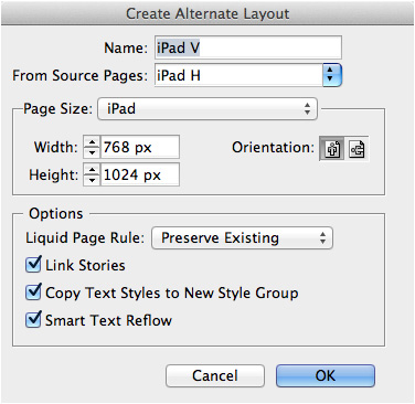
The Create Alternate Layout dialog box lets you set the options for new layouts added to the document.
To set the name and source page
Use the Name field to enter a name for the alternate layout. By default, the alternate layout is named from the source pages with a change in the orientation. So if you have been working on a horizontal iPad layout, the default name for the alternate layout is “iPad V.”
InDesign recognizes the orientation of the alternate layout and adds a V (for vertical) or an H (for horizontal) after the name.
Use the Page Size menu to choose one of the preset page sizes. These are the same choices that were available in the New Document dialog box.
If you want to enter your own sizes, use the Width and Height controls to apply custom dimensions to the alternate layout. Click the horizontal or vertical icons to flip the orientation of the alternate layout.
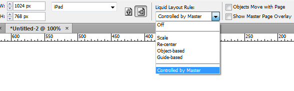
Using the Liquid Layout menu
When you create an alternate layout, you will want to set how objects on the page are resized and repositioned. This is where Liquid Layout rules come into play. You use the Liquid Layout Rule menu to set how the items and text will be modified to fit the alternate layout. (See the next section, “Using Liquid Layout Rules.”)
Unless you choose Preserve Existing, the Liquid Page Rule setting in the Create Alternate Layout dialog box overrides the settings applied to the individual pages.
Linking text between alternate layouts
When you create an alternate layout, the text and images from the source layout are duplicated in the alternate layouts. What happens, though, if you make changes to the text in one layout? You wouldn’t want to have to go through each of the alternate layouts to make those changes. Select the Link Stories check box so that changes to text in the source layout are applied to the stories in the alternate layout. (See the section “Linking Items” for more information on using this feature.)
Managing text styles
Select the Copy Text Styles to New Style Group check box to take the styles from the source document and make duplicates of them in the Paragraph Styles panel. This command collects all the styles from the original layout and puts them in a second style group folder labeled with the alternate layout name. It also applies the styles in the second style group to the alternate layout text. (For more information on copying styles between alternate layouts, see the section “Linking Styles” on page 111.)
Setting the other Alternate Layout options
Select the Smart Text Reflow check box to automatically add pages to the alternate layout if an overset is created. This is very helpful if you have a layout with long text.
Using alternate layout master pages
As you create each new alternate layout, a new master page is added for that alternate layout. The pages created by the alternate layout are automatically based on the new master.
If you need to change the size of the alternate layout pages, you should not select the document pages. Instead, select the master page with the Page tool and change the page size there.
The Document Size dialog box will change the size for only the first layout in the document, not for the alternate layouts.
Using Liquid Layout Rules
When you create alternate layouts, you’ll often need to adjust the size and shape of the elements to fit the size of the new pages. Liquid Layout rules are electronic settings that control how these elements change. Liquid Layout rules help automate the process of producing alternate layouts, but each page will likely require some adjusting afterwards.
Applying Liquid Layout rules
Choose the Page tool from the Tools panel. If the page is not automatically selected, click the page to which you want to apply a Liquid Layout rule. You can click the actual page with the Page tool, or you can click the page icon in the Pages panel. You can also use the Pages panel to select more than one page at a time.
You cannot combine several Liquid Layout rules on the same page. Each page can have only one Liquid Layout rule applied to it.
Use the Liquid Layout area in the Control panel to choose a Liquid Layout rule for the page.
When the Page tool is active, the Control panel displays the Liquid Layout Rule menu.
You can also use the Liquid Layout panel to set Liquid Layout rules. Choose Layout > Liquid Layout to open the panel.
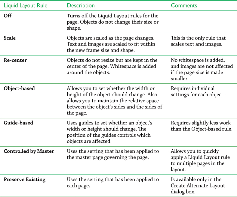
These Liquid Layout rules are explained in the following chart.
Using the Scale rule
The Scale rule is the easiest to apply and understand. When the Scale rule is applied to a layout, the objects shrink or expand to fit in the new page size and shape. This is similar to grouping the elements on a page and dragging with the Free Transform tool. Text point sizes change, as well as the size of images within frames.
Let’s say you start with a vertical layout for the iPad. The size of the page is 768 × 1024. You then use the Scale rule to create an alternate layout for the vertical layout of the Fire/Nook. This page is 600 × 1024. The height of the page remains constant, but the width needs to shrink.
When the Scale rule is applied, the objects scale down to fit the new width, but that leaves a lot of whitespace at the top and bottom of the page. The Scale rule gives the best results when the source page and the new layout have aspect ratios that are identical or very similar.

An example of how the Scale rule changes the size of objects from the iPad to the Fire/Nook. Notice that the point size of the text as well as the size of the image are reduced to fit the smaller width. Notice also that there is whitespace added at the top and bottom of the layout.
Using the Re-center rule
The Re-center rule adds or removes space for the new page size without changing the size of the elements on the page. As space is added to the page, the objects are repositioned so they stay centered on the page.
This rule creates satisfactory results if the page increases in size. But if the page is made smaller, you need to set the objects far enough from the edges of the page so that they don’t get cropped as the page edges move inward.

An example of what happens when the Re-center rule is applied to change a layout from iPad H to iPad V. Notice that the elements are centered horizontally on the page. But they extend vertically off the page because the Re-center rule does not change the size or shape of the elements.
Using the Guide-based rule
The Guide-based Liquid Layout rule uses guides to designate which objects on the page should resize and in what direction. These are special guides called Liquid guides.
To create a Liquid guide, switch to the Page tool and use the Page tool cursor to drag a guide out from the horizontal or vertical ruler. The Liquid guide appears. Liquid guides are indicated on the page by dashed lines (rather than the solid lines of Ruler guides). When selected, a Liquid guide displays a special icon  that distinguishes it from a Ruler guide
  . Click the icon to turn a Ruler guide into a Liquid guide and vice versa.
Liquid guides control the objects they touch on the page. Vertical Liquid guides allow the object to expand or contract from left to right. Horizontal Liquid guides allow the object to expand or contract from top to bottom.
Position the Liquid guide so that it crosses the items on the page that you want to resize. The Liquid guide does not have to cross through the center of an object; it only has to move through the object.
Liquid guides can also be placed on the master for document pages. This makes it much simpler to apply the Guide-based rule to multiple pages.

An example of how the Guide-based Liquid Layout rule changes objects from one orientation to another. In this case, the bottom text and image are set to change both their height and width, but the top text adjusts only horizontally.
Using the Object-based rule
The Object-based rule provides the most control over how items change as the page size changes, but it is also the most complex. Unlike the Guide-based rule, which controls only the height and width of an object, the Object-based rule lets you apply six adjustments to the shape of an object.
With the Page tool selected, choose Object-based from the Liquid Layout Rule menu in the Control panel. Then click the object that you want to control. The object-based controllers appear over the item.
On the top, bottom, left, and right sides of the object are the controls that govern whether the space between the edge of the page and the edge of the object is flexible or pinned. Set the edge to be flexible if you want the space between the object and the page edge to adjust. Set the edge to be pinned to maintain the relative spacing between the object and the page edge.
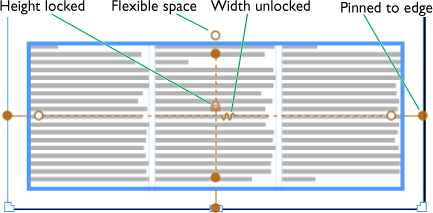
The object-based controls.
The edge controls let you keep an object in a specific area on the page. For instance, if you pin the bottom edge controller to the page, that edge of the object will maintain its position relative to the bottom edge of the page.
Inside the object are the controllers to set whether the width or height of the object adjusts. A spring icon indicates that the height or width can change as the page size changes. A lock icon indicates that the height or width is fixed.
An example of how the Object-based Liquid Layout rule controls the change from one layout to another. In this case, the right-hand text frame is pinned to the bottom and right edges of the page. This allows the frame to adjust its height and width while still hugging the page edges.
The controls need to be applied to each object on the page, but instead of manually setting them for each object, you can apply the controls to objects on the master page. Those settings are then applied to the master page objects on the document page. If there are objects on the page that are not controlled by the master, you need to set those controls on the document page.
You can set only two out of the three settings on each axis. For instance, if you pin the left and right edges to the page, then the width of the object has to be unlocked. If the height and top edge are locked and pinned, then the bottom edge has to remain flexible.
Using the Liquid Layout panel
As an alternative to setting the Liquid Layout rules using the Control panel, you can use the Liquid Layout panel. Choose Layout > Liquid Layout to open the panel. You can then choose a Liquid Layout rule. If you choose Object-based, you will see check boxes for Resize with Page and Pin. These are the same controls as the ones that appear over the object. You can set them as you want.
Tips for using Liquid Layout rules
Liquid Layout is a sophisticated feature, and setting the rules requires a certain amount of experimentation. Here are a few techniques we suggest for getting a handle on Liquid Layout rules.
• After you set a Liquid Layout rule to the page, resize the page by dragging one of the handles on the page with the Page tool. Watch how the objects resize and reposition. This will give you a better idea of how the Liquid Layout rule will affect the page. When you release the drag, the page snaps back to its original dimensions. Hold the Opt/Alt key as you drag if you don’t want the page to snap back to its original dimension when you release the drag.
• Crop images so there is extra image outside the frame. If the image frame expands, this ensures that there is more of the image to be displayed.
• Choose Flexible Width from the Column menu (covered on page 117) so that text frames automatically add or delete columns as the page width increases or decreases.
• Use the Auto-Size settings for text frames (covered on page 116) so that the text frames expand or contract to fit the text.
• Use the Auto-Fit Content Fitting options for image frames (covered on page 115) to control how images expand or contract as the frame adjusts.

The Liquid Layout panel contains check boxes that allow you to set the controllers for an Object-based Liquid Layout rule.
Using Layout Adjustment
Liquid Layout is not the only technique for adjusting page items when you change pages sizes. Earlier versions of InDesign have a feature called Layout Adjustment. This is a very primitive technique compared to Liquid Layout, but some people are more comfortable with the simple controls of Layout Adjustment. If you work with layouts created in versions of InDesign before CS6, it’s possible that Layout Adjustment will be turned on.
Layout Adjustment conflicts with Liquid Layout. You can’t have both applied. To turn off Layout Adjustment, open the Liquid Layout panel. In the panel menu, deselect the Layout Adjustment check box. This lets you work with the Liquid Layout feature.
Using the Content Tools
When you create an alternate layout, elements from one page are automatically copied onto another. You can also manually copy elements from one page or document to another using the Content tools — the Content Collector, Content Placer, and Content Conveyor. These give you more control over how objects are placed and linked.
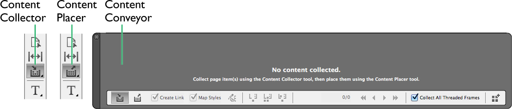
The Content tools.
To collect content
Choose the Content Collector tool from the Tools panel. The Content Conveyor automatically appears. Unless you have previously collected content, the Content Conveyor is empty.
Click to select the item that you want to place elsewhere. A preview of each item appears in the Content Conveyor as it is selected. Click to continue to collect other items. Each item appears in the Content Conveyor.
You can also drag with the Content Collector to select multiple items. This creates a set. A number appears next to the preview in the Content Collector cursor, indicating how many items are in the set. All the items in a set are placed together on the page.

The Content Conveyor as it appears with collected items.
If you want to hide the Content Conveyor but still use the Content tools, press Opt/Alt-B. Press the keystroke again to reshow the Content Conveyor.
To place content
Once you have collected content, you can place it in a different area of the page, on a different page, or even on a different document. The Content Placer is nested with the Content Collector in the Tools panel. You can also choose it from the Content Conveyor. But our favorite way to select the two tools is to tap the B key; this toggles between the two tools.
Move to the new area, page, or document where you want the content to be placed. A preview of the content appears in the cursor. If there is more than one item in the Content Conveyor, a number appears in the cursor preview, indicating how many items are in the Content Conveyor.

The Content Placer cursor with a preview of the placed item.
Click or drag to place the item. If you click, you place the item at the same size as its source. If you drag, the size of the area determines the size of the placed item. Dragged items are automatically constrained to the same proportions as the source. Hold the Shift key to change the proportions of the placed objects.
You can quickly place items using the Edit > Place and Link command. This loads the item into the Content Conveyor and switches to the Content Placer tool.
As you place content, the Content Conveyor highlights the next item in the queue for placing. You can skip an item by using the left and right arrow keys on your keyboard or the Previous and Next controls in the Content Conveyor. Click the escape (esc) key on the keyboard to delete an item from the Content Conveyor.
Items remain in the Content Conveyor until it is emptied or until you quit that session of InDesign.
To control the placement of items
You can control whether items in the Content Conveyor are kept or deleted as they are placed. This is helpful for those times you want to keep items for placement elsewhere.

The Content Conveyor controls for how items are placed, removed, reloaded, and kept.
With the Content Placer selected, choose one of the following controls from the Content Conveyor:
• Place/Remove/Load places the content, removes it from the Content Conveyor, and then loads the next item. Use this setting when you want to place an item once and then delete it from the Content Conveyor.
• Place/Reload/Keep places the content on the page, keeps it in the Content Conveyor, and then reloads it for placement again. This is helpful if you want to keep placing the same item over and over.
• Place/Keep/Load places the content, keeps it in the Content Conveyor, and then switches to the next item. This setting is useful if you want to cycle through all the items in the Content Conveyor without deleting them.
Applying Load Conveyor
You can also add items to the Content Conveyor using the Load Conveyor dialog box. This is more powerful than using just the Content Collector tool. Click the Load Conveyor icon in the Content Conveyor. This opens the Load Conveyor dialog box.

The Load Conveyor dialog box lets you enter the contents of multiple pages into the Content Conveyor.
Choose one of the following:
• Selection adds whatever content was selected on the page. This automatically creates a set if there is more than one item selected.
• Pages allows you to choose specific pages in the document. If you choose Pages, you can then use the drop-down menu to choose All Pages or one of the alternate layouts in the document. You can also enter specific page numbers in the Pages field.
• All Pages Including Pasteboard Objects adds the items from all the pages, including any items on the pasteboard. This is very helpful if you want to replicate all the items from one document in another.
Select the Create a Single Set check box to load all the items as a single group instead of as individual items.
Linking Items
The Alternate Layout and Content tools allow you to create links between the original and copied items. This is very helpful if you make changes to the source item and want those changes applied to the duplicated items.
Linking text
When you create an alternate layout, select the Link Stories check box in the Create Alternate Layout dialog box (shown on page 97). This links the text from the source layout to the alternate layouts. The Create Link setting in the Content Conveyor sets a link between the text in collected and placed items.
The relationship between the source item and the duplicate is sometimes called a parent/child relationship.
Updating linked text
When text is linked, the frame for the alternate layout text displays a link icon. When the source text has been modified, the link changes to a yellow alert triangle. Click the alert icon to update the alternate layout text to match the source text.

The yellow alert icon on the text frame on the left indicates that the source text has been modified. Click the alert icon to update the text. The link icon on the right appears.
You don’t have to go scrolling through the document to find all the instances of the modified text. Open the Links panel. A yellow alert icon appears next to each text story. Double-click the alert icon next to each text story to update all the instances of that linked text. You can also hold the Opt/Alt key as you click one to update all of them at once.

The yellow alert icons in the Links panel indicate the text that needs to be updated to match the source layout. Double-click the icon to update the text.
Releasing linked text
There may be times when you want the linked text to be different from the source. In that case it is best to free the alternate layout text from its linked state. Open the Links panel. The linked text is listed. Select the text and then choose Unlink from the Links panel menu. This removes the links between the text in the document. You can then modify the text in either layout without any alert icons.
You need to be careful if you make modifications to the child text. If you then update the child text to match the parent text, those modifications will be lost. This is why we recommend modifying only the parent text, or unlinking the child text from the parent.
Linking objects with the Content tools
You can create linked content with both alternate layouts and the Content tools, but the Content tools give you additional features.
Select the Create Link check box in the Content Conveyor to link the child item to the original source. This creates two separate types of links — one for the item’s content (text story or imported graphic) and another for the object itself (fill, stroke, size).

The Links panel with a linked story, linked images, and two modified linked objects.
Once you have links for objects, you can change the parent object’s size, shape, appearance, or other attributes and then have those changes applied to the child objects. For instance, if you change the stroke color of the parent object, you can then update the stroke color of the child objects. Simply click the yellow alert icon to update the object listing in the Links panel.
Setting the Links options
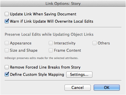
You can modify which attributes of a linked item are part of the parent/child relationship by using the Links Info dialog box. Select the linked item (or items) and choose Link Options from the Links panel menu. Depending on which type of link you have chosen, either the Link Options: Story dialog box or the Link Options: Story and Objects dialog box appears.
The Link Options: Story dialog box controls stories that have been linked by using the Content tools or by creating an alternate layout. It allows you to set the following attributes:
• Update Link When Saving Document automatically updates a modified link when the Save command is applied to the document.
• Warn if Link Update Will Overwrite Local Edits shows an alert if the child story has been modified to be different from the parent story.
• Remove Forced Line Breaks from Story removes any forced line breaks when updating the parent and child text. This is useful when the lines in the parent text have been forced to rag a certain way but the child text lines don’t need those changes.
• Define Custom Style Mapping lets you choose how styles with one name in a document can be mapped to styles with a different name. (For more information on this command, see the section “Mapping Styles” on page 112.)
The Link Options: Story dialog box controls how linked stories are updated between the parent and child text.
If you have chosen the link for an object created using the Content tools, you have additional options in the Link Options: Story and Objects dialog box. This lets you to choose to Preserve Local Edits while Updating Object Links. The following attributes can be maintained even when the link is updated to match the parent content:
• Appearance maintains the fill, stroke, effects, and corner effects.
• Size and Shape maintains the transformation settings for size, shape, rotation, scaling, and skewing of an object.
• Interactivity maintains the attributes for buttons, forms, object states, animations, and timing.
• Frame Content maintains the settings for items within a group, for HTML code, and for Media panel settings applied to movies and sounds.
• Other maintains the settings for text wrap, hyperlinks, text frame options, and object export.
The Size and Shape option is automatically selected if you drag with the Content Placer tool to create a custom size or shape for a linked object.

The Link Options: Story and Objects dialog box lets you preserve local edits applied to the child link when updating the object to match the parent setting.
Linking Styles
You may find that the text styles applied to a story in one layout or page need to be adjusted for an alternate layout or page. There are two ways to control how text styles (paragraph, character, table, and cell styles) are applied to linked stories. The first is using style groups, which are created for alternate layouts; the second is using style mapping, which is applied to items linked using the Content tools.
Using style groups
As mentioned in the section on creating alternate layouts, you have the option to select Copy Text Styles to New Style Group in the Create Alternate Layout dialog box. This copies the text styles from the first layout into a new style group folder. These second styles are then applied to the alternate layout. Once you have these two style groups applied to the linked text, you can modify the style definition in one group without changing the appearance of the text in another group.
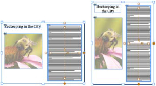
The new style group allows you to have different style definitions depending on the page size of the alternate layout. For instance, the point size for a print layout is often too small for tablet devices. Creating a new style group lets you modify the styles for the tablet device so the text is bigger. We have also seen situations where the horizontal layout for a digital magazine looks like the pages for a typical print magazine but the vertical layout has larger text without images. By creating new style groups, you can define the style for the horizontal layout with one point size and font while switching to a totally different size and font in the other. Even though the two layouts have different styles, their content is still linked.
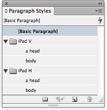
Style groups for each layout as they appear in the Paragraph Styles panel. Notice that the styles have the same name but are contained in different style group folders.

An example of what happens when different style groups are applied to alternate layouts. The vertical layout (left) has larger point sizes that work better for the longer column width. The horizontal layout (right) has smaller point sizes for the shorter column width.
Mapping styles
Mapping styles creates a similar result to style groups, but it gives you a little more flexibility.
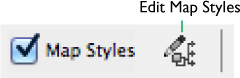
When you use the Content Conveyor to duplicate items, you have the option to map the text style names from one story to different style names in the document or in other documents. This is especially helpful if you use the Content Placer to duplicate a text story in a separate document that already has a set of styles.
The style mapping controls in the Content Conveyor.
Choose Map Styles in the Content Conveyor. Then click the Edit Map Styles icon. This opens the Custom Style Mapping dialog box.

The Custom Style Mapping dialog box without any styles mapped.
You can also open the Custom Style mapping dialog box by selecting a link in the list and choosing Link Options from the Links panel menu. Then select Define Custom Style Mapping and click the Settings button.
In the Custom Style Mapping dialog box, use the Source Document menu to choose the document that contains the styles you want to map. Choose a style from the Style Type menu; the options are Paragraph, Character, Table, and Cell.
Click the New Style Mapping button. The Select Source Style or Style Group controls appear. Click the Source Style or Style Group control (on the left) and choose a style from the list. Then click the Select Mapped Style or Style Group control and choose the alternate style that you want mapped to the source. Repeat these steps for additional styles that you want to map.

Choosing the mapped styles in the Custom Style Mapping dialog box.
If you place items between documents, you need to switch to the second document in order to map to the styles found in that second document.
Comparing Layouts
As you work with alternate layouts, you will probably want to compare how one layout looks next to another. The Split Window feature makes that easy to do.
Choose Window > Arrange > Split Window. This converts the document window into two parts. Each part displays a different alternate layout. Click a side to choose which alternate layout you are controlling. You can then use the Pages panel to choose different layouts for each side.
Drag the name of a layout to move it in the Pages panel from one position to another. This makes it easier to compare layouts.

Using the Split Window feature to compare two layouts.
Choose Window > Arrange > Unsplit Window to restore the document to a single layout.
You can also click the Split Window icons in the lower-right corner of the document window to split  or unsplit
  the layouts.
Modifying Images and Text within Frames
With the exception of the Scale Liquid Layout rule, the text and images within frames are not affected by changes in size and orientation of pages. However, Liquid Layout rules do change the size of the frames that contain the images and text. InDesign has several features for adjusting the text and images within frames as the page size changes. For instance, what happens to the text and images when frames become wider? How does the text rewrap to fit the new column width? What happens to the image inside a frame? This is where you can use the Auto-Fit options for images, Auto-Size for text frames, and Flexible Width for columns.
These features are not limited to working with Liquid Layout rules for creating alternate layouts; they can be useful when manually modifying frames.
Using the Auto-Fit options for images
Set the Auto-Fit options by choosing Object > Fitting > Frame Fitting Options. The Frame Fitting Options dialog box appears. When you select the Auto-Fit check box, the Fitting menu automatically changes to the default selection, Fill Frame Proportionally. This is the most useful setting for most images.

The Frame Fitting Options dialog box lets you control how an image is treated when the frame resizes.
Fill Frame Proportionally: This resizes the image so that it completely fills the frame without any distortion. This is the best option if you want to make sure there is no empty space within the frame. No matter how much the proportions of the frame change, the image will always fill the frame completely.
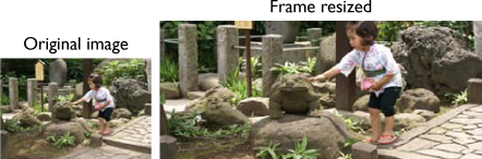
The Fill Frame Proportionally option applied to a frame. When the frame is resized, the image is scaled and cropped to fill the frame. There is no whitespace created.
You can apply Frame Fitting options to an empty frame and the options will be honored when a graphic is placed in the frame.
Use the Align From reference box to set from what point the image fitting and cropping appears. Click the center point to keep the image centered in the frame.
Use the Crop Amount settings to specify the position of the image in relation to the frame. Positive numbers crop the image. Negative numbers add space between the image and the frame.
Select the Auto-Fit check box in order to have the image resize as the frame resizes. If Auto-Fit is not selected, the image only resizes when it is first placed into the frame.
Use the Fitting menu to choose how the image will automatically adjust. There are four options in this menu:
None: Applies no resizing to the image.
Fit Content To Frame: This resizes the image to fit in the frame. If the proportions of the frame change, this setting will distort the image. We almost never choose this option.
Fit Content Proportionally: This resizes the image to fit in the frame while maintaining the proportions of the image. If the image and the adjusted frame have different proportions, there may be some whitespace within the frame.
Fill Frame Proportionally: This is the default option as described on page 115.
Applying the Auto-Size text controls
One of the worst things that can happen to your cherished text is that some of it disappears in an overset. The Auto-Size controls help you avoid that problem as text frames change size.
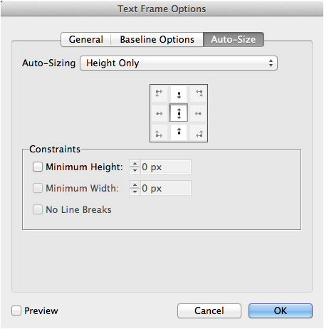
Select the text frame that you want to control. Choose Object > Text Frame Options to open the Text Frame Options dialog box.
Click the Auto-Size tab to display its settings. Choose one of the following from the Auto-Sizing menu:
• Height Only expands the top-to-bottom dimension of the frame.
• Width Only expands the left-to-right dimension of the frame.
• Height and Width expands both dimensions of the frame. This can change the frame’s proportions.
• Height and Width (Keep Proportions) expands both dimensions but keeps the original proportions of the frame.
• No Line Breaks is available when you choose Width Only. It prevents the text from wrapping to a second line.
Use the Align reference box to set from what point the auto-sizing is applied. For instance, click the upper-left corner to have a frame that resizes its height and width down and to the right. Click the top middle point to have a frame that resizes its height downward.
The Auto-Size controls of the Text Frame Options dialog box.
You can also set Minimum Height or Minimum Width to maintain the minimum amount for either dimension. For instance, if the leading for your text is 12 points, a minimum height of 24 points ensures that at least two lines of text are always visible. This is very helpful to ensure that the frame doesn’t collapse when the Liquid Layout adjustments are applied.
Setting Flexible Width columns
What happens when you change the orientation of a page from vertical to horizontal? Most likely, the width of the frame expands. This can make the column too wide to read comfortably. You need to make sure that the column width doesn’t expand so much as the frame width increases. The best way to accomplish this is to increase the number of columns in the frame.
Instead of manually changing the number of columns when the page width expands, you can use the Flexible Width option for text frames. This option simply says that if the column width expands above a certain width, then another column will be created. This forces the column widths to be less than the maximum width. If the frame width continues to expand, additional columns are created as needed.

The Flexible Width option adds new columns as the width of a text frame increases.
The same thing happens as the width of the frame decreases. As the columns become thinner, one will be deleted if the remaining columns are below the maximum width.
To set Flexible Width columns, select the text frame and choose Object > Text Frame Options. With the General tab selected, choose Flexible Width from the Columns menu. Then enter a maximum width for the columns. When the text frame changes its width, the number of columns changes so that the maximum width is not exceeded.

The Text Frame Options dialog box set to the Flexible Width option for columns.