
2. Interactive Tools
Imagine that Henry Luce, the man who created Time, Life, and Sports Illustrated magazines, were to come from the past to visit you today. What would you show him to get him excited about the power of digital publications?
Well, you’d start by showing him how each digital publication could have hyperlinks and buttons that allow the reader to click one page and instantly jump to another. You’d definitely want to play movies and sounds that enhance the printed text. You might even have him fill out an electronic subscription application that could be instantly transmitted back to Time/Life magazines.
This chapter is all about creating the interactive tools that give digital publications the figurative—and literal—bells and whistles that make them so exciting to view.
Types of Interactive Elements
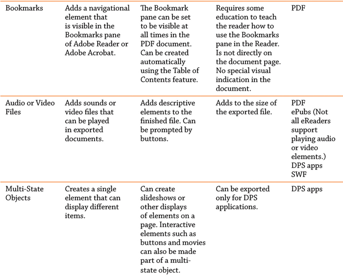
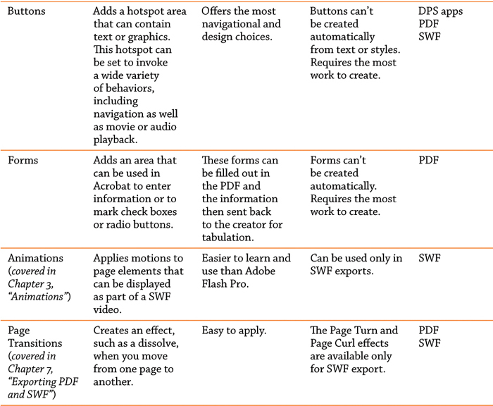
There are nine types of interactive elements you can add to InDesign documents: hyperlinks, cross-references, bookmarks, audio/video files, multi-state objects, buttons, forms, animations, and page transitions. Each has its own particular uses, but some of the features may overlap. Before you start work, you need to decide which type of interactive element is right for your job or you could be stuck with an effect that can’t be exported for your finished project.

Defining Hyperlinks
A hyperlink is an area of a page that can be clicked to send the reader to a new page, open a new document, move to a web page, or send an email message. There are two parts to a hyperlink: The source is the object or text that is clicked to trigger the hyperlink; the destination is the page, web link, or action that you go to.
Creating a hyperlink
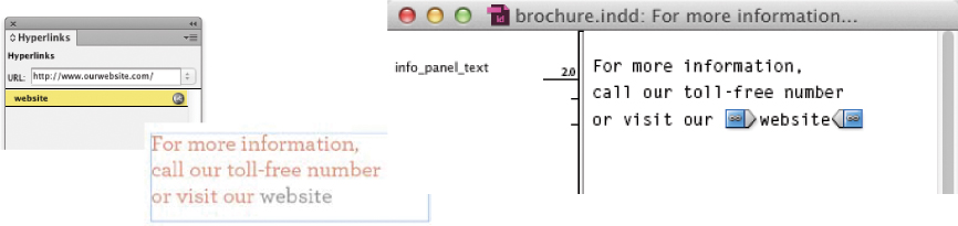
If the Hyperlinks panel is not visible, choose Window > Interactive > Hyperlinks to open the panel. In addition to the panel menu, there are buttons at the bottom of the panel that control many of the hyperlink and cross-reference functions.
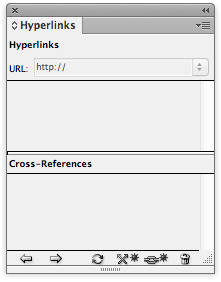
The Hyperlinks panel is where you choose new hyperlinks.
The buttons at the bottom of the Hyperlinks panel control many of the functions for creating hyperlinks and cross-references.
Select the text or object that you want to make the hyperlink source. (New Hyperlink isn’t available unless text or an object is selected.) Click the New Hyperlink button in the panel or choose New Hyperlink from the panel menu. This opens the New Hyperlink dialog box.
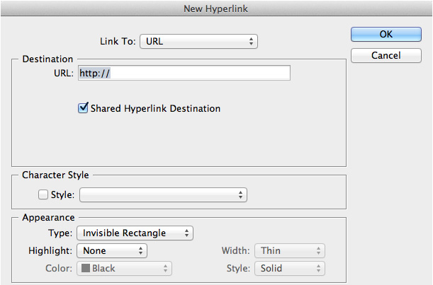
The New Hyperlink dialog box is where you set the type of link, destination, character style, and appearance for a hyperlink.
Set the options for Link To, Destination, Character Style, and Appearance as described in the following sections.
Setting the Link To and Destination options
There are three types of destinations for hyperlinks. You can link to a specific place in a document, open a web page or file, or send an email. The type of destination you choose determines the options that appear in the New Hyperlink dialog box.
As you create hyperlinks, be aware that some of the destinations or attributes do not work in all media, but you can rely on all these features to work in PDF or SWF files. For instance, a PDF or SWF file may support opening another type of file or simply going to another page in the document. But those types of destinations may be deleted completely when you export to an ePub or DPS application. And even then there may not be any consistency among the various eBook reader software.
An email destination works just fine in the iBooks software on an iPad, but it is deleted entirely on the original Kindle. So a destination that works for iBooks may not work for Kindle or Nook software. We know it’s expensive to keep up with all the new tablets and eReaders, but in order to truly rely on certain links, you must test them on the physical devices your readers are going to be using.
Here are the types of hyperlink destinations found in the Link To menu:
URL: Choose this to enter a universal resource locator (URL) as the destination. This needs to be a complete URL, such as http://www.adobe.com. You can also use any of the other protocols, such as http://, file://, ftp://, or mailto://.
If you have an extremely long URL, it may not work correctly. In that case you can use one of the URL shortening services, such as bit.ly, tinyURL.com, or goo.gl.

When you choose URL as the Link To option, the Destination area gives you a URL field where you can enter the address for the web page you want the hyperlink to go to.
File: This creates a link that opens a file in another application. This is used for PDF documents, which can then open a file such as another PDF, a word-processing file, or a spreadsheet document. It is not used in ePubs or DPS applications.
When you create a destination to open a file, you need to enter the absolute path for the file. This is the complete route from the hard drive down to the directory that contains the file. This is so that Acrobat knows where the file is located. A relative path, with just the name of the file, won’t work, even if the file is located in the same folder as the PDF document. In addition, the person who clicks the link must have the appropriate software to open the linked file.

When you choose File as the Link To option, the Destination area gives you a Path field where you can enter the path where the file is located. You can also click the folder icon to navigate to the file.
Email: This option creates a link that opens the default email application on the user’s computer. Use the Address field to enter the email address, such as [email protected]. Use the Subject Line field to enter a subject for the message. This type of destination relies on the software on the reading device. A Kindle doesn’t have any email software, so the link to open an email application doesn’t do anything on a Kindle. But iPads and other tablets do have mail programs, so clicking the email link will prompt a new email.

When you choose Email as the Link To option, the Destination area gives you an Address field where you can enter the email address. The Subject Line field lets you enter a subject for the message.
Page: This creates a link that opens a new page in the current document or a different document. You have the option to choose an open document or browse to select another document. This type of hyperlink is not used in ePub or DPS applications. Those documents have no idea of pages, so they discard the information for a page link.
You might hesitate to apply a page link if you expect to add or delete pages to the document so that the page you designated as the destination moves to a different position. That’s actually not a problem. The hyperlink is tied to the actual page, not the page number. So if you have a link from page one to page three and you add two pages after page one, the link will then take you to page five.
However, the opposite situation happens if you add two pages of text to a story so that the text that was on page three moves to page five. In that case, the hyperlink continues to take you to page three, which no longer contains the same text. In order to ensure that the link always goes to a specific point in the text, you need to link to a text anchor.

When you choose Page as the Link To option, the Destination area displays the options for document, pages, and zoom setting.
Text Anchor: This creates a link to a point in the text that was previously defined as a text anchor. The text anchor can be in the same document or a different document. This is the only type of destination that needs to be created before you define the source link. (See the section on page 28 to learn how to create text anchors.) We have gotten excellent results using text anchor links in ePubs.
The difference between a Page link and a Text Anchor link is that the Page link uses the entire page as the destination. The Text Anchor link allows you to focus on a specific position on the page.

When you choose Text Anchor as the Link To option, the Destination area lets you choose a document as well as a previously created text anchor.
Shared Destination: This creates a link to a previously defined hyperlink. This is particularly helpful if you want several different hyperlinks to go to the same destination.
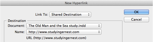
When you choose Shared Destination as the Link To option, the Destination area gives you a Document menu where you can choose the document that contains the shared link. The Name menu contains all the shared destinations for that document.
Viewing the icons in the Hyperlinks panel
As you define hyperlinks, they appear in the Hyperlinks panel. Each type of hyperlink displays a different icon.

The icon next to each hyperlink tells you the type of destination for that link.
As you work, you may need to change the name of a hyperlink in the panel. Whereas most listings in panels can be renamed by simply double-clicking the entry, to rename a hyperlink you need to choose the Rename Hyperlink command from the Hyperlinks panel menu.
Setting the style and appearance of hyperlinks
In addition to setting the destinations for hyperlinks, you can control how a hyperlink appears in the exported document. These settings are almost always ignored by the software in ePub readers. Each eReader software has its own display for hyperlinks. However, these options translate perfectly to PDF and SWF files.
Setting a character style for hyperlinks
Select the text that you want as a hyperlink. In the New Hyperlink dialog box, click the Character Style menu.
Choose a predefined character style, or choose None to apply no character style to the selected text.

The Character Style menu lets you apply a character style to the text of a hyperlink.
You can apply a character style to format the text with a special color or underline. But remember, most eBook readers will substitute their own formatting (similar to the appearance of links in a web browser). For instance, you might get the custom color you apply, but the eBook reader may add an underline in a different color.
Setting the appearance of a hyperlink
You can also create visual indicators around hyperlinks. This is controlled using the Appearance settings.

The Appearance controls let you apply formatting to the hyperlink in the exported document.
Use the Type menu in the Appearance area to choose a setting for the visibility of the rectangle around the hotspot. Invisible Rectangle hides the rectangle around the link; Visible Rectangle displays a rectangle around the link.
Use the Width, Style, and Color menus to format the rectangle around the link. We recommend either using a Thin width or, better yet, simply using Invisible Rectangle, as any rectangle style tends to look rather clunky.
Use the Highlight menu to choose the appearance of the hotspot area when clicked. None applies no change to the look of the area when clicked. Invert changes the colors in the area to their inverted RGB colors—black becomes white, white becomes black, red becomes green, and so on. Outline draws a rectangle around the area. Inset creates the appearance of the area being pushed into the page. These effects are not very sophisticated, and we recommend using them sparingly.
To use the Style menu: Choose a solid or dashed line for the visible rectangle. Solid is fine. Dashed is clunky and ugly—we never use it!
To use the Color menu: You can choose one of the colors for a visible rectangle. These colors are not from the Swatches panel.
Editing the source settings
As you work, you can edit the settings for the text area or object that has the hyperlink applied. Double-click the hyperlink entry in the Hyperlinks panel, or select the hyperlink in the Hyperlinks panel and choose Hyperlink Options in the Hyperlinks panel menu. This opens the Hyperlink Options dialog box, which contains all the options of the New Hyperlink dialog box. Make whatever changes you want.
To delete a hyperlink:
Select the hyperlink you wish to delete. Click the Delete button in the Hyperlinks panel, or choose Delete Hyperlink/Cross-Reference from the Hyperlinks panel menu.
Deleting a hyperlink does not delete any character style that was applied to the text. You need to highlight the text and remove the character style using the Character Styles panel.
Creating page destinations without sources
The easiest way to create a hyperlink destination is to create it as you define the hyperlink. However, it’s also possible to define destinations without defining the hyperlink source at the same time. This is helpful if you have a lot of destinations that you want to define but don’t know where you will apply them. For instance, it may be helpful to create a destination for a company’s website before actually applying it within the text.
Destinations don’t appear in the Hyperlinks panel. You can see the destinations for a document when you define a new hyperlink.
Choose New Hyperlink Destination in the Hyperlinks panel menu. The New Hyperlink Destination dialog box appears. Choose Text Anchor, Page, or URL from the Type menu. (The File and Email options are available only by typing in the URL.)

The New Hyperlink Destination dialog box lets you define hyperlink destinations without first selecting a source object or text.
Creating a text anchor destination: This is the only type of destination that must be defined here before you create the source hyperlink. Select the text, or place your insertion point at the position where you want the text anchor to be located. Then open the New Hyperlink Destination dialog box and choose Text Anchor from the Type menu.
Use the Name field to name the destination. The text anchor indicator appears in the selected text.
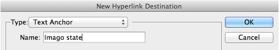
The options for a Text Anchor hyperlink destination.
Creating a URL destination: This is the same as creating a URL destination in the New Hyperlink dialog box, which is covered on page 23.
Creating a Page destination: This is the same as creating a Page destination in the New Hyperlink dialog box, as covered on page 24.
Editing hyperlink destination options
Choose Hyperlink Destination Options from the Hyperlinks panel menu. This is the only place in the document where you can see a list of all the destinations. Select a destination, and click Edit to change the name, the link, or other features. These are the same options you had when you first created the destination.
Editing the hyperlink destination doesn’t change the appearance of the link. That needs to be modified using the Edit Hyperlink dialog box.
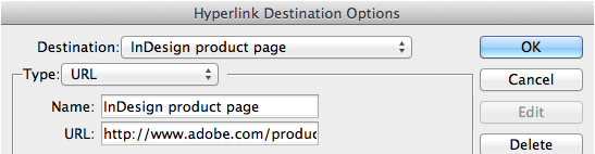
Choose Hyperlink Destination Options to edit existing destinations.
Navigating through hyperlinks in the document
As you create hyperlinks, you can test to see if they are working correctly by using the controls in the Hyperlinks panel.
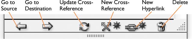
To move to a hyperlink: Select the hyperlink in the Hyperlinks panel. Choose Go to Source from the Hyperlinks panel menu, or click the Go to Source button in the Hyperlinks panel.
To move to a hyperlink destination: Select the hyperlink in the Hyperlinks panel. Choose Go to Destination from the Hyperlinks panel menu or click the Go to Destination button in the Hyperlinks panel.
To fix a missing hyperlink: If you have document, page, or text anchor hyperlink destinations, those links may become missing if the document is changed or moved. The hyperlink will then display a missing destination icon: A red circle means the document hyperlink is missing; a red flag means the page or text anchor hyperlink is missing. You then need to re-establish the hyperlink.
Choose Hyperlink Options from the panel menu, or double-click the hyperlink to open the Edit Hyperlink dialog box. (Ignore the alert dialog box that says the hyperlink is missing. You know it’s missing.) Set the new destination for the hyperlink. The hyperlink is now fixed.
The missing destination icons in the Hyperlinks panel.
Viewing hyperlinks in the Story Editor
If you don’t apply any appearance settings or character styles to hyperlinks, you may not be aware of where they are in the text. One of the best ways to view the location of a hyperlink source is to view your text in the Story Editor. The Story Editor displays a special character for hyperlinks and makes them easy to find in the text.
To access the Story Editor, choose Edit > Story Editor or use the keyboard shortcut Cmd/Ctrl-Y. The Story Editor will open in a separate window. The text in the Story Editor is dynamic, and any changes made in the Story Editor will be reflected immediately in your layout.
Type Cmd/Ctrl-Y again to jump back to the layout at the same position that you were in the Story Editor.
The Story Editor displays special markers for hyperlink sources that make them easy to spot.
You can use the Story Editor to locate hyperlinks and make sure they are applied to the correct text. The Story Editor also displays special characters for hyperlink destinations, cross-references, and text anchors.
Creating Cross-References
Cross-references are a subset of hyperlinks and are found at the bottom of the Hyperlinks panel. Like hyperlinks, cross-references create an electronic link from one part of a document to a destination in the same document or in a different document. But cross-references do more than hyperlinks do. They are dynamic and can pick up text and information from the destination and include it in the source text. So you can create a cross-reference that says “for more information, see page ###.” The page number then updates if the document is modified.
In addition to using cross-references to create links in digital publications, you can use cross-references when creating long print documents. We used them everywhere you see a reference to another page in this book. Without cross-references, we would have had to manually enter the correct page numbers.
Setting a cross-reference
Place your insertion point in the text where you want the cross-reference to appear. Unlike hyperlinks, cross-references can be inserted only into text. You can’t use an object as the source for a cross-reference.
Click the New Cross-Reference icon in the Hyperlinks panel. This opens the New Cross-Reference dialog box. Set the options as described in the following sections.
Setting the cross-reference Link To options
Like hyperlinks, cross-references let you point to a destination that you want to link to. However, the links for cross-references are to a specific position in the text. They can also pick up the page number or paragraph content in the linked text. Use the Link To menu to choose which type of cross-reference you want. The options are to a text anchor or to a paragraph with a specific paragraph style applied.
As with the Text Anchor option for hyperlinks, you need to create a text anchor before you open the New Cross-Reference dialog box.

The New Cross-Reference dialog box lets you set the destination, format, and appearance of a cross-reference.
Setting a text anchor cross-reference
When you choose a text anchor for a cross-reference, the dialog box displays the options for the document and all the text anchors in that document. You need to have previously defined the text anchor for it to appear in that list.

When you link to a text anchor, you get the options to choose a document destination and a text anchor in that document.
Setting a paragraph cross-reference
Paragraph cross-references are incredibly versatile. As long as you have previously applied paragraph styles to text, you can easily create cross-references to those paragraphs. (They are of no use, however, if you don’t use paragraph styles.) After you choose Paragraph for the Link To option, you can then choose the document for the cross-reference. Underneath, on the left, you see all the paragraph styles in the document. Choose the style that governs the text that you want to link to. For instance, if you want to refer to a chapter title, you would choose the paragraph style applied to all chapter titles.
Once you choose a paragraph style, all the text with that paragraph style appears on the right. Scroll through the list to find the paragraph that you want to link to. (If your paragraphs are long, you will see only a short section of the text.) Click the text. This sets the link to that paragraph.
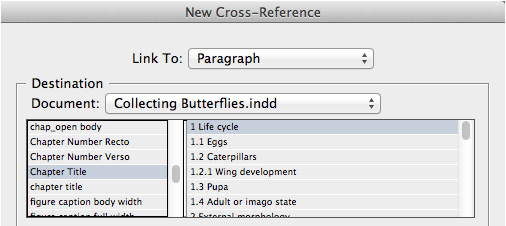
When you link to a paragraph, you get the options to choose a document destination and the paragraph styles for the text in the document. You can then choose the specific paragraph you want to link to.
Formatting the text inside the cross-reference
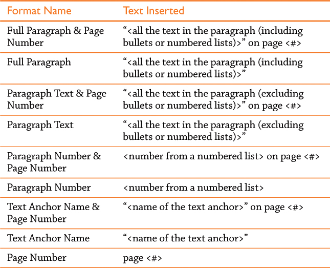
Once you have chosen the Link To and Destination options for the cross-reference, you need to format the text that will be used as the cross-reference. Use the Cross-Reference Format menu to control what text is placed inside the cross-reference.
InDesign ships with seven pre-made cross-reference formats. These formats provide most of the typical text for cross-references. For example, the Page Number format will insert the cross-reference text page <#> into the text. The code <#> is replaced by the actual page number in the document. Here are the pre-made cross-references and the text they insert. The quotation marks are part of the text that is inserted.
There is a setting in the Preflight panel that will alert you if you have missing or unresolved cross references.
Just as you can style hyperlinks, you can also format the appearances of cross-references. These are the same as the options covered in “Setting the style and appearance of hyperlinks” on page 26.
Creating a Table of Contents (TOC)
Creating a table of contents (TOC) in an InDesign document is like creating a massive set of cross-references. The TOC not only keeps track of the location of a specific paragraph in a document (along with the page number on which it appears), but it also automatically creates electronic links from the text in the TOC to the text in the document. Creating a TOC also creates bookmarks for PDF documents, which is covered in the section “Working with Bookmarks” on page 39.
Setting the table of contents paragraphs
A TOC simply is simply a list of all the paragraphs in the document that have a certain paragraph style applied. You must, however, create and apply paragraph styles to the text in your document in order to generate a TOC.
Once you have the paragraph styles applied to the text in your document, choose Layout > Table of Contents. This opens the Table of Contents dialog box.
The entire TOC generated by the dialog box is one complete area of the text linked to the paragraphs in the document. The TOC can be edited once it is created, but those edits will be discarded if you update the TOC. That’s why it is important to use all the electronic features in the Table of Contents dialog box to create and format the text.
Setting the Title listing
At the top of the Table of Contents dialog box, you’ll see the Title field. This is simply the text that will be inserted to label the table of contents. The default is “Contents,” but you can substitute any text you want. For instance, we used the title “In This Chapter” for the TOC we put at the front of each chapter of this book.
The Style menu to the right of the Title field allows you to set the paragraph style for the title text. Once again, this paragraph style needs to be defined ahead of time.
An often-requested feature is the ability to select character styles for TOC listings. Unfortunately, this is not currently available in InDesign.
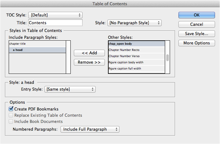
The Table of Contents dialog box is where you choose the paragraph styles and settings for the TOC. In this case, the chapter titles and a heads are used to create the TOC.
Choosing the listings for the TOC
The Styles in Table of Contents area is the main area where you choose which text will be numbered. The right side of this area has a list of styles called Other Styles. This is a list of all paragraph styles in your document.
Click the name of a style that you want listed in the TOC, and then click the Add button. This moves the style name from Other Styles to the Include Paragraph Styles area. For instance, if you want the chapter titles to appear in the TOC, you would choose the paragraph style applied to the chapter titles. (This is why using descriptive names for your paragraph styles is important.) Continue with the rest of the styles that you want to add to the TOC.
Styling the TOC listings
The paragraph styles now need to be styled. Click the name of one of the paragraph styles in the Include Paragraph Styles area. Under the section Style: [name of style], you’ll see the Entry Style menu. Once again, this is a list of all the styles in your document. Unlike the styles that you selected to be the listings in the TOC, this menu is used to format those listings. If you want the TOC list to use the same formatting that appears in the document, leave the setting as [Same Style]. If not, select a paragraph style from the list. We like to style the TOC with its own paragraph styles since most of our chapter titles are far too big to use in a TOC. Continue by selecting the next paragraph style and setting the Entry Style for that listing.
Opening the rest of the options
Just when you think you’re finished choosing and formatting the styles for the TOC, there are still other formatting options. Click the More Options button. This opens up the rest of the Table of Contents dialog box.

The additional options for styling the listings in a TOC.
Controlling the page numbers
With the additional options available, you can control the position and style of the page number for the entry listing. Use the Page Number menu to choose one of the following:
• After Entry positions the number after the end of the text for the listing.
• Before Entry positions the number before the start of the text for the listing.
• No Page Number deletes the page number from the listing. This option can be used for ePubs, which don’t have page numbers. It can also be used to create lists of items formatted with a specific paragraph style.
Use the Style menu to the right of the Page Number menu to apply a character style to the numbers in the list. Or you can leave this setting as [None], which leaves the numbers styled with the paragraph style for the entry.
We like to create two different styles for the numbers: plain black text for documents that will be printed, and blue text for interactive links in PDF documents.

The Style menu that applies character styles to the page numbers in a TOC.
The Between Entry and Number field allows you to enter the characters that separate the entry and the page number. The default setting is the code for a tab character (^t), but you can enter any character you want. Click the triangle to the right of the field to open the menu of characters. These include the various space characters, em and en dashes, bullets, tabs, forced line breaks, and the end nested style character.
But you aren’t limited to inserting just the items in the menu. You can type your own characters in the field. For instance, if you want the word “Page” to appear before the page number, just type the word and a space after the code for the tab character.
Use the Style menu to the right of the Between Entry and Number field to style those characters with a character style sheet. This can be very helpful if you have a tab leader character, such as a period, filling in the space between the entry and the page number. In that case, you might want to apply a character style that reduces the size and increases the tracking between the periods.
Setting the TOC levels
It’s strange that Adobe included a setting for the levels of the items in a TOC, because it only indented extries if they were sorted alphabetically. Other than that it would just indent the items in the Include Paragraph Styles list. There, the levels made it easy to see each type of listing in the TOC, but the setting was for cosmetic purposes only. If you wanted the items to be indented in the actual TOC, you had to set a paragraph style that indented those items.
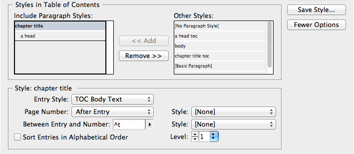
The Level setting in the Table of Contents dialog box indents the listings for the paragraphs to be included in the TOC. Here, the listing for the chapter title has a level 1 setting, while the listing for the a head has a level 2 setting.
But all that is different with the output to ePubs. When you set the levels for each listing in a TOC, you also control the indents and nesting for the items in the electronic TOC in an exported ePub. When you set the levels in the TOC, those levels can then be used in the electronic TOC that is created for the ePub. This is handled when you create a table of Contents style. (See page 38 to learn how to create a Table of Contents style.)

Entries in an ePub nested in the electronic TOC generated from the TOC in InDesign.
Sorting the TOC entries
A TOC doesn’t have to be in the order that the items appear in the document. You could, for example, have a TOC list of all the names of the photographers in your book. In that case you might want to alphabetize the list to make it easier to find a specific person. Just select Sort Entries in Alphabetical Order.
Setting the TOC options
Additional controls for creating a TOC are found under the Options area.

The Options area for the Table of Contents dialog box.
Create PDF Bookmarks
Bookmarks are navigational controls that appear on the side of a PDF document in Reader or Acrobat. Select the option Create PDF Bookmarks to automatically add these to the InDesign Bookmarks panel. The bookmarks can then be exported as part of the PDF. (See the next section, “Working with Bookmarks,” for more information.)
Replace Existing Table of Contents
Choose this option if you already have created a TOC in the document and now want to replace it with a new one with new formatting and styles. This is different from the Update Table of Contents command in the Layout menu. That command retains all the elements in the TOC but updates the text and page numbers.
Include Book Documents
This command is available only if a Book file is open. Then the TOC that you create will list all the entries in all the documents in the book.
Setting a TOC to run as a single paragraph
Select the Run-in option to set the entries as a single paragraph. The entries are separated by a semicolon (;) and a space.
Including non-printing text
The entries for a TOC don’t have to be visible in the finished document. Select the option Include Text on Hidden Layers to create a list of items such as the copyright information for photographs or illustrations.
Working with numbered paragraphs
If you have TOC entries that come from numbered paragraphs, you can control how those numbers are handled.
• Include Full Paragraph includes the text and its number.
• Include Numbers Only includes just the numbers for the paragraph.
• Exclude Numbers includes the text but not the numbers.
Flowing the table of contents text
Once you have set the paragraph styles for the TOC, click the OK button to close the dialog box. You should now have a cursor loaded with the TOC text.
Click to place the TOC text on a page. There are no indicators on the layout that the text is linked to other pages, but as with hyperlinks, you can see the link markers in the Story Editor. Of course, if you export as a PDF or ePub, the hyperlinks do work.
Creating a Table of Contents style
There is a special feature of the TOC that makes it easy to apply all the settings in the Table of Contents dialog box to other documents. But more importantly for digital publications, it is used for creating navigation for an ePub. In an ePub, you can create an list for all the chapters or headers in your document. The reader then clicks the entry in the list to jump to a new section of the book. This navigational list comes from creating and saving a TOC style for the document.
It’s very simple to create a TOC style. Just set up the Table of Contents dialog box with the paragraphs that you want in the navigation list. Click the Save Style button and name the TOC style. You don’t have to actually create a TOC. You only need the style settings captured under a style name. Then, when you create the ePub for the document, you can choose the TOC style to create the navigational list. (See Chapter 6, “ePubs and HTML,” to learn how to create ePub documents.)
Working with Bookmarks
Bookmarks are used only in PDF documents. They provide a different way to navigate within a document. Instead of being elements on the page, bookmarks are displayed in the Acrobat or Reader Bookmarks pane. The reader clicks each bookmark to move to that position in the document. One of the advantages to using bookmarks is that the Bookmarks pane can always be visible next to the area being read.

Bookmarks in Adobe Reader and Adobe Acrobat let the user easily navigate to pages in the document.
Creating individual bookmarks
To create individual bookmarks, choose Window > Interactive > Bookmarks to open the Bookmarks panel.

The Bookmarks panel as it first appears.
You can create various types of bookmarks, depending on what you select first:
• Place the insertion point within the text and click the New Bookmark icon. This creates a generically named text bookmark.
• Select the text and click the New Bookmark icon. This creates a text bookmark named with the selected text.
• Select a frame or graphic and click the New Bookmark icon. This creates a page bookmark.
• Click a page in the Pages panel and click the New Bookmark icon. This creates a page bookmark.
Nesting bookmarks
You may have a lot of bookmarks in a document. Instead of scrolling through a long list of those bookmarks, you can nest them, or move bookmarks so they are contained within others. The top bookmark is called the parent; the nested bookmark is called the child. This not only shortens the list of bookmarks, it shows the structure of how some items are sub-heads of the others in the list.
Drag the bookmark you want to nest onto the name of the parent bookmark. When the name is highlighted, release the mouse button. The child bookmark is indented under the parent. A triangle controller appears that lets you open or close the parent bookmark.
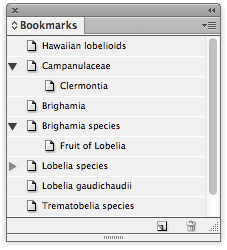
The Bookmarks panel with nested bookmarks. These bookmarks were created automatically by creating a table of contents in the document.
Getting bookmarks from a table of contents
You don’t have to manually create bookmarks. You can automatically generate bookmarks by creating a table of contents for the document. When you create the table of contents, select the option Create PDF Bookmarks in the Table of Contents dialog box. The bookmarks are automatically added to the Bookmarks panel.
As soon as you create the loaded cursor for the table of contents, the bookmarks appear in the panel. Click to place the table of contents text on a page.
You must keep the table of contents in the document. If you delete it, the bookmarks are deleted from the panel.
If you don’t want the table of contents in your document, you can put its text on a non-printing, hidden layer. This keeps the bookmarks in the panel without showing the table of contents.
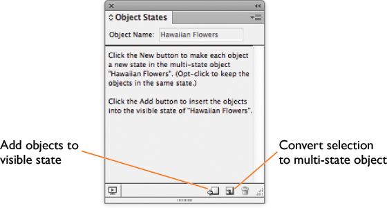
Working with Object States
Another type of interactive element is the multi-state object. A multi-state object allows you to show a series of frames in a slideshow-style display. Multi-state objects are used only in SWF or DPS app files. You create multi-state objects using the Object States panel.
Creating a multi-state object
Choose Window > Interactive > Object States to open the Object States panel. Select the objects for the multi-state object. You can have a variety of objects in each state.
For instance, you can have an image in the first state, text that describes the image in the next, and a movie that features that image in the next. You can also combine objects for each state as long as you group them before converting them into a state.

Left: A stack of objects ready to be converted into a multi-state object. Right: The same objects converted into a multi-state object.
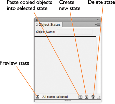
The Object States panel without any states.
Once all of your objects or grouped objects are aligned on top of each other, click the Convert Selection To Multi-State Object button. This puts each object into its own state, which appears in the Object States panel.

The Object States panel with a multi-state object selected.
Editing a multi-state object
Once you have created a multi-state object, you can make changes to each state, make changes to the object as a whole, edit the content of a state, or add states.
To edit the multi-state object as a whole, use the Selection tool to select the multi-state object on the page. The icon in the Object States panel indicates that the entire multi-state object has been selected. Then make whatever edits you want to the object. All the states will be modified. For instance, if you change the size of the object, the size of all the states will change.

The Object States panel with three states visible. The multi-state object is selected.
To edit a single state, select the state in the Object States panel. The indicator icon in the panel indicates that just that specific state has been selected. Make whatever changes you want to the object. Only that specific state will be modified.
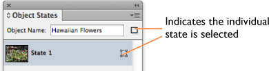
The Object States panel with an individual state selected.
To edit the content of a state, select the state in the Object States panel. Then use the Direct Selection tool to select the content of the state. The indicator icon in the panel changes to show that the content of the state is selected. Make the changes you want.

The Object States panel with the content of a state selected.
To add an object to an existing state, select both the new object and the multi-state object and then click the Add Objects to Visible State button.
To add an object as a new state in an existing multi-state object, select both the object and the multi-state object. Then click the Convert Selection to Multi-State Object button.
The Object States panel with a multi-state object and an ordinary object selected.
• To duplicate a state, select a state and then choose New State from the Object States panel menu.
• To paste objects into an existing state, cut or copy one or more objects, select the multi-state object, select the state in the Object States panel, and choose Paste Into State from the Object States panel menu.
• To convert a single state back to an object on the page, select the state in the Object States panel and choose Release State to Object from the panel menu.
• To convert all states in the multi-state object to objects, choose Release All States to Objects from the panel menu.
• To delete a state and remove its contents, select the state and click the Delete State button or choose Delete State from the panel menu.
Using buttons to display object states
Once you have created a multi-state object, you can use the actions in buttons to cycle forward and back through the object states or jump to specific object states. (See the section “Our Favorite Button Effects” for an exercise on how to create these buttons.)
Hiding multi-state objects until triggered
You use buttons to cycle through the states of a multi-state object. However, there may be times when you don’t want the object to be seen until the button to show the states is activated. To hide the multi-state object until it’s triggered by a button, choose Hidden Until Triggered from the panel menu.
Previewing and testing multi-state objects
To see how a multi-state object works, you use the SWF Preview panel. For more information on using the Preview panel, see Chapter 3, “Animations.”
You use interactive buttons to trigger each of the object states. See “Creating Buttons” on page 51.

The SWF Preview panel is used to preview the buttons that trigger the display of multi-state objects.
Audio and Video Formats
For many of us coming from the print world, it’s surprising how enjoyable it is working with sounds and movies in documents. It’s thrilling to add clicks to buttons or see our own instructional movies in interactive files.
But not all multimedia formats work in all types of digital publications. Here are some of the most common multimedia file formats and where they can be used.

As you can see, the most versatile formats are MP4 (for video) and MP3 (for audio). However, you may have files in other formats that you need to convert. In that case, you can use the Adobe Media Encoder. If you have Adobe Premiere Pro, Adobe Flash Professional, or Adobe Creative Suite Production Premium, the Adobe Media Encoder is automatically installed.
Converting files using the Adobe Media Encoder
Open the Media Encoder. Don’t let the size of the window overwhelm you. All you need to focus on is the Queue pane in the upper-left corner.
Click the plus sign to add files for conversion. Use the Format control to choose the new format for the file. Choose H.264 (Legacy) to create MP4 video files; choose MP3 to create audio files.
When you have added all the files you want to convert, click the Start Queue button (green triangle). The new files appear in the location specified in the Output File area.
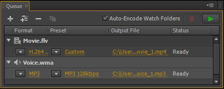
The Queue pane of the Adobe Media Encoder is where you can convert video and audio files to the correct format for digital publications.
Working with Audio Files
Despite the mind-bending concept (to a print person) of adding sound to a page layout, it’s actually very simple to work with audio files, or sounds. Our favorite use for sounds is as effects that play when a button is clicked. We might also add short bits of music that play when a document is first opened. If you know how to place an image into InDesign, you already know how to place a sound in a document.
Adding sound files to documents
Choose File > Place, and then choose the sound file you want to import. The cursor changes into the Sound Clip cursor. Click or drag the Sound Clip cursor to add the sound clip to the document.
Once you have the sound clip on the page, use the Media panel to set the options for how the sound plays.
Using the Media panel to set sound options
Choose Window > Interactive > Media. The Media panel appears. Use the panel to apply the sound options.

The Media panel with the sound controls visible.
• Play on Page Load sets the sound to automatically play when the page is visible.
• Stop on Page Turn sets the sound to automatically stop when the page is no longer visible.
• Loop repeats the sound until manually stopped.
Previewing sounds with the Media panel
The Media panel also lets you play the sound from start to finish or select specific portions of the sound.
In the exported document, a sound file can be prompted to play by clicking the element, or you can set a button to play the sound. See “Creating Buttons” on page 51 for more information on using buttons to play media.
Select the sound on the page. The Media panel shows the controls and the poster image for the sound.
Click the Play button to hear the sound. The playhead moves along the sound play line to indicate the current playback position within the clip. As the sound plays, the Play button is replaced by a Stop button. Click the Stop button to stop the playback.
The two time indicators show how far along the playback is and the total length of time of the sound clip.
Setting the poster for sounds
When a sound is included on a page, it acts like a button that can play the sound when clicked. So you might want to include a poster, or visual indicator, that lets people know there is a sound in that location.
Use the Poster menu to choose an image that will be used to show where the sound is in the document:
• None leaves the sound clip frame empty.
• Standard uses the standard sound poster image.
• From File/Choose Image lets you import a custom image to use as the sound poster. Click the Choose button to choose the custom image.
Not all graphic file formats can be used as a sound poster. We have found that the best choices are pixel-based files, such as JPEGs or PSDs.

The standard sound poster (left) and an image used as a sound poster (right).
Movies and Videos
One of the more exciting multimedia features is the ability to add movies or videos to digital publications.
Once again, as with other interactive elements, not all export formats support playing videos in documents.
Adding videos to documents
Choose File > Place, and then choose the video file you want to import. The cursor changes into the Video Clip cursor. Click or drag to place the video on the document. This adds a video object to the document.
Once you have the video on the page, you can use the Media panel to modify and set the playback options.
Using the Media panel with videos
Choose Window > Interactive > Media. The Media panel appears. With the video selected, set each of the options.
• Select Play on Page Load to play the video automatically when the page is visible.
• Select Loop (SWF export only) to repeat the video until manually stopped. This option doesn’t apply if the file is exported as a PDF.
In the exported document, a video file can be prompted to play by clicking the element, or you can set a button to play the sound. See “Creating Buttons” on page 51 for more information on using buttons to play media.

The Media panel with an MP4 file selected.
Setting the poster for movies
Like sound files, videos act as buttons that play the video when clicked. So you may want to set a poster that appears on the page to let the viewer know that there is a video at that position. Since they are movies, they have more poster options than sound files.
Use the Poster menu to choose an image that will be used to show where the movie is in the document:
• None leaves the frame empty.
• Standard uses the standard video file icon.
• From Current Frame uses the frame currently displayed in the Media panel.
• Choose Image lets you import a custom image to use as the movie poster.
Setting a controller for the video
Use the Controller menu to apply one of the controllers that can be used to control the playback of the movie, play it in full screen, adjust the sound, and show captions. The name of each controller explains which features it has. For instance, SkinOverAll contains all the features for controlling videos. The controller SkinOverPlay contains only the Play button.
Select Show Controller on Rollover to have the controller appear and disappear when the mouse moves inside and outside the area of the video. When Show Controller on Rollover is not selected, the controller is always visible.
The Media panel also lets you preview a movie from start to finish or move to specific portions of the movie. To preview a movie using the Media panel, click the Play button to play the movie within the Preview area of the Media panel. As the movie plays, the Play button is replaced by a Pause button. Click the Pause button to stop the playback.
The two time indicators show the current playback location and the total length of time of the movie.
Streaming videos to documents
When you place a video onto an InDesign page, the video is embedded in the exported file. But video files take up a lot of space and may not be practical to include in a PDF that will be emailed to someone. That’s when you can use the option to place a video from a URL. As handy as this technique is, it works only with videos that are exported as PDF files; it doesn’t work for DPS applications.
Create an empty frame on the page. It helps if the frame has the same aspect ratio as the video. With the frame selected, choose Video from URL from the Media panel menu. This opens the Place Video from URL dialog box, which allows you to set the URL path for the video. This needs to be a complete path to the video file, such as http://www.domain.com/videos/videofile.mp4. Once you have created the link to the URL, you can choose a poster for the file and set the other video options.
The video must be one of the formats that can be played by the Flash Player. But if you are working with files for the iPad or another device that doesn’t read SWF files, then you need to use the MP4 format.
Controlling movies in PDF documents
If a movie file is going to be used in a PDF document, there are some additional controls you can set.
To set the options for a video in a PDF document, click the Export Interactive PDF icon on the Media panel or choose PDF Options from the Media panel menu. This opens the PDF Options dialog box.
In the Description field, enter the text that will be used as a tool tip for the video clip. This text is also heard by visually impaired users who use screen readers to listen to the text in a document.
Click Play Video in Floating Window to display the video in a separate window above the PDF file. If you have the video play in a floating window, you can set a size for the display. Use the Size list to choose a size, such as 1/5 of the video or 2 times the size of the video. If you have chosen a QuickTime MOV file, you can also set the position of the video to the corners or center of the screen.
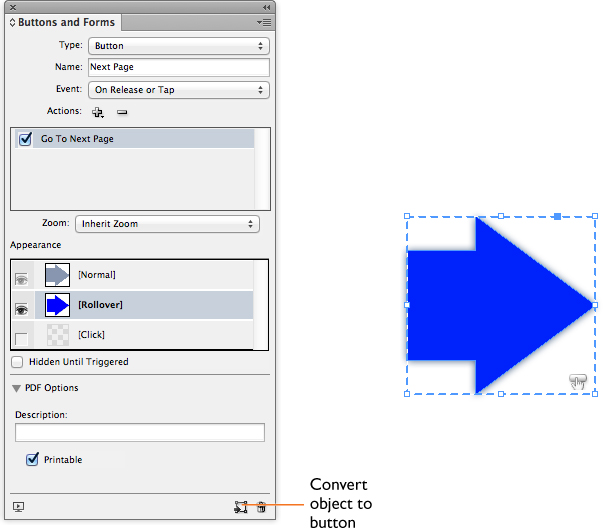
Creating Buttons
Like hyperlinks, buttons can send the user to destinations. But buttons are more powerful than simple hyperlinks. Buttons contain the code that can link you to destinations, flip pages in a document, open web pages, play movies, show and hide other buttons, and do other tricks.
You use the Buttons and Forms panel to create and apply actions to buttons. Choose Window > Interactive > Buttons and Forms to open the panel. There are two types of interactive elements that can be created in the Buttons and Forms panel: Buttons are objects that apply actions; forms are objects that allow the user to enter text or click to set the status of the field. We’ll look at buttons first and look at forms in the next section.
Creating and naming a button
Select an object. Any object, except media files, can be used as a button. Choose Object > Interactive > Convert to Button, or click the Convert Object to Button icon in the Buttons and Forms panel. The object is converted into a button and displays the button icon.
Use the Name field in the Buttons and Forms panel to change the default name to something more descriptive. It’s helpful to name buttons with their functions. For example, buttons that move the viewer to the previous page or next page would be labeled Previous Page and Next Page.
You can remove the button properties from an object by selecting the button and either choosing Object > Interactive > Convert to Object or clicking the Convert Button to Object icon in the Buttons and Forms panel.
If you create a button for a PDF document, you should open the PDF Options area and fill in the Description field. Type a description or tool tip that explains to the viewer the function of the button. For example, if the button moves the reader to the next page, the description might say “Click to move to the next page.”
The Description field is also the text that is read by electronic screen reader devices for visually impaired users. You may be required by law to add these descriptions to your documents. (See Chapter 7, “Exporting PDF and SWF” for more information on setting descriptions in PDF documents.)
The Buttons and Forms panel with a button selected.
Adding events to buttons
A button without an action is like a light switch that’s not connected to a lamp. You can click the switch all you want, but nothing’s going to happen. There are two parts to setting actions. First you use the Event menu to choose what type of mouse or keyboard action will prompt the button to perform the action.
• On Release or Tap applies an action under two circumstances: when the mouse button is released after a click and when a tablet screen is tapped.
• On Click applies an action as the mouse button is pressed down.
• On Roll Over applies an action when the mouse cursor is moved over the button’s bounding box.
• On Roll Off applies an action when the mouse cursor is moved away from the button’s bounding box.
• On Focus (PDF) applies an action when the Tab key is used to jump onto the button. Jumping onto the button is called putting the focus on the button. On Focus works only for buttons in PDF documents, where you can press the Tab key to navigate.
• On Blur (PDF) applies an action when the Tab key is used to jump off the button. In this case, the term blur is used as the opposite of focus, although the button’s visibility doesn’t actually change. On Blur works only for buttons in PDF documents, where you can press the Tab key to navigate.
You can set multiple events for a button. For example, a button can play a sound when the mouse rolls over it but open a web page when it is clicked.
Choosing actions for buttons
Once you have chosen the mouse event, you then choose the action that follows the event. Not all actions can be used with all types of exported files.
Even if the action is listed for all media, some actions may work in some ePub readers but not others. For example, videos can play in iBooks but not on Android readers.


Applying actions to events
With the event selected, click the Add Action icon in the Actions area of the Buttons panel. This displays the Actions menu.
Choose the action that you want to apply. The action appears in the Actions area of the Buttons panel. Depending on the action, additional controls may appear in the Buttons panel. Set those controls as necessary. Repeat these steps to apply more actions to the form.

Click the Add Action or Delete Action icon to apply or delete the actions applied to events.
To delete the action for a button event, select the action in the Actions area and click the Delete Action icon.
Instead of deleting an action, you can disable it by deselecting the check box next to its name. This keeps the action available, but the action does not export with the button.
If you have multiple actions for an event, the actions are applied in the order that they appear in the list. Drag the action up or down in the Actions list to change the order in which the actions are applied. This order can be important when playing sounds and movies. For instance, you might want the action for a click sound to play before the action to play a movie.
Button appearances
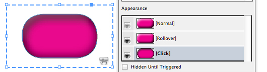
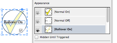
One of the benefits to working with buttons is the ability to change their appearance so that the button itself responds to the actions of the user. This means that the button can change its color when the mouse presses down, or the button can “wake up” with a glow when the cursor passes over the button boundary. However, the best appearance changes are subtle.
When you create a button, it has only one appearance, called the Normal state. There are two additional states: Rollover and Click. The Normal state is the appearance of the button when the mouse is not near it. The Rollover state is the appearance of the button when the mouse cursor enters the button area. The Click state is the appearance of the button when the mouse presses down on the button. Only the Normal and Click states are used in DPS apps.
Creating button appearances
The following exercise shows how to create the appearance for a button that starts as a native InDesign object.
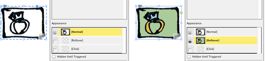
1. Use the Buttons and Forms panel to convert the object into a button. This automatically creates the Normal state. The selections for Rollover and Click are empty.

The Normal state of a button in the Appearance area of the Buttons and Forms panel.
2. To create the Rollover state, click its listing in the panel. This adds the Rollover state appearance that contains the same artwork as the Normal state.

The Normal state duplicated into the Rollover state of a button.
3. To modify the appearance of the Rollover state, keep it selected in the panel and change the size, shape, or effects applied to the object.
4. Click the listing for the Click state in the panel. This adds the Click state to the panel. It too contains the same artwork as the Normal state.
5. To modify the appearance of the Click state, keep it selected in the panel and change its size, shape, or effects.
The Click state modified from the Normal state.
One of the effects we like to create for the Rollover state is the look that the button is moving up, toward the viewer. We create a Normal state and then add the Rollover appearance. We then increase the size of the Rollover state, lighten the color, and add a slight drop shadow. We also modify the Click state so that it looks like it is moving down, away from the viewer. For that look we decrease the size of the button, darken the color, and remove the drop shadow.
Applying text to button states
You can also use text as a button. For instance, you can have buttons that are labeled “Stop,” “Play,” “Print,” or whatever action has been assigned to the button. Select the text frame and convert it to a button. This creates the Normal state. Create any additional appearances as necessary.
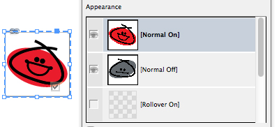
Using imported images for button states
We like to use images created in Adobe Photoshop or Adobe Illustrator for buttons.
Start by selecting the images you want to use. Most of the time we use images that are all the same size. This creates the effect of one state of the button magically changing to another state when the button is rolled over, clicked, or tapped. You can resize the artwork after you create the button, but it is easier to do so before you create each state.
1. Select the image for the Normal appearance and convert the object to a button. This converts that image to the Normal state in the Buttons and Forms panel.
2. Add the Rollover or Click state to the button. This duplicates the image from the Normal state into the Rollover or Click state.
3. Move the Selection tool cursor over the button so you see the Content Grabber (circle). Click to select the image, and delete it. An empty graphics frame appears.
4. Select the image you want to use for the Rollover or Click appearance. Copy or Cut the image to the clipboard.
5. Select the Rollover or Click appearance in the Buttons and Forms panel.
6. Double-click the button frame so that it has a solid frame rather than the dotted button-indication frame.
7. From the Edit menu, choose the Paste Into command. The new image becomes the Rollover or Click appearance for the button.
To use a different image in the Rollover or Click appearance, use the Paste Into command.
Instead of using the Paste Into command to change the image in a button, you can create separate layers in a Photoshop or Illustrator file by putting each image on its own layer. Once you use the image in a new state, select the object and then choose Object > Object Layers to turn the layers on or off for the image you wish to use.
Deleting or hiding button states
Select the Rollover or Click state and click the Delete State icon. You can’t delete the Normal state.
Instead of deleting states, which tosses out their content, it may be better to change whether or not the state is exported. To change the visibility of a state, click the eyeball icon next to the name of the state. If the eyeball is visible, it means the state is enabled and will export. If the eyeball is not visible, it means the state is disabled and will not export. The exception to this rule is the Normal state, which is always visible and can’t be deleted.
Our Favorite Button Effects
With the various events and actions, there are literally thousands of ways to work with buttons. Rather than try to cover them all, here are two step-by-step exercises for creating our favorite button effects.
Show/hide rollover effect
This exercise creates an effect wherein moving the mouse over a small image reveals a larger version of that image. Because it relies on a button rollover, it is available only for interactive PDF and SWF output.
1. Start by creating two buttons. Place both the small and large images on the page. Select each image and convert it to a button. We like to name the small image “Image Trigger” and the large image “Image Target.”
2. With the Image Trigger button selected, set the event to On Roll Over. This sets the button to respond when the mouse enters the area of the button.
3. You now want to add an action to the Image Trigger button. With the Image Trigger button still selected, click the Add New Action icon. Then choose Show/Hide Buttons and Forms from the Actions menu. When you choose this action, the panel expands to show the added controls for the Show/Hide Buttons and Forms action.
4. Set the visibility of the Image Trigger button’s On Roll Over event. The visibility controls for the Show/Hide action allow you to set whether buttons are hidden or shown when the event happens. All the buttons and forms in the document are listed in the Visibility area. Click the Show icon at the bottom of the Visibility area. This means that when the mouse rolls over the Image Trigger button, the Image Target button will be displayed. Understand that you are working on the Image Trigger button but setting the visibility of the Image Target button.
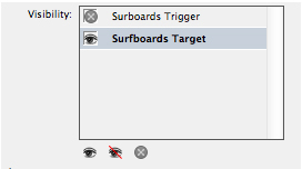
The On Roll Over visibility settings for a Show/Hide button
5. Now that you have set the On Roll Over event and action, you need to set the On Roll Off behaviors. This is necessary so that the Image Target disappears when the mouse leaves the area of the Image Trigger. With the Image Trigger button still selected, set the event to On Roll Off.
6. Choose Show/Hide Buttons and Forms from the Actions menu.
7. Click the Hide icon at the bottom of the visibility area. This means that when the mouse moves away from the button area, the Image Target button will be hidden.

The On Roll Off visibility settings for a Show/Hide button.
8. There’s one more setting that is necessary. At the moment, the Image Target will be seen when the page opens. You want it to be hidden until the mouse rolls over the Image Trigger. Select the Image Target button, and select the option Hidden Until Triggered. You only need to select this one option for the button.
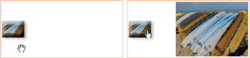
Using the rollover on one button to show or hide a separate button. When the mouse is off the button, the large image is hidden. When the mouse is inside the area of the button, the large image is displayed.
Creating buttons to show object states
This exercise creates a button that cycles through all the states in a multi-state object, and creates other buttons that display a specific state in the multi-state object. The images displayed by the buttons are in different positions on the page. Because these buttons use actions for object states, they do not play in PDF files. They work beautifully, however, in DPS apps.
1. Start by placing the images where you want them on the page. In this example, we have a full map of the United States, as well as maps for the North, South, Midwest, and West of the country. We arrange the full map in the center of the page, with the sections offset slightly.
It’s easy to display these separate areas by putting each one on its own layer in Illustrator or Photoshop and then turning those layers on and off using Object > Object Layer Options in InDesign.

Stacking the images for a multi-state object. Here, the areas of a map of the United States are stacked into position.
2. With all the images selected, click the New Multi-state Object button in the Object States panel. This combines each image into its own object state. The states are positioned as they were before being converted into the multi-state object.
The order of the object states comes from the stacking order of the original image. The top image becomes the first state, and so on down the list. Also, the top object state is, by default, the object displayed in the interactive file.
3. For the sake of your sanity, click to change the object name of the multi-state object. We call ours “Map of the US.” Also, change each object state’s name from its default to the name of its area. This is especially important if you are working in a file with many multi-state objects with many object states.
You can change the name of the object state with a “slow” double-click. Click once on the object state’s name, pause a moment, and then click again. The name field will be available for you to type in a new name.

The Object States panel with one of the object states visible. Notice that the object state is positioned in the lower-right corner of the multi-state object.
4. Next create five text frames. One has the label “USA” for the entire map. The others have the labels “North,” “South,” “Midwest,” and “West” for the four sections of the map. Select each frame and convert it into a button by clicking the Convert to Button icon at the bottom of the Buttons and Forms panel.
5. If the page is going to be used as an interactive SWF file, you can set the appearance for the Rollover effect of the button. Click the Rollover state in the Buttons and Forms panel. This duplicates the text from the Normal state into the Rollover state. Highlight the text in the Rollover state and change it to red. If the page is only going to be used in a DPS application, there is no use for the Rollover effect for the button.

Five buttons created to show the states of a multi-state object. The South button displays the Rollover state. The other buttons show the Normal state.
6. You now need to create the actions for the buttons. Start by selecting the USA button, and set the event to On Release or Tap. This is the only event that is recognized by tablet screens.
7. Click the Add Action icon in the Buttons and Forms panel. Choose Go To Next State from the menu. Since you have only one multi-state object in the document, the Object menu will automatically list that object. Make sure Stop at Last State is deselected. This will allow the button to cycle through all the states and then start again at the first.

The setting for a button that will cycle through all the states in a multi-state object.
8. The other buttons display the specific states of the multi-state object. Select one of the area buttons (North, South, and so on), and set its event to On Release or Tap. Then click the Add Action icon and choose Go To State from the Actions menu. The Object menu displays the multi-state object.
9. Click the State menu to show the five object states. Choose the appropriate state for the button.
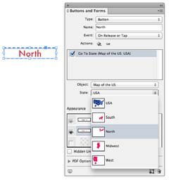
The setting for a button that will display a specific state in a multi-state object.
10. Repeat steps 8 and 9 for the rest of the buttons.
11. Use the SWF Preview panel to preview how the buttons display the object states.
If the preview of the images is blurry, choose Edit Preview Settings from the SWF Preview menu. See Chapter 7, “Exporting PDF and SWF,” for details on these settings.
Creating PDF Forms
Most likely you’ve gotten a PDF where you click inside areas of the form and fill them out with the information requested. InDesign lets you add form fields to your documents so you can create these types of interactive PDF files without having to open Acrobat. Just as with buttons, you use the Buttons and Forms panel to create forms.
While buttons can be used on PDF, SWF, and DPS documents, forms can be used only on interactive PDF documents.

A PDF document with interactive form fields.
Creating and naming forms
Select an object. Any object, except media files, can be used as a form. Choose Object > Interactive > Convert to [form name], or choose one of the types of forms from the Type menu in the Buttons and Forms panel. The following are the types of forms available:
• A Check Box creates a Normal On state and a Normal Off state that set on or off options for the form. Set the appearance for each state to create the display of the check box. If there are multiple check boxes, the viewer can select as many as desired.
• A Combo Box lets the user choose a value from a menu. This could be a favorite hobby or the way they commute to work. Use the List Items field to enter the items for the menu.
• A List Box lets the user choose a value from a list of terms. This could be something like countries the user has visited or classes the user wants to take. Use the List Items field to enter the items for the list.
• A Signature Field creates a field where the user can electronically sign a PDF document.
• Radio buttons come in groups of buttons. The user can select only one button in the group. If one is selected, the other buttons are deselected. All radio buttons with the same name work together as a group. Style the Normal On or Normal Off states for how the button looks when clicked on or off.
• A Text field lets the user enter their own custom text, such as name, address, or phone number.
Use the Name field in the Buttons and Forms panel to change the default name to something more descriptive. Leave the Event setting as On Release or Tap. Fill in the Description field with the text that will be used as a tool tip for the form field. This also lets visually impaired users hear a description of what the form field does.
Setting the options for forms
There are different options that appear when you choose each type of form. Here are the options and the types of forms they are applied to.

Applying actions to form events
This feature adds great flexibility to working with forms. You can add an action to what happens when a form field is clicked or rolled over. The action is added to the form using the same steps as you would use to apply an action to a button: Click the Add Action icon in the Actions area of the Buttons panel, and choose an action from the Actions menu. (For more information on working with actions, see the section on choosing actions for buttons on page 53.)
There are many ways to use actions with forms—too many to cover here. But one way we like to apply actions to forms is to create radio buttons that display other fields when clicked.
In our example, three radio buttons represent the state where the user lives and three list boxes represent the major areas in that state. The list boxes are stacked on top of each other, and the setting Hidden Until Triggered is chosen. The action Show/Hide Buttons and Forms is applied to the radio buttons so that when the radio button for one state is chosen, the list box for that state is shown and the other list boxes are hidden. Instead of scrolling through a long list of cities, the user is directed to choose from a smaller list.

Actions applied to radio buttons can show or hide other form fields on a page. When the radio button for New York is chosen, the list box that displays the boroughs of New York appears. When the radio button for New Jersey is chosen, the list box for New Jersey cities appears and the other list boxes are hidden.
Form formatting
One of the advantages to creating form fields in InDesign is the ability to add fills, strokes, special effects, and imported graphics to the field. These options are not available when creating form fields in Acrobat Pro. Unfortunately, not all of these options are available for all form fields.
You can apply any effect or formatting to form fields, and they will display on the InDesign page. Note that only fills and strokes are maintained in text fields, signature fields, list boxes, and combo boxes when the PDF is exported and opened in Acrobat or Reader; only radio buttons and check boxes maintain all the formatting applied in InDesign.
Radio buttons and check boxes appearance states
Unlike ordinary buttons, which only have three appearance states (Normal, Rollover, and Click), radio buttons and check boxes have six states. This is because you may want different information in the field depending on whether or not the form has been selected. The choices are as follows:
• Normal On is the state that is visible when the object has been selected.
• Normal Off is the state that is visible when the form field has been deselected.
• Rollover On is the state that is visible when the mouse cursor moves over the form field when the field has been selected (the Normal On state).
• Rollover Off is the state that is visible when the mouse cursor moves over the form field when the field has not been selected (the Normal Off state).
• Click On is the state that is visible when the mouse button is pressed when the field has been selected (the Normal On state).
• Click Off is the state that is visible when the mouse button is pressed when the field has been deselected (the Normal Off state).
The Appearance area for check boxes and radio buttons contains separate On and Off states for Normal, Rollover, and Click.
You’re not likely to need all the states for radio buttons and check boxes, but it’s nice to know they’re there if you do.
Checks and bullets
When you create a check box or a radio button, a default object is inserted into the button frame. This is a check mark for check boxes and a bullet for radio buttons. These are paths that can be selected and modified just like any path in InDesign.

The default check mark and bullet that are applied when you convert an object to a check box or radio button.
To modify the check mark or bullet, click once on the field. The dashed line appears, indicating that the form field itself is selected. Position the cursor over the check mark or bullet and click again. A regular frame appears around the object; this indicates that the path is selected. You can change the size, shape, fill, stroke, or effects applied to the path.

A form field that has been selected (left), and a path within the field that has been selected (right).
Once the check mark or bullet is selected, you can delete them from the field. You can then use the Place or Paste Into commands to add custom graphics to the form field. This makes your form more enjoyable.
Using custom graphics for the Normal On and Normal Off states of a check box or radio button.
Sample Buttons and Forms
In addition to creating your own buttons or forms, you can use the library of premade buttons and forms that Adobe has generously provided. The buttons already have Rollover states, as well as actions to go to pages and web addresses. There is even a navigation bar with four buttons that go to each page of a four-page document. The sample forms are sets of radio buttons, check boxes, and combo boxes with a variety of appearances.
The sample buttons can be customized with new states, actions, and events, just like other buttons.
Using the Sample Buttons And Forms library
Choose Sample Buttons And Forms from the Buttons panel menu. The library panel opens. If you choose the Interactive for PDF workspace, the library panel also appears docked next to the other panels.

Choose Sample Buttons And Forms from the Buttons panel menu, or switch to the Interactive for PDF workspace, to access the Sample Buttons and Forms library panel.
Once you have the sample library open, you can easily add those buttons and forms to a document. Drag the item onto your document page, or select the item in the library and choose Place Item(s) from the panel menu.
There are four types of actions assigned to the sample buttons: Go To Page, Go To Next Page, Go To Previous Page, and Go To URL. There are three types of sample forms: check boxes, radio buttons, and combo boxes.
All of the samples in the library are named, but they don’t have descriptions. This is an opportunity for you to add descriptions that make it easier to find specific forms that you want to use.
Working with the buttons
The buttons in the library are pretty basic. They each have only one action. But they have very nicely designed Normal and Rollover states with 3D effects and drop shadows. We use them for more than the simple actions already applied.

The types of buttons and forms in the Sample Buttons And Forms library panel.
Working with the check boxes
There are nine sample check boxes in the library. Each check box contains the artwork for at least one state: Normal On. However, not all the check boxes have artwork for the Normal Off state. And none of the sample check boxes contain artwork for any of the other states.
Some of the sample check boxes display a large check or cross for each state. Although they may look like the elements in a dingbat typeface, they are not a font—they are vector artwork that does not rely on a typeface.
The check boxes from the library all have a button value of “Yes.” You need to change that entry for your own form data.
Working with the radio buttons
There are 13 sets of three radio buttons. While most people think of radio buttons as dots inside circles, the samples contain all sorts of artwork. Only two of the button sets contain artwork for all the states. The rest have artwork for only the Normal On and Normal Off states.
The radio button sets all have a value of “Choice.” You can change that value for your own purposes. The Normal On state is selected by default for the top button in the set. The other two buttons have that option turned off.
Working with the combo box forms
We’re delighted to see the set of two combo boxes included in the sample forms. These are labeled for days and months.
The form for the days of the month has a list of the numbers 1 through 31. This makes it easy to set up a form that can be used to pick a day of the month. The form for the months has a list of the numbers 1 through 12, which makes it easy to create a form that can be used for the months of the year. However, the months form does not have the names of the months. This is because every language version of InDesign uses the same library and English months would not be appropriate for foreign-language versions of the software.