
10
Turning Insights into Decisions
Now that we have introduced data literacy and talked about how to tie it to organizational goals, we can move forward to discuss how to put it into action. Insights are great, but they need to be acted on. This chapter focuses on phases and steps to action your insights. You first need to turn those insights into decisions. You will be introduced to a seven-phase, data-informed decision-making model you can use. Then, you need to rally support and action for the decision by managing the change. You will be provided with best practices for managing change as a result of data-informed decisions. A big part of proactively dealing with change is by being resilient, so you will learn how to develop your resiliency skills. Another critical part of the change is how you communicate the insights and decisions via storytelling, so an entire section of this chapter is focused on this topic.
We will cover the following topics in the chapter:
- Data-informed decision-making process
- Storytelling
Data-informed decision-making process
What does being data literate enable you to do? What is the outcome? The outcome is gaining insights from your data so that you can make decisions and take action. This is what a data-informed organization does. It is able to obtain insights and knowledge from its data to enable effective data-informed decisions.
As defined in Kevin Hanegan’s book Turning Data into Wisdom, data-informed decision-making is “the ability to transform information into actionable and verified knowledge to ultimately make business decisions.”
A data-informed organization is an organization that systemically and systematically utilizes data and analytics to make the best possible decisions across all levels within the organization.
There are various processes and models out there that can be followed for data-informed decision-making. The one covered in this book is an evolution from the seven-phase process introduced in the book Turning Data into Wisdom.
This seven-phase process, shown in Figure 10.1, focuses on ensuring you are asking the right questions of your data, you understand the data that is being used, you analyze the data using the appropriate analytic techniques, you critically appraise the data and insights, you effectively communicate the insights and decisions to be made, and you evaluate the decision after it has been made.

Figure 10.1 – Data-informed decision-making process
The seven phases in the process are the following:
- Ask – Identifying decisions to be made and interpreting requirements. Formulating and asking focused analytical questions.
- Acquire – Understanding, acquiring, observing, and preparing relevant data.
- Analyze – Analyzing and interpreting data so that you can transform it into insights.
- Apply – Validating the insights. Apply the experiences and beliefs of yourself and others to the data, including being aware of any bias you or others may hold.
- Act – Transforming insights into decisions. Evaluate the information and insights provided, understand whether there is risk or uncertainty, and choose the decisions that are most likely to achieve the desired outcome.
- Announce – Communicating decisions with data to all relevant stakeholders in a way that they can understand.
- Assess – Evaluating and assessing both the outcome of the decision and the process used to come up with the decision. Leveraging this systematic and systemic process will reduce impacts from bias, foster diversity and inclusion, minimize unintended consequences, and allow you to improve on your decisions by failing fast, fixing fast, and learning fast, including improvements to your data and measurement frameworks, increased accountability, and better data-informed decisions.
We will now go into more detail about each phase to help explain it.
Ask – Identifying problems and interpreting requirements
The first phase of the decision-making process is to define the problem or decision that needs to be made. This includes not just highlighting what the problem is, but also understanding the context as well as all the requirements and constraints. Albert Einstein once said that, if he had an hour to save the world, he’d spend 55 minutes defining the problem and 5 minutes solving it. This highlights how critical this phase is. Failure to properly define the problem can result in what is called a type 3 error. A type 3 error occurs when you make a decision but the decision is based on the wrong question or problem that needs to be solved. It is critical, before we proceed, that we are in fact trying to solve the right problem. Let’s take a look at a non-business example of type 3 errors. Suppose your partner is mad at you, and you infer that it is because you have not done anything special for them in a while, so you go out and buy an expensive item for them. However, in reality, the issue is they are mad at you because you seem to always be spending money and not saving it. In this case, you answered the wrong question. In fact, buying an expensive item had the opposite impact. It made the situation even worse because you failed to understand the context of the problem.
Let’s now look at a business example of type 3 errors. Suppose a company needs to make a decision on how to increase its lead generation, as it believes the reason they are not selling as much is due to not having enough leads. In reality, the reason they are not selling as much has nothing to do with not having enough leads, it has to do with executing on the leads they do have and not converting enough of them into a sale.
These types of errors are the costliest in business, as you have invested tons of time in the process without actually spending any time on the actual problem. These errors typically occur when the organization does not work well across teams. It could be that the decision was designed just by upper management without any discussions below them, or it could be that the decision was made by the team focusing on the data model and analytics, without much collaboration from the business team.
Defining the decision includes not only identifying the decision itself but also identifying what brought you to this point where a decision needs to be made, as well as what your motive is for the decision. You should also define how you will measure the success of the decision.
Once the problem is defined, it then needs to be classified. Not every decision is the same, and as such, the effort and approach should match the need.
One classification system that can be used is the Cynefin framework, created by Dave Snowden. This framework can be used to assess the situation in which the decision needs to be made. The framework classifies the decision into one of five domains:
- Clear situations are stable and predictable, and cause-and-effect relationships are known to be involved. A simple example of a clear situation is when you decide to make dinner following a recipe. You have the ingredients, you have the equipment, you have the knowledge, and you have the process (the recipe).
- Complicated situations are much harder for us to determine the true root cause, so the cause-and-effect relationships are not clear to everyone. Rather, they require experts to solve. A good example of this would be the decisions a coach makes when coaching a sports team. The coach has all the skills, but those skills need to be applied to the players on the team. A decision with one set of players may not work for another set of players. This goes for managing employees at an organization as well. A common error in decision-making is when a manager tries to apply what they did at a previous organization to the current situation. Many things will be similar, but the employees themselves and the organizational culture are different, and the decisions need to factor that in.
- Complex situations involve multiple relationships and interdependencies, with multiple unknown factors. It may be impossible to identify one correct solution. Examples of this situation include making investments in the stock market and playing poker. Both of those situations require skills and strategies, but luck also plays a big part, which cannot be predicted.
- Chaotic situations occur when there is no way to truly understand the root cause and what may be happening with the relationships. What is clear is there are relationships that appear to be dynamic and changing. As a result, decision-making in chaotic situations is very difficult and requires a trial-and-error approach. A good example of this relates to decisions that were made at the start of the COVID-19 pandemic. Another example is the decisions that were made when the first iPhone launched. There is no historical data for a new innovative product like the first iPhone.
- Confusing situations are when you have no clarity about which of the other four domains apply.
A component of the classification is to understand the time required for the decision. Time is an important criterion for classification. Approaches for decisions that are required in terms of seconds or minutes, compared to decisions that need to be made in hours, to those that need to be made in days, weeks, or months are different.
Finally, you must define the importance of the decision. Importance is typically classified in terms of the importance of the outcome and is based on whether the decision is strategic, tactical, or operational. Strategic decisions typically have a long-term or material impact on the entire organization. Tactical decisions typically support a strategic decision and are usually for outcomes that are expected within the year. Operational decisions tend to be day-to-day decisions that typically have only a short-term impact on the organization.
Another way to look at the decision’s importance is based on the questions they answer, as shown in Figure 10.2. For example, if a company is looking to change its business model, or grow its revenue by 15%, those decisions would be strategic and would impact the entire organization. The company would then need to make a series of decisions to establish initiatives to achieve the new strategic goals. These include decisions about the supply chain vendors to use and how much of the goods to keep in inventory. Those are examples of tactical decisions. Then there are many day-to-day decisions the company would need to make that need to align with the strategic and tactical decisions. These include things like defining the return policy and other logistical decisions, such as the work schedule for the employees in the manufacturing plant. These are examples of operational decisions.
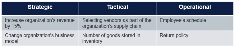
Figure 10.2 – Decision importance levels
Another framework to use to classify decisions is one created by McKinsey & Company. They classify decisions into four categories, based on two dimensions: the frequency, and the scope or impact, as shown in Figure 10.3:

Figure 10.3 – McKinsey & Company’s decision categories
Let’s move on to the next phase.
Acquire – Understanding, acquiring, and preparing relevant data
After the decision to be made is defined and classified, the next phase is to identify and acquire the right data and get it in the right format. When gathering the right data, ensure you are looking systemically at anything that is relevant. This includes data that is not only internal but also external to the organization, as well as structured and unstructured data. The data will most likely not be in the right format for analysis, which is the next phase. Therefore, you, or someone within the organization with the right skill set, must clean and prepare the data, using techniques to clean the data and transform it.
This phase typically has two different approaches, depending on whether the decision to be made is brand new or whether a data model and measurement framework already exists. If those already exist, then the existing data is typically visualized, and this part of the phase has you reviewing those visualizations to think about what additional data may be relevant or needed to help. If this is a brand-new request with no existing data model or visualizations, then the process starts by documenting all the data that you believe is required to make the decision.
Analyze – Transforming data into insights
The Analyze phase is where you leverage the data from the Acquire phase as input and perform some analysis on the data. The goal of the Analyze phase is to find insights. There is a large toolbox of analytic techniques that can be applied, depending on the need. These range from various analytic techniques, such as descriptive and diagnostics, to inferential statistics, to more advanced analytic techniques such as machine learning and optimization techniques. More details about analytic techniques were covered in detail in Chapter 7, Designing Dashboards and Reports.
Apply – Validating the insights
After the data is analyzed and insights are obtained, the insights need to be validated with the human element of decision-making. You should apply reflective thinking at this stage and ask a number of questions about the insights to ensure that you challenge any assumptions, validate your mental model, and work to mitigate any cognitive bias that may have entered the decision-making process.
In Sydney Finkelstein’s book, Why Smart Executives Fail, he studied 51 corporate failures and identified 4 patterns of destructive behavior that affect executives and led to the collapse of their organizations. Three of the four patterns relate to the human element, which is covered during the Apply phase: flawed mindsets, incorrect assumptions, and cognitive bias:
- Flawed mindsets – Leveraging data and insights to make decisions requires a data-informed mindset. Individuals and leaders alike need to think critically about data and information, to understand what data is relevant and what is not, and how to interpret what it really means. This requires everyone to question the data and information we receive. In the next chapter, Chapter 11, we will discuss in greater detail what a data-informed mindset is.
- Incorrect assumptions – Like our tendency to make biased decisions, we also easily make the wrong assumptions. Assumptions are inferences we assign to observed facts without proof. There are explicit assumptions, which are stated out loud, and implicit assumptions, which are hidden and not spoken about. We naturally make implicit assumptions as we reason about the world around us. Implicit assumptions include what we may infer about people’s motives and abilities. For example, a common assumption in business would be that people will pay for your new product. While that may be true, without any evidence to support that opinion, it can easily be overstated and become a false assumption. More details on incorrect assumptions were covered back in Chapter 8, Questioning the Data, in the Be skeptical of the insights section.
- Cognitive bias – We make a lot of decisions and are bombarded with millions of pieces of information every day. Our brains are limited when processing information from the environment. We can hold only a small portion of the millions of pieces, and the information we manage to retain is done so on our own terms or based on our own subjective experiences and knowledge. The good news is that our brains are relatively efficient at making decisions due to heuristics. Heuristics are rules of thumb and mental shortcuts that the brain applies to guide decision-making based on a limited subset of the available information. These modes of thinking demonstrate how our brains classify objects, assess probabilities, and predict values based on automatic judgments that can be skewed. The bad news is that heuristics can lead to poor decisions.
While heuristics enable us to make snap decisions without constantly stopping to think about them, when it fails to produce a correct outcome, the result is known as a bias, or more specifically, a cognitive bias. A cognitive bias, also called unconscious bias, is the tendency to draw incorrect conclusions due to cognitive factors embedded in our brain and according to our culture, interests, knowledge, experiences, and even our feelings. More details on incorrect assumptions were covered back in Chapter 7, Designing Dashboards and Reports.
Act – Transforming insights into decisions
The process does not end in the previous stage, where you have validated your insights. Insights are useless if they cannot be acted on by making a decision. The goal of the Act phase is to make a decision. These decisions should not just be made solely from the provided insight, but they should include qualitative judgments as well.
During this phase, the decision-maker needs to be able to do the following:
- Interpret probabilities – Making decisions based on the data and insights you have received typically involves making a prediction about whether something will happen. These predictions are many times based on probabilities. Understanding the basics of probabilities is an essential data literacy skill for individuals trying to make decisions from their insights. Probabilities are typically calculated by looking at the frequency with which something has happened in the past.
For example, imagine the weather forecast says there is a 7% chance of rain today. This does not mean that if it ends up raining today, the weather forecasters were wrong. It means that, based on the previous days with similar weather patterns and events, it ended up raining on 7% of the days. The other 93% of the days had no rain.
- Discern between uncertainty and risk – In the previous example, if you decided to leave the house without an umbrella given there is only a 7% chance of rain, that is a risk. It is a risk because, on 7% of the days historically similar to this day, it did end up raining. With these decisions, you do not know the outcome (whether it will rain or not) but you do know the possible outcomes (either it will rain or it won’t) and the probability of each outcome. With uncertainty, unlike risk, you either do not know all the possible outcomes or you do not know the probabilities of the outcomes. Let’s look at a different example of this. Let’s assume you work for a restaurant and have to make decisions on what perishable food items to purchase. Similar to the example with the weather, you can look at historical data to understand the consumption patterns of those items, and then make a decision based on that. However, decisions are hardly ever that simple and one-dimensional. There is always some level of uncertainty as we are trying to make decisions about the future. Suppose the next week there is the start of another pandemic, and a majority of would-be customers stay home. Suppose there is an announcement about a change in the economy that causes would-be customers to rethink whether they want to eat out or not. The point is, very few decisions are ever made without some level of uncertainty. We are always tasked with making decisions without all the information, and we often do not properly take into account how uncertain the world is today. This often leads to less-than-ideal decisions, especially when the decisions are strategic decisions, as they are harder to course correct. It is important to be aware that there is uncertainty, and factor that into your decision.
A famous example of this is from the 2016 United States presidential election. Most polls had a probability of between 71-95% that Hilary Clinton would defeat Donald Trump. This does mean that those same polls said Donald Trump had a 5-29% chance of winning. On the surface, this looks purely like risk. However, there was a lot of uncertainty with the polls and sampling that was used. Time has changed and many locations in the country have had lots of changes in their preferences for a political party. Remember, uncertainty occurs when things happen in the future that could not be assigned a probability. Another key change, which had not happened before, was that some of the polling was off because people were reluctant to state which candidate they supported. These are examples of uncertainty, which lead to the probabilities being lower than what they should have been in reality.
- Identify alternatives – When faced with a decision, you always have options. It is important that, during the Act phase, you properly identify all alternatives. Many times, decisions will be decided upon as a yes or no answer. We need to go beyond that and look at the full spectrum of possible alternatives. This includes potentially doing things differently or in a new way that has not been done before. When Airbnb wanted to get into the lodging business but did not have the upfront capital to purchase facilities, the decision was not yes or no as to whether they take out a loan to purchase facilities, it was to do something that has not been done before. They chose to make a strategic decision to leverage houses and other facilities from existing homeowners. This is an example of lateral thinking, which was introduced back in Chapter 7.
- Weigh the insights based on outcomes – Now that you have identified and understood the risks and levels of uncertainty, it is important you factor those into your decision and weigh them against the potential outcomes. This process does not just look at the outcomes when they are accurate, but also at the outcomes of making an incorrect decision. For example, going back to the weather analogy, if you decide to risk it and not take an umbrella, and it rains, your outcome will range from things like you and your clothing getting very wet to potentially leading you to get sick, or potentially, if you are carrying electronics, they can get destroyed. All of those potential outcomes and more need to be weighed based on each situation and context. My guess is if you are just going out for a walk in the park, you are more likely to not bring an umbrella if there is a 7% probability of rain than if you are going on an important job interview. This is where lateral thinking comes in, as we do not want to just focus on only answering the very specific question that is asked. In this case, should we bring an umbrella or not? Many times, the answers evolve into something in between. For example, a plausible decision could be to not bring an umbrella but take a taxi instead of walking to avoid getting wet.
Announce – Communicating decisions with data
Once the decision has been made, it needs to be communicated to all involved stakeholders. This process includes not only communication but identifying all stakeholder groups. Then, for each stakeholder group, crafting and delivering the communication, which includes the right data and insights, the right visualizations, and the right narrative.
This phase also includes the start of the change management process if the decision requires a deliberate change management approach. Details about how to communicate data and insights are covered in much greater detail later on in this chapter.
Assess – Evaluating outcomes of a decision
The process does not end with the Announce phase. After the decision is made and the action has kicked off, you must go back and evaluate the outcome of the decision. If the decision has not improved the problem or the identified need, you should take your lessons learned and go back to the beginning of the process and re-evaluate the decision and future actions to take.
While it is important to know whether the desired outcome of the decision was obtained, it is also important to not just focus on the outcome, but also focus on the process followed. Focusing on the impact alone and forgetting about the decision process is a common bias. The quality of the decision should not be measured just by the quality of the outcome and impact. The quality of a decision should be evaluated on the process, not the outcome. Just because a decision leads to a less-than-ideal outcome, it does not mean it was a bad decision. Conversely, even with a good outcome, the decision process may have been poorly designed. Take the feedback from what you learned during this evaluation and use it as a continuous improvement in the process and information at the start of the process.
Making a data-Informed decision in action
Now that we have identified the seven phases in the data-informed decision process, let’s look at an example using this process in action. In this example, let’s assume you were debating on whether you should go on a family vacation during the COVID pandemic. There is an abundance of data and information available on COVID, as shown in Figure 10.4 with a listing of news headlines, but how can you turn that into something actionable that is specific to your needs and your desired outcomes? You can use the model we just discussed to understand the right questions you should be asking, find the right data to help answer them, and then use your skills to analyze, interpret, and understand the insights and ultimately make a decision.

Figure 10.4 – Identifying the right questions to ask
Phase 1 – Ask
There are tons of metrics out there specific to COVID, but as you learned earlier, metrics and indicators serve different purposes. The right metrics really depend on the questions and decision. As we discussed earlier, it all starts with the decision to be made. In this case, the decision would be whether the family should go on a family vacation to a specific resort during the COVID pandemic. The questions can be further expanded to be specific analytic questions about the risk involved:
- What is the risk of catching COVID for me or a family member?
- What is the risk of serious illness for myself or a family member?
To properly make a decision on whether to go away or not, you will need to also determine what is an acceptable risk. There will never be no risk, so the analysis you will do later in the process will help you determine whether the risk is acceptable enough to still go forward.
Phase 2 – Acquire
Before you can answer these analytic questions, you need to understand how you can answer them. What data and information is required? To do that, we need to know additional data points:
- What are my personal risks and those of my family members?
- How is the disease spreading specific to the location in which we are planning the vacation?
- What is the transmission related to the specific activities planned (hotel, beach, concert, amusement park, and so on)?
- How well is the healthcare system able to provide care?
You should ensure you find credible places to gather this data. For example, in the USA, we have the Center for Disease Control, and in the Netherlands, we have the Centre for Infectious Disease Control. Both of these capture a lot of useful COVID data.
You will next need to build out a set of indicators into a measurement framework, as we discussed back in Chapter 6, Aligning with Organizational Goals, specific to your four questions.
Personal risk
Personal risk is an indicator that will place everyone in the family who plans to go on vacation into a risk category. For these purposes, it could just be low, medium, or high. The indicator uses other data, such as age, gender, and the number of co-morbidity conditions. You can create the indicator just based on this and use some logic, such as any co-morbidity conditions automatically puts you at high risk, anyone over 60 puts you at high risk, 40-59 puts you at medium risk, and so on. An alternative approach could be to find data from similar profiles and understand what percentage of them got infected and experienced serious illness.
Prevalence
There are tons of metrics that highlight prevalence. One of the most common ones that were used at the start of the pandemic is the total number of confirmed cases, as shown in Figure 10.5. This metric can be deceiving as it shows cumulative cases:

Figure 10.5 – Confirmed COVID-19 cases
To best answer our questions and make a decision, it is more relevant and important to know specifically about the current trends. Figure 10.6 shows a representation of daily new cases in a graph:

Figure 10.6 – Daily new confirmed cases
This metric can also be very misleading. For one, it does not take into account the spread within smaller populations. To offset this, the metric could be the number of cases per 100,000 people. Also, if you are looking at trends, tracking the data daily can be misleading as well. Daily swings up and down are less important than looking at trends and patterns over a longer period of time. Looking at the data as a rolling 7-day average would help with this. This metric takes each day’s number of cases and then averages it with the number from each of the 6 days before, as shown in Figure 10.7:
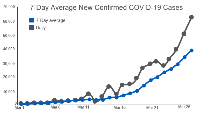
Figure 10.7 – 7-day average new confirmed COVID-19 cases
There are still a few reasons this metric can be misleading to someone trying to use it to make a decision. Trends in cases can give us a decent picture of the risk, but this is only true if we are testing enough people. This is because, with COVID, you can be infected but have no symptoms. Those individuals may not be tested since they have no symptoms, but they could be out in the community spreading it to others.
So, if a region is not doing a lot of testing, it may lead you to think there is less risk when, in reality, there is actually high risk. A better metric for testing prevalence would be the percentage of positive tests. This is the percentage of total tests conducted that are coming back positive, as shown in Figure 10.8:

Figure 10.8 – 7-day COVID-19 positive test rate
While it is the responsibility of the creator of the visualizations to try to make them easier to interpret and less likely to be misleading, as discussed in Chapter 7, Designing Dashboards and Reports, it is ultimately the responsibility of the consumers of the visualizations to be able to critically appraise them and understand what they are saying, and why they may be misleading.
When you look at the visualizations as a consumer, you should be asking yourself a series of questions, as shown in Figure 10.9 and as discussed back in Chapter 8, Questioning the Data:

Figure 10.9 – Interpreting the data behind the visualizations
Questions you should ask include the following:
- What does the increase represent and what does that mean?
- Does that help you answer your question?
- How was the information calculated?
- What is the population used for the visualization?
- What was the period of time used for each calculation in the visualization?
Rate of transmission for specific activities
Another variable that needs to be measured to answer your question is specific to the location(s) you will be traveling in. We are not talking about the region where you will be traveling, but more specifically, the activities you will be doing and the risk of getting infected, as shown in Figure 10.10. Will you be traveling by airplane, will you be at an indoor concert with 20,000 other people, will you be at the beach, and so on?

Figure 10.10 – Questions about the rate of transmission
Certain locations and activities have higher rates of transmission due to a combination of environmental conditions such as being indoors next to a lot of people, and preventative measures put in place, such as masking mandates, social distancing, and onsite required testing. In these cases, it may be hard to get quantitative data for your decision. It may come down to qualitative data and information. For example, you may not be able to find anything that says there is a 25% risk of getting COVID if you are attending an indoor concert with 15,000 other people, but you will most likely be able to find insights that tell you it is a higher risk. So, this variable may not be best served with a set of visualizations, but rather with verbal insights. For example, there is a high risk of getting COVID based on the fact that this is an indoor concert with 15,000 other people and the concert venue does not require social distancing or mandate masks.
Health systems support
In order to properly assess the risk, it is not just sufficient to assess whether someone will get sick. It is also important to assess the scale and scope and quality of the healthcare system in the area you are visiting. How many beds do they have that are available, what type of equipment and medicine is available, what is the quality of the healthcare team, and so on?
Phase 3 – Analyze
Your measurement framework may end up looking similar to Figure 10.11:

Figure 10.11 – Indicators for assessing a family vacation during COVID
You may perform various analytic techniques to obtain your insights. Those insights will be the values for each indicator: low, medium, high, and potentially, unknown.
Phase 4 – Apply
At this point, you have your indicators and understand the values. Here is where you use the Apply stage and try to challenge the data to see whether there are any gaps or misunderstandings. You should also get different perspectives. Potentially, there are other sources of data or information that are relevant. Maybe a new variant has just emerged that makes the data less relevant and accurate, at least related to prevalence and activity-specific transmission.
Phase 5 – Act
During the Act phase, you need to apply the decision criteria and understand whether there is any uncertainty or risk. The decision criteria would generally involve some type of logic, such as the decision is yes if prevalence and health system support are low, and activity-specific transmission is low or medium. Anyone in the family who has a personal risk of high would not partake in the specific activities that are considered high risk.
All of the indicators except the personal risk one have a possible value for unknown. It could be that the data does not exist for a specific region, or it does not exist from a trusted source. In those cases, this is not a risk – it is an uncertainty. When you are making the decision, you need to know what the risks are, and what is uncertain.
Phase 6 – Announce
After the decision is made, you communicate it to all the involved stakeholders, which include the people going on the vacation, as well as other friends and family. For the stakeholders going on vacation, you can explain the criteria used, the decision made, any exceptions that are included (such as specific events that were planned that will not be attended), as well as any criteria or situations for when the plans will change during the vacation.
Phase 7 – Assess
This type of decision is more of a single-use decision, but you should still take everything you learned about the process and the outcomes after the vacation, and then ensure you apply them the next time you have to make a similar decision.
Using a data-informed decision checklist
When making a data-informed decision, you can leverage the following checklist to verify you have followed the steps just discussed.
Ask
- Did you define the decision to be made or the problem that needs to be solved?
- Did you convert the decision or problem to be solved into a specific set of analytic questions?
- Did you identify what your motive is for the decision or what brought you to this point where a decision needs to be made and what problem it is trying to solve?
- Did you ensure the decision fits into the strategic plan and align it with the organization’s strategy?
- Did you describe the potential outcomes?
- Did you document any boundary conditions – for example, understanding what is the most you are willing to invest to obtain the desired outcome?
- Did you define how you will measure the success of the decision?
- Did you classify the decision using either the Cynefin framework, the McKinsey ABCD decision classification, or similar?
- Did you determine the timeframe needed for the decision (seconds, minutes, hours, days, weeks, or months)?
Acquire
- Did you interview relevant stakeholders about what data is relevant to the decision?
- Did you search for relevant qualitative data as well as quantitative data?
- Did you search for data both internally and externally?
- Did you prepare the data by transforming it into the specific data needed to answer the questions and make the decision?
- Did you document where there were any gaps in data that would have been helpful but were not available?
Analyze
Did you analyze the data using one of the various techniques to come up with insights (analytics, statistics, machine learning, or optimization)?
Apply
- Did you question the insights and consider situations when the insights may either be misleading or not true?
- Did you apply your perspectives and experience to the insights to apply meaning to them?
- Did you list out every assumption that you have related to the decision and questions?
- Did you get input and perspectives from diverse people?
- Did you leverage any techniques to mitigate any cognitive bias that could have crept into the decision?
Act
- Did you identify what portions of the decision are risks and what are uncertainties?
- Did you weigh up at least one alternative for the decision?
- Did you think about worst-case scenarios for the decision you chose?
- Did you look out for unintended consequences both with your direct team as well as with other departments or individuals?
Announce
- Did you identify all involved stakeholder groups?
- Did you build communication with each stakeholder group that included data, visuals, and stories that were relevant to them based on their background with data and how they are impacted by the decision?
- Did you consider whether the decision is consistent with other decisions made in the past? (If not, it will require more change management.)
- Did you develop a change management plan if needed?
Assess
- Did you assess the outcomes against the anticipated outcomes?
- Did you update the decision-making process or insights based on any learnings related to both the outcome and the process to get to the outcome?
Now that we have introduced the seven phases and provided you with a checklist that you can use with any upcoming decisions you need to make, we will move on to learn about why we call this a data-informed process and not a data-driven process, and what the difference is.
Why data-informed over data-driven?
It is intentional and deliberate that we call this a data-informed organization and a data-informed decision, as opposed to data-driven. Data-informed is about combining the data elements with the human element. Data and machine learning and artificial intelligence are extremely powerful. However, they are only working on the dataset that is available to them. Human abilities are broader than this. We can anticipate, and we can judge when a situation is about to change, even if it has not done so before. We can imagine future possibilities that do not exist in the data yet. We can shift our focus between short-term and long-term. This is why humans and machine intelligence complement each other perfectly and is the essence of data-informed decision-making. Let machines do the crunching and analyzing, and then provide those insights to a human who knows the business and can apply the human side of decision making to ultimately make the decision.
Storytelling
As you just read in the previous sections of this chapter, communicating with data is absolutely essential and critical, as it relates to your change management process. This skill applies across multiple phases of the process. You may have just come up with a decision that will save your organization millions of dollars, save countless lives, or something else just as spectacular. However, if you cannot communicate the right information at the right time in the right way to the right people, your decision may be ignored or ostracized. Your ability to come up with key insights to help with your decision is one skill but communicating it is another completely. Good communication of your data-informed decision can help stakeholders understand, accept, and then act on the decision.
As shown in Figure 10.12, appropriate and skillful communication of data includes an approach called analytic storytelling. This approach includes contextual design to achieve proper communication, a well-constructed narrative to bring your story to life, the right level of data and insights, and the right visualizations to support the decision. You do not want to overwhelm or bore your audience. Most importantly, you should not only present the data but also add in the appropriate context. Give the audience the idea, the picture, and then the applicable details.
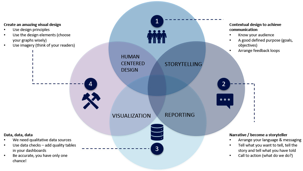
Figure 10.12 – Approach to analytic storytelling
We will learn about these various components in greater detail later on in this section. But before we go into those, it is important to understand why communicating with data is so hard.
Why is communicating with data so hard?
We have all been involved in some type of presentation where the theme and message just don’t stick with the audience. There are many reasons why it may not stick with the audience. Maybe the data is not something they are familiar with. Maybe the visualizations used are too hard to understand. Maybe there is no context provided. Even if all those are present, it could be that the message is not memorable, persuasive, and engaging.
When we are younger, we learn in school how to speak, read, and write our native language. Independently, we learn how to use numbers in math class. However, we never learn how to connect the two. We do not learn how to tell stories with numbers. It is a different approach and a different skill.
Communicating with data is a method of delivering messages derived from data analysis in a way that allows the audience to quickly and easily assimilate the material. This will help the audience to avoid information overload. It should also allow the audience to easily identify what the communication is trying to tell them, without leaving any room open for misinterpretation.
Three key elements of communication
The goal of communicating with data is to get buy-in on a decision. Ultimately, the stakeholders will need to not only buy in but also act on the decision. The communication should resonate with the stakeholders and result in them taking action, usually in support of a change. There are three key elements involved in communicating with data: the data, the visuals, and the narrative. They all work together to aid in getting the message across, as well as helping with the change management process.
The data combined with the narrative will help explain to the stakeholders the context, including what the data or insight is, what the interpretation is, and why it is relevant to them. The data combined with the visual will help the stakeholder see the insights and interpretation clearer than just if you were showing the data in a tabular format. The narrative combined with the visuals will draw your stakeholders in and engage them.
Why include a narrative?
One reason why narrative and story are so important when communicating with data is that research has shown that stories make communication more memorable, more engaging, and more persuasive.
Memorable
Research highlights that stories are 22 times more memorable than when just data is used alone. Chip Heath, the author of Made to Stick, asked a classroom of 25 students to present a 1-minute persuasive pitch to their fellow classmates. Across all of those presentations, there was an average of 2.5 data points included. Only one of the presentations included a story. The teacher continued on with the class and intentionally moved to a completely unrelated topic. Ten minutes later, he then asked the entire class to pull out a sheet of paper for a pop quiz. The students were asked to write down every idea they remembered from the student presentations earlier in the class. Only 5% of the students remembered any of the 2.5 data points, but 63% of the students remembered the story.
You can make a story even more memorable by including emotions in it. Whenever there is a story that includes emotions, more of the message is embedded in the listener’s memory, ultimately making it stick. Emotions make something more real. The stronger the emotion, the deeper the impact, to the point that it gets etched into the listener’s long-term memory. The emotion does not have to be a negative emotion, such as fear; it could be a positive emotion as well.
Engaging
When you have an audience that is curious, their attention is focused on the speaker, and they are actively listening to you and the message. They are not disengaged, as they are putting their distractions aside to listen. Research has also concluded that when people are listening to engaging communication, they actually enter into a trance-like state where they drop their intellectual guard and want to see where the story leads them.
When following a proper arc of communication in a story, the brain gets activated much more than with data alone. Listeners’ brains have their neurons fire in the same patterns as the storyteller’s brain. This process, called mirroring, creates coherence and allows the listener to turn the story into their own ideas and experience. Listeners’ brains also release dopamine when they experience an emotionally charged event, including a story. This makes it easier to remember with greater accuracy. When processing facts, typically, only two areas of the brain are activated. When listening to a well-told story, many additional areas of the brain are activated, including the motor cortex, sensory cortex, and frontal cortex.
Persuasive
It is important for the communication to be memorable and engaging, but it also must be persuasive if it is going to help as part of the change management. In another study, the Save the Children organization sent out two different types of requests for monetary donations. One of them was a brochure that just listed data and factual information about the plight of children in sub-Saharan Africa. The other request was a story about a 7-year-old girl named Rokia. The story talked about her plight and how she was at high risk of severe hunger and starvation. The results were that the communication that just listed the data and facts was far less persuasive than the communication that included the story. The average donation from the group that got the story of Rokia was double that of the average donation from the group that just got the data.
Stories are memorable when you provide just enough details, but not too many. Providing just enough details will allow the listeners to visualize the situation. In the example earlier in the chapter with the CEO of Intel, how many of you tried to visualize a car going half a million miles per hour on a highway?
To summarize, when communicating data and insights to stakeholders, if you focus only on the data, without a compelling story, it will typically deplete the attention of the audience. The audience will try to evaluate the data and think critically about it, and they will begin to ask questions about the data as they will be skeptical of it. However, if the communication includes a proper and engaging narrative, it will capture the attention and enchant the audience, causing them to be inspired and move to action.
The process
The process for communicating with data includes the following three parts:
- Defining the audience – This part includes identifying all the stakeholder groups.
- Planning the story – This part includes planning out the story and mapping it to the audience.
- Crafting the story – This part includes identifying the right data, the right visualizations, and the right narrative.
Let’s now go through each part in detail next.
Defining the audience
As you plan out your story, you need to take time to understand each unique stakeholder group. One of the most common issues that occur during this process is when you treat every one of the stakeholders the same, and provide them the same story, with the same data and visuals. Not only because each stakeholder group may have various levels of their own data literacy, but your story also needs to make an emotional connection with them too. In order to do that, you need to identify each unique stakeholder group. Consider stakeholders that are internal to the organization, such as your peers and your leaders, as well as stakeholders who are external to the organization, such as the consumers of your offerings. Also consider stakeholders who are upstream, including individuals who are involved in the implementation of whatever you’re discussing or trying to change, as well as stakeholders who are downstream, including the individuals who are consuming what the upstream stakeholders are implementing.
Planning the story
To start, you should write down the goal of the communication, meaning what are you trying to get as an outcome. What are the key insights and decisions that you want to share with this stakeholder group?
Then, you should describe the role of the stakeholder group. Therefore, you need to tailor the communication to each unique stakeholder group. The consumers who are going to be impacted by the decisions are probably going to have different answers to, say, the developers who are implementing the actions driving the decision. It is important to put the communication in the perspective of the stakeholder. What is in it for them? What questions will they most likely ask? Why should they care and listen and act? What decisions do they need to make because of this communication? Structure the communication so that it easily and directly answers anything you believe will be a high-priority question from that stakeholder group.
As we mentioned earlier in the chapter, the story should include data and visualizations. Many times, the data will not just be KPIs, but they may be the results of some analytics or statistics that have been executed against data. You must understand how knowledgeable each stakeholder group is with interpreting these outputs and then match the right data, the right visuals, and the right words to the audience. For a group that happens to be data scientists, you could go deeper into the visualizations and the complexities of the algorithms used. If they are not comfortable with data, you should stick to giving high-level descriptive analytics such as KPIs. In addition, you need to understand the industry they work in to understand how familiar they may be with the terminology and other words used in your communication. If they are a business leader, they may not understand all the data, but they do know the business, and they should have a grasp on what the KPIs mean and how to interpret them. One surefire way to lose an audience is to use business-level terminology and acronyms that they have no understanding of. If they are not likely familiar with the terminology, avoid acronyms and add clear and concise definitions.
Crafting the story
Now that you have planned the story, it is time to craft and create the story. This includes the three components we have discussed: the data, the visual, and the narrative. We already discussed a lot about visualizations in Chapter 8, Questioning the Data, so the focus of this section will be mostly on including the right data and creating the right narrative.
The right visualization
There are two reasons to use data visualizations. You use them to explore and gain insight and to describe and diagnose. You also use them to communicate those insights to your stakeholders. One of the most common mistakes that we see is that people will use the same visualization for both purposes. You may need to use a more advanced visualization to find your insights, but when you share them, you should prioritize what needs to be shown to the stakeholders and, ideally, use a simple visualization that just focuses on that. You will also want to design and configure the visualization that you are using to communicate to ensure the insights are easily understood.
The first step is understanding what the right visualization for your audience is. You want to ensure you are picking a visualization designed to visualize the data and answer the question you asked. This was discussed in the Choosing the right visualization section of Chapter 7, Designing Dashboards and Reports. You then want to ensure that the visualization prioritizes what is required to share with the audience. Anything that is not directly relevant to highlighting the insights into the questions asked should be removed. This will greatly lower the cognitive load of your audience, allowing them to interpret and comprehend the visualization more easily.
The right data and insight
Back in Chapter 7, we discussed the topics of thinking critically about the data and insights. When you are crafting your story, you will want to ensure you bring information obtained during that phase into your communication. If you do not show the details that are relevant for the audience to understand the insights, they will draw their own conclusions, which are not accurate.
Let’s look at one famous example of this. This example comes from another book by Chip and Dan Heath, called Switch. In the book, they tell the story of a Cornell University study, where movie-goers were served stale popcorn. Half of the movie-goers were given a medium container of popcorn and the other half were given a large container. The study was trying to explore whether people with the larger bucket would eat more popcorn than the ones with the medium bucket. The results highlighted that the movie-goers with large buckets ate 53% more popcorn than those with medium buckets.
This research is fascinating yet has nothing to do with data literacy. However, the Heath brothers used this to highlight a key element of the story and communication with the stakeholders. They asked the readers to imagine that someone showed them the data from the research but failed to mention the different bucket sizes. The visual in the story would look something as shown in Figure 10.13:

Figure 10.13 – Popcorn eaten by subject
Looking at this, most interpretations would highlight that there are some people who ate a bunch and some that did not each much. It would have been interpreted very differently if you had included the data that highlighted the various categories of the buckets, as shown in Figure 10.14:

Figure 10.14 – Popcorn eaten by subject and by bucket size
Taking what we learned in this chapter into account, however, can the visual used be updated to make it even more clear to the stakeholders? Yes, in something like what is shown in Figure 10.15:

Figure 10.15 – Does bucket size matter?
This is an oversimplified example, of course, but still serves a good point to remind everyone that it is important to not only pick the right visuals for communicating but also ensure you include the right data and insights to highlight.
The right narrative
The goal of the narrative is to provide context to the data and the visualizations. Context augments the audience’s understanding, and it drives their ability to see the insights. Don’t just show the insight but explain your interpretation of it and how it aided in the decision.
Another best practice is to ensure you use comparisons when needed, to avoid the audience thinking “so what?” The data and numbers you share in your narrative may not mean anything to the audience. You can make a comparison by using the same numbers but in a different context, a context that is understood by the stakeholder group. A perfect example of this approach was used by Intel’s CEO, Paul Otellini, in a 2010 presentation. He was talking about his new company’s new microprocessors and the speed of their innovation. He understood the audience and knew the stakeholders would not really understand the importance of the numbers he shared. He shared them, but then gave a comparison to the auto industry and how fast cars can go, which all the stakeholders could relate to.
Types of narratives
Proper narratives for communicating with data usually follow one of two flows. There is a flow when you are communicating an explanatory journey and one when you are communicating an exploratory journey.
In an explanatory journey, the speaker walks through the narrative in chronological order:
- It starts with the context of what is happening and the current state.
- Then, it lists out the challenges that were faced, followed by the conflict statement or business question that needs to be answered.
- Finally, the narrative lists the resolution, which includes the insight found and possibly, the decision made as a result.
In an exploratory journey, the speaker walks through the narrative following the analytical and discovery process in order:
- It starts with the expectations.
- This is followed by the findings.
- Then comes the conclusion.
- And finally, the action.
The research firm Gartner recommends the exploratory journey, as shown in Figure 10.16:

Figure 10.16 – Gartner’s approach to storytelling
They take it one step further when they are talking about storytelling or communicating with data. They tie in the four levels of analytics that you learned about earlier in the book:
- Start with the exposition where you are describing the situation.
- Then you are trying to diagnose the problem so you perform diagnostic analytics to find the root cause.
- Then, you are telling the story of the insights you obtained from the diagnostic analytics that becomes the climax of the story, and, at that point, the communication opens up for debate with the audience, including discussing what the audience thinks about the insight and why it happened.
- That is followed by a decision point, where the communication potentially goes into predictive or prescriptive modeling to talk about possible outcomes.
Let’s take a look at an example using this model. The example follows a company that sells commercial coffee-making equipment to restaurants and businesses. The company builds a dashboard to show that its sales appear to be dropping in the first half of 2022 compared to the first half of 2021, as shown in Figure 10.17:
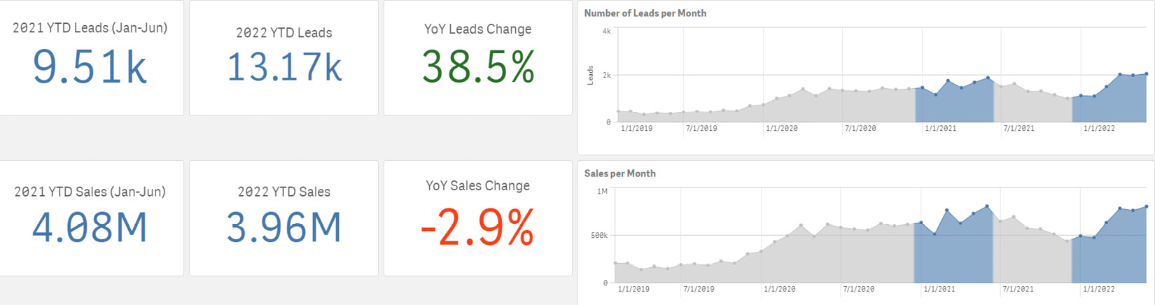
Figure 10.17 – Coffee equipment leads and sales
The dashboard also shows us something confusing that we can create a question around in order to investigate further. That question is, despite having 38% more leads coming in the first half of 2022 compared to the first half of 2011, why are our sales down close to 3% over that same time period?
We can find the answer by looking deeper at the data and performing diagnostic analytics. When we look at other dimensions that relate to the total sales, we see that the discounts that were offered in the first half of 2022 were 93% higher than those in the first half of 2021, as shown in Figure 10.18:

Figure 10.18 – Coffee equipment sales discount
Now that we have identified the probable cause for the sales to drop, despite an increase in leads, we still want to understand whether the leads were useful. It is appropriate to communicate the insight about higher discounting to the stakeholders, but those stakeholders will most likely wonder what would have happened if the discount was the same as in the first half of 2021.
To answer that, we can use analytics to ask what if the average discount in the first half of 2022 was the same as the first half of 2011. You can see in Figure 10.19 that the sales for the first half of 2022 would have been 4.2 million rather than 3.96 million; 4.2 million is also higher than the first half of 2021 sales of 3.96 million:

Figure 10.19 – Coffee equipment simulated sales
This provides a valuable story from the data that we could have easily missed if we did not use visual analytics. The story is that even though our leads were increasing year over year, our sales were not growing. In fact, they were down 2.93%. Only by investigating the data deeper and more systemically were we able to see that the organization was actually selling more units, it is just that their discounting had dramatically increased. This insight and communication allowed the organization to continue with its investment in leads but put tighter processes in place for discounts.
The SUCCESs model
We introduced Chip and Dan Heath earlier in the chapter. In their book, Made To Stick, they created a model called the SUCCESs model to help to get ideas to stick when communicating them.
The model has six principles that map to the acronym SUCCESs:
- Keep it Simple – The brothers mention that simplicity isn’t dumbing things down. It is all about prioritizing. This means if you have a ton of data and information, only show what is the most important and relevant to the question.
- Make it Unexpected – Don’t waste the time of the stakeholders by sharing information and insights with them that they already know. This will not be engaging for them and will cause them to zone out. Instead, get the audience’s attention by ensuring the information and insights are not things that they are already aware of.
- Be very Concrete – To help a message stick with the stakeholders, you cannot just cite theories and talk in very abstract terms. Ensure the message is very concrete and realistic. Concrete messages are less likely to be misunderstood.
- Show Credibility – For the insights to stick, they need to be believable and also credible. If stakeholders do not either believe the insights or they do not find the speaker credible, they will zone out very quickly. Many times, it is hard to gain credibility, so if you are in a situation where you do not currently have it, you can gain credibility by using outside sources and best practices. This can include examples where the same insight and change have worked before, or it can be getting insights that come from leading innovators or analysts in your industry.
- Don’t forget the Emotion – Remember earlier in the chapter with the story of Rokia from Africa? People care about people, not numbers. Emotions will help the message stick with the stakeholders.
- Tell a Story – As we have discussed throughout this chapter, stories will help you deliver your insights and decisions to your stakeholders, along with the right data and visualizations.
Summary
Insights are great, but they are useless unless they can be acted on in a way that helps drive you toward your goal. In this chapter, we learned about the importance of using a data-informed decision-making process to turn your insights into decisions. We also learned that the decision is not the endpoint. Typically, it is just the starting point of a change management initiative. Then, we learned about the importance of following a change management process and how to increase resilience in people to help the actions take place. A critical part of change management is effective communication and storytelling with data.
Now that we have learned various best practices for taking action on your insights, we will focus on what skills and competencies you will need to make this happen in the next chapter.
Further reading
- Snowden, D. and Boone, M., 2007. A Leader’s Framework for Decision Making. [online] Harvard Business Review. Available at: https://hbr.org/2007/11/a-leaders-framework-for-decision-making
- Heath, C., & Heath, D. (2009). Made to stick: Why some ideas take hold and others come unstuck. Random House Books