Chapter 8. The UI of FinOps
Your reports and dashboards provide the user interface (UI) for FinOps to your organization. By looking at your reports as your UI, you can apply decades of research into effective UI design. You should be looking carefully at those reports as the product of a FinOps practice. As such, it’s the interface through which your users interact with the data. How you present FinOps data in reports influences the success of FinOps enablement in your organization. The FinOps product should be treated as a production workload: quality is important, clarity is important, and user experience (UX) is important. These lead to trust in the data, which enables decision making by teams and prevents time wasted defending the quality of the data.
It’s easy to make reports containing pretty graphs and tables of data, but it’s harder to tell a story to your users based on what they need to know and enable them to make decisions about what actions they need to take. This chapter covers some important concepts to help you build high-quality FinOps reports. We’ll use the word report for the rest of this chapter, but these concepts and suggestions apply equally to dashboards and business intelligence systems used to deliver FinOps data to your users.
Build Versus Buy Versus Native
When thinking about the reporting you’ll create as part of your FinOps practice, first consider the tooling and platforms you will need to do the job. As you learned in Chapter 5, the volume of data you must process on a continuing basis to create FinOps reporting can be huge, so you will likely have a whole toolbox of tools. The question is what type of tools you will use. The concepts in this chapter are not meant to imply that you should build your own FinOps reporting platform. They also aren’t meant to discourage you from doing so. We commonly see multiple tooling paths to successful FinOps data management:
Native tooling such as AWS Cost Explorer, Google Cloud Cost Management, or Azure Cost Management are always the place to start when beginning your FinOps journey.
Software-as-a-service (SaaS) platforms like the Certified FinOps Platforms designated on FinOps.org are often procured to go beyond native tooling and speed time to value in relation to rolling your own systems. They also act as a critical abstraction layer between you and the regularly changing landscape of multicloud billing data.
Buy then augment is an increasingly common theme we’re seeing where large cloud spenders will take the APIs of either native tools or platforms and add custom functionality around the edges of their scopes as well as integrate data into and out of them.
Homegrown tooling was the fastest-growing segment in the 2022 State of FinOps data; sometimes built from scratch but often built on top of existing business intelligence (BI) tooling (e.g., Tableau or Looker) or using cloud-specific solutions (e.g., AWS Cost Intelligence Dashboards or Google’s BigQuery Export).
As with many things, the answer to which approach you take depends on your company’s resources, culture, and skills. We know some successful large FinOps practices that rely entirely on a platform and some that rely entirely on homegrown tooling. Most, if not all, organizations will rely upon a collection of tools and approaches, which can change as their maturity grows and their cloud use changes. There is no right answer.
When to Use Native Tooling
Each of the cloud providers offers its own set of cost management tooling. We recommend you always start with the native tooling. It typically provides the core capabilities you need to cover at the earlier stages of maturity. As your cloud spend and complexity increase, it’s highly likely that you will need more than native tooling can offer. At that point, the conversation becomes whether to build or buy. Whichever path you take as you advance, native tooling still serves as a sanity check for the data coming out of your platform, and it typically will be the way you communicate with your cloud service provider’s support teams. Stay up to date on the native tools and ensure the right people in your organization have access to them.
Typically, native tooling falls into two categories. First are purpose-built cost management tooling such as AWS Cost Explorer, Google Cloud Cost Management, and Azure Cost Management. Secondly, as you mature, there are also BI tools—such as Google’s Looker and AWS’s QuickSight—with report templates provided by the cloud service provider that enable you to more deeply customize your reporting through tools.
When to Build
On the FinOpsPod podcast, Kim Wier, Director of Efficiency Engineering at Target, tells the story that her CIO sees Target as a product company, and as such most of their development happens internally:
We need to have the knowledge in-house at Target. Our CIO did not want to outsource the technical knowledge to other companies. Target’s development by and large happens in-house. We’ve built up our software engineering culture, and so we do all that development internally.
As a result, Target invested in a strong FinOps engineering team to manage the data pipelines, ingestion, as well as frontend development teams working on developing custom dashboards for the various personas, like engineers and leadership.
Here are some common reasons people choose to build their own reporting layer:
Control over your own data
Easily integrate with internal data (unit economic data, taxonomy data, performance data, and so on)
Customize capabilities based on specific company needs
SaaS models often don’t have required compliance (e.g., FedRAMP, SOC 2)
Fee structures don’t always scale with value
Flexibility in reporting
Ability to quickly make changes
Technical ability to perform complex software development and data analysis within the company
Organizational buy-in to continuously invest in learning cloud data details, which are constantly evolving and expanding
Why to Buy
Conversely, RJ Hazra, CFO of Global Technology at Equifax, chose to buy a platform to more quickly move toward focusing on the cultural aspects of FinOps, but also to focus on automation efforts:
We used a procured FinOps platform to generate visibility. But it wasn’t enough—we needed to be able to quickly take action on the visibility. Finance and engineering needed to partner more closely than ever. The CTO prioritized a FinOps cultural transformation and empowered SREs [Site Reliability Engineers] in the organization to help enable and convince other engineers. We needed an engineer talking to an engineer on usage optimizations rather than building tooling. We needed to figure out how to structure the commitments of the cloud providers so we also brought sourcing/procurement into our team.
Michael Barba, Senior Cloud FinOps Manager at Couchbase, offered his perspective on the why buy a FinOps platform:
A lot of companies probably don’t have the engineering resources in-house to build out homegrown tools, or if they do, those individuals are more valuable elsewhere. For Couchbase, that meant focusing on building out the services we sell instead of building internal reporting that we can outsource via software.
Here are some common reasons people choose to buy an SaaS platform:
Fast time to value: usually very little IAM and cloud console work to set up
Simple tools to create custom groupings that map spend
Complex math like amortized RI mapping is already calculated
More detailed optimization features than what the native tools offer
Access to subject matter experts at platform companies
Platform providers mitigate risk of changes in cloud data and data quality
We encourage you to look at the concepts in this chapter as lenses through which to make any of the paths we’ve discussed more successful. FinOps relies on driving accountability and decision making, which makes it inherently a UX challenge all the way from conversations with colleagues to the data you present in reports.
Operationalized Reporting
Your reports and dashboards must present information consistently, with high data quality and with a high degree of review and control. You should treat your FinOps reports the same way your engineering teams treat their production services, with controls, quality checks, and rigorous review. If your reports break or start presenting incorrect or even inconsistent information, then FinOps inside your organization is adversely impacted.
Data Quality
Mike’s colleague Diana Mileva, a Senior Business Analyst of Cloud FinOps at Atlassian, presented at FinOps X 2022 about data quality within FinOps reports. Diana explained the importance of data quality and different approaches on how FinOps teams handle data issues. The key items in Diana’s presentation included data delays, data issues, quality checks, and reporting challenges FinOps practitioners face.
When someone questions our FinOps data, we treat it like a production bug and open a Jira ticket to investigate. We perform automated data quality checks across the entire data set along with SLOs [service level objectives] for timeliness and accuracy. We aim to detect any issues before our users and inform them proactively so they do not make decisions based on incorrect information.
Diana Mileva, Senior Business Analyst at Atlassian
At the time of this book’s printing, in most clouds there is a delay between using a cloud resource and receiving the billing data for its use. The delay tends to be 24–48 hours. Unfortunately, the delay is not consistent and can be longer, especially around the start and end of a month. You may sometimes receive partial data for the most recent period of billing data available. The impact is that FinOps reports can erroneously show a drop in costs during more recent hours of reporting and can be missing the last day or two of data—see Figure 8-1.

Figure 8-1. Cloud cost data showing a drop in the most recent days due to delays on data delivery
A common approach is to remove the latest couple of days of data from reports to avoid this drop in costs. Although trimming the available data is very helpful in making the data presented more consistent, it’s not a silver bullet that removes the need for any additional monitoring and alerts on the quality of the data reported.
Tip
For advanced practitioners building their own reports, we recommend you display two dates on your reports, with one date representing when a report was last updated, and the other indicating how recent the data available was when creating the report. This is especially important on reports that do not show an hourly or daily breakdown and offer only summarized data.
There have been numerous occasions where cloud service providers have had issues with delivering customer billing data that result in incomplete or inaccurate data for a period of time before it is corrected in the finalized bill after month end. These data issues often cause problems—using either in-house tools or vendor-provided solutions—with enriching the cloud service provider billing data in post-processing.
To detect issues with billing data, it is important that you monitor the quality of the data in your billing reports. This allows you to alert your staff when the data presented in reports has an issue. Being proactive on alerting staff helps you maintain trust in the FinOps reports. The cloud service provider can change the way data is reported. While the top cloud providers offer more details about their report structure today and often publish information about coming changes, it’s not always the case. We have seen cloud service providers fix inconsistencies in the billing data that can lead to breaking the methods a company had in place to handle the inconsistent data.
FinOps reports are built upon queries, which can incorrectly handle specific events. Examples include the change of year, where a query was incorrectly written to handle the date rolling into the next year, and queries that assume specific values are present, which filters out data accidentally. It is important for you to validate your queries not just when you first build your reports but also over the time your reports are available. This can be especially important when taking reports created by others either internally to your company or externally from the community. Knowing the limitations of the queries used underlying these reports can avoid a possible situation where the information that is presented is misunderstood or incorrect.
If your users find the data presented in your reports to be incorrect or inconsistent, then trust in your reports erodes. This loss of trust can lead to inaction from engineers or the proliferation of unsanctioned tools and reports that are often inconsistent with your official FinOps reports, resulting in a lack of decisions being made or decisions made with incorrect data. Further, inconsistent reporting will lead to large amounts of time spent reconciling the differences and discussions about correctness of the data. The point of the FinOps team providing a consistent UI into the cloud cost data is to save the engineering teams the time and effort of teasing out these details themselves. When they don’t trust the reporting, not only can cost savings disappear but valuable engineering hours are also lost.
As Diana Mileva went on to say in her 2022 FinOps X talk, “Individual reports of data quality are treated like production incidents to be investigated quickly, including consistent communications back to the reporter and a postmortem of any actual issues. Through this process we continually improve the quality of our data and we also build trust with our stakeholders that we take data quality issues seriously.”
Preventing bad data from getting into your reports is important, but sometimes this can be impossible to avoid, so building processes that detect data problems and proactively alerting your users can help maintain this confidence in your reports.
Perfect Is the Enemy of Good
Data quality does not mean 100% real-time accuracy to the micro-penny. It means data that is consistently good enough to make informed decisions. It is inevitable that some errors or inaccuracies will creep into your reports for one or more of the issues discussed. But the job of the FinOps team is to be taking steps—commercially reasonable efforts—to ensure that the data presented is consistent, current, and has enough accuracy to enable the right decisions for the organization. Over time, adjustments can be made to the timeliness of processing available information, data ingestion and normalization processes, added data sources, and query refinement.
Above all else show the data.
Edward R. Tufte
Report Tiering
The reports you build to surface data for your teams will not all be equally useful or official. There are reports you rely upon to represent official chargeback reporting, and there are other reports that simply answer an ad hoc question. Report tiering can be an effective way to differentiate reports.
Diana goes on to share: “Internally we mark our reports as managed or unmanaged. If you want something built ad hoc, we’ll create an unmanaged report and mark it as such. There becomes a long list of unmanaged reports that are not kept to date. For example, the queries may need to be updated as new data schemas come into the billing data, or the query was written in a way that was specific for that month. In order to keep trust in the reporting, be sure to maintain and indicate which are your managed reports and those that are not maintained.”
A mature FinOps practice may accumulate hundreds of FinOps reports over time, many of which were created at a specific point in time to answer a question the business had previously asked. Ideally, the team is continuously curating a much smaller and focused set of primary reports that represent the gold standard for what it believes distributed teams should be paying attention to the most.
With this growing collection of reports, it becomes unclear to your users which reports are important, which are up to date, and whether the user can trust the data. By clearly marking your reports, you can guide your users to know which is which.
Ideally, you apply a tiering or class system to your reports, from low tier reports that are marked with a creation date and labeled as nonmaintained, all the way through to high tier production reports that your users can easily identify, signaling that they are well maintained, monitored for quality, and that your users can trust them.
Ad hoc reports made for a specific purpose to answer a specific question at a point in time are an important part of the FinOps process. However, you should aim to constantly remove old reports that are no longer relevant or providing value. Doing so makes it less likely that your staff will find the wrong report and use it to make decisions.
Give a staff member the link to a specific report, and they will be back next week asking for the link to another. Provide your staff member with the link to an updated list of your production reports, and they will be set forever. This is obviously a play on a common proverb related to fishing, but it’s very useful in thinking about how you guide your staff to the FinOps data you make available. Although it’s helpful to guide them directly to the report that helps them with the current situation, making sure they also know how to find your reports in the future will reduce the support burden on your FinOps team.
Rolling Out Changes
Over time, your reports will need to change: new data will become available, and some data will become irrelevant. The next section covers the universal report, but sometimes your reports might need to be divided into two. Changing your production reports without notice will impact your FinOps practice, as your users will not understand why the changes have been made, what the new data represents, and where they can go to get access to the data that was taken away.
Manually changing your production reports runs the risk of leaving the report in a broken state, with the result that your users will consider the report untrustworthy and avoid the data going forward. Having a staging copy of your production reports allows you to test the changes you intend to make and provides you with a location to build some documentation for your users to read before the changes are made to your production reports. Bringing your users along with the changes as they are implemented will ensure they understand how to continue to use your reports.
Ideally, your FinOps reports can be configured using an API or saved and restored using some sort of file upload. This provides you with the ability to store the configurations of your reports in a configuration management system or code repository. Keep the previous configurations of your reports to enable you to quickly restore your reports to a known good state if a change does not go to plan.
The Universal Report
As the number of reports grows, there is a tendency for practitioners to try and consolidate all FinOps data into what we call the universal report—one report to rule them all. This universal report is overloaded with all the data you can fit, without consideration to the message it presents or how clearly the data is being presented to your users. The universal report is almost always hard to read, and this detracts from your users’ ability to understand the information being conveyed. These reports often have no structure or organization to the data and just provide numerous pieces of information without any connection between them.
Consolidating reports together is acceptable when there is a clear connection between the data points and a story of how your users will read and understand the report. On the other hand, you should review your reports and identify when it would be better for your reports to be broken into two or more clearer reports, each easier for your users to understand.
When designing a new FinOps report, try to keep it simple. Include only the required information, summarized as much as is practical. You may have hundreds of columns of data that you could add, but including too much will make the report harder to understand. Or, even better, provide interactive reporting that allows users to drill down on information they need, add more context, or connect more data points only when it’s required for them individually.
This becomes especially important as you build reports that are delivered to your users versus reports that your users load when they need the data. Delivered reports will arrive without context and need to be short and clear as to the message they provide. If a delivered report is complex and has too much information, your users will file the report away for when they have more time to read it, which of course they never do.
Clutter and confusion are failures of design, not attributes of information.
Edward Tufte
Tip
With the ability to set up reports that will alert you to changes, you can create reports that monitor for things you do not expect to see, such as costs from cloud products you don’t use, unattached storage volumes, or daily cost jumps of more than a set percentage. The notification function of these reports means you do not need to check on their status daily. Instead, allow the report to do the work of letting you know when you need to read it.
FinOps reports are most successful when you identify the common questions that your staff need to answer and target the report to answer these questions. Ask yourself, “What question am I trying to answer with this report?” and make sure the report achieves this goal. Also, consider the information your staff need to know to use your report. For example, if they need to have an application name or cost center number, ensure that you direct your users to reports that help them get that information first.
Think of your reports as layer cake with the topmost reports needing the least amount of information to use and providing only enough information for them to use the reports in the next layer down. As your users move down the hierarchy of reports, they are drilling down into more details of a specific area with finer granularity. Drilling down into the information is required only when your users need the extra detail to answer the questions they have.
Accessibility
Making your FinOps reports accessible to all your staff is essential. As you build your reports, consider that you will not be able to explain the report to all your users. If you have to be there when your colleagues read your reports, then you will struggle to scale FinOps across your organization.
This section provides some common design guidelines used in UIs that will help your FinOps reports be more useful. If your organization is lucky enough to have professional reporting or UI/UX teams, they may also be able to provide you with examples in use already that can help further.
Tip
There have been so many great books in the domain of information design over the years. One we can recommend you read is Envisioning Information (Graphics Press, 1990) by Edward Tufte, who is quoted throughout the chapter.
Color
While drafting the first edition of this book, one mistake we made was to write content that referenced the colors within the figures we included. It turned out the book was going to be printed in black and white, with the figures now having various shades of gray and the content saying things like “the red line versus the blue.” This removal of color made many of our figures unclear, and we had to redesign them and rewrite the references. Although achromatopsia—seeing in only black and white—is uncommon, having staff with some form of colorblindness is likely, especially in larger organizations. For this reason, you should aim to use more than just color to represent different elements of your reports. Instead of having just a red and blue line, make one solid and the other dashed. Instead of bar charts with solid colors, choose to have one with stripes and the other dots. If changing the format of the charts is not possible, it might be a better idea for you to have two charts versus one with multiple items stacked.
Visual Hierarchy
Lay out content in your reports and dashboards with related items close together. Make visual borders around related content and draw a clear delineation between indirectly connected content. Considering how you lay out content will make your reports more intuitive for your audience to read.
You should consider this visual hierarchy for the arrangement of information on reports, where summary information is generally at the top or left, and more detailed—or less important—information is below or to the right.
Usability and Consistency
Your users will quickly abandon reports and dashboards that are difficult and slow to interact with—adding to the challenge of implementing FinOps across your organization. As you build a collection of reports and dashboards, aim to maintain performance and consistency, making it easier for your staff to understand how to use them.
Language
Chapter 4 covered the language of FinOps. Using the same terms in your reports when discussing FinOps will maintain consistency. Don’t change terms between reports or use unclear terms that will cause your users to ask which meaning you intended. One inconsistency we often see FinOps practitioners make when creating reports is using the term cost. As we mentioned in Chapter 4, this could be anything from unblended costs or amortized costs or fully loaded costs.
Consistency of Color and Visual Representation
The need to use more than color as a differentiator doesn’t preclude the use of color. But aim to be consistent with your color and visual representation use. When you present savings as a green dotted line in one chart and then use a solid blue line for savings in the next, it won’t be clear to the reader that both represent the same thing. Arguably worse is using the same color/line style across charts for different items, forcing the user to carefully refer to each chart’s legend to determine what is what. Inconsistency within the same report or across a suite of FinOps reports will trick your staff into misreading the information and erode trust over time.
Recognition Versus Recall
When data is presented together, a user can more easily recognize the connection between discrete pieces of information. If you present information referring to data that is either offscreen or in another report, you force your staff to recall the information previously presented, leading them to scroll around or switch between reports to remind themselves of the values. The separation of related information can make it harder for the reader to connect together. This connection is essential for long reports or large dashboards. You should try to keep related items together and not force the user to recall information presented elsewhere. If you do need to reference information presented elsewhere, you should either repeat the critical information or assist in linking them back to the correct location.
Comparisons must be enforced within the scope of the eyespan, a fundamental point occasionally forgotten in practice.
Edward Tufte
You may find that the same top three summary boxes may appear on a lot of different dashboards you produce, because some summary-level information is always relevant as a starting point, but then the tables or numbers that follow at lower tiers differ for different personas or business purposes.
Psychological Concepts
Dale Carnegie, author of the seminal book How to Win Friends and Influence People (Simon and Schuster), said, “Success in dealing with people depends on a sympathetic grasp of the other person’s viewpoint.” FinOps is largely about providing the right information in the right way at the right time to influence and encourage behavior by others.
Designing your reports for usability is important, but considering what information you include in your reports can also influence what your users take from them. The field of cognitive behavior or cognitive psychology has exploded in the last 20 years, teaching us more and more about the biases and behaviors that are common to us humans and how to apply techniques to take advantage of (or mitigate for) those biases.
To be clear, this isn’t a chapter about how to trick people into doing things with cognitive behavioral science, but rather about understanding some of the biases people will have, because they’re people, when reading your FinOps reports, and how to design around them or present information in ways that decision makers won’t fall into well-known cognitive traps.
Let’s see how a few psychological theories can be applied to make your FinOps reports more effective.
Anchoring Bias
A cognitive bias is often in play when someone has an error in their thinking about or interpreting information. Anchoring bias, or the anchoring effect, is a type of cognitive bias in which the information presented to the user early on affects how they perceive other information later. From Wikipedia:
The anchoring effect is a cognitive bias whereby an individual’s decisions are influenced by a particular reference point or ‘anchor’. For example, an individual may be more likely to purchase a car if it is placed alongside a more expensive model (the anchor). Prices discussed in negotiations that are lower than the anchor may seem reasonable, perhaps even cheap to the buyer, even if said prices are still relatively higher than the actual market value of the car.
Your local retailer uses this all the time. Every time you enter a shop and see that expensive TV with an almost unrealistic price tag, this anchors your mind on what expensive is, so all the other TVs you are more likely to purchase appear to be a great deal in comparison.
Consider a report that presents your engineering teams with the costs of their services (see Figure 8-2). At the start of the report, you include the top 10 most expensive services in your entire organization, which anchors your engineers against the cost of these most costly services and could affect how they view their services.

Figure 8-2. Example weekly FinOps report to be presented to a team
Presenting the costs of their services alone, without the spending of other teams, will help avoid this bias and allow your teams to assess the cost of their service more fairly.
Although the decision to include this extra information may have been intended to be informative, for the desired outcome of the report, you should consider what information is required and evaluate the effect of adding in extra data points that may anchor your users.
Confirmation Bias
Another type of cognitive bias is confirmation bias. Users seek information from your reports and interpret it in a way that supports their prior beliefs. From Wikipedia:
Confirmation bias is the tendency to search for, interpret, favor, and recall information in a way that confirms or supports one’s prior beliefs or values. People display this bias when they select information that supports their views, ignoring contrary information, or when they interpret ambiguous evidence as supporting their existing attitudes.
Providing information across different reports allows users to select the ones that support their thinking. Consistency and recognition can help counteract confirmation bias.
Avoiding the universal report design can also thwart confirmation bias because it focuses every report or dashboard on a specific question rather than providing 10 or 20 data points from which the user can find some good news on which to focus attention.
As an example, having a report that includes all 40,000 compute resources that might be valuable to resize, grouped by application team, allows almost anyone to find someone who is doing worse than them. A different report entitled “Resources [Yourteam] Should Consider Rightsizing as Soon as Possible,” with the top 5 or 10 money-saving resources, provides a list no one can argue with.
The Von Restorff Effect
Another psychological theory related to how people recall information is the Von Restorff effect, also known as the isolation effect. From Wikipedia: “The Von Restorff effect, also known as the ‘isolation effect,’ predicts that when multiple homogeneous stimuli are presented, the stimulus that differs from the rest is more likely to be remembered.”
When presented with a group of items, the one that differs from the others is likely to be remembered. When applied to your FinOps reports, it’s most likely that the biggest or smallest items are the ones your staff will remember (see Figure 8-3 for an example). Or, if one of your charts uses unique coloring or style, it will stand out more in memory than others.
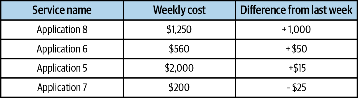
Figure 8-3. Service costs including weekly difference
If you present your engineers a report that shows the cost of their services and show only the current weekly spend of each service (as in Figure 8-2), then your engineers will remember the service with the highest cost. Instead, if you also include the amount each service has grown month on month, you can influence your engineers to recall the service that is growing most quickly. Using this effect, you can steer engineers toward the outcomes you want reached when reading your reports, i.e., to focus on the line items with the most growth.
Hick’s Law
To help your staff make a decision, your reports often present multiple options to decide upon. Hick’s law is a simple idea that says that as the number of presented options increases, so too does decision-making time. From Wikipedia:
Hick’s law describes the time it takes for a person to make a decision as a result of the possible choices: increasing the number of choices will increase the decision time logarithmically. The Hick–Hyman law assesses cognitive information capacity in choice reaction experiments. The amount of time taken to process a certain amount of bits in the Hick–Hyman law is known as the “rate of gain of information.”
Optimization reports in FinOps will often include a few alternative recommendations for your engineering teams to consider. You should aim to present only the best recommendations that are most likely to be selected.
Consider a recommendation that has multiple options.
Two of these options would result in only a small reduction in cloud costs, and another is a high-risk change for your engineers. Removing the items that are not effective reduces the total items for your engineers to consider from five to two and is likely to result in a quicker decision. In Figure 8-4, the AWS Compute Optimizer console limits the recommendations it presents to the user and shows the price difference and performance risk to help the engineer in making a decision. Keeping recommendations to a minimum has the added benefit of reducing the amount of time engineers have to spend reading all the options and can lead to higher productivity.
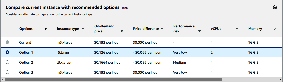
Figure 8-4. The AWS Compute Optimizer console, showing recommendations for rightsizing an EC2 instance
Tip
Hick’s law and its implied limitations on choices ties nicely to the FinOps Foundation Framework capability: establish a FinOps decision and accountability structure. Policy decisions like what kinds of optimizations will be recommended (only those over a certain threshold of savings, only those on these types of resources, only those for teams that have adopted a certain level of efficiency, only those for resources below a minimum efficiency threshold, etc.) provide a model for minimizing the options your FinOps team presents and provide transparency for why you select or exclude certain ones.
Perspectives on Reports
When evaluating the design of your collection of FinOps reports, consider the perspectives discussed in this section. They will help inform the desired outcomes for your reports and influence the essential elements that you need to include.
Personas
In contrast to the universal report concept discussed earlier in this chapter, consider when it is better to have persona-focused reports that deliver the details needed for a specific role within your organization versus trying to make a single report that can answer all the questions for all the personas. For example, keep leadership reports—which roll up the specific details into a high-level overview of how FinOps is performing within your organization—discrete from the reports that engineers use to track their individual service costs. This allows you to build more targeted reporting that is most effective at driving FinOps outcomes. It is critical that these reports be consistent with each other in terms of metric definitions and language. If one of your reports is showing that a metric is off track, the other should reflect relevant opportunities for improvement of that metric.
Maturity
As your FinOps practice matures, the amount of information that can be reported will grow quickly. And as you implement additional capabilities from the FinOps Foundation Framework, you will add further measures of success that will need to be tracked and reported upon. The addition of further capabilities will also add extra functional activities that your staff will be expected to perform. Rely on your reporting to know when there is a task that needs to be completed and measure the outcomes that performing the task returns.
Further, as your adoption of cloud services increases, the amount of information needing to be presented will increase. Often teams focus on core cloud services, e.g., compute, database, and storage, but as your organizational cloud maturity increases, expect to see a longer list of cloud native services used by your teams, such as Function as a Service (FaaS), machine learning (ML), or higher-level application services. Each of these added services will introduce different billing structures. Some bill by time like per second or per month; others charge based on quantity, or even have a little bit of both. The more services used in your cloud bill, the more complex the task of reporting on cloud costs becomes.
Multicloud
As your organization begins to significantly use multiple cloud providers, your FinOps team might start with separate reporting, especially if you choose to use each of the individual cloud service providers’ billing tools. Although many of the terms and concepts used by the major cloud providers are functionally similar, there are differences in the naming conventions and service categorizations that can be confusing, and some elements are unique to a particular cloud provider. A good breakdown of differences between tagging and metadata structures in the cloud can be found in Chapter 12.
Separating data from different clouds forces your users to recall information between various environments and connect similar concepts themselves. As Edward Tufte said, “Comparisons must be enforced within the scope of the eyespan.”
To reduce the effort and confusion associated with multicloud reporting, it is better if you combine the cloud data into consistent reports where the complexity of joining the information has been handled correctly. To achieve this, you will likely need to move beyond native tooling to in-house or external vendor tooling.
Tip
Data ingestion and normalization is a foundational capability of the FinOps Foundation Framework to enable other capabilities. Effective FinOps practice requires access to regular streams of detailed usage, utilization, and cost data, which can be categorized and analyzed to drive decision making. Monitoring platforms, security platforms, and business operations applications can also provide data that will inform on utilization, location, value, and usage, often at similar levels of volume and granularity. The data ingestion and normalization challenge grows as the complexity and diversity of the data increases. Be sure to look at the measures of success for this required capability presented with the Framework when determining how to handle your own data.
Putting Data in the Path of Each Persona
FinOps data is required to maximize the value of cloud spend, and unfortunately, it is often hidden away in isolated FinOps-specific reports and tools. When these reports are orphaned in a dashboard that is outside of daily workflows, they are underutilized by the very engineering teams, business leaders, and finance teams who need them. To counteract this, aim to put data in the path of each persona’s already established ways of working.
Data in the Path of Finance
The first persona to see some form of FinOps data is often the finance team. This comes from a mutual interest as finance seeks to have cloud spend data added into their established financial reporting systems. Cloud spend is first connected to company purchase orders to help with assigning spend to the right budgets. Getting FinOps data into finance systems allows your existing finance processes to work with your summarized cloud spend, and it reduces friction with finance teams who have well-established reporting and auditing requirements from which they typically cannot deviate.
Data in the Path of Leadership
Leadership and executive reports should also include FinOps data showing cloud spend data in relation to existing business metrics. For business leaders to make decisions, ensure key information on cloud spend, savings, and opportunities are present among other data they are used to digesting. Separating FinOps data from other business data reinforces the incorrect perception that FinOps is somehow disconnected from the rest of the business. As we’ll cover in Chapter 26, you should aim to provide unit economic metrics in leadership reporting that marry cloud spend to business metrics to showcase the value and impact of cloud usage to the business, not just the cost.
Data in the Path of Engineers
Last, but arguably most important, we strongly recommend you work on getting FinOps data into the path of your engineers. When your engineers start thinking about FinOps, it should not be a drastic departure from their well-established daily rituals, i.e., you don’t want them moving away from doing DevOps and spending time doing FinOps. Ideally, it becomes an integrated and required effort in one cohesive process.
We often say, cost is just another efficiency metric. Engineering teams will have dashboards and rituals focused on a long list of key metrics. These dashboards will monitor security, performance, and reliability metrics to manage their services running in cloud successfully. Aim to add key FinOps data into these existing locations and systems. Introduce the data they need to begin considering cloud spend changes—such as actuals versus forecast and opportunities to reduce costs—into their ongoing sprint planning. Isolated FinOps data and conversations create cognitive load and distraction that invariably results in reactive cost work that occurs only when mandated. As a result, engineers will see FinOps tasks as interruptions to their work instead of being a part of it.
When introduced early on in the development lifecycle and into existing processes, FinOps data can encourage them to consider the cost at every step of designing a new architecture or making improvements to code. Engineers need to allocate the right amount of time for FinOps activities to achieve the business’s desired outcomes around cloud efficiency.
Connecting FinOps to the Rest of the Business
Listening is more than being quiet while the other person speaks until you can say what you have to say.
Krista Tippett, Journalist
Rather than reinventing the wheel, there are likely already teams that produce finance, executive, and engineering reporting with whom the FinOps team can partner to integrate their own data. This provides an opportunity to educate these personas about FinOps and continue the work of breaking down barriers between discipline silos within the organization. It also provides an important touchpoint to tackle the UI concepts discussed earlier in this chapter, ensuring that language is consistent and data is presented to encourage action. These existing groups are often wizards at using APIs to pull and massage complex data into readable and consistent reporting.
The idea behind the Data in the Path concept is not to take the whole world of FinOps and drop it into the middle of everyone’s reports. Only bring the critical information that enables targeted conversations and decisions required for FinOps without interrupting current rituals. When questions arise from this information requiring more in-depth reporting and analysis, that is the time to connect your staff to the more detailed reports you have available in your FinOps arsenal.
Your job is to ensure each respective team has the context to truly understand cloud consumption data and, when faced with it, make the right assumptions leading to the right actions for the business. One can glean only so much from raw data regardless of how well it’s integrated into other workflows.
Seek First to Understand
It may be tempting to look at an optimization recommendation or some form of efficiency scoring data and assume that the owner of that infrastructure isn’t thinking about costs, is ignoring efficiency, or is simply a bad actor. Instead of making assumptions, use FinOps data to start a blameless conversation that seeks first to understand decisions before attempting to influence them.
Kim Wier, Director of Efficiency Engineering at Target, uses this model well. Her central FinOps enablement team goes to the various engineering teams and asks them to tell her what efficient usage of their resources should look like. “It’s important to ask them how they want to see efficiency metrics,” she says. “The engineers want to utilize their infrastructure as best they can in the best interest of Target.” She can then provide the relevant FinOps data aligned to the business goals of that particular team. Kim goes on to say, “We aim to output recommendations based on what our platform partners view as important to the platform. If we make a recommendation and the engineering team has a strong reason why they can’t do it, then we want that feedback loop to come back into our recommendations.”
This goes counter to the flawed approach that Noel Crowley from Fidelity described on the FinOpsPod as the most common one taken by immature practices: “What typically happens is that a FinOps team takes optimization recommendations from their native or platform tools to the teams and tries to get them to take action on them. Those on the receiving end of those recommendations then push back with a variety of reasons why the change doesn’t make business sense, saying things like ‘Yeah, I could rightsize, but I don’t because XYZ.’” Conversely, Kim’s approach at Target enables her engineering partners to lead her to the solution that makes the most sense for their portion of the business, rather than trying to overlay an ineffective standardized approach on everyone.
Conclusion
The reports and dashboards you create are some of the most important tools in building a collaborative FinOps practice. By thinking of your reports as the UI of FinOps, you can use common UI design considerations to make them more effective at communicating the right information to enable positive actions to be taken.
To summarize:
Treat your reports and dashboards as production, with any changes going through testing in a staging environment before being deployed.
Trust in the quality of your reports and dashboards is paramount for FinOps success.
Consistency in reports avoids confusion or confirmation bias.
Consider conditions that will impact how your reports will be viewed.
Carefully select the information you present in reports to best influence the outcomes you want.
Design your reports based on the perspectives of the intended audience. Reassess the design decisions you have previously made as your cloud journey progresses.
To make FinOps part of the business culture, bring FinOps data into the path of existing reports and rituals used by engineers, finance, and leadership.
This completes Part I of this book. We’ve laid the groundwork by introducing FinOps, why you need it, how it requires a cultural shift, what insights the cloud bill provides, the FinOps Foundation Framework, and finally the UI of FinOps. Part II gets into the fun part: implementing the FinOps lifecycle within your organization.