

6
Rendering Techniques
CREATING HIGHLIGHTS AND SHADOWS
The purpose of putting highlights and shadows on a figure is to define and contour the features and shapes of the body, and to create garment value and texture. Properly applying highlights and shadows brings out descriptive character, enhances effectiveness of design details, and contributes to the mood of the character. Shadows and highlights can be dramatic, exaggerated, or subtle. Artists in the fine arts may use more extreme lights, shadows, and cast shadows to create dramatic and exciting compositions of subjects that express their emotional experiences and intensify the mood of the artwork. However, suggested and simple highlights and shadows are used for costume figure drawings in this book because too much shadow affects garment texture and color. Shadow less on the face than the body parts to focus on facial expressions.
Adding highlights and shadows adds value to the object. Value is the degree of light or dark on the surface of fabrics. Value describes shape and texture and the space in which the object is surrounded. In costume character drawing, use value to create descriptive garments and figures. When light hits an object, highlights and shadows are present. Highlights and shadows create a three-dimensional object because they indicate depth and distinguish texture.
There is a basic pattern to forming highlights, shadows, and reflected lights coming from all directions. There are two basic planes of light and dark. The side of an object facing the light is brighter in value. In the light plane, there are highlights, and in the dark plane is a very dark boundary line and reflected light. A highlight is the brightest area that light hits directly. The boundary line is where light and dark sides meet (or where the surface of the object turns). The boundary line is darkest in value in the dark plane of an object. There is a gray tone in the dark plane, which is lighter than the boundary line but darker than reflected light. Reflected light bounces back from surrounding objects or surfaces. It is lighter in the shadow area, but not any brighter than the value of the light plane. Reflected light takes place on the outer edge of an object on the dark shadow side and is a very important element in defining three-dimensional shape and form. The cast shadow is the darkest among all shadows and has the sharpest edge. In conclusion, the six elements of creating highlights and shadows are light side, highlight, boundary line, dark side, reflected light, and cast shadow.
Hard and soft edges appear on objects due to the shape of an object. When light hits a round object, the boundary line is soft, and a gradual transition from light to dark takes place. When light hits an angular object (such as a box), it produces a hard-edged boundary line. The hard-edged boundary line is created by the sharp turn on the object. Hard edges can be seen on a human body at the nose bridge, jawline, and the outline of the lips. Soft edges show up on nonflat surfaces such as the forehead, cheekbones, arms, legs, and torso. Soft edges often occur on human bodies because of their cylindrical forms. To create a soft edge, develop a medium tone between the light side and the boundary line for a gradual transition of subtle turning.
Adding highlights and shadows transforms a two-dimensional form into a three-dimensional illusion. Here are some suggestions for shadowing a costume design figure:
![]() Complete the outline of the figure and garment.
Complete the outline of the figure and garment.
![]() Determine the boundaries where the form turns between lights and shadows of the figure and garment.
Determine the boundaries where the form turns between lights and shadows of the figure and garment.
![]() Organize and simplify the shadows.
Organize and simplify the shadows.
![]() Fill the shadow areas with middle-toned hatching/cross-hatching lines.
Fill the shadow areas with middle-toned hatching/cross-hatching lines.
![]() Further define light and dark boundaries or division lines where the form turns.
Further define light and dark boundaries or division lines where the form turns.
![]() Create soft transition edges due to the cylindrical shape of the body.
Create soft transition edges due to the cylindrical shape of the body.
![]() Depict reflected light by darkening or erasing nearby shadows.
Depict reflected light by darkening or erasing nearby shadows.
![]() When you're finished, look over the figure. There should be a high contrast between the light and dark sides of hard-edged shadows and a low contrast in soft-edged shadows.
When you're finished, look over the figure. There should be a high contrast between the light and dark sides of hard-edged shadows and a low contrast in soft-edged shadows.
A light source coming from above will define the shapes of the upper portions of features; the perimeter of the features' lower portions will be determined by shadows and reflecting lights from underneath at the bottom edges (see Figure 6-1).
Light from below is reversed from light from above: Light areas will usually be the eye sockets, the bottom of the nose, the top lip, under the lower lip, and under the chin. The bottom of the bust will have more noticeable light than other areas on garments. Boundary lines on features are usually seen along the curved bone of the eyesocket, the tip of the nose, the edge of the upper lip, the top of the cheekbones, the edge of the jawline, and the middle of the bustline (see Figure 6-2).

6-2 Light from Below

A light source coming from either the left or right is easier for developing highlights and shadows. Because all features are clearly defined—such as the turning edge on the forehead, both sides of the nose bridge, and the edges of the cheekbone, jaw, chin, and other body parts—it works best simply to position shading on one side of the features. Light coming from the left or right is most common for costume designers (see Figures 6-3 and 6-4).
Whatever light source you choose, the shadows always fall along the natural forms of the body. Pronounced parts of the body will catch more highlights, and receding parts will stay in the shadows. The bottom planes and outer edges of body features most often show reflecting lights.
There are rules to learn, but that does not mean you must always follow them—you should know how to break them and how to let them work for you. In my costume figure drawings, most of the suggested light sources are from the upper front or the sides. Some of the drawings show mixed lighting sources. Cast shadows in the background or underneath the feet actually are used for setting off the figures rather than exhibiting naturally falling cast shadows. Use only necessary shadows, and do not overstress them.
Shadowing and highlighting accents body forms. Shading a shape in the back sets off shapes in the front; shading a shape at the side sets off shapes on the other side. Parts of a figure are not isolated; they are related together as a family. When drawing one part, compare it to the others. Keep the six elements of modeling highlights and shadows (highlight, light, boundary line, dark, reflected light, and cast shadow) in mind while drawing.
6-3 Light from Left

6-4 Light from Right

CHARACTERISTICS OF MATERIALS AND DRAWING STROKES
Different materials produce very different folds and wrinkles over the body. Utilizing different types of drawing and painting strokes to express textures and feelings of fabrics is the key to deciding material types. Theatrical costumes can be made from a tremendous variety of textures, colors, patterns, and weights of any types of materials. When drawing garments, try to communicate a sense of the particular material and the way it wrinkles, folds, and conforms to the body. Crisp and bold lines create hard-edged wrinkles and folds. Curved and linear lines create soft-edged wrinkles and folds. Deep shadowing will make the fabric look heavy. Prominent highlights are inherent on shiny fabrics.
Lines, shapes, and textures are closely related. Line strokes define direction at any given point—for instance, vertical and horizontal stripes on pants, or curly or straight hair. A group of scribbled lines can produce a rough and bulky texture. Textures can also be drawn entirely in linear lines without any shadows. Whether the image is done with linear lines, shadows, or scribbles, it plays a part in presenting the feeling, movement, and silhouette of the garment. Shiny materials reflect more light. Pile-woven fabrics and wool materials absorb more light. A soft fabric flows and clings to the body and illustrates a soft silhouette. Crisp and bulky material has its own forms that tend to flare out from the body, especially when gathered. This creates a full silhouette.
Different materials are shown in individual ways:
![]() Stiff and bulky materials usually show hard geometric creases and a full body silhouette. Drawing strokes should be firm, sharp, and bony to portray a crisp impression (see Figure 6-5).
Stiff and bulky materials usually show hard geometric creases and a full body silhouette. Drawing strokes should be firm, sharp, and bony to portray a crisp impression (see Figure 6-5).
![]() Soft, smooth, and flowing materials are more capable of draping or hanging. They have a soft, clinging flare and follow body curves. Soft materials have fluid curves at the hem of the garments. Continuous, flowing, and linear lines and strokes should be used for drawing soft materials (see Figure 6-6).
Soft, smooth, and flowing materials are more capable of draping or hanging. They have a soft, clinging flare and follow body curves. Soft materials have fluid curves at the hem of the garments. Continuous, flowing, and linear lines and strokes should be used for drawing soft materials (see Figure 6-6).
![]() Rough-surfaced materials have some kind of three-dimensional dynamic surface. Suggested textural strokes are composed of short broken lines, dots, shapes, or scribbled lines (see Figure 6-7).
Rough-surfaced materials have some kind of three-dimensional dynamic surface. Suggested textural strokes are composed of short broken lines, dots, shapes, or scribbled lines (see Figure 6-7).
![]() Shiny materials contain high contrasts in value. The shiny surface of the material reflects highlights in broad areas. It can be soft or stiff. Use the same strokes you used for drawing soft materials as mentioned earlier for shiny materials. Use the same strokes you used for drawing stiff materials to draw stiff and shiny materials. Emphasize the contrast between light and dark (see Figure 6-8).
Shiny materials contain high contrasts in value. The shiny surface of the material reflects highlights in broad areas. It can be soft or stiff. Use the same strokes you used for drawing soft materials as mentioned earlier for shiny materials. Use the same strokes you used for drawing stiff materials to draw stiff and shiny materials. Emphasize the contrast between light and dark (see Figure 6-8).
![]() Pile-woven materials, such as velvet, velveteen, and velour, absorb light, drape, and are heavy. This type of fabric has a short, hairy surface. It produces soft-edged wrinkles and folds. Smearing strokes (with pencil media) can help to create this soft-edged, hairy look. Velvet material is effective when rendered in dark tones. To get a hairy look, use short strokes to contour the garment (see the cape in Figure 6-9).
Pile-woven materials, such as velvet, velveteen, and velour, absorb light, drape, and are heavy. This type of fabric has a short, hairy surface. It produces soft-edged wrinkles and folds. Smearing strokes (with pencil media) can help to create this soft-edged, hairy look. Velvet material is effective when rendered in dark tones. To get a hairy look, use short strokes to contour the garment (see the cape in Figure 6-9).
![]() Fur ranges in degrees of curvy and straight and can be long or short in length. It grows in different directions but always tapers to the ends. Tapered drawing strokes will achieve the furry look. Layer toning colored washes; then apply tapered strokes in the direction the fur grows. Keep the ends sharp (see Figures 6-10 through 6-12).
Fur ranges in degrees of curvy and straight and can be long or short in length. It grows in different directions but always tapers to the ends. Tapered drawing strokes will achieve the furry look. Layer toning colored washes; then apply tapered strokes in the direction the fur grows. Keep the ends sharp (see Figures 6-10 through 6-12).
![]() Leather can be suede or smooth. Suede has a dull surface compared to smooth leather. Suede causes the body to be more bulky, and the wrinkles and folds on the surface appear to have a rolling effect. Dry brush strokes are the best way to render suede materials. Sometimes choosing a rough-surfaced paper will help to effectively achieve the rough textured look. Using high contrast—very dark to very light—is the best way of expressing a smooth leather surface. Map highlights and shadows frst, then carefully paint them. Keep a sharp, clean division between light and dark (see the shiny leather jacket in Figure 6-13).
Leather can be suede or smooth. Suede has a dull surface compared to smooth leather. Suede causes the body to be more bulky, and the wrinkles and folds on the surface appear to have a rolling effect. Dry brush strokes are the best way to render suede materials. Sometimes choosing a rough-surfaced paper will help to effectively achieve the rough textured look. Using high contrast—very dark to very light—is the best way of expressing a smooth leather surface. Map highlights and shadows frst, then carefully paint them. Keep a sharp, clean division between light and dark (see the shiny leather jacket in Figure 6-13).
6-7 Drawing Rough-Surfaced Materials


6-11 Drawing Fur

6-12 Drawing Fur


PAINTING COSTUMES
There are two types of sketches to paint: a sketch with value and a sketch with no value but with outlines. The sketch with value (black and gray shadows created by pencil) is faster and easier to paint because value has already been indicated. You need to create value with colors if there is no value on the sketch.
Making copies of original sketches on a copy machine or scanning and printing transforms a sketch image onto lightweight paper for painting renderings. If you make a mistake or if the director doesn't like the colors you painted on the copy, you can make another copy of the original. Disadvantages are that copy machines and printers cannot process heavyweight paper, so you will have to paint on low-quality paper—but it can be done.
Two basic ways of painting renderings are commonly used for either wet or dry media. One is painting from a light to a dark tone; and the other is painting from a dark to a light tone. The following vocabulary of colors will be used to explain the process of painting costume renderings: high-key color, low-key color, local color, and reflected color.
![]() High-key color is any color that has a value level of middle gray or lighter. The color presents the light side of the garment directly hit by light.
High-key color is any color that has a value level of middle gray or lighter. The color presents the light side of the garment directly hit by light.
![]() Low-key color is any color that has a value level of middle gray or darker. The color presents a garment on the dark or poorly lighted side.
Low-key color is any color that has a value level of middle gray or darker. The color presents a garment on the dark or poorly lighted side.
![]() Local color is the color of the garment.
Local color is the color of the garment.
![]() Reflected color is presented as reflected light, but in color. It can be a cool or warm tone, or it can be a complementary color of the garment.
Reflected color is presented as reflected light, but in color. It can be a cool or warm tone, or it can be a complementary color of the garment.
The boundary color is darker than the garment's low-key color. Creating highlights and shadows develops value; color value is the relative degree of light or dark color. The six elements of creating highlights and shadows, discussed at the beginning of this chapter, can be applied to paint-colored renderings as well.
Watercolor media is used for demonstrating the process from light to dark. Watercolors are available in two main forms: pancakes and tubes. Pancake color is dry and needs to be moistened before use, whereas tube color is already moist and ready to use. Tube colors are more suitable for painting large-scale drawings. Everyone has his or her own preferences.
In my opinion, watercolor is the fastest media for painting costume renderings. Watercolor is transparent, shows all toning layers, and is easily mixed and applied. Costume renderings are usually only small area projects, and sometimes only one or two strokes are needed for painting, especially when painting a sketch with value. Buy a color wheel and practice mixing colors. Keep in mind that adding less water to paint creates higher-intensity color and deeper color values. Mixing complementary colors neutralizes colors. Mixing more than three colors together will produce muddy colors.
Painting from Light to Dark
Refer to Figures 6-14 through 6-16 for the following steps:
- Use light pencil lines to map boundary lines between the light and dark sides.
- Tone the light side only with the garment's high-key color. Leave some white areas on the paper (if it's white paper and if needed) as highlight spots on the garment. For a softedged effect, paint the next step while the paper is damp. For a hard-edged effect, wait until it's completely dry to start the next layer.
- Add reflected color to the edges of the garment on the dark side. Spread the color toward the boundary line, but don't go over it. The value of the reflected color should be brighter than the shadow color but darker than the highlight.
- Apply the local color of the garment on top of the high-key color. Don't color areas that are directly hit by light or where body forms are pronounced. Spread the paint to the dark side so that it gradually merges with the reflected color.
- Add shadows with the garment's low-key color only to the dark side of the garment. Start from the boundary line, and then merge with the reflected color.
- Using the same local color mixed with the low-key color to paint the light side only where the light and dark meet to create a soft, gradual transition from the light side to the dark side.
- Add details of highlights and very dark shadows (boundary line) to accent the rendering.
Figures 6-17 through 6-29 are design samples of watercolor rendering.
6-14 Watercolor Rendering, Step One

6-15A Watercolor Rendering, Step Two (Dark to Light with Cool-Toned Shadow)


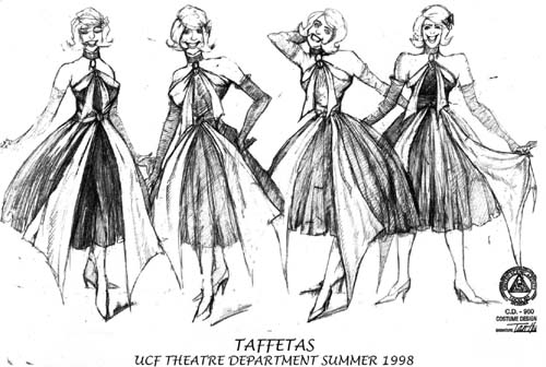
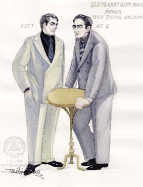
6-16 Watercolor Rendering, Step Three (Finished)—Glengarry Glen Ross

6-17 Design Sample of Watercolor Rendering—Glengarry Glen Ross


6-19 Design Sample of Watercolor Rendering—Glengarry Glen Ross
6-20 Design Sample of Watercolor Rendering—Glengarry Glen Ross


6-22 Design Sample of Watercolor Rendering—Ceremonies in Dark Old Men


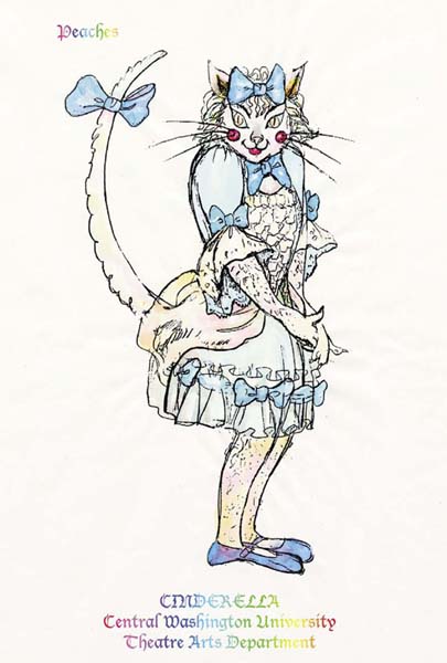
6-24 Design Sample of Watercolor Rendering—Cinderella

6-26 Design Sample of Watercolor Rendering—Cinderella


Rendering Sheer Material
Sheer material is transparent, revealing the body's contours. Sheer fabrics can be soft, flowing, and clinging to the body, or stiff and puffed away from the body. Use the same strokes (see Figures 6-6 and 6-9) as for painting soft-type material to render soft, flowing, sheer material. Use the same strokes (see Figures 6-5 and 6-7) as for stiff material to render stiff and puffy sheer material.
To render sheer material (see Figures 6-30, 6-31, and 6-32), render the body first with skin-tone paint. Then paint the garment. The contours or outlines of the garment are fine and continuous lines. For stiff fabric types, contour lines should be crisp.
6-30 Rendering Sheer Material with Watercolor Medium—Step One

6-31 Rendering Sheer Material with Watercolor Medium—Step Two

6-32 Rendering Sheer Material with Watercolor Medium—Step Three (Finished)

Painting from Dark to Light
An acrylic medium is used for the following demonstration (see Figures 6-33, 6-34, and 6-35). Watercolor techniques can be used with acrylic paints (I work from dark to light with both watercolors and acrylics). Acrylics are water-soluble when wet. Once dry, they are waterproof; you can paint over acrylics without lifting the color beneath. The dry color tone is the same as when it was wet. These paints can be used opaquely (thick build-up, like oil paints) or transparently in a thin layer by mixing in water. Acrylics dry fast, so you have to work fast. Create highlight colors by adding more water to watercolor paint and vice versa for creating darker paint. With acrylics, this can be done in two ways: add water to dilute the paint, or mix in white or other high-value paints to develop lighter-toned highlight colors. Mix in black, grays, or complementary colors to produce dark colors and shadows. Don't mix colors too thoroughly, and avoid mixing more than three colors together, because it will make the paint look muddy and reduce the freshness. Follow these guidelines:
- Use light pencil lines to map boundary lines between the light and dark sides.
- Paint the entire shadow side with reflected color. As mentioned before, reflected color can be in cool or warm tones or a complimentary color of the garment. Reflected color value is brighter than the shadow color but darker than the highlight color.
- Tone the entire light side of the garment with high-key color, and leave some white areas as highlight spots.
- For acrylics, use a wash technique (used also in watercolors) for a transparent effect. Apply local color (thin paint with water only) on top of high-key color (leave areas where light directly hits) on the shadow side and merge with reflected color. When local color overlaps the reflected color beneath, it automatically creates shadow colors.
- For an opaque look, mix selected paint with white or high-value colors to brighten high-key colors. Mix with black, gray, or complementary colors to darken or neutralize local or low-key colors. Apply local color to the light side and paint around highlight areas. Apply low-key color from the boundary line in the dark side, and then merge with reflected color.
- Mix the same local color with the same low-key color, and paint the light side in areas where light and dark meet to create a smooth progressive shift from light to dark. The value of the mixed color should be darker than the local color and lighter than the low-key color.
- Add highlights and very dark shadows (the boundary line) to accent the rendering.
Painting from dark to light and vice versa should work the same if the painting is under control. Painting on a dry surface will create hard, crisp edges. Painting on a damp surface will create a soft-edged look. Working at a fast speed helps in developing soft edges well.
Gouache colors are intense and opaque.
Gouaches are similar to acrylics in that both can be mixed together and thinned with water. Mix them with white paint to create opaque tints and thin with water for transparent colors. They can be used to paint from light to dark or vice versa. The difference between acrylics and gouaches are that acrylics dry fast and become waterproof once dry. Gouaches dry more slowly, which allows more time for work. On the other hand, gouaches have a tendency to bleed through if one coat of paint is on top of another coat. Acrylics stay the same tone when dry, whereas gouache dries to a lighter tone. Easy ways to control gouache paints include mixing the paint one shade darker than the actual color being created and avoiding back-and-forth strokes when painting on top of another layer.
Background color can be painted before or after rendering the sketch. Painting the background frst is the safe way because any mistakes can ruin a painted rendering. Figures 6-36 through 6-42 are design samples of acrylic rendering.

6-34 Acrylic Rendering—Step Two

6-35 Acrylic Rendering—Step Three (Finished)


6-37 Design Sample of Acrylic Rendering—Misalliance

6-38 Design Sample of Acrylic Rendering—Steel City


Painting with Markers
There are many different types of markers available on the market. The Staedtler-Mars Graphic 3000 and Pantone markers are my favorites. Markers are convenient for quick renderings and are an extremely useful media for costume design. Colors range widely in intensity and permanence. Markers let you create detailed drawings in little time. They can be mixed by overlapping colors or with a blender pen and can be combined with other media. Be careful when buying markers, and try them first before purchasing. Try not to buy the primary/pure or bright-color markers; they are too strong and difficult to mix. They tend to look garish and provide a less-realistic impression. It is hard to create an illusion of space between you and the object. If you paint a garment just “red” without mixing any other colors together, your figure will look “cartoony” and unrealistic.
EXAMPLES
![]() Finish sketches to be ready for coloring (see Figure 6-43A).
Finish sketches to be ready for coloring (see Figure 6-43A).
![]() Tone a garment with one color marker to create value by overlapping. This gives a smooth surface and a soft-edged look (see example 1 in Figure 6-43B).
Tone a garment with one color marker to create value by overlapping. This gives a smooth surface and a soft-edged look (see example 1 in Figure 6-43B).
![]() Overlap complementary colors to create value by applying them at the shadow areas and then coloring over it. This creates a light to dark contrast (see example 2 in Figure 6-43B).
Overlap complementary colors to create value by applying them at the shadow areas and then coloring over it. This creates a light to dark contrast (see example 2 in Figure 6-43B).
![]() Overlap with gray tones to achieve value. Your decision regarding the correct number of layers of gray to paint and how dark the gray should be is based on the local color of the garment. The gray color can be painted before or after painting local color. Experiment mixing with grays before painting (see example 3 in Figure 6-43B).
Overlap with gray tones to achieve value. Your decision regarding the correct number of layers of gray to paint and how dark the gray should be is based on the local color of the garment. The gray color can be painted before or after painting local color. Experiment mixing with grays before painting (see example 3 in Figure 6-43B).
![]() Tone the garment with markers (see Figure 6-43C). Create details with gel pens. Fine-point gel pens are available in sparkle or nonsparkle colors. There are also Super Vibrant opaque-colored pens that appear clearly on dark surfaces, and they can be used to draw patterns and lines. They are the best tool for adding details (see Figures 6-44, 6-45, and 6-46).
Tone the garment with markers (see Figure 6-43C). Create details with gel pens. Fine-point gel pens are available in sparkle or nonsparkle colors. There are also Super Vibrant opaque-colored pens that appear clearly on dark surfaces, and they can be used to draw patterns and lines. They are the best tool for adding details (see Figures 6-44, 6-45, and 6-46).
Figures 6-47 through 6-49 are design samples of painting with markers.


6-45 Creating Details with Gel Pens, Step Two: Toning the Entire Garment

6-46 Creating Details with Gel Pens, Step Three: Adding Details/Patterns/Designs to Garment


Creating Texture
Creating a textured garment can be done by painting with layers of colors and strokes to add the illusion of roughness to the surface of the paper. In this section, I discuss how to use colored pencils to create textured garments. Colored pencils are clean, quick, and portable. They are very useful for quick sketches, are simple to apply, and allow plenty of time to make adjustments while drawing. They can be blended, mixed, and built up in multiple layers. They can produce translucent and opaque effects.
There are two kinds of colored pencils you may want to have for drawing costumes: Prisma and water-soluble colored pencils. Prisma colored pencils are strong, light, and fast, and provide rich and vivid colors. A set of Prisma colored pencils lasts for many years. Water-soluble colored pencils have all the advantages of Prisma colored pencils in addition to being water-soluble. Adding water creates watercolor effects, and can create a transparent look with texture. After coloring with colored pencil, add water to dissolve it, but do not dissolve all the color evenly for a textured look. Water-soluble pencils are easier to handle than watercolor pigments. Both Prisma colored pencils and water-soluble colored pencils can be used in combination with other media to create special effects.
CREATING A PINSTRIPED SUIT AND PLAID DRESS
Creating stripes and textures using indentation marks is very effective (see Figure 6-50). The indentations build up another layer of dimension on the drawing paper. I discovered this by trying to remove indentation marks from my drawings. Then I found that they are useful for creating textures of costumes. This method works well with dry media, but it doesn't work with wet media because wet paint bleeds into the indentation marks and flattens the image.
![]() Place sketching paper on a surface softer than a drawing table (on top of a paperback book), and make striped indentation marks with a butter knife (or another dull object) on the sketch of the garment before coloring. This creates white stripes on the garment, and a soft surface allows deeper indentation marks to be etched.
Place sketching paper on a surface softer than a drawing table (on top of a paperback book), and make striped indentation marks with a butter knife (or another dull object) on the sketch of the garment before coloring. This creates white stripes on the garment, and a soft surface allows deeper indentation marks to be etched.
![]() When coloring the sketch, move the paper to a hard surface for better results because a hard surface will protect indentation marks. Hold the colored pencil at a 35 degree or less angle while coloring to avoid pigments getting into the indentation marks.
When coloring the sketch, move the paper to a hard surface for better results because a hard surface will protect indentation marks. Hold the colored pencil at a 35 degree or less angle while coloring to avoid pigments getting into the indentation marks.
![]() Color highlights of the pants first.
Color highlights of the pants first.
![]() Color reflected color second.
Color reflected color second.
![]() Color the sketch with the garment's local color and merge it with both highlights and reflected colors.
Color the sketch with the garment's local color and merge it with both highlights and reflected colors.
![]() Add shadows (the boundary line is the darkest in the shadow area) and merge the shadow color with reflected light.
Add shadows (the boundary line is the darkest in the shadow area) and merge the shadow color with reflected light.
6-50 Creating Stripes and Plaids with Indentation Marks

CREATING ROUGH-TEXTURE FABRICS
Creating other types of rough-texture fabrics, such as horizontal stripes, plaids, and twill, woven, or irregular patterns can be achieved using the same indentation mark procedure (see Figure 6-51). Paint or color at a different angle than the indentations and hold the colored pen or pencil at a 35 degree or less angle while coloring to avoid filling the indentations. For example, if you etch vertical stripes on a suit, color with horizontal movements. Make sure that you color quickly so you don't color in your indentation marks. If making a plaid pattern, color diagonally. The point is to try to color in a different direction from your indentation marks.
For color or multiple-color textures, simply apply one or more layers of the desired foundation colors (use watercolors or markers for a solid, smooth surface) and wait until the paper completely dries; then, make indentation marks. Choose a contrasting set of multiple colors. The greater the contrast, the better the outcome. Thick, heavy drawing paper is best for creating this type of textured drawing because deeper indentations are possible and the pressure is strongly supported.
Figures 6-52 through 6-60 are design samples of textured costumes.
6-51 Creating Twill, Woven, or Irregular Patterns with Indentation Marks (Colored Pencils and Markers)
6-52 Design Sample of Textured Costumes—Tom Sawyer

6-53 Design Sample of Textured Costumes—Tintypes


6-58 Design Sample of Textured Costumes—The Lion in Winter

6-59 Design Sample of Textured Costumes—The Lion in Winter


Painting the Head and Face
Facial expression is a main focus for my character costume figure drawings. I usually keep the face lightly and simply painted with a suggested flesh tone and shadows. You can use any media to render the head and face. For a transparent effect, mix paint with water. For an opaque effect, mix white into the paint. Flesh-toned markers or colored pencils also are used often. I like to use watercolors because I am able to invent any color I want.
Two examples of painting heads and faces follow. They can be painted either from dark to light (Figure 6-61) or from light to dark (Figure 6-62). Common shadows that appear on the face are at the eye sockets, sides and bottom of the nose, cheekbone areas, upper lips, temple area, under the jawline, and bottom of the lip.
![]() Using opaque colors. Add a little white to the skin-tone color. Lighter skin has a pinkish glow. A dark skin tone shows a tan or is brownish in color. Apply the desired skin tone to the entire face (don't paint the inside of the eyes). Add red to create rouge color. Add dark colors to create shadows, and apply it to shady areas. Color the cheek areas before the first layer of paint dries, for a soft look. Create cheek colors by tinting the skin tone with red shades. Keep the top eyelid thicker and darker than the bottom one. Iris color can be based on the character. Keep the top lip slightly darker than the bottom lip. The hairline and eyebrows are soft-edged for a realistic look. Tone the entire hair growth area with a wet-wash of hair-foundation color and leave white areas as highlights. Then add dark colors to the hair-foundation color, to create a shadow area. After the foundation and shadow colors dry completely, apply curved strokes with a fine brush for texture. Accent dark colors at the boundary line for contrast.
Using opaque colors. Add a little white to the skin-tone color. Lighter skin has a pinkish glow. A dark skin tone shows a tan or is brownish in color. Apply the desired skin tone to the entire face (don't paint the inside of the eyes). Add red to create rouge color. Add dark colors to create shadows, and apply it to shady areas. Color the cheek areas before the first layer of paint dries, for a soft look. Create cheek colors by tinting the skin tone with red shades. Keep the top eyelid thicker and darker than the bottom one. Iris color can be based on the character. Keep the top lip slightly darker than the bottom lip. The hairline and eyebrows are soft-edged for a realistic look. Tone the entire hair growth area with a wet-wash of hair-foundation color and leave white areas as highlights. Then add dark colors to the hair-foundation color, to create a shadow area. After the foundation and shadow colors dry completely, apply curved strokes with a fine brush for texture. Accent dark colors at the boundary line for contrast.

6-62 Painting from Light to Dark

![]() Using transparent colors. Use transparent colors to paint the head and face. Mix paint with water to create a skin-tone color and apply it to the entire face, but leave some highlighted areas, such as the eyesockets, nose bridge, upper cheekbones, and the top of the chin. Add shadow colors to shadow areas as mentioned previously. Reflected colors should be applied at the feature's bottom portions for a three-dimensional form. Paint the hair using the previous technique.
Using transparent colors. Use transparent colors to paint the head and face. Mix paint with water to create a skin-tone color and apply it to the entire face, but leave some highlighted areas, such as the eyesockets, nose bridge, upper cheekbones, and the top of the chin. Add shadow colors to shadow areas as mentioned previously. Reflected colors should be applied at the feature's bottom portions for a three-dimensional form. Paint the hair using the previous technique.
A good rendering is one that is accurate in its proportions with exciting movement, balance, facial expression, and clothing that works and fits with the body. State the garment well; apply dynamic use of space; add visible pencil strokes to increase dimension to the fabric; use vigorous lines to accent and add swing to the figure; and accent colors for a harmonious and well-contrasted color equilibrium. Create your own imaginative and unique images.
DECORATING THE BACKGROUND OF THE COSTUME DESIGN
A background supports and enhances a design but should not take away from the design. The background can be painted in color or can include shadows and shapes. It can be illustrated with objects such as furniture or scenery. Frames or particular lines may be used as well. A background creates an environment that sets off the figure and the costumes. Consider proper background decoration as part of the design concept; it enhances and enriches the three-dimensional effect of the whole body. When choosing a background, try to create a mood that fits the play and the character rather than just painting any random color. Keep the background style of the design consistent throughout each drawing to unify the design themes. Using complementary colors is recommended; I often choose black or gray colors, because those tones can easily be harmonized and blended with other colors.
Shading underneath a figure's feet exists in most of my designs. I choose to do so because it is simple, fast, and easy to control, yet provides dimension and space. It also provides a location or horizon for the figure to stand on. Some shadows in the background behind figures are not necessarily logically positioned, but are rather decorations. Even cast shadows added underneath feet do not exactly reflect the direction from which the light is coming, and may not match the shadows on the garments. They are just decorations that provide contrast. Creating a type background for a figure is a personal choice. You may develop a uniquely styled background or choose to do no background at all. Obviously, decorating the background should not be the main focus for costume-design renderings. Costumes and character figures are the central concentration. Background decoration is always just a complementary element. Adding a busy background is like drawing legs on a snake—it is uncalled-for and may ruin the design.
If you choose to add a background design, remember these two words: contrast and decorate. Contrast value, size, color, texture, and details. Decorate the elements you put on the background in a supportive and harmonious manner that won't take away from your costumes.
Figures 6-63 through 6-76 are design samples of creating background.
6-64 Design Sample of Creating Background—Cross-Hatching with Pencil


6-66 Design Sample of Creating Background—with Textured Paper
6-67 Design Sample of Creating Background—with Textured Paper


6-73 Design Sample of Creating Background—with Tinted Paper and Frame


DRAWING SUPPLIES
A wide array of paper, paints, brushes, and pencils are available on the market. Better-quality supplies will obviously produce higher-quality renderings. High-quality materials can visually help poor quality drawings. However, use low-quality materials to practice your sketching skills, such as achieving correct proportion and balance, creating body movements, capturing facial expressions, creating highlights and shadows, and using strokes to create textures. Exercise these skills with economical materials, but do your final project with high-quality materials.
I experiment with all types of paper, especially ones with texture. Throughout my design samples in this book, you will notice that the sketches and renderings are done on many different kinds of paper. Some renderings are painted with a combination of media.
As a costume designer, you should have these major drawing tools in hand:
![]() Pencils. A mechanical pencil with a replaceable eraser is best for making costume character drawings. Leads for mechanical pencils include HB, B, and 2B. Of these, 2B lead is most commonly used. Mechanical leads can make linear lines, hatching or crosshatching lines for shading, and overlapping lines for thick contour lines. Hard leads make grays, and soft leads make blacks. You don't have to sharpen the pencil while drawing. Graphite drawing pencils are useful for class work and large still-life drawings. Their leads range from 9H to H, and HB to 9B. H-type pencils are hard and good for time-consuming projects, and can produce broad sidestrokes. Hard pencils also can be used during the beginning stages of drawing and mapping light marks or outlines of highlights and shadows. Soft leads are efficient for creating value.
Pencils. A mechanical pencil with a replaceable eraser is best for making costume character drawings. Leads for mechanical pencils include HB, B, and 2B. Of these, 2B lead is most commonly used. Mechanical leads can make linear lines, hatching or crosshatching lines for shading, and overlapping lines for thick contour lines. Hard leads make grays, and soft leads make blacks. You don't have to sharpen the pencil while drawing. Graphite drawing pencils are useful for class work and large still-life drawings. Their leads range from 9H to H, and HB to 9B. H-type pencils are hard and good for time-consuming projects, and can produce broad sidestrokes. Hard pencils also can be used during the beginning stages of drawing and mapping light marks or outlines of highlights and shadows. Soft leads are efficient for creating value.
![]() Charcoal pencils. These are truly black graphite pencils and can produce firm, fluid, bold, and vigorous lines. Smudging will produce high-contrast rich tonal effects. They are good for class drawing projects. Charcoal drawings need to be sprayed with fixative to protect the surface of the drawing.
Charcoal pencils. These are truly black graphite pencils and can produce firm, fluid, bold, and vigorous lines. Smudging will produce high-contrast rich tonal effects. They are good for class drawing projects. Charcoal drawings need to be sprayed with fixative to protect the surface of the drawing.
![]() Brushes. Natural-hair brushes (sable bristles are the best) hold paint well for watercolor paintings. Synthetic-fiber brushes are slightly stiffer than natural-hair brushes and are good for acrylics and gouache paints. Brushes come in small and large, round and flat shapes. You should own both types of brushes in different sizes. A larger rendering requires a bigger brush for an even and smooth look.
Brushes. Natural-hair brushes (sable bristles are the best) hold paint well for watercolor paintings. Synthetic-fiber brushes are slightly stiffer than natural-hair brushes and are good for acrylics and gouache paints. Brushes come in small and large, round and flat shapes. You should own both types of brushes in different sizes. A larger rendering requires a bigger brush for an even and smooth look.
![]() Paper. There are many different drawing and painting papers to choose from. To choose the correct one, experiment with them yourself to figure out what is most suitable for your renderings.
Paper. There are many different drawing and painting papers to choose from. To choose the correct one, experiment with them yourself to figure out what is most suitable for your renderings.
In general, watercolors go on watercolor paper. There is heavy or lightweight paper; I use lightweight paper because it can go through a copy machine (I paint on copies). I like watercolor pad, acid-free, cold press, 90 lb. paper. It comes in different sizes: 11 × 15 or 9 × 12. Sometimes my renderings are done on copy paper. If you like heavier watercolor paper, you either can draw the sketch directly on painting paper or trace the image onto heavy painting paper.
Bristol paper is good-quality drawing paper that is preferred by a lot of costume designers because it is made from natural fibers. It can go through some copy machines (sometimes by luck). Bristol paper is ideal for dry media and light washes.
Sketchpads are made for all purposes and are similar to Bristol paper, but thinner.
Ink jet paper has an ultra smooth surface, and is very good for markers, colored pencils, light-wash watercolors, or acrylics. It is easy to make copies by copy machine or printer.
Illustration boards are good for both watercolor and acrylic paints. For an even wash, damp the surface of the paper before painting. Illustration boards are available in a wide range of colors. If you need a contrasting background, choose a tinted board.
Tinted paper is sold in sheets in a variety of colors. Choose the appropriate color for your rendering. Deep-tinted paper is good for contrast, but not suitable for watercolors and markers (the tinted color will show through transparent paint). It works for other media such as acrylics, gouaches, and colored pencils.
![]() Paints. Watercolors, acrylics, and gouaches, as mentioned earlier, are my recommendations. A color-mixing palette and a drawing board will be needed for painting renderings.
Paints. Watercolors, acrylics, and gouaches, as mentioned earlier, are my recommendations. A color-mixing palette and a drawing board will be needed for painting renderings.
![]() Artist tape. This is needed for taping down the corners or the edges of the paper, in order to keep it flat when it dries.
Artist tape. This is needed for taping down the corners or the edges of the paper, in order to keep it flat when it dries.
Any material will work for you if you know how to draw. A pocket sketchbook is a good way to practice quick sketches. Draw as much as you can on different materials, even on brown pattern paper.