
As you have learned, JavaFX is a rich client platform for creating and delivering immersive Internet experiences across different screens. So far, you have learned the JavaFX Script language capabilities and features and in this chapter, we will introduce you to various graphics APIs in JavaFX that help you build a rich Internet application. Before going into the actual APIs, you must understand how the APIs are classified in JavaFX. There are two broad categories of the APIs in JavaFX that you will learn in this chapter:
common profile
desktop profile
Common profile APIs include classes that work across devices such as desktop, mobile, and TV. So if you are developing an application that is expected to work across multiple screens, you will have to stick only to common profile APIs. But if you are developing a desktop-specific application, you can take advantage of the desktop profile APIs to add specific functionality that enhances your application further for the desktop.
JavaFX common profile graphics offer a richer and wider range of functionality to cater to varied needs of an RIA and the scope of the features extend from drawing basic geometric shapes to virtually any shape, multiple fill and pen styles, enhanced text and imaging capabilities, extensive color definition and composition, multi-stop linear and radial gradience, prefabricated graphical charts, event handling supporting mouse and keyboard interactions across all the UI elements, most standard UI controls of an enterprise UI with multiple layouts, and all kinds of two-dimensional transformations required by the RIA. All these features are built on top of a device-agnostic rendering model, thus making the look and feel uniform across screens.
Here is the broad categorization of the common profile graphical APIs:
On the desktop side, JavaFX Graphics provides a way to reuse your existing swing components within your JavaFX application and also offers a richer set of advanced effects such as Lighting, Shadow, Glow, Blur, and so forth that you can apply to any UI element.
The desktop profile graphics APIs can broadly be classified into the following:
Effects
Swing Controls
In this chapter, we will go through all the common profile APIs in detail and briefly touch upon some of the desktop-specific APIs as well.
JavaFX adopts the Retained Mode rendering model where the graphical data is maintained in a data model within the library. Any application-triggered repainting does not directly render the entire UI as is the case with immediate mode rendering, but updates the underlying data model and renders only the required portion of the data model to the display. This is far more optimized than the immediate mode rendering model, where the client code would directly cause the UI elements to be rendered to the display. For example, Java2D Graphics uses immediate mode rendering and the client code has to take care of the rasterization of the UI elements (obtain a graphics context and drawing to it yourself). With retained mode rendering, it is not the actual data that is being transferred to the GPU (Graphical Processing Unit), but only a command that tells which portion of the retained data model has to be updated. At the application level, the rendering process is the same whether the target rendering device is desktop or mobile or TV.
JavaFX uses the popular scene graph data model typically used in 3D graphical systems to implement the retained mode rendering. A scene graph is a device-independent data model that allows the programmers to define what UI elements they need and where they want them to be displayed and the actual rasterization is taken care of internally. In a scene graph, all the UI elements (a.k.a. Nodes) are represented hierarchically in a tree/graph data structure, as seen in Figure 12-1.

An example of a scene graph is given in Figure 12-1. A node in the scene graph can have zero or one parent and each node in the scene graph can either be a "leaf" node with no children or a "branch" node with one or more children. A node that does not have a parent is referred to as the "root" node. A scene graph may have multiple trees and only a single node within each scene graph tree can be a root node. For example, the Circle object in Figure 12-1 is a leaf node, the Group object that is a sibling of Image is a branch node, and the other Group object that is the parent of all other nodes is the root node. The root node is added directly to the scene and a scene may have many such root nodes and hence many trees within the scene graph. For example, similar to Figure 12-1, you may have multiple Group nodes added to the scene, in which case each of the Group nodes will be a root of its own tree. What is shown in Figure 12-1 is just a single tree in the scene graph. Any effect such as transformations, clipping, and so forth applied to a parent would implicitly be applied to all its children.
JavaFX scene graph is generic enough to support animations, transformations, clipping, and effects in addition to different node types. The JavaFX SceneGraph implementation has lot more optimizations fine-tuned toward RIAs and hence delivers a superior visual performance than other conventional scene graphs.
A scene graph is exposed to the application through the 'javafx.scene.Scene' class.
Scene is the root of the entire scene graph to which you will add your visual elements and it represents the drawing surface. If you are comfortable with Java, you can assume the drawing surface to be something equivalent to 'java.awt.Canvas' or 'javax.swing.JPanel'. The javafx.scene.Scene class has a content attribute that holds all the graphical elements to be displayed. While you assume Scene to be something equivalent to Canvas, in reality you don't have to worry about what it represents internally since JavaFX abstracts those details from the programmer. All you need to do is just to add your visual elements to the scene's content attribute and Scene takes care of drawing them.
Just having a drawing surface or a scene graph is not sufficient for drawing the visual elements to the display and you still need a top-level container to show it on the screen. You can correlate this back to Java where you would add the 'Canvas'/'JPanel' to a top-level container such as 'java.awt.Window' or 'javax.swing.JFrame'. Similarly, Stage (javafx.stage.Stage) in JavaFX is an equivalent of the top-level container that holds the drawing surface. What it represents internally is platform-dependent and as a programmer, you don't have to worry about it. Once you have the scene, just associate it to the scene attribute of the Stage class. A Stage can have only one scene at any point in time but you can change the scene anytime.
Note
Both Scene and Stage offer width/height attributes, but there are subtle differences between the two. A Scene's width/height can only be initialized and cannot be assigned or bound, whereas a Stage's width/height can be bound (must always be bi-directional) and assigned. Another difference is in terms of the actual client area. The width/height set on a Stage does take into consideration the decorations, title bar, and insets and hence the actual area of the drawing surface will be lesser on a desktop and more on platforms where there is no decoration. But in the case of setting Scene's width and height, the drawing surface is guaranteed to have the same size across devices and platforms regardless of whether the Stage is decorated or undecorated. Hence, it is recommended to always specify the required size on the Scene instead of the Stage if you want your application to behave consistently across devices.
The two-dimensional coordinate system in JavaFX is same as any other graphical system as far as user space is concerned. User space is the coordinate system with which an application developer writes the UI and device space is the coordinate system of the actual device. As an application developer, you need to be bothered only about the user space and the underlying rendering engine will take care of translating the coordinates to the target device space appropriately at the time of rasterization.
In the user space, the coordinate system is right-handed, with its origin (x, y) (0,0) at the top left corner of the display and the orientation semantics being that +y is the local gravitational down and +x is horizontal to the right, as shown in Figure 12-2.
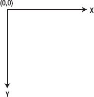
While this looks straight-forward, there is a small caveat here. The SceneGraph supports multiple coordinate systems such as local, parent, and scene, with local being specific to a leaf node, parent coordinate system is that of its parent, and scene is that of the scene to which this node belongs. Nonetheless, all the coordinate systems have the same orientation as shown in Figure 12-2. You will uncover the actual difference later in this chapter, but for now, just remember the orientation given in Figure 12-2.
Since 1.3, JavaFX also offers a basic 3D support with which you can apply three-dimensional transformations on nodes. Additionally, 3D coordinate system will have a Z axis that runs from (0,0) toward you, the reader.
JavaFX offers a wide range of functionality to cater to varied requirements of RIA. In this section, you will see a summary of all the graphics-related packages available in JavaFX with a brief description of what they offer, in Table 12-1. You will find more detailed explanations of the APIs as you read through this chapter further.
Table 12.1. Graphics API Summary
Package | Description |
|---|---|
| Contains a set of base classes of the scene graph hierarchy such as Node, CustomNode, Parent, and so forth and also the Scene class that represents the scene graph. |
| Offers multiple classes for defining geometric primitives such as rectangle, circle, curves, paths, polygons and so forth. The abstract definition of all geometric primitives is provided by the Shape class. |
| Offers various color- and paint-related classes that are used to fill and stroke the geometric primitives and text. Includes gradients such as Radial and Linear. |
| Contains classes that offer text-rendering capabilities and classes that allow to customize the font and text layouts used in text rendering. |
| Offers advanced transformation capabilities such as scale, shear, rotate, and translate that you can apply on a node. Transformations can be in two- or three-dimensional space. Most basic transformation needs are addressed with convenience attributes that are part of the Node class, but you can achieve any additional, more customized transformations using this package. |
| Offers Image loading and rendering capabilities. |
Offers a wide range of UI controls such as Button, CheckBox, RadioButton, and so forth, that enterprise RIAs can leverage on. | |
| Offers a wide variety of built-in layouts that take care of organizing the nodes in terms of position and size. Also offers customizable layouts where the application will decide how to organize the nodes. |
| Contains classes that represent the node dimensions, bounds, and position in two- or three-dimensional coordinate space. |
| Offers APIs for creating and managing various charts such as BarChart, LineChart, PieChart, and so forth and their customization. |
| Offers advanced graphical filter effects that you can apply on one or more nodes to create a rich desktop experience. These APIs are desktop only. |
| Offers APIs for supporting keyboard and mouse interactions for any node. |
| Offers wrapper classes for many swing equivalents. However, many such wrappers are obsolete and replaced by UI control equivalents that are pure JavaFX implementations that offer a uniform user experience across platforms. But these wrappers can be useful if you want to reuse some swing control that is already built and being used in a Java application. All these classes are desktop only. |
Any UI object in JavaFX must extend from a base class-javafx.scene.Node-in order to be added to a scene graph and rendered on the screen. The Node class abstracts all the common features shared by all the UI elements and all other nodes inherit these attributes and functions from the Node class. As you read in the "Scene Graph" section earlier in this chapter, each element added to a scene graph (or Scene from the application standpoint, since scene graph is exposed through the Scene class) must be an object of Node or its subclass. Some examples of Leaf nodes are javafx.scene.shape.Rectangle, javafx.scene.image.ImageView, and so forth, and these nodes cannot have any children. Branch/Parent nodes are nodes that extend from the javafx.scene.Parent class and can contain a set of children and hence form a new branch in the scene graph. Some examples are javafx.scene.Group, javafx.scene.CustomNode, or sub-classes of these node types. All UI controls extend from the Parent class. A node can occur only once within the content of the scene or parent or Group. Trying to add the same node more than once to a same parent or scene will result in a runtime error. Similarly, trying to add a node from one parent to another parent will cause the node to be silently removed from the old parent and added to the new parent. Also, there must not be any cycles in the scene graph where the node is an ancestor of itself in the scene graph. Such cycles will also cause a runtime error. All these restrictions are clearly documented in javafx.scene.Node's class description.
The Node class defines many attributes and functions, some of the important ones of which are shownin Table 12-2. Attributes that require a detailed explanation such as transformations, bounds, events, blocksMouse, and so forth, will be dealt with separately later in this chapter.
Table 12.2. Node Attributes
Attribute | Type | Default Value | Description |
|---|---|---|---|
id | String | Empty string | A String identifier for a node, just like the "id" element in HTML. This identifier must be unique within the scene graph and it is the responsibility of the application to ensure that. This can be used to lookup for a particular node within a scene graph using the Scene.lookup() method. |
visible | Boolean | TRUE | Indicates whether a node is visible or not. |
opacity | Number | 1 | Defines the transparency of the node. A value of "'1.0" indicates the node to be opaque and "0.0" indicates that the node is fully transparent. A transparent node can still receive mouse and keyboard events and can respond to user input. |
clip | Node | Null | If specified, this node will be clipped by the geometry of the given node. |
disable disabled | Boolean | FALSE | "disable" indicates whether this node is expected to respond to user interactions. If false, the mouse and keyboard events are ignored for this node. It is up to the application to change the visual representation of the node when disabled and for some cases, such as Controls, this is handled implicitly. "disabled" is a read-only attribute that is set to true when the node or its parent is disabled. "disable" takes into consideration only the disabled state of this particular node, whereas "disabled" takes into consideration the disabled state of its parent as well. One can track the value of "disabled" to change the visual appearance appropriately. |
parent | Node | Null | Gives the parent of this node in the scene graph. If this node is directly added to the Scene or not yet added to the Scene, parent will be null. |
JavaFX offers several classes that define common geometric objects (shapes), such as lines, curves, ellipses, rectangles, circles, and so forth. All the built-in geometric objects are grouped under the 'javafx.scene.shape' package. There are many attributes shared by multiple shapes and all such attributes are abstracted in the base class-javafx.scene.shape.Shape. Hence, all the geometric shapes extend from the javafx.scene.shape.Shape class and this class provides a common protocol for defining and inspecting multiple geometric objects. With the help of multiple shape objects, you can virtually define and use any two-dimensional geometric object. A shape's contour is defined as its path.
The Shape base class primarily defines the stroke-and fill-related attributes that are shared by all the shapes and you need to understand the difference between a stroke and fill.
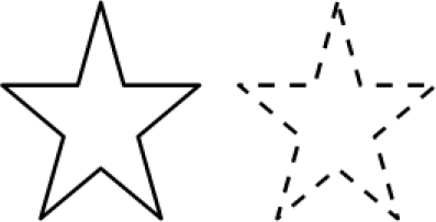
A stroke defines how the contour (or outline) of a shape is drawn and what kind of pen style to be used when drawing the outline. On the other hand, a fill defines the filling pattern, which is basically the pattern with which the geometric area of the shape is filled. An example of a stroke and a fill is given in Figure 12-3.
Both stroke and fill can accept a solid color or a gradience. You can specify a solid color as Color.RED, Color.BLUE, and so forth, whereas a gradience is a fill pattern that is defined in terms of a combination of colors that are distributed across the geometric area of the shape in specific proportions with a smooth transition between the colors. You will learn more about this in the "Paints" section, later in this chapter.

The most important and commonly used stroke attributes are:
stroke – Defines the paint to be used to draw the outline. Can be a solid color or a gradient paint.
StrokeWidth – Defines the width of the stroke; the default value is 1.0. A strokeWidth of 0.0 will still draw a hair-line stroke.
You can also customize the pen style using the following attributes:
strokeLineCap – Defines the end cap style of a stroke segment. This can be SQUARE, ROUND, or BUTT as shown in Figure 12-4.
StrokeLineJoin – Defines the pattern when two line segments meet. This can be BEVEL, MITER, or ROUND as shown in Figure 12-5.
StrokeDashArray, strokeDashOffset – Defines a dashing pattern for the stroke, where a dash array specifies the length of the dash segment and offset specifies the gap between the dash segments. Figure 12-6 shows the comparison between normal versus dashed stroke patterns.


A shape can choose to have fill alone, stroke alone, both of them, or neither of them. Each shape by design has either a default fill or a stroke defined. Not specifying a fill for a shape will cause the shape to use a default fill if one is defined internally or the default can be null for some shapes. Table 12-3 outlines the default values of fill/strokes for different shapes.
As you have already learned, JavaFX Script uses a declarative syntax and the usefulness of this syntax will be apparent when you start developing a UI. This syntax will help you code your UI in a structure that will closely resemble how those UI elements are represented visually. Hence, you can actually write the UI in a visual context.
Now let us see how to create a simple UI application using some shapes. You have already read a similar example in Chapter 2, but here you will see more about what is required to create and show a UI using JavaFX. The instructions given in Chapter 2 toward creating a Netbeans JavaFX project and executing it are still applicable for this example as well and hence, let us concentrate more on the UI elements and other requirements.
Let us try to create a UI that is as simple as drawing three circular rings that intersects with each other, as given in Figure 12-7.

For convenience, I have assumed the width of the application to be 240 and the height of the application to be 320. Now let us see how to create the three circular rings first.
Example 12.1. Creating Three Rings – Part 1
// WARNING - Not Complete yet !!
import javafx.scene.shape.Circle;
import javafx.scene.paint.Color;
var circle1 = Circle {
        centerX: 100
        centerY: 150
        radius: 40
        fill: null
        stroke: Color.RED
        strokeWidth: 3
}

var circle2 = Circle {
        centerX: 140
        centerY: 150
        radius: 40
        fill: null
        stroke: Color.BLUE
        strokeWidth: 3
}

var circle3 = Circle {
        centerX: 120
        centerY: 170
        radius: 40
        fill: null
        stroke: Color.GREEN
        strokeWidth: 3
}
As you see in the code given in Listing 12.1, the first thing you need to do is to import the Circle class from the javafx.scene.shape package in your application. Since each circle has to be colored differently, javafx.scene.paint.Color must also be imported. Likewise, whatever API you are going to use in your application needs to be imported first. You can import the classes individually or you can use the wildcard import such as 'import javafx.scene.shape.*' if you are planning to use multiple classes from the same package.
Now you have access to the Circle class within your application and hence you can create three circle objects and initialize their attributes appropriately. A circle must have an x, y value representing its center and a radius. We have chosen the x, y, radius values in such a way that the three circles have a reasonable intersection. Here, we have assigned a null value to fill since we don't want the circle to be filled and we have set the stroke attribute to the required color so that only the contour of the circle is drawn with a thickness of 3.0 pixels.
Now you have the circles ready, but you need a drawing surface to draw the circles–the Scene.
Now let us create a scene and add the circles to it.
Example 12.2. Creating Three Rings – Part 2
// Continuation of listing 12.1 - part1
var scene: Scene = Scene {
    width: 240
    height: 320
    content: [circle1, circle2, circle3]
}
In Listing 12-2, a scene has been created and all the circles are added to it. Please remember to add another import statement to import the javafx.scene.Scene class. The scene's width and height have been initialized appropriately to the required size I have assumed earlier on. However, this is optional and not doing so would make the scene fit exactly to the size of its contents by default. Likewise, optionally you can fill the entire scene with a specific color if you want the default white background of the scene to be changed to something of your choice.
There are many other attributes in the Scene class that you can use and please refer to the JavaFX API Documentation for more information on the other attributes.
Please note that certain attributes of scene, such as width, height, are public-init, which means they can only be initialized in an object literal and cannot be assigned or bound. Such attributes will not have a colored marking under the Can Write column in the API documentation.
Example 12.3. Create Three Rings - Part 3
// Continuation of listing 12.2 - part2
Stage {
    title: "Three Rings"
    scene: scene
}
Now you need the top-level container to hold the scene and render it to the display, hence a stage has been created in Listing 12-3. Please remember to import the Stage class before using it–javafx.stage.Stage. In the stage object literal, you are associating its scene attribute to the scene object you have created in your application. Similar to scene, there are many other useful attributes in the Stage class that you can make use of. Please refer to the API documentation.
Now you are ready to build and execute the application; please follow the instructions given in Chapter 2 to execute it, either through Netbeans or from the command line.
Please find the complete code for this example as follows.
Example 12.4. Three Rings Application
import javafx.scene.shape.Circle;
import javafx.scene.paint.Color;
import javafx.scene.Scene;
import javafx.stage.Stage;
var circle1 = Circle {
        centerX: 100
        centerY: 150
        radius: 40
        fill: null
        stroke: Color.RED
strokeWidth: 3
}
var circle2 = Circle {
centerX: 140
centerY: 150
radius: 40
fill: null
stroke: Color.BLUE
strokeWidth: 3
}
var circle3 = Circle {
centerX: 120
centerY: 170
radius: 40
fill: null
stroke: Color.GREEN
strokeWidth: 3
}
var scene: Scene = Scene {
width: 240
height: 320
content: [circle1, circle2, circle3]
}
Stage {
title: "Three Rings"
scene: scene
}The output of this application will look like Figure 12-8 on a desktop and Figure 12-9 on a mobile device.


So when creating a UI, you will have to first import the necessary classes, create the UI elements that you require, and add them to a scene. Then associate the scene with a Stage so that it gets displayed on the screen.
While it is good to create the scene and stage yourself in most cases, it is also possible to not create them explicitly in your application and let the runtime create it for you. However, usefulness of this is very limited and perhaps, limited to just test a standalone UI code before integrating them into an application. When there is no scene/stage in your application, the runtime synthesizes them for you but for this to work, the last statement in your application must be a node construct that can readily be added to a scene. If you have a non-UI element as your last statement in your application, the runtime will not synthesize the scene and stage. An example of this is demonstrated in Listing 12-5 (Figure 12-10 shows the output). The same example also demonstrates the usage of other stroke attributes such as dash array, line cap, and line join.
Example 12.5. Dashed Stroke with Auto Synthesis of Scene/Stage
import javafx.scene.*;
import javafx.scene.shape.*;
import javafx.scene.paint.*;
import javafx.stage.*;

var x: Number = 0;
var y: Number = 0;
var width: Number = 200;
var height: Number = 200;

var colors: Color[] = [Color.BLUE, Color.RED, Color.GREEN, Color.ORANGE,
                                           Color.YELLOW, Color.BLACK, Color.MAGENTA,
Color.GRAY,
                                           Color.CRIMSON, Color.LIME];

var gr: Group = Group {
        content: [
                for (i in [0..100 step 10])
                Rectangle {
                        x: x + i
                        y: y + i
                        width: width - 2 * i
                        height: height - 2 * i
                        arcWidth: if (i mod 20 == 0) then i else 0
                        arcHeight: if (i mod 20 == 0) then i else 0
                        fill: if (i == 90) Color.BLACK else null
                        strokeDashArray: [4.0, 2.0]
                        strokeLineJoin: StrokeLineJoin.ROUND
                        strokeLineCap: StrokeLineCap.BUTT
                        strokeWidth: 5
                        stroke: colors[i/10]
                }
        ]
}
The code given in Listing 12-5 uses a dashing pattern with two elements that give a longer segment to the opaque portion of the dash compared to the transparent portion and hence produces the output shown in Figure 12-10. It also uses a specific Stroke Line Join style and Line Cap style. The arc width/height is set for alternate rectangles and you can visibly see the difference in the output. Also, when width/height become equal or lesser than the arc width/height, the rectangles become circles. Please note that all rectangles except the innermost one are defined only with stroke and not fill. Also note that there is no stage or scene defined in this application and hence runtime synthesizes them and the last statement in the application is a group that gets added to the scene. This is the reason why I have used a group to club all the rectangles together without which only the last created rectangle would have appeared on the scene.
Apart from the built-in standard geometries, you can also create arbitrary shapes using the javafx.scene.shape.Path class and using various path elements. One such example is given in Listing 12-6 (with the output shown in Figure 12-11).
Example 12.6. Creating Custom Shapes
import javafx.scene.shape.*;
import javafx.scene.paint.*;

var path:Path = Path {
    id: "Path"
    translateX: −175
    translateY: −150
        fill: Color.GRAY
        stroke: Color.BLACK
    elements: [
            MoveTo {
                x: 200
                y: 150
            },
                LineTo {
                x: 300
                y: 350
            },
                LineTo {
                x: 200
                y: 350
            },
                LineTo {
                x: 300
                y: 150
            },
                LineTo {
                x: 200
                y: 150
            },
                MoveTo {
                x: 250
                y: 250
            },
                CubicCurveTo {
                controlX1: 250
                controlY1: 250
                controlX2: 350
controlY2: 150
x: 300
y: 350
},
MoveTo {
x: 250
y: 250
},
CubicCurveTo {
controlX1: 250
controlY1: 250
controlX2: 150
controlY2: 150
x: 200
y: 350
},
MoveTo {
x: 250
y: 250
},
ArcTo {
x: 250
y: 150
radiusX: 100
radiusY: 100
xAxisRotation: 360
sweepFlag: true
},
ArcTo {
x: 250
y: 250
radiusX: 100
radiusY: 100
xAxisRotation: −360
sweepFlag: true
},
MoveTo {
x: 250
y: 150
},
VLineTo {
y: 250
},
MoveTo {
x: 235
y: 200
},
HLineTo {
x: 265
}
]
}
The example given in Listing 12-6 creates an arbitrary shape using the Path API and various path elements and produces the output shown in Figure 12-11. The coordinates of the path elements are hard-coded, but you can make them relative to an x, y variable and hence position the node wherever you want. Also note that this example uses a little bit of transformation–translation to (x, y) −175, −150. This is because the actual node origin is hard-coded to start from 175, 150, and in order to change the origin to 0, 0 (the scene's origin), the node is translated in a negative direction. You will read more about transformations in the "transformation" section of this chapter.
In addition to supporting complex shapes, JavaFX also supports morphing of one shape to another. This is offered by DelegateShape class, which inherits its geometry from another shape. DelegateShape is initially assigned a shape that later gets morphed into another shape through a timeline (which will be explained in detail in the Animation chapter).
All the paint-related features are packaged within the javafx.scene.paint package. Shape's stroke and fill accepts a javafx.scene.paint.Paint object and this class acts as the base class. Paints can be defined in terms of single solid color or a combination of multiple colors following a pattern (gradience). In this section, you are going to see both.
javafx.scene.paint.Color extends from the Paint class and defines various ways of specifying the colors. A color is a specific combination of red, green, blue, and alpha channel (will be referred as RGB/RGBA henceforth) where alpha defines the transparency of the color–its ability to show through the background. All the colors in JavaFX refer to sRGB color space (Refer to www.w3.org/pub/WWW/Graphics/Color/sRGB.html for more information). A color space is basically a system for measuring colors and defines certain rules as to what combination of RGBA transforms to which color. All the colors that you can create using the Color class are classified as "Solid" colors, meaning a single color representation with a specific value of red, green, blue, and alpha.
The Color class offers 100+ built-in named color values that you can use directly and correlate with real-world colors. This would be sufficient for most applications. But for applications for which you would like to use custom colors, the Color class offers multiple ways of constructing colors. You will see some of the common ones in Table 12-4.
Table 12.4. Color Creation
Creation Approach | Description |
|---|---|
Using named constants | Use the built-in colors such Color.RED, Color.BLUE, Color.ORANGE, and so forth. |
Creating a color instance through object literal: Color { blue: 1.0 green: 0 red: 0 alpha: 1.0 } | Creates equivalent of Color.BLUE. The valid values are 0.0 – 1.0. Optionally, you can omit mentioning other channels and they default to 0.0. Default value of alpha will be 1.0. |
Use Color.color() methods to create a color
| The Color() method accepts values for red, green, blue, alpha channels, in that order. If you don't care about the alpha value, you can use 3 arg method as in (1). 1 – Color.RED, 2 – Color.RED that is 50% transparent. |
If you are comfortable defining colors with RGBA values ranging from 0-255, you can use the rgb() method - Color.rgb(0, 0, 255, 1.0) or Color.rgb(0, 0, 255) | Some UI toolkits define colors in terms of 0-255 and JavaFX supports the same through the Color.rgb() method. The example code creates a Color.BLUE equivalent using the rgb() method. |
If you are comfortable with HTML/web notation of defining colors, you can use one of the following web notations
|
|
Hence, JavaFX supports all possible notations of defining the color that are common in most UI toolkits. But so far, you have only seen creation of solid colors and it's often necessary to create paints that are combinations of two or more colors so as to make your application look like a real-world RIA. In the next section, you are going to see paints that are composed of multiple colors in a specific proportion.
A gradient is a smooth transition of colors. A gradient specifies a range of position-dependent colors whose intensity and magnitude vary based on the current position, providing a smooth transition from one color to the next color. Gradients can be linear or radial in nature and JavaFX supports both.
A linear color gradient is specified by two points, and a color at each point. The colors along the line through those points are calculated using linear interpolation, then extended perpendicular to that line. In other words, If Point P1 (X1, Y1) with Color C1 and Point P2 (X2, Y2) with Color C2 are specified in user space, the Color on the P1, P2 connecting line is proportionally changed from C1 to C2. Any point P (X, Y) not on the extended P1, P2 connecting line has the color of the point P that is the perpendicular projection of P on the extended P1, P2 connecting line.
From the application standpoint, you may specify two or more gradient colors, and this Paint will provide an interpolation between each color. The application provides an array of Stops specifying how to distribute the colors along the gradient.
The syntax of the Linear Gradient is as follows:
LinearGradient {
        startX: Number
        startY: Number
        endX: Number
        endY: Number
        proportional: Boolean
        stops: [
                Stop { offset: Number color: Color (C1)},
                Stop { offset: Number color: Color (C2)}
        ]
}
startX, startY – endX, endY defines a straight-line within the geometry of the node on which the color changes from C1 to C2 to C3 etc. The Stop#offset variable must be the range 0.0 to 1.0 and act like keyframes along the gradient. They mark where the gradient should be exactly a particular color on the line segment. Proportional indicates whether startX, Y and endX, Y are absolute coordinates or defined in a scale of 0.0-1.0. If proportional is false, the coordinates must be absolute coordinates of the node, and if true (default), the coordinates are defined within a scale of 0 to 1 where 0 represents the origin of the rectangular bounds of the node and 1 represents the right-bottom end point of the rectangular bounds.
For example, in case of a rectangular node having x, y as 10, 10 and width, height as 100, 100, startX, Y will be 10, 10 and endX, Y will be 110, 110 if proportional is false and if proportional is true, startX,Y will be 0 and endX,Y will be 1. Having proportional as true is more convenient since you don't have to calculate the absolute coordinates of the node and you can define the gradient with respect to a virtual space of 0 to 1. So whatever node you apply this gradient to, the runtime will do the appropriate mapping of 0-1 to the actual node geometry. If defined in absolute coordinates, it is tightly coupled with the node's geometry (position and size), whereas if defined in proportional coordinates, it can be applied to any node regardless of its position or size.
Let us see a simple example of filling a rectangle with a LinearGradient of three colors (Listing 12-7, with the output shown in Figure 12-12).
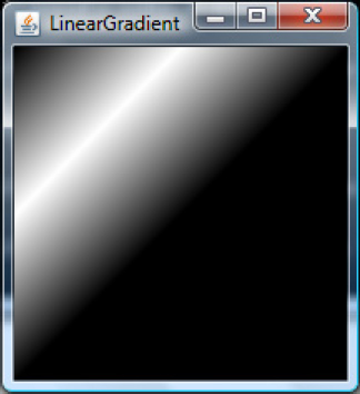
Example 12.7. Linear Gradient with Absolute Coordinates
import javafx.scene.shape.Rectangle;
import javafx.scene.paint.*;
import javafx.scene.Scene;
import javafx.stage.Stage;

Stage {
        title: "LinearGradient"
        scene: Scene {
                width: 120
                height: 120
                content: Rectangle {
                        x: 0
                        y: 0
                        width: 100
                        height: 100
                        fill: LinearGradient {
                        startX: 0.0, startY: 0.0, endX: 100.0, endY: 100.0
                        proportional: false
                        stops: [
                                Stop { offset: 0.0 color: Color.BLACK },
                                Stop { offset: 0.5 color: Color.WHITE },
                                Stop { offset: 1.0 color: Color.BLACK }
                                ]
                        }
                }
        }
}
In Listing 12-7, the gradient is defined for a rectangle using its absolute coordinates, where startX,Y represents the actual node origin and endX, endY represents (x+width), (y+height). In the stop definition, there are three stops defined–one at origin, one at the mid-point of the rectangle (0.5), and one at the end point of the straight line represented by the startX,Y-endX,Y. So the stop definition says, start filling the rectangle with Color.BLACK at origin, smoothly transition to Color.WHITE at the mid-point, and transition back to Color.BLACK toward the end point. Listing 12-7 will produce the output shown in Figure 12-12.
There are no limitations on the number of stop values that you can define for a gradient and you can define as many stop values as you like. However, the offset values must be unique and each stop must have an offset that is greater than the previous stop's offset. If not, this will result in a runtime error.
Now to differentiate absolute vs. proportional coordinates, let us assume the rectangle's width and height are bound to some variables and gets increased to 200, 200. Gradient attributes cannot be bound, and hence the definition of that would remain the same. In this case, the output of the code in Listing 12-7 will become like what is shown in Figure 12-13.
This is certainly not what we would want since we want the gradient to be maintained as-is, regardless of the node dimensions. This is where a proportional attribute comes very handy. Had if we defined the LinearGradient in a proportional way, the same output would have been maintained even when the node size increases. Now let us re-write the example given in Listing 12-7 in a proportional way.
Example 12.8. Linear Gradient with Proportional Coordinates
import javafx.scene.shape.Rectangle;
import javafx.scene.paint.*;
import javafx.scene.Scene;
import javafx.stage.Stage;
var w: Number = 100;
var h: Number = 100;

Stage {
        title: "LinearGradient"
        scene: Scene {
                content: Rectangle {
                        x: 0
                        y: 0
                        width: bind w
                        height: bind h
                        fill: LinearGradient {
                                startX: 0, startY: 0, endX: 1, endY: 1
                        proportional: true
                        stops: [
                                Stop { offset: 0.0 color: Color.BLACK },
                                Stop { offset: 0.5 color: Color.WHITE },
                                Stop { offset: 1.0 color: Color.BLACK }
                                ]
                        }
                }
        }
}

w = 200;
h = 200;
As you see in Figure 12-14, the gradient definition is maintained even when the node width/height is increased and also the same gradient definition can be applied to a different node that has different dimensions.
But it is not always true that you would want to have endX, endY as 1, 1 always, and sometimes you may define the gradient for a smaller area of the node and you can make the same gradient repeat or reflect for the rest of the area. This is what is defined by 'cycleMethod'. A cycle method defines how to fill the area beyond the end point endX, endY if the node's geometry extends beyond endX, endY. There are three options for such cases (applicable to both proportional as well as absolute definitions):
NO_CYCLE–Do not do any cycling and just fill the rest of the area with the color of the last stop. In the rectangle example, such an area would be filled with Color.BLACK.
REPEAT–Start repeating the same gradient considering the first x, y that lie outside of the gradient definition as startX, startY and proceed until the actual end point of the node's geometry.
REFLECT–Apply a mirror image of the defined gradient from the x,y that lie outside of the gradient definition, which means the stop values will now be applied in the reverse order.
Now you will see an example of REFLECT and REPEAT –in Listing 12-9.
Example 12.9. Linear Gradient REPEAT Cycle
import javafx.scene.shape.Rectangle;
import javafx.scene.paint.*;
import javafx.scene.Scene;
import javafx.stage.Stage;

var w: Number = 100;
var h: Number = 100;

Stage {
        title: "LinearGradient"
        scene: Scene {
                content: Rectangle {
                        x: 0
                        y: 0
                        width: bind w
                        height: bind h
                        fill: LinearGradient {
                                cycleMethod: CycleMethod.REPEAT
                                startX: 0, startY: 0, endX: 0.5, endY: 0.5
                        proportional: true
                        stops: [
                                Stop { offset: 0.0 color: Color.BLACK },
                                Stop { offset: 0.3 color: Color.WHITE },
                                Stop { offset: 0.6 color: Color.RED },
                                Stop { offset: 1.0 color: Color.BLACK }
                                ]
                        }
                }
        }
}
w = 200;
h = 200;
Figure 12-15 shows the output of the example given in Listing 12-9. In Listing 12-9, you can see a couple of changes. The endX, Y have been reduced to 0.5, 0.5, which means the gradient is defined only for 50% of the node's geometry. Now we have to let the runtime know what it should do with the remaining 50% of the node geometry and hence define a suitable cycleMethod. If you don't specify anything, the remaining area will be filled with the last stop color and the output would look similar to Figure-12-13. If you specify the cycleMethod as REPEAT, as given in Listing 12-9, the same gradient that was defined for the first half of the node geometry will be repeated for the rest of the node area as well, as shown in Figure 12-15.
Now when you replace 'cycleMethod.REPEAT' with 'cycleMethod.REFLECT' in Listing 12-9, you will get the output shown in Figure 12-16. As you compare Figure 12-15 with Figure 12-16, Figure 12-16 shows a mirror image of the gradient in the lower half of the node, whereas in Figure 12-15, it is more of a repetition of the same gradience.

A radial gradient is specified as a circle that has one color and a focus (usually at the center of the circle) that has another. Colors are calculated by linear interpolation based on distance from the focus. This class provides a way to fill a shape with a circular radial color gradient pattern. You may specify two or more gradient colors, and this paint will provide an interpolation between each color. You must specify the circle controlling the gradient pattern, which is described by a center point and a radius. You can also specify a separate focus point within that circle, which controls the location of the first color of the gradient. By default, the focus is set to be the center of the circle.
The syntax of radial gradient is as follows:
RadialGradient {
        centerX: Number
        centerY: Number
        focusX: Number
        focusY: Number
        radius: Number
        proportional: Boolean
        stops: [
                Stop { offset: Number color: Color (C1)},
                Stop { offset: Number color: Color (C2)}
        ]
}
The syntax is pretty much similar to LinearGradient with the only difference that you are defining a circle instead of a straight-line and the circle can optionally define a focus point.
This paint will map the first color of the gradient to the focus point, and the last color to the perimeter of the circle, interpolating smoothly for any in-between colors specified by you. Any line drawn from the focus point to the circumference will thus span all the gradient colors. Specifying a focus point outside of the circle's radius will result in the focus being set to the intersection point of the focus-center line and the perimeter of the circle. All the advantages discussed about the proportional attribute are applicable to RadialGradient as well.
Listing 12-10 shows an example of how to use the radial gradient with different focus points.
Example 12.10. Radial Gradient with Focus
import javafx.stage.Stage;
import javafx.scene.Scene;
import javafx.scene.shape.*;
import javafx.scene.paint.*;
import javafx.scene.layout.*;

public class RadialGradientSample {

    init {
        var h: Number = 100;
        var w: Number = 100;
        var sceneWidth = 300;
        var sceneHeight = 300;
        var counter = 0;
        var radialGradient: RadialGradient [] = [
            for(y in [10..30 step 10]) {
for(x in [10..30 step 10]) {
RadialGradient {
cycleMethod: CycleMethod.NO_CYCLE
centerX: w / 2,
centerY: h / 2,
focusX: if (x/10 == 1) (w/2 + 30)
else if (x/10 == 2) (w/2)
else (w/2 - 30)
focusY: if (y/10 == 1) (h/2 + 30)
else if (y/10 == 2) (h/2)
else (h/2 - 30)
radius: 50
proportional: false
stops: [ Stop { offset: 0.0 color: Color.BLACK },
Stop { offset: 1.0 color: Color.RED } ]
}
}
}
];
var tile: Tile = Tile {
rows: 3
columns: 3
content: [
for (g in radialGradient)
Rectangle {
x: 0
y: 0
width: 100
height: 100
fill: radialGradient [counter++]
}
]
}
Stage {
scene: Scene {
height: sceneHeight
width: sceneWidth
content: [
tile
]
}
}
}
}
public function run() {
RadialGradientSample{};
}
Listing 12-10 demonstrates the usage of RadialGradient with different focus points. This sample creates nine Radial Gradient objects, each with a different focus point and each of them is used to fill a rectangle. All the rectangles are added to a Tile (you will learn more about Tile in the "Controls & Layouts" section later in this chapter; just understand that it is a layout for now). The output of this example is shown in Figure-12-17. The default behavior is the circle shown at the middle in Figure 12-17, where the focus and center points are the same.
Radial Gradient also supports the same set of cycle methods that you have already learned for Linear Gradient and it is handled in the same way as Linear Gradient.
Please note that the gradients are common profile APIs and hence supported across multiple platforms/devices, providing a uniform and richer user experience.
Handling user interactions such as keyboard and mouse is critical to any UI application and it has been largely simplified in JavaFX by providing convenient attributes in the Node class itself. When you are defining a node, you will have to define the event-related attributes as well to keep track of the keyboard and mouse interactions from the user.
Keyboard operations can be tracked through the following attributes:
onKeyPressed: function (ke: KeyEvent) { }onKeyReleased: function (ke: KeyEvent) { }onKeyTyped: function (ke: KeyEvent) { }
All these attributes are of type 'function' and each of them accept a javafx.scene.input.KeyEvent object as an argument. This is pretty much similar to the event handling in AWT/Swing toolkits in Java, but here you don't need a separate listener implementation; rather, define the listener code implicitly within the node definition.
For these functions to work properly, a node first should contain the focus so that it can get notified of the key inputs. So first, let us see an introduction on focus.
For key events to work, a node should contain the keyboard focus and all the key events should be targeted to the node containing the focus. Focus is a state of the node that indicates whether the respective node is ready to respond to the keyboard inputs from the user. This is visually reflected in some cases, such as controls where an additional border is shown around the control when it has focus. For non-control nodes, it is up to the application to differentiate the node visually based on its focus state.
If a node contains focus, it's 'focused' attribute will be true and it is called the 'focus owner'. If there are multiple stages in the application, you can find out which stage has the focus owner by checking the value of the 'Stage.containsFocus' attribute. A true value also indicates that the stage is active. A node can be a focus owner but cannot be 'focused' (focused attribute of Node becoming true) until the respective stage in which it resides is active. If not currently active and when subsequently made active, the respective focus owner will become 'focused'.
A node that is not a control has its focusTraversable turned off by default, which means it cannot transfer focus automatically to the next node in the focus cycle when pressing TAB. But controls (javafx.scene.control) can transfer focus to the next node in the focus cycle. Hence, a non-control node can receive focus from a control through TAB traversal, but then it is up to the application to transfer it to the next node through requestFocus() calls.
A call to requestFocus() will be entertained only when the node is eligible and eligibility is decided by the following factors:
Node is added to the scene
Node and its ancestors are visible
Node and its ancestors within the scene are not disabled
If any of these conditions are violated, requestFocus calls are ignored. If any of these violations occur after the node becomes a focus owner, focus will be moved to the next node in the focus cycle if one is eligible. If no nodes in the scene are eligible, focus owner becomes null. It is up to the traversal engine to pick up the the next eligible node and it may depend on various factors such as proximity of the next eligible node to the current focus owner that is affected, the order in which nodes are added to the scene, and so forth.
Similarly, if the focus owner is moved from one sub-tree to another within the same scene graph, its focus state will be maintained. However, if it is moved to a new scene, its focus state will depend on the new scene's focus state. If the new scene had a focus owner already, that will be preserved and if not, the moved node will gain focus depending on its eligibility. There is one situation where the requestFocus() call will be remembered and honored later on and that is when it is called before the nodes are initialized when the scene is shown for the first time. Any call made before the initialization will be remembered and honored when the scene is made visible.
Mouse operations on a node can be tracked through the following attributes:
onMousePressed: function (me: MouseEvent)– Triggered when mouse is pressed on a node.onMouseReleased: function (me: MouseEvent)– Triggered when mouse is released on a node.onMouseClicked: function (me: MouseEvent)- Triggered when mouse is pressed and released on a node.onMouseEntered: function (me: MouseEvent)– Triggered when the mouse pointer enters a node.onMouseExited: function (me: MouseEvent)– Triggered when the mouse pointer exits a node.onMouseDragged: function (me: MouseEvent)– Triggered when the mouse pointer is pressed on a node and dragged. This keeps triggering until the mouse is released, regardless of the mouse position.onMouseMoved: function (me: MouseEvent)– Triggered when the mouse is hovered on a node.onMouseWheelMoved: function (me: MouseEvent)– Triggered when the mouse wheel is moved when the mouse pointer is within the node.
All these attributes are of type 'function' and each of them accept a javafx.scene.input.MouseEvent object as an argument. This is pretty much similar to the event handling in AWT/Swing toolkits in Java, but here you don't need a separate listener implementation; rather, define the listener code implicitly within the node definition. In other words, you don't have to implement the entire listener interface as in Java; you can implement just the functions that are needed.
While these attributes are self-explanatory, there are a few mouse-related attributes that are worth defining here. They are:
Node.pressed is set when the mouse is pressed on the node. If you are just interested in the pressed state of the node, you don't have to define the onMousePressed and instead you can just use this attribute directly to check if the mouse is pressed. Similarly, Node.hover will let you know whether the mouse is moved on a node without you defining the onMouseMoved explicitly. These attributes are given for convenience since they are very widely used by most applications.
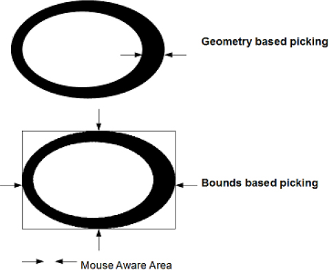
Please note that mouse-aware area of a node is the geometry of the node for most shapes. However, certain nodes such as Text and controls are exceptions where the mouse-aware area is the bounds of the node and not its geometry. Say if it is based on the geometry, it would be really hard to use some of the controls such as CheckBox, RadioButton, and so forth, and the user has to keep the mouse pointer exactly on the text to produce a selection of the control. This is unintuitive and, perhaps, very difficult. On the other hand, if it is bounds-driven, the user can click anywhere on the area where text is shown and it will change the selection.
While the default behaviors of certain nodes are chosen to be this way, it is valuable to give an option to the developer as to what he would want to choose–geometry-based picking or bounds-based picking. This is achieved through Node.pickOnBounds. If this is set to true, it enables bounds-based picking just like the text node. If it is false, the mouse-aware area is defined by the node geometry. This behavior is pictorially represented in Figure 12-18.
Node.blocksMouse is an important feature that defines how mouse events are handled for nodes that are overlapping one another. If a node is said to be blocking the mouse events, it means it does not allow the mouse events to pass through to the nodes located beneath or visually obscured by this node (or up the hierarchy in the scene graph). This can be considered equivalent to the event consumption in AWT/Swing toolkits. By default, blocksMouse is set to false for all the nodes (except those that descend from the control class) and hence, they allow the mouse events to propagate up the scene graph.
Some interesting facts about blocksMouse are that the node acts as if it is isolated from the parent when its blocksMouse is set to true. Say you add a rectangle to a group and set blocksMouse to true for the rectangle. Now when you enter the mouse into the rectangle from the group, group would trigger onMouseExit and Rectangle will trigger onMouseEnter. Similarly, when moving the mouse out of rectangle and into the group, rectangle will trigger onMouseExit and Group will trigger onMouseEntered. This might look a bit strange at first sight because mouse is actually within the rectangle and hence within the group as well. But this behavior is intentional and as per the design and you can consider the node to be excluded from its parent when its blocksMouse is true.
Another interesting aspect of blocksMouse is with respect to a disabled node. BlocksMouse setting is not honored for a disabled node and hence a disabled node will always allow the events to pass through to the nodes obscured.
Text rendering in JavaFX is done through the javafx.scene.text.Text class available in the javafx.scene.text package. You can consider a text node as another shape with additional capabilities and Text node indeed extends from the javafx.scene.shape.Shape class. Hence, all the features such as stroke, fill, and so forth that you have learned so far with respect to shapes are applicable for text as well. In this section, you will learn about some of the important aspects of text rendering and the support for different fonts. Before jumping into the API, let us see some basic concepts in text rendering.
A string is commonly thought of in terms of the characters that comprise the string. When a string is drawn, its appearance is determined by the font that is selected. However, the shapes that the font uses to display the string don't always correspond to individual characters. For example, in professional publishing, certain combinations of two or more characters are often replaced by a single shape called a ligature. The shapes that a font uses to represent the characters in the string are called glyphs. A font might represent a character such as a lowercase a in acute using multiple glyphs, or represent certain character combinations such as the fi in final with a single glyph. A glyph is simply a shape that can be manipulated and rendered in the same way as any other shape. An application developer need not worry about glyphs since they are the internal representation of the string to be rendered.
A font can be thought of as a collection of glyphs. A single font might have many versions, such as heavy, medium, oblique, gothic, and regular. These different versions are called faces. All of the faces in a font have a similar typographic design and can be recognized as members of the same family. In other words, a collection of glyphs with a particular style forms a font face, a collection of font faces forms a font family, and a collection of font families forms the set of fonts available on a particular configuration.
Fonts can be manipulated in JavaFX using the javafx.scene.text.Font class. A font can be built by specifying the full font name, which is a combination of font family plus the font style. For example, Arial is a family name and Bold is the style. So you can build a font using the name Arial Bold. Font look-up is done in the following order:
Embedded fonts
Fonts shipped with JavaFX
Fonts available on the system
Fallback fonts
The runtime looks for the given font in these places and if it cannot find one, it falls back to using the default font available in the runtime. In any case, Font.name is updated to the font being used and you can compare that with what you have specified or some other default font.
Please note that all the attributes in the font class are public-init and hence cannot be bound. If you really want to bind a font, you will have to bind it, as shown in Listing 12-11.
Example 12.11. A Text Node with a Bound Font
import javafx.scene.*;
import javafx.scene.text.*;
import javafx.scene.input.*;

var fontNames = ["Arial Bold", "Amble Condensed", "Amble Condensed Italic"];
var index = 0 on replace {
        println("Font Used: {t.font.name}");
}

var t = Text {
        font: bind Font {
                name: fontNames[index]
                size: 25
        }
        content: "JavaFX"
        textOrigin: TextOrigin.TOP

        onMouseClicked: function (me: MouseEvent) {
                if (index < sizeof fontNames) {
                        index ++;
                } else {
                        index = 0;
                }
        }
}Font Used:
Font Used: Amble Condensed
Font Used: Amble Condensed Italic
Font Used: Amble Condensed
Font Used: Arial Bold
In Listing 12-11, the Font object literal as such is bound with the text node's font attribute and no binding is specified at the attribute level within the Font object. So when the user clicks on the text node, the index changes, which causes the entire font object to be re-created and used with the text node and hence, the user will see the font changing visually.
The Font class provides some built-in functions to get all the fonts available on the system (includes JavaFX and embedded fonts as well). It is much safer to use the built-in functions to get the font names instead of specifying a font name yourself, mainly because hard-coding a font name is prone to typographic errors and it will not be very apparent since the runtime will use the default font under the covers if the specified one does not exist.
You can also construct a new font using the built-in functions by specifying your requirements in terms of size, name, weight, size, posture, and so forth and you can do the same through the object literal as well. Font offers lots of additional attributes such as size, embolden, oblique, ligatures, letter spacing, and so forth. Please refer to the API documentation for more information. However, the most predominantly used attributes are font name and font size.
The text node is just another shape, so all the shape attributes are applicable for the text node as well. It supports multi-line rendering in two ways. The developer can break the text into multiple lines by including a '
' in the string. Another way to do this is to use wrappingWidth. Specify wrappingWidth in terms of pixels and the given text gets word wrapped when its bounds exceeds the given width. Additionally, you can specify various origins and alignments to form a paragraph of text.
The example given in Listing 12-12 demonstrates various text alignments with respect to multi-line text.
Example 12.12. Text Alignments
import javafx.scene.paint.*;
import javafx.stage.*;
import javafx.scene.*;
import javafx.scene.input.*;
import javafx.scene.shape.*;
import javafx.scene.text.*;

public class TextAlignments {

     init {

        var content: String = "The quick brown fox jumps over the lazy dog.
"
                "Woven silk pyjamas exchanged for blue quartz?
"
                "Have a pick: twenty six letters - no forcing a jumbled quiz!";
        var alignments: TextAlignment[] = [
                        TextAlignment.LEFT,
                        TextAlignment.CENTER,
                        TextAlignment.RIGHT,
                        TextAlignment.JUSTIFY
        ];

        var alignmentsString: String[] = [
                        "TextAlignment.LEFT",
                        "TextAlignment.CENTER",
                        "TextAlignment.RIGHT",
                        "TextAlignment.JUSTIFY"
        ];

        var counter = 0;
        Stage {
                scene: Scene {
                    height: 160
                    width: 240
                    content: [
                        Text {
                                x: 10
                                y: 10
                                content: bind alignmentsString[counter]
                        },
                        Text {
                            x: 10
                            y: 40
                            font: Font { size: 15 }
content: content
fill: Color.BLACK
wrappingWidth: 200
underline: true
textAlignment: bind alignments[counter]
focusTraversable: true
onKeyPressed: function(e:KeyEvent) {
if (e.code == KeyCode.VK_LEFT) {
if (counter < alignments.size()-1) {
counter ++;
} else {
counter = 0;
}
}
}
}
]
}
}
}
}
public function run() {
TextAlignments{};
}
Listing 12-12 demonstrates the usage of multi-line text, wrapping width, and text alignments. While running this example, when the stage appears on the screen, press the LEFT arrow key to cycle through various alignments. The given text is wrapped at 200 pixels and various alignments are applied to the text. Figure 12-19 shows the output of Listing 12-12–the various alignments that are possible with JavaFX. A text node is provided with x, y attributes for defining the position within the scene. The font set on the text node does not specify a name and hence, the default FX font (Amble family) would be used. Setting underline to true underlines the content text, as shown in the output.
With the combination of attributes offered by Font and Text classes, you can do any kind of text rendering that is possible with other UI toolkits. The JavaFX controls such as Label, Button, CheckBox, RadioButton, TextBox (multi-line/single-line), and so forth use text nodes extensively to represent textual information (such as label text) and can get as powerful as a multi-line textbox, where you can create and edit multiple lines of text.
Images are collections of pixels organized spatially. JavaFX offers a comprehensive yet simple API for image rendering through two classes available in the javafx.scene.image package. The actual image (bitmap) is represented using the javafx.scene.image.Image class and rendering of the image onto a scene is handled by the javafx.scene.image.ImageView class. An image has to be first loaded on to the memory before rendered on the scene. The next section shows how to load an image.
javafx.scene.image.Image is capable of loading an image from a URL that could be a web URL or a local file URL. An image can be loaded in the foreground thread (default) or in a background thread. If the image is of a relatively large size, the developer may not want the application user to wait until the entire image is loaded and hence can choose to load the image in a background thread. Until the entire image is loaded, the Image class allows the developer to show a placeholder image, which is often the thumbnail of the actual image being loaded. This engages the end user appropriately when the image is being loaded in the background. If you are writing a desktop-only application, you can also convert an existing buffered image created in java (java.awt.image.BufferedImage) to a JavaFX Image (javafx.scene.image.Image) using the following API:
javafx.ext.swing.SwingUtils.toFXImage(image: java.awt.image.BufferedImage):
javafx.scene.image.Image
Currently (as of 1.3), JavaFX supports loading of the following image formats–GIF, Animated GIF, JPEG, PNG, and BMP. Future version of JavaFX may support additional image formats. However, if you are developing a common profile application, you may have to restrict the image type to PNG and GIF since mobile implementation currently only supports these formats.
Note
The image format support for desktop applications comes from the underlying ImageIO implementation from Java (javax.imageio.*) that JavaFX leverages on. Hence, if you have an imageio plug-in to recognize a new image format, just add the plug-in to your classpath and JavaFX will automatically be able to support the new format without any code change.
As mentioned already, images can be loaded from the local file system or from the Web. The Image class also allows the developer to specify a preferred width and height for the image optionally, and the image loaded gets scaled to the specified width/height. You can choose the appropriate scaling algorithm to control the rendering quality, by giving priority either to the performance or smoothness of the image.
Listing 12-13 shows a simple example of loading an image.
Example 12.13. Simple Image Loading
import javafx.scene.image.*;

var img = Image {
        url: "{__DIR__}duke.gif"
}

ImageView {
        image: img
}
In Listing 12-13, the code tries to load an image–duke.gif– from the directory where classes are available (represented by __DIR__) and uses the default width and height of the original image. The ImageView is used to render the image on to the scene and you will see that in a while. The output of this example is shown in Figure 12-20.
Now let us customize the image width and height for an image loaded from the Web (Listing 12-14).
Example 12.14. Image Loading–Custom Size
import javafx.scene.image.*;

var img = Image {
        url: "http://www.apress.com/img/masthead_logo.gif"
        width: 200
        height: 200
}

ImageView {
        image: img
}
Listing 12-14 is loading an image from the Web (the Apress logo from www.apress.com) and changing its default size to 200, 200. Please note that the actual size of this image is 422×80, and hence changing it to 200, 200 alters the aspect ratio between the width and height. It's pretty apparent from the output shown in Figure-12-21 that the ratio has gone for a toss. If you want to preserve the aspect ratio while resizing the image (either width alone, or height alone, or both), you can set preserveRatio to true and you will get an output as shown in Figure 12-22.

Note
It is always better to specify the appropriate width and height when loading the image, depending on your requirements, since it optimizes the image that resides in the memory. While it is also possible to do the scaling at rendering time using ImageView, it is better doing it at loading time since it helps you manage the memory appropriately by keeping a smaller-size image in memory if your usage is likely to scale down the image from it's original size.
Now let's see another example where we load the image in the background while keeping the user engaged through a placeholder (Listing 12-15).
Example 12.15. Background Loading of Images
import javafx.scene.image.*;
import javafx.scene.Scene;
import javafx.stage.Stage;

var width = 800;
var height = 600;

var img = Image {
        url: "http://c0278592.cdn.cloudfiles.rackspacecloud.com/original/191195.jpg"
        backgroundLoading: true
        placeholder: Image {
                url: "{__DIR__}191195.png"
        }
}

Stage {
        scene: Scene {
                width: width
                height: height
                content: ImageView {
                        image: img
                        x: bind (width/2 - img.width/2)
                        y: bind (height/2 - img.height/2)
                }
        }
}
Listing 12-15 loads a larger image in the background thread and while the image is being loaded, a placeholder image (thumbnail version of the image being loaded) is shown to the user, as shown in Figure 12-23. When the actual image completes loading, the placeholder image is replaced with the actual image, as shown in Figure 12-24. Another use of this placeholder image is that when there is an issue with loading the actual image, the placeholder will be retained forever, thus avoiding a blank screen for the end user. In such cases, the placeholder could be an image that indicates an error in image loading such as the ones we typically see on web pages with a red colored X on one of the corners.
Note
Loading an image in the background is optional and often decided by the size of the image and probability of an error when loading it. But please note that the runtime should not have any issues in loading the placeholder image, if you have specified one. An invalid placeholder image will prevent proper loading of the actual image and will not load the actual image even if the actual image is correct. So please take extra care when specifying the placeholder to ensure the placeholder is correct. However, this is not an issue if the placeholder is skipped altogether.
Images are rendered on to the scene through the javafx.scene.image.ImageView class. So far, you have seen a basic use of the image view class, but ImageView has lot more features to offer. It is possible to alter the width and height of the image view using the fitWidth and fitHeight attributes, and it is also possible to preserve the aspect ratio just like you did with Image.
Note
The width and height attributes of the Image class are public-init and hence cannot be bound, whereas fitWidth and fitHeight of image view are normal public attributes and hence can be bound. So if there is a need to alter the width and height of the image in response to another variable, it is better to do it with fitWidth/fitHeight where you can just bind them. On the other hand, specifying it at Image level will offer better optimization in terms of the size of the image kept in the memory.
Additionally, you can specify an 'x' and 'y' location for the image view if you want the image view to be placed at a specific point. This has already been demonstrated in Listing 12-15, where the image is placed at the center of the scene through the use of 'X'/'Y' attributes of ImageView.
When scaling the image up or down, you can control the rendering quality by choosing the appropriate algorithm by toggling the 'smooth' attribute. If smooth is true, runtime chooses an algorithm that offers better smoothness compromising on the performance, and if you set it to false, focus will be on the performance compromising on the smoothness of the image.
ImageView also offers a way to specify a view port into the original image. Viewport is a rectangle within the image which indicates that only those pixels that fall within the viewport must be shown and not others. Viewport rectangle is independent of image view's transformations or scaling. If viewport is not specified, the entire image is shown.
Listing 12-16 shows a simple example of the viewport usage.
Example 12.16. ImageView Viewport
import javafx.scene.image.*;
import javafx.scene.Scene;
import javafx.stage.Stage;
import javafx.geometry.*;

var width = 200;
var height = 200;

var img = Image {
        url: "http://noelschweig.com/photos/gallery/nature/nature4.jpg"
        width: 200
        height: 200
}

Stage {
        x: 0
        y: 0
        scene: Scene {
                width: width
                height: height
                content: ImageView {
                        image: img
                }
        }
}

Stage {
        x: 200
        y: 0
        scene: Scene {
                width: width
                height: height
                content: ImageView {
                        image: img
                        viewport: Rectangle2D {
                                minX: 0
                                minY: 0
                                width: 100
                                height: 100
                        }
                }
        }
}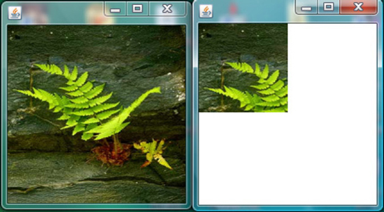
Listing 12-16 demonstrates the use of viewport where it creates an image object and displays it using two image view objects, one with view port and another one without it. If there is no viewport, the entire image is shown as given in the left half of Figure-12.25. The code specifies a viewport of 0, 0, 100, 100 within the image, which is of size 0, 0, 200, 200, and that's what is shown in the right half of Figure 12-25. If the viewport is smaller than the actual image, only the pixels that fall within the viewport area are shown. If the viewport is bigger than the actual size of the image, the entire image is shown.
Also note that the same image instance can be used by multiple image view objects and can be displayed differently on the scene.
Any Node can have transformations applied to it. These include translation, rotation, scaling, or shearing transformations. Transformations can be two-dimensional or three dimensional (available since 1.3). Let's see each of the 2-D transformations in detail.
A translation is applied to a node by repositioning it along a straight-line path from one coordinate location to another. The node is translated by adding translation distances tx and ty to the original coordinate position (x,y) of the origin of the node. For example, if you create a rectangle that is drawn at the origin (x=0, y=0) and has a width of 100 and a height of 50, and then apply a translation with a shift of 10 along the x axis (x=10), then the rectangle will appear drawn at (x=10, y=0) and remain 100 points wide and 50 points tall. Note that the origin was shifted, not the x variable of the rectangle.
In JavaFX, you can translate a node in two ways. One way is to use the convenience attributes available in the Node class–translateX, translateY. The other way is to use the 'Node.transforms' attribute. For most basic transformations, it is sufficient to use translateX, translate, but if you want to combine multiple transformations to create a composite transformation, it is better to go for 'transforms' attribute, which accepts an array of transformations and the order of transformations will also be preserved.
Note
It is not advisable and potentially dangerous to use both convenience variables and the 'transforms' attribute together for a node and the behavior would be unpredictable since you do not know the order in which transformations will be evaluated. Hence, if you decide to use either of the ways to apply transformations, better stick to the same for that node and do not mix up both.
Listing 12-17 shows a simple example of a translate transformation applied on a rectangle through translateX, translateY attributes.
Example 12.17. Translate Transformation Using translateX, Y
import javafx.scene.*;
import javafx.scene.shape.*;
import javafx.scene.paint.*;
import javafx.scene.input.*;
import javafx.stage.Stage;

var tx: Number = 0;
var ty: Number = 0;

var rect: Rectangle = Rectangle {
        x: 0
        y: 0
        width: 100
        height: 100
        fill: Color.GRAY
        translateX: bind tx
        translateY: bind ty

        onKeyPressed: function (ke: KeyEvent) {
                if (ke.code == KeyCode.VK_RIGHT) {
                        tx = tx + 10;
                } else if (ke.code == KeyCode.VK_LEFT) {
                        tx = tx - 10;
                } else if (ke.code == KeyCode.VK_UP) {
                        ty = ty - 10;
                } else if (ke.code == KeyCode.VK_DOWN) {
                        ty = ty + 10;
                }
        }
}

Stage {
        scene: Scene {
width: 400
height: 400
content: [rect]
}
}
rect.requestFocus();
In Listing 12-17, a rectangle is drawn at 0, 0 with a width/height of 100, 100 and its translateX, translateY are bound to two variables tx, ty. A key listener is added to the node that changes the tx, ty values based on what key is pressed. UP/DOWN arrow keys move the node along the y-axis and LEFT/RIGHT arrow keys move the node along the x-axis. Please note that the x, y values of the rectangle are unchanged and translation is applied to the rectangle's origin and not to the x, y value of the rectangle. The output of Listing 12-17 is shown in Figure 12-26.
Now let's re-write example 12-17 to use the transforms attribute instead of translateX,Y.
var rect: Rectangle = Rectangle {
        x: 0
        y: 0
        width: 100
        height: 100
        fill: Color.GRAY
        transforms: bind Transform.translate(tx, ty)
        . . . .
        . . . .
}
As you can see in the re-factored code, there is not much difference between translateX, Y and the transforms attribute with respect to translate transformation. However, you will see a significant difference for transformations that depend on a pivot point such as scale, rotate, and shear, and you will learn it while learning those transformations.
A rotation is applied to a node by repositioning it along a circular path in the xy plane. A rotation transformation needs a rotation angle and the pivot point (x, y) about which the node is to be rotated. For example, if you create a rectangle that is drawn at the origin (x=0, y=0) and has a width of 100 and height of 30 and you apply a 90-degree rotation (angle=90) and a pivot at the origin (pivotX=0, pivotY=0), then the rectangle will be drawn as if its x and y were 0 but its height was 100 and its width −30. That is, it is as if a pin is being stuck at the top left corner and the rectangle is rotating 90 degrees clockwise around that pin. If the pivot point is instead placed in the center of the rectangle (at point x=50, y=15) then the rectangle will instead appear to rotate about its center. Note that as with all transformations, the x, y, width, and height variables of the rectangle (which remain relative to the local coordinate space) have not changed, but rather the transformation alters the entire coordinate space of the rectangle.
Similar to translate, you can apply rotate either using the 'Node.rotate' attribute or the 'Node.transforms' attribute of the Node class. The 'rotate' attribute, by default, assumes the center of the node as the pivot point, whereas in the case of transforms, you need to explicitly specify the pivot point.
Listing 12-18 shows a simple example of a rotate transformation applied on a node using rotate, with the output being shown in Figure 12-27.
Example 12.18. Rotate Transformation Using Rotate on a Custom Node
import javafx.scene.*;
import javafx.scene.shape.*;
import javafx.scene.paint.*;
import javafx.scene.input.*;
import javafx.stage.Stage;
import javafx.scene.transform.*;

var rotate: Number = 0;

var svgNode: SVGNode = SVGNode {
        rotate: bind rotate
onKeyPressed: function (ke: KeyEvent) {
if (ke.code == KeyCode.VK_RIGHT) {
rotate++; if (rotate > 360) rotate = 360;
} else if (ke.code == KeyCode.VK_LEFT) {
rotate --;
if (rotate < 0) rotate = 0;
}
}
}
Stage {
scene: Scene {
width: 150
height: 150
content: [svgNode]
}
}
svgNode.requestFocus();
class SVGNode extends CustomNode {
public override function create(): Node {
var gr: Group = Group {
content: [
SVGPath {
content: "M70 20 L30 100 L110 100 Z"
},
Rectangle {
x: 30
y: 20
width: 80
height: 80
fill: null
stroke: Color.RED
}
]
}
}
}
In Listing 12-18, there is a new concept being introduced–CustomNode.
A Custom Node is the base class for defining new node types that are not available as part of built-in nodes in the API. This is perhaps one of the most-used classes in JavaFX since every application will have the need to define its own nodes. As you see in the Listing 12-18, you can create a custom node by extending the javafx.scene.CustomNode class and overriding its create method. You can return any node or a composite node such as a group from the create method and the object of this class will be treated as a node by itself. Whatever you do with your custom node, such as transformations, clipping, and so forth will be applied to all its children (the nodes returned by the create method). Instead of overriding the create method, alternatively you can also override the 'children' attribute of the custom node and assign your own node to it.
Now, coming back to the rotation aspect of it, Listing 12-18 creates an instance of the custom node and binds its rotate attribute to a rotate variable. The value of the rotate variable changes based on the keyboard input. When the rotate value increments or decrements, the custom node rotates in the clockwise or counter-clockwise direction visually. Please note that the pivot point is assumed to be the center of the custom node and hence the node rotates with respect to its center, as shown in Figure 12-27.
However, if you want to have more control over the pivot point, you can use the 'transforms' attribute of the node to rotate the node instead of the 'rotate' attribute and, for example, you can re-factor the code to use 'transforms' to use a pivot point of the origin 0,0 instead of the center, as follows:
...
...
...
var svgNode: SVGNode = SVGNode {
    transforms: bind Transform.rotate(rotate, 0, 0)
...
...
}
The re-factored code uses a pivot point of 0, 0 instead of the default center of the node and you can see the difference yourself when you run the application.
Note
The rotation example clearly differentiates the difference between the convenience attributes and the 'transforms' attribute, where transforms offers you more control over the transformation than the convenience attributes. On the other hand, people who just use simple basic transformations will definitely find convenience attributes to be handier than the transforms attribute. Nevertheless, use the approach that is appropriate for you and do not mix up both.
A scaling transformation alters the size of the node, causing a node to either appear larger or smaller depending on the scaling factor. Scaling alters the coordinate space of the node such that each unit of distance along the axis in local coordinates is multiplied by the scale factor. As with rotation transformations, scaling transformations are applied about a "pivot" point. You can think of this as the point in the Node around which you "zoom." For example, if you create a rectangle with a strokeWidth of 5, and a width and height of 50, and you apply a scale transformation with scale factors (x=2.0, y=2.0) and a pivot at the origin (pivotX=0, pivotY=0), the entire rectangle (including the stroke) will double in size, growing to the right and downward from the origin.
A shearing transformation, sometimes called a skew, effectively rotates one axis so that the x and y axes are no longer perpendicular.
Note
A shear transformation does not have the convenience attribute and hence has to be specified only through the 'transforms' attribute of the node, whereas the scale transformation has scaleX, scaleY in the node class.
Listing 12-19 shows how you can apply scaling and shear transformation for the custom node you saw in the previous example, with the output shown in Figure 12-28.
Example 12.19. Scale and Shear Transformations
import javafx.scene.*;
import javafx.scene.shape.*;
import javafx.scene.paint.*;
import javafx.scene.input.*;
import javafx.stage.Stage;
import javafx.scene.transform.*;

var scaleX: Number = 1;
var scaleY: Number = 1;
var shearX: Number = 0.0;
var shearY: Number = 0.0;

var svgNode: SVGNode = SVGNode {
        transforms: bind [
                Transform.scale(scaleX, scaleY, svgNode.layoutBounds.maxX/2,
svgNode.layoutBounds.maxY/2),
                Transform.shear(shearX, shearY)
        ]

        onKeyPressed: function (ke: KeyEvent) {
                if (ke.code == KeyCode.VK_UP) {
                        scaleX += 0.2;
                        scaleY += 0.2;
                        if (scaleX > 3.0) {
                                scaleX = −3.0;
                                scaleY = −3.0;
                        }
                } else if (ke.code == KeyCode.VK_DOWN) {
                        scaleX −= 0.2;
                        scaleY −= 0.2;
                        if (scaleX < −3.0) {
                                scaleX = 3.0;
                                scaleY = 3.0;
                        }
                } else if (ke.code == KeyCode.VK_LEFT) {
                        shearX += 0.2;
                        shearY += 0.2;
                        if (shearX > 1.0) {
                                shearX = −1.0;
                                shearY = −1.0;
                        }
                } else if (ke.code == KeyCode.VK_RIGHT) {
                        shearX −= 0.2;
                        shearY −= 0.2;
                        if (shearX < −1.0) {
                                shearX = 1.0;
                                shearY = 1.0;
                        }
               }
         }
}

Stage {
        scene: Scene {
                width: 150
                height: 150
                content: [svgNode]
        }
}

svgNode.requestFocus();
class SVGNode extends CustomNode {
public override var children: Node[] = [
SVGPath {
content: "M70 20 L30 100 L110 100 Z"
},
Rectangle {
x: 30
y: 20
width: 80
height: 80
fill: null
stroke: Color.RED
}
];
}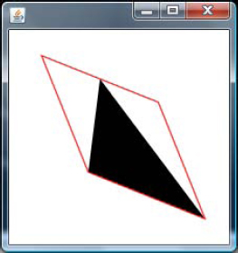
In Listing 12-19, the custom node you saw in Listing 12-18 has been applied with a scale and a shear transformation. Please note that both the transformations are applied using the 'transforms' attribute of the node and scale also requires a pivot point (x, y) about which the node is to be scaled. In this case, the center of the node has been specified. Node.layoutBounds returns the rectangular bounds of the node, excluding any transformations or clipping, but inclusive of its stroke width. The code is calculating the center point of the node, which is used as the pivot so that it appears as if the node zooms about its center. The default pivot points when using 'Transforms.scale (x, y)' will be 0, 0, which is the origin of the node. Pressing UP/DOWN arrow keys will scale the node up and down appropriately, and pressing LEFT/RIGHT arrow keys will shear the node up and down. Scaling using a negative value will invert the node to look as if it is a mirror image of the original node and it is often used to create reflection-like effects.
Also note one other difference in the implementation of the custom node in Listing 12-19. The example does not override the 'create' method of the CustomNode class, but instead overrides the 'children' attribute of the CustomNode. This is the preferred approach over overriding the create method and the advantage of this approach is that you do not have to create an intermediate group to represent multiple nodes within a custom node as we had done in Listing 12-18. The children attribute is a node array as opposed to a single Node return value of CustomNode.create.
You may apply multiple transformations to a node by specifying an ordered chain of transforms. The order in which the transforms are applied is defined by the sequence specified in the transforms variable.
JavaFX offers a wide set of controls and layouts that are useful for creating front-ends for enterprise applications. All these controls are pure JavaFX implementations and hence provide a uniform look and feel across all devices. Controls provide additional variables and behaviors beyond those of Node to support common user interactions in a manner that is consistent and predictable for the user. However, controls are no different from normal nodes as far as developers are concerned and you can add a control wherever you can add a node. All controls extend from the javafx.scene.Control class, which in tern extend from javafx.scene.CustomNode. Each control comes with its own skin that you can customize to suit your application requirements. By default, all controls except Label blocks mouse events and hence the nodes obscured by controls will not get the mouse events when interacting with the control unless you turn off blocksMouse explicitly.
All controls except for a few, such as ProgressBar, Label, are focus-traversable by default. So you don't have to explicitly make them focus-traversable and they all support keyboard focus traversal in the forward and reverse directions by default, unlike nodes. A control can transfer focus to a focus-traversable node available in the focus-traversal cycle when pressing TAB but after that, it is the responsibility of that node to transfer the focus to the next node in the focus cycle. Whereas, controls do this by default for you.
JavaFX as of 1.3 offers the set of controls shown in Figure 12-29.

In addition to what is shown in the diagram, there is also a set of preview controls that are available purely on an experimental basis in the com.javafx.preview.control package and you can try them out. Some of those controls are:
CheckMenuItem
CustomMenuItem
Menu
MenuBar
MenuButton
MenuItem
MenuItemBase
PopupMenu
RadioMenuItem
SplitMenuButton
ToolBar
TreeCell
TreeItem
TreeItemBase
TreeView
However, these controls are not for production use and may change in the next release. You can just play with them and provide your feedback.
Similarly, there are many layout managers available under javafx.scene.layout and these layouts can accept controls as well as nodes. Lot of improvements have gone into layouts and controls in JavaFX 1.3. Listing 12-20 shows one of the most typical usecases of controls and layouts–a simple login form created using the Panel layout and a set of controls (see Figure 12-30).
Example 12.20. Login Form Using Controls
package layout;

import javafx.stage.Stage;
import javafx.scene.Scene;
import javafx.scene.CustomNode;
import javafx.scene.Node;
import javafx.scene.layout.Panel;
import javafx.scene.control.Label;
import javafx.scene.control.TextBox;
import javafx.scene.control.PasswordBox;
import javafx.scene.control.Button;
import javafx.scene.paint.Color;
import javafx.scene.paint.LinearGradient;
import javafx.scene.paint.Stop;
import javafx.scene.shape.Rectangle;
import javafx.stage.StageStyle;

public class LoginForm extends CustomNode{

    def width = bind scene.width on replace {
        panel.requestLayout();
    }
    def height = bind scene.height on replace {
        panel.requestLayout();
    }
    var panel : Panel;

    var paddingTop = 20.0;
    var paddingLeft = 20.0;
    var paddingBottom = 20.0;
    var paddingRight = 20.0;

    var saveButton:Button = Button {
        text: "Save"
        action: function() {
                saveButton.scene.stage.close();
        }
    }
    var cancelButton:Button = Button {
        text: "Cancel"
        action: function() {
                cancelButton.scene.stage.close();
        }
    }

    var idLabel = Label { text: "Login Name" };
    var idText = TextBox { columns : 20};
    var passwordLabel = Label { text: "Password" };
    var passwordTxtBox = PasswordBox { columns : 20};

    override function create() : Node {
        panel = Panel{
            content: [
                idLabel, idText,
                passwordLabel, passwordTxtBox,
               saveButton, cancelButton
            ]
            onLayout: onLayout
      }
   }

   function onLayout() : Void {
var hSpacing = 10.0;
var vSpacing = 5.0;
var gridW = 50.0;
var gridH = 25.0;
idLabel.height = gridH;
var w = panel.getNodePrefWidth(idLabel);
var x = (paddingLeft + gridW) - w;
var y = paddingTop;
var h = gridH;
panel.layoutNode(idLabel, x, y, w, h);
x = paddingLeft + gridW + hSpacing;
w = panel.getNodePrefWidth(idText);
panel.layoutNode(idText, x, y, w, h);
w = panel.getNodePrefWidth(passwordLabel);
x = (paddingLeft + gridW) - w;
y = idLabel.layoutY + gridH + vSpacing;
panel.layoutNode(passwordLabel, x, y, w, h);
x = paddingLeft + gridW + hSpacing;
w = panel.getNodePrefWidth(passwordTxtBox);
panel.layoutNode(passwordTxtBox, x, y, w, h);
w = panel.getNodePrefWidth(cancelButton);
var buttonPanelWidth = (w * 2) + hSpacing;
x = (scene.width - buttonPanelWidth)/2.0;
y = passwordTxtBox.layoutY + (gridH * 2);
panel.layoutNode(saveButton, x, y, w, h);
x = saveButton.layoutX + hSpacing + w;
panel.layoutNode(cancelButton, x, y, w, h);
}
}
function run(){
Stage {
title: "Login Form"
style : StageStyle.UNDECORATED
scene: Scene {
width: 280
height: 140
content: [
Rectangle {
width: 280
height: 140
stroke: Color.BLACK
strokeWidth: 2
fill: LinearGradient {
startX: 0.491
startY: −0.009endX: 0.509
endY: 1.009
proportional: true
stops: [Stop {
offset: 0
color: Color.color(0.639, 0.639, 0.639, 0.239)
}, Stop {
offset: 1
color: Color.color(0.078, 0.078, 0.078, 0.988)
}]
}
arcHeight: 20
arcWidth: 20
},
LoginForm{}
]
}
}
}
Listing 12-20 demonstrates a common usecase of designing a login form using the Panel layout and a set of UI controls. Panel is the layout that offers maximum flexibility to you and you can customize the way controls/nodes must be displayed within the panel by defining your own coordinates. As you can see in Listing 12-20, there is an 'onLayout' function that is defined within the Panel object literal and this method takes care of positioning the controls appropriately within the panel. Also, this method is invoked indirectly by 'Container.requestLayout' whenever the scene width/height changes. The actual positioning code is self-explanatory.
Covering controls and layouts further in this chapter will really be overwhelming since they are huge topics by themselves. There is pretty good online documentation available for controls and layouts at www.javafx.com and please refer the same for more information, in addition to the API documentation shipped with the SDK. For example, the following document is worth referring to for controls: www.javafx.com/docs/articles/UIControls/overview.jsp
JavaFX 1.3 offers a powerful and comprehensive CSS engine that allows you to customize the built-in look of the nodes and controls. Using CSS in JavaFX is similar to using it with HTML since CSS implementation is fully adherent to the CSS specification specified at www.w3.org/Style/CSS/. You can define the styles at the application level through a .css file that you can embed into the scene using the javafx.scene.Scene.stylesheets attribute that accepts an array of string URLs to multiple style sheets. Alternatively, you can also customize the style on a per-node basis using the 'id' and 'styleClass' attributes available in the node class. Please refer to the online documentation at www.javafx.com/docs/articles/UIControls/theming.jsp for more information on how to use CSS with JavaFX. Also note that this is available on desktop as well as mobile devices, as of JavaFX 1.3.
Charts allow the user of the chart to visualize and interpret a large volume of data in an easy way and derive appropriate business conclusions from it. JavaFX offers a wide range of APIs to create and manipulate charts and graphs and it supports creation of the following charts that are most commonly used in a RIA (also demonstrated in Figure 12-31):
Area Chart: Displays quantitative data like a line chart but with the area between the line and the horizontal axis shaded. Good for comparing the magnitude of two or more series of data.
Bar Chart: A good way to show data in a way that makes it easy to see how the data changes over time or under a set of different conditions.
Bubble Chart: Plot data points on a two-dimensional grid and have the extra ability to display the relative magnitudes of the data by controlling the diameter of the point (or bubble) displayed at each XY coordinate.
Line Chart: A simple way to display two-dimensional data points where each point is connected to the next point in the data series by a line.
Pie Chart: Typically used to display the relative percentages of a series of values on a circle. The value of each piece of data, as a percentage of the total, dictates how much of the circle's area it takes up. In other words, the chart shows how big a slice of the pie each value represents.
Scatter Chart: Used to plot the points of one or more series of data. These charts are typically used to show the correlation (or not) of the data by comparing how the data points are clustered (or not).
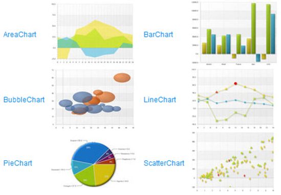
Listing 12-21 shows a simple example of how to create a pie-chart using JavaFX Chart APIs, with the output shown in Figure 12-32.
Example 12.21. A Pie Chart
import javafx.stage.Stage;
import javafx.scene.Scene;
import javafx.scene.chart.*;

def pieChart = PieChart {
    title: "Health Pie"
    data: [
        PieChart.Data { label: "Carrot" value: 22  }
        PieChart.Data { label: "Eggplant" value: 27 }
        PieChart.Data { label: "Potato" value: 16 }
        PieChart.Data { label: "Tomato" value: 50 }
        PieChart.Data { label: "Cauliflower" value: 6 }
        PieChart.Data { label: "Mushroom" value: 7 }

    ]
}

Stage {
title: "Pie Chart"
scene: Scene{
width: 540
height: 410
content: pieChart
} //Scene
}//Stage
In Listing 12-21, a pie chart has been defined with a title and a set of data, where each data is provided with a label and a value of this pie. As you see in Figure 12-32, all the labels and the pie value are displayed in the output. Additionally, you can use other attributes PieChart.Data to customize the chart or make it interactive by responding to user input.
For some of the other charts, such as BarChart, you will have to define the X and Y axis of the chart where you can have the category on one axis and a set of numeric values on the other and define a lower and upper bound for the numeric values with appropriate tick values. There is a detailed article on charts at http://java.sun.com that will help you build more complex charts using JavaFX. Please refer to the following article for more information: http://java.sun.com/developer/technicalArticles/javafx/v1_2_charts/.
An effect is a graphical algorithm that produces an image, typically as a modification of a source image. Effects primarily add richness to your UI by manipulating the default look of your node in various ways, such as adding a glow effect, a shadow within the node, a drop-shadow outside of your node, blurring certain pixels of your node, and so forth. You can associate an effect with a scene graph Node by setting the Node.effect attribute. Some effects change the color properties of the source pixels (such as ColorAdjust), others combine multiple images together (such as Blend), while still others warp or move the pixels of the source image around (such as DisplacementMap or PerspectiveTransform). All effects have at least one input defined and the input can be set to another effect to chain the effects together and combine their results, or it can be left unspecified, in which case the effect will operate on a graphical rendering of the node it is attached to. All effects available in javafx.scene.effect descend from the javafx.scene.effect.Effect class. Effects are desktop-only APIs and not available on other devices.
Note
Advanced effects are visually intensive and often require a good video card (with OpenGL or Direct3D support) so that the operations can be hardware-accelerated for better performance. Without a good video card, these operations will use the software pipeline and may cause sluggishness or a drop in visual performance in some cases.
The visuals displayed within a JavaFX scene are fully represented by a 2D scene graph, where each visual element (line, path, image, and so forth) is represented by a distinct node with variables that can be easily manipulated dynamically. The node's size and position (otherwise known as its bounds) become complicated when considering these many variables that contribute to its bounds, such as shape geometry (for example, startX/startY, width, and radius), transformations (for example, scale and rotate), effects (for example, shadows and glow), and clipping. Understanding how each of these variables affects the bounds calculations of a node is crucial to getting the scene layout you want.
A node's rectangular bounds are represented by the javafx.geometry.Bounds class, which provides init-only minX, minY, maxX, maxY, width, height variables. Keep in mind that since the bounding box can be anywhere in the 2D coordinate space, the X/Y values may often be negative.
A Bounds object is always relative to a particular coordinate system, and for each node it is useful to look at bounds in both the node's local (untransformed) coordinate space, as well as in its parent's coordinate space once all transforms have been applied. The Node API provides three variables for these bounds values and are listed in Table 12-5.
Table 12.5. bounds related attributes in Node class
Attribute | Access | Description |
|---|---|---|
boundsInLocal | (public-read) | physical bounds in the node's local, untransformed coordinate space, including shape geometry, space required for a non-zero strokeWidth that may fall outside the shape's position/size geometry, the effect and the clip. |
boundsInParent | (public-read) | physical bounds of the node after ALL transforms have been applied to the node's coordinate space, including transforms[], scaleX/scaleY, rotate, translateX/translateY, and layoutX/layoutY. |
layoutBounds | (public-read protected) | logical bounds used as basis for layout calculations; by default only includes a node's shape geometry, however its definition may be overridden in subclasses. It does not necessarily correspond to the node's physical bounds. |
It's worth pointing out that a node's visibility has no affect on its bounds; these bounds can be queried whether its visible or not.
It might be easier to visualize in Figure 12-33, which shows the sequence in which the bounds-affecting variables are applied; variables are applied left-to-right, where each is applied to the result of the one preceding it (geometry first, layoutX/Y last).

The reason we need a more malleable definition for layout bounds (versus just using boundsInParent) is because a dynamic, animating interface often needs to control which aspects of a node should be factored into layout versus not.
Figure 12-34 shows a simple example of how bounds computation is done for a simple rounded rectangle with no effects, transforms, or clipping.

In Figure 12-34, note that x and y are variables specific to rectangle and that they position the rectangle within its own coordinate space rather than moving the entire coordinate space of the node. On the other hand, transformations change the coordinate space of the node instead of the actual geometry. All of the javafx.scene.shape classes have variables for specifying appropriate shape geometry within their local coordinate space (for example, Rectangle has x, y, width, height; Circle has centerX, centerY, radius; and so forth) and such position variables should not be confused with a translation on the coordinate space.
Figure 12-35 shows how a simple translation works for this case.

Now in Figure 12-35, boundsInParent has changed to reflect the translated rectangle; however, boundsInLocal and layoutBounds remain unchanged because they are relative to the rectangle's coordinate space, which was what was shifted. Although layoutBounds is relative to the node's local coordinate space, I'm showing it in the parent's to emphasize how a parent container interprets its value when laying out the node.
Figure 12-36 demonstrates the bounds of a rectangle when it is rotated and scaled.
Please note that layoutBounds remains unchanged (from the perspective of the parent), even as the node's local coordinate system is scaled and rotated.
The bounds of a Group node have a slight twist: layoutBounds is calculated by taking the union of the boundsInParent on all visible children (invisible children are not factored into its bounds). boundsInLocal will take the layoutBounds and add any effect or clip set on the group. Finally, the group's boundsInParent is calculated by taking boundsInLocal and applying any transforms set on the group. This is demonstrated in Figure 12-37.

The group's layoutBounds are tightly wrapped around the union of its children boundsInParent and do not include the drop shadow.
In this chapter, you have learned about all the graphical features available in JavaFX right from the fundamentals such as the rendering model, scene graph, scene and stage, and various graphics APIs that JavaFX offer such as shapes, strokes, fills, font, text, images, colors, gradience, bounds, transformations, controls, layouts, and so forth. You have also learned about how to make your applications interactive by handling the keyboard and mouse events appropriately. Already you have learned about the JavaFX Script language extensively in the previous chapters, and now you have gained all that is required to build a wonderful RIA.
The next and final chapter will help you learn more about how to add dynamic contents to your application through various animations and will give you a good introduction on the animation framework that is built-in to the JavaFX Script language.