At this point, we have examined the basics of what it takes to create Ajax web applications—the standards that are used, the design patterns to follow, the server-side languages available, the frameworks, and the Document Object Model (DOM) methods and properties used to fetch data and manipulate the DOM. However, we have not discussed how to design the interface to your application. Just as important as the tools that go into building an application are the components that make up the user interface.
The interface is how the end user (your main focus) interacts with and uses the application you have designed. Unless you design the interface with the user in mind from the beginning, parts of your application may be cumbersome to navigate, agitating people and discouraging them from using your Ajax web application in the future.
Fortunately, there are ways to prevent this from happening. In addition to the general rules we created more than 15 years ago for desktop applications, other suggestions and guidelines were created specifically for web interfaces. With these as your guide, you should have no problems designing an interface that people find useful and enjoy interacting with.
Designing Ajax interfaces covers four distinct yet related components: usability, functionality, visualization, and accessibility. By considering each component and the nuances they bring, you will design and create an application that users find intuitive, user-friendly, and easy to navigate.
The usability of an Ajax web application refers mainly to how easy the application is to navigate and manipulate, and how intuitive it is to the end user. If an application is usable, it is:
Structured
Simple
Tolerant
Reusable
Receptive
An Ajax web application that is structured is organized in meaningful and useful ways. Related parts of a page are placed together, and unrelated parts are separated based on a clear model that the user recognizes. A structured application results in more logical site navigation.
An Ajax web application should be simple to use. Common tasks should be easy to accomplish. Communication between the application and the user should be basic in nature, avoiding technical and complicated language or jargon. When shortcuts are provided, they should be easy to follow so that the user understands where he is navigating.
Tip
Statistically speaking, designers and programmers (those who typically develop web applications) have better-than-average spatial conceptualization skills. To put this another way, it’s often easy for web application developers to know where they are in an application without needing additional support. However, an application that a developer finds easy to navigate may not be easy for regular users to navigate.
Tolerant Ajax applications are flexible in how they handle mistakes and abuse. A flexible application allows for easy cancellation and backtracking of user submissions and navigation. Furthermore, it gracefully handles incorrect user input, and does not break or produce errors from such cases. Most important, tolerant web applications make every effort to prevent most errors from reaching the user, and instead make reasonable assumptions about user intent and act accordingly.
A reusable web application reduces the amount of information the user needs to remember and rethink each time she reacts to a page or control on the application. Consistent navigation tools, site structure, naming conventions, and so on allow the user to navigate the application without stopping to think about every action. Being reusable boils down to being consistent.
An Ajax web application should be receptive to user feedback—whether it takes the form of criticism, suggestions, or praise. The developer must accept that in order to make an application usable for the end user, she must be receptive to whatever comments that user may make about the application. A receptive developer strives for quality in the application, thinks about the user, and designs with that user in mind.
It is always good to learn from your mistakes, but a better lesson is to learn from the mistakes of others and not repeat them. So many things can turn an Ajax web application that has a good concept into a bad reality. Understanding the common mistakes designers and developers make should reduce your chances of making the same ones. Remember: whatever can go wrong, will go wrong.
The number one reason a person leaves a web site is that it takes too long for a page to load. The number one reason a page loads too slowly is bloat—too many images, images that are too large, too much content, and so on. Web designers are notorious for designing layouts that are graphics-intensive or have a lot of Flash content. These layouts take time to download to the client, and users are generally not that patient. Figure 6-1, the main page for ESPN (http://www.espn.com/), is a good example of bloat.

This is a good example of bloat for several reasons. First, the page is 134 KB in size—that is large just for the site content and its code. The page also has 42 images and 11 embedded objects, all of which the client needs to download. These media files are an additional 317 KB in size. The total size for this site—a site built for the general public to view—is 451 KB.
To put this size in context, if I were a user still connecting to the Internet on my 56 Kbps modem, a site this large would take one minute and two seconds to download. Even if I were one of the millions of users now enjoying broadband it would still generally take more than 10 seconds to download the entire contents of the main page.
As an Ajax web application developer, you have to keep in mind that users do not like to wait. Studies from 1998-2002 showed that more than 80 percent of users abandon a site after 8-10 seconds.[3] User connection speeds have increased since 2002, and I can only assume that users’ patience levels have decreased concurrently.
When a web site or web application is dedicated to showcasing a single item, it needs to make sure it succeeds at that task. A site is poorly designed if it has no focus or provides no information. Such sites are generally trying to look “cool” without providing what is helpful—information.
A good example of a site with no focus appears in Figure 6-2, which shows Amp’s main page in 2006, found on the Wayback Machine at http://web.archive.org/web/20060616160639/http://www.1amp.com/.

What is Amp? What does “Experienced Passion” mean? Is the site’s focus the white background that constitutes the entire page except for the navigation bar? You know nothing about this site until you dig further by following the links on the page. The point of a business site’s main page is to grab your attention with a central focus: We do web design. Our specialty is architectural engineering. We sell fluffy animals. Regardless of the focus, it should be readily apparent.
This can cover two different problems you do not want for your application. The first obscurity occurs when you use abbreviations and acronyms without explaining what they mean. This is especially heinous when the acronym or abbreviation is part of the site’s navigation (e.g., in tabs, navigation menus, etc.). Another site obscurity is icons whose purpose is unclear because they have no explanatory text or titles.
In addition to these problems, you also want to avoid site structure obscurity. A site that breaks every normal layout convention makes it much harder for the average end user to navigate. Figure 6-3 shows a good example of an obscure site structure, BVS Performance Center for Banks (http://www.bvsinc.com/buick_nash/lobby.asp?goBackTo=bankDoor).

This site probably sounded like a really cool concept when it was first pitched and put on paper, but after implementation—well, it certainly will not win any usability awards. This is a perfect example of a site whose layout is obscure simply because it follows no structure to govern the layout, making it difficult to navigate. In fact, when you first arrive at the site, you may end up being overwhelmed and not know where to even begin.
All good web applications should have navigation controls that are easy to find and use; otherwise, they will quickly frustrate end users. It’s easy for you to assume that your users have the same intimate knowledge of your application that you do. If a user has difficulty finding the information she wants, she will not keep hunting for it and will instead depart.
As you design your Ajax web application, you should consider how you’re structuring the information and how to navigate through it. This navigation should be clear. Providing site maps or breadcrumbs can help users navigate an application.
To better understand what I’m talking about, look at Figure 6-4, which shows the main page for Dalton Mailing Service, Inc. (http://www.daltonmailingservice.com/).

Not until you put your mouse over one of the round buttons do you know what the button does or where it will take you. Never use icons that are obscure or that mean something only to you, the developer. Many icons have been developed over time that are almost universally recognized for what they are. We all know an envelope signifies email, just as a left-pointing arrow means back and a right-pointing arrow means forward.
A good Ajax web application development maxim is “Never overestimate the sophistication of the end user.” Expecting that your users will have the technologies required for your application or site to work is never a good idea. Generally speaking, if a media type does not bring any real value to the page, do not use it. Flash is great; it can bring a page to life. But is it necessary? The same goes for any other type of media that requires the end user to have a plug-in installed on his client so that he can view the page correctly. If the user does not have a necessary plug-in already installed, something like Figure 6-5 will typically appear on the page, encouraging the user to download whatever software is necessary.

Plenty of end users are still not very technologically capable, and having to install some software just to view your application can be daunting for them.
Likewise, a site requiring a good understanding of how operating system software works—how to drag and drop, for example—could spell trouble for many users who are not accustomed to such functions. Of course, sometimes it is acceptable to have sophisticated software running on your application. For example, shopping carts could put drag-and-drop technology to good use. Just make sure your audience can handle what you give them.
How users read online material is different from how they read books. Books (as well as newspapers and other printed material) are written in a narrative style that is optimized for the printed page and for linear reading. Conversely, users do not read web sites so much as scan them. For this reason, pages on the Web are structured differently.
Web content should be divided into short, self-contained topics. Each topic should address one main subject, and should never comprise more than a few screens of information. As long as the text is written using direct language and a consistent and transparent style, users will be able to scan for the information they’re looking for. Also, restructuring narrative text into bulleted lists helps with page readability.
Of course, all of this depends on the type of site being viewed. Academic sites are slightly off the hook when it comes to web reading style. You should not alter papers, theses, and so on to accommodate online reading. In these cases, it is acceptable to leave the documents in their linear narrative style.
By following certain principles geared specifically toward Ajax web development, you can avoid the pitfalls I mentioned in the preceding section. These principles are designed to provide users with an application that is simple to use and navigate, while maintaining the Ajax edge of site layout.
You should follow these six principles when designing Ajax web applications:
Minimalist and aesthetic structure
Flexibility and efficiency
Consistency
Navigation
Feedback
Documentation and help
An application’s structure is the most important aspect of its usability; how everything is laid out on the page determines how easy it is to read, navigate, and use the application. Different structural layouts are “standard” from a user’s point of view, with each having its place depending on the application’s needs. However, keep in mind that nothing is stopping you from combining one or more layouts to create a structure that you find usable. All of the designs we will discuss in this section allow two important qualities that you should consider regarding any structure you use: minimalist and aesthetic. A site can stand on its own without all the frills some designers like to use. By strategically using CSS, even the most minimalist application can be aesthetically pleasing to the end user.
In other books, these structures or layouts I am talking about are sometimes called design patterns, and I will switch back and forth between this term and the word structures. Some examples of design patterns are guided tours, wizards, panels, trees, and one-stop shops.
Guided tours and wizards are closely related structures. Both guide the user from one part of the application to another. The main difference between the two is that wizards are typically for applications that have procedural rules that must be completed in a specific order, whereas guided tours are looser in structure and allow you to move back and forth through the application in random ways. Anyone who has ever installed a program on a Windows machine knows the basic premise of a wizard. Select an action and click Next. Repeat on the next screen, and the next screen, until you are able to click Finish. It is the same principle on the Web. Guided tours operate similarly. They provide information and an option to find out more. That next screen provides more information and entices you to find out even more, but it does provide navigation to the rest of the application if the user desires.
Panels are probably the most common type of design pattern that developers use. Any site that places an application’s different components in specific spots (or columns) is a paneled design pattern. Slashdot’s web site (http://slashdot.org/) is a good example of a paneled structure, as seen in Figure 6-6.

Looking at Slashdot, you can immediately see a top panel for the site name, slogan, search bar, and so on, and three vertical panels that make up the rest of the site. The left panel is for navigation, the right panel is for information, quick links, and so forth, and the middle panel contains the site content. This pattern does not change as you move through the site.
Trees and one-stop shops are two design patterns that work in certain situations, but for the most part you should avoid them as standalone structures. Trees are applications that have links branching to other parts of the application, which branch to yet other parts of the application. Without navigational aids, it is easy to get lost in such a design. A Wiki is a good example of this design pattern. One-stop shops display not only their central focus, but everything you’d want to know about them, right there on the main page.
The best advice I can give you regarding good design patterns is that your pattern needs to fit your application’s theme and content. There is no one-size-fits-all structure that you can just plug in to any web application. Instead, you must determine the best structures for you and apply them accordingly. A combination of panels and trees is common, as is using a modified one-stop-shop and guided tour main page with panels behind it.
Flexibility is an important characteristic of an Ajax web application. It allows the application to handle any form of input the user sends its way, any GUI manipulation the user attempts, and any data the server receives after a request. This means it needs to handle user inputs and respond to the user when there is a problem, without throwing an error. Likewise, when the user is manipulating the application’s GUI, whatever it may be, it needs to catch and handle any unexpected user action. Finally, it needs to be able to take any data sent from the server and parse the good from the bad without breaking.
Efficiency is also important, but more in terms of making the application as fast and as smooth as possible for both novices and experts. For example, a novice user may require a three-step process to complete a given action; an efficient application would enable an expert user to complete the same process in only one or two steps. For this to occur, the user must understand exactly how the application is structured. To copy and paste, for example, a novice user would select what he wants to copy, click the Edit drop-down menu, click Copy, move his mouse to where he wants to paste the selected text, click the Edit drop-down menu again, and then click Paste. That takes six steps. An expert user would select what needs to be copied, press Ctrl-C, move his mouse to where he wants to paste the selected text, and click Ctrl-V—four steps.
You can also achieve flexibility and efficiency through other means. Allowing the building of user macros and putting advanced options on a separate page provides flexibility in how the application is used, and improves efficiency for different users with different proficiencies.
Consistency is something most developers think is trivial to implement, and yet time and again I see small inconsistencies in page development that appear trivial but that can impact application use. Consistency is merely choosing to use a standard and sticking with that choice throughout the application. Icons within the application should always perform the same action, no matter what page the user is on. Use one word or phrase to describe something, and then use only that word or phrase throughout the application. Users should not need to guess or wonder whether words, phrases, or icons have multiple meanings and actions. Also, make sure you are consistent with buttons the user employs to interact with the client. The biggest form of inconsistency in this regard is following a Submit button with a Cancel button on one page, and then reversing the order of the buttons on the next page.
Applying the standards that have been set for the platform being used is also important in terms of consistency—and I am not talking about World Wide Web Consortium (W3C) standards. It is universally accepted that underlined text within a web page means the text is a hyperlink to somewhere else. This use of standards will help to make an Ajax web application consistent. And don’t get me wrong: you can create your own set of standards for any behavior or action within the application—after all, it is your application. You just need to make sure you are consistent throughout.
The navigation found within an Ajax web application is paramount to the application’s success in the eyes of the end user. Menu bars, tabs, navigation boxes, and breadcrumbs are some of the navigation tools that are typically found in an application. On the Web, however, there are others that developers sometimes do not consider, or simply forget about.
The names of pages, logos, banners, icons, and backgrounds—these are visual clues that users can employ when navigating the application. When all pages in the application are distinct from one another, it’s easier for users to understand where they are. No two pages should have the same title. This little rule aids in the creation of another type of navigation aid: the site map.
A site map is a basic directory listing of all the pages in the application, broken down by their appropriate categories and arranged so that it’s easy to see the parent-child relationship between them. Of course, site maps work only if the application is built with a hierarchy of some sort. If there is no real organization and hierarchical relationship between the pages, you can use a variation on the site map, called a site index. A site index works like any other index, whereby pages in the application are arranged in alphabetical order based on their titles and subtitles.
A search bar is also an easy way for the user to navigate a site. Providing a search tool that gives accurate and relevant results based on the query is important. The search should weight results so that the user also knows where each result fits within the query.
The final part of web application navigation is the client itself—the browser. This part of navigation is challenging for Ajax web developers because a lot of the simple tricks for creating dynamic content break things, such as the browser’s back button and bookmarks. I will cover this topic, as well as how accessibility relates to Ajax, in this chapter’s upcoming “Accessibility” section, and in Appendix D. For now, I’ll just say that you cannot overlook navigation tools built into the browser.
Feedback is sort of a two-way street in terms of Ajax web applications. If you missed some problems when testing the application, you want to know about them. So, you should make sure you provide users with a way to submit feedback about the application. Hopefully, not all of the feedback will be negative!
You need to give feedback to the user too, though, in that you need to let the user know what is going on with the application. One part of having Ajax send requests to the server is that the client does not give the user much of a hint that it is requesting data. For that reason, the developer needs to indicate to the user that the application is working and that it hasn’t locked up or broken down.
The feedback you give to the user can be as simple as an hourglass (standard Windows fare) or a message that the page is loading data. Alternatively, an indicator bar could report loading status. You can do several things to give the user a sense that things are operating normally. I’ve said it before, but remember that users do not like to wait. They have minimal patience, and if your application does not seem to be working for several seconds, with no indication to the contrary, they may abandon it.
The simplest way to give feedback to your users is to let them know what the application is doing. If you are authenticating their username and password, tell them that. If you are grabbing tabular data, they should know. There is seldom a need to hide communication between the client and server. It is a web application, and few users do not understand that this means sending data back and forth between the client and server.
Documentation in the form of user manuals, tutorials, online help, and technical manuals can be a good resource regarding your application. This documentation is not just for the end user, though. Think of the different types of people that will interact with your application at some level. This will include end users (your customers), managers, other programmers, database administrators—potentially a long list of people.
However, the most important person the documentation is for is you. If there is one lesson all programmers, desktop and web alike, need to learn is to document what they have done. In two months’ time (especially if you haven’t been working with the application), you could forget an important nuance or why you did things the way you did. Documentation is invaluable at this point. If you move on from this application to work on other projects, it is also helpful to the programmer who will be maintaining the application to have some sort of manual that explains how components were put together. After all, if you were in that position, wouldn’t you find it helpful to have some documentation?
Then there is the user of the application. Many people do not like to ask for help (and not just men). However, these people will readily take advantage of help that is provided to them automatically. Online help can be invaluable to your application if it can answer users’ questions. This help can take the form of a user manual, FAQ sheet, or simple tutorial.
Functionality refers to the features in an Ajax application that support a given task. The application’s functionality is directly related to its success on the Internet. If your application does not contain the functionality that web users have come to expect as standard, it cannot succeed. Going beyond what is standard and porting desktop functionality to the Web will set your application apart.
Applications provide different types of functionality with the tools they use. Table 6-1 lists the different function types that can appear in an application.
Table 6-1. Types of functions in applications
Type | General function |
|---|---|
Collecting | Accumulate information. |
Navigating | Move around the application. |
Seeking | Locate information. |
Organizing | Group similar information together for easier understanding. |
Communicating | Share ideas with a group. |
Generating | Create content or information. |
Assisting | Ensure equal accessibility to information for those with handicaps. |
Manipulating | Revise or otherwise change information. |
Storing | Store accumulated information. |
What standard web tools have users come to expect as commonplace and feel are necessary for all applications on the Web? The following is a list of some of the most common web tools today:
Forms
Menus
Search engines
Shopping carts
Chat services
Forums (bulletin boards)
Blogs
Forms are commonplace on the Web. Few interactive sites do not have a form of some kind on one or more of their pages. Forms allow the user to input data that will be sent to the server for parsing and interpretation. Figure 6-7 shows an example of a form on O’Reilly’s Safari Registration page (http://safari.oreilly.com/). Forms are used for collecting information, which is simple and intuitive for almost any user.

Menus come in a variety of types, ranging from Windows-like menu bars or toolbars and slide-out menus, to a number of different tab varieties, icon-based menus, navigation boxes, lists of links, and trees. Menus provide the user with ways to navigate to different areas of the application with simple mouse clicks. Figure 6-8, Amazon’s Book page (http://www.amazon.com/), shows examples of tabs and a list of links at the top of the page, as well as a navigation box on the left of the page. The function of menus is to aid in navigating a site, which—if emulating existing software applications—is easy for users to understand. Even menus that are unique in some way are usually easy to use.

Search engines have been around on the Internet for a while. They have also been integrated into sites for some time. Search engines provide the user with the functionality of seeking specific information on a site without having to navigate through the whole site to find what is being sought. Take another look at Figure 6-8, and notice the search box at the top of the page.
A shopping cart is more like a tool of commerce, a part of the application flow that allows the user to choose and buy something using a web application. Naturally, its function (along with other tools of this type) is to organize the information in an application. Organizing tools can be simple or complex in nature, depending on the application’s needs. Some examples on the Web now are Flickr (http://www.flickr.com/) and Amazon.
Chat services, forums, and blogs are designed with certain functionality in mind: communication. Chat services allow users to talk to one another across the Internet in real time. Forums (what used to be called bulletin boards a long time ago) are categorized posts and subposts on all manner of topics, and are prevalent in help systems. Blogs, also known as weblogs, have been around for a long time, but in the past couple of years (when the word blog was coined), they have become tremendously popular. Figure 6-9 is a good example and is from http://www.ajaxian.com/.

The ability to store information is an important feature of an application. Just imagine how useful an application such as Microsoft Word would be if you could not store the information you typed into it. Not at all, right? The Web, through the use of databases and text files, is able to store information from users around the globe. This has led to applications such as Wikipedia (http://www.wikipedia.org/) and Flickr, which store information submitted by users that the whole world can view.
Until recently, some tools in a desktop application were not possible to duplicate on the Web. Web applications are slowly closing the gap, however, thanks in part to Ajax and other Web 2.0 methodologies. These desktop tools are what will make your application more appealing to users and make them want to use it. Some of these tools are:
Text editors are more than just text areas used to accept input from a user. They are a means to format text, embed images and links, and style all of it in any way the user likes. A text editor is really just a WYSIWYG editor. WYSIWYG editors are starting to show themselves in web applications, and the gap between desktop and web applications is narrowing in this area. A little more functionality on the web side of things, and the gap will close.
Spreadsheets are used to keep tabular data and perform calculations on that data, storing results along with the input information. They allow the user to edit information in-place, keeping the application efficient and clean. Spreadsheets also provide graphs and charts from the input data, giving visual representations to the tabular data.
Text editors, spreadsheets, and in-place editing represent application functionality that supports generating data. The other major functionality of text editors and spreadsheets is storing the information for the user to come back to at another time.
Spellcheckers aid users by searching through text and looking for words that are not recognized, and then suggesting alternative spellings for those words. This is most helpful for those of us whose fingers are quicker than the keyboard, who misspell words by inverting characters, and who are just poor spellers!
A magnifier is part of an accessibility software suite and does just what its name implies. When you move your mouse over an area of the screen, the portion in the magnification area gets larger. This is good for people with vision problems, or for users who do not want to strain their eyes. Magnifiers and spellcheckers are tools whose functionality is to assist users with tasks.
Drag-and-drop functionality is the ability to click on an object with the mouse, and then drag the object anywhere on the screen. Most commonly it’s used to pull information between a set of lists within an application, or to move windows within the application to different places than where they were originally loaded. Drag-and-drop functionality allows you to manipulate the application in set ways to the user’s satisfaction.
When considering the functionality of an Ajax web application, the first thing the developer should think about is the functions, features, and actions the interface will need. The interface must support the tasks the application is supposed to accomplish. Developers must ask themselves what functions, features, and actions the user expects the application to support. Create a checklist of the functionality that is needed, and then determine all the tools that you must build to fit into the usability features already decided on for the application. Some sample items for a checklist are:
Navigation (menu controls, links, etc.)
Organization (shopping cart, general organization)
Searching requirements (internal pages, database, web)
Forms and storage (user inputs, database storage)
Manipulation (tool tips, drag and drop, etc.)
Content creation (editors, spellcheckers)
Accessibility
Once you have determined what tools you need to build, it’s time to start coding them.
The biggest issue with porting desktop application tools to web applications is not so much in being able to mimic behavior. With Web 2.0 in full swing, any remaining issues will be gone in no time at all. The real problem with porting desktop applications to the Web is that users are not yet ready to change their usage habits. Until we see a paradigm shift away from the desktop and completely onto the Web, a gap between desktop and Ajax web applications will remain.
Visualization is all about the look of the application. It concerns creating an application that is aesthetically pleasing and that visually keeps the user’s interest, while avoiding any potential distractions by including unnecessary components. Although it can be tempting to add “bells and whistles” to an application just because you can, they will only distract from the application and should be included only if the client has requested them.
The application layout is what ultimately determines the application’s usability structure. Layout is the graphical design and structure of the web pages—something that should stay in the background of the application and allow the functionality to be the focus instead. A good application layout will do this, whereas a bad one will constantly distract the user.
You should adhere to the following four factors when designing an application’s layout:
Balance
Density
Focal point
Consistency
With the classic Web, sites were linear, adhering to the structure of tables and frames. That’s all there was to work with. As CSS became the norm, layout shifted away from this linear approach. Designers were able to develop sites that were organic in their form and flow. Organic design can be a powerful way to lay out an application; after all, advertising has been using an organic technique for a long time simply because it works as a way to attract a user’s attention.
Figure 6-10 shows the organic site layout of script.aculo.us (http://script.aculo.us/). Trying to design an organic layout can, however, be a slippery slope. If the layout is not balanced, it will only be a cluttered and distracting mess of information.

Tip
An organic layout flows freely throughout the page, and is not constrained by the traditional row and column (table) layout that pages of the past always followed. An organic layout allows a developer to place a broader focus on the application as a whole in a much more creative manner.
Always remember that organic does not mean chaotic. You must always maintain some sort of balance. The easiest way to achieve this is to superimpose a letter of the Latin alphabet on your layout. Then imagine that all the objects in the application follow along a line or curve of the letter shape. This technique will ensure that you maintain balance.
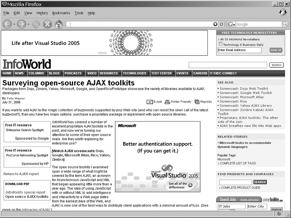
Of course, an organic design is not a must for modern web applications. It is perfectly acceptable to still use a linear approach. Such layouts are usually built on the principle of creating columns of information in the application. But with CSS to lay out the application, the site can remain linear without having to look linear, as the CSS Zen Garden design in Figure 6-11 illustrates (http://csszengarden.com/?cssfile=http://www.tabfolder.com/zengarden/sample.css).
Tip
Several of the JavaScript frameworks, libraries, and toolkits give developers a little extra flair for their linear layout by using rounded corners. In particular, the Rico and MochiKit libraries provide this functionality out of the box. Additions to other libraries can also provide this feature.
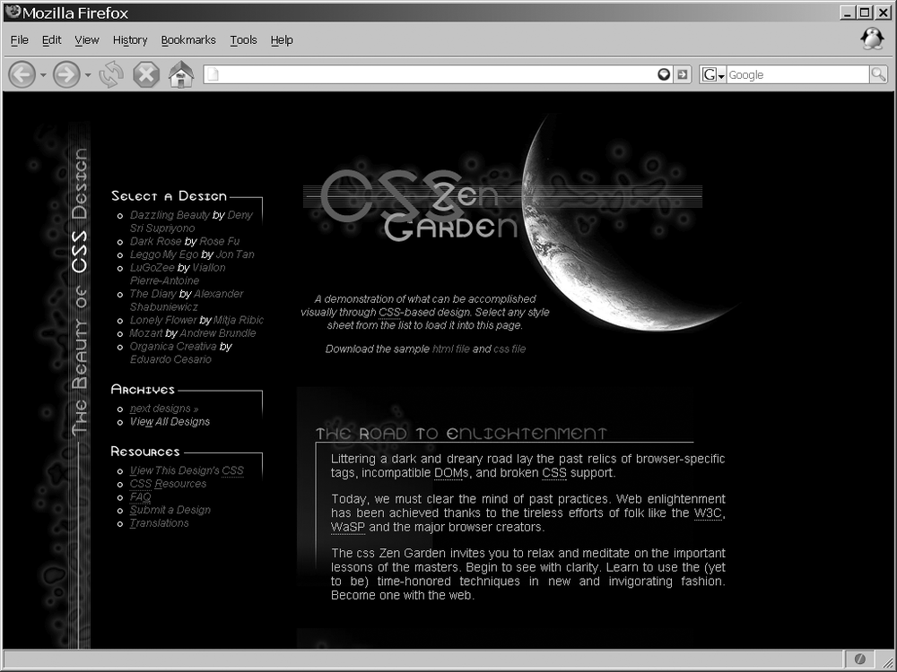
The density of the text information, images, icons, and features must maintain an average weight, or the application will be so cluttered that the user will feel momentarily overwhelmed when first experiencing the site. This is never the way you want the user to feel. Wholesale computer parts companies are notorious for having storefronts that are too dense, as Figure 6-12 clearly shows. To keep the user’s experience with the application a happy one, remember the axiom that “less is more.” Rather than flood the user with information, break that content out in a logical manner, and always allow some whitespace to keep the user from getting claustrophobic while navigating the application.
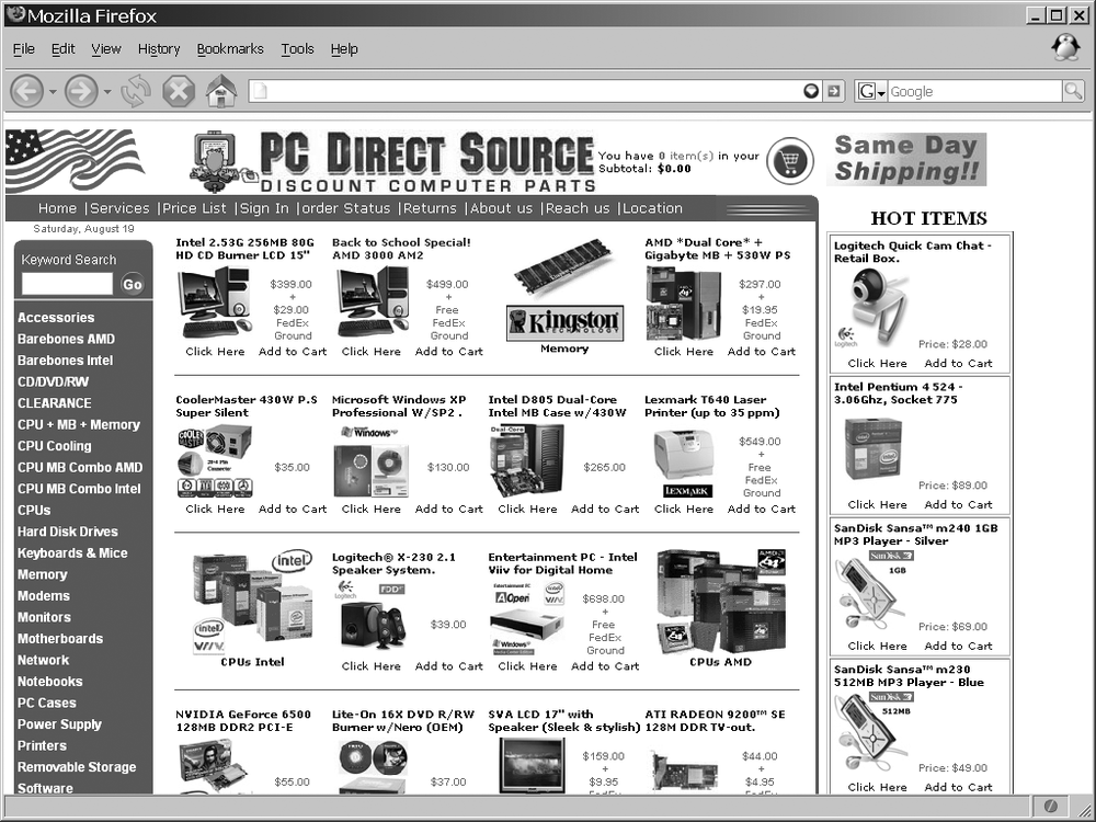
Figure 6-12. The storefront of PC Direct Source (http://www.pcdirectsource.com/), which clearly has density issues
Whitespace can also be a good tool in the developer’s bag of tricks to direct a user’s attention to the application’s focal point. The contrast between size and space will naturally draw the user’s attention to the point the developer wants. Advertisers like to use the focal point to draw attention to the product being sold, as shown within the InfoWorld article (http://www.infoworld.com/) in Figure 6-13.
The “Rule of Thirds”
The “rule of thirds”—a common guideline in professional photography—states that if you divide an application into thirds, horizontally and vertically, thereby creating nine equal parts, the viewer’s attention will fall on objects placed near the lines’ four points of intersection. This rule stems from what is known as the golden ratio, golden number, or divine proportion.
The golden ratio is known in mathematics, art, and architecture as Φ (Phi), which is an irrational number ≈ 1.618033988749895. Euclid first described Phi in his Elements as a line divided in its mean and extreme ratio by C if AB:AC = AC:CB. For nonmathematicians, the golden ratio is a ratio defined by a geometric construction, in this case the division of lines.
Take a line of a given length A and divide it such that the ratio of the length of the entire line (A) to the length of the larger segment (B) is the same as the ratio of the length of the larger line segment (B) to the length of the smaller line segment (C). This can happen only at the point where A is approximately 1.61803398 times B and B is approximately 1.61803398 times C.

Dan Brown’s novel The DaVinci Code (Doubleday) made this ratio famous to laypeople, though mathematicians have known it for thousands of years, and it has been applied to art and architecture as early as the design of the great Egyptian pyramids. You can find information on the golden ratio at GoldenNumber.Net (http://www.goldennumber.net/).
I will come back to this again and again, because it is the simplest of principles to implement and often the most forgotten. The key to visualization, usability, and functionality is consistency. The best interfaces for applications maintain a consistent look throughout to avoid any confusion on the user’s part. As we will now see, this applies to the application’s text, color, images, and icons as well.
Text in an Ajax web application is an important component, and it requires some forethought. Size, color, weight, decoration, and family are elements of the font that will be displayed. Remember that the text in the application is the main form of communication between the client and the user. Text formed correctly will enhance the application visually, but badly formatted text will not only detract from the application, it will also adversely affect its usability and functionality.
Always think about the families you are going to use in the application, and keep in mind that too many font types on one page or throughout the site are distracting. There is an appropriate time to use different families, too. Sans-serif fonts—fonts without feet—are more appropriate for titles and bulleted items within a page, whereas serif fonts—fonts with feet—are more appropriate as the block content within a page. Table 6-2 lists common font families, the types they belong to, and the operating system(s) where you can find them.
Table 6-2. Font families and their types
Font family | Font type | Operating system |
|---|---|---|
Abadi MT Condensed Light | Sans-serif | Windows |
Algerian | Fantasy | Windows |
American Typewriter | Serif | Mac |
Andale Mono | Monospace | Windows, Mac, Unix/Linux |
Apple Chancery | Cursive | Mac |
Arial | Sans-serif | Windows, Mac, Unix/Linux |
Arial Black | Sans-serif | Windows, Mac, Unix/Linux |
Arial Narrow | Sans-serif | Windows, Mac |
Arial Rounded MT Bold | Sans-serif | Windows, Mac |
Arial Unicode MS | Sans-serif | Windows |
Avant Garde | Sans-serif | Mac, Unix/Linux |
Baskerville | Serif | Mac |
Big Caslon | Serif | Mac |
Bitstream Vera Sans | Sans-serif | Unix/Linux |
Bitstream Vera Sans Mono | Monospace | Unix/Linux |
Bitstream Vera Serif | Serif | Unix/Linux |
Book Antiqua | Serif | Windows |
Bookman | Serif | Mac, Unix/Linux |
Bookman Old Style | Serif | Windows |
Braggadocio | Fantasy | Windows |
Britannic Bold | Fantasy | Windows |
Brush Script MT | Cursive | Windows, Mac |
Calisto MT | Serif | Windows |
Capitals | Fantasy | Mac |
Century Gothic | Sans-serif | Windows |
Century Schoolbook (L) | Serif | Windows, Unix/Linux |
Charcoal | Sans-serif | Mac |
Charter | Serif | Unix/Linux |
Charter BT | Serif | Unix/Linux |
Chicago | Sans-serif | Mac |
ClearlyU | Serif | Unix/Linux |
Colonna MT | Fantasy | Windows |
Comic Sans MS | Cursive | Windows, Mac, Unix/Linux |
Copperplate | Fantasy | Mac |
Copperplate Gothic Bold | Fantasy | Windows |
Courier | Monospace | Mac, Unix/Linux |
Courier New | Monospace | Windows, Mac, Unix/Linux |
Courier Regular | Monospace | Mac |
Desdemona | Fantasy | Windows |
Didot | Serif | Mac |
Fixed | Monospace | Unix/Linux |
Footlight MT Light | Serif | Windows |
Futura | Sans-serif | Mac |
Gadget | Sans-serif | Mac |
Garamond | Serif | Windows, Mac |
Geneva | Sans-serif | Mac |
Georgia | Serif | Windows, Mac, Unix/Linux |
Gill Sans | Sans-serif | Mac |
Haettenschweiler | Fantasy | Windows |
Helvetica | Sans-serif | Mac, Unix/Linux |
Helvetica Narrow | Sans-serif | Mac, Unix/Linux |
Helvetica Neue | Sans-serif | Mac |
Herculanum | Fantasy | Mac |
Hoefler Text | Serif | Mac |
Impact | Fantasy | Windows, Mac, Unix/Linux |
Kino MT | Fantasy | Windows |
Lucida | Sans-serif | Unix/Linux |
Lucida Console | Monospace | Windows |
Lucida Grande | Sans-serif | Mac |
Lucida Handwriting | Cursive | Windows |
Lucida Sans Unicode | Sans-serif | Windows |
Lucidabright | Serif | Unix/Linux |
Lucidatypewriter | Monospace | Unix/Linux |
Marker Felt | Fantasy | Mac |
Matura MT Script Capitals | Fantasy | Windows |
Monaco | Monospace | Mac |
New Century Schoolbook | Serif | Mac, Unix/Linux |
New York | Serif | Mac |
News Gothic MT | Sans-serif | Windows |
Nimbus Mono L | Monospace | Unix/Linux |
Nimbus Roman No9 L | Serif | Unix/Linux |
Nimbus Roman Sans L | Sans-serif | Unix/Linux |
OCR A Extended | Monospace | Windows |
Optima | Sans-serif | Mac |
Palatino | Serif | Mac, Unix/Linux |
Papyrus | Fantasy | Mac |
Playbill | Fantasy | Windows |
Sand | Cursive | Mac |
Skia | Sans-serif | Mac |
Tahoma | Sans-serif | Windows |
Techno | Sans-serif | Mac |
Terminal | Monospace | Windows |
Terminal | Monospace | Unix/Linux |
Textile | Cursive | Mac |
Times | Serif | Mac, Unix/Linux |
Times New Roman | Serif | Windows, Mac, Unix/Linux |
Trebuchet MS | Sans-serif | Windows, Mac, Unix/Linux |
Univers | Sans-serif | Mac |
URW Antiqua T | Serif | Unix/Linux |
URW Bookman L | Serif | Unix/Linux |
URW Chancery L | Cursive | Unix/Linux |
URW Gothic L | Sans-serif | Unix/Linux |
URW Grotesk T | Sans-serif | Unix/Linux |
URW Palladio L | Serif | Unix/Linux |
Utopia | Serif | Unix/Linux |
Verdana | Sans-serif | Windows, Mac, Unix/Linux |
VT 100 | Monospace | Mac |
Wide Latin | Fantasy | Windows |
Zapf Chancery | Cursive | Mac |
Zapfino | Cursive | Mac |
The safest fonts to use are the ones that all operating systems support; otherwise, your application may not appear as you intended on some systems. Of course, whether this consideration is critical is entirely up to the developer.
Also with fonts, avoid the use of all capital letters for block content, but note that this is fine for highlighting items and for titles. The general rule of thumb is that if the text in question constructs a sentence (with a period) or a long paragraph, you should not use capital letters.
Text spacing is also important in an application. Text is most legible when the separation between lines is one and a half times the average letter height. When lines are spaced too far apart, the text will seem disconnected, whereas compacting lines on top of each other makes the text difficult or impossible to read.
When text in the application must command attention, you can employ several techniques. Capitalizing all the letters in a word or phrase will draw attention, as will changing the font weight to bold, italics, or some other font style, such as underlining. Creating a contrasting color may also attract the desired attention.
The final consideration for font and color is the contrast in color between the text in the application and the background on which it sits. Table 6-3 lists some color combinations and whether they work well.
Table 6-3. Color contrasts
Foreground | Background | Adequate contrast |
|---|---|---|
Any light color | Any light color | No |
Black | Orange | Yes |
Black | White | Yes |
Dark color | Dark color | No |
Red | Green | No |
White | Black | Yes |
White | Green | Yes |
Yellow | Dark blue | Yes |
When picking colors for the application, it’s important that you think about color contrast, not just for the contrast with text and backgrounds, but also between components.
An icon in an application will mean nothing to the user if the graphic is an arbitrary symbol, or if the user has never been exposed to the icon’s meaning. It is most appropriate to use symbols that have universal meaning. For instance, the universal symbol for a doctor or aid is a red cross on a white field. By using symbols that have been globally accepted on the Web, you can ensure that your icons will not confuse the user.
Another important characteristic of icons and symbols is that they vary by age, education, and even culture. It is important to remember this when designing an icon in an application.
Lastly, experienced web users readily recognize icons as navigation tools, and they expect small symbols to allow navigation. A layout that incorporates a line of small images will tempt these users to click on the images. If the images have no navigation function, they will likely frustrate users.
Larger images in the application will attract the most attention. You should remember this when designing the layout. Also remember that a user is more likely to focus on a large image before anything else, so it is wise to choose images that merge well with the application’s overall theme.
Accessibility in web design is a hot topic, and for good reason. The Internet was born only recently, and now gives us unprecedented access to information, news, entertainment, and commerce at our fingertips—so much so that most of us cannot imagine life without the Web.
The Internet changed how we conduct business, get news, stay in touch with friends, and are entertained. As much as our lives have changed, though, the lives of people with disabilities have changed much more. Think about what it is like now for this group of people. A blind person who could never read a book or newspaper can now do so using text-to-speech synthesizers (screen readers). A deaf person can download transcripts from events he could not participate in, or view multimedia with captioning. A person with motor disabilities may have special technologies available to her that allow her to navigate without the use of her hands or a mouse.
The W3C hosts the Web Accessibility Initiative (WAI), found at http://www.w3.org/WAI/, which is sponsored by government entities such as the U.S. Department of Education’s National Institute on Disability and Rehabilitation Research and the European Commission’s Information Society Technologies Programme, as well as technology industry support from businesses such as Microsoft and IBM. The WAI believes that accessibility on the Web is a problem in many areas. It is currently working on the following five areas:
Developing accessibility guidelines
Ensuring accessibility support in web technologies
Improving accessibility evaluation and repair tools
Developing accessibility education and outreach materials
Coordinating accessibility research and development
The WAI has created several guidelines, though the most important for a web application developer is the Web Content Accessibility Guidelines 1.0 (WCAG 1.0). The WCAG 1.0 guideline became a W3C Recommendation in May 1999, and explained how web sites should be made accessible. This guideline has three priorities that are used as checkpoints against the recommendation. You can find a checklist for this recommendation at http://www.w3.org/TR/WAI-WEBCONTENT/full-checklist.html.
By reviewing W3C specifications during the Last Call Working Draft stage and having technical experts participate in W3C working groups, the WAI ensures that there is support for accessibility. The WAI has a working group for evaluating and repairing accessibility, called the Evaluation and Repair Tools Working Group. This group maintains a list of references to tools for evaluating and repairing accessibility, and has developed the Evaluation and Report Language.
Another working group that the WAI uses is the Education and Outreach Working Group. This group helps develop education and outreach material, such as the Quick Tips Reference Card, Curriculum for Web Content Accessibility Guidelines, and Policies Relating to Web Accessibility. Meanwhile, the Research and Development Interest Group researches potential topics and gets public opinion on them, as well as holds seminars on topics in research and development.
The main thing to remember about the WAI is that its goal is a Web that everyone can access, regardless of ability.
Each disability requires some kind of change in the design of a web application. This can be costly if a disability is not recognized and coded from the beginning. Some businesses may believe it would not be cost-effective to make a site accessible. However, the simple truth is that disabilities affect a significant percentage of the population, making disabled people a large portion of potential customers.
In 2002, 18 percent of Americans were disabled—12 percent with a severe disability, according to the U.S. Census Bureau.[4] Twelve percent of the U.S. population in 2002 was estimated at 34.5 million people; 12 percent of the world population would be quite large. Not taking the time to make the Internet accessible to this many people would be incomprehensible, and in some cases against the law.
Adapting a web site to make it accessible to disabled people is not always a major issue. People with cognitive disabilities benefit from graphics, organized headings and lists, and navigation that has visual cues. Likewise, people with hearing disabilities can benefit from video content that is captioned. These additions and changes to a web site are helpful to everyone, not just those who are disabled. Therefore, implementing them should not be such a big deal.
That being said, when it comes to Ajax web applications, sometimes the design should change to accommodate the disabled, but other times it just does not make sense.
The problem with Ajax is its dynamic nature. Ajax uses JavaScript and CSS extensively, technologies which screen readers, text browsers, and other disability aids do not support very well. So, trying to write an application that is Ajax in nature and yet accessible to everyone is pretty much impossible.
Therefore, when designing an Ajax web application, you should ask yourself these two questions:
Is this functionality required for the application to work?
Is there no JavaScript and CSS alternative?
If you answer “yes” to both questions, you must accept that the application cannot meet WCAG recommendations and move on. If you answer “no” to the second question, you should decide what it means to you to have an application that meets WCAG 1.0 recommendations.
This is not as tricky as it might look. If you’re designing a web site, it should meet all the WCAG 1.0 recommendations. If you’re designing a web application, it should not be difficult to get it to comply. Although most software vendors will try to make sure their applications are released on all major platforms—Windows, Mac OS X, various Linux distributions, and so on—it is not always possible to do so. The same applies here.
Warning
Accessibility can be a legal requirement for a site, particularly those involving government agencies. Using Ajax will either break accessibility or make it very difficult to achieve. In these instances, Ajax may not be the best solution for the application.
Now, this is strictly for accessibility guidelines. You still need to address issues with Ajax breaking the browser’s functionality, as you will see later in the book. I am not advocating that you forget about accessibility. There is no excuse for not following most of the WCAG 1.0 recommendations, as they benefit anyone viewing the application, not just the disabled. There simply has to be a point when you cut your losses, or you accept the fact that you want this functionality in your application, and not everyone is going to be able to view it. After all, by developing with Ajax, you are already excluding the group of people still using browsers from the good old days.
So, what should a developer do when his Ajax application cannot meet accessibility guidelines? Though I know some of you may view this as a cop-out, I say developers in this position should create an alternative version. This requires more work, of course. Plus, it may not be feasible in all situations. How do you create a non-JavaScript/CSS spreadsheet application, for example?
Tip
Creating alternative pages with the same content, even dynamic content, satisfies the following WAI-WCAG 1.0 guidelines:
Priority 1 checkpoint 11.4: If, after best efforts, you cannot create an accessible page, provide a link to an alternative page that uses W3C technologies, is accessible, has equivalent information (or functionality), and is updated as often as the inaccessible (original) page.
Priority 2 checkpoint 6.5: Ensure that dynamic content is accessible or provide an alternative presentation or page.
I do not like the idea of not allowing everyone access to an application I build, but sometimes you just cannot please everyone. Besides, not all of the responsibility for making accessible content should fall on the developer’s shoulders (only most of it should). At some point, the languages need to be addressed, and even more so, the tools used to view the web content. So, until browsers become more accessible or other disability technology aids gain in functionality, do your best. That is all anyone can ask.
What does all this have to do with Ajax applications? Everything. An Ajax application encompasses all of these different ideas—usability, functionality, visualization, and accessibility. An Ajax application should follow all of these web design issues, as all of these are important for any application on the Web.
Remember what I said in Chapter 2, though: Ajax has its place. Do not force an application to have an Ajax interface just to say that it has one. You should use Ajax when it is necessary or required. You are defeating the purpose of its very design if you do not follow this and instead create an application that is not usable or functional, is visually unappealing, or has accessibility issues.
A good example of an Ajax design working on the Web is Gmail, found at http://www.gmail.com/. Figure 6-15 shows what the application looks like from the browser.

Notice how this application follows the recipe for a good design, and makes good use of Ajax. There is no clutter, and its simple design makes it easy to use. It is integrated well with the rest of Google’s suite of web applications. It is extremely fast, and it gives the user the feeling that he is using a desktop application. In a nutshell, that is what an Ajax interface is all about—mimicking a desktop interface.
Google did not have to use Ajax when developing its mail client. After all, Microsoft has been providing a mail client for years that did not use any Web 2.0 features, and it is a hugely popular application to this day. Using Ajax and allowing the user to navigate through the application without all of the reloading and page flashing did set Google apart, though. There are many reasons to use Ajax when you can, and Gmail shows you why. It sets the application apart. It makes the application feel like a desktop application. It makes the application faster. Ajax, when used correctly and for the right functionality, provides you with so much more than a traditional web design that it is helping to change the feel of the Web to what it is today.
[3] * Chris Roast, “Designing for Delay in Interactive Information Retrieval,” Interacting with Computers 10 (1998): 87-104. “Need for Speed I,” Zona Research, Zona Market Bulletin (1999). “Need for Speed II,” Zona Research, Zona Market Bulletin (2001). Jonathan Klein, Youngme Moon, and Rosalind W. Picard, “This Computer Responds to User Frustration: Theory, Design, and Results,” Interacting with Computers 14 (2) (2002): 119-140.
[4] * U.S. Census Bureau News, http://www.census.gov/Press-Release/www/releases/archives/aging_population/006809.html