For those of us tasked with building dashboards and reports, charts are a daily part of our work life. However, few of us have had the inclination to automate any aspect of our chart work with macros. Many of us would say that there are too many scope changes and iterative adjustments in the normal reporting environment to automate charting.
On many levels, that is true, but some aspects of our work lend themselves to a bit of automation. In this Part, we explore a handful of charting macros that can help you save time and become a bit more efficient.
 The code for this Part can be found on this book's companion website. See this book's Introduction for more on the companion website.
Macro 78: Resize All Charts on a Worksheet
When building a dashboard, you often want to achieve some level of symmetry and balance. This sometimes requires some level of chart size standardization. The macro in this section gives you an easy way to set a standard height and width for all your charts at once.
How it works
All charts belong to the ChartObjects collection. To take an action on all charts at one time, you simply iterate through all the charts in ChartObjects. Each chart in the ChartObjects collection has an index number that you can use to bring it into focus. For example, ChartObjects(1) points to the first chart in the sheet.
In this macro, we use this concept to loop through the charts on the active sheet with a simple counter. Each time a new chart is brought into focus, we change its height and width to the size we've defined.
Sub Macro78()
‘Step 1: Declare your variables
Dim i As Integer
‘Step 2: Start Looping through all the charts
For i = 1 To ActiveSheet.ChartObjects.Count
‘Step 3: Activate each chart and size
With ActiveSheet.ChartObjects(i)
.Width = 300
.Height = 200
End With
‘Step 4: Increment to move to next chart
Next i
End Sub
1. Step 1 declares an integer object that is used as a looping mechanism. We call the variable i.
2. Step 2 starts the looping by setting i to count from 1 to the maximum number of charts in the ChartObjects collection on the active sheet. When the code starts, i initiates with the number 1. As we loop, the variable increments up one number until it reaches a number equal to the maximum number of charts on the sheet.
3. Step 3 passes i to the ChartObjects collection as the index number. This brings a chart into focus. We then set the width and height of the chart to the number we specify here in the code. You can change these numbers to suit your needs.
4. In Step 4, the macro loops back around to increment i up one number and get the next chart. After all charts have been evaluated, the macro ends.
How to use it
To implement this macro, you can copy and paste it into a standard module:
1. Activate the Visual Basic Editor by pressing ALT+F11.
2. Right-click the project/workbook name in the Project window.
3. Choose Insert⇒Module.
4. Type or paste the code into the newly created blank module.
Macro 79: Align a Chart to a Specific Range
Along with adjusting the size of our charts, many of us spend a good bit of time positioning them so that they align nicely in our dashboards. This macro helps easily snap your charts to defined ranges, getting perfect positioning every time.
How it works
Every chart has four properties that dictate its size and position. These properties are Width, Height, Top, and Left. Interestingly enough, every Range object has these same properties. So if you set a chart's Width, Height, Top, and Left properties to match that of a particular range, the chart essentially snaps to that range.
The idea is that after you have decided how you want your dashboard to be laid out, you take note of the ranges that encompass each area of your dashboard. You then use those ranges in this macro to snap each chart to the appropriate range. In this example, we adjust four charts so that their Width, Height, Top, and Left properties match a given range.
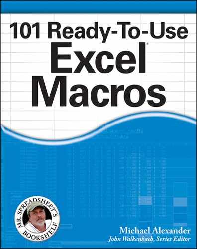
Note that we are identifying each chart with a name. Charts are, by default, named “Chart” and the order number they were added (Chart 1, Chart 2, Chart 3, and so on). You can see what each of your charts is named by clicking any chart, and then going up to the Ribbon and selecting Format⇒Selection Pane. This activates a task pane (seen here in Figure 7-1) that lists all the objects on your sheet with their names.
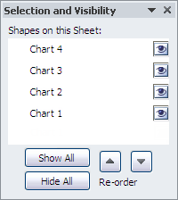
Figure 7-1: The Selection Pane allows you to see all of your chart objects and their respective names.
You can use it to get the appropriate chart names for your version of this macro.
Sub Macro79()
Dim SnapRange As Range
Set SnapRange = ActiveSheet.Range(“B6:G19”)
With ActiveSheet.ChartObjects(“Chart 1”)
.Height = SnapRange.Height
.Width = SnapRange.Width
.Top = SnapRange.Top
.Left = SnapRange.Left
End With
Set SnapRange = ActiveSheet.Range(“B21:G34”)
With ActiveSheet.ChartObjects(“Chart 2”)
.Height = SnapRange.Height
.Width = SnapRange.Width
.Top = SnapRange.Top
.Left = SnapRange.Left
End With
Set SnapRange = ActiveSheet.Range(“I6:Q19”)
With ActiveSheet.ChartObjects(“Chart 3”)
.Height = SnapRange.Height
.Width = SnapRange.Width
.Top = SnapRange.Top
.Left = SnapRange.Left
End With
Set SnapRange = ActiveSheet.Range(“I21:Q34”)
With ActiveSheet.ChartObjects(“Chart 4”)
.Height = SnapRange.Height
.Width = SnapRange.Width
.Top = SnapRange.Top
.Left = SnapRange.Left
End With
End Sub
How to use it
To implement this macro, you can copy and paste it into a standard module:
1. Activate the Visual Basic Editor by pressing ALT+F11.
2. Right-click the project/workbook name in the Project window.
3. Choose Insert⇒Module.
4. Type or paste the code into the newly created Module.
Macro 80: Create a Set of Disconnected Charts
When you need to copy charts from a workbook and paste them elsewhere (another workbook, PowerPoint, Outlook, and so on), it's often best to disconnect them from the original source data. This way, you won't get any of the annoying missing link messages that Excel throws. This macro copies all of the charts in the active sheet, pastes them into a new workbook, and disconnects them from the original source data.
How it works
This macro uses the ShapeRange.Group method to group all the charts on the active sheet into one shape. This is similar to what you would do if you were to group a set of shapes manually. After the charts are grouped, we copy the group and paste it to a new workbook. We then use the BreakLink method to remove references to the original source data. When we do this, Excel hard-codes the chart data into array formulas.
Sub Macro80()
‘Step 1: Declare your variables
Dim wbLinks As Variant
‘Step 2: Group the charts, copy the group, and then ungroup
With ActiveSheet.ChartObjects.ShapeRange.Group
.Copy
.Ungroup
End With
‘Step 3: Paste into a new workbook and ungroup
Workbooks.Add.Sheets(1).Paste
Selection.ShapeRange.Ungroup
‘Step 4: Break the links
wbLinks = ActiveWorkbook.LinkSources(Type:=xlLinkTypeExcelLinks)
ActiveWorkbook.BreakLink Name:=wbLinks(1), _
Type:=xlLinkTypeExcelLinks
End Sub
1. Step 1 declares the wbLinks variant variable. The macro uses this in Step 4 to pass the link source when breaking the links.
2. Step 2 uses ChartObjects.ShapeRange.Group to group all the charts into a single shape. The macro then copies the group to the clipboard. After the group is copied, the macro ungroups the charts.
3. Step 3 creates a new workbook and pastes the copied group to Sheet 1. After the group has been pasted, we can ungroup so that each chart is separate again. Note that the newly created workbook is now the active object, so all references to ActiveWorkbook point back to this workbook.
4. Step 4 captures the link source in the wbLinks variable. The macro then tells Excel to break the links.
 Note that because this technique converts the chart source links to an array formula, this technique can fail if your chart contains too many data points. How many is too many? It can be different for every PC because it's limited by memory.
How to use it
To implement this macro, you can copy and paste it into a standard module:
1. Activate the Visual Basic Editor by pressing ALT+F11.
2. Right-click the project/workbook name in the Project window.
3. Choose Insert⇒Module.
4. Type or paste the code into the newly created Module.
Macro 81: Print All Charts on a Worksheet
To print a chart, you can click any embedded chart in your worksheet and then click Print. This prints the chart on its own sheet without any of the other data on the sheet. This sounds easy enough, but it can become a chore if you've got to do this for many charts. This macro makes short work of this task.
How it works
All charts belong to the ChartObjects collection. To take an action on all charts at one time, you simply iterate through all the charts in ChartObjects. Each chart in the ChartObjects collection has an index number that you can use to bring it into focus. For example, ChartObjects(1) points to the first chart in the sheet.
In this macro, we use this concept to loop through the charts on the active sheet with a simple counter. Each time a new chart is brought into focus, print it.
Sub Macro81()
‘Step 1: Declare your variables
Dim ChartList As Integer
Dim i As Integer
‘Step 2: Start Looping through all the charts
For i = 1 To ActiveSheet.ChartObjects.Count
‘Step 3: Activate each chart and print
ActiveSheet.ChartObjects(i).Activate
ActiveChart.PageSetup.Orientation = xlLandscape
ActiveChart.PrintOut Copies:=1
‘Step 4: Increment to move to next chart
Next i
End Sub
1. Step 1 declares an integer object that is used as a looping mechanism. We call the variable i.
2. Step 2 starts the looping by setting i to count from 1 to the maximum number of charts in the ChartObjects collection on the active sheet. When the code starts, i initiates with the number 1. As we loop, the variable increments up one number until it reaches a number equal to the maximum number of charts on the sheet.
3. Step 3 passes i to the ChartObjects collection as the index number. This brings a chart into focus. We then use the ActiveChart.Printout method to trigger the print. Note that you can adjust the Orientation property to either xlLandscape or xlPortrait depending on what you need.
4. Step 4 loops back around to increment i up one number and get the next chart. After all charts have been evaluated, the macro ends.
How to use it
To implement this macro, you can copy and paste it into a standard module:
1. Activate the Visual Basic Editor by pressing ALT+F11.
2. Right-click the project/workbook name in the Project window.
3. Choose Insert⇒Module.
4. Type or paste the code into the newly created module.
Macro 82: Label First and Last Chart Points
One of the best practices for dashboard building is to avoid overwhelming your customers with too much data at one time — especially in a chart, where they can lose sight of the primary message if focusing on inconsequential data.
One of the common ways dashboard designers help focus the message of a chart is to limit the data labels to only the key points — typically, the first and last data points.
That being said, it is a bit arduous to continuously adjust labels every time data is added or when a new chart is needed. The macro outlined in this section automates the adding of labels to the first and last data points.
How it works
All charts have a SeriesCollection object that holds the various data series. This macro loops through all the series, bringing each one into focus one at a time. With the series in focus, we can use any of its many properties to manipulate it. Here, we are activating the data labels for the first and last data point in the series.
Sub Macro82()
‘Step 1: Declare your variables
Dim oChart As Chart
Dim MySeries As Series
‘Step 2: Point to the active chart
On Error Resume Next
Set oChart = ActiveChart
‘Step 3: Exit no chart has been selected
If oChart Is Nothing Then
MsgBox “You select a chart first.”
Exit Sub
End If
‘Step 4: Loop through the chart series
For Each MySeries In oChart.SeriesCollection
‘Step 5: Clear ExistingData Labels
MySeries.ApplyDataLabels (xlDataLabelsShowNone)
‘Step 6: Add labels to the first and last data point
MySeries.Points(1).ApplyDataLabels
MySeries.Points(MySeries.Points.Count).ApplyDataLabels
MySeries.DataLabels.Font.Bold = True
‘Step 7: Move to the next series
Next MySeries
End Sub
1. Step 1 declares two variables. We use oChart as the memory container for our chart. We use MySeries as a memory container for each series in our chart.
2. This macro is designed so that we infer the target chart based on the chart selection. That is to say, a chart must be selected for this macro to run. The assumption is that we want to perform the macro action on the chart we clicked on.
Step 2 sets the oChart variable to the ActiveChart. If a chart is not selected, an error is thrown. This is why we use the On Error Resume Next statement. This tells Excel to continue with the macro if there is an error.
3. Step 3 checks to see if the oChart variable is filled with a chart object. If the oChart variable is set to Nothing, no chart was selected before running the macro. If this is the case, we tell the user in a message box, and then we exit the procedure.
4. Step 4 uses the For…Each statement to start looping through the series in the active charts SeriesCollection.
5. If data labels already exist, we need to clear them out. We can do this by using xlDataLabelsShowNone.
6. Each data series has a Points collection, which holds all the data points for the chart. Like most collections in the Excel object model, data points have index numbers.
Step 6 of the macro uses index numbers to get to the first and last data points. The first data point is easy; we capture it by using MySeries.Points(1). After we have it in focus, we can use the ApplyDataLabels method to turn on data labels for that one point.
The last data label is a bit trickier. We use MySeries.Points.Count to get the maximum number of data points in the series. That is the index number of the last data point. We place the last data point in focus, and then we apply labels to it.
Finally, we adjust the formatting on the data labels so they have bold font.
7. Step 7 loops back around to get the next series. After we have gone through all the data series in the chart, the macro ends.
How to use it
The best place to store this macro is in your Personal Macro Workbook. This way, the macro is always available to you. The Personal Macro Workbook is loaded whenever you start Excel. In the VBE Project window, it will be named personal.xlsb.
1. Activate the Visual Basic Editor by pressing ALT+F11.
2. Right-click personal.xlb in the Project window.
3. Choose Insert⇒Module.
4. Type or paste the code into the newly created module.
If you don't see personal.xlb in your project window, it doesn't exist yet. You'll have to record a macro, using Personal Macro Workbook as the destination.
To record the macro in your Personal Macro Workbook, select the Personal Macro Workbook option in the Record Macro dialog box before you start recording. This option is in the Store Macro In drop-down list box. Simply record a couple of cell clicks and then stop recording. You can discard the recorded macro and replace it with this one.
Macro 83: Color Chart Series to Match Source Cell Colors
When you create a dashboard, you may have specific color schemes for various types of data. For example, you may want the North region to always appear in a certain color, or you may want certain products to have a trademark color. This gives your dashboards a familiarity and consistency that makes it easier for your audience to consume.
The macro in this section allows the series in your charts to automatically adopt colors in their source range. The idea is that you can color code the cells in the source range, and then fire this macro to force the chart to apply the same colors to each respective chart series. Although it's in black and white, Figure 7-2 gives you an idea of how it works.
Figure 7-2: Using this macro automatically formats the chart series to match the source cells.
This macro cannot capture colors that have been applied via conditional formatting or table color banding. This is because conditional format coloring and table color banding are not applied directly to the cell. They are applied to objects that are separate but sit on top of the cells.
How it works
All charts have a SeriesCollection object that holds the various data series. In this macro, we loop through all the series, bringing each one into focus one at a time. With the series in focus, we can use any of its many properties to manipulate it.
In this case, we are setting the color to the color of the source range. We identify the source range for each series by evaluating its series formula. The series formula contains the range address of the source data. Passing that address to a range object, we can capture the exact color of cells, and then use that to color the series.
Sub Macro83()
‘Step 1: Declare your variables
Dim oChart As Chart
Dim MySeries As Series
Dim FormulaSplit As Variant
Dim SourceRangeColor As Long
‘Step 2: Point to the active chart
On Error Resume Next
Set oChart = ActiveChart
‘Step 3: Exit no chart has been selected
If oChart Is Nothing Then
MsgBox “You must select a chart first.”
Exit Sub
End If
‘Step 4: Loop through the chart series
For Each MySeries In oChart.SeriesCollection
‘Step 5: Get Source Data Range for the target series
FormulaSplit = Split(MySeries.Formula, “,”)(2)
‘Step 6: Capture the color in the first cell
SourceRangeColor = Range(FormulaSplit).Item(1).Interior.Color
‘Step 7: Apply Coloring
On Error Resume Next
MySeries.Format.Line.ForeColor.RGB = SourceRangeColor
MySeries.Format.Line.BackColor.RGB = SourceRangeColor
MySeries.Format.Fill.ForeColor.RGB = SourceRangeColor
If Not MySeries.MarkerStyle = xlMarkerStyleNone Then
MySeries.MarkerBackgroundColor = SourceRangeColor
MySeries.MarkerForegroundColor = SourceRangeColor
End If
‘Step 8: Move to the next series
Next MySeries
End Sub
1. Step 1 declares four variables. We use oChart as the memory container for our chart, MySeries as a memory container for each series in our chart, FormulaSplit to capture and store the source data range, and SourceRangeColor to capture and store the color index for the source range.
2. This macro is designed so that we infer the target chart based on the chart selection. In other words, a chart must be selected for this macro to run. The assumption is that we will want to perform the macro action on the chart we clicked on.
In Step 2, we set the oChart variable to the ActiveChart. If a chart is not selected, an error is thrown. This is why we use the On Error Resume Next statement. This tells Excel to continue with the macro if there is an error.
3. Step 3 checks to see whether the oChart variable is filled with a chart object. If the oChart variable is set to Nothing, no chart was selected before running the macro. If this is the case, we tell the user in a message box, and then we exit the procedure.
4. Step 4 uses the For…Each statement to start looping through the series in the active charts SeriesCollection.
5. Every chart series has a series formula. The series formula contains references back to the spreadsheet, pointing to the cells used to create it. A typical series formula looks something like this:
=SERIES(Sheet1!$F$6,Sheet1!$D$7:$D$10,Sheet1!$F$7:$F$10,2)
Note that there are three distinct ranges in the formula. The first range points to the series name, the second range points to the series data labels, and the third range points to the series data values.
Step 5 uses the Split function to parse this formula in order to extract out the range for the series data values.
6. Step 6 captures the color index of the first cell (item) in the source data range. We assume that the first cell will be formatted the same as the rest of the range.
7. After we have the color index, we can apply the color to the various series properties.
8. In the last step, we loop back around to get the next series. After we have gone through all the data series in the chart, the macro ends.
How to use it
The best place to store this macro is in your Personal Macro Workbook. This way, the macro is always available to you. The Personal Macro Workbook is loaded whenever you start Excel. In the VBE Project window, it will be named personal.xlsb.
1. Activate the Visual Basic Editor by pressing ALT+F11.
2. Right-click personal.xlb in the Project window.
3. Choose Insert⇒Module.
4. Type or paste the code into the newly created module.
If you don't see personal.xlb in your project window, it means it doesn't exist yet. You'll have to record a macro, using Personal Macro Workbook as the destination.
To record the macro in your Personal Macro Workbook, select the Personal Macro Workbook option in the Record Macro dialog box before you start recording. This option is in the Store Macro In drop-down list box. Simply record a couple of cell clicks and then stop recording. You can discard the recorded macro and replace it with this one.
Macro 84: Color Chart Data Points to Match Source Cell Colors
In the previous macro, we force each chart series to apply the same colors as their respective source data ranges. This macro works the same way, but with data points. You would use this macro if you wanted to force a pie chart to adopt the color of each data point's source range.
This macro cannot capture colors that have been applied via conditional formatting or table color banding. This is because conditional format coloring and table color banding are not applied directly to the cell. They are applied to objects that are separate but sit on top of the cells.
How it works
In this case, we are setting the color to the color of the source range. We identify the source range for each series by evaluating its series formula. The series formula contains the range address of the source data. Passing that address to a range object, we can capture the exact color of cells, and then use that to color the series.
Sub Macro84()
‘Step 1: Declare your variables
Dim oChart As Chart
Dim MySeries As Series
Dim i As Integer
Dim dValues As Variant
Dim FormulaSplit As String
‘Step 2: Point to the active chart
On Error Resume Next
Set oChart = ActiveChart
‘Step 3: Exit no chart has been selected
If oChart Is Nothing Then
MsgBox “You must select a chart first.”
Exit Sub
End If
‘Step 4: Loop through the chart series
For Each MySeries In oChart.SeriesCollection
‘Step 5: Get Source Data Range for the target series
FormulaSplit = Split(MySeries.Formula, “,”)(2)
‘Step 6: Capture Series Values
dValues = MySeries.Values
‘Step 7: Loop through series values and set color
For i = 1 To UBound(dValues)
MySeries.Points(i).Interior.Color = _
Range(FormulaSplit).Cells(i).Interior.Color
Next i
‘Step 8: Move to the next series
Next MySeries
End Sub
1. Step 1 declares five variables. We use oChart as the memory container for our chart, MySeries as a memory container for each series in our chart, dValues in conjunction with i to loop through the values in the series, and FormulaSplit to capture and store the source data range.
2. This macro is designed so that we infer the target chart based on the chart selection. A chart must be selected for this macro to run. The assumption is that we want to perform the macro action on the chart we clicked on.
In Step 2, we set the oChart variable to the ActiveChart. If a chart is not selected, an error is thrown. This is why we use the On Error Resume Next statement. This tells Excel to continue with the macro if there is an error.
3. In Step 3, we check to see whether the oChart variable is filled with a chart object. If the oChart variable is set to Nothing, no chart was selected before running the macro. If this is the case, we tell the user in a message box, and then we exit the procedure.
4. Step 4 uses the For…Each statement to start looping through the series in the active charts SeriesCollection.
5. Every chart series has a series formula. The series formula contains references back to the spreadsheet, pointing to the cells used to create it. A typical series formula looks something like this:
=SERIES(Sheet1!$F$6,Sheet1!$D$7:$D$10,Sheet1!$F$7:$F$10,2)
Note that there are three distinct ranges in the formula. The first range points to the series name, the second range points to the series data labels, and the third range points to the series data values.
Step 5 uses the Split function to parse this formula in order to extract the range for the series data values.
6. Step 6 uses the dValues variant variable to capture the array of data values in the active series.
7. Step 7 starts the looping through the data points in the series. It does this by setting i to count from 1 to the number of data points in dValues. When the loop begins, i initiates with the number 1. As the macro loops, the variable increments up one number until it reaches a number equal to the maximum number of data points in the series.
As the macro loops, it uses i as the index number for the Points collection, effectively exposing the properties for each data point. We then set the color index of the data point to match the color index for its corresponding source cell.
8. In the last step, the macro loops back around to get the next series. After we have gone through all the data series in the chart, the macro ends.
How to use it
The best place to store this macro is in your Personal Macro Workbook. This way, the macro is always available to you. The Personal Macro Workbook is loaded whenever you start Excel. In the VBE Project window, it will be named personal.xlsb.
1. Activate the Visual Basic Editor by pressing ALT+F11.
2. Right-click personal.xlb in the Project window.
3. Choose Insert⇒Module.
4. Type or paste the code into the newly created module.
If you don't see personal.xlb in your project window, it doesn't exist yet. You'll have to record a macro, using Personal Macro Workbook as the destination.
To record the macro in your Personal Macro Workbook, select the Personal Macro Workbook option in the Record Macro dialog box before you start recording. This option is in the Store Macro In drop-down list box. Simply record a couple of cell clicks and then stop recording. You can discard the recorded macro and replace it with this one.