
CHAPTER THREE
Measurement: Units of Capacity
The only man who behaves sensibly is my tailor; he takes my measurements anew every time he sees me, while all the rest go on with their old measurements and expect me to fit them.
George Bernard Shaw

If you don’t have a way to measure current capacity, you can’t conduct capacity planning—you would only be guessing. Fortunately, a seemingly endless range of tools is available for measuring computer performance and usage. Most operating systems come with some basic built-in utilities that can measure various performance and resource consumption metrics. Most of these utilities usually provide a way to record results, as well. For instance, on Linux, the following commands are commonly used:
uptime-
You use this to view the load averages, which in turn indicates the number of tasks (processes) that are queued up to run. For links to the discussions about understanding
uptime, go to the section “Resources”. dmesg-
You use this to view the last 10 system messages, if there are any, and look for errors that can cause performance issues.
vmstat 1-
This provides a summary of key server statistics—such as processes running on the CPU and waiting for a turn, free memory in kilobytes, swap-ins, and swap-outs—every second.
mpstat –P ALL 1-
This provides CPU time breakdowns per CPU every second.
pistat 1-
This provides a per-process summary on a rolling basis.
iostat –xz 1-
You use this for understanding block devices (disks), both the workload applied and the resulting performance.
free –m-
You can use this to view the amount of free memory available and the size of the buffer and file cache.
sar –n DEV 1-
Use this to view the network interface throughput:
rxkB/sandtxkB/s, as a measure of workload and also to check whether any limit has been reached. sar –n TCP,ETCP 1-
You can use this to view the server load in terms of the number of locally/remotely initiated TCP connections per second and the number of TCP retransmits per second.
top-
Use this to view the summary of most of the metrics exposed by the aforementioned commands.
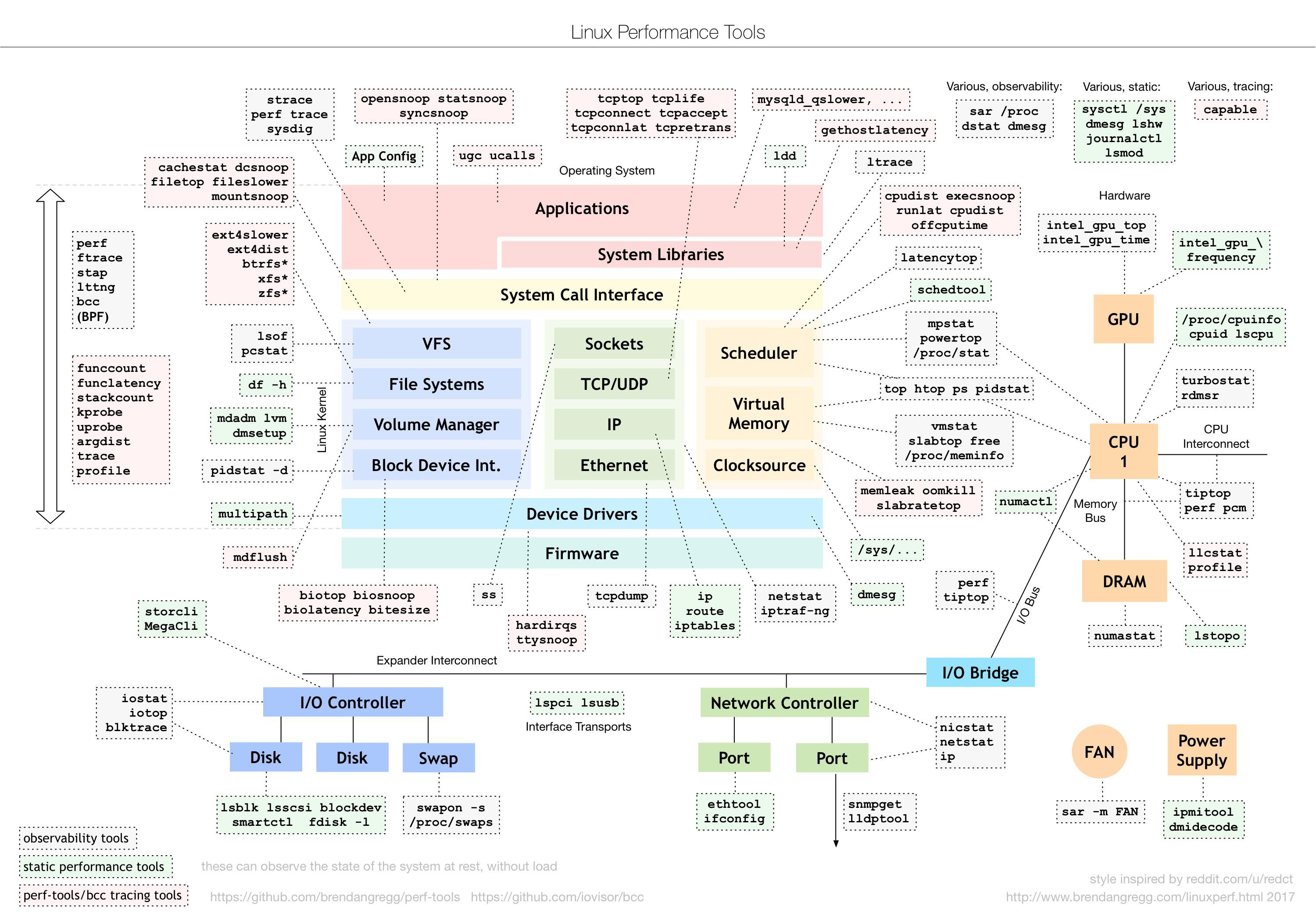
Other tools such as netstat, tcpstat, and ncstat are commonly used. Figure 3-1 presents an overview of the various tools available for Linux.

Figure 3-1. Landscape of monitoring tools available in Linux (source: http://www.brendangregg.com/Perf/linux_perf_tools_full.png)
In addition to the tools shown in Figure 3-1, there are tools that are more advanced and enable monitoring at the kernel level. For example, you can use SystemTap to extract, filter, and summarize data so that you can diagnose complex performance or functional problems of a Linux system. Using a SystemTap script, you can name events and give them handlers. Whenever a specified event occurs, the Linux kernel runs the handler as if it were a quick subroutine and then resumes. There are many other types of events such as entering or exiting a function, a timer expiring, or the entire SystemTap session starting or stopping. A handler is a series of script language statements that specify the work to be done whenever the event occurs. This work normally includes extracting data from the event context, storing the data into internal variables, or printing results.
Akin to SystemTap (stap), you also can use ktap—which is based on bytecode, so it doesn’t depend upon the GNU Compiler Collection (GCC) and doesn’t require compiling the kernel module for each script—for dynamic tracing of the Linux kernel. In a similar vein, Linux enhanced BPF (Berkeley Packet Filter) also has raw tracing capabilities, and you can use it to carry out custom analysis by attaching the BPF bytecode with Linux kernel dynamic tracing (kprobe), user-level dynamic tracing (uprobes), kernel static tracing (tracepoints), and profiling events. eBPF was described by Ingo Molnár as follows:
One of the more interesting features in this cycle is the ability to attach eBPF programs (user-defined, sandboxed bytecode executed by the kernel) to kprobes. This allows user-defined instrumentation on a live kernel image that can never crash, hang or interfere with the kernel negatively.
Unlike other built-in tracers in Linux, eBPF can summarize data in kernel context and emits only the summary you care about to user level—for example, latency histograms and filesystem I/O. You can use eBPF in a wide variety of contexts, such as Software-Defined Networks (SDNs), Distributed Denial of Service (DDoS) mitigation, and intrusion detection.
The discussion so far has been at the host level. However, host-level monitoring is not sufficient in a virtualized or containerized environment. To this end, both virtual machines (VMs) and containers come along with tools to expose CPU, memory, I/O, and network metrics on a per–VM/container basis. Besides the standard metrics, container-specific metrics such as CPU throttling are also exposed. For instance, Docker surfaces the number of times throttling was enforced for each container, and the total time that each container was throttled. Likewise, Docker exposes a metric called container memory fail counter, which is increased each time memory allocation fails, i.e., each time the preset memory limit is hit. Thus, spikes in this metric suggest that one or more containers need more memory than what was allocated. If the process in the container terminates because of this error, you also might see out-of-memory events from Docker.
Most popular open source tools are easy to download and run on virtually any modern system. For capacity planning, the measurement tools should provide, at minimum, an easy way to do the following:
-
Record and store data over time—maintaining a history is key for many reasons such as forecasting and trend analysis
-
Build custom metrics
-
Compare metrics from various sources such as RRD (discussed further later), Hadoop, OpenTSDB, and so on
-
Import and export metrics as, for example, CSVs, JSON, and so forth
As long as you choose tools that can in some way satisfy the aforementioned criteria, you don’t need to spend much time pondering which to use. What is more important is to determine which metrics to measure and which metrics to give particular attention.
Metrics have different flavors. The common case is of the form <name/value, timestamp>. The name is in the form of a k-tuple, e.g., <hostname, process, status>. On the other hand, values can assume the following types:
-
Counter
-
Gauge
-
Percentiles
-
Interval
-
Ratio

Resolution and diversity of metrics being collected play a vital role toward effective capacity planning. For instance, in the context of the cloud, collecting metrics at hourly/daily granularity limits the triggering of an autoscaling action in a timely fashion (we discuss autoscaling in detail in Chapter 6). Likewise, lack of diversity of the metrics at disposal can potentially misguide capacity planning. Although monitoring a large set of metrics enables carrying out correlation analysis (which in turn helps to weed out false positives), it is not in and of itself reflective of diversity of the metrics.
Increase in resolution and number of metrics being collected has direct ramifications on the capital expenditure (capex) required for monitoring (refer to the sidebar “ACCEPTING THE OBSERVER EFFECT”) and makes analysis more challenging. The impact of the former can be contained via techniques such as downsampling, filtering, or aggregation. You should make the selection of one or more techniques on a case-by-case basis because the requirements of each user of the monitoring system often differ from one another.
It is not uncommon for the volume of metadata (associated with a metric) collected to eclipse the volume of the metric itself. This also has direct impact on the capex required for monitoring. Further, unfortunately, more than 90 percent of the metrics and the corresponding metadata collected is never read—in other words, it is never used. This indeed used to be the case at Netflix and Twitter.
NOTE
For a discussion of the pros and cons of some of the commonly used monitoring tools, refer to Caskey Dickson’s talk at the LISA’13 conference.
In this chapter, we discuss the specific statistics such as cache hit rate and disk usage rate that you would want to measure for different purposes and then show the results in graphs to help you better interpret them. There are plenty of other sources of information on how to set up particular tools to generate the measurements; most professional system administrators already have such tools installed.
Capacity Tracking Tools
This chapter is about automatically and routinely measuring server behavior over a predefined amount of time. By monitoring normal behavior over days, weeks, and months, you would be able to see both patterns that recur regularly as well as trends over time that help predict when you would need to increase capacity. The former is exemplified by an increase in traffic on Friday evenings and over the weekends; the latter is exemplified by an organic increase in traffic over a longer period (for example, three to six months). You must be wary of using data corresponding to longer periods because, in some context, data recency is key to decision making.
We also discuss deliberately increasing the load through artificial scaling (also referred to as load testing) using methods that closely simulate what will happen to the site under test in the future. You can use tools such as Loadrunner, Iago, or JMeter for load testing. This will also help you to predict when to increase capacity.
For the tasks in this chapter, you would need tools that collect, store, and display (usually on a graph) metrics over time. You can use them to drive capacity predictions as well as root-cause analysis.
Examples of these tools include the following:
Tools such as Grafana are often used to query and visualize time–series of operational metrics. The tools don’t need to be fancy. In fact, for some metrics, you can simply load them into Excel and plot them there. Appendix C contains a more comprehensive list of capacity planning tools. In similar fashion, several commercial infrastructure monitoring services have sprung to this end:
It’s important to begin by understanding the types of monitoring to which this chapter refers. Companies in the web operations field use the term monitoring to describe all sorts of operations—generating alerts concerning system availability, data collection and its analysis, real-world (commonly referred to as RUM, real user monitoring1) and artificial end user interaction measurement (commonly referred to as synthetic monitoring)—the list goes on and on. Quite often this causes confusion. We suspect many commercial vendors who align on any one of those areas exploit this confusion to further their own goals, much to our detriment as end users.
This chapter is not concerned with system availability, the health of servers, or notification management—the sorts of activities offered by Nagios, Zenoss, OpenNMS, and other popular network monitoring systems such as Wireshark, GFI LanGuard, NetXMS, and PRTG Network Monitor. Some of these tools do offer some of the features we need for our monitoring purposes, such as the ability to display and store metrics. But they exist mostly to help recognize urgent problems and avoid imminent disasters. For the most part, they function a lot like extremely complex alarm clocks and smoke detectors.
Metric collection systems, on the other hand, act more like court reporters, who observe and record what’s going on without taking any action whatsoever. As it pertains to our goals, the term “monitoring” refers to metric collection systems used to collect, store, and display system- and application-level metrics of an infrastructure.
Fundamentals and Elements of Metric Collection Systems
Nearly every major commercial and open source metric collection system employs the same architecture. As depicted in Figure 3-2, this architecture usually consists of an agent that runs on each of the physical machines being monitored, and a single server that aggregates and displays the metrics. As the number of nodes in an infrastructure grows, you will probably have more than a single server performing aggregation, especially in the case of multiple datacenter operations.

Figure 3-2. The fundamental pieces of most metric collection systems
The agent’s job is to periodically collect data from the machine on which it’s running and send a summary to the metric aggregation server. The metric aggregation server stores the metrics for each of the machines that it’s monitoring, which then can be displayed by various methods. Most aggregation servers use some sort of database; one specialized format known as Round-Robin Database (RRD) is particularly popular. Other databases used for storing time–series of metrics include OpenTSDB, DalmatinerDB, InfluxDB, Riak TS, BoltDB, and KairosDB. Broadly speaking, the time–series databases use either files or a Log-Structured-Merge Tree (LSM-Tree) backed or a B-Tree ordered key/value store.
There exist several daemons to collect metrics. collectd is one of the most common daemons used to collect system and application performance metrics periodically. It has mechanisms to store the values in a variety of ways; for example, RRD files. collectd supports plug-ins for a large set of applications.
Round-Robin Database and RRDTool
RRDTool is a commonly used utility for storing system and network data—be it a LAMP (Linux, Apache, MySQL, PHP)/MAMP (Mac, Apache, MySQL, PHP) or the modern MEAN (MongoDB, Express.js, Angular.js, Node.js) stack, or even if you are using any other framework (for a link to Richard Clayton’s blog on the different frameworks, go to “Resources”). Here, we offer only an overview, but you can find a full description of RRDTool on the “about” page and in the tutorials at http://rrdtool.org.
The key characteristics of system monitoring data is its size: with cloud computing becoming ubiquitous, the footprint of operational data has experienced an explosive growth, and it is expected to grow at an even faster pace. Thus, ironically, you need to do capacity planning specifically for the data you’re collecting for capacity planning! The RRDTool utility solves that by making an assumption that you are interested in fine details only for the recent past. As you move backward in the stored data, it’s acceptable to lose some of the details. After some maximum time defined by the user (say, a year), you can let data disappear completely. This approach sets a finite limit on how much data you’re storing, with the trade-off being the degree of detail as time moves on. Setting up a retention period is crucial to containing the storage costs. Back when we were at Netflix, we had set up aggressive retention policies for operations data that helped save millions of dollars in AWS S3 cost. Even from a contextual standpoint, storing long periods of operations data might not be useful, because use of stale data can potentially misguide decision-making.
You also can use RRDTool to generate graphs from this data and show views on the various time slices for which you have recorded data. It also contains utilities to dump, restore, and manipulate RRD data, which come in handy when you drill down into some of the nitty-gritty details of capacity measurement. The metric collection tools mentioned earlier in “Capacity Tracking Tools” are frontends to RRDTool.
Ganglia
The charts in this chapter were generated by Ganglia. We had several reasons for choosing this frontend to present examples and illustrate useful monitoring practices. First, Ganglia was the tool used for this type of monitoring when John was at Flickr. We chose it based partly on some general reasons that might make it a good choice for you, as well: it’s powerful (offering good support for the criteria we listed at the beginning of the chapter) and popular. But in addition, Ganglia was developed originally as a grid management and measurement mechanism aimed at high-performance computing (HPC) clusters. Ganglia worked well for Flickr’s infrastructure because its architecture is similar to HPC environments, in that Flickr’s backend was segmented into separate clusters of machines that each play a different role.
The principles in this chapter, however, are valuable regardless of which monitoring tool you use. Fundamentally, Ganglia works similarly to most metric collection and storage tools. Its metric collection agent is called gmond and the aggregation server piece is called gmetad. The metrics are displayed using a PHP-based web interface.
Simple Network Management Protocol
The Simple Network Management Protocol (SNMP) is a common mechanism for gathering metrics for most networking and server equipment. Think of SNMP as a standardized monitoring and metric collection protocol. Most routers, switches, and servers support it.
SNMP collects and sends more types of metrics than most administrators choose to measure. Because most networking equipment and embedded devices are closed systems, you can’t run user-installed applications such as a metric collection agent like gmond. However, as SNMP has long been a standard for networking devices, it provides an easy way to extract metrics from those devices without depending on an agent.
Treating Logs as Past Metrics
Logs are a great way to inject metrics into measurement systems, and it underscores one of the criteria for being able to create custom metrics within a monitoring system.
Web servers can log a wealth of information. When you see a spike in resources on a graph, you often can examine the access and error logs to find the exact moment those resources jumped. Thus, logs make root-cause analysis easier. Most databases have options to log queries that exceed a certain amount of time, allowing you to identify and fix those slow-running queries. Almost everything you use—mail servers, load balancers, firewalls—has the ability to generate logs, either directly or via a Unix-style syslog facility.
In recent years, Splunk as emerged as a leading service for collecting and indexing data, regardless of format or source—logs, clickstreams, sensors, stream network traffic, web servers, custom applications, hypervisors, social media, and cloud services. The structure and schema are applied only at search time.
Monitoring as a Tool for Urgent Problem Identification
As the upcoming section “Applications of Monitoring” mentions, problem notification is a separate area of expertise from capacity planning, and generally uses different tools. But some emerging problems are too subtle to trigger health checks from tools such as Nagios. However, you can press the tools we cover in this chapter into service to warn of an impending problem. The techniques in this section also can quickly show you the effects of an optimization. For instance, back at Yahoo!, the Machine Learned Ranking (MLR) team had come up with a new algorithm and was testing its efficacy. Although the quality of search results showed material improvements during A/B testing, the CPU overhead was markedly high. At peak load, the overhead would have made Search BCM (Business Continuity Plan) noncompliant (we discuss BCP further later in this chapter). Based on this, the rollout of the algorithm was gated, thereby avoiding any potential issues in production.
Figure 3-3 shows some anomalous behavior discovered through Ganglia. It represents several high-level views of a few clusters.

Figure 3-3. Using metric collection to identify problems
Without even looking into the details, you can see from the graphs on the left in Figure 3-3 that something unusual has just happened. These graphs cover the load and running processes on the cluster, whereas the groups on the right display combined reports on the memory usage for those clusters. The x-axes for all of the graphs correspond to the same time period, so it’s quite easy to see the number of running processes dip in conjunction with the spike in the GEO cluster (notably in the WWW cluster).
The WWW cluster contained Apache frontend machines serving flickr.com, and the GEO cluster was a collection of servers that perform geographic lookups for features such as photo geotagging. By looking at this one web page, you can ascertain where the problem originated (GEO) and where its effects were felt (all other clusters). As it turns out, this particular event occurred when one of the GEO servers stalled on some of its requests. The connections from our web servers accumulated as a result. When the GEO server was restarted, the web servers gradually recovered.
When faults occur with a website, there is tremendous value in being able to quickly gather status information. You would want to be able to get fast answers to the following questions:
-
What was the fault?
-
When did the fault occur?
-
What caused the fault?
In this example, the graphs in Figure 3-3 helped to pinpoint the source of the trouble because you can correlate the event’s effects (via the timeline) on each cluster.
Network Measurement and Planning
Capacity planning goes beyond servers and storage to include the network to which they’re all connected. The implementation details of routing protocols and switching architectures are beyond the scope of this book, but the network is just like any other resource: finite in capacity and well worth measuring.
NOTE
For references to experience papers from Google, Microsoft, and Facebook on the network topologies and measurement of network latency in their respective datacenters, go to “Readings”. In addition, the section lists several references to recent research on datacenter networks.
The survey by Chen et al. provides an overview of the features, hardware, and architectures of datacenter networks, including their logical topological connections and physical component categorizations. Recently, tools such as PathDump have been proposed that utilizes resources at edge devices for network debugging.
Networks are commonly viewed as plumbing for servers, and that analogy is apt. When a network is operating well, data simply flows. When it doesn’t, everything comes to a grinding halt. This isn’t to say that subtle and challenging problems don’t crop up with networking: far from it. But for the most part, network devices are designed to do one task well, and their limits should be clear. Network capacity in hosted environments is often a metered and strictly controlled resource; getting data about the usage can be difficult, depending on the contract your organization has with a network provider. As a sanity check of inbound and outbound network usage, aggregate the outward-facing server network metrics and compare them with the bill received from the hosting provider.

When you own your racks and switches, you can make educated decisions about how to divide the hosts across them according to the network capacity they’ll need. For example, at Flickr, our photo cache servers demanded quite a bit from their switches, because all they did was handle requests for downloads of photos. We were careful to not put too many of them on one switch so that the servers would have enough bandwidth.
Routers and switches are like servers in that they have various metrics that we can extract (usually with the SNMP protocol) and record. Although their main metrics are the bytes in and out per second (or packets in and out if the payloads are small), they often expose other metrics, as well, such as CPU usage and current network sessions.
You should measure all of these metrics on a periodic basis with a network graphing tool, such as MRTG or some other utility that can store the history for each metric. Unlike Ganglia and other metric collection tools, MRTG is built with SNMP in mind. Simply because bandwidth usage on the switch and the router is well below the limits of network capacity doesn’t mean you’re not nearing CPU usage ceilings on those devices—you should monitor all of those metrics with alerting thresholds, as well.
Load Balancing
Load balancers have been a source of much joy and pain in the field of web operations. Their main purpose is to distribute load among pools, or clusters, of machines, and they can range from the simplest to the most complex beasts in a datacenter. Load balancing is usually implemented on the frontend of the architecture, playing traffic cop to web servers that respond to data requests from users’ browsers. But load balancers also have been used to spread loads across databases, middle-layer application servers, geographically dispersed datacenters, and mail servers; the list can continue on and on. For example, Amazon EC2 is hosted in multiple locations worldwide. These locations are composed of regions and Availability Zones. Each region is a separate geographic area. Each region has multiple, isolated locations known as Availability Zones. Elastic Load Balancers (ELBs) automatically distribute incoming application traffic across multiple Amazon EC2 instances.
Load balancers establish load distribution based on a relatively short list of algorithms, which make it possible for you to specify the protocols to balance the traffic across the available servers:
-
Round Robin
-
Weighted Round Robin
-
Weighted Balance
-
Priority
-
Lowest Latency
-
Least Used
-
Persistence
NOTE
Scalable Internet Architectures by Theo Schlossnagle (Pearson) contains some excellent insights into load balancers and their role in web architectures.
For our purposes, load balancers provide a great framework for capacity management, because they allow the easy expansion and removal of capacity in a production environment. They also offer us a place to experiment safely with various amounts of live web traffic so that you can track the real effect it has on a server’s resources. You will see later why this is useful in helping to find a server’s ceilings. This can be the joy found with load balancing: convenience in deploying and researching capacity. But there is also pain. Because load balancers are such an integral part of the architecture, failures can be spectacular and dramatic. Not all situations call for load balancing. Even when load balancing is needed, not all balancing algorithms are appropriate.

Jeremy Zawodny recounted a story in the first edition of High Performance MySQL (O’Reilly) in which databases at Yahoo! were being load-balanced using a “least connections” scheme. This scheme works quite well when balancing web servers: it ensures that the server with the smallest number of requests has more traffic directed to it. The reason it works with web servers is because web requests are almost always short-lived and on average don’t vary to a great extent in size or latency. The paradigm falls apart, however, with databases because not all queries are the same in terms of size and time to process, and the results of those queries can be quite large. The lesson Zawodny leaves us with is just because a database has relatively few current connections does not mean it can tolerate more load.
A second concern with load balancing databases is how to check the health of specific servers within the pool to determine if they all remain capable of receiving traffic. As mentioned earlier, databases are application-specific beasts; hence, what might be suitable for one application might not be suitable for another application. In a similar vein, replication slave lag might be the determining factor for health in one scenario, whereas it could be the current rate of SELECT statements in another scenario. Further complications in load balancing include uncommon protocols, complicated balancing algorithms, and the tuning needed to ensure that load balancing is working optimally for the application.
NOTE
For a reference to Google’s software network load balancer, called Maglev, go to “Readings”. Network routers distribute packets evenly to the Maglev machines via Equal-Cost Multipath (ECMP); each Maglev machine then matches the packets to their corresponding services and spreads them evenly to the service endpoints. To accommodate high and ever-increasing traffic, Maglev is specifically optimized for packet processing performance. A single Maglev machine is able to saturate a 10 Gbps link with small packets. Maglev also is equipped with consistent hashing and connection tracking features, to minimize the negative impact of unexpected faults and failures on connection-oriented protocols.
Applications of Monitoring
The remainder of this chapter uses examples to demonstrate some of the important monitoring techniques that you need to know and perform.
Application-Level Measurement
As mentioned earlier, server statistics paint only a part of the capacity picture. You also should measure and record higher-level metrics specific to the application—not specific to one server, but to the entire system. CPU and disk usage on a web server doesn’t tell the complete tale of what’s happening to each web request, and a stream of web requests can involve multiple pieces of hardware. Example application-level metrics include the number of Tweets/min, number of Photos uploaded/min (Instagram), number of Messages/min (WhatsApp), number of Concurrent Streams/min (Netflix). Further, application-level metrics are often collected at different granularities—by second, by minute, daily, weekly, monthly, or yearly—depending on the use case.
Back at Flickr, application-level metrics were collected on both a daily and cumulative basis. Some of the metrics could be drawn from a database, such as the number of photos uploaded. Others came from aggregating some of the server statistics, such as total disk space consumed across disparate machines. Data collection techniques could be as simple as running a script from a cron job and putting results into its own database for future mining. Some of the metrics tracked included the following:
-
Photos uploaded (daily, cumulative)
-
Photos uploaded per hour
-
Average photo size (daily, cumulative)
-
Processing time to segregate photos based on their different sizes (hourly)
-
User registrations (daily, cumulative)
-
Pro account signups (daily, cumulative)
-
Number of photos tagged (daily, cumulative)
-
API traffic (API keys in use, requests made per second, per key)
-
Number of unique tags (daily, cumulative)
-
Number of geotagged photos (daily, cumulative)
Certain financial metrics such as payments received (which are beyond the scope of this book) were also tracked. For any application, it is a good exercise to spend some time correlating business and financial data to the system and application metrics being tracked.
For example, a Total Cost of Ownership (TCO) calculation would be incomplete without some indication of how much these system and application metrics cost the business. Imagine being able to correlate the real costs to serve a single web page of an application. Having these calculations not only would put the architecture into a different context from web operations (business metrics instead of availability, or performance metrics), but they also could provide context for the more finance-obsessed, nontechnical upper management who might have access to these tools.
We can’t overemphasize the value inherent to identifying and tracking application metrics. The efforts will be rewarded by imbuing the system statistics with context beyond server health, and will help guide the forecasts. During the procurement process, TCO calculations will prove to be invaluable, as we’ll see later.
Now that we’ve covered the basics of capacity measurement, let’s take a look at which measurements you, as the manager of a potentially fast-growing website, would likely want to pay special attention. We discuss the common elements of web infrastructure and list considerations for measuring their capacity and establishing their upper limits. We also provide some examples taken from Flickr’s own capacity planning to add greater relevance. The examples are designed to illustrate useful metrics that you might want to track, as well. They are not intended to suggest Flickr’s architecture or implementation will fit every application’s environment.
Storage Capacity
The topic of data storage is vast. For our purposes, we’re going to focus only on the segments of storage that directly influence capacity planning for a high-data-volume website.
One of the most effective storage analogies is that of a glass of water. The analogy combines a finite limit (the size of the glass) with a variable (the amount of water that can be put into and taken out of the glass at any given time). This helps one to visualize the two major factors to consider when choosing where and how to store the data:
-
The maximum capacity of the storage media
-
The rate at which the data can be accessed
Traditionally, most web operations have been concerned with the first consideration—the size of the glass. However, most commercial storage vendors have aligned their product families with both considerations in mind. In most cases, there are two options in the case of hard disk drives (HDDs):
-
Large, slow, inexpensive disks—usually using ATA/SATA protocols
-
Smaller, fast, expensive disks—SCSI (Serial Computer System Interface) and SAS (Serial Attached SCSI)
As of January 8, 2017, the price of a Seagate 4TB HDD, 7200 RPM, 6 Gbps, 128 MB cache was $169 and $180 for the SATA and SAS version, respectively. Note that the random or transactional (IOPS) performance of HDDS is dominated by the access time, which in turn is determined by rotational latency and seek time. Interface performance has almost no impact on IOPS. Additionally, interface speed has no measurable effect on sustained performance. The following metrics are typically used to compare the performance of different HDDs:
-
Sustained transfer rate
-
Average latency
-
Operating power
-
Idle power
-
Cache buffer—size and type
-
Mean Time Between Failures (MTBF)
Choosing the “right” HDD always boils down to capacity, performance, and power consumption metrics, but not always in that order. For instance, bulk data and archival workloads require pedestrian performance but copious capacity. Power consumption and capacity are often the key focus in these segments, and performance falls into a distant third place.
Even though the field of data storage has matured, there are still many emerging—and possibly disruptive—technologies of which you should be aware. The popularity of solid-state drives (SSDs)—these are approximately six times more expensive than their HDD counterparts; however, they have a much faster file copy/write speeds than HDDs—and the hierarchical storage schemes that incorporate them might soon become the norm as the costs of storage continue to drop (as illustrated in Figure 3-4) and the raw I/O speed of storage has remained flat in recent years. For transactional workloads, an all-SSD storage solution is likely to have lower overall capital and operational cost than one made from 15,000 RPM HDDs due to the reduction in total slots required to achieve a given transaction performance. Additionally, SSDs have a greatly reduced power footprint compared to spinning drives for a given number of transactions.
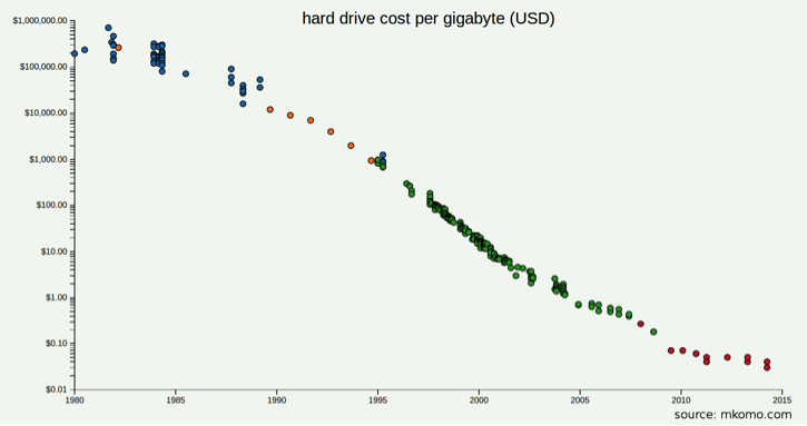
Figure 3-4. Trend of hard drive cost per gigabyte
NOTE
For references to papers describing the anatomy of HDDs (in particular, see Chapter 37 in the book Operating Systems: Three Easy Pieces, by R. Arpaci-Dusseau and A. Arpaci-Dusseau), SSDs, and how to characterize their performance, go to “Readings”.
You can use tools such as Hard Disk Sentinel for benchmarking and monitoring of both HDDs and SSDs. Benchmarks such as IOBench and ATTO Disk Benchmark often are used to measure storage performance.
Consumption rates
When planning the storage needs for an application, the first and foremost consideration should be the consumption rate. This is the growth in data volume measured against a specific length of time. For sites that consume, process, and store rich media files such as images, video, and audio, keeping an eye on storage consumption rates can be critical to the business. But consumption is important to watch even if storage doesn’t grow much at all.
Disk space is about the easiest capacity metric to understand. Even the least technically inclined computer user understands what it means to run out of disk space. For storage consumption, the central question is, “When will I run out of disk space?”
A real-world example: tracking storage consumption
Back at Flickr, a lot of disk space was consumed as photos were uploaded and stored. We’ll use this simple case as an example of planning for storage consumption.
When photos were uploaded, they were divided into different groups based on size and then sent to a storage appliance. (Today, most of the media such as images and videos are stored on either private or public clouds that use commodity servers.) A wide range of metrics related to this process were collected:
-
How much time it takes to process each image into its various sizes
-
How many photos were uploaded?
-
The average size of the photos
-
How much disk space is consumed by those photos?
Later, we’ll see why the aforementioned metrics were chosen for measurement, but for the moment our focus is on the last item: the total disk space consumption over time. This metric was collected and stored on a daily basis. The daily time slice had enough detail to show weekly, monthly, seasonal, and holiday trends. Thus, we could use it to predict when more storage hardware needed to be ordered. Table 3-1 presents disk space consumption (for photos only) for a two-week period.
| Date | Total usage (GB) | Daily usage (GB) |
|---|---|---|
| 07/26 | 14321.83 | 138.00 |
| 07/27 | 14452.60 | 130.77 |
| 07/28 | 14586.54 | 133.93 |
| 07/29 | 14700.89 | 114.35 |
| 07/30 | 14845.72 | 144.82 |
| 07/31 | 15063.99 | 218.27 |
| 08/01 | 15250.21 | 186.21 |
| 08/02 | 15403.82 | 153.61 |
| 08/03 | 15558.81 | 154.99 |
| 08/04 | 15702.35 | 143.53 |
| 08/05 | 15835.76 | 133.41 |
| 08/06 | 15986.55 | 150.79 |
| 08/07 | 16189.27 | 202.72 |
| 08/08 | 16367.88 | 178.60 |
The data in Table 3-1 was derived from a cron job that ran a script to record the output from the standard Unix df command on the storage appliances. The data then was aggregated and included on a metrics dashboard. (Data was also collected in much smaller increments [minutes] using Ganglia, but this is not relevant to the current example.) Upon plotting the data from Table 3-1, two observations become clear, as shown in Figure 3-5.

Figure 3-5. Table of daily disk consumption
From Figure 3-5, we note that the dates 7/31 and 8/07 were high upload periods. In fact, those dates were both Sundays. Indeed, metrics gathered over a long period revealed that Sundays have always been the weekly peak for uploads. Another general trend that you can see in the chart is that Fridays are the lowest upload days of the week. We’ll discuss trends in the next chapter, but for now, it’s enough to know that you should be collecting data with an appropriate resolution to illuminate trends. Some sites show variations on an hourly basis (such as visits to news or weather information); others use monthly slices (retail sites with high-volume periods prior to Christmas).
Today, you can use low-cost services such as Amazon’s Glacier, Google’s Nearline or Coldline Storage, or Microsoft’s Azure’s Cool Blob Storage for storing long-term data. In the context of operations, a capacity planner should challenge the very retention of long-term data. It is not uncommon to come across cases wherein operations data such as 99th percentile of latency is stored spanning several months or even over a year. Barring events such as a Super Bowl, Christmas, or the like, this is perhaps unwarranted. As discussed earlier in the chapter, setting up retention policies is a common way to contain storage costs of monitoring data.
Storage I/O patterns
How you are going to access storage is the next most important consideration. Is one a video site requiring a considerable amount of sequential disk access? Is one using storage for a database that needs to search for fragmented bits of data stored on drives in a random fashion?
Disk utilization metrics can vary depending on what sort of storage architecture you’re trying to measure, but here are the basics:
-
How much is the read volume?
-
How much is the write volume?
-
How long is the CPU waiting for either reading or writing to finish?
Disk drives are the slowest devices in a server. Depending on a server’s load characteristic, these metrics could be what defines the capacity for an entire server platform. We can measure disk utilization and throughput a number of ways. The Read/Write performance—transfer rate in Mbps and average/max latency—of an HDD is evaluated along the following dimensions:
-
Sequential access
-
Random access
-
Bursty load
Appendix C lists a lot of useful disk measurement tools.
Whether you’re using RAID on a local disk subsystem, a Network-Attached Storage (NAS) appliance, a Storage-Area Network (SAN), or any of the various clustered storage solutions, the metrics that you should monitor remain the same: disk consumption and disk I/O consumption. Tracking available disk space and the rate at which you are able to access that space is irrelevant to which hardware solution you end up choosing; you still need to track them both.
Logs and backup: the metacapacity issue
Backups and logs can consume large amounts of storage, and instituting requirements for them can be a large undertaking. Both backups and logs are part of a typical Business Continuity Plan (BCP) and Disaster Recovery (DR) procedure, so you would need to factor in those requirements along with the core business requirements. Everyone needs a backup plan, but for how long do you maintain backup data? A week? A month? Forever? The answers to those questions will differ from site to site, application to application, and business to business.
For example, when archiving financial information, your organization might be under legal obligation to store data for a specific period of time to comply with regulations. On the other hand, some sites—particularly search engines—typically maintain their stored data (such as search logs) for shorter durations in an effort to preserve user privacy.
Storage for backups and log archiving entails identifying how much of each you must have readily available (outlined in retention/purge policies) versus how much you can archive to cheaper (usually slower) hardware. There’s nothing particularly special about planning for this type of storage, but it’s quite often overlooked because sites don’t usually depend on logging and backups for critical guarantees of uptime. We discuss how you should go about measuring the growing storage needs later in this chapter. In Chapter 4, we explore the process of forecasting those needs.
Measuring load on web servers
Web server capacity is application-specific. Generally speaking, web servers are considered frontend machines that accept users’ requests, make calls to backend resources (such as databases or other downstream [micro]services), and then use the results of those calls to generate responses. Some applications make simple and fast database queries; others make fewer but more complex queries. Some websites serve mostly static pages, whereas others prepare mainly dynamic content. We will use both system and application-level metrics to take a long view of the usage metrics, which will serve as the foundation for the capacity plan.
Capacity planning for web servers (static or dynamic) is peak-driven and therefore elastic, unlike storage consumption. The servers consume a wide range of hardware resources over a daily period, and have a breaking point somewhere near the saturation of those resources. The goal is to discover the periodic peaks and use them to drive the capacity trajectory. As with any peak-driven resource, you would want to find out when the peaks occur and then explore what’s actually going on during those cycles.
A real-world example: web server measurement
As an example, let’s take a look at the hourly, daily, and weekly metrics of a single Apache web server. Figure 3-6 presents graphs of all three time frames, from which we’ll try to isolate peak periods. The hourly graph reveals no particular pattern, whereas the daily graph shows a smooth decline and rise. Most interesting in terms of capacity planning is the weekly graph, which indicates Mondays undergo the highest web server traffic. As the saying goes: X marks the spot, so let’s start digging.
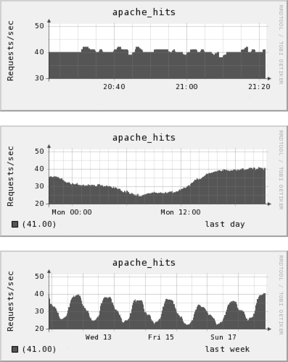
Figure 3-6. Hourly, daily, and weekly view of Apache requests
First, let’s narrow down what hardware resources we’re using. We can pare down this list further by ignoring resources that are operating well within their limits during peak time. Looking at memory, disk I/O, and network resources (not covered in this chapter), we can see none of them come close to approaching their limits during peak times. By eliminating those resources from the list of potential bottlenecks, we already know something significant about the web server capacity. What’s left is CPU time, which we can assume is the critical resource. Figure 3-7 displays two graphs tracking CPU usage.
Figure 3-7 demonstrates that at peak, with user and system CPU usage combined, we’re just a bit above 50 percent of total CPU capacity. Let’s compare the trend with the actual work that is done by the web server so that we can see whether the peak CPU usage has any visible effects on the application layer. Figure 3-8 shows the number of busy Apache processes at each unit of time we measure.

Figure 3-7. User and system CPU on a web server: daily view

Figure 3-8. Busy Apache processes: daily view
The graphs in Figures 3-7 and 3-8 confirm what we might expect: the number of busy Apache processes proportionally follows the CPU usage. Drilling into the most recent RRD values, at 50.7 percent of total CPU usage (45.20 user + 5.50 system), there are 46 Apache processes that are busy. If we were to assume that this relationship between CPU and busy Apache processes stays the same—that is, it’s linear—until CPU usage reaches some high (and probably unsafe) value that is not observed in the graphs, you can have some reasonable confidence that the CPU capacity is adequate.
But, hey, that’s quite an assumption. Let’s try to confirm it through another form of capacity planning: controlled load testing.
Finding web server ceilings in a load-balancing environment
You can simplify capturing the upper limit of a web server’s resources by a design decision that you have probably already made: using a load balancer. To confirm the ceiling estimates with live traffic, increase the production load—by “pulling” servers (e.g., dialing the weights in HAProxy) from the live pool of servers, which increases the load on the remaining servers commensurately—carefully on some web servers and measure the effects it has on resources. We want to emphasize the importance of using real traffic instead of running a simulation or attempting to model a web server’s resources in a benchmark-like setting.

The artificially load-balanced exercise confirms the assumption we made in the previous section, which is: the relationship between CPU usage and busy Apache processes remain (roughly) constant. Figure 3-9 graphs the increase in active Apache processes and corresponding CPU usage. This graph was generated from the RRDs produced by one of the web servers throughout its daily peaks and valleys, sorted by increasing amount of total CPU. It confirms CPU usage does indeed follow the number of busy Apache processes, at least between the values of 40 and 90 percent of CPU.

Figure 3-9. Total CPU versus busy Apache processes
This suggests that, in the current context, it is safe to use CPU as the single defining metric for capacity on the web servers. In addition, it directly correlates to the work done by the web server—and hopefully correlates further to the website’s traffic. Based on this, you can set the upper limit on total CPU to be 85 percent, which gives enough headroom to handle occasional spikes while still making efficient use of the servers.
A little more digging shows the ratio of CPU usage to busy Apache processes to be about 1:1, which allows us to compute one from the other. In general, finding a relationship between system resource statistics and application-level work will be valuable (but is typically not straightforward) when you move on to forecasting usage.
Another benefit of determining the upper limit of a server’s resources is that it serves as a key input to check cluster underutilization, thereby boosting operational efficiency. Cluster underutilization has become increasingly common. We can ascribe this to a multitude of reasons; here are just two:
-
Lack of knowledge of the upper limit of a server’s resources.
-
Ease of horizontal scaling on clouds has, in part, shadowed the emphasis on performance optimization. In particular, it is not uncommon to see large instances—be it with respect to compute, memory, or network—on Amazon Web Services (AWS) EC2 being used unnecessarily and clusters being over-provisioned. Tables 3-2 and 3-3 demonstrates that as of January 2017, the prices vary significantly across different instance types on AWS EC2 and Google Compute Engine.
| Effective Hourly | ||
|---|---|---|
| Reserveda | On-Demand | |
| m4.large | $0.062 | $0.10 |
| m4.xlarge | $0.124 | $0.20 |
| m4.2xlarge | $0.248 | $0.40 |
| m4.4xlarge | $0.496 | $0.80 |
| m4.10xlarge | $1.239 | $2.00 |
| m4.16xlarge | $1.982 | $3.20 |
| ... | ||
| x1.16xlarge | $4.110 | $6.669 |
| x1.32xlarge | $8.219 | $13.338 |
a Standard 1-year term with no upfront cost | ||
| Hourly Price | |
|---|---|
| n1-standard-1 | $0.05 |
| n1-standard-2 | $0.10 |
| n1-standard-4 | $0.19 |
| n1-standard-8 | $0.38 |
| n1-standard-16 | $0.76 |
| n1-standard-32 | $1.52 |
| n1-standard-64 | $3.04 |
| n1-highmem-2 | $0.12 |
| n1-highmem-4 | $0.24 |
| n1-highmem-8 | $0.47 |
| n1-highmem-16 | $0.95 |
| n1-highmem-32 | $1.89 |
| n1-highmem-64 | $3.79 |
| n1-highcpu-2 | $0.07 |
| n1-highcpu-4 | $0.14 |
| n1-highcpu-8 | $0.28 |
| n1-highcpu-16 | $0.57 |
| n1-highcpu-32 | $1.13 |
| n1-highcpu-64 | $2.27 |
Arun (along with his colleagues) had addressed the aforementioned issues back at Netflix, which reduced the operational footprint by several million dollars.
Owing to this, the burn rate increases and then, as an afterthought, operational efficiency comes to the forefront.
Database Capacity
Nearly every dynamic website uses some form of a database to keep track of its data. This means that you need to provide the capacity for it. In the good old days of the LAMP/MAMP world, MySQL and Postgres used to be the favorite databases, whereas Oracle, Microsoft SQL Server, and myriad others also serve as the backend data store for many successful sites.
Outside of the basic server statistics, there are a number of database-specific metrics you would want to track:
-
Queries-per-second (SELECTs, INSERTs, UPDATEs, and DELETEs)
-
Connections currently open
-
Lag time between master and slave during replication
-
Cache hit rates
Planning the capacity needs of databases—particularly clusters of them—can be tricky business. Establishing the performance ceilings of databases can be difficult because there might be hidden cliffs that only reveal themselves in certain edge cases.
For example, back at Flickr, it was assumed that the databases running on a given hardware platform had a ceiling of X queries-per-second before performance began to degrade unacceptably. It was surprising to learn that some queries performed fine for a user with fewer than 10,000 photos, but slowed down alarmingly for a user who had more than 100,000 photos. So, ceilings for the database server that handled users with large numbers of photos were redefined. This type of creative sleuthing of capacity and performance is mandatory with databases and underscores the importance of understanding how the databases are actually being used outside the perspective of system statistics.
At this stage, we’ll reiterate our point about performance tuning. As pointed out in Jeremy Zawodny and Derek Balling’s book, High Performance MySQL, database performance often depends more on the schemas and queries than on the speed of the hardware. Because of this, developers and database administrators focus on optimizing their schemas and queries, knowing that doing so can change the performance of the database quite dramatically. This in turn, affects the database ceilings. One day you might think that you need 10 database servers to get 20,000 queries-per-second; the next day you might find that you need only five. This is because the developers were able to optimize some of the more common (or computationally expensive) queries.
A real-world example: database measurement
Databases are complex beasts, and finding the limits of a database can be time-consuming but well worth the effort. Just as with web servers, database capacity tends to be peak-driven, meaning that their limits are usually defined by how they perform during the heaviest periods of end-user activity. As a result, we generally take a close look at the peak traffic times to see what’s going on with system resources, and then take it from there.

But before we begin hunting for the magical “red line” of database consumption, remember, it is recommended to look at how a database performs with real queries and real data. One of the first things to determine is when the database is expected to run out of hardware resources relative to traffic. Depending on the load characteristics, you might be bound by the CPU, the network, or disk I/O.
If you’re lucky enough to keep the most-requested data in memory, you might find CPU or network resources to be the constraints. This situation makes the hunt for a performance ceiling a bit easier because you would need to track only a single number, as it was discovered when monitoring Apache performance. If data is substantially larger than what you can fit into physical memory, the database’s performance will be limited by the slowest piece of equipment: the physical disk. Because of the random nature of database-driven websites, queries for data on databases tend to be yet even more random, and the resulting disk I/O is correspondingly random. Random disk I/O tends to be slow, because the data being requested is bound by the disk’s ability to seek back and forth to random points on the platter. Therefore, many growing websites eventually have disk I/O as their defining metric for database capacity. Depending on whether a website or mobile app is read-heavy (for example, the New York Times) versus write-heavy (such as Facebook or Instagram) as well as the SLA, the selection of the type of underlying storage—be it HDD or SSD—should be made accordingly (refer to the section “Storage Capacity”).
Let’s use one of the servers as an example. Figure 3-10 shows the relevant MySQL metrics for a single user database during a peak hour. It depicts the rate of concurrent MySQL connections along with the rate of INSERTs, UPDATEs, DELETEs, and SELECTs per second for a single hour. There are a few spikes during this time in each of the metrics, but only one stands out as a potential item of interest.

Figure 3-10. Production database MySQL metrics
The bottom graph shows the amount of database replication lag experienced during the last hour; it peaks at more than 80 seconds. Presence of lag of this degree in database replication generally means that the slaves temporarily lack a lot of the recent data loaded onto the master. If all user queries are directed to the slaves, which means until the slaves catch up to the master, users won’t see the most up-to-date data. This can cause various unwelcome effects, such as a user annotating a photo, clicking the Submit button, but not seeing that comment right away. This is confusing for the user and can result in all sorts of out-of-sync weirdness. Even if you were to know from past experience that the databases are disk I/O bound, you would still want to confirm that by taking a look at disk utilization and I/O wait in Figure 3-11.
In this example, Ganglia was used to collect and plot disk utilization statistics for the database. These are reported every 60 seconds by some of the fields returned by the Linux iostat command, %iowait and %ioutil. Note on the graph that although disk utilization jumped up to 100 percent more than once, it was only during the period when I/O wait exceeded the 40 percent mark that the MySQL replication lag jumped.

Figure 3-11. Production database disk utilization and I/O wait
What does this mean? With nothing more than a cursory look at the metrics, we can deduce that replication slave lag is caused by disk I/O wait rather than disk utilization. We can further deduce that the replication lag becomes a problem only at a disk I/O wait of 40 percent or higher. Keep in mind that these results apply only to a particular configuration; this is an example rather than a general rule. The results make us wonder: could they indicate something defective with this particular server? Possibly, and the hypothesis should be easy enough to verify by provoking the behavior on similar production hardware. In this case, the examination of graphs from other servers demonstrates the relationship to be a general one that applied to Flickr activity at the time: other databases of identical hardware in production experience replication lag starting in, or near 40 percent disk I/O wait.
Armed with these metrics, it can be said with high confidence that the 40 percent disk I/O wait threshold is the ceiling for this database. As it relates to hardware configuration and the database query mix and rate, you should plan on staying below 40 percent disk I/O wait. But what does that mean in terms of actual database work? Before we dig into the numbers a bit further, let’s apply the same test method as we did with the web servers: increase production load on the database.
Finding database ceilings
A more focused and aggressive approach to finding database ceilings is to slowly (but again, carefully) increase the load on a live production server. If you maintain only a single database, this can be difficult to do safely. With only a single point of failure, testing runs the risk of bringing the site down entirely. This exercise becomes markedly easier if your organization employs any sort of database load balancing (via hardware appliance or within the application layer). Figure 3-12 revisits the diagram of a common database architecture, this time with more real-world details added.
In this scenario, all database write operations are directed to the master; read functions are performed by database slaves. The slaves are kept up-to-date by replication. To pinpoint the ceilings of the database slaves, you want to increase the load on one of them by instructing an application to favor that particular device. If your organization operates a hardware load balancer for the databases, you might be able to weight one of the servers higher than the others in the balanced pool.
Increasing load to a database in this manner can reveal the effects load has on the resources, and hopefully expose the point at which the load will begin to affect replication lag. In our case, we’d hope to confirm the educated guess of 40 percent disk I/O wait is the upper limit that the database can withstand without inducing replication lag.

Figure 3-12. A master-slave database architecture
This example reflects a common database capacity issue defined by disk I/O. The databases might be CPU-, memory-, or network-bound, but the process of finding the ceiling of each server is the same.
Caching Systems
We mentioned earlier that disks are the slowest pieces of an infrastructure, which makes accessing them expensive in terms of time. Most large-scale sites alleviate the need for making these expensive operations by caching data in various locations.
In web architectures, caches are most often used to store database results (as with Memcached) or actual files (as with Squid or Varnish). Both approaches call for the same considerations with respect to capacity planning. They are examples of reverse proxies, which are specialized systems that cache data sent from the web server to the client (usually a web browser).
First, let’s take a look at the diagram in Figure 3-13 to see how Squid and Varnish caching normally works with servers. As Figure 3-14 shows, the diagram differs only slightly when illustrating database caching in the style of Memcached.

Figure 3-13. Basic content server caching mechanisms (reverse-proxy)

Figure 3-14. Database caching
Cache efficiency: working sets and dynamic data
The two main factors affecting cache capacity are the size of the working set—the amount of memory that a process requires in a given time interval—and the extent to which the data is dynamic or changing.
How often the data changes will dictate whether you would choose to cache that data. On one end of the spectrum is data that almost never changes. Examples of this type of data include usernames and account information. On the other end of the spectrum is information that changes frequently, such as the last comment made by a user, or the last photo uploaded. Figure 3-15 illustrates the relationship between caching efficiency and types of data.
It should be obvious that there’s no benefit in caching data that changes frequently, because the proxy will spend more time invalidating the cache than retrieving data from it. Every application will have its own unique characteristics with respect to caching, so there isn’t any rule of thumb to follow. However, measuring and recording the cache’s hit ratio is imperative to understanding how efficient it is. This can help guide your capacity plan and hopefully steer how (and when) you would want to cache objects.

Figure 3-15. Cache efficiency depends on rate of change
The other major consideration is the size of the working set of cacheable objects. Caches have a fixed size. The working set of cacheable objects is the number of unique objects, whether database results or files, that are requested over a given time period. Ideally, you would have enough cache capacity to handle the entire working set. This would mean the vast majority of requests to the cache would result in cache hits. However, in real terms, there could be many reasons why you can’t keep all the objects you want in cache. You would then need to depend on something called cache eviction to make room for new objects coming in. We’ll present more on cache eviction later.
To function, caching software needs to keep track of its own metrics internally. Because of this, most caches expose those metrics, allowing them to be measured and recorded by the monitoring tools. Back at Flickr, we used Squid for reverse-proxy caching of photos. Slower, cheaper, and larger-capacity disks were used to store the photos. At the same time, caching systems that use smaller and faster disks to serve those photos were also employed. The number of caching servers was horizontally scaled as the request rate for photos increased. Additionally, the backend persistent storage was horizontally scaled as the number of photos grew. Each caching server had a limited amount of disk and memory available to use as cache. Because the working set of photos was too large to fit into the caches, the caches used to fill up. A full cache needs to constantly make decisions on which objects to evict to make room for new objects coming in. This process is based on a replacement or “eviction” algorithm. There are many eviction algorithms, but one of the most common is Least Recently Used (LRU), which is demonstrated in Figure 3-16.

Figure 3-16. The LRU cache eviction algorithm
Here are some other popular cache eviction algorithms:
-
First In First Out (FIFO)
-
Last In First Out (LIFO)
-
Least Frequently Used (LFU)
NOTE
For a reference to a survey by Podlipnig and Boszormenyi, go to “Readings”.
As requests come into a cache, the objects are organized into a list based on when each was last requested. A cache-missed object, once retrieved from the origin server, will be placed at the top of the list, and a cache hit will also be moved from its current location to the top of the list. This keeps all of the objects in order from most recently used to least recently used. When the cache needs to make room for new objects, it will remove objects from the bottom of the list. The age of the oldest object on the list is known as the LRU reference age; this is an indicator of how efficient the cache is, along with the hit ratio.
The LRU algorithm is used in Memcached, Squid, Varnish, and countless other caching applications. Its behavior is well known and relatively simple to understand. Squid offers a choice of some more complex eviction algorithms, but nearly all of the most popular database caches use the LRU method. Following are the most important metrics to track with any caching software:
-
Cache hit ratio
-
Total request rate
-
Average object size
-
LRU reference age (when using the LRU method)
Let’s take a look at some caching metrics (compiled using Squid) from production.
Establishing Caching System Ceilings
The capacity of caching systems is defined differently depending on their usage. For a cache that can hold its entire working set, the request rate and response time might dictate its upper limits. In this case, you again can make use of the same method that was applied to web serving and database disk I/O wait: carefully increase the load on a server in production, gather metric data along the way, and tie system resource metrics (CPU, disk I/O, network, memory usage) to the caching system metrics listed in the previous section.
Determining the ceiling of a cache when it is constantly full and must continually evict objects is a complicated exercise. It might better be defined not by request rate, but by its hit ratio (and indirectly, its reference age).
Table 3-4 summarizes cache planning considerations.
| Type of cache use | Characteristics | Cache ceilings | Resource ceilings |
|---|---|---|---|
| Small or slowly increasing working set | 100 percent contained in cache | Request rate | Disk I/O utilization and wait, CPU and memory usage |
| Large or growing working set | Moving window, constant eviction (churn) | Hit ratio, LRU reference age | Cache size |
A real-world example: cache measurement
As we mentioned earlier, at Flickr all of the metrics mentioned in the previous section were considered. The caches were constantly full, and cache eviction is a continuous process as users regularly upload new photos. Squid’s memory and disk cache were measured, as well. Let’s first take a look at the graphs in Figure 3-17 to see what effect request rates had on the system resources.

Figure 3-17. Five-month view of Squid request rate and CPU load (user and system)
As you can see from the graphs, the Squid request rate increased steadily within the time period shown. The zigzag pattern represents the weekly peak activity periods (Mondays). For the same time period, the total CPU usage has increased, as well, but there was no immediate risk of running out of CPU resources. Because there was an extensive use of disk cache on the Squid servers, you would want to take a look the disk I/O usage, as well; refer to Figure 3-18 for the results. The figure confirms what was suspected: the amount of operations waiting for disk activity follows the rate of requests in near perfect synchronization. Because one now knows that the Squid server uses the disk more than any other resource, such as CPU or memory, this tells us that the defining peak resource metric is disk I/O wait—the same as the database ceiling. If you were to zoom into the data using RRDTool to overlay disk I/O wait and request rate, you could plot them against each other in Excel, as shown in Figure 3-19.

Figure 3-18. Five-month view of Squid server disk I/O wait and utilization

Figure 3-19. Squid request rate versus disk I/O wait: daily view
Now that the correlation has been established, let’s sort the data in Excel as a function of increasing order and plot it again. As illustrated in Figure 3-20, this permits us to more easily see the trends related to the amount of the data requested at a particular moment. Now, we can clearly see how the two metrics relate to each other as they go up and how disk I/O wait affects Squid’s performance.

Figure 3-20. Squid request rate versus disk I/O wait: increasing view
Squid keeps internal metrics regarding the time it takes to handle both cache hits and misses. One can collect those metrics in Ganglia, as well. We’re not very concerned about the time spent for cache misses, because for the most part that doesn’t inform us as to the upper limits of the cache—handling a miss mostly strains the network and origin server. Hits come from Squid’s memory and disk cache, so that merits attention. Figure 3-21 presents the results over a five-month period.

Figure 3-21. Squid hit time (in milliseconds): five-month view
This illustrates how the time for a cache hit has not changed significantly over the time period we’re measuring (hovering around 100 milliseconds). Note that Squid’s “time-to-serve” metrics include the time until the client finishes receiving the last byte of the response, which can vary depending on how far the clients are from the server. This informs us that although disk I/O wait has increased, it has not affected the response time of the Squid server—at least not with the load it has been experiencing. We’d like to keep the time-to-serve metric within a reasonable range so that the user isn’t forced to wait for photos, so we’ve arbitrarily set a maximum time-to-serve of 180 milliseconds for this particular server; we’ll still want to stay below that. But what amount of traffic will push the time-to-serve above that threshold?
To find out, let’s go to the stalwart load-increasing exercise—increase production load slowly on the servers while recording their metrics. Based on the context, you should watch for the following: the threshold at which disk I/O wait begins to affect cache hit response time. You should increase the request rate to the Squid server slowly to avoid completely flooding the hit ratio. As depicted in Figure 3-22, by either replaying URLs via Httperf or Siege, or by removing servers from a load-balanced pool, the request rate can be bumped up gradually on a single Squid server.

Figure 3-22. Testing for Squid ceilings: serving time versus disk I/O wait
As you can see, the service time increases along with the disk I/O wait time (no surprise there). Due to a wide range of photo sizes, there’s a lot of variation in the data for time-to-serve, but you would note serving times of 180 milliseconds at approximately 40 percent disk I/O wait. The only task remaining is to find the request rate at which that threshold was hit (see Figure 3-23). Here, the “red line” can be seen—at 40 percent disk I/O wait, upward of 850 requests per second can be processed. If time-to-serve were to be used as a guide, this is going to be the maximum performance that you can expect from the hardware platform with this particular configuration.

Figure 3-23. Squid request rate versus disk I/O wait, ceiling
However, we’re not done with the cache measurements. You also should analyze how the cache’s efficiency—with respect to hit ratio and LRU reference age—changes over time owing to a dynamic working set. Figure 3-24 presents the results from a five-month view.

Figure 3-24. Cache hit ratios (percent) and LRU age (days): five-month view
These two graphs display the hit ratio and LRU reference age of a particular Squid caching server that was used to serve images over a period of five months. The hit ratio is expressed as a percentage, and the LRU reference age as units of days. During that time, LRU age and hit rate have both declined at a small but discernible rate, which we can attribute to the increase in photos being uploaded by users. As the working set of requested photos grows, the cache needs to work increasingly harder to evict objects to make room for new ones. But even with this decrease in efficiency, it appears that with a 72 percent hit rate, the LRU reference age for this server is about three hours. This is nothing to sneeze at and is acceptable in the current context. You would want to keep an eye on the hit rate as time goes on and continue to tune the cache size as appropriate.
To summarize, this exercise involved two metrics related to the ceilings experienced by the caching system: disk I/O wait and cache efficiency. As the request rate goes up, so does the demand on the disk subsystem and the time-to-serve. At roughly 850 requests per second, what was deemed to be an acceptable end-user experience could be maintained. In general, as you approach the SLA, the number of cache servers should be increased so as to comfortably handle the load. The ceiling of 850 requests per second assumed a steady cache hit ratio (which in practice can also change over time).
Special Use and Multiple Use Servers
In the web server example, CPU usage was the defining metric. Admittedly, this makes the job pretty easy; we have a fixed amount of CPU to work with. It was also made less difficult by virtue of the fact that Apache was the only significant application using the CPU. There are many circumstances, though, in which we don’t have the luxury of dedicating each server to do a single task. Having a server perform more than one task—email, web, uploads—can make more efficient use of the hardware, but it complicates taking measurements.
The approach thus far has been to tie system resources (CPU, memory, network, disk, and so on) to application-level metrics (Apache hits, database queries, etc.). When you run many different processes, it’s difficult to track how their usage relates to one another, and how each process might signal that it’s reaching the upper limits of efficient operation. Further, in a cloud environment, there might be processes of others running on the same node/cluster; that is, the environment might be multitenant, which is very typical of public clouds. But simply because this scenario can complicate capacity measurements, you need not assume that it makes planning impossible.
To discern what processes are consuming which resources, you’ll want to do one of the following:
-
Isolate each running application or microservice and measure its resource consumption.
-
Hold some of the applications’ resource usage constant in order to measure one at a time.
The process requires some poking around in the data to find situations in which events just happen to run controlled experiments implicitly. For instance, as we’ll see in the example later in this section, it was noticed that two days had similar web server traffic but different CPU usage. This oddity could have been exploited potentially to find out the constraints on capacity for the web server.
Back at Flickr, the photo upload and processing tasks resided on the same machines that were serving pages for the Flickr.com website; that configuration made capacity planning difficult. Image processing is a CPU-intensive task, and as the number of uploads increased, so did the dependence on disk I/O resources. Add to that the increase in traffic, and it was discovered that three different jobs were all fighting for the same resources.
At any given moment, it wasn’t exactly certain how much hardware was being used for each process, so the following application-level metrics were additionally measured to guide the estimates:
-
Photo uploads (which mostly drove disk I/O and network utilization)
-
Image processing (which drove CPU utilization)
-
Serving the site’s pages (which drove both memory and CPU utilization)
Based on prior knowledge of the traffic pattern and shape for each system metric, the latter could be correlated to the tasks they were doing. The objective was to isolate the resource effects of each of those tasks to track them separately, or at least get a good idea of what was doing what. Having these metrics already stored in RRD files, their values were dumped to text and then loaded into Excel for graphing and analysis.
First, a two-day period was found in which the pattern of web traffic was similar for both days (Figure 3-25). At that time, the burden on the web servers included not only serving the site’s page, but taking in photo uploads and processing them, as well.

Figure 3-25. Two-day view of Apache requests
Now let’s take a look at the system resources. In Figure 3-26, the CPU usage from Figure 3-25 is overlaid onto the web server data for the same time period.

Figure 3-26. Web server work versus total CPU: two-day view
Clearly, the CPU was working harder on the second day, even though the amount of Apache traffic was roughly the same. The only other task this server was doing was image processing; so, we could attribute the different CPU usage to image processing. Figure 3-27 uncovers what was suspected: the extra CPU consumption on the second day was due to photo processing. This activity actually occurred over a weekend, and, as mentioned earlier in the chapter, Sundays are a high upload day. Figure 3-28 plots the photo processing rates for both days against each other and shows the differences. Note that while the peaks for Sunday were more than 20 percent higher, during the evening the rate dropped below that of Saturday’s rates at the same time, making the difference negative on the graph.

Figure 3-27. Total CPU versus photo processing rate, two-day view

Figure 3-28. Saturday and Sunday photo processing rates
Figure 3-29 highlights that, at least for the weekend under consideration, every 30 photos processed per minute corresponds to an additional 25 percent CPU utilization.

Figure 3-29. Photo processing rate and CPU usage, distilled from two-day data
This is an extremely rough estimate based on a small sample, and you should consider this nothing more than an example of how to isolate resource usage on a multiple-use system. Confirming this 25:30 ratio using proper rigor would mean looking at a larger range of traffic and upload rates and comparing the data again. But this process gives us a starting point from which the ceilings can be determined. In this situation, an ideal scenario is one in which the two variables (web traffic and upload rates) are being tracked and we can figure out how many machines are needed if both processes run on each machine. This process worked for more than a year in planning the capacity for Flickr’s web servers. Eventually, image processing was assigned its own dedicated cluster that could take advantage of multicore CPUs—another example of diagonal scaling at work.
API Usage and Its Effect on Capacity
As more and more websites use open APIs to provide access to their services to external developers, capacity planning for the use of those services must follow. You might have guessed by now that we are strong advocates of application-level metrics as well as system metrics and API usage is the area where application-level metrics can matter the most. When you allow others access to data via an open API, you are essentially allowing a much more focused and routine use of a website.
One of the advantages of having an open API is that it allows for more efficient use of an application. If external developers wanted to gain access to data and no API methods existed, they might screen scrape the site’s pages to get at the data, which is extremely inefficient for a number of reasons. If they’re interested only in a specific piece of data on the page, they’d still need to request the entire page and everything that entails, such as downloading CSS markup, JavaScript, and other components necessary for a client’s browser to render the page, but is of no interest to the developer. Although APIs allow more efficient use of an application, if not tracked properly, they also expose a web service to potential abuse because they enable other applications to ask for those specific pieces of data. To address this, it is has become routine for services that expose an API—such as Google Maps and Facebook Graph API—to rate-limit the call rate on a per-endpoint basis. Even consumer-facing services such as Google Search have set up checks to curtail traffic driven by bots.
Having some way to measure and record the usage of an open API on a per-user, or per-request-method basis, should be considered mandatory in capacity tracking on a site offering a web API. This is commonly done through the use of unique API keys or other unique credentials. Upon each call to the API, the key identifies the application and the developer responsible for building the application. Because it’s much easier to issue an enormous volume of calls to an API than to use a regular client browser, you should keep track of what API calls are being made by what application, and at what rate.
Back at Flickr, any key that appeared to be abusing the API was automatically invalidated, according to provisions outlined in the Terms of Service. A running total was maintained every hour for a) every API key that made a call, b) how many calls were made, and c) the details of each call (refer to Figure 3-30 for the basic idea of API call metrics). With this information, you can identify which API keys are responsible for the most traffic—you can potentially set up a tiered pricing system based on this. You should keep track of the details of each key, as shown in Figure 3-31.

Figure 3-30. Keeping track of API request statistics

Figure 3-31. API key details and history
By collecting this information on a regular basis, you will have a much better idea of how API usage affects the resource consumption. You then can adjust API limits as the capacity landscape changes.
Examples and Reality
Each application and type of data affects system resources differently. The examples in this chapter simply illustrate the methods and thought processes by which you can investigate and form a better understanding of how increased load can affect each part of an infrastructure. The important lesson to retain is that each component of an architecture will spend system resources to serve the website, and you should ensure that the consumption of those resources is measured accurately. However, recording the right measurements isn’t enough. You need to have some idea of when those resources will run out, and that’s why you should periodically reestablish those ceilings. This is particularly important in the context of Agile development for which the performance profile of a given application or microservice can change materially in a short amount of time.

Running through the exercise of finding the upper limits of an architecture can reveal the bottlenecks that you didn’t even know existed. As a result, you might make changes to the application, hardware, network, or any other component responsible for the problem. Every time you make a change to the architecture, you should check the resource ceilings again, because they’re likely to change. This shouldn’t be a surprise, because capacity planning is a process, not a one-time event.
Summary
Measurement is a necessity, not an option. It should be viewed as the eyes and ears of an infrastructure. It can inform all parts of an organization: finance, customer care, engineering, and product management.
Capacity planning can’t exist without the measurement and history of a system and application-level metrics. Planning is also ineffective without knowing a system’s upper performance boundaries so that you can avoid approaching them. Finding the ceilings of each part of an architecture involves the same process:
-
Measure and record the server’s primary function.
Examples: Apache hits, database queries
-
Measure and record the server’s fundamental hardware resources.
Examples: CPU, memory, disk, network usage
-
Determine how the server’s primary function relates to its hardware resources.
Example: n database queries result in m percent CPU usage
-
Find the maximum acceptable resource usage (or ceiling) based on both the server’s primary function and hardware resources by using one of the following methods:
-
Artificially (and carefully) increasing real production load on the server through manipulated load balancing or application techniques.
-
Simulating as close as possible a real-world production load.
-
Readings
Performance
-
J. M. Anderson et al. (1997). Continuous profiling: where have all the cycles gone?
-
G. Ren et al. (2010). Google-Wide Profiling: A Continuous Profiling Infrastructure for Data Centers.
-
J. Dai et al. (2011). HiTune: dataflow-based performance analysis for big data cloud.
-
M. Kambadur et al. (2012). Measuring interference between live datacenter applications.
-
Ú. Erlingsson et al. (2012). Fay: Extensible Distributed Tracing from Kernels to Clusters.
-
B. Gregg. (2012). Thinking Methodically about Performance.
-
M. Schwarzkopf et al. (2013). Omega: flexible, scalable schedulers for large compute clusters.
-
C. Wang et al. (2013). Performance troubleshooting in data centers: an annotated bibliography?
-
S. Mahlke et al. (2013). Instrumentation sampling for profiling datacenter applications.
-
A. Verma et al. (2015). Large-scale cluster management at Google with Borg.
-
S. Kanev et al. (2015). Profiling a warehouse-scale computer.
-
B. Burns et al. (2016). Borg, Omega, and Kubernetes: Lessons learned from three container-management systems over a decade.
-
W. Hassanein. (2016). Understanding and improving JVM GC work stealing at the data center scale.
-
Y. Zhang et al. (2016). History-based harvesting of spare cycles and storage in large-scale datacenters.
Network
-
A. Singh et al. (2015). Jupiter Rising: A Decade of Clos Topologies and Centralized Control in Google’s Datacenter.
-
C. Guo et al. (2015). Pingmesh: A Large-Scale System for Data Center Network Latency Measurement and Analysis.
-
Y. E. Sung et al. (2016). Robotron: Top-down Network Management at Facebook Scale.
-
R. Govindan et al. (2016). Evolve or Die: High-Availability Design Principles Drawn from Googles Network Infrastructure.
-
P. Tammana et al. (2016). Simplifying datacenter network debugging with PathDump.
-
Y. Geng et al. (2016). Juggler: a practical reordering resilient network stack for datacenters.
-
K. He et al. (2016). AC/DC TCP: Virtual Congestion Control Enforcement for Datacenter Networks.
-
T. Chen, X. Gao and G. Chen. (2016). The features, hardware, and architectures of data center networks.
-
W. M. Mellette et al. (2016). P-FatTree: A multi-channel datacenter network topology.
Load Balancer
-
D. E. Eisenbud et al. (2016). Maglev: a fast and reliable software network load balancer.
Storage
-
C. Ruemmler and J. Wilkes. (1993). UNIX Disk Access Patterns.
-
C. Ruemmler and J. Wilkes. (1994). An introduction to disk drive modeling.
-
D. Anderson et al. (2003). More Than an Interface—SCSI vs. ATA.
-
D. Anderson. (2003). You Don’t Know Jack About Disks.
-
W. W. Hsu and A. J. Smith. (2004). The performance impact of I/O optimizations and disk improvements.
-
J. Elerath. (2007). Hard Disk Drives, The Good, Bad and Ugly.
-
M. K. McKusick. (2012). Disks from the Perspective of a File System: Disks lie. And the controllers that run them are partners in crime.
-
M. Cornwell. (2012). Anatomy of a Solid-state Drive.
Database and Caching
-
P. J. Denning. (1968). The working set model for program behavior.
-
P. J. Denning. (1980). Working Sets Past and Present.
-
H.-T. Chou and D. J. DeWitt. (1985). An Evaluation of Buffer Management Strategies for Relational Database Systems.
-
E. J. O’Neil et al. (1993). The LRU-K Page Replacement Algorithm for Database Disk Buffering.
-
R. Nishtala et al. (2013). Scaling Memcache at Facebook.
-
S. Podlipnig and L. Boszormenyi. (2003). A Survey of Web Cache Replacement Strategies.
Resources
-
“A Working Theory-of-Monitoring.” (2013) https://www.usenix.org/conference/lisa13/working-theory-monitoring.
-
“eBPF and systems performance.” (2017) https://www.oreilly.com/ideas/ebpf-and-systems-performance.
-
“Runtime metrics.” https://docs.docker.com/engine/admin/runmetrics.
-
“Linux Performance Analysis in 60,000 Milliseconds.” (2015) http://www.brendangregg.com/Articles/Netflix_Linux_Perf_Analysis_60s.pdf.
-
“Linux Performance.” http://www.brendangregg.com/linuxperf.html.
-
“UNIX Load Average Part 1: How It Works.” (2010) http://www.teamquest.com/files/9214/2049/9761/ldavg1.pdf.
-
“UNIX Load Average Part 2: Not Your Average Average.” (2010) http://www.teamquest.com/import/pdfs/whitepaper/ldavg2.pdf.
-
“Understanding load averages and stretch factors.” (2007) http://www.linux-magazine.com/content/download/62593/485442/Load_Average.pdf.
-
“Systemtap tutorial.” (2015) https://sourceware.org/systemtap/tutorial.pdf.
-
“ktap GitHub repo.” https://github.com/ktap/ktap.
-
“Thoughts on Time-series Databases.” (2015) http://jmoiron.net/blog/thoughts-on-timeseries-databases.
-
“MEAN’s great, but then you grow up.” (2014) https://rclayton.silvrback.com/means-great-but-then-you-grow-up.
-
“Load Balancing Methods & Algorithms.” http://www.peplink.com/technology/load-balancing-algorithms/.
-
“SSD vs HDD.” http://www.storagereview.com/ssd_vs_hdd.
-
“The sorry state of server utilization and the impending post-hypervisor era.” (2013) http://bit.ly/sorry-state-server.
-
“How one startup hopes to solve server underutilization.” (2015) http://bit.ly/solve-server-under.
-
“Cache replacement policies—References.” http://bit.ly/cache-replacement-policies.
1 There exist several commercial services for RUM, such as Catchpoint, Keynote, Soasta, and ThousandEyes.