
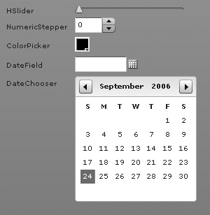
Value selectors are components that allow the user to select a value. This is a fairly
diverse category of components because the types of values they allow the
user to select and the ways in which they allow the user to select the
values are quite different. Figure 7-3
shows the basic value selector components (except for VSlider, because it is the vertical version of
HSlider, which is shown).
The slider components (HSlider and VSlider) differ only in that one is horizontal and one is vertical.
Otherwise, they behave identically. The slider components allow the user
to select a numeric value along a range from a minimum to a maximum value.
The default range is 0 to 10, but you can adjust the range using the
minimum and maximum properties. The slider components allow
the user to drag a thumb along that range. Optionally, you can add more
than one thumb and allow the user to select a range of values. Use the
thumbCount property to specify the number of thumbs. The following example adds
a new thumb when the user clicks on the button:
<?xml version="1.0" encoding="utf-8"?>
<mx:Application xmlns:mx="http://www.adobe.com/2006/mxml" layout="vertical">

    <mx:Script>
        <![CDATA[

            private function addThumb():void {
                hslider.thumbCount++;
            }

        ]]>
    </mx:Script>
    <mx:HSlider id="hslider" />
    <mx:Button label="Add Thumb" click="addThumb();" />
</mx:Application>
You may notice that when you add a new thumb, all the thumbs are
reset back to 0 even if you had moved them previously. To maintain the
values you must read the values prior to incrementing the thumbs and then
reassign them just after incrementing the thumbs. When there's just one
thumb, you can read the value using the value property. When there are many thumbs, you
must use the values property, which is
an array of values. The following rewrite of addThumb() reads the values, increments thumbCount, and then reassigns the preexisting
values to the slider:
private function addThumb():void {
                var values:Array = hslider.values;
                hslider.thumbCount++;
               values.unshift(0);
               hslider.values = values;
            }
The numeric stepper control allows the user to select a numeric value as well. However, the interface for a numeric stepper is quite different from that of a slider interface. Whereas a slider interface is very graphical, the numeric stepper interface actually displays the current numeric value in digits, allowing the user to scroll through the list of possible values in the range.
The color picker component is very useful for allowing the user to select a color value from an expandable/collapsible grid of color swatches. The following simple example uses a color picker and a text area. The color style of the text area is data-bound to the color picker value, effectively changing the text color when the user changes the color picker value.
<mx:ColorPicker id="colorPicker" />
    <mx:TextArea color="{colorPicker.value as int}" />
The date field and date chooser components are useful for allowing the user to select date values. The date field component is a good way to allow the user to select a single date in a compact form. Although the date field component expands to display a calendar while the user is selecting a date, it again collapses to a compact form once the user has selected a value. The date chooser component, on the other hand, is an expanded format component that always displays the calendar from which the user can select a date. The date chooser component also allows the user to select multiple dates and ranges of dates.