
Chapter 10. Desktop Applications
Java leapt to fame and glory on the power of applets—amazing, interactive elements on a web page. Sounds mundane these days but at the time it was nothing short of a marvel. But Java also had cross-platform support up its sleeve and could run the same code on Windows, Unix, and Mac systems. The early JDKs had a rudimentary set of graphical components collectively known as the Abstract Window Toolkit (AWT). The “abstract” in AWT comes from the use of common classes (Button, Window, etc.) with native implementations. You write AWT applications with abstract, cross-platform code; your computer runs your application and provides concrete, native components.
That nifty combination of abstract and native comes with some pretty serious limitations, unfortunately. In the abstract realm, you encounter “lowest common denominator” designs that only give you access to features available on every platform Java supports. The native implementations meant that even some features roughly available everywhere were distinctly different when actually rendered on the screen. Many desktop developers working with Java in those early days joked that the “write once, run everywhere” tagline was really “write once, debug everywhere”. The Java Swing package set out to ameliorate this woeful state. While Swing didn’t solve every problem of cross-platform application delivery, it did make serious desktop application development possible in Java. You can find many quality open source projects and even some commercial applications written in Swing. Indeed, the IDE we detail in Appendix A, IntelliJ IDEA, is a Swing application! It clearly goes toe-to-toe with native IDEs on both performance and usability.1
If you look at the documentation for the javax.swing2 package, you will see it contains a multitude of classes. And you will still need some pieces of the original java.awt realm as well. There are entire books on AWT (Java AWT Reference, Zukowski) and on Swing (Java Swing, 2e, Loy, et al.), and even books on subpackages such as 2D graphics (Java 2D Graphics, Knudsen). In this chapter, we’ll settle for covering some popular components such as buttons and text fields. We’ll look at how to lay them out in your application window and how to interact with them. You may be surprised by how sophistocated your application can get with these simple starting topics. If you do more desktop development after this book, you may also be surprised how much more graphical user interface (GUI, or just UI) content is out there for Java. We want to whet your appetite while acknowledging that there are many, many more UI discussions we must leave aside for you to discover later. With that said, let the whirlwind tour commence!
Buttons and sliders and text fields, oh my!
So where to begin? We have a bit of a chicken and the egg problem. We need to discuss the “things” to put on the screen, such as the JLabel objects we used in “HelloJava”. But we also need to discuss what you put those things into. And where you put those things merits discussion as it’s a non-trivial process. So now we have a chicken, egg, and brunch problem. Grab a cup of coffee or a mimosa and we’ll get started. We will cover some popular components (the “things”) first, then their containers, and finally the topic of laying out your components in those containers. Once you can put a nice set of widgets on the screen, we’ll discuss how to interact with them as well as how to handle the UI in a multi-threaded world.
Component hierarchies
As we’ve discussed in previous chapters, Java classes are designed and extended in a hierarchical fashion. JComponent and JContainer sit at the top of the Swing class hierarchy as shown in Figure 10-1. We won’t cover these two classes in much detail, but remember their names. You will find several common attributes and methods in these classes as you read the Swing documentation. As you advance in your programming endeavors, you’ll likely hit a point where you want to build your own component. JComponent is a great starting point. We’ll be doing just that to fill out our apple tossing game example.

Figure 10-1. Partial (very partial) Swing class hierarchy
We will be covering most of the other classes mentioned in the abridged hierarchy above, but you will definitely want to visit the online documentation to see the many components we had to leave out.
Model View Controller architecture
At the base of Swing’s notion of “things” is a design pattern known as MVC—Model View Controller. The Swing package authors worked hard to consistently apply this pattern so that when you encounter new components, their behavior and usage should feel familiar. MVC architecture aims to compartmentalize what you see (the View) from the behind-the-scenes state (the Model) and from the collection of interactions (the controller) that causes changes to those parts. This separation of concerns allows you to concentrate on getting each piece right. Network traffic can update the model behind the scenes. The view can be synchronized at regular intervals that feel smooth and responsive to the user. MVC provides a powerful yet manageable framework to use when building any desktop application.
As we look at our small selection of components, we’ll highlight the model and the view elements. We’ll then go into more detail on the controllers in “Events”. If you find the notion of programming patterns intriguing, Design Patterns (Addison-Wesley, 1994) by Gamma, Helm, Johnson, and Vlissides (the reknowned Gang of Four) is the seminal work. For more details on the use of the MVC pattern in Swing, see the introductory chapter of Java Swing, 2nd Edition by Loy, Eckstein, Wood, Elliott, and Cole.
Labels and Buttons
The simplest UI component is not surprisingly almost one of the most popular. Labels are used all over the place to indicate functionality, display status, and draw focus. We used a label for our first graphical application back in Chapter 2. We’ll use many more labels as we continue building more interesting programs. The JLabel component is a versatile tool. Let’s get some examples up so we can see how to use JLabel and customize its many attributes. We’ll start by revisiting our “Hello, Java” program with a few preparatory tweaks.
packagech10;importjavax.swing.*;importjava.awt.*;publicclassLabels{publicstaticvoidmain(String[]args){JFrameframe=newJFrame("JLabel Examples");frame.setLayout(newFlowLayout());frame.setDefaultCloseOperation(JFrame.EXIT_ON_CLOSE);frame.setSize(300,300);JLabelbasic=newJLabel("Default Label");frame.add(basic);frame.setVisible(true);}}
Briefly, the interesting parts are:

Setting the layout manage for use by the frame.

Setting the action taken when using the operating system’s “close” button (in this case, the red dot in the upper left corner of the window). The action we selected here exits the application.

Creating our simple label.
You can see the label declared and initialized then added to the frame. Hopefully that is familiar. What is likely new is our use of a FlowLayout instance. That line helps us produce the screenshot show in Figure 10-2.

Figure 10-2. A single, simple JLabel
We’ll go over layout managers in much more detail in “Containers and layouts” but we need something to get us off the ground that also allows us to add mutliple components to a single container. The FlowLayout class fills a container by horizontally centering components at the top, adding from left to right until that “row” runs out of room and then continuing on a new row below. This type of arrangment won’t be of much use in larger applications, but it is ideal for getting several things on the screen quickly.
Let’s prove that point by adding a few more labels. Just add a few more label declarations and add them to the frame then check out the results shown in Figure 10-3.
publicclassLabels{publicstaticvoidmain(String[]args){JFrameframe=newJFrame("JLabel Examples");frame.setLayout(newGridLayout(0,1));frame.setDefaultCloseOperation(JFrame.EXIT_ON_CLOSE);frame.setSize(300,300);JLabelbasic=newJLabel("Default Label");JLabelanother=newJLabel("Another Label");JLabelsimple=newJLabel("A Simple Label");JLabelstandard=newJLabel("A Standard Label");frame.add(basic);frame.add(another);frame.add(simple);frame.add(standard);frame.setVisible(true);}}
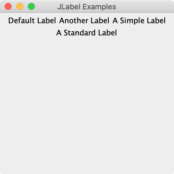
Figure 10-3. Several basic JLabel objects
Neat, right? Again, this simple layout is not meant for most types of content you find in production applications, but it’s definitely useful as you get started. One more point about layouts that we want to make as we’ll encounter this idea later, but FlowLayout also deals with the size of the labels. That can be hard to notice in this example because labels have a transparent background by default. If we import the java.awt.Color class, we can use that class to help make them opaque and give them a specific background color:
// ...JLabelbasic=newJLabel("Default Label");basic.setOpaque(true);basic.setBackgroundColor(Color.YELLOW);JLabelanother=newJLabel("Another Label");another.setOpaque(true);another.setBackgroundColor(Color.GREEN);frame.add(basic);frame.add(another);// ...

Figure 10-4. Opaque, colored labels
If we do the same for all of our labels, you can now see their true sizes and the gaps between them in Figure 10-4. But if we can control the background color of labels, what else can we do? Can we change the foreground color? (Yes.) Can we change the font? (Yes.) Can we change the alignment? (Yes.) Can we add icons? (Yes.) Can we create self-aware labels that eventually build Skynet and bring about the end of humanity? (Maybe, but probably not, and certainly not easily. Just as well.) Figure 10-5 shows some of these possible tweaks.
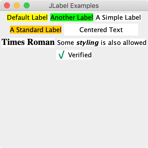
Figure 10-5. More labels with fancier options
And here is the respective source code that built this variety:
// ...JLabelcentered=newJLabel("Centered Text",JLabel.CENTER);centered.setPreferredSize(newDimension(150,24));centered.setOpaque(true);centered.setBackground(Color.WHITE);JLabeltimes=newJLabel("Times Roman");times.setOpaque(true);times.setBackground(Color.WHITE);times.setFont(newFont("TimesRoman",Font.BOLD,18));JLabelstyled=newJLabel("<html>Some <b><i>styling</i></b> is also allowed</html>");styled.setOpaque(true);styled.setBackground(Color.WHITE);JLabelicon=newJLabel("Verified",newImageIcon("ch10/check.png"),JLabel.LEFT);icon.setOpaque(true);icon.setBackground(Color.WHITE);// ...frame.add(centered);frame.add(times);frame.add(styled);frame.add(icon);// ...
We used a few other classes to help out such as java.awt.Font and javax.swing.ImageIcon. There are many more options we could review, but we need to look at some other components. If you want to play around with these labels and try out more of the options you see in the Java documentation, try importing a helper we built for jshell and playing around.3 The results of our few lines are shown in Figure 10-6.
jshell> import javax.swing.*

jshell> import java.awt.*

jshell> import ch10.Widget

jshell> Widget w = new Widget()
w ==> ch10.Widget[frame0,0,23,300x300,layout=java.awt.B ... tPaneCheckingEnabled=true]

jshell> JLabel label1 = new JLabel("Green")
label1 ==> javax.swing.JLabel[,0,0,0x0,invalid,alignmentX=0. ... rticalTextPosition=CENTER]

jshell> label1.setOpaque(true)

jshell> label1.setBackground(Color.GREEN)

jshell> w.add(label1)
$8 ==> javax.swing.JLabel[,0,0,0x0,...]

jshell> w.add(new JLabel("Quick test"))
$9 ==> javax.swing.JLabel[,0,0,0x0,...]
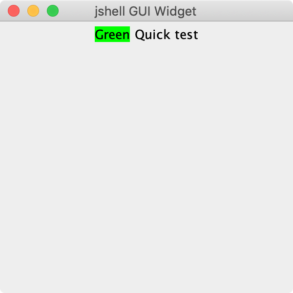
Figure 10-6. Using our Widget class in jshell
Hopefully you see how easy it is now to create a label (or other component such as a button that we’ll be exploring next) and tweak its parameters interactively. This is a great way to familiarize yourself with the bits and pieces you have at your disposal for building Java desktop applications. If you use our Widget much, you may find its reset() method handy. This method removes all of the current components and refreshes the screen so you can start over quickly.
Buttons
The other near-universal component you’ll need for graphical applications is the button. The JButton class is your go-to button in Swing. (You’ll also find other popular button types such as JCheckbox and JToggleButton in the documentation.) Creating a button is very similar to creating a label as shown in Figure 10-7.
packagech10;importjavax.swing.*;importjava.awt.*;publicclassButtons{publicstaticvoidmain(String[]args){JFrameframe=newJFrame("JButton Examples");frame.setLayout(newFlowLayout());frame.setDefaultCloseOperation(JFrame.EXIT_ON_CLOSE);frame.setSize(300,200);JButtonbasic=newJButton("Try me!");frame.add(basic);frame.setVisible(true);}}

Figure 10-7. A simple JButton
You can control the colors, alignment, font, etc. for buttons in much the same way as you do for labels. The difference, of course, is that you can click on a button and react to that click in your program, whereas labels are static for the most part. Try running this example and click on the button. It should change color and feel “pressed” even though it does not perform any other function in our program yet. Hopefully you’ve used enough applications or web sites to be familiar with buttons and their behavior. We want to go through a few more components before tackling that notion of “reacting” to a button click (an “event” in Swing-speak) but you can jump to “Events” if you just can’t wait!
Text components
Right behind buttons and labels in popularity would be text fields. These input elements that allow for free-form entry of information are nearly ubiquitous in online forms. You can grab names, email addresses, phone numbers, and credit card numbers. You can do all that in languages that compose their characters or others that read from right to left. It would be impossible to imagine a desktop or web application today without the availability of text input. Swing has three big text components: JTextField, JTextArea, and JTextPane; all extend a common parent, JTextComponent. JTextField is a classic text field meant for brief, single-word or single-line input. JTextArea allows for much more input spread across multiple lines. JTextPane is a specialized component meant for editing rich text. We won’t be using JTextPane in this chapter but it is worth noting that there are some very interesting components available in Swing without using third-party libraries.
Text fields
Let’s get an example of each up in our simple, flowing application. We’ll pare things back to a pair of labels and corresponding text fields, by far the more common of the two input components:
packagech10;importjavax.swing.*;importjava.awt.*;publicclassTextInputs{publicstaticvoidmain(String[]args){JFrameframe=newJFrame("JTextField Examples");frame.setLayout(newFlowLayout());frame.setDefaultCloseOperation(JFrame.EXIT_ON_CLOSE);frame.setSize(400,200);JLabelnameLabel=newJLabel("Name:");JTextFieldnameField=newJTextField(10);JLabelemailLabel=newJLabel("Email:");JTextFieldemailField=newJTextField(24);frame.add(nameLabel);frame.add(nameField);frame.add(emailLabel);frame.add(emailField);frame.setVisible(true);}}
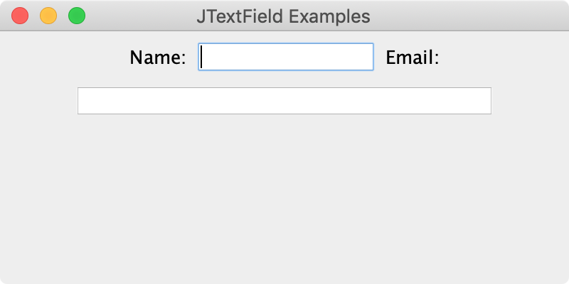
Figure 10-8. Simple labels and JTextFields
Notice in Figure 10-8 that the size of a text field is dictated by the number of columns we specified in its constructor. That’s not the only way to initialize a text field, but it is useful when there are no other layout mechanisms dictating the width of the field. (Here the FlowLayout failed us a bit, the “Email:” label did not stay on the same line as the email text field. But again, more on layouts soon.) Go ahead and type something! You can enter and delete text; cut, copy, and paste as you’d expect, and highlight stuff inside the field with your mouse. We still need the ability to react to this input coming up in “Events”, but if you add a text field to our demo app in jshell as shown in Figure 10-9, you can call its getText() method to see that the content is indeed available to you.
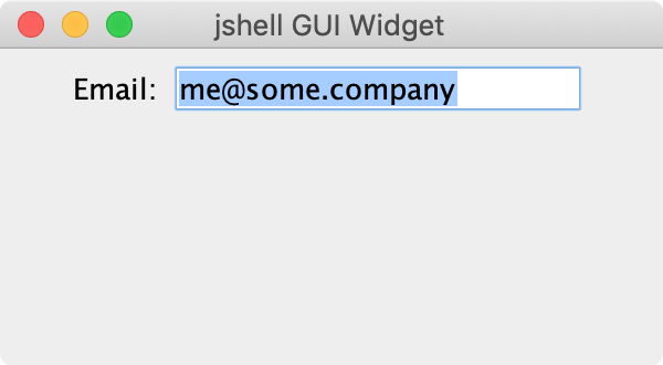
Figure 10-9. Retrieving the contents of a JTextField
jshell> w.reset()

jshell> JTextField emailField = new JTextField(15)
emailField ==> javax.swing.JTextField[,0,0,0x0,invalid,layout=ja ... rizontalAlignment=LEADING]

jshell> w.add(new JLabel("Email:"))
$12 ==> javax.swing.JLabel[,0,0,0x0, ... sition=CENTER]

jshell> w.add(emailField)
$13 ==> javax.swing.JTextField[,0,0,0x0, ... lignment=LEADING]

// Enter an email address, we typed in "[email protected]"

jshell> emailField.getText()
$14 ==> "[email protected]"
Note that the text property is read-write. You can call setText() on your text field to change its content programmatically. This can be great for setting default values, auto-formatting things like phone numbers, or for pre-filling a form from information you gather over the network. Try it out in jshell.
Text areas
When simple words or even long URL entries are not enough, you’ll likely turn to JTextArea to give the user enough room. We can create an empty text area with a similar constructor as the one we used for JTextField, but this time specify the number of rows in addition to the number of columns. The code to add our text area to our running text input demo app is below and the results are shown in Figure 10-10.
JLabelbodyLabel=newJLabel("Body:");JTextAreabodyArea=newJTextArea(10,30);frame.add(bodyLabel);frame.add(bodyArea);
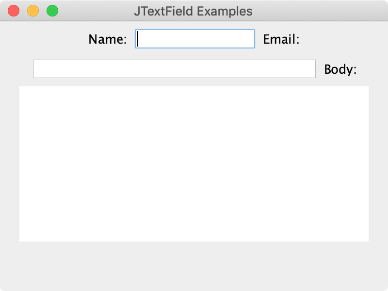
Figure 10-10. Adding a JTextArea
You can easily see we have room for multiple lines of text. Go ahead and run this new version and try it yourself. What happens if you type past the end of a line? What happens when you press the return key? Hopefully you get the behaviors you’ familiar with. We’ll see how to adjust those behaviors just below, but we do want to point out you still have access to its content just like you do with a text field. Let’s add a text area to our widget in jshell:
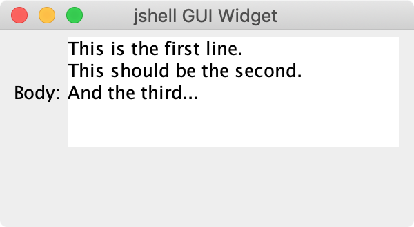
Figure 10-11. Retrieving the contents of a JTextArea
jshell> w.reset()

jshell> w.add(new JLabel("Body:"))
$16 ==> javax.swing.JLabel[,0,0,0x0, ... ition=CENTER]

jshell> JTextArea bodyArea = new JTextArea(5,20)
bodyArea ==> javax.swing.JTextArea[,0,0,0x0,invalid,layout=jav ... t=0,word=false,wrap=false]

jshell> w.add(bodyArea)
$18 ==> javax.swing.JTextArea[,0,0,0x0, ... lse,wrap=false]

jshell> bodyArea.getText()
$19 ==> "This is the first line.
This should be the second.
And the third..."
Great! You can see the return key we typed to produce our three lines in Figure 10-11 gets encoded as the
character in the string we retrieve. But what if you did try to type a long, run-on sentence that runs past the end of the line? You may get an odd text area that expanded to the size of our window and beyond as shown in Figure 10-12.

Figure 10-12. An overly long line in a simple JTextArea
We can fix that incorrect sizing behavior by looking at a pair of properties of JTextArea shown in Table 10-1.
| Property | Default | Description |
|---|---|---|
|
|
Whether lines longer than the table should wrap at all |
|
|
If lines do wrap, whether the line breaks be on word or character boundaries |
So let’s start fresh and turn on the word wrap. We can use setLineWrap(true) to make sure the text wraps. But that’s probably not enough. Use setWrapStyleWord(true) in addition to make sure the text area doesn’t just break words in the middle. That should get us the image in Figure 10-13.
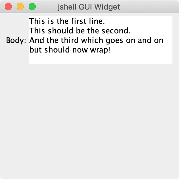
Figure 10-13. A wrapping line in a simple JTextArea
You can try that yourself in jshell or your own app if you want to prove to yourself that the third line wraps. When you retrieve the text from our bodyArea object, you should not see a line break (
) in line three between the second “on” and the “but”.
Text scrolling
We’ve fixed what happens if we have too many characters for one line, but what happens if we have too many rows? On its own, JTextArea does that odd “grow until we can’t” trick as shown in Figure 10-14.
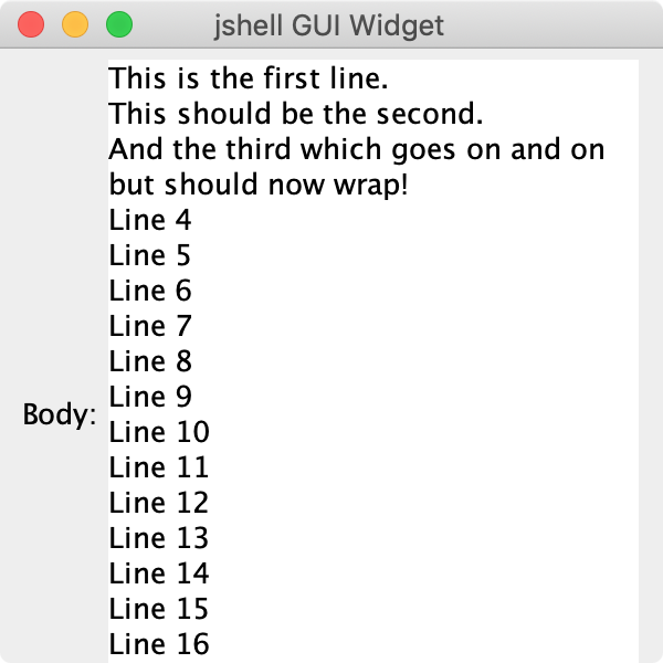
Figure 10-14. Too many lines in a simple JTextArea
To fix this problem, we need to call in some support from a standard Swing helper component: JScrollPane. This is a general purpose container that makes it easy to present large components in confined spaces. To show you just how easy, let’s fix our text area:4
jshell> w.remove(bodyArea); // So we can start with a fresh text area

jshell> bodyArea = new JTextArea(5,20)
bodyArea ==> javax.swing.JTextArea[,0,0,0x0,inval... word=false,wrap=false]

jshell> w.add(new JScrollPane(bodyArea))
$17 ==> javax.swing.JScrollPane[,47,5,244x84, ... ortBorder=]
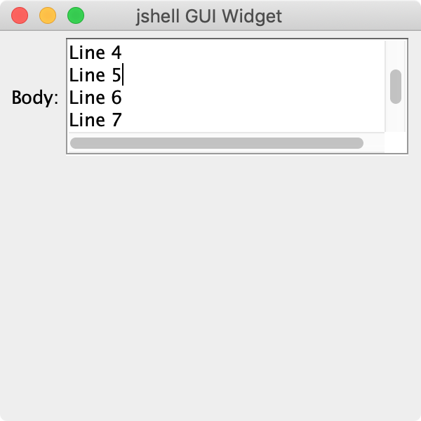
Figure 10-15. Too many lines in a JTextArea embedded in a JScrollPane
You can see in Figure 10-15 that we no longer grow beyond the bounds of the frame. You can also see the standard scrollbars along the side and bottom. If you just need simple scrolling, you’re done! But like most other components in Swing, JScrollPane has many fine details you can adjust as needed. We won’t cover most of those here, but we do want to show you how to tackle a common setup for text areas: line wrapping (breaking on words) with vertical scrolling—meaning no horizontal scrolling. We should end up with a text area like the one shown in Figure 10-16.
JLabelbodyLabel=newJLabel("Body:");JTextAreabodyArea=newJTextArea(10,30);bodyArea.setLineWrap(true);bodyArea.setWrapStyleWord(true);JScrollPanebodyScroller=newJScrollPane(bodyArea);bodyScroller.setHorizontalScrollBarPolicy(JScrollPane.HORIZONTAL_SCROLLBAR_NEVER);bodyScroller.setVerticalScrollBarPolicy(JScrollPane.VERTICAL_SCROLLBAR_ALWAYS);frame.add(bodyLabel);frame.add(bodyScroller);// note we don't add bodyArea, it's already in bodyScroller

Figure 10-16. A well-formed JTextArea in a JScrollPane
Hooray! You now have a taste of the most common Swing components including labels, buttons, and text fields. But we really have just scratched the surface of these components. They all have many different attributes that can be easily adjusted with calls like the setBackground() method we used on our JLabel instances in “Labels and Buttons”. Look over the Java documentation and play around with each of these components in jshell or in your own mini applications. Getting comfortable with UI design rests on practice. We definitely encourage you to look up other books and online resources if you will be building desktop applications for work or even just to share with friends, but nothing beats time spent at the keyboard actually creating an app and fixing the things that invariably go awry.
Other components
If you’ve already looked at the documentation on the javax.swing package, you know there are several dozen other components available for use in your applications. Within that large list, there are a few that we want to make sure you know about.5
JSlider
Sliders are a nifty, efficient input component when you have a range of values. You have probably seen sliders in things like font size selectors, color pickers (think the ranges of red, green, and blue), zoom selectors, etc. Indeed, a slider is perfect for both the angle and the force values we need in our apple tossing game. Our angles range from 0 to 180, and our force value ranges from 0 to 20 (our arbitrary maximum). Figure 10-17 shows these sliders in place, just ignore how we achieved the layout for now.

Figure 10-17. Using JSlider in our apple tossing game
To create a new slider, you typically provide three values: the minimum (0 for our angle slider), the maximum (180), and the initial value (we’ll go for the middle at 90). We can add just such a slider to our jshell playground like this:
jshell> w.reset()

jshell> JSlider slider = new JSlider(0, 180, 90);
slider ==> javax.swing.JSlider[,0,0,0x0,invalid,alignmentX=0 ... ks=false,snapToValue=true]

jshell> w.add(slider)
$20 ==> javax.swing.JSlider[,0,0,0x0, ... alue=true]
Scoot the slider around like you see in Figure 10-18 and then look at its current value using the getValue() method:
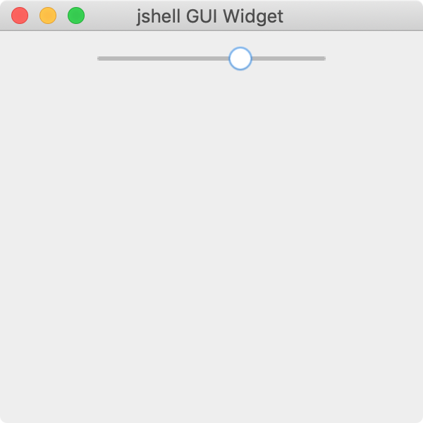
Figure 10-18. A simple JSlider in jshell
jshell> slider.getValue()
$21 ==> 112
In “Events”, we’ll see how to receive those values as the user changes them in realtime.
If you look over the documentation for the JSlider constructors, you’ll notice that they use integers for the minimum and maximum values. You may have also noticed that getValue() also returns an integer. If you need fractional values, that falls to you. The force slider in our game, for example, would benefit from supporting more than 21 discrete levels. We can address that type of need by building the slider with a (often much) larger range and then simply divide the current value by an appropriate scale factor.
jshell> JSlider force = new JSlider(0, 200, 100)
force ==> javax.swing.JSlider[,0,0,0x0,invalid,alignmentX=0 ... ks=false,snapToValue=true]

jshell> w.add(force)
$23 ==> javax.swing.JSlider[,0,0,0x0,invalid ... alue=true]

jshell> force.getValue()
$24 ==> 68

jshell> float myForce = force.getValue() / 10.0f;
myForce ==> 6.8
JList
If you have a range of values but those values are not simple, contiguous integers, the “list” UI element is a great choice. JList is the Swing implementation of this input type. You can set it to allow single or mutlipe selections and if you dig deeper into Swing’s features, you can produce custom views that display the items in your list with extra information or details. (For example you can make lists of icons, or icons and text, or multi-line text, etc. etc.)
Unlike the other components we’ve seen so far, JList requires a little more information to get started. To make a useful list component, you need to use one of the constructors that takes the data you intend to show. The simplest such constructor accepts an Object array. While you can pass an array of strange objects, the default behavior of JList will be to show the output of your objects’ toString() method in the list. Using an array of String objects is very common and produces the expected results. Figure 10-19 shows a simple list of cities.
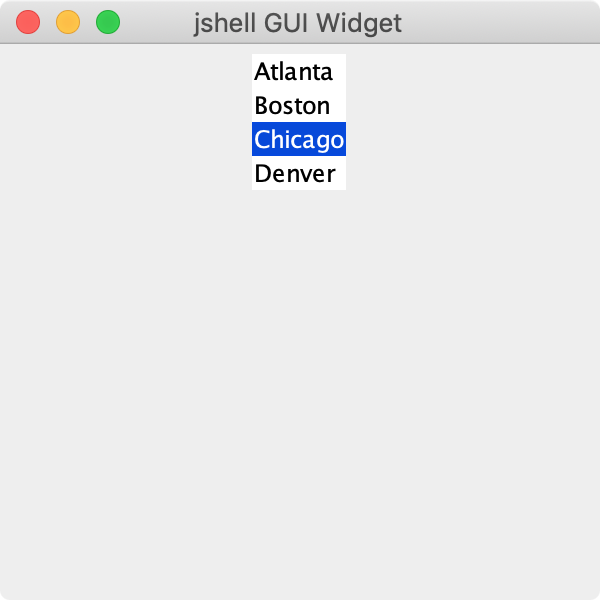
Figure 10-19. A simple JList of four cities in jshell
jshell> w.reset()

jshell> String[] cities = new String[] { "Atlanta", "Boston", "Chicago", "Denver" };
cities ==> String[4] { "Atlanta", "Boston", "Chicago", "Denver" }

jshell> JList cityList = new JList<String>(cities);
cityList ==> javax.swing.JList[,0,0,0x0,invalid,alignmentX=0.0 ... unt=8,layoutOrientation=0]

jshell> w.add(cityList)
$29 ==> javax.swing.JList[,0,0,0x0,invalid ... ation=0]
Notice we use the same <String> type information with the constructor as we do when creating collection objects such as ArrayList (see “Type Limitations”). As Swing was added well before generics, you may encounter examples online or in books that do not add the type information. As with the collections classes, this doesn’t stop your code from compiling or running, but you will receive the same unchecked warning message at compile-time.
Similar to getting the current value of a slider, you can retrieve the selected item or items in a list using one of four methods:
-
getSelectedIndex()for single-select lists, returns anint -
getSelectedIndices()for multi-select lists, returns an array ofint -
getSelectedValue()for single-select lists, returns an object -
getSelectedValues()for multi-select lists, returns an array of objects
Obviously the main difference is whether the index of the selected item(s) or the actual value(s) is more useful to you. Playing with our city list in jshell we can pull out a selected city like so:
jshell> cityList.getSelectedIndex()
$31 ==> 2

jshell> cityList.getSelectedIndices()
$32 ==> int[1] { 2 }

jshell> cityList.getSelectedValue()
$33 ==> "Chicago"

jshell> cities[cityList.getSelectedIndex()]
$34 ==> "Chicago"
Note that for large lists, you’ll probably want a scrollbar. Swing promotes reusability in its code, so perhaps it is no surprise that you can use a JScrollPane with JList just like we did for text areas in “Text scrolling”.
Containers and layouts
That is quite a list of components! And it really is only a subset of the widgets available for your graphical applications. But we’ll leave the exploration of the other Swing components to you as you get more comfortable with Java in general and design specific programming solutions to actual problems. In this section, we want to concentrate on assembling the components above into useful arrangements. Those arrangements happen inside a container so let’s start this discussion by looking at the most common containers.
Frames and windows
Every desktop application will need at least one window. This term pre-dates Swing and is used by most graphical interfaces available on the three big operating systems. Swing does provide a low-level JWindow class if you need it, but most likely you will build your application inside a JFrame. Indeed, our first graphical application in Chapter 2 used a JFrame. Figure 10-30 illustrates the class hierarchy of JFrame. We will stick to the basic features of JFrame, but as your applications become richer, you may want to create your own windows using elements higher up in the hierarchy.
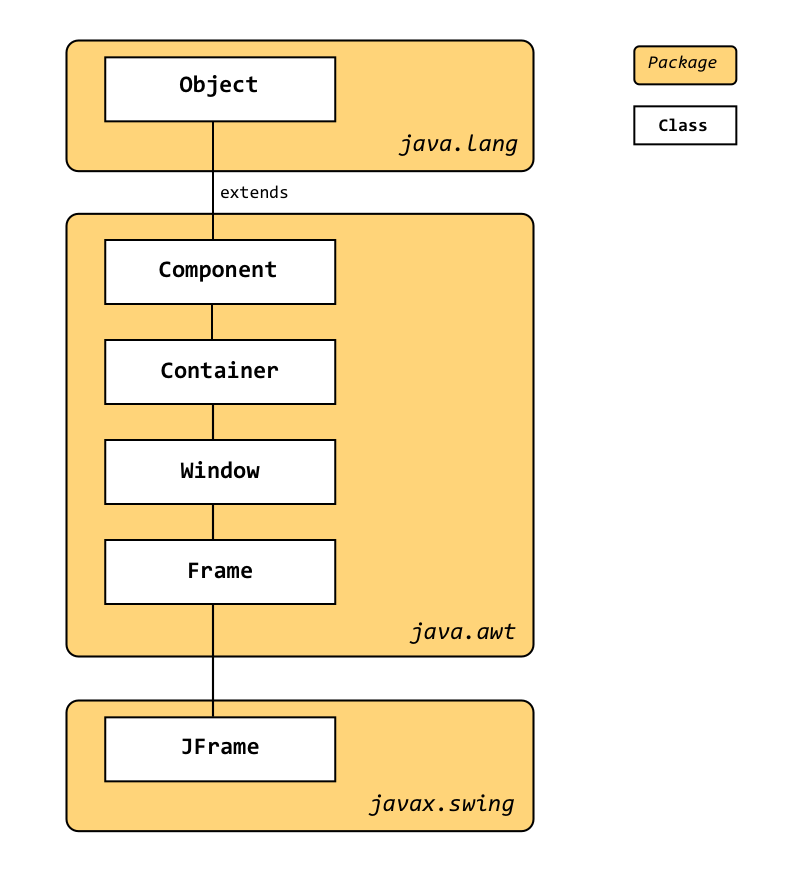
Figure 10-20. The JFrame class hierarchy
Let’s revisit the creation of that first graphical application and focus a bit more on exactly what we do with the JFrame object we build.
importjavax.swing.*;publicclassHelloJavaAgain{publicstaticvoidmain(String[]args){JFrameframe=newJFrame("Hello, Java!");frame.setDefaultCloseOperation(JFrame.EXIT_ON_CLOSE);frame.setSize(300,300);JLabellabel=newJLabel("Hello, Java!",JLabel.CENTER);frame.add(label);frame.setVisible(true);}}
The string we pass to the JFrame constructor becomes the title of the window. We then set a few specific properties on our object. We make sure that when the user closes the window, we quit our program. (That might seem obvious, but complex applications might have multiple windows such as tool palettes or support for multiple documents. Closing a window in these applications may not mean “quit”.) We then pick a starting size for the window and add our actual label component the frame (which in turn places the label in its content pane, more on that in a minute). Once the component is added, we make the window visible and the result is Figure 10-21.
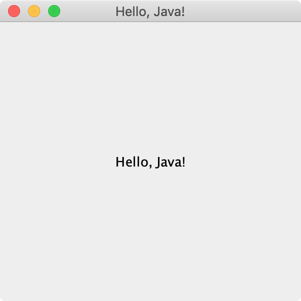
Figure 10-21. A simple JFrame with an added label
This basic process is the foundation of every Swing application. The interesting part of your application comes from what you do with that content pane. But what is that content pane? Turns out the frame uses is its own component/container, an instance of JPanel (more on JPanel in the next section). If you look closely at the documentation for JFrame you might notice that you can set your own content pane to be any object descended from java.awt.Container but we’ll be sticking with the default for now. As you may have noticed above, we are also using a shortcut to add our label. The JFrame version of add() will call the content pane’s add(). We could have said, for example:
JLabellabel=newJLabel("Hello, Java!",JLabel.CENTER);frame.getContentPane().add(label);
The JFrame class does not have shortcuts for everything you might do with the content pane, however. Read the documentation and use a shortcut if it exists. If it does not, don’t hesitate to grab a reference via getContentPane() and then configure or tweak that object.
JPanel
The JPanel class is the go-to container in Swing. It is a component just like JButton or JLabel so your panels can contain other panels. Such nesting often plays a big role in the layout of an application. For example, you could create a JPanel to house the formatting buttons of a text editor in a “toolbar” so that it is easy to move that toolbar around according to user preferences.
JPanel gives you the ability to add and remove components from the screen. (More accurately, those add/remove methods are inherited from the Container class, but we access them through our JPanel objects.) You can also repaint() a panel if something has changed and you want to update your UI. We can see the effects of the add() and remove() methods shown in Figure 10-22 using our playground object in jshell:

Figure 10-22. Adding and removing components in a JPanel
jshell> Widget w = new Widget()
w ==> ch10.Widget[frame0,0,23,300x300,layout=java.awt.B ... tPaneCheckingEnabled=true]

jshell> JLabel emailLabel = new JLabel("Email:")
emailLabel ==> javax.swing.JLabel[,0,0,0x0,invalid,alignmentX=0. ... rticalTextPosition=CENTER]

jshell> JTextField emailField = new JTextField(12)
emailField ==> javax.swing.JTextField[,0,0,0x0,invalid,layout=ja ... rizontalAlignment=LEADING]

jshell> JButton submitButton = new JButton("Submit")
submitButton ==> javax.swing.JButton[,0,0,0x0,invalid,alignmentX=0 ... ubmit,defaultCapable=true]

jshell> w.add(emailLabel);
$8 ==> javax.swing.JLabel[,0,0,0x0, ... ition=CENTER]
// Left screenshot in image above

jshell> w.add(emailField)
$9 ==> javax.swing.JTextField[,0,0,0x0, ... nment=LEADING]

jshell> w.add(submitButton)
$10 ==> javax.swing.JButton[,0,0,0x0, ... pable=true]
// Now we have the middle screenshot

jshell> w.remove(emailLabel)
// And finally the right screenshot
Try it yourself! Most applications, however, don’t add and remove components willy-nilly. You usually build up your interface by adding what you need and then simply leave it alone. You may enable or disable some buttons along the way, but you don’t want to be in the habit of surprising the user with disappearing parts or new elements popping up.
Layout managers
The other key feature of JPanel in Swing (or of any descendent of Container, really) is the notion of where the components you add end up in the container and what size they have. In UI-speak, this is “laying out” your container and Java provides several layout managers to help you achieve your desired results.
BorderLayout
We’ve already seen the FlowLayout in action (at least in its horizontal orientation, one of its constructors can make a column of components). We were also using another layout manager without really knowing it. The content pane of a JFrame uses the BorderLayout by default. Figure 10-23 shows the five areas controlled by BorderLayout along with the names of their region. Notice that the NORTH and SOUTH regions are as wide as the application window but only as tall as required to fit the label. Similarly, the EAST and WEST regions fill the vertical gap between the NORTH and SOUTH regions, but are only as wide as required, leaving the remaining space to be filled both horizontally and vertically by the CENTER region.
importjava.awt.*;importjavax.swing.*;publicclassBorderLayoutDemo{publicstaticvoidmain(String[]args){JFrameframe=newJFrame("BorderLayout Demo");frame.setDefaultCloseOperation(JFrame.EXIT_ON_CLOSE);frame.setSize(400,200);JLabelnorthLabel=newJLabel("Top - North",JLabel.CENTER);JLabelsouthLabel=newJLabel("Bottom - South",JLabel.CENTER);JLabeleastLabel=newJLabel("Right - East",JLabel.CENTER);JLabelwestLabel=newJLabel("Left - West",JLabel.CENTER);JLabelcenterLabel=newJLabel("Center (everything else)",JLabel.CENTER);// Color the labels so we can see their boundaries betternorthLabel.setOpaque(true);northLabel.setBackground(Color.GREEN);southLabel.setOpaque(true);southLabel.setBackground(Color.GREEN);eastLabel.setOpaque(true);eastLabel.setBackground(Color.RED);westLabel.setOpaque(true);westLabel.setBackground(Color.RED);centerLabel.setOpaque(true);centerLabel.setBackground(Color.YELLOW);frame.add(northLabel,BorderLayout.NORTH);frame.add(southLabel,BorderLayout.SOUTH);frame.add(eastLabel,BorderLayout.EAST);frame.add(westLabel,BorderLayout.WEST);frame.add(centerLabel,BorderLayout.CENTER);frame.setVisible(true);}}
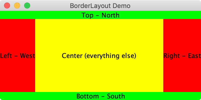
Figure 10-23. The regions available with BorderLayout
Notice the add() method in this case takes an extra argument. That argument is passed to the layout manager. Not all managers need this argument, as we saw with FlowLayout.
Here is an example where nesting JPanel objects can be very handy—main app in a JPanel in the center, toolbar in a JPanel along the top, status bar in a JPanel along the bottom, project manager in a JPanel on the side, etc. BorderLayout defines those regions using compass directions. Figure 10-24 shows a very simple example of such container nesting. We use a text area for a large message in the center and then add some action buttons to a panel along the bottom. Again, without the events we’ll cover in the next section, none of these buttons do anything, but we want to show you how to work with multiple containers. And you could continue nesting JPanel objects if you wanted; just make sure your hierarchy is readable. Sometimes a better top-level layout choice makes your app both more maintainable and more performant.
publicclassNestedPanelDemo{publicstaticvoidmain(String[]args){JFrameframe=newJFrame("Nested Panel Demo");frame.setDefaultCloseOperation(JFrame.EXIT_ON_CLOSE);frame.setSize(400,200);// Create the text area and go ahead and add it to the centerJTextAreamessageArea=newJTextArea();frame.add(messageArea,BorderLayout.CENTER);// Create the button containerJPanelbuttonPanel=newJPanel(newFlowLayout());// Create the buttonsJButtonsendButton=newJButton("Send");JButtonsaveButton=newJButton("Save");JButtonresetButton=newJButton("Reset");JButtoncancelButton=newJButton("Cancel");// Add the buttons to their containerbuttonPanel.add(sendButton);buttonPanel.add(saveButton);buttonPanel.add(resetButton);buttonPanel.add(cancelButton);// And finally, add the button container to the bottom of the appframe.add(buttonPanel,BorderLayout.SOUTH);frame.setVisible(true);}}
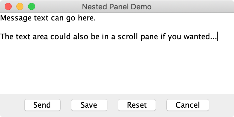
Figure 10-24. A simple nested container example
Two things to point out in this example. First, you might see that we did not specify the number of rows or columns when creating our JTextArea object. Unlike FlowLayout, BorderLayout will set the size of its components when possible. For the top and bottom, this means using the component’s own height similar to how FlowLayout works, but then setting the width of the component to fill the frame. The sides use their components’ width, but then set the height. The component in the center, like our text area above, gets its width and height set by BorderLayout.
The second thing may be obvious, but we want to call attention to it just the same. Notice that when we add the messageArea and buttonPanel objects to the frame, we specify the extra “where” argument to the frame’s add() method. However, when we are adding the buttons themselves to buttonPanel, we use the simpler version of add() with only the component argument. Those various add() calls are tied to the container doing the calling and they pass arguments appropriate for that container’s layout manager. So even though the buttonPanel is in the SOUTH region of the frame, the saveButton and its compatriots don’t know or care about that detail.
GridLayout
Many times you need (or want) your components or labels to occupy symmetric spaces. Think of the “Yes/No/Cancel” buttons along the bottom of a confirmation dialog. (Swing can make those dialogs, too, but more on that in “Modals and popups”.) The GridLayout class is one of the early layout managers that helps with such even spacing. Let’s try using GridLayout for those buttons in our previous example. All we have to do is change one line:
// Create the button container// old version: JPanel buttonPanel = new JPanel(new FlowLayout());JPanelbuttonPanel=newJPanel(newGridLayout(1,0));
The calls to add() remain exactly the same; no separate constraint argument is needed. The result is shown in Figure 10-35.
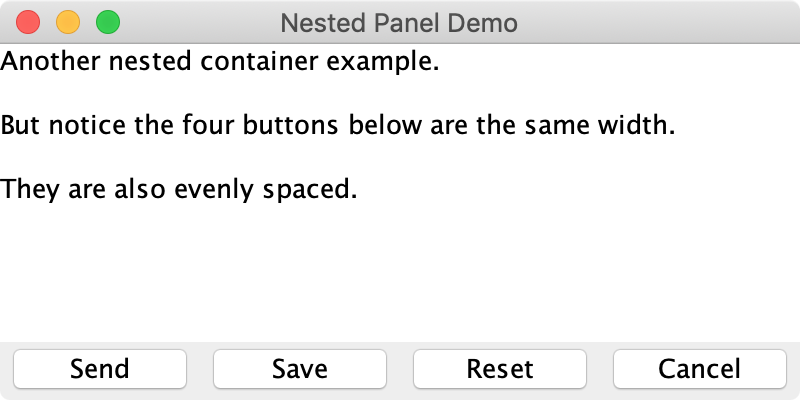
Figure 10-25. Using GridLayout for a row of buttons
As you can see in Figure 10-25, the GridLayout buttons are the same size, even though the text of the “Cancel” button is a bit longer than the others. In creating the layout manager, we told it we want exactly one row, no restrictions (the “zero”) on how many columns. Although as the name implies, grids can be two-dimensional and we can specify exactly how many rows and columns we want. Figure 10-26 shows the classic phone keypad layout.
publicclassPhoneGridDemo{publicstaticvoidmain(String[]args){JFrameframe=newJFrame("Nested Panel Demo");frame.setDefaultCloseOperation(JFrame.EXIT_ON_CLOSE);frame.setSize(200,300);// Create the phone pad containerJPanelphonePad=newJPanel(newGridLayout(4,3));// Create and add the 12 buttons, top-left to bottom-rightphonePad.add(newJButton("1"));phonePad.add(newJButton("2"));phonePad.add(newJButton("3"));phonePad.add(newJButton("4"));phonePad.add(newJButton("5"));phonePad.add(newJButton("6"));phonePad.add(newJButton("7"));phonePad.add(newJButton("8"));phonePad.add(newJButton("9"));phonePad.add(newJButton("*"));phonePad.add(newJButton("0"));phonePad.add(newJButton("#"));// And finally, add the pad to the center of the appframe.add(phonePad,BorderLayout.CENTER);frame.setVisible(true);}}
Adding the buttons in order from left-to-right, top-to-bottom should result in the app you see in Figure 10-26.

Figure 10-26. A two-dimensional grid layout for a phone pad
Very handy and very easy if you need perfectly symmetric elements. But what if you want mostly symmetric? Think of popular web forms with a column of labels on the left and a column of text fields on the right. GridLayout could absolutely handle a basic form like that, but many times your labels are short and simple, while your text fields are wider allowing for more input from the user. How do we accommodate those layouts?
GridBagLayout
If you need a more interesting layout but don’t want to nest lots of panels, the GridBagLayout is a possibility. It’s a little more complex to set up, but it allows for some nicely intricate layouts that still keep elements aesthetically aligned and sized. Similar to BorderLayout, you add components with an extra argument. The argument for GridBagLayout however, is a rich GridBagConstraints object rather than a simple String.
The “grid” in GridBagLayout is exactly that, a rectangular container divvied up into various rows and columns. The “bag” part, though, comes from a sort of grab bag notion of how you use the cells created by those rows and columns. The rows and columns can each have their own height or width, and components can occupy any rectangular collection of cells. We can take advantage of this flexibility to build out our game interface with a single JPanel rather than with several nested panes. Figure 10-27 shows one way of carving up the screen into four rows and three columns and then placing the components.
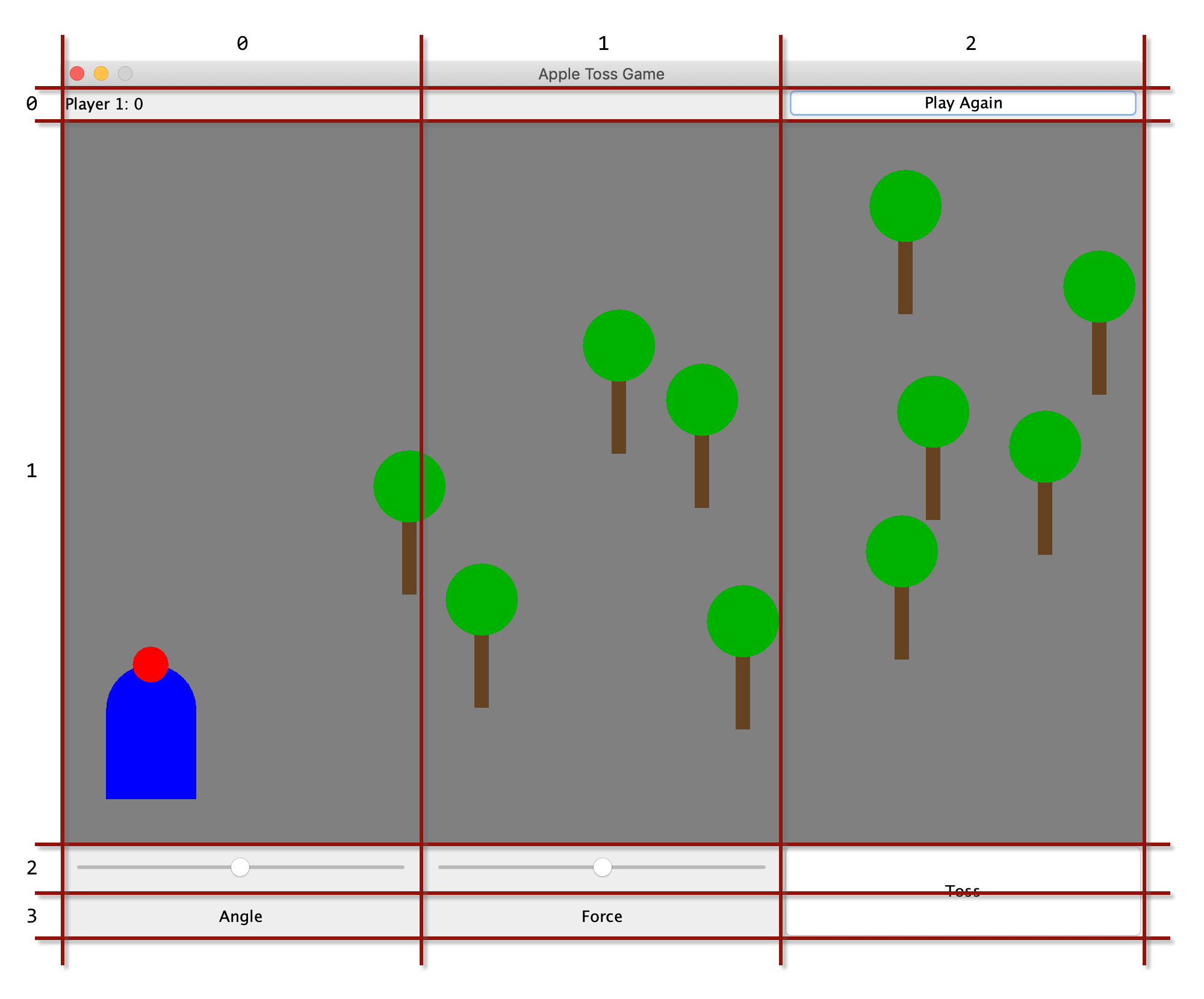
Figure 10-27. An example grid for use with GridBagLayout
You can see the different row heights and column widths. And notice how some components occupy more than one cell. This type of arrangement won’t work for every application, but it is powerful and works for many UIs that need more than simple layouts.
To build an application with a GridBagLayout, you need to keep a couple of references around as you add components. Let’s setup the grid first.
publicstaticfinalintSCORE_HEIGHT=30;publicstaticfinalintCONTROL_WIDTH=300;publicstaticfinalintCONTROL_HEIGHT=40;publicstaticfinalintFIELD_WIDTH=3*CONTROL_WIDTH;publicstaticfinalintFIELD_HEIGHT=2*CONTROL_WIDTH;publicstaticfinalfloatFORCE_SCALE=0.7f;GridBagLayoutgameLayout=newGridBagLayout();gameLayout.columnWidths=newint[]{CONTROL_WIDTH,CONTROL_WIDTH,CONTROL_WIDTH};gameLayout.rowHeights=newint[]{SCORE_HEIGHT,FIELD_HEIGHT,CONTROL_HEIGHT,CONTROL_HEIGHT};JPanelgamePane=newJPanel(gameLayout);
Great. This step requires a little planning on your part, but it’s always easy to adjust once you get a few components on the screen. To get those components added, you need to create and configure a GridBagConstraints object. Fortunately you can reuse the same object for all of your components, you just need to repeat the configuration portion before adding each element. Here’s an example of how we could add the main playing field component:
GridBagConstraintsgameConstraints=newGridBagConstraints();gameConstraints.fill=GridBagConstraints.BOTH;gameConstraints.gridy=1;gameConstraints.gridx=0;gameConstraints.gridheight=1;gameConstraints.gridwidth=3;Fieldfield=newField();gamePane.add(field,gameConstraints);
Notice how we set which cells the field will occupy. This is the core of configuring grid bag constraints. You can also adjust things like how a component will fill the cells it occupies and how much of a margin each component gets. We’ve settled on simply filling all of the space available in a group of cells (“both” a horizontal fill and a vertical fill), but you can read about more options in the documentation for GridBagConstraints.
Let’s add a scorekeeping label at the top:
gameConstraints.fill=GridBagConstraints.BOTH;gameConstraints.gridy=0;gameConstraints.gridx=0;gameConstraints.gridheight=1;gameConstraints.gridwidth=1;JLabelscoreLabel=newJLabel(" Player 1: 0");gamePane.add(scoreLabel,gameConstraints);
For this second component, notice how similar the setup of the constraints is to how we handled the game field? Any time you see similarities like this, you should consider pulling those steps into a function you can reuse. We could do just that:
privateGridBagConstraintsbuildConstraints(introw,intcol,introwspan,intcolspan){// Use our global reference to the gameConstraints objectgameConstraints.fill=GridBagConstraints.BOTH;gameConstraints.gridy=row;gameConstraints.gridx=col;gameConstraints.gridheight=rowspan;gameConstraints.gridwidth=colspan;returngameConstraints;}
And then rewrite the earlier blocks of code for the score label and game field like this:
GridBagConstraintsgameConstraints=newGridBagConstraints();JLabelscoreLabel=newJLabel(" Player 1: 0");Fieldfield=newField();gamePane.add(scoreLabel,buildConstraints(0,0,1,1));gamePane.add(field,buildConstraints(1,0,1,3));
With that function in place, we can quickly add the various other components and labels we want to complete our game interface. For example, the toss button in the lower right corner of Figure 10-27 can be setup like this:
JLabeltossButton=newJButton("Toss");gamePane.add(tossButton,buildConstraints(2,2,2,1));
Much cleaner! We simply continue building our components and placing them on the correct row and column, with the appropriate spans. In the end we have a reasonably interesting set of components laid out in a single container.
As with other sections in this chapter, we don’t have time to cover every layout manager, or even every feature of the layout managers we do discuss. Be sure to check the Java documentation and try creating a few dummy apps to play with the different layouts. As a starting point, BoxLayout is a nice upgrade to the grid idea and GroupLayout can produce some nicely aligned data entry forms. For now, though, we’re going to move on and finally get all these components “hooked up” and start responding to all the typing and clicking and button-pushing—all actions that are encoded in Java as events.
Events
When thinking about the MVC architecture, the model and view elements are straightforward. We’ve seen several Swing components already and touched on their view as well as the model for more interesting components like JList. (Labels and buttons also have models, of course, they just aren’t very complex.) With that background in place, let’s look at the controller functionality. In Swing (and Java more generally) interaction between users and components is communicated via events. An event contains general information such as when it occurred as well as information specifc to the event type such as the point on your screen where you clicked your mouse. A listener (or handler) picks up the message and can respond in some useful way.
As you work through the examples below, you’ll likely notice that some of the events and listeners are part of the javax.swing.event package while others live in java.awt.event. This reflects the fact that Swing succeeded AWT. The parts of AWT that are still relevant remain in use, but Swing added a number of new items to accommodate the expanding functionality provided by the library.
Mouse events
The easiest way to get started is just to generate and handle an event. Let’s return to our simple HelloJava application (updated to HelloMouse!) and we’ll add a listener for mouse events. When we click our mouse, we’ll use that click event to determine the position of our JLabel. (This will require removing the layout manager, by the way. We want to set the coordinates of our label manually.) Here is the code of our new, interactive application:
packagech10;importjava.awt.*;importjavax.swing.*;importjava.awt.event.MouseEvent;importjava.awt.event.MouseListener;publicclassHelloMouseextendsJFrameimplementsMouseListener{JLabellabel;publicHelloMouse(){super("MouseEvent Demo");setDefaultCloseOperation(JFrame.EXIT_ON_CLOSE);setLayout(null);setSize(300,100);label=newJLabel("Hello, Mouse!",JLabel.CENTER);label.setOpaque(true);label.setBackground(Color.YELLOW);label.setSize(100,20);label.setLocation(100,100);add(label);getContentPane().addMouseListener(this);}publicvoidmouseClicked(MouseEvente){label.setLocation(e.getX(),e.getY());}publicvoidmousePressed(MouseEvente){}publicvoidmouseReleased(MouseEvente){}publicvoidmouseEntered(MouseEvente){}publicvoidmouseExited(MouseEvente){}publicstaticvoidmain(String[]args){HelloMouseframe=newHelloMouse();frame.setVisible(true);}}
Go ahead and run the application. You’ll get a fairly familiar “Hello, World” graphical application as shown in Figure 10-28. The friendly message should follow you around as you click around.
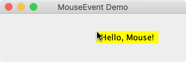
Figure 10-28. Using a MouseEvent to position a label
As you look at the source code for this example, pay attention to a few particular items:
As you click, your computer is generating low-level events that are handed to the JVM and end up in your code to be handled by a listener. In Java, listeners are interfaces and you can make special classes just to implement the interface or you can implement listeners as part of your main application class like we did here. Where you handle events really depends on what actions you need to take in response. You’ll see a number of examples of both approaches throughout the rest of this book.
We implemented the
MouseListenerinterface in addition to extendingJFrame. We had to provide a body for every method listed inMouseListener, but we do our real work inmouseClicked(). You can see we take the coordinates of the click from theeventobject, and use them to change the position of our label. TheMouseEventclass contains a wealth of information about the event. When it occurred, which component it occurred on, which mouse button was involved, the (x,y) coordinate where the event occurred, etc. Try printing some of that information in some of the unimplemented methods such asmouseDown().You may have noticed that we added quite a few methods for other types of mouse events that we didn’t use. That’s common with lower-level events such as mouse and keyboard events. The listener interfaces are designed to give you a central point to get many related events. You just respond to the particular events you care about and leave the other methods empty.

The other critical bit of new code is the call to
addMouseListener()for our content pane. The syntax may look a little odd, but it’s a valid approach. The use ofgetContentPane()on the left says “this is where the events will be generated” and the use ofthisas the argument says “this is where events will be delivered”. For our example, the events from the frame’s content pane will be delivered back to the same class which is where we put all of the mouse handling code.
Mouse adapters
If we want to try the helper class approach, we could add another, separate class to our file and implement MouseListener in that class. But if we’re going to create a separate class, we can take advantage of a shortcut Swing provides for many listeners. The MouseAdapter class is a simple, empty implementation of the MouseListener interface with empty methods written for every type of event. When you extend this class, you are free to override only the methods you care about. That can make for a cleaner handler.
packagech10;importjava.awt.*;importjava.awt.event.MouseEvent;importjava.awt.event.MouseAdapter;importjavax.swing.*;publicclassHelloMouseHelper{publicstaticvoidmain(String[]args){JFrameframe=newJFrame("MouseEvent Demo");frame.setDefaultCloseOperation(JFrame.EXIT_ON_CLOSE);frame.setLayout(null);frame.setSize(300,300);JLabellabel=newJLabel("Hello, Mouse!",JLabel.CENTER);label.setOpaque(true);label.setBackground(Color.YELLOW);label.setSize(100,20);label.setLocation(100,100);frame.add(label);LabelMovermover=newLabelMover(label);frame.getContentPane().addMouseListener(mover);frame.setVisible(true);}}/*** Helper class to move a label to the position of a mouse click.*/classLabelMoverextendsMouseAdapter{JLabellabelToMove;publicLabelMover(JLabellabel){labelToMove=label;}publicvoidmouseClicked(MouseEvente){labelToMove.setLocation(e.getX(),e.getY());}}
The important thing to remember about helper classes is that they need to have a reference to every object they’ll be interacting with. You can see we passed our label to the constructor. That’s a popular way to establish the necessary connections, but you could certainly add the required access later—as long as the handler can communicate with every object it needs before it starts receiving events.
Action events
While mouse and keyboard events are available on just about every Swing component, they can be a little tedious. Most UI libraries provide higher-level events that are simpler to think about. Swing is no exception. The JButton class, for example, supports an ActionEvent that lets you know the button has been pressed. Most of the time this is exactly what you want. But the mouse events are still available if you need some special behavior such as reacting to clicks from different mouse buttons, or on touch screens it is common to distinguish between a long and a short press.

Figure 10-29. Using ActionEvent to increment a counter
A popular way to demonstrate the button click event is to build a simple counter like the one you see in Figure 10-29. Each time you click the button, we update the label. This simple proof of concept shows that you are ready to add many buttons with many responses. Let’s see the wiring required for this demo:
packagech10;importjavax.swing.*;importjava.awt.*;importjava.awt.event.ActionEvent;importjava.awt.event.ActionListener;publicclassActionDemo1extendsJFrameimplementsActionListener{intcounterValue=0;JLabelcounterLabel;publicActionDemo1(){super("ActionEvent Counter Demo");setDefaultCloseOperation(JFrame.EXIT_ON_CLOSE);setLayout(newFlowLayout());setSize(300,180);counterLabel=newJLabel("Count: 0",JLabel.CENTER);add(counterLabel);JButtonincrementer=newJButton("Increment");incrementer.addActionListener(this);add(incrementer);}publicvoidactionPerformed(ActionEvente){counterValue++;counterLabel.setText("Count: "+counterValue);}publicstaticvoidmain(String[]args){ActionDemo1demo=newActionDemo1();demo.setVisible(true);}}
Not too bad. We update a simple counter variable and display the result inside the actionPerformed() method which is where ActionListener objects receive their events. We used the direct listener implementation approach, but we could just as easily have created a helper class as we did with the first example in “Mouse events”.
Action events are straightforward; they don’t have as many details available as mouse events, but they do carry a “command” property. This property can be customized, but for buttons, the default is to pass the text of the button’s label. The JTextField class also generates an action event if you press the return key while typing in the text field. In this case, the command passed would be the text currently in the field. Figure 10-30 shows a little demo that hooks up a button and a text field to a label.
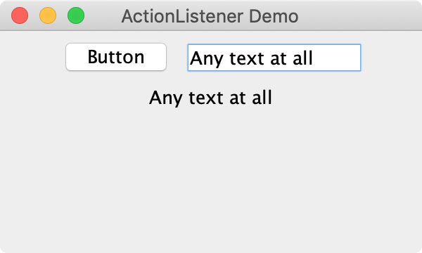
Figure 10-30. Using ActionEvents from different sources
publicclassActionDemo2{publicstaticvoidmain(String[]args){JFrameframe=newJFrame("ActionListener Demo");frame.setDefaultCloseOperation(JFrame.EXIT_ON_CLOSE);frame.setLayout(newFlowLayout());frame.setSize(300,180);JLabellabel=newJLabel("Results go here",JLabel.CENTER);ActionCommandHelperhelper=newActionCommandHelper(label);JButtonsimpleButton=newJButton("Button");simpleButton.addActionListener(helper);JTextFieldsimpleField=newJTextField(10);simpleField.addActionListener(helper);frame.add(simpleButton);frame.add(simpleField);frame.add(label);frame.setVisible(true);}}/*** Helper class to show the command property of any ActionEvent in a given label.*/classActionCommandHelperimplementsActionListener{JLabelresultLabel;publicActionCommandHelper(JLabellabel){resultLabel=label;}publicvoidactionPerformed(ActionEventae){resultLabel.setText(ae.getActionCommand());}}
Notice a very interesting thing about this code: we used one ActionListener object to handle the events for both the button and the text field. This is a great feature of the listener approach that Swing takes to handling events. Any component that generates a given type of event can report to any listener that receives that type. Sometimes the event handlers are unique and you’ll build a separate handler for each component. But many applications offer multiple ways to accomplish the same task. You can often handle those different inputs with a single listener. And the less code you have, the less that can go wrong!
Change events
Another event type that appears in several Swing components is the ChangeEvent. This is a simple event that mainly lets you know something, well, changed. The JSlider class uses just this mechanism to report changes to the position of the slider. The ChangeEvent class has a reference to the component that changed (the event’s source) but no details on what might have changed within that component. It’s up to you to go ask the component for those details. That listen-then-query process might seem tedious, but it does allow for efficient notifications that updates are necessary without creating hundreds of classes with thousands of methods to cover all the event variations that might come up.
We won’t reproduce the entire application here, but let’s take a look at how the apple tossing game uses ChangeListener to map the aiming slider to our physicist.
gamePane.add(buildAngleControl(),buildConstraints(2,0,1,1));// ...privateJSliderbuildAngleControl(){// Our aim can range from 0 to 180 degreesJSliderslider=newJSlider(0,180);// but trigonometric 0 is on the right side, not the leftslider.setInverted(true);// And now, any time the slider value changes, we should updateslider.addChangeListener(newChangeListener(){publicvoidstateChanged(ChangeEvente){player1.setAimingAngle((float)slider.getValue());field.repaint();}});returnslider;}
In this snippet, we use a factory pattern to create our slider and return it for use in the add() method of our gamePane container. You can see we create a simple anonymous inner class. Changing our aiming slider has one effect, and there is only one way to aim the apple. Since there is no possibility of class reuse, the anonymous inner class is very efficient. There is nothing wrong with creating a complete helper class and passing it the player1 and field elements as arguments to a constructor or initialization method, but you will find the approach used above quite often in the wild. While it may seem a little odd at first, after you get comfortable with the pattern, it becomes easy. It becomes self-documenting and you can trust that there are no hidden side-effects. For programmers, “what you see is what you get” is a wonderful situation.
Our Widget isn’t really good for event trial and error in jshell. While you certainly can write code like the anonymous inner ChangeListener above at a command line, it can be tedious and prone to errors—which are not easy to fix from that same command line. It’s usually simpler to write small, focused demo apps. While we encourage you to fire up the apple tossing game to play with the slider shown in the code above, you should also try your hand at a few original apps.
Other events
There are dozens of other events and listeners spread across the java.awt.event and javax.swing.event packages. It’s worth peeking at the documentation just to get a sense of the other types of events you might run into. Table 10-2 shows the events and listeners associated with the components we’ve discussed so far in this chapter as well as a few that are worth checking out as you work more with Swing. Again, this is not an exhaustive list, but should help you work with these basic components and leave you confident about exploring other components and their events.
| S/A | Event Class | Listener Interface | Generating Components |
|---|---|---|---|
A |
|
|
|
S |
|
|
|
A |
|
|
|
A |
|
|
Descendants of |
S |
|
|
|
A |
|
|
Descendants of |
A |
|
|
Descendants of |
AWT events (A) from |
|||
If you’re unsure what events a particular components supports, check its documentation for methods that look like addXYZListener(). That “XYZ” type will hand you a direct clue about where else to look in the documentation. Once you have the documentation for the listener, try implementing every method and simply printing which event was reported. It’s a little trial and error, but you can learn alot about how the various Swing components react to keyboard and mouse events this way.
Modals and popups
Events let the user get your attention, or at least the attention of some method in your application. But what if you need to get the user’s attention? A popular mechanism for this task in UIs is the popup window. You’ll often hear such a window referred to as a “modal” or “dialog” or even “modal dialog”. The use of dialog comes from the fact that these popups present some information to the user and expect or require a response. Perhaps not as lofty as a Socratic symposium, but still. The modal name refers to the fact that some of those dialogs that require a response will actually disable the rest of the application until you have provided that response. You may have experienced such a dialog in other desktop applications. If your software requires you to stay up-to-date with the latest release, for example, they might “gray out” the application indicating you can’t use it and then show you a modal dialog with a button that initiates the update process. The application has forced you into a restricted mode until you indicate how to proceed.
A “popup” is a more general term. While you can certainly have modal popups, you can also have plain (or “modeless” though use of that technical definition is fading) popups that do not block you from using the rest of the application. Think of a search dialog that you can leave available and just scoot off to the side of your main word processing document.
Message dialogs
Swing provides a bare JDialog class that can be used to create custom dialog windows, but for typical dialog interactions with your users, the JOptionPane class has some really handy shortcuts.
Perhaps the single most annoying popup is the “something broke” dialog letting you know (vaguely) that the application is not work as expected. This popup shows the user a brief message and an “OK” button that can be clicked to get rid of the dialog. The purpose of this dialog is to hold up operation of the program until the user acknowledges that they have seen the message. Figure 10-31 shows a basic example of presenting a message dialog in response to clicking a button.
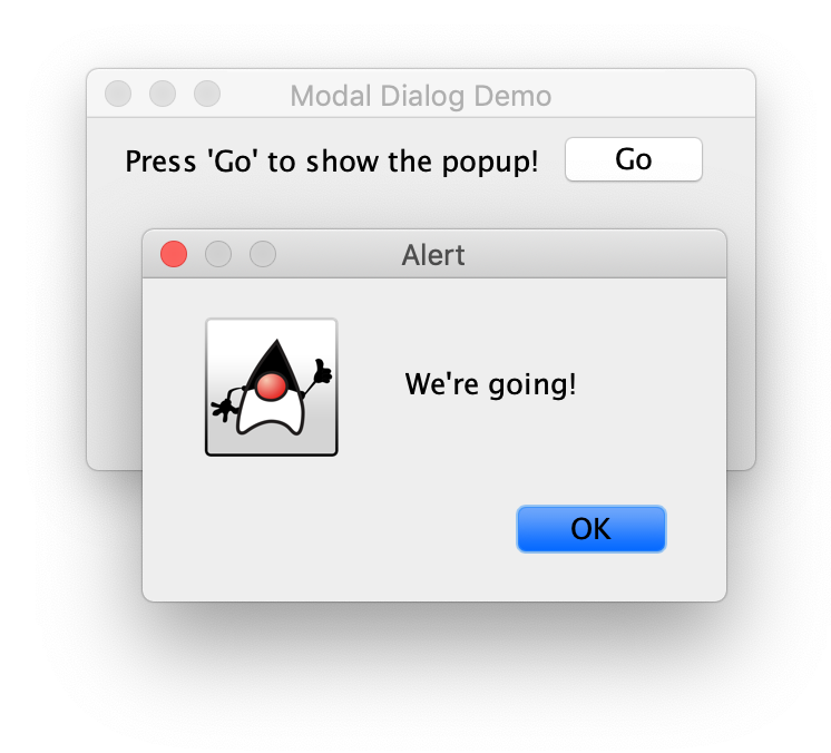
Figure 10-31. A simple JOptionPanes modal popup
packagech10;importjavax.swing.*;importjava.awt.*;importjava.awt.event.ActionEvent;importjava.awt.event.ActionListener;publicclassModalDemoextendsJFrameimplementsActionListener{JLabelmodalLabel;publicModalDemo(){super("Modal Dialog Demo");setDefaultCloseOperation(JFrame.EXIT_ON_CLOSE);setLayout(newFlowLayout());setSize(300,180);modalLabel=newJLabel("Press 'Go' to show the popup!",JLabel.CENTER);add(modalLabel);JButtongoButton=newJButton("Go");goButton.addActionListener(this);add(goButton);}publicvoidactionPerformed(ActionEventae){JOptionPane.showMessageDialog(this,"We're going!","Alert",JOptionPane.INFORMATION_MESSAGE);modalLabel.setText("Go pressed! Press again if you like.");}publicstaticvoidmain(Stringargs[]){ModalDemodemo=newModalDemo();demo.setVisible(true);}}
Hopefully you recognize the code connecting our goButton to the this listener. It’s the same pattern we used with our very first ActionEvent. What is new is what we do with that event. We show our message dialog and then update our label to indicate that we successfully presented the dialog.
The showMessageDialog() call takes four arguments. The this argument you see in the first position is the frame or window “owning” the popup; the alert will try to center itself over its owner when shown. We specify our application itself as the owner. The second and third arguments are Strings for the dialog’s message and title, respectively. The final arugment indicates the “type” of the popup—which mostly affects the icon you see. There are several types you can specify:
-
ERROR_MESSAGE, red “stop” icon -
INFORMATION_MESSAGE, Duke6 icon -
WARNING_MESSAGE, yellow triangle icon -
QUESTION_MESSAGE, Duke icon -
PLAIN_MESSAGE, no icon
If you want to play around with these popups, you can head back to your jshell. We can use our Widget object as the owner, or you can employ the handy option of using null to indicate there is no particular frame or window in charge, but that popup should pause the entire application and show itself at the center of your screen like so:
jshell> import javax.swing.*

jshell> JOptionPane.showMessageDialog(null, "Hi there", "jshell Alert", JOptionPane.ERROR_MESSAGE)

Figure 10-32. A JOptionPane launched from jshell
You might have to run the ModalDemo a few times, but watch the text in our modalLabel object. Notice that it only changes after you dismiss the popup. It is important to remember that these modal dialogs halt the normal flow of your application. That is exactly what you want for error conditions or where some user input is required, but may not be what you want for simple status updates.
Perhaps you can imagine other, more valuable situations for such an alert. Or if you do encounter the “somthing broke” situation in your application, hopefully you can provide a useful error message that helps the user fix whatever went wrong. Remember the email validating regular expression from “Pattern”? You could attach an ActionListener to a text field and when the user presses return, popup an error dialog if the content of the field doesn’t look like an email address.
Confirmation dialogs
Another common task for popups is verifying the user’s intent. Many applications ask if you’re sure you want to quit, or to delete something, or to do some other ostensibly irreversible action like snapping your fingers while wearing a gauntlet studded with Infinity Stones. JOptionPane has you covered. We can try out this new dialog in jshell like so:
jshell> JOptionPane.showConfirmDialog(null, "Are you sure?")
$18 ==> 0

Figure 10-33. A “confirmation” JOptionPane
And that should produce a popup with a “Yes”, “No”, and “Cancel” buttons as shown in Figure 10-33. You can determine which answer the user selected by keeping the return value (an int) from the showConfirmDialog() method call. (In running this example as we wrote this chapter, we pressed the “Yes” button. That’s the 0 return value shown in the jshell snippet above.) So let’s modify our call to catch that answer (we’ll press “Yes” again):
jshell> int answer = JOptionPane.showConfirmDialog(null, "Are you sure?")
answer ==> 0

jshell> answer == JOptionPane.YES_OPTION ? "They said yes!" : "They said no or canceled. :("
$20 ==> "They said yes!"
There are other standard confirmation dialogs that can be shown with an extra pair of arguments: a String title to show on the dialog, and one of the following option types:
-
YES_NO_OPTION -
YES_NO_CANCEL_OPTION -
OK_CANCEL_OPTION
You may notice that our example did not specify the extra arguments so we got the default title of “Select an Option” and the buttons dictated by the YES_NO_CANCEL_OPTION type constant. In most situations, having both a “No” and a “Cancel” choice is confusing for users. We recommend using one of the other type choices. The user can always close the dialog using the standard window “x” window control. without pressing any of the provided buttons. You can detect that closing action by testing for JOptionPane.CLOSED_OPTION in the result.
We won’t cover it here, but you can use the showOptionDialog() method if you need to create something similar to the confirmation dialogs above but you want to use a custom set of buttons. As always, the JDK documentation is your friend!
Input dialogs
Last but not least in the world of popups are windows that ask for a quick bit of arbitrary input. You can use the showInputDialog() method to ask a question and allow the user to type in an answer. That answer (a String) can be stored similar to how you keep the confirmation choice. Let’s add one more popup producing button to our demo:

Figure 10-34. An “input” JOptionPane
jshell> String pin = JOptionPane.showInputDialog(null, "Please enter your PIN:")

pin ==> "1234"
This is handy for one-off requests, but is not something to do if you have a series of questions to ask the user. Keep modals confined to quick tasks. They interrupt the user. Sometimes that is exactly what you need, but if you abuse that attention, you’re likely to annoy the user and they’ll learn to simply ignore every popup from your application.
Threading considerations
If you have read any of the JDK documentation on Swing as you’ve been working through this chapter, you may have come across the warning that Swing components are not thread safe. If you recall from Chapter 9, Java supports multiple threads of execution to take advantage of modern computer processing power. One of the concerns about multithreaded applications is that two threads might fight over the same resource or update the same variable at the same time but with different values. Not knowing if your data is correct can severely impact your ability to debug a program or even just trust its output. For Swing components, this warning is reminding you that your UI elements are subject to this type of corruption.
To help maitain a consistent UI, Swing encourages you to update your components on the AWT event dispatch thread. This is the thread that naturally handles things like button presses. If you update a component in response to an event (such as our counter example in “Action events” above), you are set. The idea is that if every other thread in your application sends UI updates to the event dispatch thread, no component can be adversely affected by simultaneous, possibly conflicting changes.
A common example of when threading is front and center in graphical applications is the “long running task”. Think of downloading a file from the cloud while an animated spinner sits on your screen, hopefully keeping you entertained. But what if you get impatient? What if it seems like the download has failed but the spinner is still going? If your long running task is using the event dispatch thread, your user won’t be able to click a cancel button or take any action at all. Long running tasks should be handled by separate threads that can run in the background, leaving your application responsive and available. But then how do we update the UI when that background thread finishes? Swing has a helper for just that task.
SwingUtilities and component updates
You can use the SwingUtilities class from any thread to perform updates to your UI components in a safe, stable manner. There are two static methods you can use to communicate with your UI:
-
invokeAndWait() -
invokeLater()
As their names imply, the first method will run some UI update code and makes the current thread wait for that code to finish before continuing on. The second method hands off some UI update code to the event dispatch thread and then immediately resumes executing on the current thread. Which one you use really depends on whether your background thread needs to know the state of the UI before continuing on. For example, if you are adding a new button to your interface, you might want to use invokeAndWait() so that by the time your background thread continues, it can be sure that future updates to the added button will actually have a button to update.
If you aren’t as concerned about when something gets updated, just that it does eventually get handled safely by the dispatch thread, invokeLater() is perfect. Think about updating a progress bar as a large file is downloading. You might fire off several updates with more and more of the download completed. You don’t need to wait for those graphical updates to finish before resuming your download. If a progress update gets delayed or runs very close to a second update, there’s no real harm. But you don’t want a busy graphical interface to interrupt your download—especially if the server is sensitive to pauses.
We’ll see several examples of exactly this type of network/UI interaction in the next chapter, but let’s fake some network traffic and update a small label to show off SwingUtilities. We can setup a “start” button that will update a status label with a simple percentage display and kick off a background thread that simply sleeps for a second then increments the progress. Each time the thread wakes up, it will update the label using invokeLater() to correctly set the label’s text. First, let’s look at setting up our demo:
publicclassProgressDemo{publicstaticvoidmain(String[]args){JFrameframe=newJFrame("SwingUtilities 'invoke' Demo");frame.setDefaultCloseOperation(JFrame.EXIT_ON_CLOSE);frame.setLayout(newFlowLayout());frame.setSize(300,180);JLabellabel=newJLabel("Download Progress Goes Here!",JLabel.CENTER);Threadpretender=newThread(newProgressPretender(label));JButtonsimpleButton=newJButton("Start");simpleButton.addActionListener(newActionListener(){publicvoidactionPerformed(ActionEvente){simpleButton.setEnabled(false);pretender.start();}});JLabelcheckLabel=newJLabel("Can you still type?");JTextFieldcheckField=newJTextField(10);frame.add(label);frame.add(simpleButton);frame.add(checkLabel);frame.add(checkField);frame.setVisible(true);}}
Hopefully most of this looks familiar but we do want to point out a few interesting details. First, look at how we create our thread. We pass a new ProgressPretender call as the the argument to our Thread constructor. We could have broken that into separate parts, but since we do not refer to our ProgressPretender object again, we can stick with this tidier, denser approach. We do refer to the thread itself, however, so we make a proper variable for it. We can then start our thread running in the ActionListener for our button. Notice in this listener that we disable our “Start” button. We don’t want the user trying to start a thread that is already running!
The other thing we want to point out is that we added a text field for you to type in. While the progress is being updated, your application should continue responding to user input like typing. Try it! The text field isn’t connected to anything, of course, but you should be able to enter and delete text all while watching the progress counter slowly climb up as shown in Figure 10-35.
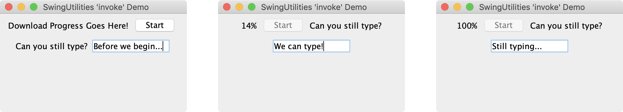
Figure 10-35. Thread-safe updates to a progress label
So how did we update that label without locking up the application? Let’s look at the ProgressPretender class and inspect the run() method.
classProgressPretenderimplementsRunnable{JLabellabel;intprogress;publicProgressPretender(JLabellabel){this.label=label;progress=0;}publicvoidrun(){while(progress<=100){SwingUtilities.invokeLater(newRunnable(){publicvoidrun(){label.setText(progress+"%");}});try{Thread.sleep(1000);}catch(InterruptedExceptionie){System.err.println("Someone interrupted us. Skipping download.");break;}progress++;}}}
In this class, we store the label passed to our constructor so we know where to display our updated progress. The run() method has three basic steps: 1) update the label, 2) sleep for 1000 milliseconds, and 3) increment our progress.
For step 1, notice the fairly complex argument we pass to invokeLater(). It looks a lot like a class definition but it is based on the Runnable interface we saw in Chapter 9. This is another example of using anonymous inner classes in Java. There are other ways to create the Runnable object, but like handling simple events with anonymous listeners, this thread pattern is very common. This nested Runnable argument updates the label with our current progress value—but again, it performs this update on the event dispatch thread. This is the magic that leaves the text field responsive even though our “progress” thread is sleeping most of the time.
Step 2 is standard issue thread sleeping. Recall that the sleep() method knows it can be interrupted, so the compiler will make sure you supply a try/catch block like we’ve done above. There are many ways we could handle the interruption, but in this case we chose to simply break out of the loop.
Finally, we increment our progress counter and start the whole process over. Once we hit 100, the loop ends and our progress label should stop changing. If you wait patiently, you’ll see that final value. The app itself should remain active, though. You can still type in the text field. Our download is complete and all is well with the world!
Timers
The Swing library also includes a timer that is designed to work in the UI space. The javax.swing.Timer class is fairly straightforward. It waits a specified period of time and then fires off an action event. It can fire that action once or repeatedly. There are many reasons to use timers with graphical applications. Besides an animation loop, you might want to automatically cancel some action like loading a network resource if it is taking too long. Or conversely, you might put up a little “please wait” spinner or message to let the user know the operation is ongoing. You might want to take down a modal dialog if the user doesn’t respond within a specified time span. In all these cases, simple one-time timers are great. Swing’s Timer can handle all of them.
Animation with Timer
Let’s revisit our flying apples animation from “Revisiting animation with threads” and try implementing it with an instance of Timer. We actually glossed over using a correct utility method such as invokeLater() to safely repaint the game when using standard threads. The Timer class takes care of that detail for us. And happily we can still use our step() method in the Apple class from our first pass at animation. We just need to alter the start method and keep a suitable variable around for the timer:
publicstaticfinalintSTEP=40;// frame duration in millisecondsTimeranimationTimer;// ...voidstartAnimation(){if(animationTimer==null){animationTimer=newTimer(STEP,this);animationTimer.setActionCommand("repaint");animationTimer.setRepeats(true);animationTimer.start();}elseif(!animationTimer.isRunning()){animationTimer.restart();}}// ...publicvoidactionPerformed(ActionEventevent){if(animating&&event.getActionCommand().equals("repaint")){System.out.println("Timer stepping "+apples.size()+" apples");for(Applea:apples){a.step();detectCollisions(a);}repaint();cullFallenApples();}}
There are two nice things about this approach. It’s definitely easier to read because we are not responsible for the pauses between actions. We create the Timer by passing the constructor the time interval between events and an ActionListener to receive the events—--our Field class in this case. We give the timer a nice action command, make it a repeating timer, and start it up! As we noted as part of the motiviation for looking at timers, the other nice thing is specific to Swing and graphical applications: javax.swing.Timer fires its action events on the event dispatch thread. You do not need to wrap anything in invokeAndWait() or invokeLater(). Just put your time-based code in an attached listener’s actionPerformed() method and you are good to go!
Because several components generate ActionEvent objects as we’ve seen, we did take a little precaution against collisions by setting the actionCommand attribute for our timer. This step is not strictly necessary in our case, but it leaves room for the Field class to handle other events down the road without breaking our animation.
Other Timer uses
As mentioned at the top of this section, mature, polished applications have a variety of small moments where it helps to have a one-time timer. Our apple game is simple by comparison to most commercial apps or games, but even here we can add a little “realism” with a timer: after tossing an apple, we could make the physicist pause before being able to fire another apple. They have to bend down and grab another apple from a bucket before aiming or tossing. This kind of delay is another perfect spot for a Timer.
We can add such a pause to the bit of code in the Field class where we toss the apple:
publicvoidstartTossFromPlayer(Physicistphysicist){if(!animating){System.out.println("Starting animation!");animating=true;startAnimation();}if(animating){// Check to make sure we have an apple to tossif(physicist.aimingApple!=null){Appleapple=physicist.takeApple();apple.toss(physicist.aimingAngle,physicist.aimingForce);apples.add(apple);TimerappleLoader=newTimer(800,physicist);appleLoader.setActionCommand("New Apple");appleLoader.setRepeats(false);appleLoader.start();}}}
Notice this time that we set the timer to run only once with the setRepeats(false) call. This means after a little less than a second, a single event will be fired off to our physicist. The Physicist class, in turn, needs to add the implements ActionListener portion to the class definition and include an appropriate actionPerformed() function like so:
publicvoidactionPerformed(ActionEvente){if(e.getActionCommand().equals("New Apple")){getNewApple();if(field!=null){field.repaint();}}}
Again, using Timer isn’t the only way to accomplish such tasks, but in Swing, the combination of efficient time-based events and automatic use of the event dispatch thread make it worth considering. If nothing else, it is a great way to prototype. You can always come back and refactor your application to use custom threading code if needed.
Next steps
As we noted at the beginning of the chapter, there are many, many more discussions and topics and explorations available in the world of Java graphical applications. We’ll leave it to you to do that exploring, but wanted to go through at least a few key topics worth focusing on first if you have plans for a desktop app.
Menus
While not technically required, most desktop applications have an application-wide menu of common tasks such as saving changed files or setting preferences and specific features like spreadsheet apps that allow sorting the data in a column or selection. The JMenu, JMenuBar, and JMenuItem classes help you add this functionality to your Swing apps. Menus go inside a menu bar, and menu items go inside menus. Swing has three pre-built menu item classes: JMenuItem for basic menu entries and then JCheckboxMenuItem for option items and JRadioButtonMenuItem for grouped menu items such as you might see for the currently selected font or color theme. The JMenu class is itself a valid menu item so that you can build nested menus. JMenuItem behaves like a button (as do its menu item compatriots) and you can catch menu events using the same listeners.
Figure 10-36 shows an example of a simple menu bar populated with some menus and items. Notice that the Mac application differs slightly from the Linux version. Swing (and Java) still reflect many aspects of the native environments they run in. Although a glaring discrepancy here is that Mac applications typically use a global menu bar at the top of their main screen. You can do platform-specific things such as using the Mac menu or setting application icons as you get more comfortable with programming and want to start sharing your code or distributing your application to others. But for now we’ll live with the Mac menu local to the application’s window.

Figure 10-36. JMenu and JMenuItem on Mac and Linux systems
packagech10;importjavax.swing.*;importjava.awt.*;importjava.awt.event.ActionEvent;importjava.awt.event.ActionListener;publicclassMenuDemoextendsJFrameimplementsActionListener{JLabelresultsLabel;publicMenuDemo(){super("JMenu Demo");setDefaultCloseOperation(JFrame.EXIT_ON_CLOSE);setLayout(newFlowLayout());setSize(300,180);resultsLabel=newJLabel("Click a menu item!");add(resultsLabel);// Now let's create a couple menus and populate themJMenufileMenu=newJMenu("File");JMenuItemsaveItem=newJMenuItem("Save");saveItem.addActionListener(this);fileMenu.add(saveItem);JMenuItemquitItem=newJMenuItem("Quit");quitItem.addActionListener(this);fileMenu.add(quitItem);JMenueditMenu=newJMenu("Edit");JMenuItemcutItem=newJMenuItem("Cut");cutItem.addActionListener(this);editMenu.add(cutItem);JMenuItemcopyItem=newJMenuItem("Copy");copyItem.addActionListener(this);editMenu.add(copyItem);JMenuItempasteItem=newJMenuItem("Paste");pasteItem.addActionListener(this);editMenu.add(pasteItem);// And finally build a JMenuBar for the applicationJMenuBarmainBar=newJMenuBar();mainBar.add(fileMenu);mainBar.add(editMenu);setJMenuBar(mainBar);}publicvoidactionPerformed(ActionEventevent){resultsLabel.setText("Menu selected: "+event.getActionCommand());}publicstaticvoidmain(Stringargs[]){MenuDemodemo=newMenuDemo();demo.setVisible(true);}}
We obviously don’t do much with the menu item actions here, but we want to show how you can start building out the exptected parts of a professional application.
Preferences
The Java Preferences API accommodates the need to store both system and per-user configuration data persistently across executions of the Java VM. The Preferences API is like a portable version of the Windows registry, a mini-database in which you can keep small amounts of information, accessible to all applications. Entries are stored as name/value pairs, where the values may be of several standard types including strings, numbers, Booleans, and even short byte arrays (remember we said small amounts of data). As you build more interesting desktop applications, you will certainly encounter elements that your users can customize. The Preferences API is a great way to keep that information available in a cross-platform form that is easy to use and will improve the user experience.
You can read more from Oracle online in their Preferences technote.
Custom components and Java2D
We touched briefly on creating custom components with our game and its Field class. We provided a custom paintComponent() method to draw our apples, trees, and physicists. This is a start, but you can add a lot (a lot) more functionality. You can take low-level mouse and keyboard events and map them onto fancier visual interfaces. You can generate your own custom events. You can build your own layout manager. You can even create an entire look and feel that touches every component in the Swing library! This amazing extensibility requires some pretty in-depth knowledge of Swing and Java, but it’s there waiting for you.
In the drawing arena, you can check out the Java 2D API (see Oracle’s online overview). This API provides several nice upgrades to the drawing and imaging capabilities in the AWT package. If you have an interest in Java’s 2D graphics capabilities, be sure to check out Java 2D Graphics by Jonathan Knudsen. And again, Java Swing, 2nd Edition by Loy, Eckstein, Wood, Elliott, and Cole is an in-depth resource for all things Swing.
JavaFX
Another API you should look at is JavaFX. This collection of packages was originally designed to replace Swing and includes rich media options such as video and high fidelity audio. It is sufficiently different from Swing that both libraries remain a part of the JDK and there appear to be no real plans to deprecate or remove Swing. As of Java 11—recall this is the current long-term support version—the OpenJDK gained support for JavaFX in the form of the OpenJFX project. You can find more online at https://openjfx.io.
User Interface and User Experience
This was a whirlwind tour of some of the more common elements that you’ll be using when creating a user interface (UI) for your desktop applications. We’ve seen components such as JButton, JLabel, and JTextField that will likely be in any graphical application you make. We discussed how to arrange those components in containers and how to create more complex combinations of containers and components to handle more interesting presentations. Hopefully we also introduced enough of the other components to give you the tools you need to make sure the user experience (UX) of your application is a positive one.
These days, desktop applications are only part of the story. Many applications work online in coordination with other applications. The remaining two chapters will cover networking basics and introduce Java’s web programming capacity.
1 If you are curious about this topic and want to see behind the curtains of a commercial, desktop Java application, Jetbrains publishes the source code for the Community Edition.
2 The javax package prefix was introduced early by Sun to accomodate packages that were distributed with Java but not “core”. The decision was modestly controversial, but javax has stuck and has been used with other packages as well.
3 You’ll need to start jshell from the directory containing your compiled class files. If you are using IntelliJ IDEA, you can start their terminal and switch directories using cd out/production/LearningJava5e and then start jshell.
4 As we create Swing components for use in these jshell examples, we’ll be eliding much of the resulting output. jshell prints a lot of information about each component although it also uses ellipses when things get too extreme. Don’t be alarmed if you see extra details about an element’s attributes while you’re playing. That’s normal. We just want to keep the text concise and have chosen to omit some of this output that isn’t relevant to the topic.
5 We should also note that there are many open source projects with yet fancier components for handling things like syntax highlighting in text, various selection helpers, and composite inputs like date or time pickers.
6 “Duke” is the official Java mascot. You can find out more at https://www.oracle.com/java/duke.html.