
Part 6
New and Improved CSS Elements
In addition to changes in HTML, there have been some striking new changes in Cascading Style Sheets (CSS) technology. Now almost all of the page formatting, style, and layout is performed by CSS. This part describes those features of CSS3 that are relatively new, are supported (or are expected to be supported), and have a potential significant impact on the Web. As you work with these CSS elements, you’ll notice that many of them are not fully implemented. The major rendering engines have created vendor-specific test versions of many of these tags:
-webkit-: This indicates a test version of the attribute optimized for browsers based on the WebKit rendering engine. This includes Safari, Chrome, and the iPhone browsers.
-o-: This prefix stands for the Opera browser. It’s not used very often because Opera tends to either support an attribute completely or not at all. The Opera rendering engine is (naturally enough) used in the Opera browser. You’ll also see versions of the Opera browser on many portable devices.
-moz-: The -moz- prefix is used for test versions of an attribute optimized for the Mozilla rendering engine. This is primarily Firefox, but a number of other Mozilla-based browsers are starting to appear.
 IE8 supports almost none of the features described in this part. IE9 promises fuller support for HTML5 standards (and hopefully support for CSS3).
 As always, be sure to check out my Web site for working examples of every code fragment in the book: www.aharrisbooks.net/h5qr.
In this part . . .
Introducing New CSS3 Selection Tools
Taking a Look at Font and Text Support
Examining the Flexible Box Layout Model
Previewing New Visual Elements
CSS3’s New Selection Tools
One key element of CSS is the way a developer can select parts of the page for markup. Traditional CSS has allowed selection by tag type (p to select all paragraphs, for example), by class (.fancy indicates a style applied to all elements with the fancy class), or by id (#sidebar indicates a style that will be applied to an element with the sidebar id).
CSS3 supports several new selectors with interesting new capabilities.
Attribute selection
You can now apply a style to any element with a specific attribute value. For example, the input tag takes many different forms, all determined by the type attribute. If you apply a single style to the input element, that style is applied to many different kinds of elements: check boxes, text fields, and radio buttons. By using the new attribute syntax, you can apply a style to any particular type of input element:
input[type=”text”]{
background-color: #CCCCFF;
}
You can apply the style with or without a tag type, but it’s possible to have unexpected side effects if you choose an extremely common attribute.
not
There are times you want an inverse selection. For example, imagine you wanted to apply a style to all the paragraphs that are not members of the special class:
p:not(.special) {
border: 1px solid red;
}
The given code will apply the solid red border to any paragraph that does not have the special class assigned.
nth-child
The nth-child selector allows you to select one or more elements in a group. The basic version uses a numeric input:
#myList>li:nth-child(1){
border: 1px solid blue;
}
This allows you to apply a style to the first of a group of elements. In my example, I have a list with four items. The style is applied to the list items, not the list. (It seems to me that the list items are children of the list, so it should be the nth-child of the list — but nobody asked me.)
The numeric value can actually be a formula, like an+b. If you love algebra (and who doesn’t?), you can select all the even-numbered elements like this:
#myList>li:nth-child(2n){
border: 1px solid blue;
}
A similar formula can be used to pick the odd-numbered children:
#myList>li:nth-child(2n+1){
border: 1px solid blue;
}
You could use this formula system to get all kinds of groupings (every third element with 3n, for example), but most people simply need a particular element, or all the even or odd rows. CSS3 supplies shortcut keywords — even and odd — so you don’t have to do it using math:
#myList>li:nth-child(even){
color: white;
background-color: red;
}
The last keyword allows you to pick the last element from a group. There are a few more variations of this selection technique:
:nth-last-child(N): Works just like nth-child, except it counts from the end of the group of elements rather than the beginning.
:nth-of-type(N): This selector works just like nth-child, except it filters to a specific type and ignores any elements that are not of exactly the same type of element.
last-child: This (naturally enough) selects the last child element.
last-nth-of-type(N): Works like nth-of-type, but from the end of the group.
first-child: Grabs the first element. (Technically, this was available in CSS2, but it was rarely used.)
These selection tools are fully supported in all the recent browsers except IE. IE9 supports these tools, but older versions do not. However, as they are generally used simply to improve readability, it should be safe to use them. Non-compliant browsers will simply skip the style.
Other new pseudo-classes
Pseudo-classes allow you to specify styles based on the state of an element. Modern CSS supports a number of new pseudo-classes:
:hover: The :hover pseudo-class has been a part of CSS from the beginning, but it was officially defined only for the <a> tag. Now the :hover pseudo-class can be applied to any element. If the mouse (or other pointing device) is over an element, that element has the hover state activated.
Note that mobile devices don’t always support hover, because the position of the pointing device (the stylus or finger) isn’t known until the item is activated. Mobile devices may have some sort of tabbing mechanism to indicate which item is being “hovered” over.
:focus: This pseudo-class is activated when an element is ready to receive keyboard input.
:active: A form element is active when it’s currently being used. For example, when a button has been pressed but not yet released.
Mobile devices often skip directly to active mode without going through hover mode. This can be an important design consideration when using state for styling.
The state pseudo-classes are fully supported by all modern browsers except the IE family of browsers. There is limited (but buggy support) in early versions of IE.
Downloadable Fonts and Text Support
Font support has always been one of the biggest weaknesses of the HTML/CSS model. Although a Web developer can suggest any font for a Web page, the font files are traditionally a client-level asset — if the client doesn’t have the font installed, she won’t see it. Developers had to rely on a series of substitute fonts and fallbacks. Finally, CSS3 now supports a sensible solution for providing downloadable fonts.
@font-face
The @font-face style does not work like most CSS elements. It doesn’t apply markup to some part of the page. Instead, it defines a new CSS value that can be used in other markup. Specifically, it allows you to place a font file on your server and define a font family using that font.
@font-face {
font-family: “Miama”;
src: url(“Miama.otf”);
}
The font-family attribute indicates the name you will be giving this font in the rest of your CSS code. Typically, it’s similar to the font filename, but this isn’t required. The src attribute is the URL of the actual font file as it is found on the server. Once a font face has been defined, it can be used in an ordinary font-family attribute in the rest of your CSS code:
h1 {
font-family: Miama;
}
While all modern browsers support the @font-face feature, the actual file types supported vary from browser to browser. Here are the primary font types:
TTF: The standard TrueType format (TTF) is well-supported, but not by all browsers. Many open source fonts are available in this format.
OTF: Similar to TTF, but it’s a truly open standard and, as a result, is preferred by those who are interested in open standards. OTF (OpenType) is supported by most browsers except IE.
WOFF: A proposed standard format currently supported by Firefox. Microsoft has hinted at supporting WOFF (Web Open Font Format) in IE9.
EOT: Microsoft’s proprietary embedded font format. EOT (Embedded OpenType) works only in IE, but to be fair, Microsoft has had embedded font support for many years.
You can use a font conversion tool like the free Online Font Converter (http://onlinefontconverter.com) to convert to whatever font format you prefer.
It’s possible to supply multiple src attributes. This way, you can include both an EOT and OTF version of a font so that it will work on a wide variety of browsers.
 Just because you can include a font doesn’t mean you should. Think carefully about readability. Also, be respectful of intellectual property. There are many excellent free open source fonts available. Begin by looking at http://openfontlibrary.org.
Column support
Web developers have been looking for column support since the early days of HTML. Many approaches have been used over the years, including frames, tables, and floating elements. Finally, CSS3 has now integrated column support.
#main{
column-count: 3;
column-gap: 2em;
column-rule: 5px double red;
-webkit-column-count: 3;
-webkit-column-gap: 2em;
-webkit-column-rule: 5px double red;
-moz-column-count: 3;
-moz-column-gap: 2em;
-moz-column-rule: 5px double red;
} // end main
Three new rules govern columns:
column-count: Indicates the number of columns.
column-gap: The space between columns using standard CSS measurements.
column-rule: The vertical line (if any) between the columns. This rule is defined with exactly the same parameters as the border rule.
Promising as the column system looks, it has a few problems:
It isn’t supported. The standard column rules are not yet supported by any major browsers. However, two of the main engines have their own variations of the column tags. Incorporate the -moz- versions of the tag for Firefox and related browsers. The -webkit- versions support Safari and Chrome.
Column width is automatic. You can either set all columns to the same width (in which case the number of columns is automatically determined) or you can set the number of columns (which automatically determines a width for each). You cannot make one column a different size from the others.
Text flow is automatic. Content fills up the entire area, automatically flowing from one column to the next. There is no easy way to specify which text is in which column.
It’s tempting to consider use of the column CSS attributes as a page layout technique, but this doesn’t seem to be a practical consideration yet. Also, since there is no support for columns in IE or Opera, it’s still necessary to consider other more universal page layout techniques. (For one interesting new option, see “Flexible Box Layout Model” later in this part.)
Columns are more suited for magazine-style layout with text flowing among columns.
text-stroke
You can change the appearance of your fonts in another new way. With CSS3, you can specify a stroke color for your text. This defines an outline around the letter. You can specify the stroke color (using any of the standard CSS color values) as well as a stroke width (using the normal size attributes).
h2 {
color: yellow;
-webkit-text-stroke: 2px red;
font-size: 300%;
}
Currently, no browsers support the text-stroke attribute directly, but WebKit-based browsers (Chrome and Safari) support the vendor-specific -webkit- version.
text-shadow
Shadows are another common feature of modern Web designs. Shadows add an element of depth to a page, but they can also enhance readability (if used properly) to lift a headline from the page. The text-shadow attribute was technically part of CSS2, but it has only recently been supported by major browsers:
h2 {
font-size: 300%;
text-shadow: 3px 3px 5px #666666;
}
The text-shadow attribute has four parameters:
offset-x: Determines how far in the x-axis (left-right) the shadow will be from the original text. A positive value moves the shadow to the right, and a negative value moves to the left.
offset-y: Indicates how far in the y-axis (up-down) the shadow will be from the original text. A positive value moves the shadow down, and a negative value moves the shadow up
blur: Specifies the blur radius of the shadow. If the value is 0px, there is no blur, and the shadow looks just like the original text. Generally, you’ll want the blur equivalent to the longest of your offsets. This allows the shadow to be recognizable as a shadow of the text without becoming a distraction.
color: Defines the shadow color. Generally, a dark gray is the standard shadow color, but you can also try other colors for special effects. Note that blurring tends to lighten the shadow color. If there’s a great deal of blur applied, the shadow color can be the same color as the text. If the shadow will not be blurred much, you may need to lighten the shadow color for readability.
The size of the shadow is determined indirectly with a combination of offsets and blurs. You may have to experiment to get the shadow you’re looking for.
A special case of text shadowing can be used to help text stand out against a background image. Apply a small shadow of a contrasting color.
All late-model browsers except IE support the text-shadow feature. No special prefixes are necessary.
Flexible Box Layout Model
Page layout has been a constant concern in Web development. There have been many different approaches to page layout, and all have weaknesses. The current standard is the floating mechanism. While this works quite well, it has two major weaknesses:
It can be hard to understand. The various parts of the float specification can be difficult to follow, and the behavior is not intuitive. The relationship between width, clear, and float attributes can be difficult to follow.
The page order matters. One goal of semantic layout is to completely divorce the way the page is created from how it is displayed. With the floating layout, the order in which various elements are written in the HTML document influences how they are placed. An ideal layout solution would allow any kind of placement through CSS, even after the HTML is finished.
While the floating mechanism is the current standard for page layout, clearly another option would be nice. CSS3 includes the new flexible box layout as an alternative.
Creating a flexible box layout
CSS3 proposes a new layout mechanism, flexible box. While it is far from complete, this mechanism shows significant promise. Here’s essentially how it works. (I’m deliberately leaving out details here for clarity; see “Viewing a flexible box layout” later in this part.)
1. Designate a page segment as a box. The display attribute of most elements can be set to various types. CSS3 introduces a new display type: box. Setting the display of an element to box makes it capable of holding other elements with the flexible box mechanism.
2. Determine the orientation of child elements. Use a new attribute called box-orient to determine if the child elements of the current element will be placed vertically or horizontally inside the main element.
3. Specify the weight of child elements. Each child element can be given a numeric weight. The weight determines how much space that element takes up. If the weight is zero, the element takes as little space as possible. If the weight of all the elements is one, they all take up the same amount of space. If one element has a weight of two and the others all have a weight of one, the larger element has twice the size of the others, and so on. Weight is determined through the box-flex attribute.
4. Nest another box inside the first. You can nest flex boxes inside each other. Simply apply the box display type to inner elements, which will show the display.
5. Modify the order in which elements appear. Normally, elements will appear in the order in which they were placed on the page, but you can use the box-ordinal-group attribute to adjust the placement order.
Viewing a flexible box layout
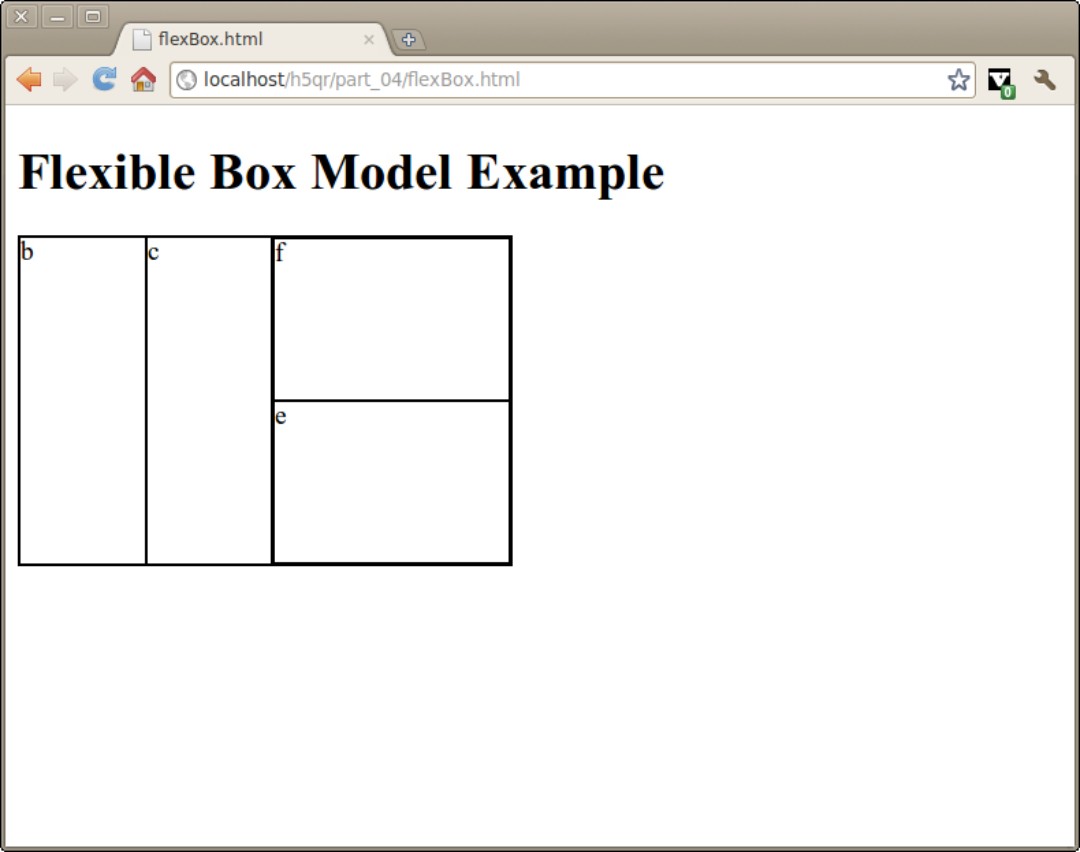
As an example of the new layout mechanism (see “Creating a flexible box layout” earlier in this part), take a look at the following HTML code:
<div id = “a”>
<div id = “b”>b</div>
<div id = “c”>c</div>
<div id = “d”>
<div id = “e”>e</div>
<div id = „f“>f</div>
</div>
</div>
While this is a clearly made-up example, it shows a complex structure that could be difficult to style using standard layout techniques. Figure 6-1 illustrates a complex nested style that would be difficult to achieve through traditional layout techniques (for example, CSS2).
Figure 6-1
The following example style sheet is used to apply a floating style to this page:
div {
border: 1px solid black;
}
#a {
width: 300px;
height: 200px;
box-orient: horizontal;
display: box;
}
#b {
box-flex: 1;
}
#c {
box-flex: 1;
}
#d {
display: box;
box-orient: vertical;
box-flex: 2;
}
#e {
box-flex: 1;
box-ordinal-group: 2;
}
#f {
box-flex: 1;
}
The CSS looks complex, but there are only four new CSS elements. Here’s how this specific example works:
1. Set up a to be the primary container. The a div is the primary container, so give it a height and width. It will contain flex boxes, so set the display attribute to box. Determine how you want the children of this box to be lined up by setting the box-orient attribute to vertical or horizontal.
2. Specify the weights of b, c, and d. In my example style sheet here, I want elements b and c to take up half the space, and d to fill up the remainder of the space. To get this behavior, set the box-flex value of c and d to 1, and the box-flex value of d to 2.
3. Set up d as another container. The d element will contain e and f. Use display: box to make d a flex container, and set box-orient to vertical to make the elements line up vertically. (Normally, nested elements will switch between horizontal and vertical.)
4. Elements e and f should each take half of d. Use the box-flex attribute to give these elements equal weight.
5. Change the ordinal group of e so it appears after f. The box-ordinal-group attribute indicates the order in which an element will be displayed inside its group. Normally, all items have a default value of 1, so they appear in the order they are written. You can demote an element by setting its box-ordinal-group value to a higher number, causing that element to be displayed later than normal. I set e to ordinal group 2, so it is displayed after element f.
. . . And now for a little reality
The flex box system seems perfect. It’s much more sensible than the Byzantine layout techniques that are currently in use. However, the flexible box system is not ready for common use yet. Right now, not a single browser implements the flex box attributes directly. However, there are special vendor-specific versions available. WebKit-based browsers (primarily Safari and Chrome) use variations that begin with -webkit-, and Gecko-based browsers (Firefox and Mozilla) use the -moz- extension. To make the example in this part work in modern browsers, you need to include both -webkit- and -moz- versions of all the attributes, like this:
#a {
width: 300px;
height: 200px;
-moz-box-orient: horizontal;
display: -moz-box;
-webkit-box-orient: horizontal;
display: -webkit-box;
}
#b {
-moz-box-flex: 1;
-webkit-box-flex: 1;
}
At the moment, no version of IE supports the flex box model, but preliminary versions of IE9 do support the model. Surprisingly, Opera does not yet support this mechanism. Regardless, it looks like this could become an important layout technique, particularly on mobile devices that already include compliant browsers.
Some browsers have problems with multiple levels of nesting, but this is expected to be resolved. This technique is worth learning about, as it may well become the preferred layout technique in the future. See the file flexTwoCol.html on my Web site (www.aharrisbooks.net/h5qr) for an example of a standard two-column page using the flex box technique.
New Visual Elements
A large number of visual enhancements are available in upcoming versions of CSS. While none of them are essential, they add tremendous new options for developers.
Color values
CSS3 includes new ways of thinking about colors.
CSS3 also supports a new form of color representation that also incorporates transparency. You can now define a color in the RGBA format:
h1 {
color: rgba(0, 0, 0, .3);
}
This format uses four numeric values. The first three are for red (r), green (g), and blue (b), respectively. Use standard 0–255 values to indicate the color you want. The fourth value (a) stands for alpha, which is another term for transparency. The alpha value is a real number between 0 (completely transparent) and 1 (completely opaque).
CSS3 also supports the flexible HSL color model. HSL stands for hue, saturation, and lightness. While the RGB model reflects the way colors are represented on the computer monitor, the HSL model is closer to the way most artists and designers actually work with colors. An HSL color requires three parameters:
hue: An angle around the color wheel. Red is value 0 and 360, and the visible spectrum is wrapped around a circle. Use a value between 0 and 360 for hue. See the tool at http://colorschemedesigner.com for an example of a color wheel.
saturation: Refers to the distance from gray, black, or white. A color with 0% saturation is gray, black, or white (depending on the lightness). A color with 100% saturation is the brightest form of the hue color. Saturation values are integers between 0 and 100 followed by a percent sign.
lightness: Makes the color lighter or darker than the base color. Any color with 0% lightness will be black, and any color with 100% lightness will be white. Lightness values are integers between 0 and 100 followed by a percent sign.
You can assign an HSL color anywhere you can use colors:
background: hsl(0, 0%, 50%);
Colors can’t be appreciated in a black-and-white book. Look at hsl.html on the Web site for this book (www.aharrisbooks.net/h5qr/hsl.html). It is an interactive example of the HSL color model. Change the values of hue, saturation, and lightness, and see a color sample change colors on the fly.
 The HSL model is not exactly the same as the HSV model (hue, saturation, and value) often used in graphics programs (although they are similar). Both models use hue and saturation in essentially the same way. The
 value in HSV ranges from black to full saturation, where lightness in HSL ranges from black to white. Also, note that the term luminance is often used in color theory, but the L in HSL is not about luminance (which is a technical measurement of light energy) but about lightness.
CSS3 includes one more color model, HSLA. As you might guess, it is the HSL model with an alpha channel. The alpha channel indicates the level of transparency; an alpha channel with a value of 0 is fully transparent, and 1 is fully opaque.
background: hsla(0, 0%, 50%, 0.7);
Gradients
A gradient is a sequence of colors. Simple gradients flow from a foreground to a background color, but gradients can contain many other colors. There are also multiple types of gradients. The most common are linear (which flows in a straight line from one color to another) or radial (where one color is concentrated at a specific point, and the other colors are visible farther from that point).
Gradients have been used for some time in Web development as a nice way to add color. The primary way to handle gradients has been to build a thin gradient strip in an image editor and apply that image to the background-image attribute of an element.
Figure 6-2 illustrates the gradients described in this section.
Figure 6-2

CSS3 suggests a structure to build gradients directly in the browser. These generated gradients can be used anywhere an image can be used (commonly as a background image).
Unfortunately, a standard syntax for the gradient has not yet been determined. The Mozilla and WebKit engines have differing approaches to the attribute. The Mozilla version is a bit easier to follow:
background-image:
-moz-linear-gradient(left, blue, white);
Here’s how you attach a Mozilla-style gradient to the background of an element:
1. Begin with an image attribute. The gradient isn’t a stand-alone attribute. It is meant to be a replacement for an image. Use the gradient attribute wherever you would use an image.
2. Use the -moz-linear-gradient attribute. Mozilla uses different attributes for linear and radial gradients.
3. Specify the direction of the gradient. This gradient will go from left to right, so I specify left. (You can also specify a pixel value or percentage, but the special ‘left’ keyword is easy to remember.)
4. Indicate starting and ending colors. My gradient starts as blue and ends as white.
The WebKit-based browsers (Chrome, Safari, and iPhone) use a completely different syntax:
background-image:
-webkit-gradient(
linear,
left center, right center,
from(blue),
to(white)
);
The parameters are familiar, but slightly different from the Mozilla variant.
1. Attach the gradient to an image. The gradient does not stand on its own, but must be used where you would use an image.
2. Specify the gradient type. WebKit uses a single attribute for both gradient types. The first parameter indicates which type of gradient (linear in this example) will be created.
3. Indicate the beginning and ending position of the gradient. You can indicate how the gradient will flow. The value left center, right center tells the gradient to move from left to right; a left top, right bottom value would create a diagonal gradient, and so on.
4. Specify starting and ending colors. The from() and to() parameters are an easy way to create a two-color gradient. Each parameter accepts a color value. The gradient will always begin at the from value and end at the to value.
5. Add color-stops if you want. Between the from and to color, you can add as many color-stop elements as you want. Each color-stop takes two parameters: a percentage (0–1) and a color. The indicated color will appear at the percentage of the gradient indicated by the percentage.
Radial gradients are very similar to the linear variety. Again, the WebKit and Mozilla engines have different syntax. Here’s the Mozilla-style radial gradient:
background-image:
-moz-radial-gradient(white, blue);
It’s a pretty simple syntax. Simply list the colors you want to display from inside to outside.
The WebKit version is more complex:
background-image:
-webkit-gradient(
radial,
center center, 0,
center center, 100,
from(white),
to(blue)
);
In the WebKit model, linear and radial gradients use the same attribute with different parameters:
1. Make the gradient an image. As usual, the gradient does not appear on its own, but is part of an image element, usually background-image.
2. Set the gradient type to radial. The first parameter of the -webkit-gradient attribute is the type.
3. Determine the center and radius of the first color. Generally, the first color will be a point in the center. The value center center, 0 indicates a value at the center of the element with a radius of zero.
4. Determine the center and radius of the second color. The second color will be the outer color. It will also generally be centered on the center of the element, but it will usually have a larger radius.
5. Specify starting and ending colors. Describe which colors will be displayed.
It is not clear which version will become the standard. (If you’re a member of the W3C and you’re asking me, I vote for the Mozilla model.)
Image borders
CSS 3 allows you to use an image for an element border. The mechanism is quite powerful, as it detects the edges of an image and slices it to create the edges and corners of the border from the edges and corners of the image.
For example, look at the simple picture frame image in Figure 6-3.
The frame image is stored as frame.png in the same directory as the HTML file. It has a transparent center. Apply the following code to add an image border around all h2 elements on the page:
h2 {
border-width: 15px;
border-image: url(“frame.png”) 25% repeat;
-webkit-border-image: url(“frame.png”) 25% repeat;
-moz-border-image: url(“frame.png”) 25% repeat;
}
Figure 6-3

Here’s how you add a border image:
1. Acquire your image. The image should already be designed as some sort of border. Typically, it will be a shape around the edges, with either a solid-color center or a transparent center. I usually make the image 100 × 100 pixels, so the math is easier to figure later.
2. Specify the border width. You’ll need to indicate the border width directly. The border of the frame image will be scaled to fit whatever size you want.
3. Calculate how much of the image’s border you want. I want to use the outer 25% of my frame image as the border, so I specify 25%. If you leave off the percent sign, the value will calculate in pixels. You can add four values if you prefer to use different amounts of the original image for each boundary.
4. Indicate the behavior you want. The original image will almost never be the same size as the element you’re wanting to surround, so you can supply a tip to explain how the browser should handle elements larger than the original. The most common choices are repeat (repeat the original image) or stretch (stretch the image to take up the entire space). With a simple image like frame.png used in this example, the results will be the same.
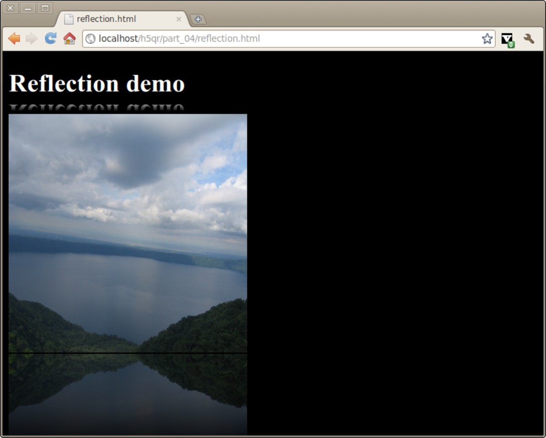
Reflections
Reflection is another one of those visual elements that adds quite a bit to a page when done well. CSS3 promises to handle reflections using only CSS. Currently, only the WebKit-based browsers (that is, Safari, Mobile Safari, and Chrome) support this capability. However, it shows such promise that some form of this capability is likely to appear in the other browsers at some point. Apply the following CSS to make any element with the reflect class have a nice-looking reflection in the supported browsers:
-webkit-box-reflect: below 2px;
Basic reflections are quite simple:
1. Apply the -webkit-box-reflect attribute. Unfortunately, there is no generic version, nor has the reflect attribute been duplicated by other browsers.
2. Specify where the reflection is to be placed. Normally, the reflection goes beneath (below) the primary element, but it can also be above, left, or right.
3. Indicate a gap width. The reflection can be placed right next to the original element, but often it looks better with a small gap. The gap is normally measured in pixels.
This will produce a very nice reflection.
However, reflections aren’t usually pixel-perfect duplications. They tend to fade out over distance. WebKit allows you to add a gradient to a reflection. In this case, the gradient will go from completely opaque (white) to completely transparent (transparent.) The webkit gradient model is a bit complex. (See “Gradients” earlier in this part for more details.) You can usually just use a variation of the gradient I supply in this example:
.reflect {
-webkit-box-reflect: below 2px
-webkit-gradient(
linear,
center top, center bottom,
from(transparent),
color-stop(.6, transparent),
to(white));
}
The standard part of the reflection is just like the previous example, but it includes a gradient that will fade the reflection to transparency.
1. Build a linear gradient. The gradient for a reflection will nearly always be linear.
2. Make the gradient move from top to bottom. Use “center top” to indicate the top, and “center bottom” to indicate the bottom. These values represent the top and bottom of the original image, not the reflection (which will, of course, be reversed.)
3. Begin with complete transparency. The top of the original image will be the bottom of the reflection, so begin with transparency. (Set transparent as the from color.)
4. Finish at complete opacity. This gradient isn’t really about color, but about which parts of the reflection are visible. The bottom of the original image (which will be the top of the reflection) will be completely opaque. Set the to color to white to indicate opacity.
5. Add a color-stop to adjust the fade. The color-stop parameter allows you to add a new color. Add a color-stop to indicate where in the reflection you want the image to begin appearing. I set a second transparent color at 60%, so only the bottom 40% (or so) of the original image appears as the reflection.
Note that the reflected image is not calculated as a separate element for page layout purposes, so text and other content will flow right on top of your reflection.
Figure 6-4 shows a reflected image.
Reflections are commonly applied to images, but they can be applied to any element, even video!
Figure 6-4
Rounded corners
Rounded corners have become a symbol of Web 3.0 design. It was quite difficult to create cross-platform round corners in previous versions of CSS, but CSS3 makes this quite easy.
The following CSS makes a nice-looking blue heading:
h1 {
width: 60%;
background-color: #000066;
color: #9999ff;
border: #9999ff 3px groove;
margin: auto;
text-align: center;
border-radius: 10px;
}
Almost all of the code is garden-variety CSS2. The one new element is the border-radius attribute. This attribute allows you to specify a rounding parameter for the corners. Each corner will be replaced by a small arc. The rounding parameter determines the radius of that arc. A value of 1em will lead to perfectly round ends for one-line elements (like most headers and links). A value of .5em will create a button shape like the ones common in most operating systems.
Although the attribute is called border-radius, it does not require a border to be defined.
Note that there are variations of each tag to support specific corners: border-top-left-radius and so on. This can be useful if you do not want to apply the same radius to all four corners of your element.
This attribute is not supported in its default format in any major browsers. However, all the major browsers except IE have vendor-specific variants. Use -moz-border-radius, -webkit-border-radius, or -o-border-radius to get a rounded corner in any of these browsers.
Shadows
You can add a shadow to any element with the box-shadow attribute. This tool works much like the text-shadow attribute. (See “Downloadable Fonts and Text Support” earlier in this part.) The following code adds an attractive drop shadow to a div containing the class shadow:
.shadow {
box-shadow: 10px 10px 10px #000000;
-moz-box-shadow: 10px 10px 10px #000000;
-webkit-box-shadow: 10px 10px 10px #000000;
}
Figure 6-5 illustrates this drop shadow.
Figure 6-5

The shadow attribute takes four parameters:
x-offset: This determines how far the shadow is offset from the main element in the x (left-right) axis. Positive values move the shadow to the right; negative values move the shadow to the left.
y-offset: This determines how far the shadow is offset from the main element in the y (up-down) axis. Positive values move the shadow downward, and negative values move the shadow up.
cast-length: This indicates the level of blur of the shadow. A larger value makes the shadow more blurry. A smaller value casts a sharper shadow.
color: The final parameter is the shadow color. Normally this is black or gray, but you can use other colors to add interesting features.
Like many other CSS3 elements, support for the standard version of box-shadow is spotty (only Opera supports it directly) but vendor-specific variants are available for browsers based on WebKit and Mozilla.
Generally all the shadows on a page should have the same general characteristics. It’s most efficient to create a shadow class and add this class to all elements that will have a shadow.
If the original image has rounded corners (see the border-radius attribute in the “Rounded corners” section, earlier in this part, for details on how to achieve this effect), the shadow will also have rounded corners.
See the example in the “text-shadow” section, earlier in this part, for information on adding shadows to text elements.
Transformations
CSS3 includes the ability to apply geometric transformations onto any element. This provides a remarkable level of visual control not previously available to Web developers.
The transform attribute allows you to apply a mathematical transformation to any div. When you apply transform to an element, you need to apply one or more of the following parameters to describe the type of transformation:
translate: Moves the object from its default position. Translation requires two parameters, an X measurement and a Y measurement. Use the standard CSS measurement units.
rotate: Rotates the image around its center value and takes one parameter, an angle measurement in degrees. (for example 30 degrees is 30deg.)
scale: Changes the size of the object. The standard version changes both the horizontal and vertical size uniformly. The scalex and scaley attributes can be used to adjust the scale along an individual axis. Scale is measured in the standard CSS measurement units. If scale is larger than 1, the object is larger than the original. A scale between zero and one makes the item smaller than it was. Zero or negative scale values are not defined.
skew: This allows you to tilt the element by some angle. The skew parameter requires an angle measurement in degrees. The skewx and skewy variations allow for more complete control of the transformation.
You can combine multiple parameters by listing them after the transform attribute separated by spaces.
To illustrate, imagine the following HTML snippet:
<div id = “box1”>box 1</div>
<div id = “box2”>box 2</div>
<div id = “box3”>box 3</div>
<div id = “box4”>box 4</div>
<div id = “box5”>box 5</div>
The code shows five identical divs. For illustration purposes, all the divs share the same common CSS:
#box1, #box2, #box3, #box4, #box5{
width: 100px;
height: 80px;
border: 3px solid black;
background-color: yellow;
}
Apply variations of the transform attribute to each element to see how the transformations work:
#box2 {
transform: translate(100px, 0px);
}
#box3 {
transform: rotate(45deg);
}
#box4 {
transform: scale(2) translate(100px, 0px);
}
#box5 {
transform: skew(3);
}
This code is illustrated in Figure 6-6.
Figure 6-6

Note that none of the current browsers support the transform element as stated in the specifications. However, all of the major browsers except IE have a vendor-specific version, so the actual code for box 2 looks like this:
#box2 {
transform: translate(100px, 0px);
-webkit-transform: translate(100px, 0px);
-moz-transform: translate(100px, 0px);
-o-transform: translate(100px, 0px);
}
Transition animation
It’s already possible to change CSS properties on the fly through pseudo-classes (like hover) or with JavaScript code. Prior to CSS3, all CSS state changes happened instantly. With the new transition attribute, you can cause transitions to happen over time.
Look at a simple h1 heading:
<h1>Transition Demo</h1>
The CSS code is mainly quite straightforward:
h1 {
color: black
font-size: 300%;
transition:color 1s ease-in;
}
h1:hover {
color: red;
}
Begin by ignoring the transition attribute. If you look at the rest of the code, it’s easy to see what it does. In the normal state, the heading is black. In the hover state, the color is red. Typically, the heading will turn red as soon as the mouse hovers over it, and will instantly turn black when the mouse leaves. However, when the transition attribute is added, the color change is not immediate, but takes a second. The color gradually changes from black to red and back.
Transitions are even more interesting when you pair them with transformations. Imagine a very simple div:
<div id = “box”>Box 1</div>
Apply a little CSS3 magic and when the user hovers over the div, it rotates smoothly until it is upside-down. When the user leaves the div, it smoothly rotates back to its original position:
#box {
transition: all 1s ease-in;
height: 100px;
width: 100px;
border: 1px solid black;
}
#box:hover {
transform: rotate(180deg);
}
The transform is defined in the :hover pseudo-class. The only new element is the transition specified in the class’s standard style.
The transition attribute takes several parameters:
animation property: The type of animation defined by this tag. The default value is all, but other types are expected to work, including color, length, width, percentage, opacity, and number.
If in doubt, use the standard all.
duration: The length of the animation in seconds. One second is 1s.
timing function: If you want the animation to occur at a constant speed, use linear. If you want a more natural motion that gradually speeds up and slows down at the ends of the animation, use one of the following: ease, ease-in, ease-out, ease-in-out.
delay: If you include a second time value, this will be considered a delay. The animation will not begin until after the delay.
If you prefer, you can use individual properties for the various parts of the animation, but most developers prefer the one-line shortcut (like the one used for borders).
Not all CSS attributes can be animated, but many can be. It may require some experimentation to determine which CSS attribute can be animated with the transition attribute.
Unfortunately, the stock transition attribute is not currently supported by any major browsers, but there are vendor-specific versions for Mozilla (-moz-), WebKit (-webkit-), and Opera (-o-). Sadly, there does not appear to be any support for any version of IE yet. Your best bet until support is widespread is to include all vendor-specific versions in addition to the standard version.
Transparency
CSS3 has complete support for adjustable opacity. This is reflected in a couple of ways. First, any element has an opacity attribute that can be set from 0 (fully transparent) to 1 (fully opaque.)
Figure 6-7 shows a div with partial transparency superimposed on an image.
The CSS for this effect is quite simple:
#box {
position: absolute;
top: 350px;
left: 100px;
height: 100px;
width: 100px;
border: 1px solid red;
background-color: white;
opacity: .3;
}
All of the code is common CSS2 stuff, except the last attribute. The opacity attribute takes a single floating point value between 0 and 1. A value of 0 is completely transparent, and a value of 1 is completely opaque.
Figure 6-7
