Chapter 15
Ten Chart Design Principles
I’m the first to admit that I’ve created my share of poorly designed charts — bar charts with every color known to man, line charts with ten or more lines slapped on top of each other, and pie charts with slices so thin they melded into a blob of black ink. When I look at these early disasters, I feel the shame of a Baby Boomer looking at pictures of himself in white bell-bottom jeans.
Excel makes charting so simple that it’s often tempting to accept the charts it creates no matter how bad the default colors or settings are. But I’m here to implore you to turn away from the glitzy lure of the default settings. You can easily avoid charting fiascos by following a few basic design principles.
In this chapter, I share a few of these principles and help you avoid some of the mistakes I’ve made in the past. (No thanks needed.)
Avoid Fancy Formatting
Excel makes it easy to apply effects that make everything look shiny, glittery, and oh-so-pretty. Now, don’t get me wrong; these new graphics are more than acceptable for charts created for sales and marketing presentations. However, when it comes to dashboards, you definitely want to stay away from them.
A dashboard is a platform to present your case with data. Why dress up your data with superfluous formatting when the data itself is the thing you want to get across? It’s like making a speech in a Roman general’s uniform. How well will you get your point across when your audience is thinking “What’s the deal with Tiberius?”
Take Figure 15-1, for instance — I created this chart (formatting and all) with just a few clicks. Excel makes it super easy to achieve these types of effects with its Layout and Style features. The problem is that these effects subdue the very data you’re trying to present. Furthermore, if you include this chart on a page with five to ten other charts with the same formatting, you create a blinding mess that’s difficult to look at, much less read.

Figure 15-1: Fancy formatting can be overwhelming, subduing the very data you’re trying to present.
The key to communicating effectively with charts is to present data as simply as possible. I promise you: Your data is interesting on its own. There’s no need to wrap it in eye candy to make it more interesting.
Figure 15-2 shows the same data without the fancy formatting. I think you’ll find that not only is the chart easier to read, but you can also process the data more effectively.

Figure 15-2: Charts should present data as simply as possible.
Here are some simple “don’ts” to keep you from overdoing the fancy factor:
- Don’t apply background colors to the Chart area or Plot area. Colors in general should be reserved for key data points in your chart.
- Don’t use 3D charts or 3D effects. No one’s going to give you an Oscar for special effects. Nothing 3D belongs on a dashboard.
- Don’t apply fancy effects such as gradients, pattern fills, shadows, glow, soft edges, and other formatting. Again, the word of the day is focus, as in “Focus on the data and not on the shiny, happy graphics.”
- Don’t try to enhance your charts with clip art or pictures. They do nothing to further data presentation, and they often just look tacky.
Skip the Unnecessary Chart Junk
Data visualization pioneer Edward Tufte introduced the notion of data-to-ink ratio. Tufte’s basic idea is that a large percentage of the ink on a chart or dashboard should be dedicated to data. Very little ink should be used to present what he calls chart junk: borders, gridlines, trend lines, labels, backgrounds, and other elements.
Figure 15-3 illustrates the impact that chart junk can have on your ability to communicate your data. At first glance, the top chart in Figure 15-3 may look exaggerated in its ambition to show many chart elements at one time, but believe me, other charts out there also look like this. Notice how convoluted and cramped the data looks.

Figure 15-3: Charts with too many chart elements can become convoluted and hard to read. Removing the unnecessary elements clarifies the message.
The bottom chart presents the same information as the top chart. However, the bottom chart more effectively presents the core message that driver registrations in Texas rose from more than 10 million in 1980 to almost 17 million in 2004 (a message that was diluted in the top chart). You can see from this simple example how a chart can be dramatically improved by simply removing the elements that don’t directly contribute to the core message of the chart.
Here are a few ways to avoid chart junk and ensure that your charts clearly present your data:
- Remove gridlines. Gridlines (both vertical and horizontal) are almost always unnecessary. The implied reason for gridlines is that they help to visually gauge the value represented by each data point. The truth is, however, that you typically gauge the value of a data point by comparing its position to the other data points in the chart. So gridlines become secondary reference points that simply take up ink.
- Remove borders. You’ll find that eliminating borders and frames gives your charts a cleaner look and helps avoid the dizzying lines you get when placing many charts with borders on a single dashboard. Instead of borders, use the white space between the charts as implied borders.
- Skip the trend lines. Seldom does a trend line provide insight that can’t be gained with the already plotted data or a simple label. In fact, trend lines often state the obvious and sometimes confuse readers into thinking that they’re another data series. Why place a trend line on a line chart when the line chart is itself a trend line of sorts? Why place a trend line on a bar chart when it’s just as easy to look at the top of the bars? In lieu of trend lines, add a simple label that states what you’re trying to say about the overall trend of the data.
- Avoid data label overload. Nothing says that you need to show the data label for every value on your chart. It’s okay to plot a data point and not display its value. You’ll find that your charts have more impact when you show only numbers relevant to your message. For example, the bottom chart in Figure 15-3 shows a trend that includes seven years of data. Although all the years are plotted to show the trend, only values of the first and last plotted years are shown. The first and last plotted years’ data is enough to fulfill the purpose of this chart, which is to show the trend and ultimate growth of driver registrations.
- Don’t show a legend if you don’t have to. When you’re plotting one data series, there’s no need to display a space-taking chart legend. If you allow the chart title to identify the lone data series in your chart, you can simply delete the legend.
- Remove any axis that doesn’t provide value. The purpose of the x- and y-axes are to help a user visually gauge and position the values represented by each data point. However, if the nature and utility of the chart don’t require a particular axis, you should remove it. For the bottom chart in Figure 15-3, for example, there’s no real need for the y-axis because the two data points I’m trying to draw attention to are labeled already. Again, the goal here isn’t to hack away at your chart. The goal is to include only those chart elements that directly contribute to the core message of your chart.
Format Large Numbers Where Possible
It’s never fun to count the zeros in a large number, especially when you’re staring at 8-point font. When plotting very large numbers on a chart, consider formatting the values so that they’re truncated for easy reading.
For instance, in Figure 15-4, I’ve formatted the values to appear as 10M and 17M instead of the hard-to-read 10,475,000 and 16,906,714.

Figure 15-4: Formatting large numbers to millions or thousands makes for a clearer chart.
You can easily format large numbers in Excel by using the Format Cells dialog box. There, you can specify a custom number format by selecting Custom in the Category list and entering a number format code in the Type input box. In Figure 15-5, the code 0,, “M” ensures that the numbers are formatted to millions with an M appendage.

Figure 15-5: Select Custom in the Category list, and enter a number format code in the Type input box.
 To get to the Format Cells dialog box, highlight the numbers you’re formatting, right-click, and then choose Format Cells from the menu that appears.
It’s generally good practice to format the source data that feeds your chart as opposed to the data labels on your chart. This way, your formatting persists even as you add and remove data labels.
 The table in Chapter 3 lists common format codes and their effect on your numbers.
Use Data Tables Instead of Data Labels
Sometimes it’s valuable to show all the data values along with the plotted data points. However, earlier sections in this chapter show how data labels can inundate users with chart junk.
Rather than use data labels, you can attach a data table to your Excel chart. A data table allows you to see the data values for each plotted data point, beneath the chart. Figure 15-6 illustrates a data table, showing the data values for two series. As you can see, a lot of information is shown here without overcrowding the chart itself.

Figure 15-6: Data tables enable you to show data values without overloading your chart with data labels.
Although data tables increase the space that your charts occupy on your dashboard, they respond well to formatting and can be made to meld nicely into your charts. Data tables come in particularly handy if your clients are constantly asking to see the detailed information behind your charts.
To add or remove data tables, select the chart and click the Chart Elements button next to the chart. This action expands a menu of chart elements that you can add to your chart. (See Figure 15-7.) Place a check next to Data Table to add a data table. Remove the check mark to remove the data table.

Figure 15-7: Adding a data table to a chart.
You can right-click the data table at any time to call up the Format Table dialog box and apply additional formatting to the table. (See Figure 15-8.)

Figure 15-8: The Format Data Table dialog box.
Make Effective Use of Chart Titles
A chart title doesn’t have to be limited to simple labeling and naming duties. You can use a chart title to add an extra layer of information, presenting analysis derived from the data presented in the chart. Figure 15-9 demonstrates this.
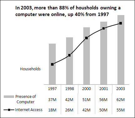
Figure 15-9: Use chart titles to present extra layers of data without taking up extra space on your dashboard.
Sort Your Data before Charting
Unless there’s an obvious natural order, such as age or time, it’s generally good practice to sort your data when charting. By sorting, I mean sort the source data that feeds your chart in ascending or descending order by data value.
As you can see in Figure 15-10, building a chart using a dataset sorted by values enhances its readability and somehow gives the chart a professional look and feel.

Figure 15-10: Using sorted data in a chart improves readability and clarity.
Limit the Use of Pie Charts
Although pie charts have long been considered a viable charting option for business reporting, they often aren’t well suited for dashboard reporting. There are a couple of reasons for this.
First, they typically take up more space than their cousins, the line and bar charts. Sure, you can make them small, but pixel for pixel, you get a lot less bang for your data-visualization buck with a pie chart.
Second, pie charts can’t clearly represent more than two or three data categories. Figure 15-11 demonstrates this fact.

Figure 15-11: Pie charts can’t clearly represent more than two or three data categories.
The pie chart on the left does a good job visually of representing two data categories. You can easily distinguish the two categories and clearly get a sense of distribution for each category. The pie chart on the right is a different story. As you can see, when you go past two or three categories, a pie chart isn’t as effective in relaying the proper sense of percent distribution. The slices are too similar in size and shape to visually compare the categories. Plus the legend and data categories are disconnected, causing your eyes to jump back and forth from pie to legend. (Even in color, the legend doesn’t help.) Sure, you could add category labels, but that would cause the chart to take up more real estate without adding much value.
What’s the alternative? Instead of a pie chart, consider using a bar chart. With a bar chart, you can clearly represent the distribution percentages for many categories without taking up extra real estate. In Figure 15-12, you can see the dramatic improvement in clarity that you can achieve by using bar charts.

Figure 15-12: Bar charts are an alternative to pie charts when you have more than two or three data categories.
Don’t Be Afraid to Parse Data into Separate Charts
Be aware that a single chart can lose its effectiveness if you try to plot too much data into it. Take Figure 15-13, for example.

Figure 15-13: Sometimes you work with so much data that your charts no longer make sense.
This chart has a couple of problems. First, the data is split into nine age groups, which forces you to use nine lines. When you start plotting more than three lines on a line chart, your chart begins to look jumbled. Second, the age groups have a wide range of data values. This causes the chart’s y-axis scale to be so spread out that each line essentially looks like a straight line.
In situations like this, step back and try to boil down what exactly the chart needs to do. What is the ultimate purpose of the chart? In this case, the ultimate purpose of this chart is to show the growth or decline of the workforce numbers for each age group. Now, you obviously can’t show every data point on the same chart, so you have to show each age group in its own chart. That means you want to make sure that you can see each age group alongside the other for comparison purposes.
Figure 15-14 shows just one of many solutions for this particular example.

Figure 15-14: Creating separate, individual charts is often better than one convoluted chart.
Here, I’ve created a separate area chart for each age group and then lined them up side by side. Each chart individually shows a general trend from 2005 to 2010. Because they’re placed together, you can get an idea of the magnitude of each age group. Also, notice that I merged the last three age groups into one category called 65 & Up. This groups the three smallest categories into one that’s worthy of plotting. Finally, I used data labels to quickly show the growth or decline percentage from 2005 to 2010 for each group.
Again, this isn’t the only solution to this problem, but it does do the job of displaying the analysis I chose to present.
It’s not always easy to know exactly how to display your data in a chart — especially when the data is multilayered and complex. Rather than jam the world into one chart, step back and think about how to show the data separately but together.
Maintain Appropriate Aspect Ratios
In terms of charts, aspect ratio refers to the ratio of height to width. That is to say, charts should maintain an appropriate height-to-width ratio in order for the integrity of the chart to remain intact. Take a look at Figure 15-15 to see what I mean.

Figure 15-15: A skewed aspect ratio can distort your charts.
The chart at the top of Figure 15-15 is at an appropriate aspect ratio that correctly renders the chart. The bottom two charts display the same data, but the aspect ratios of these charts are skewed. The middle chart is too tall, and the bottom chart is too wide. This essentially distorts the visual representation, exaggerating the trend in the chart that’s too tall and flattening the trend in the chart that’s too wide.
I’ve seen lots of people contort their charts just to fit them into the empty space on their dashboards. If you want to avoid distorting your charts, you must keep them at an appropriate aspect ratio.
What is that ratio? Generally, the most appropriate aspect ratio for a chart is one in which the width of the chart is about twice as long as the height. For example, 1 inch tall by 2 inches wide is an appropriate ratio. And 1.5 inches tall by 3 inches wide is also appropriate. The actual height and width aren’t important. You can make your charts as small or as big as they need to be. What is important is the ratio of height to width.
Don’t Be Afraid to Use Something Other Than a Chart
Ask yourself whether a simple table will present the data just fine. If the data you’re reporting can be more effectively shared in a table, that’s how it should be presented. Remember that the goal of a dashboard is not to present everything in a chart — it’s to present key data in the most effective way possible.