
Chapter 4: Visualizing Data with Python
Regardless of the field of work you operate in, the career path you've chosen, or the specific project you are working on, the ability to effectively communicate information to others will always be useful. In fact, exactly one hundred years ago, in 1921, Frederick R. Barnard first said something which has become a phrase you have probably heard countless times: A picture is worth a thousand words.
With the many new technologies that have emerged in the realm of machine learning in recent years, the amount of data being structured, processed, and analyzed has grown exponentially. The ability to take data in its raw form and translate it to a meaningful and communicative diagram is one of the most sought-after skill sets in the industry today. Most decisions made in large companies and corporations are generally data-driven, and the best way to start a conversation about an area you care about is to create a meaningful visualization about it. Consider the following:
- The human brain is able to process visualizations 60,000 times faster than text.
- Nearly 90% of all information processed by the human brain is done visually.
- Visualizations are 30 times more likely to be read than even simple text.
Visualizations are not always about driving a conversation or convincing an opposing party to agree on something – they are often used as a means to investigate and explore data for the purposes of uncovering hidden insights. In almost every machine learning project you undertake, a significant amount of effort will be devoted to exploring data to uncover its hidden features through a process known as Exploratory Data Analysis (EDA). EDA is normally done prior to any type of machine learning project in order to better understand the data, its features, and its limits. One of the best ways to explore data in this fashion is in a visual form, allowing you to uncover much more than the numerical values alone.
Over the course of the following chapter, we will look over some useful steps to follow to develop a robust visual for a given dataset. We will also explore some of the most common visualization libraries used in the Python community today. Finally, we will explore several datasets and learn how to develop some of the most common visualizations for them.
Within this chapter, we will cover the following main topics:
- Exploring the six steps of data visualization
- Commonly used visualization libraries
- Tutorial – visualizing data in Python
Technical requirements
In this chapter, we will apply our understanding of Python and Structured Query Language (SQL) to retrieve data and design meaningful visualizations through a number of popular Python libraries. These libraries can be installed using the pip installer demonstrated in Chapter 2, Introducing Python and the Command Line. Recall that the process of installing a library is done via the command line:
$ pip install library-name
So, now that we are set up, let's begin!
Exploring the six steps of data visualization
When it comes to effectively communicating key trends in your data, the method in which it is presented will always be important. When presenting any type of data to an audience, there are two main considerations: first, selecting the correct segment of data for the argument; second, selecting the most effective visualization for the argument. When working on a new visualization, there are six steps you can follow to help guide you:
- Acquire: Obtain the data from its source.
- Understand: Learn about the data and understand its categories and features.
- Filter: Clean the data and remove missing values, NaN values, and corrupt entries.
- Mine: Identify patterns or engineer new features.
- Condense: Isolate the most useful features.
- Represent: Select a representation for these features.
Let's look at each step in detail.
The first step is to acquire your data from its source. This source may be a simple CSV file, a relational database, or even a NoSQL database.
Second, it is important to understand the context of the data as well as its content. As a data scientist, your objective is to place yourself in the shoes of your stakeholders and understand their data as best you can. Often, a simple conversation with a Subject Matter Expert (SME) can save you hours by highlighting facts about the data that you otherwise would not have known.
Third, filtering your data will always be crucial. Most real-world applications of data science rarely involve ready-to-use datasets. Often, data in its raw form will be the main data source, and it is up to data scientists and developers to ensure that any missing values and corrupt entries are taken care of. Data scientists often refer to this step as preprocessing, and we will explore this in more detail in Chapter 5, Understanding Machine Learning.
With the data preprocessed, our next objective is to mine the data in an attempt to identify patterns or engineer new features. In simple datasets, values can often be quickly visualized as either increasing or decreasing, allowing us to easily understand the trend. In multidimensional datasets, these trends are often more difficult to uncover. For example, a time-series graph may show you an increasing trend, however, the first derivative of this graph may expose trends relating to seasonality.
Once a trend of interest is identified, the data representing that trend is often isolated from the rest of the data. And finally, this trend is represented using a visualization that complements it.
It is important to understand that these steps are by no means hard rules, but they should be thought of as useful guidelines to assist you in generating effective visualizations. Not every visualization will require every step! In fact, some visualizations may require other steps, perhaps sometimes in a different order. We will go through a number of these steps to generate some visualizations later in the Tutorial – Visualizing data in Python section within this chapter. When we do, try to recall these steps and see if you can identify them.
Before we begin generating some interesting visuals, let's talk about some of the libraries we will need.
Commonly used visualization libraries
There are countless visualization libraries available in Python, and more are being published every day. Visualization libraries can be divided into two main categories: static visualization libraries and interactive visualization libraries. Static visualizations are images consisting of plotted values that cannot be clicked by the user. On the other hand, interactive visualizations are not just images but representations that can be clicked on, reshaped, moved around, and scaled in a particular direction. Static visualizations are often destined for email communications, printed publications, or slide decks, as they are visualizations that you do not intend others to change. However, interactive visualizations are generally destined for dashboards and websites (such as AWS or Heroku) in anticipation of users interacting with them and exploring the data as permitted.
The following open source libraries are currently some of the most popular in the industry. Each of them has its own advantages and disadvantages, which are detailed in the following table:

Figure 4.1 – A list of the most common visualization libraries in Python
Now that we know about visualization libraries, let's move on to the next section!
Tutorial – visualizing data in Python
Over the course of this tutorial, we will be retrieving a few different datasets from a range of sources and exploring them through various kinds of visualizations. To create these visuals, we will implement many of the visualization steps in conjunction with some of the open source visualization libraries. Let's get started!
Getting data
Recall that, in Chapter 3, Getting Started with SQL and Relational Databases, we used AWS to create and deploy a database to the cloud, allowing us to query data using MySQL Workbench. This same database can also be queried directly from Python using a library known as sqlalchemy:
- Let's query that dataset directly from Amazon Relational Database Service (RDS). To do so, we will need the endpoint, username, and password values generated in the previous chapter. Go ahead and list these as variables in Python:
ENDPOINT=" yourEndPointHere>"
PORT="3306"
USR="admin"
DBNAME="toxicity_db_tutorial"
PASSWORD = "<YourPasswordHere>"
- With the variables populated with your respective parameters, we can now query this data using sqlalchemy. Since we are interested in the dataset as a whole, we can simply run a SELECT * FROM dataset_toxicity_sd command:
from sqlalchemy import create_engine
import pandas as pd
db_connection_str =
'mysql+pymysql://{USR}:{PASSWORD}@{ENDPOINT}:{PORT}/{DBNAME}'.format(USR=USR, PASSWORD=PASSWORD, ENDPOINT=ENDPOINT, PORT=PORT, DBNAME=DBNAME)
db_connection = create_engine(db_connection_str)
df = pd.read_sql('SELECT * FROM dataset_toxicity_sd',
con=db_connection)
Alternatively, you can simply import the same dataset as a CSV file using the read_csv() function:
df = pd.read_csv("../../datasets/dataset_toxicity_sd.csv")
- We can take a quick look at the dataset to understand its content using the head() function. Recall that we can choose to reduce the columns by specifying the names of the ones we are interested in by using double square brackets ([[]]):
df[["ID", "smiles", "toxic"]].head()
This gives us the following output:

Figure 4.2 – A DataFrame representation of selected columns from the toxicity dataset
If you recall, there are quite a few columns within this dataset, ranging from general data such as the primary key (ID) to the structure (smiles) and the toxicity (toxic). In addition, there are many features that describe and represent the dataset, ranging from the total polar surface area (TPSA) all the way to lipophilicity (LogP).
- We can also get a sense of some of the general statistics behind this dataset – such as the maximum, minimum, and averages relating to each column – by using the describe() function in pandas:
df[["toxic", "TPSA", "MolWt", "LogP"]].describe()
This results in the following table:

Figure 4.3 – Some general statistics of selected columns from the toxicity dataset
Immediately, we notice that the means and standard deviations of each of the columns are drastically different from each other. We also notice that the minimum and maximum values are also quite different, in the sense that many of the columns are integers (whole numbers), whereas others are floats (decimals). We can also see that many of the minimums have values of zero, with two columns (FormalCharge and LogP) having negative values. So, this real-world dataset is quite diverse and spread out.
- Before we can explore the dataset further, we will need to ensure that there are no missing values. To do this, we can run a quick check using the isna() function provided by the pandas library. We can chain this with the sum() function to get a sum of all of the missing values for each column:
df.isna().sum()
The result is shown in Figure 4.4:

Figure 4.4 – The list of missing values within the DataFrame
Thankfully, there are no missing values from this particular dataset, so we are free to move forward with creating a few plots and visuals.
Important note
Missing values: Please note that missing values can be addressed in a number of different ways. One option is to exclude a row with missing values from the dataset completely by using the dropna() function. Another option is to replace any missing value with a common value using the fillna() or replace() functions. Finally, you can also replace missing values with the mean of all the other values using the mean() function. The method you select will be highly dependent on the identity and meaning of the column.
Summarizing data with bar plots
Bar plots or bar charts are often used to describe categorical data in which the lengths or heights of the bars are proportional to the values of the categories they represent. Bar plots provide a visual estimate of the central tendency of a dataset with the uncertainty of the estimate represented by error bars.
So, let's create our first bar plot. We will be using the seaborn library for this particular task. There are a number of different ways to style your graphs. For the purposes of this tutorial, we will use the darkgrid style from seaborn.
Let's plot the TPSA feature relative to the FormalCharge feature to get a sense of the relationship between them:
import pandas as pd
import seaborn as sns
plt.figure(figsize=(10,5))
sns.barplot(x="FormalCharge", y="TPSA", data=df);
Our initial results are shown in Figure 4.5:

Figure 4.5 – A bar plot of the TPSA and FormalCharge features
Immediately, we can see an interesting relationship between the two, in the sense that the TPSA feature tends to increase when the absolute value of FormalCharge is further away from zero. If you are following along with the provided Jupyter notebooks, feel free to explore a few other relationships within this dataset. Now, let's try exploring the number of hydrogen donors (HDonors) instead of TPSA:
sns.barplot(x="FormalCharge", y="HDonors", data=df)
We can see the subsequent output in Figure 4.6:
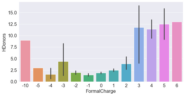
Figure 4.6 – A bar plot of the HDonors and FormalCharge features
Taking a look at the plot, we do not see as strong a relationship between the two variables. The highest and lowest formal charges do in fact show higher hydrogen donors. Let's compare this to HAcceptors – a similar feature in this dataset. We could either plot this feature individually, as we did with the hydrogen donors, or we could combine them both into one diagram. We can do this by isolating the features of interest (do you remember the name of this step?) and then reshaping the dataset. DataFrames within Python are often reshaped using four common functions:

Figure 4.7 – Four of the most common DataFrame reshaping functions
Each of these functions serves to reshape the data in a specific way. The pivot() function is often used to reshape a DataFrame organized by its index. The stack() function is often used with multi-index DataFrames – this allows you to stack your data, making the table long and narrow instead of wide and short. The melt() function is similar to the stack() function in the sense that it also stacks your data, but the difference between them is that stack() will insert the compressed columns into the inner index, whereas melt() will create a new column called Variable. Finally, unstack() is simply the opposite of stack(), in the sense that data is converted from long to wide.
For the purposes of comparing the hydrogen donors and acceptors, we will be using the melt() function, which you can see in Figure 4.8. Note that two new columns are created in the process: Variable and Value:
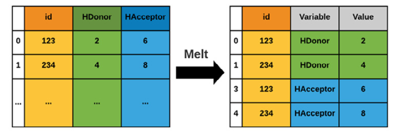
Figure 4.8 – A graphical representation of the melt() function
First, we create a variable called df_iso to represent the isolated DataFrame, and then we use the melt() function to melt its data and assign it to a new variable called df_melt. We can also print the shape of the data to prove to ourselves that the columns stack correctly if they exactly double in length. Recall that you can also check the data using the head() function:
df_iso = df[["FormalCharge", "HDonors", "HAcceptors"]]
print(df_iso.shape)
(1460, 3)
df_melted = pd.melt(df_iso, id_vars=["FormalCharge"],
value_vars=["HDonors", "HAcceptors"])
print(df_melted.shape)
(2920, 3)
Finally, with the data ordered correctly, we can go ahead and plot this data, specifying the x-axis as FormalCharge, and the y-axis as value:
sns.barplot(data=df_melted, x='FormalCharge', y='value',
hue='variable')
Upon executing this line of code, we will get the following figure:

Figure 4.9 – A bar plot of two features relative to FormalCharge
As you begin to explore the many functions and classes within the seaborn library, referring to the documentation as you write your code can help you to debug errors and also uncover new functionality that you may not have known about. You can view the Seaborn documentation at https://seaborn.pydata.org/api.html.
Working with distributions and histograms
Histograms are plots that visually portray a summary or approximation of the distribution of a numerical dataset. In order to construct a histogram, bins must be established, representing a range of values by which the full range is divided. For example, take the molecular weights of the items in a dataset; we can plot a histogram of the weights in bins of 40:
plt.figure(figsize=(10,5))
plt.title("Histogram of Molecular Weight (g/mol)", fontsize=20)
plt.xlabel("Molecular Weight (g/mol)", fontsize=15)
plt.ylabel("Frequency", fontsize=15)
df["MolWt"].hist(figsize=(10, 5),
bins=40,
xlabelsize=10,
ylabelsize=10,
color = "royalblue")
We can see the output of this code in Figure 4.10:
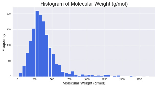
Figure 4.10 – A histogram of molecular weight with a bin size of 40
As you explore more visualization methods in Python, you will notice that most libraries offer a number of quick functions that have already been developed and optimized to perform a specific task. We could go through the same process of reshaping our data for each feature and iterate through them to plot a histogram for each of the features, or we could simply use the hist() function for them collectively:
dftmp = df[["MolWt", "NHOH", "HAcceptors", "Heteroatoms",
"LogP", "TPSA"]]
dftmp.hist(figsize=(30, 10), bins=40, xlabelsize=10,
ylabelsize=10, color = "royalblue")
The subsequent output can be seen in Figure 4.11:
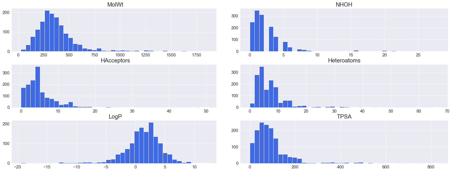
Figure 4.11 – A series of histograms for various features automated using the hist() function
Histograms can also be overlayed in order to showcase two features on the same plot. When doing this, we would need to give the plots a degree of transparency by using the alpha parameter:
dftmp = df[["MolWt","TPSA"]]
x1 = dftmp.MolWt.values
x2 = dftmp.TPSA.values
kwargs = dict(histtype='stepfilled', alpha=0.3,
density=True, bins=100, ec="k")
plt.figure(figsize=(10,5))
plt.title("Histogram of Molecular Weight (g/mol)",
fontsize=20)
plt.xlabel("Molecular Weight (g/mol)", fontsize=15)
plt.ylabel("Frequency", fontsize=15)
plt.xlim([-100, 1000])
plt.ylim([0, 0.01])
plt.hist(x1, **kwargs)
plt.hist(x2, **kwargs)
plt.legend(dftmp.columns)
plt.show()
We can see the output of the preceding command in Figure 4.12:
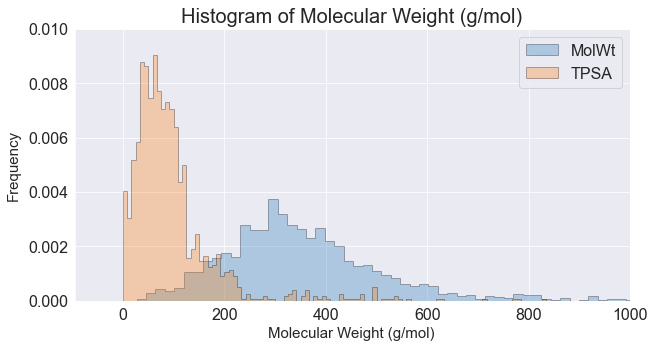
Figure 4.12 – An overlay of two histograms where their opacity was reduced
Histograms are wonderful ways to summarize and visualize data in large quantities, especially when the functionality is as easy as using the hist() function. You will find that most libraries – such as pandas and numpy – have numerous functions with similar functionality.
Visualizing features with scatter plots
Scatter plots are representations based on Cartesian coordinates that allow for visualizations to be created in both two- and three-dimensional spaces. Scatter plots consist of an x-axis and a y-axis and are normally accompanied by an additional feature that allows for separation within the data. Scatter plots are best used when accompanied by a third feature that can be represented either by color or shape, depending on the data type available. Let's look at a simple example:
- We'll take a look at an example of a simple scatter plot showing TPSA relative to the HeavyAtoms feature:
plt.figure(figsize=(10,5))
plt.title("Scatterplot of Heavy Atoms and TPSA", fontsize=20)
plt.ylabel("Heavy Atoms", fontsize=15)
plt.xlabel("TPSA", fontsize=15)
sns.scatterplot(x="TPSA", y="HeavyAtoms", data=df)
The output for the preceding code can be seen in Figure 4.13:

Figure 4.13 – A scatter plot of the TPSA and HeavyAtoms features
Immediately, we notice that there is some dependency between the two features, as shown by the slight positive correlation.
- We can take a look at a third feature, such as MolWt, by changing the color and size using the hue and size arguments, respectively. This gives us the ability to plot three or four features on the same graph, giving us an excellent interpretation of the dataset. We can see some trending among TPSA relative to HeavyAtoms, and increasing MolWt:
plt.figure(figsize=(10,5))
plt.title("Scatterplot of Heavy Atoms and TPSA", fontsize=20)
plt.ylabel("Heavy Atoms", fontsize=15)
plt.xlabel("Molecular Weight (g/mol)", fontsize=15)
sns.scatterplot(x="TPSA",y="HeavyAtoms",
size="MolWt", hue="MolWt", data=df)
The output of the preceding code can be seen in Figure 4.14:

Figure 4.14 – A scatter plot of two features, with a third represented by size and color
- As an alternative to 2D scatter plots, we can use 3D scatter plots to introduce another feature in the form of a new dimension. We can take advantage of the Plotly library to implement some 3D functionality. To do this, we can define a fig object using the scatter_3d function, and subsequently, we define the source of our data and the axes of interest:
import plotly.express as px
fig = px.scatter_3d(df, x='TPSA', y='LogP', z='HeavyAtoms',
color='toxic', opacity=0.7)
fig.update_traces(marker=dict(size=4))
fig.show()
The output of this code will result in Figure 4.15:
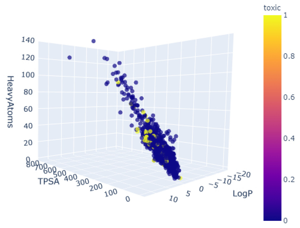
Figure 4.15 – A 3D scatter plot of three features, colored by toxicity
- Instead of adding more features, we can add some more elements to the scatter plot to help interpret the two features on the x and y coordinates. We noticed earlier that there was a slight correlation within the dataset that seems ripe for exploration. It would be interesting to see if this correlation holds true for both toxic and non-toxic compounds. We can get a sense of the correlation using the lmplot() function, which allows us to graphically represent the correlation as a linear regression within the scatter plot:
sns.lmplot(x="HAcceptors", y="TPSA", hue="toxic",
data=df, markers=["o", "x"], height = 5,
aspect = 1.7, palette="muted");
plt.xlim([0, 16])
plt.ylim([0, 400])
The subsequent output can be seen in Figure 4.16:
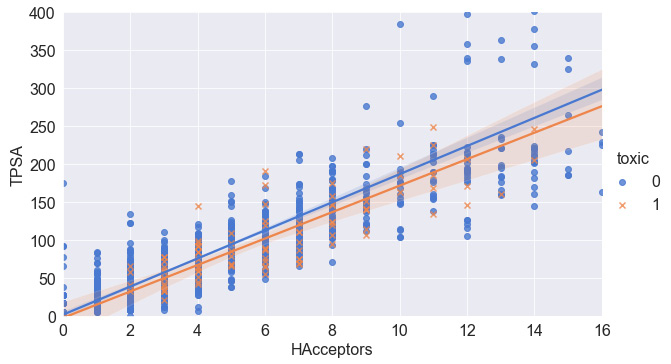
Figure 4.16 – A scatter plot of two features and their associated correlations
Scatter plots are great ways to portray data relationships and begin to understand any dependencies or correlations they may have. Plotting regressions or lines of best fit can give you some insight into any possible relationships. We will explore this in greater detail in the following section.
Identifying correlations with heat maps
Now that we have established a correlation between two molecular features within our dataset, let's investigate to see if there are any others. We can easily go through each set of features, plot them, and look at their respective regressions to determine whether or not a correlation may exist. In Python, automating whenever possible is advised, and luckily for us, this task has already been automated! So, let's take a look:
- Using the pairplot() function will take your dataset as input and return a figure of all the scatter plots for all of the features within your dataset. To fit the figure within the confines of this page, only the most interesting features were selected. However, I challenge you to run the code in the provided Jupyter notebook to see if there are any other interesting trends:
featOfInterest = ["TPSA", "MolWt", "HAcceptors",
"HDonors", "toxic", "LogP"]
sns.pairplot(df[featOfInterest], hue = "toxic", markers="o")
The results are presented in the form of numerous smaller graphs, as shown in Figure 4.17:
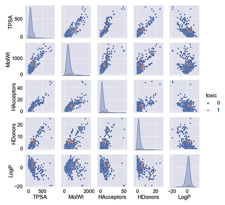
Figure 4.17 – A pairplot() graphic of the toxicity dataset for selected features
- Alternatively, we can capture the Pearson correlation for each of the feature pairs using the corr() function in conjunction with the DataFrame itself:
df[["TPSA", "MolWt", "HeavyAtoms", "NHOH", "HAcceptors",
"HDonors", "AromaticRings", "LogP", "AromaticN"]].corr()
We can review these correlations as a DataFrame in Figure 4.18:
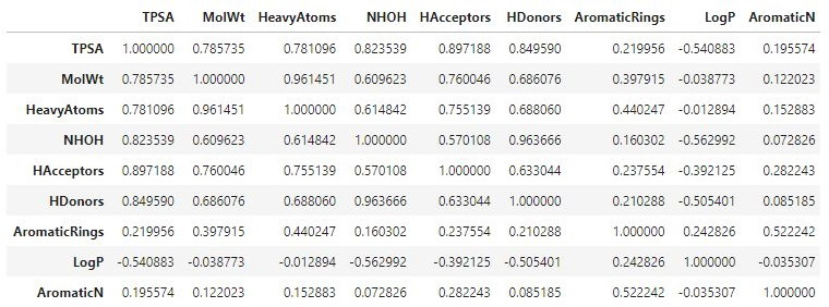
Figure 4.18 – A DataFrame showing the correlations between selected features
- For a more visually appealing result, we can wrap our data within a heatmap() function and apply a color map to show dark colors for strong correlations and light colors for weaker ones:
sns.heatmap(df[["TPSA", "MolWt", "HeavyAtoms", "NHOH",
"HAcceptors", "HDonors", "AromaticRings",
"LogP", "AromaticN"]].corr(),
annot = True, cmap="YlGnBu")
Some of the code we have written so far has become a little complicated as we begin to chain multiple functions together. To provide some clarity of the syntax and structure, let's take a closer look at the following function. We begin by calling the main heatmap class within the seaborn library (recall that we give this the alias sns). We then add our dataset, containing the sliced set of the features of interest. We then apply the correlation function to get the respective correlations, and finally add some additional arguments to style and color the plot:

Figure 4.19 – A heat map showing the correlation between selected features
Identifying correlations within datasets will always be useful, regardless of whether you are analyzing data or preparing a predictive model. You will find that corr() and many of its derivatives are commonly used in the machine learning space.
Displaying sequential and time-series plots
The datasets and features we have explored so far have all been provided in a structured and tabular form, existing as rows and columns within DataFrames. These rows are fully independent of each other. This is not always the case in all datasets, and dependence (especially time-based dependence) is sometimes a factor we need to consider. For example, take a Fast All (FASTA) sequence – that is, a text-based format often used in the realm of bioinformatics for representing nucleotide or amino acid sequences via letter codes. In molecular biology and genetics, a parameter known as Guanine-Cytosine (GC) content is a metric used to determine the percent of nitrogenous bases within DNA or RNA molecules. Let's explore plotting this sequential data using a FASTA file for COVID-19 data:
- We will begin the process by importing the dataset using the wget library:
import wget
url_covid = "https://ftp.expasy.org/databases/uniprot/pre_release/covid-19.fasta"
filename = wget.download(url_covid, out="../../datasets")
- Next, we can calculate the GC content using the Biopython (also called Bio) library – one of the most commonly utilized Python libraries in the computational molecular biology space. The documentation and tutorials for the Biopython library can be found at http://biopython.org/DIST/docs/tutorial/Tutorial.html.
- We will then parse the file using the SeqIO and GC classes and write the results to the gc_values_covid variable:
from Bio import SeqIO
from Bio.SeqUtils import GC
gc_values_covid = sorted(GC(rec.seq) for rec in
SeqIO.parse("../../datasets/covid-19.fasta", "fasta"))
Please note that the path to the file in the preceding code may change depending on which directory the file was saved in.
- Finally, we can go ahead and plot the results using either pylab or matplotlib:
import pylab
plt.figure(figsize=(10,5))
plt.title("COVID-19 FASTA Sequence GC%", fontsize=20)
plt.ylabel("GC Content %", fontsize=15)
plt.xlabel("Genes", fontsize=15)
pylab.plot(gc_values_covid)
pylab.show()
The subsequent output can be seen in Figure 4.20:
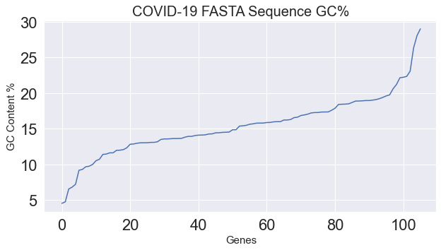
Figure 4.20 – A plot showing the GC content of the COVID-19 sequence
While there are many non-time-based sequential datasets such as text, images, and audio, there are also time-based datasets such as stock prices and manufacturing processes. Within the laboratory space, there are many pieces of equipment that also utilize time series-based approaches, such as those relating to chromatography. For example, take Size-Exclusion Chromatography (SEC), in which molecules are separated by their sizes. This property is known as molecular weight. Most predictive maintenance models tend to monitor temperature and pressure to detect anomalies and alert users. Let's go ahead and pull in the following time-series dataset and overlay Temperature and Pressure together over time:
dfts = pd.read_csv("../../datasets/dataset_pressure_ts.csv")
plt.title("Timeseries of an LCMS Chromatogram (Pressure &
Temperature)", fontsize=20)
plt.ylabel("Pressure (Bar)", fontsize=15)
plt.xlabel("Run Time (min)", fontsize=15)
ax1 = sns.lineplot(x="Run Time", y="Pressure",
data=dfts, color = "royalblue",
label = "Pressure (Bar)");
ax2 = sns.lineplot(x="Run Time", y="Temperature",
data=dfts, color = "orange",
label = "Pressure (Bar)");
The output of this code can be seen in Figure 4.21:

Figure 4.21 – A time-series plot showing the temperature and pressure of a failed LCMS run
We notice that within the first 5 minutes of this graph, the temperature and pressure parameters are increasing quite quickly. A dip of some sort occurs within the 6.5-minute range, and the system keeps increasing for a moment, then both parameters begin to plummet downward and level out at their respective ranges. This is an example of an instrument failure, and it is a situation that a finely tuned machine learning model would be able to detect relative to its successful counterpart. We will explore the development of this anomaly detection model in greater detail in Chapter 7, Supervised Machine Learning.
Emphasizing flows with Sankey diagrams
A popular form of visualization in data science is the Sankey diagram – made famous by Minard's classic depiction of Napoleon's army during the invasion of Russia. The main purpose of a Sankey diagram is to visualize a magnitude in terms of its proportional width on a flow diagram:

Figure 4.22 – A Sankey diagram by Charles Joseph Minard depicting Napoleon's march to Russia
Sankey diagrams are often used to depict many applications across various sectors. Biotechnology and health sector applications of Sankey diagrams include the following:
- Depictions of drug candidates during clinical trials
- Process flow diagrams for synthetic molecules
- Process flow diagrams for microbial fermentation
- Project flow diagrams and success rates
- Financial diagrams depicting costs within an organization
Let's visualize a simple example of a company's drug candidate pipeline. We'll take the total number of candidates, their classification by phase, and finally, their designation by modality as small or large molecules. We can take advantage of the Plotly library to assist us with this:
import plotly.graph_objects as go
fig = go.Figure(data=[go.Sankey(node = dict(pad = 50,
thickness = 10,
line = dict(color = "black", width = 0.5),
label = ["Drug Candidates", "Phase 1", "Phase 2",
"Phase 3", "Small Molecules", "Large Molecules"],
color = "blue"),
link = dict(
source = [0, 0, 0, 1, 2, 3, 1, 2, 3],
target = [1, 2, 3, 4, 4, 4, 5, 5, 5],
value = [15, 4, 2, 13, 3, 1, 2, 1, 1]
))])
This segment of code is quite long and complex – let's try to break this down. The figure object consists of several arguments we need to take into account. The first is pad, which describes the spacing between the nodes of the visualization. The second describes the thickness value of the node's bars. The third sets the color and width values of the lines. The fourth contains the label names of the nodes. And finally, we arrive at the data, which has been structured in a slightly different way to how we are accustomed. In this case, the dataset is divided into a source array (or origin), the target array, and the value array associated with it. Starting on the left-hand side, we see that the first value of source is node 0, which goes to the target of node 1, with a value of 15. Reading the process in this fashion makes the flow of the data a little clearer to the user or developer. Finally, we can go ahead and plot the image using show():
fig.update_layout(title_text="Drug Candidates within a Company Pipeline", font_size=10)
fig.show()
The following diagram displays the output of the preceding code:
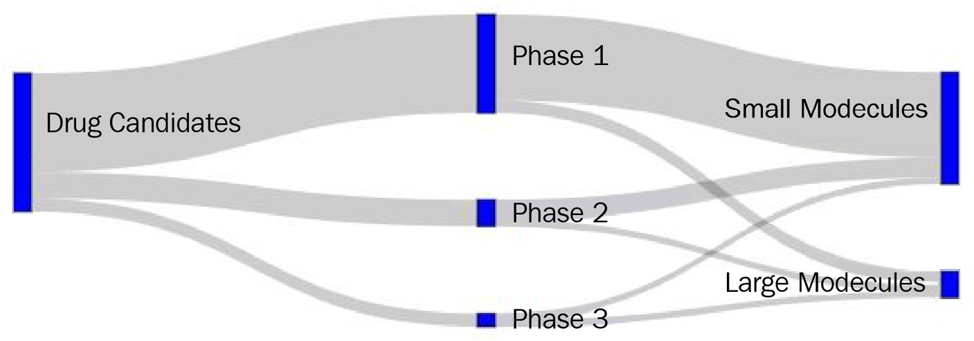
Figure 4.23 – A Sankey diagram representing a company's pipeline
Sankey diagrams are a great way to show the flow or transfer of information over time or by category. In the preceding example, we looked at its application in terms of small and large molecules within a pipeline. Let's now take a look at how we can visualize these molecules.
Visualizing small molecules
When it comes to small molecules, there are a number of ways we can visualize them using various software platforms and online services. Luckily, there exists an excellent library commonly utilized for cheminformatics applications known as the Research and Development Kit (RDKit) that allows for the depiction of small molecules using the SMILES format. The rdkit library can be installed using pip:
import pandas as pd
import rdkit
from rdkit import Chem
We can parse the DataFrame we imported earlier in this tutorial and extract a sample smiles string via indexing. We can then create a molecule object using the MolFromSmiles() function within the Chem class of rdkit using the smiles string as the single argument:
df = pd.read_csv("../../datasets/dataset_toxicity_sd.csv")
m = Chem.MolFromSmiles(df["smiles"][5])
m
The output of this variable can be seen in Figure 4.24:
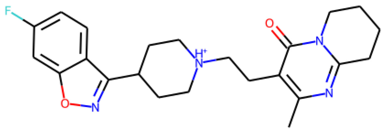
Figure 4.24 – A representation of a small molecule
We can check the structure of another molecule by looking at a different index value:
m = Chem.MolFromSmiles(df["smiles"][20])
m
This time, our output is as follows:
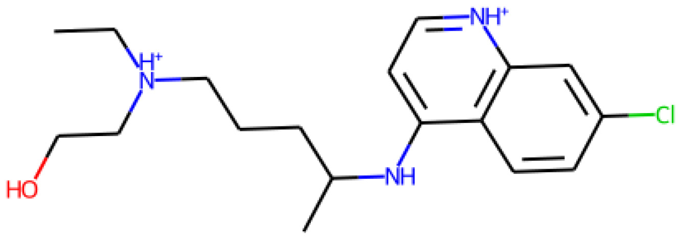
Figure 4.25 – A representation of a small molecule
In addition to rendering print-ready depictions of small molecules, the rdkit library also supports a wide variety of functions related to the analysis, prediction, and calculation of small molecule properties. In addition, the library also supports the use of charge calculations, as well as similarity maps:
from rdkit.Chem import AllChem
from rdkit.Chem.Draw import SimilarityMaps
AllChem.ComputeGasteigerCharges(m)
contribs = [m.GetAtomWithIdx(i).GetDoubleProp('_GasteigerCharge') for i in range(m.GetNumAtoms())]
fig = SimilarityMaps.GetSimilarityMapFromWeights(m,
contribs, contourLines=10, )
The output of the preceding code can be seen in Figure 4.26:

Figure 4.26 – A representation of a small molecule's charge
Now that we have gained an idea of how we can use RDKit to represent small molecules, let's look at an application of this for large molecules instead.
Visualizing large molecules
There are a number of Python libraries designed for the visualization, simulation, and analysis of large molecules for the purposes of research and development. Currently, one of the most common libraries is py3Dmol. Exclusively used for the purposes of 3D visualization within a Jupyter Notebook setting, this library allows for the creation of publication-ready visuals of 3D proteins. The library can be easily downloaded using the pip framework.
At the time of writing, the world is still in the midst of dealing with the COVID-19 virus that originated in Wuhan, China and spread throughout the world. On July 8, 2020, a 1.7 Å resolution structure of the SARS-CoV-2 3CL protease was released in the RCSB Protein Data Bank (RCSB PDB) at pdb = 6XMK. Let's go ahead and use this protein as an example in the following visualizations:
- We can begin the development of this visual using the py3dmol library and querying the protein structure directly within the following function:
import py3Dmol
largeMol = py3Dmol.view(query='pdb:6xmk',
width=600,
height=600)
- With the library imported, a new variable object called lm can be specified using the view class in py3Dmol. This function takes three main arguments. The first is the identity of the protein of interest, namely 6xmk. The second and third arguments are the width and height of the display window, respectively. For more information about PDB files, visit the RCSB PDB at www.rcsb.org. Let's start by viewing this protein as a basic molecular stick structure by passing a stick argument:
largeMol.setStyle({'stick':{'color':'spectrum'}})
largeMol
Upon executing this line of code, we get the following image of the molecule:
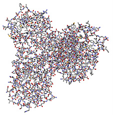
Figure 4.27 – A representation of a large molecule or protein in ball-stick form
- Notice that we added a stick argument that displayed the last structure. We can change this argument to cartoon to see a cartoon representation of this protein based on its secondary structure:
largeMol.setStyle({'cartoon':{'color':'spectrum'}})
largeMol
When executing this line of code, we get the following image of the molecule:

Figure 4.28 – A representation of a large molecule or protein's secondary structure
- There are a number of other changes and arguments that can be added to custom fit this visualization to a user's particular aims. One of these changes is the addition of a Van der Waals surface, which allows for the illustration of the area through which a molecular interaction might occur. We will add this surface to only one of the two chains on this protein:
lm = py3Dmol.view(query='pdb:6xmk')
chA = {'chain':'A'}
chB = {'chain':'B'}
lm.setStyle(chA,{'cartoon': {'color':'spectrum'}})
lm.addSurface(py3Dmol.VDW, {'opacity':0.7, 'color':'white'}, chA)
lm.setStyle(chB,{'cartoon': {'color':'spectrum'}})
lm.show()
We can see the output of this code in Figure 4.29:
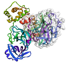
Figure 4.29 – A representation of a large molecule or protein's secondary structure with a Van der Waals surface on one of the chains
The study of large molecules, or biologics, have shown tremendous growth in the biotechnology sector in recent years. Within this chapter, we briefly introduced one of the many methods used to visualize these complex molecules – an important first step for any bioinformatics project.
Summary
Visualizations can be useful, powerful, and convincing tools to help illustrate points and drive conversations in specific directions. To create a proper visualization, there are certain steps and techniques that need to be taken to ensure your diagram is correct and effective.
Within this chapter, we explored the six main steps to follow when creating a proper visualization. We also explored many different methods and libraries within the scope of Python to help you create and style visuals for your specific aims. We explored some of the more basic visuals, such as bar plots, histograms, and scatter plots to analyze a few features at a time. We also explored more complex visualizations such as pair plots, heat maps, Sankey diagrams, and molecular representations, with which we can explore many more features.
We also touched on the concept of correlation and how certain features can have relationships with others – a concept we will cover in greater detail as we turn our attention to machine learning in the next chapter.