
3
Building and Documenting Components
In React, everything is a component. This paradigm allows us to split user interfaces into smaller parts, thus making it easier to develop applications. It also enables component reusability since we can reuse the same components in multiple places.
In this chapter, we will build some components that we will use as the application’s user interface base. This will make the application UI more consistent and easier to understand and maintain. We will also learn how to document the components with Storybook, a great tool that can serve as a catalog of common application components.
In this chapter, we will cover the following topics:
- Chakra UI
- Building components
- Storybook
- Documenting components
By the end of this chapter, we will learn how to create and document reusable components that we can use for the application.
Technical requirements
Before we get started, we need to set up the project. To be able to develop the project, you will need the following things installed on your computer:
- Node.js version 16 or above and npm version 8 or above.
There are multiple ways to install Node.js and npm. Here is a great article that goes into more detail:
https://www.nodejsdesignpatterns.com/blog/5-ways-to-install-node-js
- VSCode (optional) is currently the most popular editor/IDE for JavaScript/TypeScript, so we will be using it. It is open source, has great integration with TypeScript, and you can extend its features via extensions. It can be downloaded from here: https://code.visualstudio.com/.
The code files for this chapter can be found here: https://github.com/PacktPublishing/React-Application-Architecture-for-Production.
The repository can be cloned locally with the following command:
git clone https://github.com/PacktPublishing/React-Application-Architecture-for-Production.git
Once the repository is cloned, we need to install the application’s dependencies:
npm install
We also need to provide the environment variables:
cp .env.example .env
Once the dependencies have been installed, we need to select the right stage of the code base that matches this chapter. We can do that by executing the following command:
npm run stage:switch
This command will prompt us with a list of stages for each chapter:
? What stage do you want to switch to? (Use arrow
 keys)
❯ chapter-02
  chapter-03
  chapter-03-start
  chapter-04
  chapter-04-start
  chapter-05
  chapter-05-start
(Move up and down to reveal more choices)
This is the third chapter, so you can select chapter-03-start if you want to follow along or chapter-03 to see the final results of the chapter.
Once the chapter has been selected, all files required to follow along with the chapter will appear.
To follow along with this chapter, you don’t need to make any changes to the code. You can use it as a reference to help get a better overview of the code base.
For more information about the setup details, check out the README.md file.
Chakra UI
Whenever we build a UI for an application, we must decide what to use for styling our components. In addition, we must also consider whether we want to make all components from scratch or use a component library with pre-made components.
The advantage of using a component library is that it gives us a productivity boost as we don’t have to implement components that have already been implemented, such as buttons, dialogs, and tabs. Also, some libraries come with great accessibility defaults out of the box, so we don’t have to think about it as much as we would if we built everything from scratch. These libraries can come with costs, such as difficult customizability or a significant impact on the final bundle size. On the other hand, they save us a lot of development time.
For our application, we will use Chakra UI, a component library built on top of a combination of emotion and styled-system, which will allow us to write CSS in JavaScript in a consistent way.
Chakra UI setup
We already have the Chakra UI library installed, and now we need to configure it.
To use Chakra UI, first, we need to configure its theme provider to enable styles for its components. Since all our providers and wrappers are defined in src/providers/app.tsx, we can add ChakraProvider there:
import {
  ChakraProvider,
  GlobalStyle,
} from '@chakra-ui/react';
import { ReactNode } from 'react';
import { theme } from '@/config/theme';
type AppProviderProps = {
  children: ReactNode;
};
export const AppProvider = ({
  children,
}: AppProviderProps) => {
  return (
    <ChakraProvider theme={theme}>
      <GlobalStyle />
      {children}
    </ChakraProvider>
  );
};
Here, we are wrapping the entire application with the provider to apply theming and styles to all Chakra UI components. We are also rendering the GlobalStyles component, which will take any global styles from our theme and apply it to the application.
Chakra UI settings and components are very customizable and can be configured in a custom theme, which we can pass to the provider. It will override the default theme configuration. Let’s configure the theme in src/config/theme.ts by adding the following:
import { extendTheme } from '@chakra-ui/react';
const colors = {
  primary: '#1a365d',
  primaryAccent: '#ffffff',
};
const styles = {
  global: {
    'html, body': {
      height: '100%',
      bg: 'gray.50',
    },
    '#__next': {
      height: '100%',
      bg: 'gray.50',
    },
  },
};
export const theme = extendTheme({ colors, styles });
We are defining some global styles that will be injected via the GlobalStyles component, which we have already added in AppProvider. We also define the theme colors we want to have available in the components. Then, we combine these configurations with the default theme values by using the extendTheme utility, which will merge all configurations and give us the complete theme object.
It is useful to centralize theme configuration since it is easy to use and change if the branding of the application changes. For example, we can easily change the primary color value in one place and apply it to the entire application without any additional changes.
Building components
Now that the Chakra UI setup is in place, we can build the components. In the starting files for this chapter, we already have some default components exported. For now, we can render them on the landing page defined in src/pages/index.tsx as follows:
import { Button } from '@/components/button';
import { InputField } from '@/components/form';
import { Link } from '@/components/link';
const LandingPage = () => {
  return (
    <>
      <Button />
      <br />
      <InputField />
      <br />
      <Link />
    </>
  );
};
export default LandingPage;
To start the application development server, we need to run the following:
npm run dev
This will make the newly created page available at http://localhost:3000. The development server will listen to any changes we make and auto-refresh the page with the latest changes.
The landing page will display the components. If we open http://localhost:3000, we should see the following:
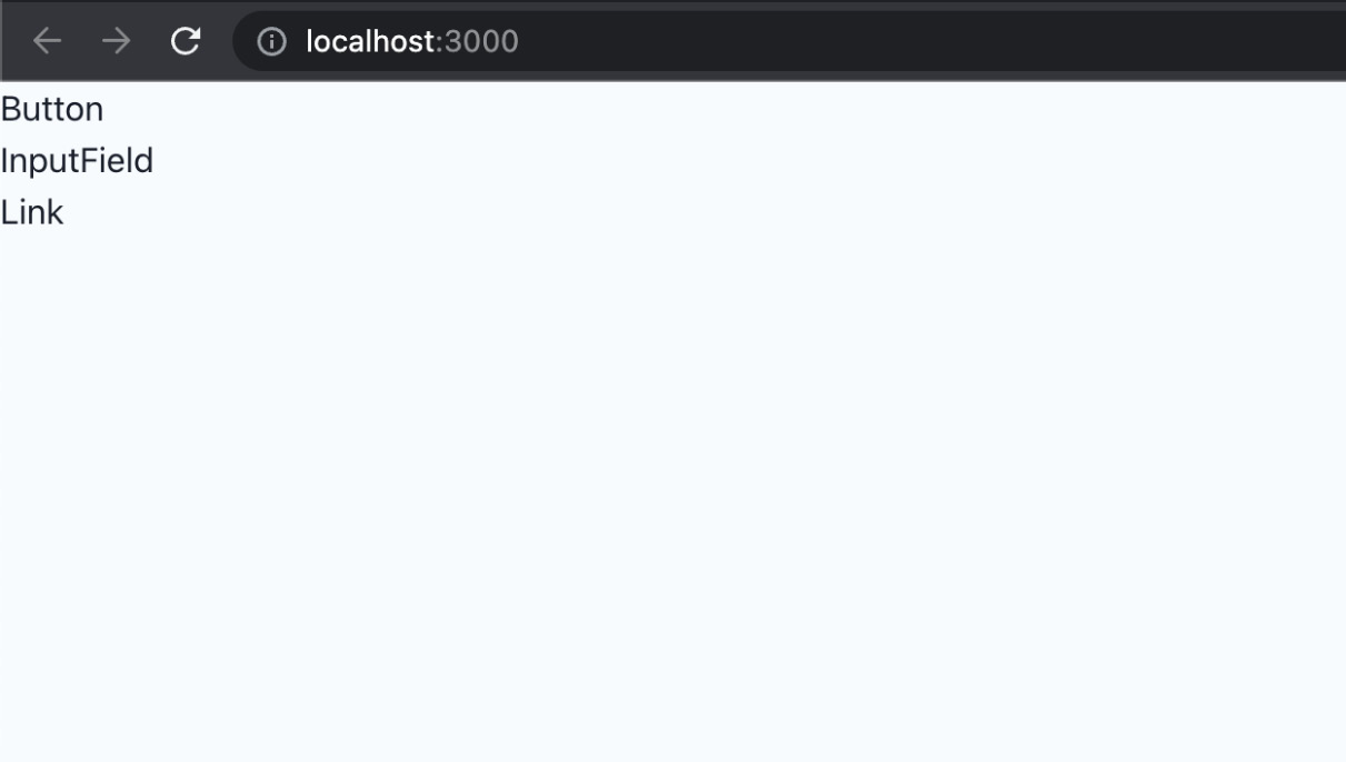
Figure 3.1 – Preview of the initial components on the landing page
The components aren’t doing much right now, so we need to work on their implementation.
Button
Let’s start by implementing the Button component, one of the most common components in every application. The component is already created in src/components/button/button.tsx, but we need to modify it.
Let’s start by importing its dependencies:
import { Button as ChakraButton } from '@chakra-ui/react';
import { MouseEventHandler, ReactNode } from 'react';
Now, we can create the variants object, which will hold all styling properties of our button and they will be applied accordingly to the default Chakra UI Button component:
const variants = {
  solid: {
    variant: 'solid',
    bg: 'primary',
    color: 'primaryAccent',
    _hover: {
      opacity: '0.9',
    },
  },
  outline: {
    variant: 'outline',
    bg: 'white',
    color: 'primary',
  },
};
Then, we can type the props for the Button component:
export type ButtonProps = {
  children: ReactNode;
  type?: 'button' | 'submit' | 'reset';
  variant?: keyof typeof variants;
  isLoading?: boolean;
  isDisabled?: boolean;
  onClick?: MouseEventHandler<HTMLButtonElement>;
  icon?: JSX.Element;
};
Typing the component’s props is a great way to describe its API, which is very useful as it documents how it should be used.
And now, we can create the Button component, which is just a wrapper around the default Button component provided by Chakra UI:
export const Button = ({
  variant = 'solid',
  type = 'button',
  children,
  icon,
  ...props
}: ButtonProps) => {
  return (
    <ChakraButton
      {...props}
      {...variants[variant]}
      type={type}
      leftIcon={icon}
    >
      {children}
    </ChakraButton>
  );
};
Then, we can update the Button component usage in src/pages/index.tsx as follows:
<Button variant="solid" type="button">
  Click Me
</Button>
InputField
The input field component is an input component that we want to use when building our forms. Let’s change src/components/form/input-field.tsx.
First, we need to import all dependencies:
import {
  FormControl,
  FormHelperText,
  FormLabel,
  forwardRef,
  Input,
  Textarea,
} from '@chakra-ui/react';
import {
  FieldError,
  UseFormRegister,
} from 'react-hook-form';
Then, we define types for the component’s props:
export type InputFieldProps = {
  type?: 'text' | 'email' | 'password' | 'textarea';
  label?: string;
  error?: FieldError;
} & Partial<
  ReturnType<UseFormRegister<Record<string, unknown>>>
>;
Finally, we implement the component itself:
export const InputField = forwardRef(
  (props: InputFieldProps, ref) => {
    const {
      type = 'text',
      label,
      error,
      ...inputProps
    } = props;
    return (
      <FormControl>
        {label && <FormLabel>{label}</FormLabel>}
        {type === 'textarea' ? (
          <Textarea
            bg="white"
            rows={8}
            {...inputProps}
            ref={ref}
          />
        ) : (
          <Input
            bg="white"
            type={type}
            {...inputProps}
            ref={ref}
          />
        )}
        {error && (
          <FormHelperText color="red">
            {error.message}
          </FormHelperText>
        )}
      </FormControl>
    );
  }
);
As you can see, we are building an input field component that we can use with the react-hook-form library to create forms, and we will learn how to do that in the upcoming chapters. Notice how we are wrapping the component with forwardRef. This will allow us to pass references to the component if necessary.
Let’s update its usage in src/pages/index.tsx:
<InputField label="Name" />
Link
For the links, we will use the Link component provided by Next.js. However, we want to centralize the configuration and styling and use it everywhere. Let’s modify src/components/link/link.tsx:
First, let’s import all dependencies:
import { Button } from '@chakra-ui/react';
import NextLink from 'next/link';
import { ReactNode } from 'react';
Similar to what we did with the Button component, we want to allow the link to accept some variants, which will apply additional styling props to the component:
const variants = {
  link: {
    variant: 'link',
    color: 'primary',
  },
  solid: {
    variant: 'solid',
    bg: 'primary',
    color: 'primaryAccent',
    _hover: {
      opacity: '0.9',
    },
  },
  outline: {
    variant: 'outline',
    color: 'primary',
    bg: 'white',
  },
};
Then, we define the type of the component’s props:
export type LinkProps = {
  href: string;
  children: ReactNode;
  variant?: keyof typeof variants;
  icon?: JSX.Element;
  shallow?: boolean;
};
And here is the implementation of the Link component. Notice how we are using the Link component from Next.js, which we use to wrap the Button component from Chakra UI:
export const Link = ({
  href,
  children,
  variant = 'link',
  icon,
  shallow = false,
}: LinkProps) => {
  return (
    <NextLink shallow={shallow} href={href} passHref>
      <Button
        leftIcon={icon}
        as="a"
        {...variants[variant]}
      >
        {children}
      </Button>
    </NextLink>
  );
};
Why are we using the Button component instead of Link from Chakra UI? We could have used Link, but we want most of our links to look and feel like buttons, so the reason is just the style preference. Notice how we are passing as="a" to Button. This will make the element an anchor, which is correct from the accessibility standpoint, and the component will be rendered as a link element in the DOM.
Let’s update its usage in src/pages/index.tsx:
<Link href="/">Home</Link>
Note that we can’t predict and build all shared components upfront. Sometimes we realize that something needs to be abstracted while we are developing it. It is also challenging to anticipate all edge cases of a component, so abstracting it too early might complicate things in the long run.
For now, we have abstracted the most generic components we will surely use as they are.
Remember, the implementation details of each component don’t matter. If you don’t understand everything they are doing and how they work, it’s okay. The key takeaway is that we want to abstract the most common components so we can reuse them when needed.
Since most component libraries are very generic, with many options to fit everyone’s needs, it is a good idea to make our wrappers around their default components to reduce the default API surface and adapt them to the application’s needs. This will reduce the overhead of components with too many configuration options and props we will never use. Also, it will bring consistency since developers are constrained to using fewer options.
Let’s look at our index page where the components are rendered:

Figure 3.2 – Preview of the components on the landing page
Great! Now go ahead and try to play around with different props and see how the components behave.
Our components are working correctly and are ready to be used in the application. However, there are a couple of issues:
- We are occupying the index route. What happens when we want to use it for something meaningful, such as the landing page? We will not be able to use that page for previewing our components. Sure, we can create and use another page that will never be used, but that is not a very good option either.
- We don’t want to display all components together as it is messy, and it would be better to try them out in isolation.
- We want to play around with the component props, which is impossible with the current approach since we would have to modify the code.
Let’s see in the next section how we can solve these issues and develop and try components in isolation without changing our application’s code.
Storybook
Storybook is a tool that allows us to develop and test UI components in isolation. We can think of it as a tool for making catalogs of all the components we have. It is great for documenting components. A couple of benefits of using Storybook include the following:
- Storybook allows developing components in isolation without the need to reproduce the exact state of the application, allowing developers to focus on the things they are building
- Storybook serves as a catalog of UI components allowing all stakeholders to try out the components without using them in the application
Storybook is configured by using the following command:
npx storybook init
This command will install all required dependencies and set up the configuration that resides in the .storybook folder at the root of the project.
Storybook configuration
We already have Storybook installed, so let’s look at the configuration, which has two files.
The first file contains the main configuration, which controls how the Storybook server behaves and how it processes our stories. It lives in .storybook/main.js:
const path = require('path');
const TsconfigPathsPlugin = require('tsconfig-paths-webpack-plugin');
module.exports = {
  stories: ['../src/**/*.stories.tsx'],
  addons: [
    '@storybook/addon-links',
    '@storybook/addon-essentials',
    '@storybook/addon-interactions',
    '@chakra-ui/storybook-addon',
  ],
  features: {
    emotionAlias: false,
  },
  framework: '@storybook/react',
  core: {
    builder: '@storybook/builder-webpack5',
  },
  webpackFinal: async (config) => {
    config.resolve.plugins = config.resolve.plugins || [];
    config.resolve.plugins.push(
      new TsconfigPathsPlugin({
        configFile: path.resolve(
          __dirname,
          '../tsconfig.json'
        ),
      })
    );
    return config;
  },
};
The main configuration contains the following properties:
- stories: An array of globs that indicates the locations of our stories.
- addons: A list of add-ons used to enhance the default behavior of Storybook.
- features: Enables Storybook’s additional features.
- framework: Framework-specific configurations.
- core: Internal feature configuration.
- webpackFinal: Configuration for extending default webpack configuration. We are enabling absolute imports by telling Storybook to use paths from the tsconfig.json file.
The second configuration file controls how the stories are rendered in the UI. This configuration lives in .storybook/preview.js:
import { theme } from '../src/config/theme';
export const parameters = {
  actions: { argTypesRegex: '^on[A-Z].*' },
  controls: {
    matchers: {
      color: /(background|color)$/i,
      date: /Date$/,
    },
  },
  controls: { expanded: true },
  chakra: {
    theme,
  },
};
Notice how we are passing the theme to the chakra property in parameters. This will enable Chakra theming to be applied to our components in Storybook.
We can optionally export decorators, which will wrap all the stories. It is useful if the components rely on some providers that we want to have available in all stories.
Storybook scripts
Our Storybook setup has two npm scripts:
- Running Storybook in development
To start the development server, we can execute the following command:
npm run storybook
The command will open Storybook at http://localhost:6006/.
- Building Storybook for production
We can also generate and deploy the stories to be visible without running the development server. To build the stories, we can execute the following command:
npm run storybook:build
Generated files can then be found in the storybook-static folder, and they can be deployed anywhere.
Now that we have familiarized ourselves with the setup, it’s time to write the stories for the components.
Documenting components
If we recall from the previous section, the configuration in .storybook/main.js has the stories property as follows:
stories: ['../src/**/*.stories.tsx']
This means that any file in the src folder that ends with .stories.tsx should be picked by Storybook and treated as a story. With that said, we will co-locate stories next to the components, so the structure for every component will look something like this:
components
  my-component
    my-component.stories.tsx
    my-component.tsx
    index.ts
We will create our stories based on Component Story Format (CSF), an open standard for writing component examples.
But first, what is a story? According to the CSF standard, a story should represent a single source of truth for a component. We can think of a story as a user story where a component is presented in the corresponding state.
CSF requires the following:
- Default exports should define metadata about a component, including the component itself, the component’s name, decorators, and parameters
- Named exports should define all stories
Let’s now create the stories for the components.
Button stories
To create stories for the Button component, we need to create an src/components/button/button.stories.tsx file.
Then, we can start by adding the required imports:
import { PlusSquareIcon } from '@chakra-ui/icons';
import { Meta, Story } from '@storybook/react';
import { Button, ButtonProps } from './button';
Then, we create the meta configuration object:
const meta: Meta = {
  title: 'Components/Button',
  component: Button,
};
export default meta;
Notice that we are exporting it as a default export. This is what Storybook requires, according to CSF.
Since we can have multiple stories, we must create a story template:
const Template: Story<ButtonProps> = (props) => (
  <Button {...props} />
);
And then we can export the first story:
export const Default = Template.bind({});
Default.args = {
  children: 'Click Me',
};
We can pass any props we need to the args object attached to the story, which will be reflected in our stories in Storybook.
We can do the same thing for another story where we want to have a version of Button that has an icon:
export const WithIcon = Template.bind({});
WithIcon.args = {
  children: 'Click Me',
  icon: <PlusSquareIcon />,
};
To see the story, let’s execute the following command:
npm run storybook
Now, let’s visit http://localhost:6006/:

Figure 3.3 – Button component story
And there, we have the Button component previewed in isolation. Notice the control panel at the bottom. This gives us a friendly interface to play with the component’s props without touching the code.
Isn’t this much nicer than what we had first with rendering components on the index page? We can deploy stories anywhere and allow non-technical people to experiment with the components without coding knowledge.
Exercises
To solidify your understanding of Storybook, let’s have a go at some exercises. Go ahead and create stories for the following components:
- InputField:
- Default story
- With error story
- Link:
- Default story
- With icon story
Summary
In this chapter, our focus was on building base components that we will reuse in our application.
We started by configuring the Chakra UI provider and theming. Then we displayed the components on the landing page for testing purposes. They were not doing much, so we implemented them. The point of defining shared components is that we can reuse them anywhere, which makes development easier in the long run. What the components are doing here is not very important. The important thing is to think about creating shared components as a base for the application.
We then needed to preview the components somewhere and since doing that on a page is not a very elegant solution, we chose Storybook. We covered its configuration, and then we defined a couple of stories for the Button component. The stories are written in Component Story Format (CSF), which is a standard for how to write component examples.
As an exercise at the end of this chapter, there were further stories to implement, which should solidify all learnings so far.
In the next chapter, we will use these components when we start creating our pages.