
With multiple jobs in our detection portfolio, an analyst might want to visualize all of a jobs' anomalies in a common time period. This is something equivalent to the Anomaly Explorer viewer in the Machine Learning Kibana application with all the jobs selected, as shown in the following screenshot:

The Kibana visualization we are going to use to get an equivalent of the preceding screenshot is the Heat Map. Go into the visualization part to create a new Heat Map visualization:

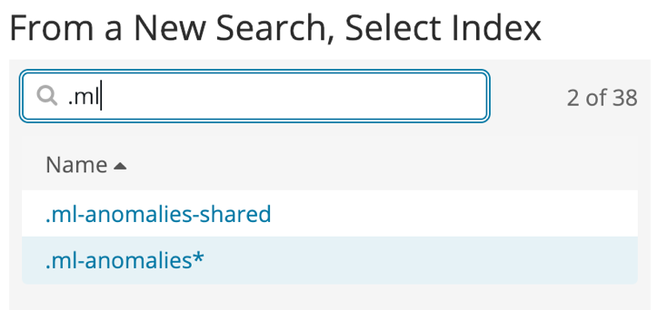
Pick the .ml-anomalies* index pattern, which contains all of the results that are relative to the jobs we have created so far:
Now, let's configure the Heat Map by going into the left panel first and choosing Buckets. We want to represent the detected anomalies over time. Thus, for the X-Axis, we'll choose a Date Histogram:

Now, let's add a sub-bucket so that we can split the vertical axis per job. Since we are focusing on the time period where our data exists (remember, the logs are from 1995!), we should decrease the possibility of causing collisions with results from other jobs. However, to make sure that you can still set filters on job names, click on Add sub-buckets, select Y-Axis, and choose a Terms aggregation to split on job_id, as shown in the following screenshot:

If you click on the Play button to render the chart, here is what you will get:

Now, let's configure the Metrics part so that we can emphasize every anomaly's severity over time on the Heat Map:

For the last touch on the Heat Map, we'll change the Color Schema to Reds in the Options panel:

Finally, this is the rendering of our Heat Map:
