
One of the reasons why we perform visualization is to confirm our knowledge of data. However, if the data is not well understood, you may not frame the right questions about the data.
When creating visualizations, the first step is to be clear on the question to be answered. In other words, how is visualization going to help? There is another challenge that follows this—knowing the right plotting method. Some visualization methods are as follows:
- Bar graph and pie chart
- Box plot
- Bubble chart
- Histogram
- Kernel Density Estimation (KDE) plot
- Line and surface plot
- Network graph plot
- Scatter plot
- Tree map
- Violin plot
In the course of identifying the message that the visualization should convey, it makes sense to look at the following questions:
- How many variables are we dealing with, and what are we trying to plot?
- What do the x axis and y axis refer to? (For 3D, z axis as well.)
- Are the data sizes normalized and does the size of data points mean anything?
- Are we using the right choices of colors?
- For time series data, are we trying to identify a trend or a correlation?
If there are too many variables, it makes sense to draw multiple instances of the same plot on different subsets of data. This technique is called lattice or trellis plotting. It allows a viewer to quickly extract a large amount of information about complex data.
Consider a subset of student data that has an unusual mixture of information about (gender, sleep, tv, exercise, computer, gpa) and (height, momheight, dadheight). The units for computer, tv, sleep, and exercise are hours, height is in inches and gpa is measured on a scale of 4.0.

The preceding data is an example that has more variables than usual, and therefore, it makes sense to do a trellis plot to visualize and see the relationship between these variables.
One of the reasons we perform visualization is to confirm our knowledge of data. However, if the data is not well understood, one may not frame the right questions about it.
Since there are only two genders in the data, there are 10 combinations of variables that can be possible (sleep, tv), (sleep, exercise), (sleep, computer), (sleep, gpa), (tv, exercise), (tv, computer), (tv, gpa), (exercise, computer), (exercise, gpa), and (computer, gpa) for the first set of variables; another two, (height, momheight) and (height, dadheight) for the second set. Following are all the combinations except (sleep, tv), (tv, exercise).

Our goal is to find what combination of variables can be used to make some sense out of this data, or to see if any of these variables have any meaningful impact. Since the data is about students, gpa may be a key variable that drives the relevance of the other variables. The preceding image depicts scatter plots that show that a greater number of female students have a higher gpa than the male students and a greater number of male students spend more time on computer and get a similar gpa range of values. Although all scatter plots are being shown here, the intent is to find out which data plays a more significant role, and what sense can we make out of this data.

A greater number of blue dots high up (for gpa on the y axis) shows that there are more female students with a higher gpa (this data was collected from UCSD).
The data can be downloaded from http://www.knapdata.com/python/ucdavis.csv.
One can use the
seaborn package and display a scatter plot with very few lines of code, and the following example shows a scatter plot of gpa along the x - axis compared with the time spent on computer by students:
import pandas as pd
import seaborn as sns
import matplotlib.pyplot as plt

students = pd.read_csv("/Users/kvenkatr/Downloads/ucdavis.csv")

g = sns.FacetGrid(students, hue="gender", palette="Set1", size=6)
g.map(plt.scatter, "gpa", "computer", s=250, linewidth=0.65,
  edgecolor="white")

g.add_legend()
Tip
Downloading the example code
You can download the example code files for all Packt books you have purchased from your account at http://www.packtpub.com. If you purchased this book elsewhere, you can visit http://www.packtpub.com/support and register to have the files e-mailed directly to you.
These plots were generated using the matplotlib, pandas, and seaborn library packages. Seaborn is a statistical data visualization library based on matplotlib, created by Michael Waskom from Stanford University. Further details about these libraries will be discussed in the following chapters.
There are many useful classes in the Seaborn library. In particular, the FacetGrid class comes in handy when we need to visualize the distribution of a variable or the relationship between multiple variables separately within subsets of data. FacetGrid can be drawn with up to three dimensions, that is, row, column and hue. These library packages and their functions will be described in later chapters.
When creating visualizations, the first step is to be clear on the question to be answered. In other words, how is visualization going to help? The other challenge is choosing the right plotting method.
When do we choose bar graphs and pie charts? They are the oldest visualization methods and pie chart is best used to compare the parts of a whole. However, bar graphs can compare things between different groups to show patterns.
Bar graphs, histograms, and pie charts help us compare different data samples, categorize them, and determine the distribution of data values across that sample. Bar graphs come in several different styles varying from single, multiple, and stacked.
Bar graphs are especially effective when you have numerical data that splits nicely into different categories, so you can quickly see trends within your data.
Bar graphs are useful when comparing data across categories. Some notable examples include the following:
- Volume of jeans in different sizes
- World population change in the past two decades
- Percent of spending by department
In addition to this, consider the following:
- Add color to bars for more impact: Showing revenue performance with bars is informative, but adding color to reveal the profits adds visual insight. However, if there are too many bars, colors might make the graph look clumsy.
- Include multiple bar charts on a dashboard: This helps the viewer to quickly compare related information instead of flipping through a bunch of spreadsheets or slides to answer a question.
- Put bars on both sides of an axis: Plotting both positive and negative data points along a continuous axis is an effective way to spot trends.
- Use stacked bars or side-by-side bars: Displaying related data on top of or next to each other gives depth to your analysis and addresses multiple questions at once.
These plots can be achieved with fewer than 12 lines of Python code, and more examples will be discussed in the later chapters.
With bar graphs, each column represents a group defined by a specific category; with histograms, each column represents a group defined by a quantitative variable. With bar graphs, the x axis does not have a low-end or a high-end value, because the labels on the x axis are categorical and not quantitative. On the other hand, in a histogram, there is going to be a range of values. The following bar graph shows the statistics of Oscar winners and nominees in the US from 2000-2009:

The following Python code uses matplotlib to display bar graphs for a small data sample from the movies (This may not necessarily be a real example, but gives an idea of plotting and comparing):
[5]: import numpy as np
     import matplotlib.pyplot as plt

     N = 7
     winnersplot = (142.6, 125.3, 62.0, 81.0, 145.6, 319.4, 178.1)

     ind = np.arange(N)  # the x locations for the groups
     width = 0.35        # the width of the bars

     fig, ax = plt.subplots()
     winners = ax.bar(ind, winnersplot, width, color='#ffad00')

     nomineesplot = (109.4, 94.8, 60.7, 44.6, 116.9, 262.5, 102.0)
     nominees = ax.bar(ind+width, nomineesplot, width,
       color='#9b3c38')

     # add some text for labels, title and axes ticks
     ax.set_xticks(ind+width)
     ax.set_xticklabels( ('Best Picture', 'Director', 'Best Actor',
       'Best Actress','Editing', 'Visual Effects', 'Cinematography'))

     ax.legend( (winners[0], nominees[0]), ('Academy Award Winners',
       'Academy Award Nominees') )

     def autolabel(rects):
       # attach some text labels
       for rect in rects:
         height = rect.get_height()
         hcap = "$"+str(height)+"M"
         ax.text(rect.get_x()+rect.get_width()/2., height, hcap,
           ha='center', va='bottom', rotation="vertical")

     autolabel(winners)
     autolabel(nominees)

plt.show()When it comes to pie charts, one should really consider answering the questions, "Do the parts make up a meaningful whole?" and "Do you have sufficient real-estate to represent them using a circular view?". There are critics who come crashing down on pie charts, and one of the main reasons, for that is that when there are numerous categories, it becomes very hard to get the proportions and compare those categories to gain any insight. (Source: https://www.quora.com/How-and-why-are-pie-charts-considered-evil-by-data-visualization-experts).
Pie charts are useful for showing proportions on a single space or across a map. Some notable examples include the following:
- Response categories from a survey
- Top five company market shares in a specific technology (in this case, one can quickly know which companies have a major share in the market)
In addition to this, consider the following:
- Limit pie wedges to eight: If there are more than eight proportions to represent, consider a bar graph. Due to limited real - estate, it is difficult to meaningfully represent and interpret the pieces.
- Overlay pie charts on maps: Pie charts can be much easier to spread across a map and highlight geographical trends. (The wedges should be limited here too.)
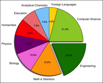
Consider the following code for a simple pie-chart to compare how the intake of admissions among several disciplines are distributed:
[6]: import matplotlib.pyplot as plt

     labels = 'Computer Science', 'Foreign Languages',
       'Analytical Chemistry', 'Education', 'Humanities',
       'Physics', 'Biology', 'Math and Statistics', 'Engineering'

     sizes = [21, 4, 7, 7, 8, 9, 10, 15, 19]
     colors = ['yellowgreen', 'gold', 'lightskyblue', 'lightcoral',
       'red', 'purple', '#f280de', 'orange', 'green']
     explode = (0,0,0,0,0,0,0,0,0.1)
     plt.pie(sizes, explode=explode, labels=labels,
       autopct='%1.1f%%', colors=colors)
     plt.axis('equal')
     plt.show()
The following pie chart example shows the university admission intake in some chosen top-study areas:
Box plots are also known as box-and-whisker plots. This is a standardized way of displaying the distribution of data based on the five number summaries: minimum, first quartile, median, third quartile, and maximum. The following diagram shows how a box plot can be read:

A box plot is a quick way of examining one or more sets of data graphically, and they take up less space to define five summaries at a time. One example that we can think of for this usage is: if the same exam is given to two or more classes, then a box plot can tell when the most students in one class did better than most students in the other class. Another example is that if there are more people who eat burgers, the median is going to be higher or the top whisker could be longer than the bottom one. In such a case, it gives one a good overview of the data distribution.
Before we try to understand when to use box plots, here is a definition that one needs to understand. An outlier in a collection of data values is an observation that lies at an abnormal distance from other values.
Box plots are most useful in showing the distribution of a set of data. Some notable examples are as follows:
- Identifying outliers in the data
- Determining how the data is skewed towards either end
In addition to this, consider the following:
A scatter plot is a type of visualization method for displaying two variables. The pattern of their intersecting points can graphically show the relationship patterns. A scatter plot is a visualization of the relationship between two variables measured on the same set of individuals. On the other hand, a Bubble chart displays three dimensions of data. Each entity with its triplet (a,b,c) of associated data is plotted as a disk that expresses two of those three variables through the xy location and the third shows the quantity measured for significance.
The data is usually displayed as a collection of points, and is often used to plot various kinds of correlations. For instance, a positive correlation is noticed when the increase in the value of one set of data increases the other value as well. The student record data shown earlier has various scatter plots that show the correlations among them.
In the following example, we compare the heights of students with the height of their mother to determine if there is any positive correlation. The data can be downloaded from http://www.knapdata.com/python/ucdavis.csv.
import numpy as np
import pandas as pd
import seaborn as sns
import matplotlib.pyplot as plt
students = pd.read_csv("/Users/Macbook/python/data/ucdavis.csv")
g = sns.FacetGrid(students, palette="Set1", size=7)
g.map(plt.scatter, "momheight", "height", s=140, linewidth=.7, edgecolor="#ffad40", color="#ff8000")
g.set_axis_labels("Mothers Height", "Students Height")
We demonstrate this example using the seaborn package, but one can also accomplish this using only matplotlib, which will be shown in the following section. The scatterplot map for the preceding code is depicted as follows:

Scatter plots are most useful for investigating the relationship between two different variables. Some notable examples are as follows:
- The likelihood of having skin cancer at different ages in males versus females
- The correlation between the IQ test score and GPA
In addition to this, consider the following:
- Add a trend line or line of best-fit (if the relation is linear): Adding a trend line can show the correlation among the data values
- Use informative mark types: Informative mark types should be used if the story to be revealed is about data that can be visually enhanced with relevant shapes and colors
The following example shows how one can use color map as a third dimension that may indicate the volume of sales or any appropriate indicator that drives the profit:
 [7]: import numpy as np
     import pandas as pd
     import seaborn as sns
     import matplotlib.pyplot as plt

     sns.set(style="whitegrid")
     mov = pd.read_csv("/Users/MacBook/python/data/2014_gross.csv")

     x=mov.ProductionCost
     y=mov.WorldGross
     z=mov.WorldGross

     cm = plt.cm.get_cmap('RdYlBu')
     fig, ax = plt.subplots(figsize=(12,10))

     sc = ax.scatter(x,y,s=z*3, c=z,cmap=cm, linewidth=0.2, alpha=0.5)
     ax.grid()
     fig.colorbar(sc)

     ax.set_xlabel('Production Cost', fontsize=14)
     ax.set_ylabel('Gross Profits', fontsize=14)

     plt.show()
..-.
The following scatter plot is the result of the example using color map:

Bubble charts are extremely useful for comparing relationships between data in three numeric-data dimensions: the x axis data, the y axis data, and the data represented by the bubble size. Bubble charts are like XY scatter plots, except that each point on the scatter plot has an additional data value associated with it that is represented by the size of the circle or "bubble" centered on the XY point. Another example of a bubble chart is shown here (without the python code, to demonstrate a different style):

In the preceding display, the bubble chart shows the Life Expectancy versus Gross Domestic Product per Capita around different continents.
Bubble charts are most useful for showing the concentration of data along two axes with a third data element being the significance value measured. Some notable examples are as follows:
- The production cost of movies and gross profit made, and the significance measured along a heated scale as shown in the example
In addition to this, consider the following:
- Adding color and shape significance: By varying the size and color, the data points can be transformed into a visualization that clearly answers some questions
- Make it interactive: If there are too many data points, bubble charts could get cluttered, so group them on the time axis or categories, and visualize them interactively
Kernel Density Estimation (KDE) is a non-parametric way to estimate the probability density function and its average across the observed data points to create a smooth approximation. They are closely related to histograms, but sometimes can be endowed with smoothness or continuity by a concept called kernel.
The kernel of a Probability Density Function (PDF) is the form of the PDF in which any factors that are not functions of any of the variables in the domain are omitted. We will focus only on the visualization aspect of it; for more theory, one may refer to books on statistics.
There are several different Python libraries that can be used to accomplish a KDE plot at various depths and levels including matplotlib, Scipy, scikit-learn, and seaborn. Following are two examples of KDE Plots. There will be more examples in later chapters, wherever necessary to demonstrate various other ways of displaying KDE plots.
In the following example, we use a random dataset of size 250 and the seaborn package to show the distribution plot in a few simple lines:

One can display simple distribution of a data plot using seaborn, which is demonstrated here using a random sample generated using numpy.random:
from numpy.random import randn
import matplotlib as mpl
import seaborn as sns
import matplotlib.pyplot as plt

sns.set_palette("hls")
mpl.rc("figure", figsize=(10,6))
data = randn(250)
plt.title("KDE Demonstration using Seaborn and Matplotlib", fontsize=20)
sns.distplot(data, color='#ff8000')
In the second example, we are demonstrating the probability density function using SciPy and NumPy. First we use norm() from SciPy to create normal distribution samples and later, use hstack() from NumPy to stack them horizontally and apply gaussian_kde() from SciPy.

The preceding plot is the result of a KDE plot using SciPy and NumPy, which is shown as follows:
from scipy.stats.kde import gaussian_kde
from scipy.stats import norm
from numpy import linspace, hstack
from pylab import plot, show, hist

sample1 = norm.rvs(loc=-1.0, scale=1, size=320)
sample2 = norm.rvs(loc=2.0, scale=0.6, size=320)
sample = hstack([sample1, sample2])
probDensityFun = gaussian_kde(sample)
plt.title("KDE Demonstration using Scipy and Numpy", fontsize=20)
x = linspace(-5,5,200)
plot(x, probDensityFun(x), 'r')
hist(sample, normed=1, alpha=0.45, color='purple')
show()
The other visualization methods such as the line and surface plot, network graph plot, tree maps, heat maps, radar or spider chart, and the violin plot will be discussed in the next few chapters.