pieces, parts, and process


Logo Development
Typography
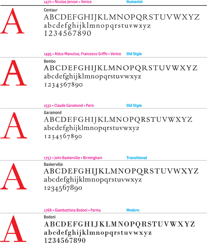
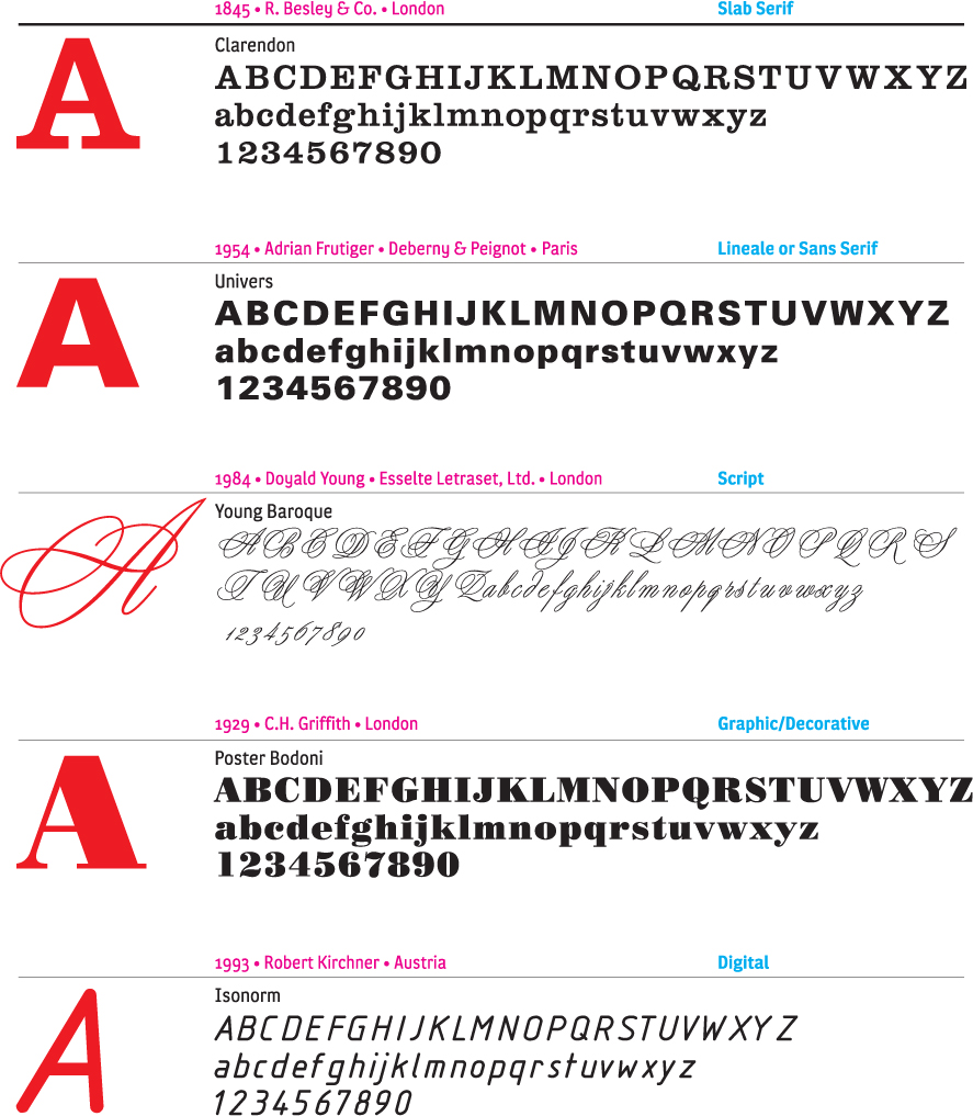
Typography is pictures of words. The letterforms work together to convey a message. In the same way that we decipher imagery, we decode typography. The attitude, history, and culture of a company are conveyed with the letterforms of the logo. Choosing the appropriate typeface for a logo is a complex task. The shape of the letters in combination must be considered, as well as the legibility and distinct sound of the word when spoken. Certain typefaces will lend themselves to better legibility with upper and lower case.
Often, a type study is conducted to examine options. Once a general typographic direction is established, a letter-style will be created. There are instances when an existing font will work adequately, but proprietary and unique letterforms provide greater value. This is either a modification of an existing typeface, or a completely original typeface. While most nongraphic designers will not recognize the difference between Helvetica and a custom font, it is the unique attributes of the custom font that give ownership to the client. A word of warning, however; the further the letterforms depart from the original recognizable forms, the more quickly they will date.
44-45
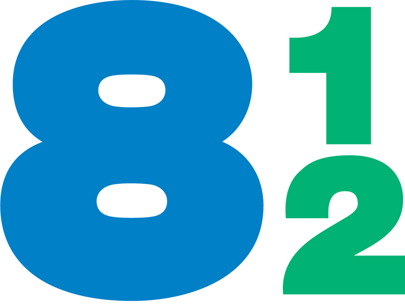
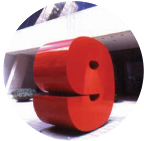
Brasserie 8 1/2, the restaurant at 9 West 57th Street, references the large three-dimensional figure “9,” which is a famous New York City landmark in front of the building. The curves of the beautifully drawn custom letterforms of the Brasserie 8 1/2 logo have been simplified; the shapes of each letterform echoes the shapes of the others.
Chermayeff & Geismar
46
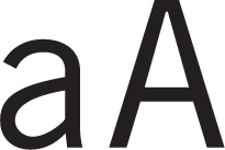
The Architects Alliance is an amalgam of several architectural practices. The Trade Gothic letterforms are clear, confident, and minimalist in their creation.
Concrete
47
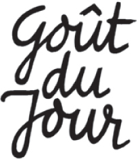
Goût du Jour is a Japanese cake and bread bakery chain. The letterforms are hand-drawn and communicate an attitude of spontaneity and joyfulness.
Anthon Beeke
48
Gizmo, a board game, is a combination of various forms based on the slab serif font Geometric 703. The dingbats simulate the action of this game about creating mechanical “inventions.” The shift of letters on the baseline forces the viewer to “hear” the word.
Tom and John, A Design Collaborative

49
Based on the classical font Firmin Didot, the ITC Didi letterforms used on the Bocconi logo exaggerate the terminal of the “c,” which echoes the dot on the “i” and creates a proprietary element.
Pentagram UK
50
The Design Exchange promotes connections in cultural identity and design innovation. The name is simplified into an iconic language with minimal means. The letterforms are based on Gill Sans.
Concrete
51
Lowe and Partners is one of the world’s leading advertising agencies. Taking advantage of the possibilities inherent in each letterform, a custom letterstyle was developed with a square as the primary guide.
Carter Wong Tomlin
52
MTVI Group, the online division of MTV Networks, connects three online businesses. As opposed to using the MTV logo, heavily modified versions of News Gothic and Venus were used, while the three dots of the “i” relate to the composition of the division.
AdamsMorioka, Inc.
Color
Color is subjective. There are emotional connections that are personal to each color we see. In relationship to logo design, color is integral to mnemonic value. It also conveys the tone of a company. Although certain colors have accepted meanings in Western European culture, there are multiple meanings across other cultures. In the United Kingdom, white is considered pure and positive. In China, white is used in mourning, symbolizing heaven. Red is connected with strength and life, but is taboo in financial communities. In these instances, the color acts as a signifier of ideas.
The idea of “owning” a color is one of the highest priorities of a logo and subsequent identity. Orange has been associated with Nickelodeon for almost two decades. PMS 659, a deep dark blue, is used on the Gap identity, and was also the name of their fragrance. Subverting standard definitions can help to make a color proprietary. Wells Fargo Bank’s use of red was considered heretical by the financial community, but has given Wells Fargo a clear identity above the multitudes of financial institutions with blue logos.
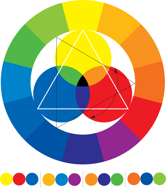
The triangle rotates to identify harmonious color combinations.
Hue: The color itself, ranging from yellow to blue to red
Saturation: The purity of a color from gray to the most intense color value
Value or tint: The brightness of a color from black to white
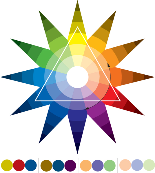
Tints from white to black use the same three-point combination method to identify harmony.
53
Red and gray were selected as the colors for architectural lighting fixture manufacturers Gotham. According to designer Clive Piercy, it was chosen because these colors are “prettywittysoftiespecial.”
Ph.D
54
When the logo was redesigned, electronics retailer Good Guys asked Pentagram to continue to use their exhisting colors of red and black for branding continuity.
Pentagram SF
55
The color palette for the pan-European graphic design conference Grafic Europe is not restricted to one combination. The colors are intended to change to reflect each city chosen to host the conference. This logo is for the conference in Barcelona, Spain.
Lippa Pierce
56
Sonic Fruit is a sound design company. The logo’s colors are a modern interpretation of classic corporate colors. The colors—red, blue and a touch of orange—reflect the hip nature of the client’s business.
Volker Dürre
57
Information, Advise and Guidance Network, or IAG, is an organization, that is committed to helping people with training, career counseling, and job placement with regional offices throughout the United Kingdom. The chartreuse color makes this logo both visible and memorable.
blue river design limited
58
Vodovod-Kanalizacija Ljubljana is the town’s water supply service. Blue is an obvious choice to represent water. The “V” for Vodovod and the waves combine to create the dynamic shape of this logo.
KROG

59
Steel blue grey and sans serif typography create a solid minimalist logo for polygon.
Lippa Pierce
60
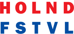
Holland Festival is an annual avant-garde cultural festival in Amsterdam. The “HOLND” is red and the “FSTVL” is blue, which results in a logo that resembles the Dutch flag.
Anthon Beeke

61
Developmentor is a company that trains software engineers and developers. Their logo is black and orange to give a twist to the traditional corporate colors.
Ph.D
62
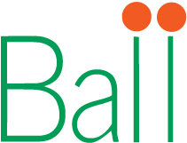
Green typography with red circles above the l’s suggest a growing plant for Geo. J. Ball—growers and distributors of seeds of plants.
Chermayeff & Geismar
63
The primary blue of the VH1 logo references multiple musical ideas: the blues, Blue Suede Shoes, Blue Note Records.
AdamsMorioka, Inc.
64
“The official VT color is blue, any blue. Why? Because research has shown conclusively that blue is America’s favorite color,” says designer John Bielenberg.
John Bielenberg
65
Blue was chosen for Mediabolic, a company that provides home entertainment networking systems, to be an unexpected nature-based color instead of a slick high-tech one.
Tom and John, A Design Collaborative
66
Danes Oblikujem Jutri means Today I Design for Tomorrow. This logo was created for a Slovenian conference on sustainable development, with green selected because of its connection to nature and the environment.
Kontrapunkt
67
Eneos is the gasoline service station brand of Nippon Oil Corporation. The radiating spirals of red and orange convey energy, innovation, and provide visual impact.
Landor Associated International Limited
Image/Iconography
When we talk about iconography here, we are discussing its role in the context of logo development. Icons are loaded. They can be very powerful and convey a large amount of information quickly. They can, conversely, be oblique and neutral, allowing for a broad range of meaning. The style of execution impacts the tone and meaning. An icon created for a logo does not need to be a hard-edged, flat drawing of an abstract shape. While direct illustration of the subject matter is a mistake, various representational techniques can be utilized.
An apple acts as both a symbol of New York and of education. This may seem like a cliché, but clichés are, intrinsically, very recognizable. Such symbols should not be disregarded but, rather, presented in a fresh form. The iconography should engage the viewer. Seeing recognizable signs in a unique form is a good way to achieve this goal.
As society and culture change, the meaning of imagery and iconography shifts. Aunt Jemima was an acceptable image in the 1930s, but has since been modified to better represent an African-American woman as an individual, not as a stereotype. Responsibility for understanding the meaning(s) of an image lies with the designer.
68
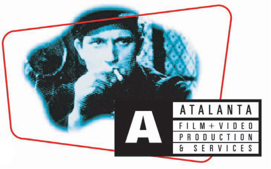
The representational technique of photography is used for the Atalanta Film + Video Production logo. The execution (photography) evolves from the subject matter—film—and does not rely on a purely graphic solution.
Kontrapunkt
69
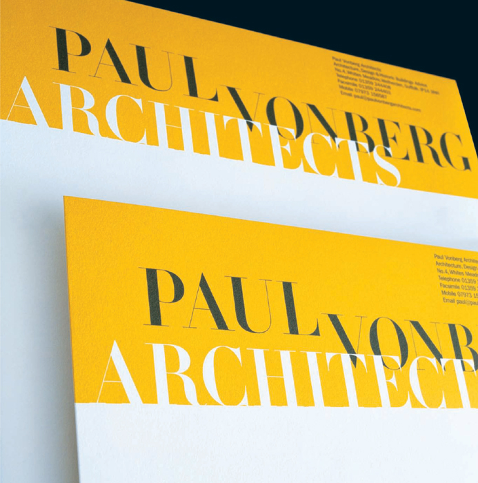
The stationery for Paul Vonberg Architects plays with the concept of space. The yellow block creates a horizon on which the word “architects” stands. The viewer can move through the type in the same way a person can walk through a building. Lippa Pierce created a typographic landscape, steeped in classicism, especially with the use of the font Didot.
Lippa Pierce
70
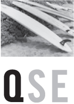
The photograph of surfboards for Quicksilver Edition is an image. It represents the tone of the company and serves as an icon for the lifestyle Quicksilver serves.
Ph.D
71
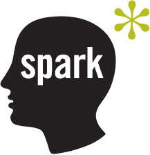
The drawing of the head and asterisk communicate the process of thinking for the Spark logo, as opposed to a representation of a thought. The action is communicated with a diagrammatic icon.
BIG, Ogilvy & Mather
72
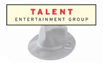
Since entertainment industry talent agents seem to wear a lot of hats in their work, metaphorically speaking, a hat makes a great icon for the company.
Ph.D
73
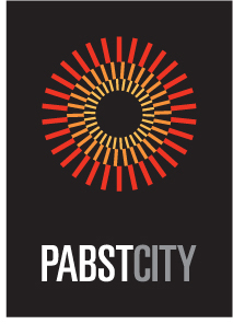
The logo for Pabst City is a skillful blend of letterforms and an abstract shape. The shape conveys multiple meanings (energy and light). It acquires meaning, however, only with its relationship to Pabst City.
SamataMason
74
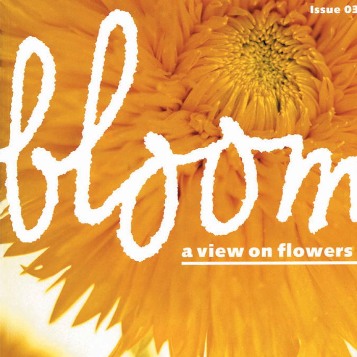
Bloom, a Dutch magazine, relies on a logo that is a simple typographic form combined with an image. The image in this instance takes the place of an icon connected to the logo.
Anthon Beeke
Shape
A good logo will involve a shape that is appropriate and memorable. Shape is at the core of mnemonic value. Although it would be easy to say that a circle is the most successful shape for a logo, it would be untrue. There are logos made with squares, ellipses, triangles, and other unique shapes that are equally successful.
It is also wrong to think that all logos must be contained within a shape. The overall form of a logo should comprise a shape. This is achieved by the letterforms and icon being constrained within a shape. Alternatively, the letterforms and icon can create an implied shape.
75
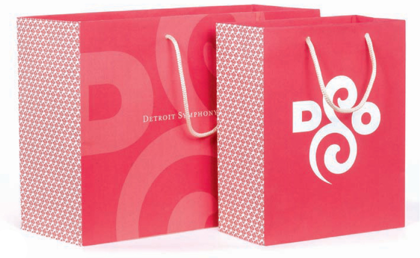
The counters of the “O” and “D” of the DSO logo echo the shapes of the curvilinear “S.” The negative shapes within the lower portion of the “S” are as well considered as the positive shapes.
Pentagram NY

76
The LAB [3.2] logo is primarily a rectangle. The brackets around 3.2 and the “L” reinforce the strong horizontality.
KINETIK
77
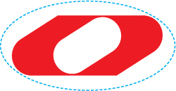
The strong mechanical shape, a chain link, symbolizes Gruppo Principe, an Italian heavy industries group.
R&Mag
78
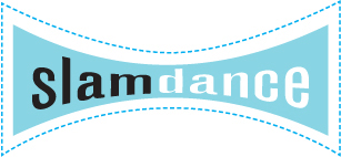
The bow-tie shape of the Slamdance logo refers to filmic technologies like VistaVision and Cinemascope.
AdamsMorioka, Inc.

79
Dodo’s logo is composed of identical rectangular forms with slight variations. The repetition of the rectangles provides unity and power.
Carlos Segura

80
The La Bella del Golfo logo features a sceptre contained in a circle. The shape also suggests the curved lines of the female form.
R&Mag

81
The logo for T26 creates an implied circle. Each element—the eyes, head, and letterforms—echo the circle.
Carlos Segura

82, 84
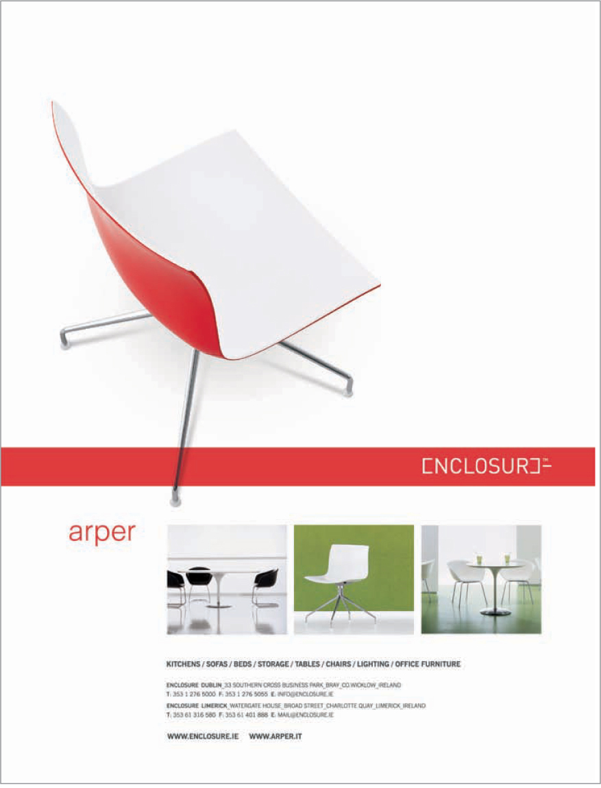
The Enclosure identity is designed to complement the fluid forms of the furniture it represents. The applications take advantage of the strong linear shape of the logo as a counterpoint to the product’s nonlinear lines.
Dynamo
83
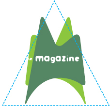
Overlapping shapes play a prominent role in the logo developed for ESPN’s publication, “The Magazine.”
Carlos Segura
Hierarchy and Scale
Myth: Everyone likes everything bigger. This might be true at a Burger King drive-through, but it is rarely true in design. A logo must be able to exist as a twenty-five foot sign on a building, but it must also function on a business card. Intricate, complex, and layered forms might look incredible on the computer screen at 400 percent, but will become a jumbled mess on a CD label. Obviously, simple forms reduce best. Conversely, bad curves or sloppy kerning are only exaggerated on a fifty-foot billboard.
The issue of hierarchy and meaning are interconnected. Is an individual product more important than the parent company? This depends on two questions. First, will it be advantageous for the client to be associated with the product? Second, will it be disadvantageous? If the connection with a product will position the client inappropriately, there’s a much bigger problem that needs to be addressed than just the size of the logo.

85-86
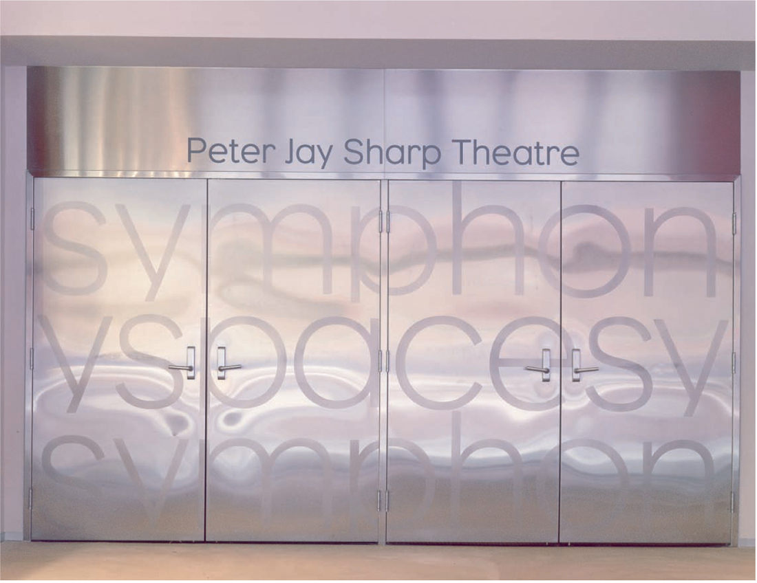
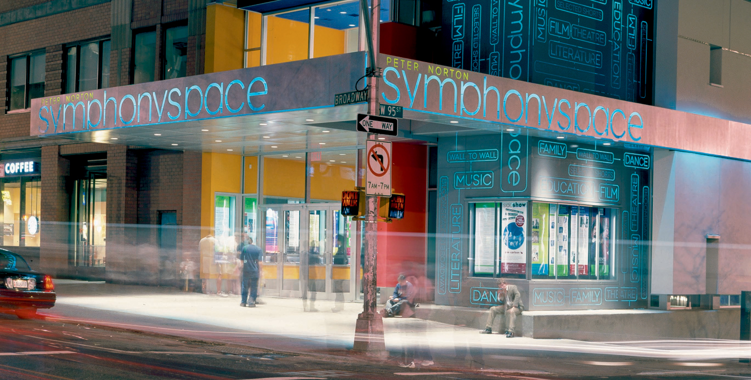
Symphony Space is a community-based arts organization that presents a diverse range of programming in music, film, dance, literature, and theater. The new logo needed to work in environmental and print applications. The logo usage ranges in scale from 1/4” (0.6 cm) to two-story building-sized signage.
Pentagram NY
87
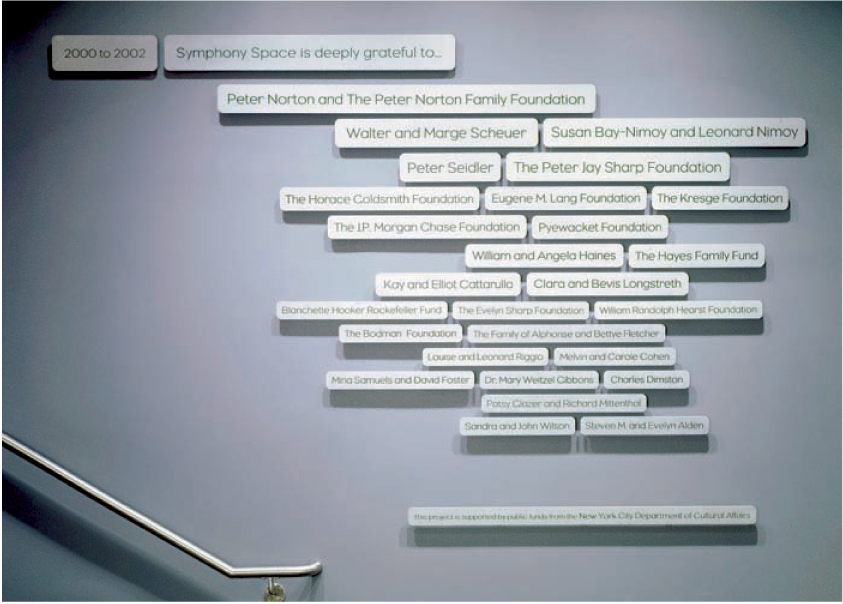
The donor signage system reflects the new Symphony Space logo’s aesthetics.
Pentagram NY
88
The exterior marquee visually connects Symphony Space to the adjacent Thalia Theater by extending its reach out over the corner of 95th and Broadway in New York City. The use of the building’s architecture and graphics at this scale cause a direct dialog between the street and this cultural center.
Pentagram NY
Static vs. Changeable
The logo must serve as a central tool providing a cohesive voice for a wide range of applications. This does not necessitate that the logo be an intransigent, immutable object. Twenty years ago, the idea of designing a logo that could mutate was heresy. As the delivery systems of information have expanded into television and new media though, the desire for logos to move, change, or just plain “do something” has increased. We now expect a logo on the bottom right corner of the television screen to animate. An accompanying audio cue is also expected. Whether it was meant to move or not is irrelevant; somewhere along the line, someone will make it spin.
Rather than allow someone else to make decisions about the changeable qualities of the logo, the designer should presuppose this scenario. Providing guidelines for motion, audio, and print is as important as choosing color. Once again, however, the message is at the heart of the decision-making process. It might be possible to have a logo twirl, flash, and bubble to the tune of “Surrey with the Fringe on Top,” but it is not wise unless it is appropriate for the product. The action and reaction of the logo should reinforce the overall criteria and concept.


89-91
Creative director Michael Johnson says, “The girls at Kushti are hard-drinking, twenty-first century women. We call them ‘laddettes’ over here. So we wanted to find something that expressed what being ‘Kushti’ (i.e. sorted) meant to modern women. So it seemed that the modern, sorted woman would always pull in bars, never worry about her weight or waistline, had well-endowed boyfriends, and enjoyed a night in with chocolate, cucumbers, and a chick movie.” All these images form the basis of a series of promotional pieces illustrating this kinetic branding concept.
Johnson Banks

92
London-based firm Johnson Banks developed a lot of visual ideas for their client Kushti, an all female PR/communications consultancy. It seemed too limiting to just have one logo, and much more fun to have six. The client liked the idea, and it suited them well.
Johnson Banks
