
Chapter 11. Profiling Data
The art of data preparation is understanding the data set in order to determine what you might need to do to prepare it for analysis. Understanding the profile of the data is key to forming a full view of the data. Without profiling the data, you can easily miss an obvious preparation step or add in unnecessary work. This chapter will explore what profiling is, why profiling data is important, and how Prep profiles data.
What Is a Profile?
By profile, I mean the characteristics of the data set. As discussed in earlier chapters, understanding the types of data you have in the data set is essential to your analysis. Equally important is understanding the number and variance of the categorical data fields of the data set. Determining the data set’s level of granularity will help you to identify how many unique records there are, or whether there are duplicate records that you need to remove in the data preparation process. All of these factors form the foundation of the data set profile, which comprises these factors:
-
Minimum, maximum, and range of values: Does the range between the minimum and maximum values make sense?
-
Data outside of limits: Are there natural limits in the data, like 100%, or current dates that cannot be exceeded but have been?
-
Outliers: Do the values lie inside a certain range except for one or a few that sit outside of it?
-
Irregular number of records: Is there a consistent number of rows for certain dimensions, and does this number suddenly change? For example, do you expect a set number of records for each date within the data set?
-
Irregular spelling: Can you identify the correct spelling for names and words in the data set?
-
Duplicate records: Were duplicates created prior to data preparation, or during the previous steps of this process?
-
Missing data: Are there certain values that aren’t present in the data set but should be? Are there nulls where you would expect a value?
Checking for all these factors can be quite time-consuming if you have a lot of columns, but there are ways to make this task easier and more intuitive.
Why Visualizing the Data Set Is Important
One of the most important strategies for profiling your data sets is visualization.
Anscombe’s Quartet
If you have read any books on data visualization, then you have likely come across Anscombe’s Quartet, the very best argument for why descriptive statistics (minimum, maximum, average, etc.) isn’t enough to understand what is truly going on in a data set. In 1973, Francis Anscombe constructed four data sets comprising pairs of x and y values (Figure 11-1).

Figure 11-1. Anscombe’s data set
As you can see in the figure, there is a significant range of values, but all four sets have largely the same descriptive statistics, namely:
-
Means: x = 9, y = 7.5
-
Sample variance: x = 11, y = 4.5
-
Correlation, linear regression, and coefficient of determination are all similar to two or three decimal places.
However, when the individual data points for each set are visualized, we can see the data sets are actually very different (Figure 11-2).

Figure 11-2. Anscombe’s visualizations of his data set
Therefore, to adequately prepare the data, you must visualize it in some basic ways—not necessarily to form an analysis yet but to understand whether the data is as expected. If it isn’t, don’t simply remove those rogue data points, but also make an effort to understand why they differ from what you expected.
Visualizations Versus Data Tables
When viewing the underlying data for Anscombe’s Quartet, maybe you spotted some variables that were not as expected, like the outlier on the x- and y-axis in Set 4. But it’s tough to make those kinds of assessments in a table, especially in a data set larger than Anscombe’s. For example, try finding all of the outliers in Figure 11-3 at a glance. Your eyes are a fantastic tool at spotting patterns, so let’s make life easier for ourselves when it comes to finding oddities within our data by using data visualization techniques.

Figure 11-3. Can you quickly find the trends in this table of data?
To that end, let’s use Prep Builder’s built-in Profile pane to help us spot things to investigate in the London Theatre Shows data set shown in Figure 11-3.
How Prep Builder Profiles Data
When you load the London Theatre Shows data set into Prep Builder and add a Clean step, Prep Builder instantly visualizes the data profile in the Profile pane (Figure 11-4).
Note
Prep automatically samples data when you input larger data sources to help maintain its response time. The algorithm used by Prep aims to maintain the data set’s profile. Sampling is covered further in Chapter 12.

Figure 11-4. Profile pane of Prep Builder with data loaded from Figure 11-3
Though it looks like a relatively straightforward data set in the table format, the Profile pane demonstrates that actually it contains a lot of variations. Before assessing this particular data set, let’s dig in further to what happens in the Profile pane in Prep Builder.
Generating Histograms and Mini-Histograms
Before Prep Builder, a lot of my investigations of new data sets involved building histograms. Often, I was looking at the number of records found for each bin (range of values) or the date to determine the data profile and understand its completeness.
Thankfully, now Prep Builder does this automatically when data is loaded into a Clean step. Time previously wasted building these charts can now instead be spent cleaning, investigating more data sets, and getting to the analysis sooner. This is the genius of the Profile pane: you can see the profile of your data instantly. Each histogram helps you spot trends and gaps quickly. Each bar length, regardless of whether it represents a bin or specific value, indicates the number of rows containing those values (Figure 11-5).

Figure 11-5. Histogram built in the Profile pane showing the % Attended data field
Prep Builder has summarized the data into bins of similar ranges of data, indicated by the dark blue histogram bars. Therefore, you will see gaps in your data where no records exist within that range. You can very quickly see the most common values too, as they will be the longest bars (Figure 11-6).

Figure 11-6. Profile pane histogram showing most common values
The gray bars are used when either there are not enough values to form bins of similar values or you are analyzing a dimensional value instead of a numerical one. Because the gray bars are used only for values actually found in the data set, you will not spot missing values as easily as you can with the dark blue bars; that is, there will be no gaps like you have with bins. If the data has a logical order and one of those values is missing, however, you might be able to identify the missing value.
When Prep Builder cannot fit the whole histogram into the Profile pane space, it will create a scrolling histogram of all the values or bins within that data field, as well as a mini-histogram in the top-right corner of the data fields Profile pane (Figure 11-7).

Figure 11-7. Mini-histogram
Although this mini-histogram looks like an icon simply indicating there is more data, this isn’t the case. The mini-histogram is a representation of the actual data. The box around the mini-histogram highlights what part of the data field is being displayed in the data field’s Profile pane.
Selecting Summary Versus Detail Views
Prep Builder will automatically create a summarized view of the data where there are lots of different values. This is very common for measures, but it also happens for dates. If you want to check exact values rather than the summary shown in histogram bins, you can change the View State option in the data field’s menu in the Profile pane (Figure 11-8).

Figure 11-8. Changing the histogram View State
The greater precision of the Detail view can help you investigate patterns within the histogram that you didn’t expect to find.
Highlighting Values
Clicking on a value in the Profile pane will highlight all the values in other columns that relate to (exist in a row with) the selected value. This feature is another way to profile and gain insight into the data (Figure 11-9).

Figure 11-9. Highlighting values related to a selected value
The highlighted area in each value forms a new blue histogram within the existing gray one, allowing you to profile the data for the selected value. You can then narrow down this data further by selecting additional values in other columns, or expand it by holding down the Ctrl key while clicking additional values within the original column.
This highlighting functionality allows you to dig deeper into the data set to ask the follow-up questions that inevitably arise as you investigate your initial question.
This technique is particularly useful when you are assessing the records that have null values in certain columns (Figure 11-10). By selecting the null values in one field, you can see the dates when those records originated or other bits of key information to help you determine whether the nulls should be replaced by other values or removed altogether.
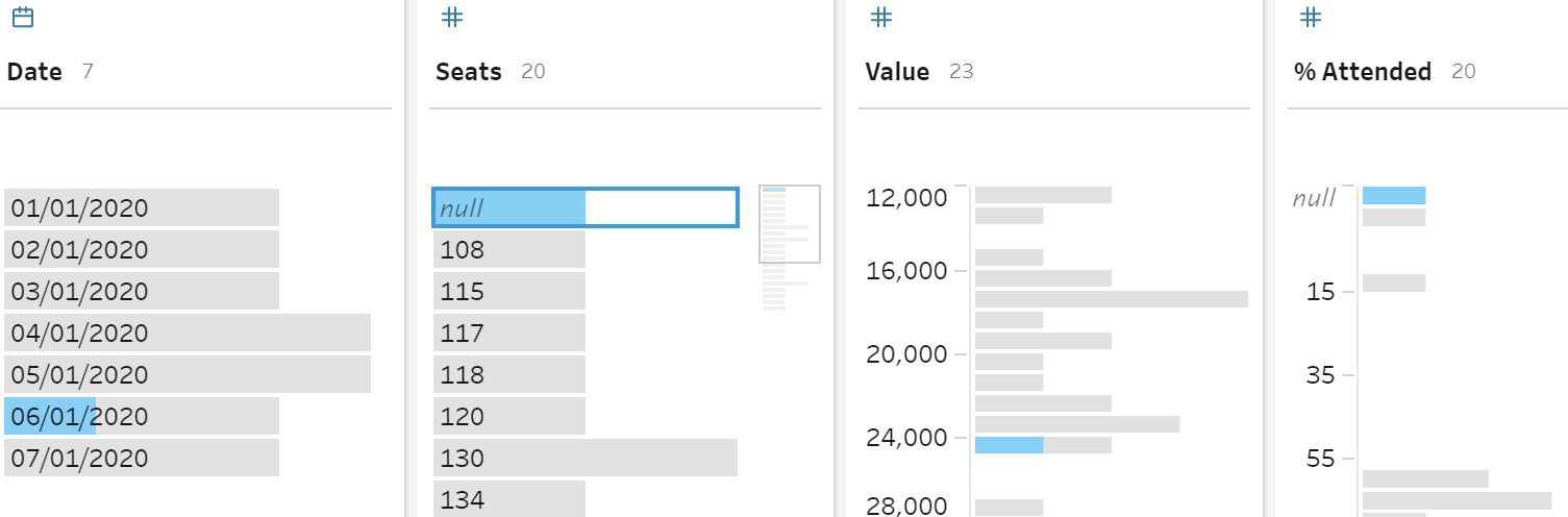
Figure 11-10. Selecting a null value
Viewing Dimension Counts
The final way that Prep Builder profiles the data is by displaying how many members (unique values) there are in a dimension. This count is shown at the top of a data field within the Profile pane (Figure 11-11).

Figure 11-11. Count on different dates for a data field
In this case, there are seven different dates within the data set. When this count is more or less than you expect, it can prompt you to investigate where an issue might lie.
Sorting
Within each data field in the Profile pane, you have the option to sort the values in either alphabetical or numerical order (Figure 11-12). The numerical sort is based on the number of rows in the data set Prep is using (remember this may be a sample of the full data set) and can be set to either Ascending or Descending. The alphabetical sorting order can be set to either A to Z or Z to A.

Figure 11-12. Sorting options in the Profile pane
To apply a sort, click the Sort icon and then click the drop-down arrow to specify which sort to use. Each click on the Sort icon changes the sort order as follows:
Summary
This chapter has emphasized the importance of profiling your data through visualizations. Prep automatically visualizes the data through the Profile pane in the Clean step, saving you a lot of work. Tableau Prep makes it much easier to profile your data set, which means you’ll be able to prepare your data more thoroughly and with fewer iterations than in the traditional, manual data profiling process.