
C H A P T E R 8
Creating and Using Screens
Once you’ve been using LightSwitch for even just a short time, you’ll probably want to start designing screens that are a bit more advanced than those the wizards will produce for you. In this chapter we’ll look at some techniques you can use to do exactly that. We’ll begin by showing you:
- How to create screens, the screen template types you can use, and the parts that make up the screen designer.
- How to use the Add Data Item dialog to add properties, queries, and methods.
- The built-in controls that are available.
After explaining the screen designer, we’ll show you how to perform screen-related actions using code. Some of the topics we’ll cover will include:
- The screen events you can use.
- How to access controls using code.
- How to make your application respond to changes in data.
At the end of the screen code section, we’ll show you how to extend and use the Modal window, and AutoCompleteBox controls using code.
To finish the chapter, we’ll pull everything together and give some examples of how to create some customized screens. We’ll show you:
- A home screen that includes static text, images, and links.
- A custom search screen that allows you to filter items using an
AutoCompleteBox(this is aComboBoxcontrol that filters the items shown as the user types into it).- How to create a single screen that allows records to be added and edited.
- How to create screens to support many-to-many relationships in data.
- How to customize the data grid control to enable multiple selection of records.
We know this is a very long and detailed chapter, but we felt that completeness was important, especially on a topic as important as screen design. We’ve added plenty of reference detail, so you may prefer to skim through the chapter quickly first and then refer to it when you’re actually writing your application.
Designing Screens
Screens are not just about “layout,” they’re also business objects in their own right that have properties, methods, and events, in addition to controls, that display data.
Each screen also represents what’s called a unit of work, meaning that all changes that are made on the screen (including changes made to child records in any lists or grids) are saved or discarded, all as a single unit. This is made possible by each screen having its own data workspace, allowing it to maintain an independent set of data changes.
Adding a Screen
To add a screen to your application, right-click the Screens folder in Solution Explorer and choose the Add Screen … option. This opens the Add New Screen dialog, as shown in Figure 8-1.
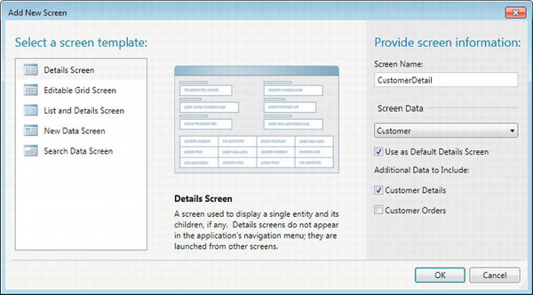
Figure 8-1. Add new screen dialog box
The first thing you’ll need to do is to choose a screen template. The screen templates provide an initial layout of controls, but the screens they produce can be easily customized later. They each consist of a specific number of controls that are laid out in a particular way, according to the template’s intended function, and some of them allow the inclusion of related data as well.
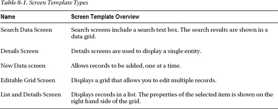
There are five screen templates that come with LightSwitch. Table 8-1 describes the purpose of each screen template.
After selecting a template, the next thing you’ll need to do is to name your screen. When choosing your screen name, there are certain special characters you can’t use. However, LightSwitch will warn you if you attempt to use characters that are not allowed.
In Solution Explorer, it isn’t possible to organize your screens into subfolders. All of your screens appear beneath the Screens folder, and if you’ve created a sizable number of screens in you project, it can soon become unmanageable. To make life easier, you can invent a naming convention to help you organize your screens in Solution Explorer. For example, you can prefix the names of similar screens with similar characters so they appear grouped together in the Screens folder.
The Screen Data drop-down allows you to choose the underlying query for your screen. The queries shown in this drop-down will vary depending on the screen template you’ve chosen. If you’ve chosen the details or new data screen templates, a list of entities will appear in the drop-down. If you’ve chosen one of the other templates, the drop-down will be populated with queries that return multiple records (this was described in Chapter 6).
If you choose the Details Screen template, you’ll need to select a value from the screen data drop-down—it’s a mandatory option. If you choose one of the other screen template types, you can choose not to base your screen on a data item.
Not choosing a data item allows you to create an empty screen. This is useful for creating a home screen (or welcome screen), and we’ll show you how to create one later in this chapter.
If you’ve selected a data item with related records, you can choose to include the related data in your screen. Check boxes beneath the screen data drop-down allow you to select any related data items.
All of the screens you create in LightSwitch will share some common items. We’ll show you what these common items are, and then move on to describe each of the screen template types in more detail.
Common Screen Elements
Figure 8-2 presents the common screen elements that are shown when you run your application. These include Save and Refresh buttons, which we’ll now discuss in more detail.
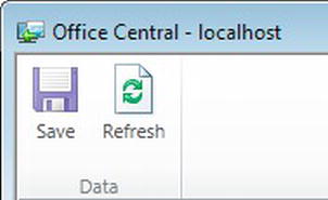
Figure 8-2. Common screen elements
Save Command Button
The Save button is found in the ribbon bar section of your application. Clicking it saves all the data in the underlying change set. The Save button saves any changes made to the properties on the screen, including any related records in any grids. LightSwitch performs the save inside a transaction. If you’ve made changes to multiple records and one record fails to save, LightSwitch won’t commit the changes you’ve made to any other records.
If you create a screen using the Search Screen template, you’ll find that the Save button still appears. Even though the default screen created with this template doesn’t include any editable controls, the addition of a Save button can be useful. If you extend your Search screen to include some editable controls, the Save button will already be there for you.
If you don’t want the Save button to appear, you can delete it by using the right-click context menu, as shown in Figure 8-3. If you change your mind afterward, you can always add it back in by using the Add drop-down box that you’ll find beneath the Screen Command Bar node.
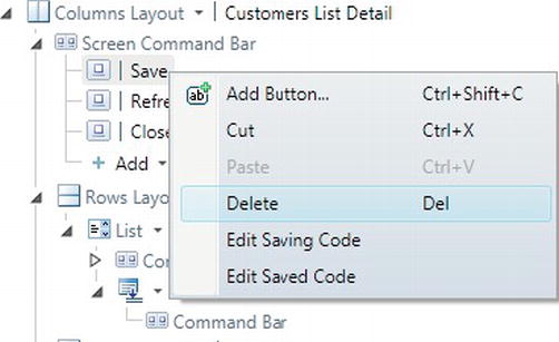
Figure 8-3. Deleting the Save Command button
Refresh Command Button
The Refresh button is also common to all screens. As the name suggests, it refreshes the screen data from the underlying data source and allows you to see the up-to date data.
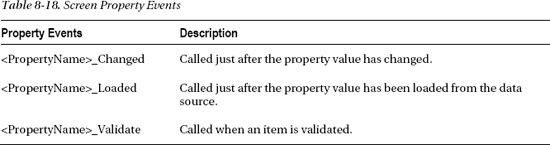
If you have any unsaved changes and click the Refresh button, you’ll be prompted to save your changes using the dialog shown in Figure 8-4.
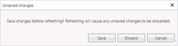
Figure 8-4. Refresh screen confirmation
This gives you the option to:
- Save. This will save your changes before attempting a refresh.
- Discard. This discards your changes before performing the refresh.
- Cancel. Nothing happens and you’re returned to the screen.
If you’ve created a screen based on the New Data Screen template, it might not appear to make sense to have a Refresh button. Clicking the Refresh button effectively clears any values that have been entered and allows you to start over.
Because the word refresh might not seem appropriate in this scenario, you can change the button label by modifying the Display Name setting in the Properties pane (as shown in Figure 8-5). In this example, we’ve changed the display name from Refresh to Reset. The Refresh button will now be labeled Reset, rather than Refresh. You can change the labels of the other buttons in the same way.
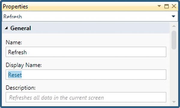
Figure 8-5. Changing the Refresh Command label
As with all other buttons that appear in the Screen Command Bar node, you can delete the Refresh button from your screen if you don’t want it to appear.
 Note The Refresh command actually destroys the current instance of the screen, creating a new one in its place. So any screen that has changes made to it will prompt for them to be saved before the “refresh” occurs.
Choosing a Screen Template Type
In this section we’ll look at the five screen types you can choose from. You’ll discover why you might want to use each particular type of template, or why each type might provide the basis for a more advanced screen you’d like to design.
Details Screen
Details screens are opened from other screens. For example, a details screen for an entity can be opened from the results of a search screen.
If you haven’t created a details screen for an entity, LightSwitch automatically generates one for you. But the screen that LightSwitch autogenerates can’t be modified in any way. So if you want to change any aspect of how it looks, or how it works, you’ll need to create a custom details screen. Figure 8-6 illustrates a sample details screen.
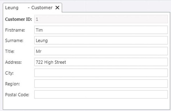
Figure 8-6. Details screen
When you add a new details screen, you’ll be prompted to specify if the screen should be used as the default details screen. You can also specify any additional data you want to include, as shown in Figure 8-7.
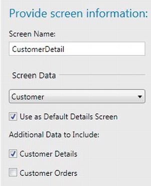
Figure 8-7. Adding a details screen
So what exactly is a default screen? This is the screen that LightSwitch uses by default to display your data when you open a record from a summary control. You can only have one default screen per entity in your application. If you’ve already specified a default screen and create a new screen with the option Use as Default Details Screen check box selected, the new screen will be set as the default screen.
Details screens are based on a single entity, but you can also include related data by selecting the check boxes that appear in the Screen Data section.
You can uncheck the screen data check box that relates to the entity (in this example, the Customer Details check box). However, it doesn’t seem to matter if this is checked or not. The entity’s details are included anyway!
Editable Grid Screen
The Editable Grid Screen template creates a screen that allows users to view, add, and update multiple records at one time. Figure 8-8 shows an editable grid screen at runtime.
After creating an entity in the table designer, the Editable Grid Screen template is the fastest way to create a screen with full CRUD (Create, Read, Update, Delete) functionality.
The data contents are displayed using a data grid control. The command bar section of the grid includes buttons to add, edit, or delete records. Clicking the add or edit button opens an autogenerated modal dialog, rather than the default screen you’ve defined for your entity.
The command bar also includes a button that exports the results to Excel. The Export to Excel option is only available if your application is set up to run as a desktop application.
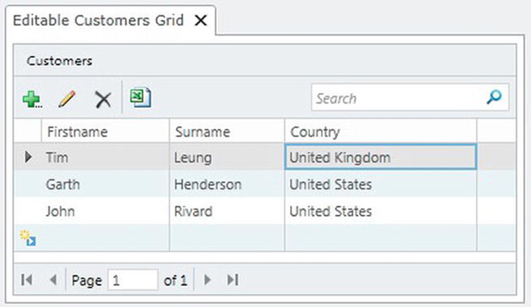
Figure 8-8. Editable grid screen
List Detail Screen
The List Detail screen displays a summary of your data in a list. When a user selects a record from the list, additional details about the selected item are shown in a details section. Figure 8-9 shows a List Detail screen in a running application.
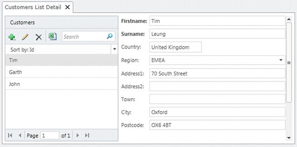
Figure 8-9. Adding a List Detail screen
When you create a List Detail screen, LightSwitch adds a data list to the left-hand side of your screen. The data list also includes a search box, so that you can filter the items shown in the list.
An editable details panel is bound to the selected item in the list. This updates itself whenever the selected item changes.
New Data Screen
Another common thing you’ll want to do in your application is to allow users to add new records. This is what the New Data Screen template was designed to do. It allows users to add new records, one at a time. Figure 8-10 shows a new data screen at runtime.
Notice how a * symbol appears in the tab title. This is LightSwitch’s way of telling you that there are unsaved changes in the screen. All other screens in LightSwitch also show a * when there are unsaved changes.
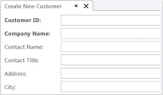
Figure 8-10. Adding a new data screen
When you save your record using the Save button, LightSwitch automatically closes the new data screen and opens the newly created record using the default details screen you’ve defined for your entity. If you don’t have a default screen, LightSwitch displays the record using an autogenerated screen.
You might not want your application to behave like this. After saving a record, you might prefer to clear your screen and prepare it for the entry of another new record. You’ll need to write some code to do this, and we’ll show you how to do this later in this chapter.
Note In the current version of LightSwitch, you can’t specify a default New Data screen, like you can for a default Details screen.
Search Screen
One of the most common things you’ll want to do in any application is search for a specific entity or some group of entities. This is what the Search Screen template was designed to provide. Figure 8-11 shows a search screen at runtime.
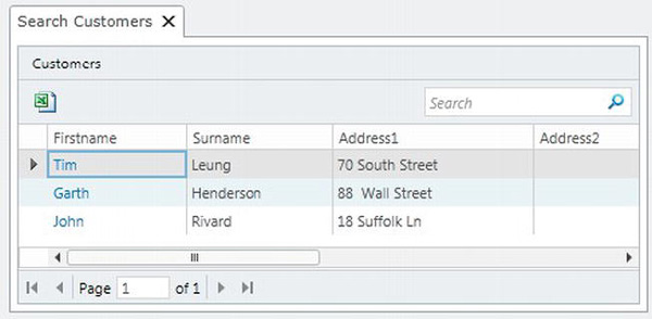
Figure 8-11. Search screen template
When you create a screen based on the Search Data template, LightSwitch creates a screen with a search text box. Users can enter a search string into this box, and the results are shown in a data grid. The data grid is paged, and, by default, 45 records are shown per page. The data grid also includes a clickable details link. Clicking the link opens the selected record using the default screen that’s configured for your entity. If you prefer not to use the default screen, you can design your screen so that it uses a different details screen.
LightSwitch performs the equivalent of a “contains” search on the search criteria that’s entered by the user. This means that the results will include any record that has a string property (where Is Searchable is set to true in the table designer) that contains the value you entered. Behind the scenes, LightSwitch uses the Search operator, which is exposed via the IDataServiceQueryable query property of your data source.
In the current version of LightSwitch, you can’t change the way the search is performed to any other search method.
If you needed a search that returns records that have a string property that begins with the value that you entered, you’d have to turn off the built-in searching capabilities and create a custom search screen instead.
Note Only an entity’s string properties will be included in the search. Numeric properties or navigation properties (even if you’re displaying a string from it) are not included in the search. To perform a more advanced search, you’ll need to create a search screen that uses a custom query.
Understanding the Screen Designer
After adding your screen, you can use the screen designer to customize your screen further. It’s likely that you’ll spend much of your time in the screen designer, so it’s important to get to know this well.
Within the screen designer, there are three main parts you need to become familiar with (see Figure 8-12). These are:
- Screen Members list,
- Screen Designer Command bar,
- Screen Content Tree.
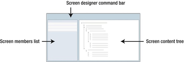
Figure 8-12. Parts of the screen designer
We’ll now describe each of these three parts in more detail and explain what each part does.
Screen Designer Command Bar
The Screen Designer Command bar is located at the top of the screen designer and has six buttons, some of which you’ll find yourself using quite often as you design screens. These are shown in Figure 8-13.
The purpose of each button is explained in Table 8-2.
Figure 8-13. Screen Designer Command bar
The Reset button is a useful feature. Let’s say you’ve created a screen. Later on, you add several extra properties to your table using the table designer. When you return to the screen designer, you can use the Reset button to reset the controls inside a container object back to their default state. This automatically adds the new properties you’ve added to your table and can save you from having to add each property one by one onto your screen.
The Edit Query and Add Data Item buttons are worth a special mention too. We’ll now explain these in a bit more detail.
Edit Query Button
The Edit Query button opens the query editor and allows you to edit the underlying screen query. This button is only enabled on screens that are based on collections of data, such as the Editable Grid Screen or Search Screen template.
Editing the screen query allows you to apply additional filtering and sorting to your screen. Let’s imagine you want to set up an editable grid screen that only shows customers from the United States. Editing the screen query allows you to do this.
For more details, you can refer to Chapter 6. This showed you how screen queries work and described how to use the query designer.
Instead of extending the query, you could even change the underlying query the screen uses. You’ll find the option to do this in the Properties pane of your query.
Add Data Item Button
The Add Data Item button opens a dialog that allows you to add additional data items to your screen (shown in Figure 8-14).
The screen member types you can add are:
- Method,
- Local property,
- Query.
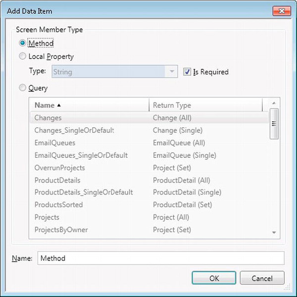
Figure 8-14. Add Data Item dialog
We’ll now describe each of these screen member types in more detail.
Method
Methods allow you to add code to the screen, either for attaching to a button or for writing code that’ll be used by other methods.
A common reason for adding a method is to create a button. After you add a method, it’ll appear in the Screen Members list in the left-hand side of the screen designer. From there, you can create a button by dragging the method onto the Screen Content Tree (Figure 8-15).
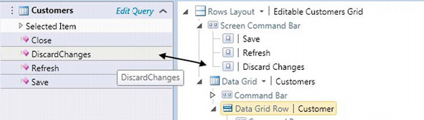
Figure 8-15. Adding a button onto the Screen Content Tree
This isn’t the only way to add a button onto a screen however. You can also use the Add option that you’ll find beneath the screen command bar nodes to add new methods.
Local Property
Local properties are a very important part of screen design. Imagine how difficult it would be to write a VB or C# program without using variables. Local properties are just as important to screen design, as variables are to writing code.
Local properties allow you to add entities that are independent of the underlying screen data. You can store data in local properties and use the properties during any intermediary processing you might want to carry out.
When you create a local property, you’ll need to use the type drop-down box to specify a type. This drop-down contains all of the standard LightSwitch data types, in addition to the entities you’ve added to your application. Figure 8-16 shows the contents of the type drop-down. Notice how some of our user-defined entities (such as Change and EmailQueue) appear in the list.
Local properties are important because UI controls in LightSwitch can only be bound to entities or properties. Let’s imagine you want to show a text box on your screen. You can’t just declare a variable in C#/VB and set the text box value to the value of your variable. The text box must be data bound to a property or entity. This is why local properties are so important.
When you add a property, you’ll also have the option to make it a required property. You would do this by checking the Is Required check box (also shown in Figure 8-16). Making a property required means that the user won’t be able to save the screen unless the property contains a value. If the user attempts to save a screen with a required property that hasn’t been set, LightSwitch shows a validation error to the user and prevents the save from happening.
Later in this chapter, we’ll show you how to display a piece of static text (which isn’t bound to a database record) on your screen. This illustrates a perfect example of where you might want to use a local property.
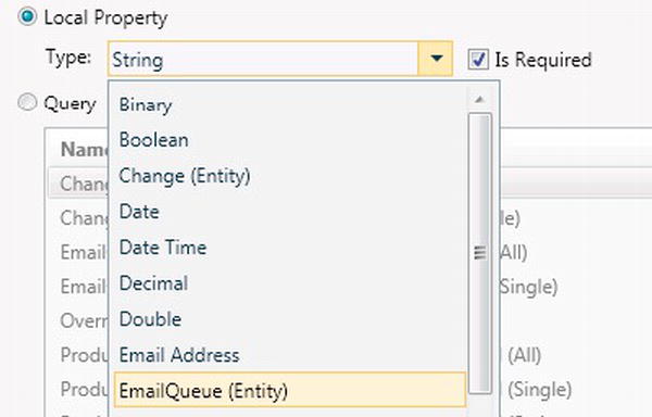
Figure 8-16. Screen property types
Query
The last option in the Add Data Item dialog allows you to add a query. Queries are important because they provide a data source for the controls you’ll use on your screen.
After choosing the query radio button, you’ll need to select a query from the query list that’s shown. This list includes all of the default Single and All queries that are autogenerated by LightSwitch, as well as any user-defined queries you’ve created.
Here’s an example of where you might want to add a query to your screen. Let’s imagine you’ve created a new data screen for a customer entity. The customer entity includes a country of residence property, which stores where the customer lives. In the table structure of the customer table, country of residence is defined as a navigation property to the Country table.
The default screen that’s created by LightSwitch displays the country of residence property as an AutoCompleteBox. By default, the AutoCompleteBox shows all of the countries in the country table. If you want to restrict the countries shown in the AutoCompleteBox to only those in the EMEA (Europe, Middle East, and Asia) region, you’d need to add a query that returns those countries in that region. You would then set the data source of your AutoCompleteBox to the query you’ve added to your screen using the Add Data Item dialog.
Screen Members List (Left-Hand Pane)
The Screen Members list is the screen designer section that appears down the left-hand side. For a long time, this panel was referred to by many people as the View Model pane. Even some in the LightSwitch team have trouble coming up with a definitive name they can all agree on. Consequently, it often just gets referred to as “that pane on the left of the screen designer.”
Depending on the screen template you’ve chosen, it can contain the following elements, as shown in Figure 8-17:
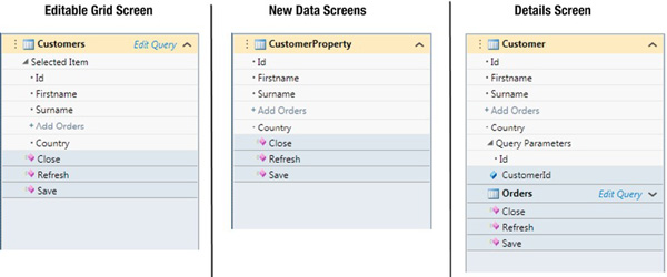
Figure 8-17. Screen Members list
If you’ve chosen to create a screen based on a collection of data, the screen query appears as the first item in the Screen Members list. Because this represents a collection of data, this object includes a child object called Selected Item. This refers to the currently selected record in the collection of data.
If you create a screen using the new data screen template, LightSwitch creates a property that represents a single instance of your entity (rather than the screen query that we’ve just described). LightSwitch appends the word property after the object. So in this example, the data item has been named CustomerProperty.
If you create a screen using the Details Screen template, LightSwitch creates an object that represents a single entity. In Figure 8-17, this object is called Customer and represents a single customer. At first glance, the Customer object looks similar to the CustomerProperty object that was added using the new data screen template.
However, these two objects are not the same. The Customer object is a query that returns a single entity. If you look at the Properties pane, you’ll find query-related attributes. You won’t find these when you view the properties of the CustomerProperty object in a new data entry screen. This distinction is important when you begin referring to these objects in code.
We’ll now move on to describe some of the other items you’ll find in the Screen Member list in more detail.
Screen Query (Visual Collections)
When you create a screen based on a collection of data (e.g., using the editable grid screen template), the screen query represents the screen’s data source. Initially this is what you specified in the Screen Data section of the Add Screen wizard.
The Screen Query item is an object of type VisualCollection<T>. This object contains the visible records that are bound to a control such as a data grid.
You’ll find some visual-related settings when you view the Properties pane for a screen query (shown in Figure 8-18). These settings are reflected in the data grids and lists that are bound to the query, and it’s useful to remember what they are. Otherwise, you could spend considerable time hunting around in the properties pane of a data grid trying to find a setting that actually belongs to the query (switching off pagination, for example).
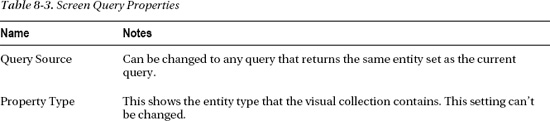
Table 8-3 describes the purpose of the properties you’ll find here.

Figure 8-18. Screen query properties
If you want to change the data source of your visual collection, you can do so by using the Query Source drop-down box. LightSwitch only allows you to change to another query based on the same entity set, and the query drop-down is filtered as such.
The Auto Execute Query property indicates whether or not the query runs when the screen is first opened. In most cases, you’d leave this set to true. In general, you’d set this to false if you want to populate the visual collection manually in code (using the visual collection’s Refresh method, for example).
To help improve performance, LightSwitch provides a paging mechanism that allows the client to only download a set number of records at a time. You would use the Support Paging check box to turn this option on or off. By default, the number of records downloaded is limited to 45. You can of course change this number to whatever suits you or you could disable the paging mechanism altogether if you know for certain you only have a reasonable number of records that will be returned.
You might also want to turn off paging if you have a desktop application and you have a fast local network connection. You wouldn’t want to disable paging if your application was a web application, where the data were being retrieved over the Internet.
If support sorting is set to true, users can sort data grids that are bound to the query by clicking the column header. In desktop applications, LightSwitch remembers the selected sort sequence between sessions. If a user exits out of the application, starts up the application again, and reopens the same screen, the previous sort order is retained. If you’ve applied a sort condition on the underlying query, this makes it impossible for a user to return to the sort order that’s defined in your query after clicking a column header. Switching off sorting is a way to avoid this problem. The “Sorting Grids” section in Chapter 6 describes this behavior in more detail.
Selected Item
When you’re working with collections of data, LightSwitch keeps track of the currently selected data item. Let’s say you’ve bound a data grid to your screen query. When a user selects a row in the data grid, LightSwitch sets the SelectedItem object to the record that’s been selected by the user.
At design time, the SelectedItem is exposed as an entity property. This allows you to use or to bind the properties of the selected item to other UI controls.
Screens based on the List and Details Screen template provide a perfect illustration of how the Selected Item property is used on a screen.
Let’s imagine that you’ve created a customer screen. You can use a list to display just the customer surname. When the user selects a customer, you can use the selected item object to display the address details in another part of your screen.
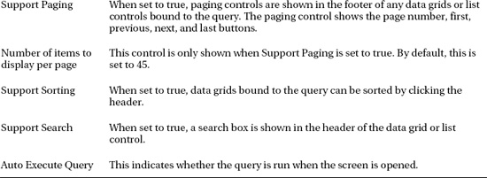
Related Collections
Let’s imagine you’ve created an editable grid screen based on a collection of customers and you now want some way to display the orders that are related to the selected customer. If you’ve defined related items through the table designer, you can show these on your screen by adding related collections.
You’d do this by clicking a link that LightSwitch automatically generates for you. LightSwitch generates a link for all related child tables. Figure 8-19 shows how an Add Order link appears inside the customer collection. Clicking this link adds the order collection onto your screen (as a visual collection). You can then add the related orders onto your screen, and LightSwitch would render the collection as a data grid by default.
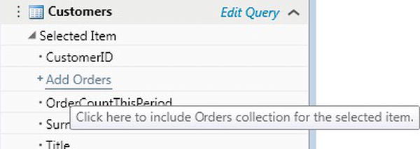
Figure 8-19. Adding related collections
Setting Query Parameters
If your underlying query expects parameters, you’ll need some way to set these parameter values. We’ll now show you a technique you’ll need to use whenever you need to create any sort of custom search screen or whenever you need to apply any type of filtering on a screen. Filtering the items shown in an AutoCompleteBox is an example.
In this example, we’ll create a screen that allows the user to filter order records by month and year. After creating a parameterized query, we’ve created an editable grid screen based on this query.
The query parameters are shown inside a Query Parameters group within your query. When you add a screen that’s based on a parameterized query, LightSwitch makes life really easy for you. It automatically creates local screen properties to store your parameter values. It also adds UI controls onto your screen to allow your user to set the parameter values.
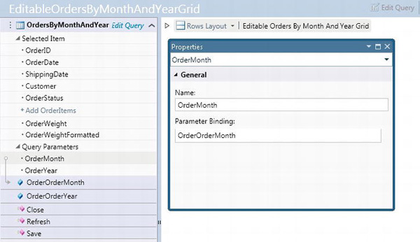
Figure 8-20. Changing the parameter bindings
The query we’ve created includes two parameters called OrderMonth and OrderYear. The OrderMonth query parameter is bound to a local screen property called OrderOrderMonth. Likewise, the OrderYear query parameter is bound to a local screen property called OrderOrderYear.
The OrderOrderMonth and OrderOrderYear screen properties are automatically created by LightSwitch. LightSwitch also renders these properties as text boxes on your screen.
The bindings themselves are specified in the properties pane of the query parameter. When you select a query parameter in the Screen Member list, LightSwitch uses an arrow to show you the property that’s bound to the query parameter.
If you need to change a parameter binding, you can use the Parameter Binding text box to make this change (Figure 8-20). LightSwitch provides IntelliSense in the Parameter Binding text box, so you don’t need to worry about knowing how to construct the correct syntax.
Screen Content Tree (Middle Pane)
We’ll now discuss the final part of the screen designer—the Screen Content Tree. This represents the central part of the screen designer that allows you to design the layout of your screen and add or remove UI controls.
Unlike the WYSIWYG designers you may have seen in other development applications (such as Microsoft Access or Windows Forms), the screen designer shows the UI elements as a series of nodes. This is illustrated in Figure 8-21.
Figure 8-21. Screen Content Tree
Figure 8-21 shows a how a typical screen looks like within the content tree of the screen designer.
In general, the nodes you’ll find will be one of two types:
- Layout controls. These allow you to layout your screen.
- Data controls. These are used to view or edit your data.
The columns layout and rows layout controls shown are examples of layout controls. The text box control is an example of a data control.
You can add controls by selecting a node and using the Add drop-down box. Alternatively, you can drag items from the Screen Member List onto the Screen Content Tree.
Beneath the root node, you’ll find a Screen Command Bar node. This node contains the buttons that are shown in the ribbon bar of your application at runtime. By default, the Save and Refresh commands are shown here.
We’ll now describe the root node, and then move on to describe the layout and data controls that you can use.
Root Node
The root node is the very first node that appears in the Screen Content Tree, and it allows you to set the main screen layout properties. When you select the root node and view the properties, you’ll find a couple of useful properties you can set (Figure 8-22).
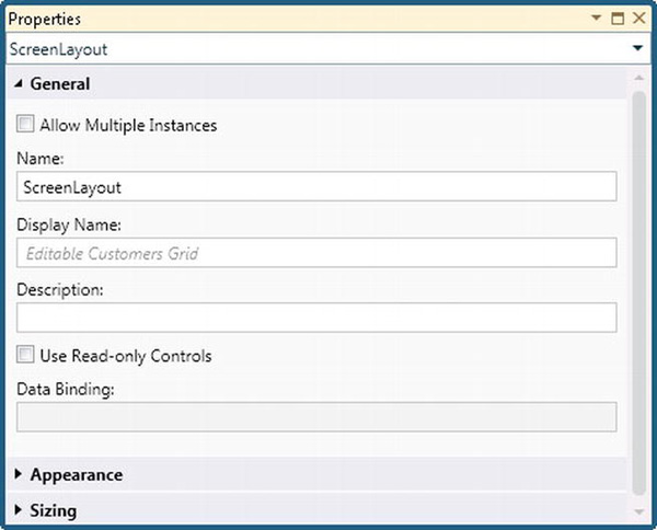
Figure 8-22. Screen Content Tree
The Display Name text box allows you to change the display name of your screen. This piece of text is shown in the screen’s tab title and also in the screen navigation pane.
The Allow Multiple Instance check box specifies whether you want to allow the user to open multiple instances of your screen. If this is set to false, the user can only open a single instance of your screen. If your user attempts to open more than one instance, LightSwitch displays the screen that’s already open.
Layout Controls
The layout container types that you can use fall into two different categories. These are:
- Presentational containers,
- Data item containers.
Presentational containers are used to layout your screen. You’d use presentation containers to position the data controls (e.g., text boxes, labels, check boxes) you want to show on your screen. These data controls are added as child items to a presentational container. Presentational containers can also be nested inside one another—you can create as many levels of nesting as you want.
The presentational containers you can use are shown in Table 8-4. Figure 8-23 illustrates how these layouts appear on screen.
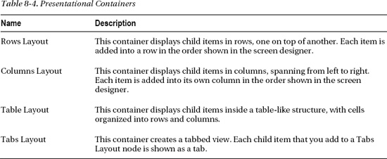
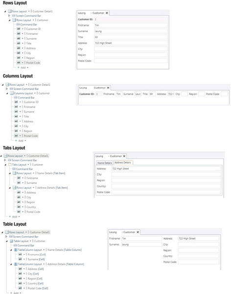
Figure 8-23. Presentational containers
Data item containers are used to display data. They contain placeholders you can bind to data items on your screen. Unlike presentational containers, data item containers cannot be nested. Table 8-5 shows the data item containers you can use.
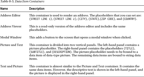
Figure 8-24 shows how some of these data item containers appear at design time and runtime.
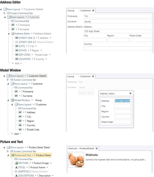
Figure 8-24. Data item containers
Data Controls
Data controls are the UI elements that allow users to view or edit your data. LightSwitch includes a host of controls you can use. We’ve split the available controls into three main categories:
- Editable controls,
- Read-only controls,
- Data controls.
If you can’t find a control here that suits your needs, you can use custom controls. These are explained in Chapter 9.
Editable Controls
Table 8-6 shows the controls you can use to edit data. In many cases, you’ll use the Text Box control. This is the default control that’s used for editing string data. You can only use a control if it’s supported by the underlying data type. For example, you can’t use a check box to render string data.
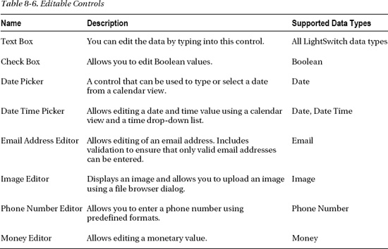
Figure 8-25 shows the appearance of some of these editable controls. The Image Editor control allows you to upload an image. Clicking the control displays a Load Image button that opens a file browser dialog. This allows you to upload an image.
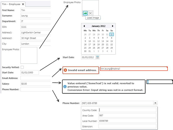
Figure 8-25. Editable controls
The Date Picker control displays a pop-up calendar that allows users to select a date.
The Email and Money controls will validate the data that is entered by users.
When users click the Phone Number control, a drop-down panel is displayed. This allows users to enter the parts that make up a phone number. The valid formats you want to allow are specified in the table designer.
Enabling Multiline Text Using the Text Box Control
By default, the Text Box control is shown as a single line text box. A common requirement is the ability to enter multiline text.
To allow multiline text, and to allow the entry of line breaks in your text, set the lines property that you’ll find in the Properties pane to a value greater than one (as shown in Figure 8-26).
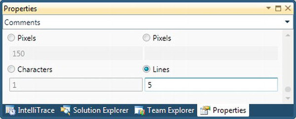
Figure 8-26. Enabling multiline text to be entered
Read-Only Controls
Table 8-7 shows the Read-Only controls you can use to allow users to view data. The Label control is the simplest control for displaying read-only data.
Some developers often overlook these controls when needing to make parts of their screen read-only. All of these controls provide a quick and simple way to make your data items read-only.
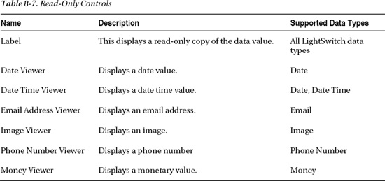
In Table 8-7, notice how there isn’t a read-only check box. If you want to display a read-only check box, you’ll need to write some code to do this. We’ll explain how to do this later in this chapter.
Changing Label Styles
In general, you can’t change the fonts that are used by LightSwitch controls. This is because the font settings are designed to be configured using the theme you’ve defined for your application. The benefit is that it allows you to easily maintain a consistent look and feel throughout all screens in your application.
A nice feature about the Label control is that you can set the font style to one of six predefined styles. The font style is set in the Property pane for your label.
Figure 8-27 shows the drop-down that you can use to select the font style at design time. This figure also shows the appearance of these font styles at runtime.
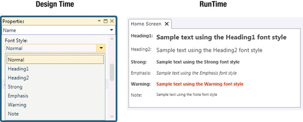
Figure 8-27. The available font label styles
Data Controls
The Editable and Read-Only controls are used to render scalar values. In other words, these controls can only display a single value (such as a surname).
LightSwitch includes Details controls to show related entities. These controls allow you to link a record with some other related data. If you created a customer screen, for example, you could use a Detail control to allow the user to select a country of residence.
The Detail controls you can use are described in Table 8-8. The AutoCompleteBox and Modal Window Picker controls are shown in Figure 8-28.
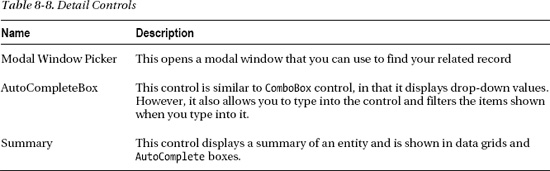
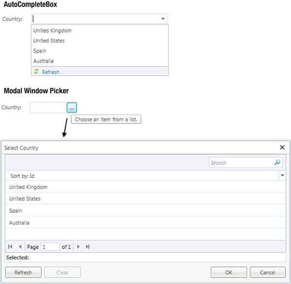
Figure 8-28. AutoCompleteBox and Modal Window Picker controls
The AutoCompleteBox is a pretty complex control. We’ve devoted a section later in this chapter to describe some of the more advanced usage scenarios.
Finally, LightSwitch provides Collection controls that allow you to display related collections (Table 8-9). On a customer screen, for example, you’d use a Collection control to display the related orders for a customer.
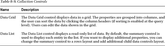
The main difference between the Data Grid and Data List controls is that the Data List control is used to display read-only data. If paging and searching is supported at the query level, both controls display a search text box and pagination controls.
The Data Grid control can be sorted by clicking the column header. The items in a data list are sorted by using a drop-down box in the header. These two controls are shown in Figure 8-29.
Figure 8-29. Collection controls
Data Grid Control
LightSwitch adds a Data Grid control onto any screens you create using the editable grid or search templates. In this section, we’ll describe how the Data Grid control works in more detail.
You can add or remove the columns shown on your data grid by adding or deleting the child nodes that are shown beneath the Data Grid row.
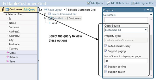
Figure 8-30. Data Grid paging, sorting, and searching options
As described earlier, the paging, sorting, and search options are attributes of the screen query. So to modify any of these settings, you’ll need to refer to the Property pane that relates to the query, rather than the Property pane that relates to the Data Grid control (Figure 8-30).
Table 8-10 describes where you’ll find the various options that relate to the data grid.
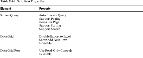
Data Grid Properties
There are a couple of useful properties you can set at the data grid level (Figure 8-31).
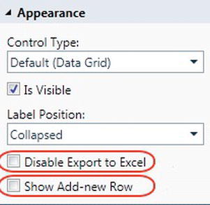
Figure 8-31. Data Grid properties
The first option disables Export to Excel. Checking this check box hides the Excel button, which is shown to the user on the toolbar of the data grid in a desktop application.
The second option is the Show Add-new Row check box. This refers to a feature that allows users to enter new records by typing directly into the data grid. Beneath any existing records that are shown, LightSwitch adds an empty row that acts as a new record placeholder. Users can type into this empty row to begin the entry of a new record (Figure 8-32).
Unchecking this check box disables this option. However, unchecking this option won’t disable the option to add new records altogether. Users can still add records by clicking the Add button that appears in the command bar section of the data grid. We’ll show you how to disable this button in the “Grid Commands” section that follows.
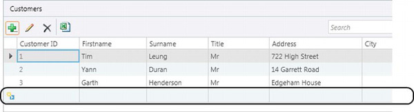
Figure 8-32. Show Add-new Row feature
Note When using an attached SQL Server data source, columns that use the text data type cannot be sorted. Use the varchar or nvarchar data types if you want users to be able to sort their data using the column headers.
Grid Commands
At runtime, the Data Grid Command bar is shown as a toolbar that sits above the contents of the data grid.
A point to remember is that the Data Grid Command bar is different from the Screen Command bar. Any item you add to the Screen Command bar is shown in the ribbon bar section of your application.
LightSwitch includes built-in commands that allow users to add, delete, or update records. You might want to disable some of these buttons or you might want to add a button that carries out some other custom action you want to perform on the selected row.
If you want to add a button to the command bar section, use the Add button that appears beneath the Command Bar node, as shown in Figure 8-33.
Figure 8-33. Data grid in command bar area
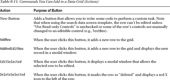
Table 8-11 describes the command types that are shown when you click this button.
At runtime, clicking the Add or Edit button opens an autogenerated window (Figure 8-34) that allows the user to edit the data. There isn’t any way for you to modify the appearance of this autogenerated form. However, a work around is to create your own custom modal window. We’ll show you how to use this technique later in this chapter.
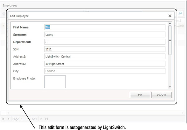
Figure 8-34. Autogenerated screens
Note As with any grid, any data that are added, edited, or deleted are not saved to the database until the Save button is clicked. There’s no way to “undo” a change to a single row via the grid, you’d have to do it by writing some code.
Setting Clickable Links
You can turn any label that’s displayed in a data grid row into a clickable link. This allows the user to click the label and open the selected record in a details screen. You can even select the details screen you want to use to open your record.
If you’ve created a screen based on the Search Data Screen template, the first column shown will be set to show as a link. If you don’t like this clickable link behavior, you can easily turn it off.
To customize the link behavior of a label, use the Show as Link and Target Screen drop-down, as shown in Figure 8-35.
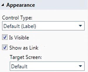
Figure 8-35. Setting a clickable link
Appearance Settings
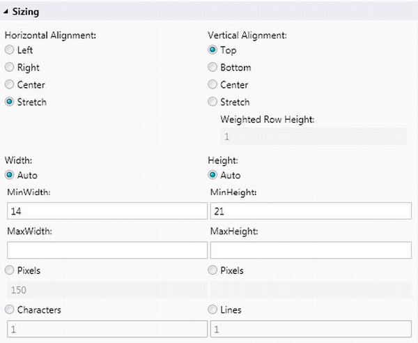
The controls you add to your screen can be positioned using the controls you’ll find in the sizing section of the Properties pane. Figure 8-36 shows the options that are available to you. Depending on the control you choose, additional sizing options may also be available. For example, you’ll find an Is Resizable options in some of the layout controls. This allows your user to resize the contents using a splitter control.
Table 8-12 summarizes the sizing options you’ll find for most controls.
For each data control you add to your screen, LightSwitch automatically displays a label. If you add a surname text box to your screen, for example, LightSwitch displays a surname label next to the text box.
Figure 8-37 shows the options in the appearance section for a typical control (in this example, a text box).
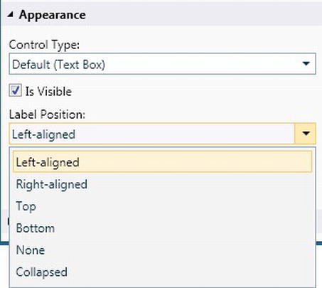
Figure 8-37. Label position dialog
Depending on the control you choose, additional appearance options may also be available.
If you view the appearance options for a rows layout control, for example, you can enable horizontal and vertical scrollbars and set a maximum label width. If you configure a label position (e.g., right-aligned or left-aligned), all child controls will inherit this setting. However, you can override this setting at the child level.
Table 8-13 describes the label positions you can use.
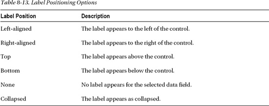
If you want to hide a label, the options you can choose from are none or collapsed. If you set the label to none, the label still takes up space on the screen (even though it’s not shown). If you choose the collapsed option, the label doesn’t take up any space. This is illustrated in Figure 8-38.
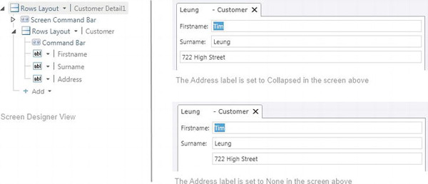
Figure 8-38. The difference between collapsed and none options
Designing Screens at Runtime
Due to the hierarchical manner that items are shown in the screen designer, you might find it difficult to visualize how your screen will appear at runtime.
The runtime designer is a really useful feature of LightSwitch. It allows you to design your screens during debug time. It’s particularly useful for setting the sizing and appearance of controls because it allows you to see immediately the changes you’re making.
To use the runtime designer, start up your application (press F5) and click the Design Screen button in the upper right-hand side of your application. This opens the runtime designer, as shown in Figure 8-39.
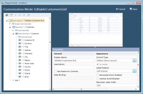
Figure 8-39. Runtime screen designer
The runtime designer lets you change the settings of the controls that are shown on your screen. You can even add and delete layout items. When you’re happy with your changes, click the Save button. The changes you’ve made will be reflected in your Visual Studio project.
Although the runtime designer provides a great way to visually design your screens, it has some limitations. These are:
- You can’t add new data items (such as local screen properties queries, or methods).
- You can’t move items out of their layout containers.
- You can’t edit the underlying VB or C# code. You can only change the way items appear visually on the screen.
User Interface Settings
So far in this chapter, we’ve only shown you how to modify the appearance of your screens. We’ll now show you how to modify the appearance of other elements that are shown in your application. The majority of these settings are configured in the Properties pane of your application (Figure 8-40).
The Properties pane allows you to change the shell and theme of your application. As you learned in Chapter 1, changing the shell and theme allows you to quite radically change the look and feel of your application.
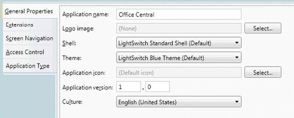
Figure 8-40. General Properties pane
The other properties you can set are shown in Table 8-14.
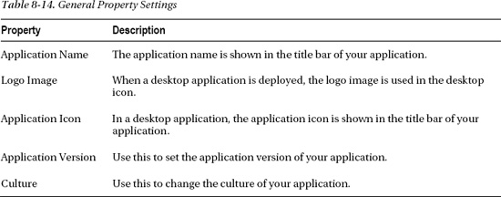
The application name is shown in the title bar of your application. In a desktop application, the server name is also shown in the title bar after the application name. This is a security feature that Silverlight imposes, and it isn’t possible to hide the server name.
Each LightSwitch application uses a single language and culture. In the current version, LightSwitch applications cannot support multiple languages.
To change the culture, use the culture drop-down box to select one of the 42 available cultures.
Figure 8-41 shows a running application with the culture setting set to Spanish. As you’ll see in the illustration, LightSwitch automatically localizes the built-in messages and menu items that are shown to the user. LightSwitch also provides support for right-to-left languages such as Arabic and Chinese.
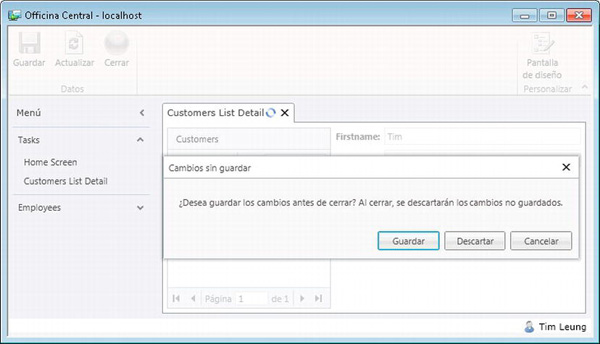
Figure 8-41. Localized application
Screen Navigation
The screen navigation menu appears on the left-hand side of your running application. It allows users to open the screens you’ve defined in your application.
You can use the screen navigation tab in the properties of your project to order your menu items, set the display text, and organize your screens into groups. Figure 8-42 shows the screen navigation tab in the designer, alongside the screen navigation menu in the running application.
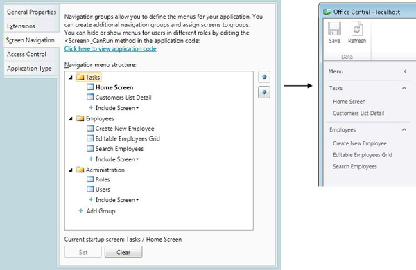
Figure 8-42. Screen navigation at design time and runtime
The Up and Down buttons are used to reorder the menu items. Any new screen you create automatically gets added into the navigation menu structure. This, however, excludes any screens that are based on the Details Screen template.
You can use the right-click context menu item to remove a menu item from the navigation menu. You would do this to hide screens from users.
The Add Group button allows you to add a group to the navigation menu. Within a group, you’d use the Include Screen drop-down to add menu items to the group.
You can add menu items that open the same screen multiple times. The Include Screen drop-down also includes the Users and Roles screens. These are built-in screens that allow you to manage the security of your application. By default, menu items for these screens are added to the Administration group. At debug time, the Administration group isn’t shown. This group only appears in deployed applications and is only shown to application administrators.
LightSwitch recognizes the permissions of the logged-on user when it builds the navigation menu at runtime. If a user doesn’t have sufficient permission to access a screen, LightSwitch doesn’t show it in the navigation menu. You don’t need to do any extra work in the Screen Navigation pane to configure menu-item permissions.
Chapter 14 describes authorization in more detail and how to restrict access to screens for specified users.
Finally, you can specify the startup screen by clicking the Set button. The startup screen is highlighted in bold—in Figure 8-42, this has been set to Home Screen. The startup screen is the first screen that’s shown when your application starts. By default, the first screen you create is set to be the startup screen.
If you don’t want your application to display a screen when it starts, you can use the Clear button to unset your startup screen.
Later in this chapter, we’ll explain how to create a home screen. This type of screen might contain welcome text and a company logo. Such a screen can add a friendly image to your application and makes an ideal startup screen.
Note If you want to create a set of nested navigation groups, you can achieve this by manually editing your LSML file. This technique was described in Chapter 2.
Writing Screen Code
In this section, we’ll describe some of the things you can do in code. Writing screen code is a key part of extending any LightSwitch application.
The screen code you write is executed on the client. The LightSwitch client uses Silverlight and, therefore, any C# or VB code that you write must target the Silverlight runtime.
There are various .NET classes that are not included or not supported through the Silverlight runtime. For example, the .NET SmtpClient class is not supported in Silverlight. This means that you can’t send email directly from any screen code you write. However, we’ll show you other techniques you can use to send email in Chapter 12.
The important point for now is to realize that there are certain classes or methods in the full .NET Framework that are not available when writing screen code in LightSwitch.
LightSwitch saves any screen code you write into your client project. If you want to find your code files in Windows Explorer, you can navigate to the clientusercode folder, which you’ll find beneath your project folder. LightSwitch automatically creates the usercode folder when you write your first screen method.
Working with Screen Events
LightSwitch exposes various screen events you can handle. For example, you might want to perform some additional action in code when your user clicks the Save button. You can achieve this by writing code in the Saving method.
To handle the events you can use, you’ll need to click the Write Code button. This produces a drop-down list of events, which can vary depending on the screen template type you’ve chosen (Figure 8-43). Clicking one of the events opens the code editor window.
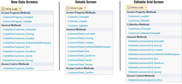
The events you can use can be categorized into:
- General events,
- Access control events,
- Collection events,
- Screen property events.
We’ll now describe these events in more detail.
General Events
General events are triggered throughout the lifecycle of your screen. You can handle these events and write code that runs when your data are loaded or saved or when your screen is closed. For example, you can use the InitializeDataWorkspace method to initialize some text you want to show on your screen. You’ll see plenty of examples of how you would handle these events in the code samples that are shown later in this chapter.
Table 8-15 shows a full list of general events you can handle.
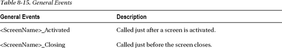
The Saving event includes a parameter called handled. If you set this to true in your code, the save operation that LightSwitch would normally carry out is canceled.
Likewise, the Closing event includes a parameter called cancel. Setting this to true cancels the close of a screen.
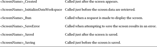
Access Control Events
Access control methods are called to verify whether a user has permission to perform a task.
Table 8-16 summarizes the access control events you can handle. The authorization chapter (Chapter 14) describes these events in more detail. Feel free to refer to that chapter if you want to see some code samples.
Although you’d normally write code in the CanExecute method to control access permissions, you can also write custom code here to guard your methods. For example, if you create a method that uses COM to automate Microsoft Word, you can write code in the CanExecute method to prevent the automation from happening if the application isn’t running as a desktop application.
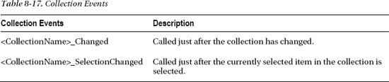
Collection Events
Collection methods are called when a collection is modified.
If you want to handle a collection event, a very important point is that the collection methods only appear in the Write Code drop-down list if the collection is selected in the screen member list. Many developers often struggle when they can’t see the collection event they want to use and are left confused as to why the events are missing.
Table 8-17 summarizes the collection events you can handle.
Screen Property Events
Screen property methods are called during the lifecycle of a property. Table 8-18 summarizes the events you can handle.
Displaying Messages
A common requirement in any application is to prompt your user for a confirmation, or to display a message in a pop-up dialog. LightSwitch includes a couple of built-in methods to help you. These methods are called ShowMessageBox and ShowImputBox.
Displaying Messages Using ShowMessageBox
You can use the ShowMessageBox method to display a message using a dialog box.
In the following example, we’ll create a screen method called DiscardChanges. This method discards any changes that have been made on the screen. The code in Listing 8-1 demonstrates how to use the ShowMessageBox method.
Listing 8-1. Using the ShowMessageBox method
VB:


File: OfficeCentralClientUserCodeEmployeeDetail.vb


Private Sub DiscardChanges_Execute()

    If Me.ShowMessageBox(

        "Are you sure you want to discard your changes?",

        "Confirm", MessageBoxOption.YesNo) =

        System.Windows.MessageBoxResult.Yes Then

            Me.DataWorkspace.ApplicationData.Details.DiscardChanges()

            Me.ShowMessageBox("The changes have been discarded")

    End If

End Sub


C#:


File: OfficeCentralClientUserCodeEmployeeDetail.cs


partial void DiscardChanges_Execute()

{

    if (this.ShowMessageBox(

        "Are you sure you want to discard your changes?",

        "Confirm", MessageBoxOption.YesNo) ==

        System.Windows.MessageBoxResult.Yes)

    {

        this.DataWorkspace.ApplicationData.Details.DiscardChanges();

        this.ShowMessageBox("The changes have been discarded");

    }

}
The ShowMessageBox method lets you pass in a message, dialog caption, and an argument that specifies the buttons that are shown.
You can use the return value from the message box to control the logic flow in your application. In this example, the first call uses the return value to determine whether to carry out the operation. If the user chooses to discard the screen changes, the ShowMessageBox is called once again to display a confirmation.
Figure 8-44 shows what the first message box looks like.
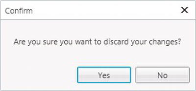
Figure 8-44. ShowMessageBox dialog
Displaying Messages Using ShowInputBox
The ShowInputBox method displays a dialog that contains a text box. The dialog allows you to carry out data entry, and the method returns the text the user enters.
Listing 8-2 shows how you would use the ShowInputBox method on a new customer screen. The code in the saving method prompts the user to enter any additional comments using an input box.
Listing 8-2. Using the ShowInputBox method
VB:


File: OfficeCentralClientUserCodeCreateNewCustomer.vb


Private Sub CreateNewCustomer_Saving(ByRef handled As Boolean)


    Dim comment = Me.ShowInputBox(

        "Do you want to include any additional comments?",

        "Confirm Save", "")


    If Not comment Is Nothing AndAlso comment.Length > 0 Then

        Me.CustomerProperty.Comment = comment

    End If

End Sub


C#:


File: OfficeCentralClientUserCodeCreateNewCustomer.cs


partial void CreateNewCustomer_Saving(ref bool handled)

{

    string comment = this.ShowInputBox(

        "Do you want to include any additional comments?",

        "Confirm Save", "");


    if ((comment != null) && comment.Length > 0) {

        this.CustomerProperty.Comment = comment;

    }

}
Just like the ShowMessageBox method, the ShowInputBox method allows you to specify a dialog caption. Figure 8-45 shows what the dialog looks like.
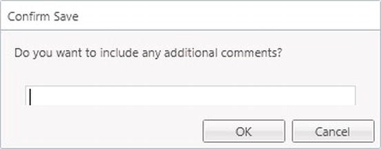
Figure 8-45. ShowInputBox dialog
Setting the Screen Title in Code
There are a couple of methods that you can use to set the screen title in code. These methods are called:
DisplayName,SetDisplayNameFromEntity.
The simplest way to set the screen title in code is to use the DisplayName method and to pass in the screen title you want to display.
LightSwitch also includes a method called SetDisplayNameFromEntity. This requires you to pass in an entity, and LightSwitch sets the screen title using the summary property of the entity you’ve supplied.
Listing 8-3 shows the sample code you’d use to set the screen title using the DisplayName method. The commented out section of code shows how to use the SetDisplayNameFromEntity method. Figure 8-46 illustrates what the user would see at runtime.
Listing 8-3. Setting the screen title in code
VB:


File: OfficeCentralClientUserCodeCustomerDetail.vb


Private Sub Customer_Loaded(succeeded As Boolean)

    Me.DisplayName = "My title's been set in code"

    'Here’s how you’d use SetDisplayNameFromEntity

    'Me.SetDisplayNameFromEntity(Me.Customer)

End Sub


C#:


File: OfficeCentralClientUserCodeCustomerDetail.cs


partial void Customer_Loaded(bool succeeded)

{

   this.DisplayName = "My title's been set in code";

   //Here’s how you’d use SetDisplayNameFromEntity

   //this.SetDisplayNameFromEntity(this.Customer);

}
Figure 8-46. Setting the screen title in code
Changing the Save Behavior of New Data Screens
Earlier on we discussed the default behavior of screens that are created using the New Data Screen template. When a user clicks the Save button, LightSwitch automatically closes the new data screen and opens the newly created record using the details screen for your entity.
You might not want the new data screen to behave like this. After saving a record, you might prefer to clear the screen and prepare it for the entry of another new record. Now that you understand the screen events you can handle in LightSwitch, we’ll show you the code you can write to change this behavior.
You’ll find the code that closes the new data screen and opens the details screen in the Saved method. In the screen designer, click the Write Code button and select the Saved method.
Now modify the code as shown in Listing 8-4.
Listing 8-4. Reset the New Data Screen after a save
VB:


File: OfficeCentralClientUserCodeCreateNewEmployee.vb


Private Sub CreateNewEmployee_Saved()


   'The commented lines beneath are added by LightSwitch

   'Delete these lines

   'Me.Close(False)

   'Application.Current.ShowDefaultScreen(Me.EmployeeProperty)


   'Now add a line of code to reset the entity

   Me.EmployeeProperty = New Employee()


End Sub


C#:


File: OfficeCentralClientUserCodeCreateNewEmployee.cs


partial void CreateNewEmployee_Saved()

{

    //The commented lines beneath are added by LightSwitch

    //Delete these lines

    //this.Close(false);

    //Application.Current.ShowDefaultScreen(this.EmployeeProperty);
    //Now add a line of code to reset the entity

    this.EmployeeProperty = new Employee();

}
In the code shown, we’ve removed the line of code that closes the screen. We’ve added a new line that creates a new instance of the underlying entity. This effectively resets the screen and allows the user to immediately enter another record.
Opening Screens from Code
At times, you might want to open another screen using code. LightSwitch allows you to do this easily. It autogenerates a show method for every screen you’ve defined in your application. Calling the show method opens the screen. These show methods are exposed via the Application object.
Listing 8-5 shows a method that opens a customer search screen.
Listing 8-5. Opening screens from code
File: OfficeCentralClientUserCodeHome.vb


Private Sub OpenSearchScreen()

    Me.Application.ShowSearchCustomer()

End Sub


C#:


File: OfficeCentralClientUserCodeHome.cs


partial void OpenSearchScreen()

{

    this.Application.ShowSearchCustomer();

}
As you can see, LightSwitch creates a method called ShowSearchCustomer, where SearchCustomer is the name of the screen.
If you want to open a details screen, the show method that LightSwitch generates will require you to pass in the primary key of the record you want to display. This technique is particularly useful for opening details screens that are not set as the default screen.
Passing Argument Values into Screens
LightSwitch allows you to pass in arguments when you open a screen. You would do this by defining properties as parameters. Figure 8-47 shows the setting you’d use in the Properties pane.
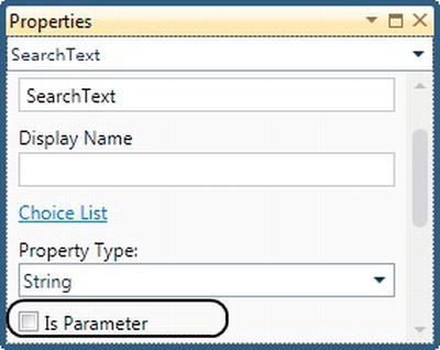
Figure 8-47. Defining screen parameters
This example illustrates a search screen with a SearchText property set as a parameter.
Using code you’ve defined on another screen, you can create a button that opens the search screen. This allows you to default the SearchText text to “Smith” by using the code shown in Listing 8-6.
Listing 8-6. Passing screen parameters
VB:

File: OfficeCentralClientUserCodeHome.vb


Private Sub OpenSearchScreen()

    Me.Application.ShowSearchCustomer("Smith")

End Sub


C#:


File: OfficeCentralClientUserCodeHome.cs


partial void OpenSearchScreen()

{

    this.Application.ShowSearchCustomer("Smith");

}
Setting Control Values in Code
An important point about LightSwitch is that all UI controls are bound to properties. If you want to change the text that’s shown on a text box, for example, you’d change the value of the underlying property. Because the text box is data-bound to the property, the text displayed will be updated when you change the property value.
Many other development environments (Windows Forms or ASP.NET, for example) allow you to access text boxes and controls in code and expose a value or text property that allows you to set their values. In LightSwitch, you wouldn’t work directly with controls to set their values. Instead, you always set control values by setting the value on the underlying property.
Finding Controls Using FindControl
The FindControl method allows you to reference a control in code. The method requires you to pass in the name of your control, which you can find in the Properties pane. Note that the control name doesn’t always match the property name, since you could add multiple instances of a control onto your screen.
For example, imagine that you have a control called Surname on your screen. If you add Surname again onto your screen, LightSwitch names the new control Surname1. So if you want to reference the second Surname control using the FindControl method, you’ll have to pass in the name Surname1.
The FindControl method returns an object of type IContentItemProxy, which is LightSwitch’s View-Model object. The methods that are exposed by this object are shown in Table 8-19.
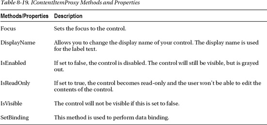
The SetBinding method becomes important when you start using custom controls. We’ll show you how to use these in Chapter 9.
If want to refer to a control that belongs inside a data grid (or other collection control), you’ll need to use the FindControlInCollection method, rather than the FindControl method. When you call the FindControlInCollection method, you’ll need to supply an entity. This entity will refer to the data row you’re searching within. Just like the FindControl method, FindControlInCollection also returns an IContentItemProxy object.
We’ll now show you some examples of how you would use the FindControl method.
Setting the Focus to a Control
The IContentItemProxy object provides a method called focus that you can call to set the screen focus to a control.
Listing 8-7 shows how you would call this method in the screen-loaded method to set the focus to the surname control.
Listing 8-7. Setting the focus to a control
VB:


File: OfficeCentralClientUserCodeCustomerDetail.vb


Private Sub Customer_Loaded(succeeded As Boolean)

    Me.FindControl("Surname").Focus()

End Sub


C#:


File: OfficeCentralClientUserCodeCustomerDetail.cs


partial void Customer_Loaded(bool succeeded)

{

    this.FindControl("Surname").Focus();

}
Hiding and Showing Controls
The IsVisible property allows you to hide controls or groups of controls.
In this example, we’ll create a button that toggles the visibility of a row’s layout on a customer detail screen. The name of the row’s layout is AddressGroup and the name of the method is ToggleVisibility (Figure 8-48).
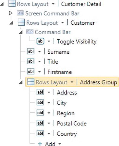
Figure 8-48. Hiding and showing controls
Calling this method shows or hides the address controls that relate to a customer. After creating the ToggleVisibility method, add the code shown in Listing 8-8.
Listing 8-8. Hiding and showing controls
VB:


File: OfficeCentralClientUserCodeCustomerDetail.vb


Private Sub ToggleVisibility_Execute()

    Dim rowLayout = Me.FindControl("AddressGroup")

    rowLayout.IsVisible = Not (rowLayout.IsVisible)

End Sub


C#:


File: OfficeCentralClientUserCodeCustomerDetail.cs


partial void ToggleVisibility_Execute()

{

    var rowLayout = this.FindControl("AddressGroup");

    rowLayout.IsVisible = !(rowLayout.IsVisible);

}
When you first open your screen and call the ToggleVisibility method, the rows layout and all associated child controls will be hidden. Calling the ToggleVisibility method again restores the visibility of the rows layout.
Making Check Boxes Read-Only
You can make a control read-only by setting the IsReadOnly property to true. This code works with all controls but is particularly useful when you’re working with check boxes. This is because check boxes don’t always behave quite as expected.
If you’ve checked the Use Read-Only Controls check box on the root node of your screen or on a data grid, LightSwitch renders your data using labels or other read-only controls. However, any check boxes you’ve added will still be enabled, despite the Use Read-Only Controls option being set to true. If you want to disable a check box, you’ll have to write code to do this.
In this example, we’ll show you how to disable a check box that’s shown on an employee data grid. The name of our check box is SecurityVetted. This is a Boolean property that indicates whether the employee is security cleared. In the loaded method, we’ll loop through the rows in the data grid. We’ll then use the FindControlInCollection method to obtain a reference to the check box. We can then use the IsEnabled property on the IContentItemProxy that’s returned to make the check box read-only.
The code to do this is shown in Listing 8-9.
Listing 8-9. Making check boxes read-only
VB:


File: OfficeCentralClientUserCodeEmployees.vb


Private Sub Employees_Loaded(succeeded As Boolean)
    For Each emp In Employees

        Me.FindControlInCollection(

            "SecurityVetted", emp).IsEnabled = False

    Next


End Sub


C#:


File: OfficeCentralClientUserCodeEmployees.cs


partial void Employees_Loaded(bool succeeded)

{

    foreach (Employee emp in Employees)

    {

        this.FindControlInCollection(

            "SecurityVetted", emp).IsEnabled  = false;

    }

}
When you run this screen, the check boxes in the grid are correctly disabled and the user won’t be able to change any of the check box values in the grid.
Reference the Underlying Silverlight Control
Let's imagine you've created a screen that displays a text box. The actual control that LightSwitch displays is a Silverlight Text Box control. The IContentItemProxy object that we showed you allows you to control certain elements of the text box such as visibility and the enabled state. However, IContentItemProxy can only take you so far. To set text box specific properties, you’ll need to reference the underlying Silverlight control.
To demonstrate how to do this, we’ll show you some code that sets the background style of a text box.
Accessing the underlying Silverlight control still relies on you using the FindControl method to return an IContentItemProxy. This exposes two methods you can use to access the underlying control. These are:
- The
SetBindingmethod,- The
ControlAvailablemethod.
You’d use the SetBinding method to data bind a screen property to a dependency property of your control. This technique is commonly used when working with custom controls. In the custom control chapter (Chapter 9), we’ll show you how to use the SetBinding method and also explain exactly what a dependency property is.
In this example, we’ll focus on how you would use the ControlAvailable method. For any given control, LightSwitch raises the ControlAvailable event when the control becomes available.
When you handle this event, the ControlAvailableEventArgs parameter gives you access to the underlying Silverlight control. As the name suggests, this event is fired when the control becomes available. When you write code that handles this event, you can be sure that you won’t encounter the types of errors that might occur if you try accessing the control too early. Listing 8-10 specifies the code for ControlAvailable.
Listing 8-10. Referencing a control using ControlAvailable
VB:


File: OfficeCentralClientUserCodeCreateNewCustomer.vb


Imports System.Windows.Media


Private Sub CreateNewCustomer_InitializeDataWorkspace(

    ByVal saveChangesTo As System.Collections.Generic.List(

        Of Microsoft.LightSwitch.IDataService))


    Dim control = Me.FindControl("Surname")


    AddHandler control.ControlAvailable,

        Sub(sender As Object, e As ControlAvailableEventArgs)

            Dim textbox = CType(e.Control,

                System.Windows.Controls.TextBox)

            textbox.Background = New SolidColorBrush(Colors.Yellow)

        End Sub


End Sub


C#:


File: OfficeCentralClientUserCodeCreateNewCustomer.cs


using System.Windows.Media;


partial void CreateNewCustomer_InitializeDataWorkspace(

   List<IDataService> saveChangesTo)

{

    var control = this.FindControl("Surname");


    control.ControlAvailable +=

      (object sender, ControlAvailableEventArgs e) =>

        {

            var textbox =

               (System.Windows.Controls.TextBox)e.Control;

                textbox.Background = new SolidColorBrush(Colors.Yellow);

         };


}
In the code shown, we’ve added inline event handlers to handle the ControlAvailable event. The e.control object gives you access to Silverlight control. Because we know that the surname control is rendered as a text box, we can simply declare a variable and cast it to System.Windows.Controls.TextBox.
This gives us access to all of the Silverlight text box properties and allows us to set the background color in code.
When you now run this screen, the background color of the surname text box is shown in yellow.
Handling Silverlight Control Events
When you obtain a reference to a Silverlight control using the ControlAvailable method, you can also add event handlers to handle the events that are raised by the Silverlight control.
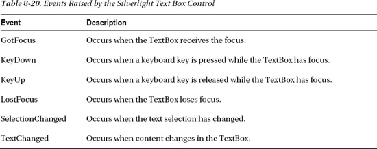
To give you an example of the sort of events you can handle, Table 8-20 shows some of the events that are raised by the Silverlight text box control. There are many more events you can use. This table only shows a subset, but hopefully gives you a flavor of the sort of events you can handle.
In the following example, we’ll show you how to uppercase the characters that are entered into a text box by a user. We’ll handle the KeyUp event so that characters are upper cased as soon as they’re entered by the user.
Listing 8-11 extends our previous code sample. To show you a slightly different syntax, we’ve used named delegates rather than inline event handlers.
Listing 8-11. Handling the TextBox KeyUp event
VB:


File: OfficeCentralClientUserCodeCreateNewCustomer.vb


Private Sub CreateNewCustomer_InitializeDataWorkspace(

    ByVal saveChangesTo As System.Collections.Generic.List(

        Of Microsoft.LightSwitch.IDataService))

    Dim control = Me.FindControl("Surname")

    AddHandler control.ControlAvailable,

        AddressOf TextBoxAvailable

End Sub


Private Sub TextBoxAvailable(

    sender As Object, e As ControlAvailableEventArgs)

        AddHandler CType(e.Control,

            System.Windows.Controls.TextBox).KeyUp,

                AddressOf TextBoxKeyUp
End Sub


Private Sub TextBoxKeyUp(

    sender As Object, e As System.Windows.RoutedEventArgs)


    Dim textbox = CType(sender, System.Windows.Controls.TextBox)

    Dim textUppered As String = textbox.Text.ToUpper

    Dim selStart As Integer = textbox.SelectionStart

    textbox.Text = textUppered

    textbox.SelectionStart = selStart


End Sub


C#:


File: OfficeCentralClientUserCodeCreateNewCustomer.cs


partial void CreateNewCustomer_InitializeDataWorkspace(

   List<IDataService> saveChangesTo)

{

  this.FindControl("Surname").ControlAvailable += TextBoxAvailable;

}


private void TextBoxAvailable(object sender, ControlAvailableEventArgs e)

{

    ((System.Windows.Controls.TextBox)e.Control).KeyUp += TextBoxKeyUp;

}


private void TextBoxKeyUp(object sender, System.Windows.RoutedEventArgs e)

{

    var textbox = (System.Windows.Controls.TextBox)sender;


    string textUppered = textbox.Text.ToUpper();

    int selStart = textbox.SelectionStart;

    textbox.Text = textUppered;

    textbox.SelectionStart = selStart;

}
In the code shown, we’ve saved the SelectionStart position prior to upper casing and replacing the text. After modifying the text, we’ve restored the SelectionStart property back to its original setting. If you don’t do this, the control sets the cursor location to the end of the text box. This would make it impossible for a user to type into the middle of a text box, because every key press event would send the cursor position to the end of the string.
When you run this screen, the KeyUp event of the surname is handled and any text that you enter will be upper cased.
Reacting to Data Changes Using Property Changed
In any advanced application, you’ll want some way to make your UI react to changes in your data.
The LightSwitch entities that represent your data (e.g., customer, order, etc.) implement the INotifyPropertyChanged interface. This causes an event called PropertyChanged to be raised whenever any property (e.g., surname, order status) changes. So to make your application react to data changes, you can handle this event and carry out any UI changes in the event handler.
In the earlier example, we showed you how to handle the events that are raised by the underlying Silverlight control. Handling these events provides an alternative to using PropertyChanged. So, for example, if you have an employee screen that contains an IsSecurityVetted check box, you can handle its LostFocus event and hide or show controls depending on the value.
However, the advantage of using PropertyChanged is that it aligns itself better with the way Silverlight works. If you want to use the LostFocus technique to monitor multiple properties, you would need to set up an event handler for each control. Using the PropertyChanged method, you only need to set up one event handler and you can use that to detect changes in any number of properties.
Furthermore, the LostFocus method assumes what the underlying Silverlight control will be. You could potentially break your application by changing the control type. Using the LostFocus technique is therefore more fragile than the PropertyChanged technique.
In the example that follows, we’ll create a new data screen based on an employee table. In addition to the properties you would normally find such as name and contact details, the employee table also contains properties that relate to security clearance. These properties are:
SecurityVetted. Required, Boolean field.SecurityClearanceRef. String field.VettingExpiryDate. Date field.
The details screen has a check box that indicates whether the employee is security vetted. If true, the text boxes that allow the user to enter a reference number and vetting expiry date are shown. If false, these controls are hidden.
The PropertyChanged method works differently on screens that are based on the new data and details screens. We’ll begin by describing the technique on a new data screen.
Using PropertyChanged on a New Data Screen
To handle the PropertyChanged event for an entity on a new data screen, create a new screen based on an employee. By default, the screen template creates a local screen property called EmployeeProperty.
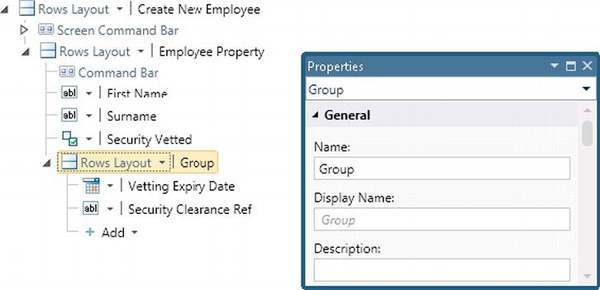
Figure 8-49. Layout of the new data screen
In the screen shown, we’ve created a rows layout called Group. This group contains the controls that we want to hide or show, depending on the value of the SecurityVetted property (Figure 8-49).
After creating the screen, enter the code as shown in Listing 8-12.
Listing 8-12. Using PropertyChanged on a new data screen
VB:


File: OfficeCentralClientUserCodeCreateNewEmployee.vb


Imports System.ComponentModel


Private Sub CreateNewEmployee_Created()

    Microsoft.LightSwitch.Threading.Dispatchers.Main.BeginInvoke(

      Sub()

         AddHandler DirectCast(

            Me.EmployeeProperty, INotifyPropertyChanged

            ).PropertyChanged, AddressOf EmployeeFieldChanged

       End Sub)


       'Set the initial visibility here

       Me.FindControl("group").IsVisible =

           EmployeeProperty.SecurityVetted.GetValueOrDefault(False)

End Sub


Private Sub EmployeeFieldChanged(

    sender As Object, e As PropertyChangedEventArgs)

    If e.PropertyName = "SecurityVetted" Then

        Me.FindControl("group").IsVisible =

           EmployeeProperty.SecurityVetted.GetValueOrDefault(False)
    End If

End Sub


C#:


File: OfficeCentralClientUserCodeCreateNewEmployee.cs


using System.ComponentModel;


partial void CreateNewEmployee_Created()

{

    Microsoft.LightSwitch.Threading.Dispatchers.Main.BeginInvoke(() =>

        {

            ((INotifyPropertyChanged)this.EmployeeProperty).PropertyChanged +=

               EmployeeFieldChanged;

        });


    this.FindControl("group").IsVisible =

        EmployeeProperty.SecurityVetted.GetValueOrDefault(false);


}


private void EmployeeFieldChanged(object sender, PropertyChangedEventArgs e)

{

    if (e.PropertyName == "SecurityVetted") {

        this.FindControl("group").IsVisible =

            EmployeeProperty.SecurityVetted.GetValueOrDefault(false);

    }

}
In the created method of screen, we’ve added an event handler that handles the PropertyChanged event of EmployeeProperty. This event handler needs to be added using code that executes on the main UI thread. If you don’t do this, you’ll receive an error that says It is not valid to execute the operation on the current thread.
The EmployeeFieldChanged method includes a parameter of type PropertyChangedEventArgs. We can find out the name of the property that has changed by referring to the PropertyName property in PropertyChangedEventArgs.
If the SecurityVetted property has changed, we then call some code that uses the FindControl method to hide the group that contains the other controls related to security vetting.
The behavior of this screen at runtime is shown in Figure 8-50.
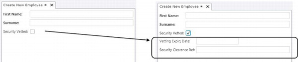
Figure 8-50. Checking SecurityVetted unhides the other controls
Using PropertyChanged on a Details Screen
The code you would use on a details screen is different from the code you would use on a new data screen.
The reason for this is because a detail screen uses a query that returns a single record filtered by the primary key value. A new data screen contains a local property, rather than a query. So in order to monitor PropertyChanged on a details screen, you’ll need to create a local property you can monitor.
In this example, we’ll create a details screen for an employee. The layout of this screen is identical to the layout shown in the new data screen example.
After creating the screen, we’ll add the code that’s shown in Listing 8-13. This code adds an event handler in the InitializeDataWorkspace method that handles the ExecuteCompleted event of the query loader. When the loader finishes executing the query, we save the results in a local property called monitoredEmployee. We can then handle the PropertyChanged event on the monitorEmployee property to detect any changes that have been made for the employee.
Just as before, we’ll hide or show the group that contains the vetting details based on the value of the SecurityVetted property.
Listing 8-13. Using PropertyChanged on a details screen
VB:


File: OfficeCentralClientUserCodeEmployeeDetail.vb


Imports System.ComponentModel


Private monitoredEmployee As Employee


Private Sub EmployeeDetail_InitializeDataWorkspace(

    saveChangesTo As System.Collections.Generic.List(

        Of Microsoft.LightSwitch.IDataService))


    Microsoft.LightSwitch.Threading.Dispatchers.Main.BeginInvoke(

       Sub()

          AddHandler Me.Details.Properties.Employee.Loader.ExecuteCompleted,

              AddressOf Me.EmployeeLoaderExecuted

       End Sub)

End Sub


Private Sub EmployeeLoaderExecuted(

    sender As Object, e As Microsoft.LightSwitch.ExecuteCompletedEventArgs)


    If monitoredEmployee IsNot Me.Employee Then

        If monitoredEmployee IsNot Nothing Then

            RemoveHandler TryCast(monitoredEmployee,

                INotifyPropertyChanged).PropertyChanged,

                    AddressOf Me.EmployeeChanged

        End If


        monitoredEmployee = Me.Employee


        If monitoredEmployee IsNot Nothing Then
           AddHandler TryCast(

              monitoredEmployee, INotifyPropertyChanged).PropertyChanged,

                 AddressOf Me.EmployeeChanged


            'Set the initial visibility here

            Me.FindControl("group").IsVisible =

                monitoredEmployee.SecurityVetted.GetValueOrDefault(False)


        End If

    End If

End Sub


Private Sub EmployeeChanged(sender As Object, e As PropertyChangedEventArgs)


    If e.PropertyName = "SecurityVetted" Then

        Me.FindControl("group").IsVisible =

            monitoredEmployee.SecurityVetted.GetValueOrDefault(False)

    End If


End Sub


C#:


File: OfficeCentralClientUserCodeEmployeeDetail.cs


using System.ComponentModel;


private Employee monitoredEmployee;


private void EmployeeDetail_InitializeDataWorkspace(

    System.Collections.Generic.List<Microsoft.LightSwitch.IDataService>

        saveChangesTo)

{

    Microsoft.LightSwitch.Threading.Dispatchers.Main.BeginInvoke(() =>

        {

            this.Details.Properties.Employee.Loader.ExecuteCompleted +=

                this.EmployeeLoaderExecuted;

        });

}


private void EmployeeLoaderExecuted(object sender, Microsoft.LightSwitch.ExecuteCompletedEventArgs e)

{


    if (monitoredEmployee != this.Employee) {

        if (monitoredEmployee != null) {

            (monitoredEmployee as INotifyPropertyChanged).PropertyChanged -=

                this.EmployeeChanged;

        }
        monitoredEmployee = this.Employee;

        if (monitoredEmployee != null) {

             (monitoredEmployee as INotifyPropertyChanged).PropertyChanged +=

                 this.EmployeeChanged;


              //set the initial visibility here

              this.FindControl("group").IsVisible =

                 monitoredEmployee.SecurityVetted.GetValueOrDefault(false);

         }

    }

}


private void EmployeeChanged(object sender, PropertyChangedEventArgs e)

{

    if (e.PropertyName == "SecurityVetted") {

        this.FindControl("group").IsVisible =

            monitoredEmployee.SecurityVetted.GetValueOrDefault(false);

    }

}
Working with Built-In Data Controls
Now that you know how to write screen code, we’ll show you how to use some of the built-in data controls and how you can extend the functionality by using code. The controls we’ll cover are:
- Modal window control,
AutoCompleteBox.
Creating modal windows can be useful, particularly when designing screens that use the data grid control. The data grid includes buttons in the command bar area that allow users to add and edit records. You can’t customize the screens that are shown when a user clicks one of these buttons. Therefore, designing your own modal window provides a work around.
The AutoCompleteBox is the default control that a user uses to select related records. In this section, we’ll describe some of the more advanced things you can do with this control.
Introducing the Modal Window Control
Whenever you add or edit a record, LightSwitch will open it in a new screen tab. This will either be an autogenerated screen or a screen that you’ve designed yourself. Sometimes this is what you want, particularly if you have a lot of controls on the screen. But sometimes there may only be a few properties to display on the screen, which can look a bit odd if the application has been maximized.
To handle this situation, or if you just don’t want to use a screen tab, you can create a modal window instead. A modal window appears as a pop-up on top of the screen that it was opened from, instead of opening in another screen tab (Figure 8-51).
In most applications, a modal window would prevent you from moving to other parts of the application until that modal window was closed. This is known as an application modal, meaning modal to the whole application. But LightSwitch is pretty clever with its modal windows that are screen modal, which allows each screen tab to have its own modal window open while still letting you move around to other screens in the application. When you come back to the screen that opened the modal window, it’ll still be there.
This means, though, that you can only display one record for any particular screen at a time, whereas when you’re using screen tabs you could be displaying multiple records, with each being displayed in its own tab (unless of course you had unchecked the Allow Multiple Instances option for the screen).
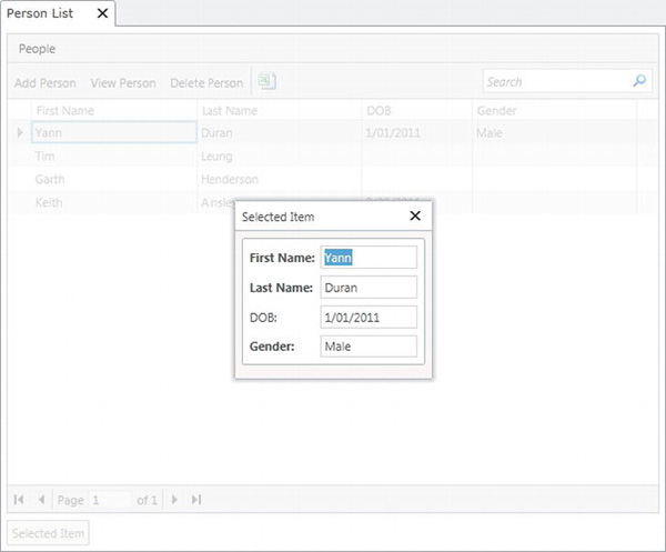
Figure 8-51. Displaying a modal window
You’ve got more control over the size of a modal window, but there’s a little more work you have to do to set one up.
In any screen that has a list or grid on it that’s bound to a collection, the easiest way to add a modal window is to drag the collection’s SelectedItem to the bottom of the content tree (see Figure 8-52), then change the control type to ModalWindow. You could also use the root RowsLayout’s Add drop-down button to add a ModalWindow control if you want, but you’d have to add each of the controls to it manually if you do it that way.
If you’re going to have more than one modal window in your screen, it’s a good idea to add something like a RowsLayout control to keep them all together. You might even want to get into the habit of doing this even if you only have one modal window, just in case. There are a couple of reasons why you might want to put your modal windows in a group control of their own.
The first reason is that it gives you the ability to collapse the group while you’re designing the screen, so your design surface is less cluttered.
The second reason is that you then only have to uncheck the Is Visible setting for the group, and all the modal windows will inherit the visibility setting.
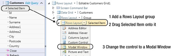
Figure 8-52. Dragging SelectedItem to the screen’s content tree
Once you’ve added the ModalWindow control, you can lay out its controls the same way you would for any screen. By default LightSwitch will also automatically add a button you can use to open the modal window.
In many cases you’re going to want to open the window via code, so you can hide the button by unchecking the Show Button check box in the ModalWindow control’s properties window.
Tip Adding a RowsLayout or ColumnsLayout control (or any other group control) as the root control of your modal window, then moving the rest of your controls into that group, is the only way you can set the width of the window.
Creating a Modal Window Helper Class
In the example that follows, we’ll add some buttons onto the toolbar of a data grid. When a user clicks one of the buttons, it’ll open a customized modal window that allows a record to be added or edited.
But before we show you how to do this, we’ll create a helper class that makes it easier for us to work with collections of data and modal windows.
Working on the basis that the modal window Show button will be hidden, our helper class includes methods to help show or hide the modal window. You’d initialize an instance of the modal window helper class with a collection of data, and Table 8-21 describes the methods that are exposed by this helper class.
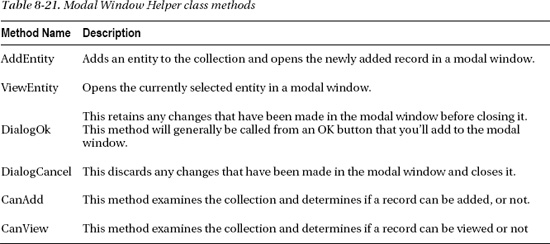
We suggest that you add this class into a new project. This makes it possible to reuse the class in more than one LightSwitch project. Because this code is client related, you’ll need to create a new Silverlight class library project.
If you don’t have Visual Studio 2010 Professional or above, you can switch to File view and add the helper class to your client project.
If you decide to add the code to a Silverlight class library project, you’ll need to add some assembly references:
System.Windows.ControlsSystem.Windows.Controls.DataMicrosoft.LightSwitchMicrosoft.LightSwitch.Client
You won’t be able to choose the LightSwitch ones from the Assemblies list as you normally would. LightSwitch assemblies aren’t stored in the GAC (Global Assembly Cache), so you’ll have to use the Browse button to find them manually.
The two DLLs that you’ll need are located on the drive where you installed Visual Studio 2010 (see Table 8-22). This will usually be the C drive, but if you’ve installed Visual Studio on a different drive, then you’ll need to take that into account.
After adding your assembly references, you can create the modal window helper class using the code shown in Listing 8-14.
Listing 8-14. Modal window helper class
VB:


File: Central.Utilities.ClientWindowsModalWindow.vb


Imports System.ComponentModel

Imports System.Windows.Controls

Imports Microsoft.LightSwitch

Imports Microsoft.LightSwitch.Client

Imports Microsoft.LightSwitch.Presentation

Imports Microsoft.LightSwitch.Threading

Imports Microsoft.LightSwitch.Presentation.Extensions


Public Class ModalWindowHelper

    Public Delegate Function CanCloseFunction() As Boolean


    Private _collection As IVisualCollection

    Private _dialogName As String

    Private _entityName As String

    Private _screen As IScreenObject

    Private _window As IContentItemProxy

    Private _entity As IEntityObject

    Private _saveOnClose As Boolean


    Public Sub New( _

          ByVal visualCollection As IVisualCollection _

        , ByVal dialogName As String _

        , Optional entityName As String = "")


        _collection = visualCollection

        _dialogName = dialogName

        _entityName = If(entityName <> "",

                         entityName,

                         _collection.Details.GetModel.ElementType.Name)

        _screen = _collection.Screen

    End Sub
    Public Sub Initialize( _

          Optional hasCloseButton As Boolean = True _

        , Optional saveOnClose As Boolean = False _

        )

        _window = _screen.FindControl(_dialogName)

        _saveOnClose = saveOnClose


        AddHandler _window.ControlAvailable, _

            Sub(s As Object, e As ControlAvailableEventArgs)

                Dim window = DirectCast(e.Control, ChildWindow)


                window.HasCloseButton = hasCloseButton


                AddHandler window.Closed, _

                    Sub(s1 As Object, e1 As EventArgs)

                        DialogClosed(s1)

                    End Sub

            End Sub

    End Sub


    Public Function CanAdd() As Boolean

        Return (_collection.CanAddNew = True)

    End Function


    Public Function CanView() As Boolean

        Return (_collection.SelectedItem IsNot Nothing)

    End Function


    Public Sub AddEntity()

        Dim result As IEntityObject = Nothing


        _window.DisplayName =

            String.Format("Add {0}", _entityName)

        _collection.AddNew()


        OpenModalWindow()

    End Sub


    Public Sub ViewEntity()

        _window.DisplayName = String.Format("View {0}", _entityName)


        OpenModalWindow()

    End Sub


    Private Sub OpenModalWindow()

        _entity = TryCast(_collection.SelectedItem, IEntityObject)

        _screen.OpenModalWindow(_dialogName)

    End Sub


    Public Sub DialogOk()

        If (_entity IsNot Nothing) Then
            _screen.CloseModalWindow(_dialogName)

        End If

    End Sub


    Public Sub DialogCancel()

        If (_entity IsNot Nothing) Then

            _screen.CloseModalWindow(_dialogName)

            DiscardChanges()

        End If

    End Sub


    Public Sub DialogClosed(sender As Object)

        Dim window = DirectCast(sender, ChildWindow)


        Select Case window.DialogResult.HasValue

            Case True

                If (_saveOnClose = True) Then

                    _screen.Details.Dispatcher.BeginInvoke( _

                        Sub()

                            _screen.Save()

                        End Sub)

                End If


            Case False

                DiscardChanges()

        End Select

    End Sub


    Private Sub DiscardChanges()

        If (_entity IsNot Nothing) Then

            _entity.Details.DiscardChanges()

        End If

    End Sub


End Class


C#:


File: Central.Utilities.ClientWindowsModalWindow.cs


using System;

using System.ComponentModel;

using System.Windows.Controls;

using Microsoft.LightSwitch;

using Microsoft.LightSwitch.Client;

using Microsoft.LightSwitch.Presentation;

using Microsoft.LightSwitch.Threading;

using Microsoft.LightSwitch.Presentation.Extensions;


namespace Central.Utilities.Client

{

    class ModalWindowHelper
    {

        public delegate bool CanCloseFunction();

        private IVisualCollection _collection;

        private string _dialogName;

        private string _entityName;

        private IScreenObject _screen;

        private IContentItemProxy _window;

        private IEntityObject _entity;

        private bool _saveOnClose;


        public ModalWindowHelper(

            IVisualCollection visualCollection,

            string dialogName, string entityName = "")

        {

            _collection = visualCollection;

            _dialogName = dialogName;

            _screen = _collection.Screen;

            if (entityName != "")

            {

                _entityName = entityName;

            }

            else

            {

                _entityName =

                   _collection.Details.GetModel().ElementType.Name;

            }

        }


        public void Initialize(

            bool hasCloseButton = true, bool saveOnClose = false)

        {

            _window = _screen.FindControl(_dialogName);

            _saveOnClose = saveOnClose;


            _window.ControlAvailable +=

                delegate(object sender, ControlAvailableEventArgs e)

                {

                    var window = (ChildWindow)e.Control;

                    window.HasCloseButton = hasCloseButton;


                    window.Closed +=

                        delegate(object sender1, EventArgs e1)

                        {

                            DialogClosed(sender1);

                        };

                };


        }


        public bool CanAdd()

        {

            return (_collection.CanAddNew == true);
        }


        public bool CanView()

        {

            return (_collection.SelectedItem != null);

        }


        public void AddEntity()

        {

            _window.DisplayName =

               string.Format("Add {0}", _entityName);

            _collection.AddNew();

            OpenModalWindow();

        }


        public void ViewEntity()

        {

            _window.DisplayName =

               string.Format("View {0}", _entityName);

            OpenModalWindow();

        }


        private void OpenModalWindow()

        {

            _entity =

               _collection.SelectedItem as IEntityObject;

            _screen.OpenModalWindow(_dialogName);

        }


        public void DialogOk()

        {

            if ((_entity != null))

            {

                _screen.CloseModalWindow(_dialogName);

            }

        }


        public void DialogCancel()

        {

            if ((_entity != null))

            {

                _screen.CloseModalWindow(_dialogName);

                DiscardChanges();

            }

        }


        public void DialogClosed(object sender)

        {

            var window = (ChildWindow)sender;


            if (window.DialogResult.HasValue && _saveOnClose == true)

            {
                _screen.Details.Dispatcher.BeginInvoke(

                    delegate()

                    {

                        _screen.Save();

                    });

            }

            else

            {

                DiscardChanges();

            }


        }


        private void DiscardChanges()

        {

            if ((_entity != null))

            {

                _entity.Details.DiscardChanges();

            }

        }


    }

}
Using the Modal Window Helper Class
Now that you’ve created your modal window helper class, you can use this on any screen that uses a data grid.
First, create a new screen using the editable grid screen template. We’ve called our screen PersonList. As described earlier, create a new rows layout. Drag the Selected Item object from the screen member list into the rows layout. Change the control type to ModalWindow and hide the Show button by unchecking the Show Button check box using the ModalWindow control’s properties window. While you’re in the properties window, make a note of the name of the ModalWindow control. You’ll need to know this when you initialize an instance of the ModalWindowHelper class.
Now carry out the steps that follow:
- If you’ve created a Silverlight class library:
- Switch the LightSwitch project to File view.
- Add a reference to the new
Central.Utilities.Client(or whatever you’ve called your Silverlight class library) project to your project.- Switch to File view and add a reference to the
System.Windows.Controls.DataandSystem.Windows.Controlsassemblies.- In the partial
PersonListclass (see Listing 8-15):
- Add a class level
ModalWindowHelpervariable.- In the
PersonList_InitializeDataWorkspacemethod, initialize the variable to a new instance ofModalWindowHelper, passing it the collection it needs to works with, the name of theModalWindowcontrol, and an optional entity name (it’ll use the name of the entity that the collection is based on if no entity name is supplied).- In the
PersonList_Createdmethod, call the helper’s Initialize method, optionally passing a Boolean value that determines if the windows has a Close button or not, and whether any changes should be automatically saved when the window is closed.- Set the
LIST_CONTROLconstant to the name of your data grid or data list.- Delete the grid’s Add, Edit, and Delete buttons (you could also override them if you prefer, instead of deleting and re-creating them).
- Add a new Add button, a View button, and a Delete button (name these methods
AddItem,ViewItem, andDeleteItem). Create theirCanExecuteandExecutemethods.- In the Add button’s
CanExecutemethod, set the result to the helper’sCanAddmethod (the method examines the collection and determines if a record can be added, or not, in the case of a read-only collection—in a real scenario you’d probably want to combine this with a test for an add permission as well).- In the Add button’s Execute method, simply call the helper’s
AddEntitymethod.- Follow the same procedure for the View button and the Delete button.
- You’ll need to add an OK button to your modal window (name this
SaveItem), then set its Execute method to call the helper’sDialogOKmethod (the method takes care of closing the window, and even saving the record in the collection if you specifiedSaveOnCloseto be true in the Initialize method—you’d only do this in fairly rare circumstances, but the functionality is there for you if you need it).- You can optionally add a Cancel button (setting its Execute method the same way you set the OK button’s Execute method), but if you click the X in the window’s title bar, the changes will be discarded, and the window will close (you’d only need to add a Cancel button for cosmetic reasons).
That’s it! Just by wiring up a few methods and buttons to the appropriate helper methods, you never have to worry about the complex workings of a modal window again.
Tip After calling AddEntity, you can use the collection’s SelectedItem property to initialize any of the newly added entity’s properties, if you need to do that.
Listing 8-15. Using the ModalWindow helper class
VB:


File: OfficeCentralClientUserCodePersonList.vb


Imports Central.Utilities.Client


Public Class PersonList


    'Set LIST_CONTROL to the name of your data grid or control

    'eg Grid or List

    Private Const LIST_CONTROL As String = "ListControl"

    Private Const ITEM_WINDOW As String = "ItemWindow"

    Private Const ITEM As String = "Item"

    Private itemsControl As DataGrid = Nothing

    Private itemWindow As ModalWindowHelper


    Private Sub PersonList_InitializeDataWorkspace(

        saveChangesTo As System.Collections.Generic.List(

            Of Microsoft.LightSwitch.IDataService))


        itemWindow =

            New ModalWindowHelper(Me.Items, ITEM_WINDOW, entityName:=ITEM)


            AddHandler Me.FindControl(LIST_CONTROL).ControlAvailable,

             Sub(send As Object, e As ControlAvailableEventArgs)

                 itemsControl = TryCast(

                    e.Control, System.Windows.Controls.DataGrid)

             End Sub


    End Sub


    Private Sub PersonList_Created()

        itemWindow.Initialize(hasCloseButton:=True, saveOnClose:=True)

    End Sub


    Private Sub AddItem_CanExecute(ByRef result As Boolean)

        result = (itemWindow.CanAdd = True)

    End Sub


    Private Sub AddItem_Execute()

        itemWindow.AddEntity()

    End Sub

    Private Sub ViewItem_CanExecute(ByRef result As Boolean)

        result = (itemWindow.CanView = True)

    End Sub


    Private Sub ViewItem_Execute()

        itemWindow.ViewEntity()

    End Sub
    Private Sub SaveItem_Execute()

        itemWindow.DialogOk()

    End Sub


    Private Sub CancelItem_Execute()

        itemWindow.DialogCancel()

    End Sub


End Class


C#:


File: OfficeCentralClientUserCodePersonList.cs


using System;

using System.Collections;

using System.Collections.Generic;

using System.Data;

using System.Windows.Controls;

using Central.Utilities.Client;


public class ListScreen

{


    //Set LIST_CONTROL to the name of your data grid or control

    //eg Grid or List

    private const string LIST_CONTROL = "ListControl";

    private const string ITEM_WINDOW = "ItemWindow";

    private const string ITEM = "Item";

    private DataGrid itemsControl = null;

    private ModalWindowHelper itemWindow;


    partial void ListScreen_InitializeDataWorkspace(

        System.Collections.Generic.List<Microsoft.LightSwitch.IDataService>

           saveChangesTo)

    {


        itemWindow = new ModalWindowHelper(

           this.Items, ITEM_WINDOW, entityName: ITEM);


        this.FindControl(LIST_CONTROL).ControlAvailable += (

                object send, ControlAvailableEventArgs e) => {

                   itemsControl = e.Control as System.Windows.Controls.DataGrid; };

    }


    partial void PersonList_Created()

    {

        itemWindow.Initialize(

           hasCloseButton: true, saveOnClose: true);

    }
    partial void AddItem_CanExecute(ref bool result)

    {

        result = (itemWindow.CanAdd() == true);

    }


    partial void AddItem_Execute()

    {

        itemWindow.AddEntity();

    }

    partial void ViewItem_CanExecute(ref bool result)

    {

        result = (itemWindow.CanView() == true);

    }


    partial void ViewItem_Execute()

    {

        itemWindow.ViewEntity();

    }


    partial void SaveItem_Execute()

    {

        itemWindow.DialogOk();

    }


    partial void CancelItem_Execute()

    {

        itemWindow.DialogCancel();

    }


}
Using the AutoCompleteBox Control
In this section, we’ll show you how to use the AutoCompleteBox control. We’ll begin by explaining what it does, before moving on to show you how to do the following:
- Add an unbound
AutoCompleteBoxthat’s unconnected to the main data on your screen.- Set
AutoCompleteBoxvalues in code.- Create sets of nested
AutoCompleteBoxes.
The AutoCompleteBox control allows users to select an item from a list of drop-down values. It also allows the user to type into the control and filters the drop-down items based on the text that’s entered.
You can set the filter mode by using the filter mode in the Properties pane of your AutoCompleteBox control (Figure 8-53).
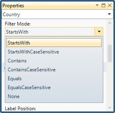
Figure 8-53. AutoCompleteBox filter model
Setting the Items Shown on Each Row
By default, the AutoCompleteBox uses the summary control to display the summary property for each row that’s shown in the AutoCompleteBox.
If you want to show additional properties in each row of the AutoCompleteBox, you can change the summary control to a columns layout and add the additional properties you want to show as child items (Figure 8-54).
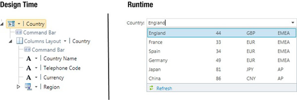
Figure 8-54. Setting the items shown on each AutoCompleteBox row
Creating an Unbound AutoCompleteBox
Sometimes you’ll want to create an AutoCompleteBox that’s unconnected with the main data that’s shown in your screen.
Let’s imagine you want to create a search screen that filters customers by country. The search results are shown in a data grid in the main area of the screen.
To allow a user to carry out the filtering, you’d like to add an AutoCompleteBox that returns a list of countries.
To do this, follow these steps:
- Create a new screen.
- Click the Add Data Item button and add a new local property. Using the Type drop-down, choose Country. Name your property
CountryProperty.CountryPropertynow appears in the screen member list. Drag this onto the Screen Content Tree. This will addCountryPropertyas anAutoCompleteBoxon your screen.
By default, the AutoCompleteBox returns all records in the country table. You might want to filter the items shown in the AutoCompleteBox. For example, you might only want to show countries that are in the EMEA region. To do this, you’d create a query that returns a filtered list of countries. Next, you’d add the query to your screen using the Add Data Item button. You can then set the data source of your AutoCompleteBox to the query you’ve added.
This concludes the process you would follow to add an AutoCompleteBox onto your screen. We’ll come back to this example later when we describe how to complete our custom search screen.
Setting the Value of an AutoCompleteBox in Code
From time to time you’ll want to set the value of your AutoCompleteBox in code. In the same way as you’d set the value of any other control on your screen, you’d do this by setting the value on your underlying data property.
Returning to the country example, let’s imagine you want to set the AutoCompleteBox value to England when your screen loads.
To do this, you’ll need to write a LINQ query that returns the England record from the database, and set the CountryProperty to the value that’s returned. Listing 8-16 shows the code that you’d use.
Listing 8-16. Setting AutoCompleteBox values in code
VB:


File: OfficeCentralClientUserCodeCustomerSearch.vb


Me.CountryProperty =

   DataWorkspace.ApplicationData.Country.Where(

       Function(country) country.CountryName = "England"

          ).FirstOrDefault()
C#:


File: OfficeCentralClientUserCodeCustomerSearch.vb


this.CountryProperty =

    DataWorkspace.ApplicationData.Countries.Where(

        (country) => country.CountryName == " England"

      ).FirstOrDefault();
Nested AutoCompleteBox Example
Another common scenario you might encounter is the need to create sets of nested AutoCompleteBoxes.
In this example, we’ll demonstrate a set of two AutoCompleteBoxes. The first AutoCompleteBox shows a list of international regions (such as EMEA, NCSA, AP). After a user selects a region, a second AutoCompleteBox will be filtered to show a list of countries that matches the region selected in the first AutoCompleteBox.
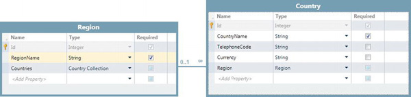
Figure 8-55. Country and region tables
To create this sample:
- Create a set of tables as shown in Figure 8-55.
- Create a new screen.
- Click the Add Data Item button and add a new local property. Using the Type drop-down, choose Region. Name your property
RegionProperty.- Click the Add Data Item button and add a new local property. Using the Type drop-down, choose Country. Name your property
CountryProperty.- Drag
RegionPropertyandCountryPropertyonto the Screen Content Tree.
The data source of the CountryProperty needs to be set to a query that filters the countries based on region. You’ll need to create a parameterized query that filters the country table by region. This query is shown in Figure 8-56. We’ve called this query CountriesByRegion and have named the parameter RegionIdParameter.
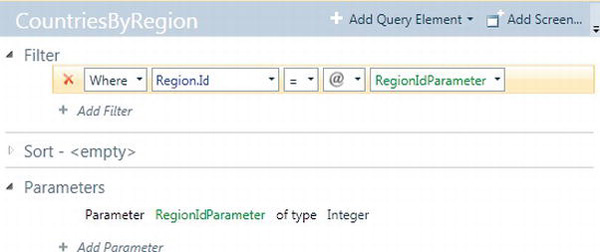
Figure 8-56. CountryByRegion query
After creating your query, you’ll need to carry out the remaining steps in the screen designer:
6. Click the Add Data Item button and add a new query. Select the
CountriesByRegionquery that you’ve just created.7. You’ll need to set the Region parameter value of your
CountriesByRegionquery to the value that’s selected in the RegionAutoCompleteBox. To do this, select theRegionIdParameterparameter and set the parameter binding toRegionProperty.Id.8. Select the Country
AutoCompleteBoxand go the properties window. Use the Choices drop-down to change the data source from Auto to theCountriesByRegionquery.
This completes what you need to do to create a set of nested AutoCompleteBoxes. When you run your screen, the Country AutoCompleteBox will be filtered by the value selected in the Region AutoCompleteBox.
Custom Screens and Scenarios
The built-in screen templates allow you to quickly create screens that are functional. But these can only take you so far. If you want to create a rounded application to show off to an end user, you’ll need to do some extra customization.
In this section, we’ll describe some of the typical customization scenarios you’ll encounter. We’ll show you how to create a home page, a custom search screen, and describe how to create some customized data entry screens.
Adding a Home Page
Earlier in this chapter, we showed you how to specify a start-up screen. The start-up screen is the first screen that’s shown to the user when your application starts. Your application won’t look very attractive if the startup screen consists of a data grid or some bog standard data entry screen.
You can make your application more appealing by creating a custom home page. The home page might contain a company logo, welcome text, and links that open up other screens in your application. In this section, we’ll show you:
- How to create a home page.
- How to add static text to a screen.
- How to add static images to your screen.
- How to add clickable links to a screen.
Creating an Empty Screen
The first thing you’ll need to do is to create an empty screen. Unlike most other screens, the home screen doesn’t require any data. All you really need is an empty screen that gives you a blank canvas to work from.
To create an empty screen, open the Add New Screen dialog (Figure 8-57). Select any screen template, apart from the Details Screen template. Leave the Screen Data drop-down as None and click the OK button to create your screen.
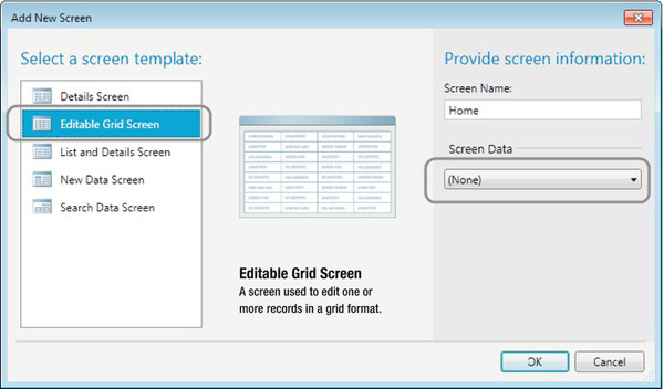
Figure 8-57. Creating an empty screen
The reason why you can’t use the Details Screen template is because LightSwitch doesn’t allow you to leave the Screen Data drop-down as None. If you try and do this, it disables the OK button, which prevents you from adding the screen.
In this example, we’ve named our home screen Home. You can set this as your startup screen by using the screen navigation tab in the properties of your project, as shown earlier in this chapter.
Adding Static Text to a Screen
A home screen is most likely to contain some static text. This could be a heading, welcome message, or some additional help text. Adding static text is a common task you’ll want to do and not just limited to home screen design.
As you now know, any control you use in LightSwitch must be data bound to a data item. So in order to display a label, you’ll need to first create a data item that represents the text you want to display. Only after you do this can you add a label to display the text.
In this example, we’ll add a label that says Welcome to the Office Central Application. The steps that you’ll need to follow in order to do this are:
- In the screen designer, click the Add Data Item button.
- When the Add Data Item dialog appears, select the Local Property radio option, and choose the type string. Name your property
ScreenTitle.- The
ScreenTitleproperty now appears in the Screen Members list. Drag this into your content tree and use the drop-down to change the control type from a text box to a label.- If you prefer, you can use the Font Style drop-down to change the display style to something different. For example, you can change the font style to
Heading1to display the label text in a larger and bolder font.- You’ll now need to assign a value to the
ScreenTitleproperty by adding some code to theHome_InitializeDataWorkspacemethod. This is shown in Listing 8-17.
If you now run your home screen, the screen title text appears as expected. You can now repeat the same process for any other labels you want to show on your screen.
Listing 8-17. Setting the label text in code
VB:


File: OfficeCentralClientUserCodeHome.vb


Private Sub Home_InitializeDataWorkspace(

    saveChangesTo As System.Collections.Generic.List(

        Of Microsoft.LightSwitch.IDataService))

    ScreenTitle = "Welcome to the Office Central Application"

End Sub


C#:


File: OfficeCentralClientUserCodeHome.cs


partial void Home_InitializeDataWorkspace(

    System.Collections.Generic.List<Microsoft.LightSwitch.IDataService>
       saveChangesTo)

{

    ScreenTitle = "Welcome to the Office Central Application";

}
Adding a Static Image to a Screen
When working with data in your application, it’s pretty easy to add an image column to your table. This allows you to upload and display images.
In the home screen, however, we don’t want to use an image that’s stored in the database. Instead, we want to embed a static image within our client application and display that on our home screen.
Just like the static text example, you’ll need to write some code that retrieves the embedded image and stores it into a local property.
To set up your screen, carry out the following steps:
- In the screen designer, click the Add Data Item button.
- When the Add Data Item dialog appears, choose the Local Property radio option, and select the type image. Name your property
ScreenLogo.- The
ScreenLogoproperty now appears in the Screen Members list. Drag this onto your content tree and use the drop-down to change the control type from an image editor to an image viewer. Because we don’t want the users to modify the static image, changing the control to an image viewer makes the image read-only.
The most important part of this process is to embed your image file inside your Silverlight client. To do this, you’ll need to switch your project into File view.
In Solution Explorer, right-click your client project and choose the Add  Existing Item option. Using the file browser dialog that appears, select the image file you want to include. The image file must be in PNG or JPG format. This is because the image viewer control only supports these two formats.
In our example, we’ve embedded an image called ScreenLogo.png. After adding the image, you’ll need to change the Build Action to Embedded Resource in the Properties pane (Figure 8-58).
Figure 8-58. Embedding an image in the client project
The last thing that remains is to add the code that sets the ScreenLogo property. Click the Write Code button and select the Home_InitializeDataWorkspace method. Now add the code as shown in Listing 8-18.
Listing 8-18. Retrieving an embedded image
VB:


File: OfficeCentralClientUserCodeHome.vb


Private Sub Home_InitializeDataWorkspace(

    saveChangesTo As System.Collections.Generic.List(

        Of Microsoft.LightSwitch.IDataService))


    ScreenTitle = "Welcome to the Office Central Application"

    ScreenLogo = GetImageFromAssembly("ScreenLogo.png")

End Sub


Private Function GetImageFromAssembly(

    fileName As String) As Byte()


    Dim assembly As Reflection.Assembly =

        Reflection.Assembly.GetExecutingAssembly()


    Dim stream As Stream =

        assembly.GetManifestResourceStream(fileName)


    Dim streamLength As Integer = CInt(stream.Length)


    Dim fileData(streamLength - 1) As Byte

    stream.Read(fileData, 0, streamLength)

    stream.Close()

    Return fileData


End Function


C#:


File: OfficeCentralClientUserCodeHome.cs


partial void Home_InitializeDataWorkspace(

    System.Collections.Generic.List<Microsoft.LightSwitch.IDataService>

       saveChangesTo)

{

    ScreenTitle = "Welcome to the Office Central Application";

    ScreenLogo = GetImageFromAssembly("ScreenLogo.png");

}


private byte[] GetImageFromAssembly(string fileName)

{

    System.Reflection.Assembly assembly =

        System.Reflection.Assembly.GetExecutingAssembly();
    Stream stream =

        assembly.GetManifestResourceStream(fileName);


    int streamLength = Convert.ToInt32(stream.Length);

    byte[] fileData = new byte[streamLength];

    stream.Read(fileData, 0, streamLength);

    stream.Close();

    return fileData;

}
The code shown includes a helper method called GetImageFromAssembly. This is used to extract the image file from the client assembly. Note that in C#, the file name you pass to the GetManifestResourceStream method must be prefixed with the namespace (typically LightSwitchApplication). If you can’t work out the correct file name to pass to this method, you can place a breakpoint in the GetImageFromAssembly method and interrogate the result of the assembly.GetManifestResourceNames method to show the names of the resources in the assembly.
Retrieving an Image from the Database
An embedded image is the ideal solution for the home page scenario. However, the disadvantage of this technique is that you can’t easily change the image that’s shown without redeploying your application. So if you want to allow your users to change the home screen image, it’s better to use an image that’s stored in the database, rather than a static image.
An easy way to store your home page image inside the database is to create a control table that contains a single row.
We’ll now modify our code sample so that the image is retrieved from the database, rather than the client assembly.
First, you’ll need to create a table to store the home page image. Figure 8-59 shows the schema of a table we’ve created called AppSettings. This table contains an image column called HomePageLogo.
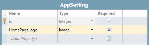
Figure 8-59. AppSettings table
To upload your image into the AppSettings table, you’ll need to create a simple data entry screen.
Listing 8-19 shows the change you’d make to the Home_InitializeDataWorkspace method to retrieve the image from the database.
Listing 8-19. Retrieving an image from the database
VB:


File: OfficeCentralClientUserCodeHome.vb


Private Sub Home_InitializeDataWorkspace(

    saveChangesTo As System.Collections.Generic.List(

        Of Microsoft.LightSwitch.IDataService))


    Dim appSetting = DataWorkspace.ApplicationData.AppSettings.FirstOrDefault()


    If Not appSetting Is Nothing Then

        ScreenLogo = appSetting.HomePageLogo

    End If


End Sub


C#:


File: OfficeCentralClientUserCodeHome.cs


partial void Home_InitializeDataWorkspace(

    System.Collections.Generic.List<Microsoft.LightSwitch.IDataService>

       saveChangesTo)

{

    var appSetting =

        DataWorkspace.ApplicationData.AppSettings.FirstOrDefault();

    if (appSetting != null)

    {

        ScreenLogo = appSetting.HomePageLogo;

    }

}
In the code shown, we’ve created a query that retrieves the first record from the AppSettings table. The code then sets the ScreenLogo property to the HomePageLogo value of the first record.
The important point about this code is that it illustrates how to retrieve an image from a database table. In practice, you might want to write some validation code to ensure that the AppSettings table can contain only one record. You can also protect write access to your AppSettings table by setting permissions and only allowing administrators to update the contents of the table.
Adding Links to Open Other Screens
Another feature you’ll typically find on a home screen is links. These allow users to open up other screens or perform other actions.
In this example, we’ll add a link that opens up the customer search screen. A simple way of creating a layout that allows you to add links is to add a table layout.
After adding a table layout, add a child table column layout. Now add a rows layout beneath it, in order to create a table cell.
Right-click the Rows Layout and select the option to add a new button. The button appears in the command bar area after you’ve added it. You can then use the drop-down button to change the button into a link, as shown in Figure 8-60.
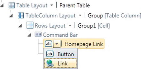
Figure 8-60. Creating a link
Once you’ve created your link, you can double-click it to open the code window. You can then use the code that was shown in Listing 8-5 to open the customer search screen. This code would open the customer search screen by calling the show method you’ll find via the Application object.
Alternatively, you could write some other code that performs another custom action.
Creating a Custom Search Screen
The search screen that LightSwitch creates when you choose the Search Data Screen template is pretty basic.
By using the various techniques you’ve learned throughout this and the query design chapters, we’ll show you how to create a more powerful search screen.
In this example, we’ll create a search screen for finding customers. The screen contains an AutoCompleteBox that allows users to filter the customers by country. The screen contains a surname text box that allows the user to filter additionally by surname.
The first thing you’ll need to do is to create a query that filters customers by country and surname. We’ve called this CustomerSearch, and it is shown in Figure 8-61. This query includes two optional parameters called CountryIdParameter and SurnameParameter.
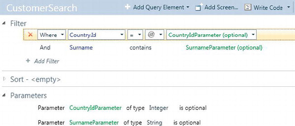
Figure 8-61. Custom search query
Having created your query, you’ll need to create a screen that uses this query. Here are the steps you’ll need to carry out:
- Create a new screen based on the search data screen template. In the Screen Data drop-down of the Add New Screen dialog, select the
CustomerSearchquery that you’ve created.- You’ll now need to create an
AutoCompleteBoxthat shows a list of countries. Follow the instructions shown earlier in the “Creating an UnboundAutoCompleteBox” section. This involves creating a local property of type Country using the Add New Data dialog. Name this propertyCountryProperty.- After creating the
CountryPropertyproperty, drag this onto the Screen Content Tree to create yourAutoCompleteBox.- By default, LightSwitch will bind the
CountryIdParameterparameter of your query to a property that it automatically creates. Change the parameter binding so that it points to theCountryPropertyproperty you created in step 2. The syntax you would use in the parameter binding text box would beCountryProperty.Id.
This completes the tasks you need to carry out in the screen designer. The screen you’ll see when you run your application is shown in Figure 8-62.
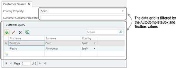
Figure 8-62. Custom search screen
Designing an Add/Edit Screen
As you now know, you can create screens to view data using the Details Screen template. For adding data, you can add a screen that uses the new data template. However, LightSwitch doesn’t provide a screen template that allows you to both edit and view data using the same screen.
Let’s suppose you want to create identical screens to carry out both tasks. If you use the default templates provided by LightSwitch, you’d first need to create a details screen and customize it as necessary. Afterward, you’d have to create a new data screen and carry out the same customization work you’ve already done once before on the details screen.
In this example, we’ll show you how to create a combined Add and Edit screen. If you need to create screens that look consistent for adding and viewing data, this technique will save you a lot of time. It’ll also make your application more maintainable because you’ll have fewer screens to manage in your application.
In the steps that follow, we’ll build a combination screen that adds and edits a product entity.
- Create a details screen for the product entity. In the Add New Data screen dialog, check the check box that sets this as the default screen for the entity.
- By default, LightSwitch creates an ID property (called
ProductIdin our example). You’ll need to make this optional by unchecking the Is Required check box.- Click the Add Data Item button and add a local property of data type product. Name this
ProductProperty.- Delete the content on the screen that’s bound to the product query.
- Add the
ProductPropertyproperty onto the Screen Content Tree.
Now add the code, as shown in Listing 8-20.
Listing 8-20. Product add and edit code
VB:


File: OfficeCentralClientUserCodeProductAddEdit.vb


Private Sub Product_Loaded(succeeded As Boolean)

    If Not Me.ProductId.HasValue Then

        Me.ProductProperty = New Product()

    Else

        Me.ProductProperty = Me.Product

    End If


    Me.SetDisplayNameFromEntity(Me.ProductProperty)

End Sub


Private Sub Product_Changed()

    Me.SetDisplayNameFromEntity(Me.ProductProperty)

End Sub


Private Sub ProductAddEdit_Saved()

    Me.SetDisplayNameFromEntity(Me.ProductProperty)

End Sub


C#:


File: OfficeCentralClientUserCodeProductAddEdit.cs


partial void Product_Loaded(bool succeeded)

{

    if (!this.ProductId.HasValue)

    {

        this.ProductProperty = new Product();

    }

    else

    {

        this.ProductProperty = this.Product;

    }


    this.SetDisplayNameFromEntity(this.ProductProperty);

}


partial void Product_Changed()

{

    this.SetDisplayNameFromEntity(this.ProductProperty);

}


partial void ProductAddEdit_Saved()

{

    this.SetDisplayNameFromEntity(this.ProductProperty);

}
When you create a screen that uses the details template, LightSwitch creates a query that returns a single product using the primary key value. It creates a screen parameter/property for you called ProductId.
We don’t want the screen to be based on this query because it wouldn’t work when the screen is in Add mode. We’ve therefore created a local product property called ProductProperty and have bound the UI controls on our screen to this property.
We’ve then made the ProductId screen parameter optional. If this parameter isn’t set, ProductProperty is set to an instance of a new product and the screen opens in Add mode.
If the ProductId parameter is set, we simply set ProductProperty to the value that’s returned by ProductQuery.
Because we’ve set this screen as the default screen, any product that’s displayed using the summary control will navigate to this screen.
When you want to open this screen to enter a new product, you can simply create a method (CreateNewProduct in our example) and use the code as shown in Listing 8-21.
Listing 8-21. Opening the product screen to add a new record
VB:


File: OfficeCentralClientUserCodeHome.vb


Private Sub CreateNewProduct()

    Me.Application.ShowProductAddEdit(null);

End Sub


C#:


File: OfficeCentralClientUserCodeHome.cs


partial void CreateNewProduct()

{

    this.Application.ShowProductAddEdit(null);

}
Many-to-Many Screen
A common requirement is the ability to support many-to-many relationships. In this example, we’ll show you how to create a screen that enables many-to-many details to be entered.
Our application includes a table of product attributes. Examples of product attributes could include gluten-free or suitable for vegetarians. Each product can be associated with many attributes. Each product attribute can be associated with many products.
In Chapter 3, we showed you how to set up tables to represent a many-to-many relationship. You’ll need to set up a junction table as shown in Figure 8-63. This includes a one-to-many relationship between the ProductAttribute and Product tables and a one-to-many relationship between the ProductAttribute and Attribute tables.
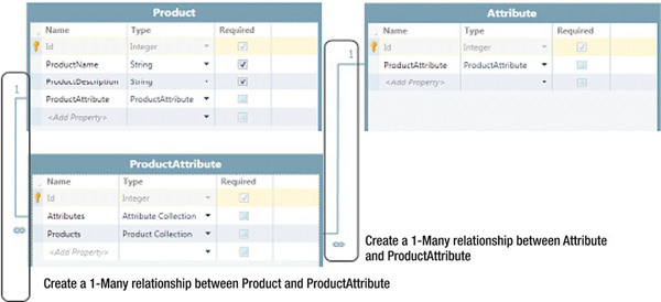
Figure 8-63. Structure of tables
After creating your tables, here are the steps you’ll need to carry out in the screen designer:
- Create a screen based on the product entity, using the new data screen template. In the additional data to include section, make sure the
ProductDescriptionandProductAttributecheck boxes are selected- You’ll need to add a query that returns all attributes. This allows the user to select an attribute and assign it to the product. Click the Add Data Item button and add a query that returns
Attributes (All).- By default, LightSwitch creates a rows layout that contains a
ProductAttributedata grid. Delete this and create a new group. Change it to a columns layout and call itColumnGroup.- Add a new rows layout beneath
ColumnGroup. Add the Attributes collection that you created in step 2 and change the control to a list.- Add another rows layout beneath
ColumnGroupand call itButtonGroup. Add two more row layouts beneathButtonGroupand name themButton1andButton2.- Right-click the
Button1group and choose the option to create a new button calledAddAttribute. You won't find an option to add a new button using the Add drop-down box, so you'll need to use the right-click option.- Right-click the
Button2group and choose the option to create a new button calledRemoveAttribute.- Add another rows layout beneath
ColumnGroupand call itProductAttributeGroup. Add theProductAttributecollection to this group and change the control to a list. By default, a summary control is shown beneath the data list, so change this to a rows layout. Delete the Products summary control so that only the Attributes summary control is shown.- Figure 8-64 shows how your screen looks after carrying out the above steps.
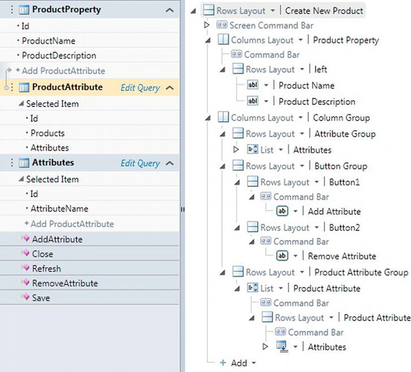
Figure 8-64. Screen layout of many-to-many screen
You’ll now need to add the code that adds and removes attributes from a product. This is shown in Listing 8-22.
Listing 8-22. Code to Add/Remove product attributes
VB:


File: OfficeCentralClientUserCodeProductAttributes.vb


Private Sub AddAttribute_Execute()

    ' Write your code here.
    If (Attributes.SelectedItem IsNot Nothing) Then

        Dim prodAtt As ProductAttribute = ProductAttribute.AddNew()

        prodAtt.Products = Me.ProductProperty

        prodAtt.Attributes = Attributes.SelectedItem

    End If

End Sub


Private Sub RemoveAttribute_Execute()

    ProductAttribute.DeleteSelected()

End Sub


C#:


File: OfficeCentralClientUserCodeProductAttributes.cs


partial void AddAttribute_Execute()

{

    if (Attributes.SelectedItem != null) {

        ProductAttribute prodAtt = ProductAttribute.AddNew();

        prodAtt.Products = this.ProductProperty;

        prodAtt.Attributes = Attributes.SelectedItem;

    }

}


partial void RemoveAttribute_Execute()

{

     ProductAttribute.DeleteSelected();

}
This completes the design of our screen. Figure 8-65 shows how this screen looks when you run your application.
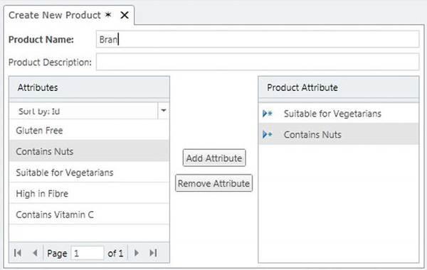
Figure 8-65. Many-to-many list picker
Creating a Multiselect Data Grid
One of the limitations of the built-in data is that you can’t select multiple records.
To illustrate the use of a multiselect data grid, we’ll create a screen that displays orders. We’ll set up the data grid so that multiple orders can be selected. We’ll then create a button that allows the user to set the order status to shipped on the records that are selected.
To begin, you’ll need to add a reference to the System.Windows.Controls.Data assembly. To do this:
- Switch your project to File view.
- Right-click the client project.
- Choose the Add Reference option and select
System.Windows.Controls.Datafrom the .NET tab.Now return to Logical view and carry out the following tasks:
- Create an editable grid screen based on the Order entity. We’ve called our screen
UpdateOrders.- Click the Add Data Item button and add a new method called
UpdateSelectedRecords.- Create a button by dragging the
UpdateSelectedRecordsmethod from the Screen Member list to the screen command bar node.- Add the code as shown in Listing 8-23. In the Created method, we use the
FindControlmethod to return a reference to the data grid. By default, this is calledgrid, so you might need to change this line of code if you’ve named your data grid differently.
Listing 8-23. Opening the product screen to add a new record
VB:


File: OfficeCentralClientUserCodeUpdateOrders.vb


Imports System.Windows.Controls


Private WithEvents _datagridControl As DataGrid = Nothing


Private Sub UpdateOrders_Created()


    'Replace grid with the name of your data grid control

    AddHandler Me.FindControl("grid").ControlAvailable,

        Sub(send As Object, e As ControlAvailableEventArgs)


            _datagridControl = TryCast(e.Control, DataGrid)

            _datagridControl.SelectionMode =

                DataGridSelectionMode.Extended


        End Sub


End Sub


Private Sub UpdateStatuses_Execute()


    ' this query returns an OrderStatus entity

    ' in our data model, status id 3 means shipped


    Dim shippedStatus =

        DataWorkspace.ApplicationData.OrderStatusSet.Where(

            Function(item) item.OrderStatusID = 3).FirstOrDefault()


    For Each ord As Order In _datagridControl.SelectedItems

        ord.OrderStatus = shippedStatus

    Next


End Sub


C#:


File: OfficeCentralClientUserCodeUpdateOrders.cs


using System.Windows.Controls;


private DataGrid _datagridControl = null;


partial void UpdateOrders_Created()
{

    //Replace grid with the name of your data grid control

    this.FindControl("grid").ControlAvailable +=

        (object sender, ControlAvailableEventArgs e) =>

        {

             _datagridControl = ((DataGrid)e.Control);

             _datagridControl.SelectionMode =

                DataGridSelectionMode.Extended;

        };

}


partial void UpdateStatuses_Execute()

{

    // this query returns an OrderStatus entity

    // in our data model, status id 3 means shipped


    var shippedStatus =

        DataWorkspace.ApplicationData.OrderStatusSet.Where(

           item => item.OrderStatusID == 3).FirstOrDefault();


    foreach (Order ord in _datagridControl.SelectedItems)

    {

        ord.OrderStatus = shippedStatus;

    }

}
In the Created method of the screen, we’ve added an event handler that handles the ControlAvailable event of the data grid. In the ControlAvailable method, we simply set the SelectionMode of the data grid to Extended.
The UpdateSelectedRecords method loops through the selected items on the grid and sets the OrderStatus as appropriate. To demonstrate the principle, we’ve hard coded the order status ID but in practice, it might be wise to avoid such magic numbers by using a constant.
When you run this screen, you’ll be able to select multiple rows by using the Ctrl key. In Figure 8-66, notice how three rows have been selected in the grid. Clicking the update button updates all of the rows that have been selected.
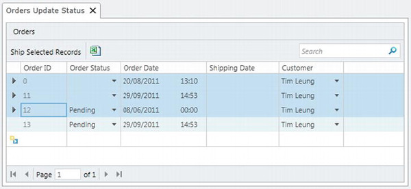
Figure 8-66. Multiselect screen at runtime
Working with Files
The LightSwitch table designer allows you to define properties with a data type of binary. By using this data type, you can create applications that allow users to store and retrieve files. However, LightSwitch doesn’t include a built in control for uploading and downloading files. Instead, you’ll need to write your own code that uses the Silverlight file open dialog and save file dialog boxes.
In this section, we’ll show you how to use these Silverlight file dialogs. We’ll use a ProductDocument table as an example. This allows the user to upload and retrieve documents that relate to a product. Example documents might be product fact sheets in Word or Excel format. Figure 8-67 shows the schema of the ProductDocument table.
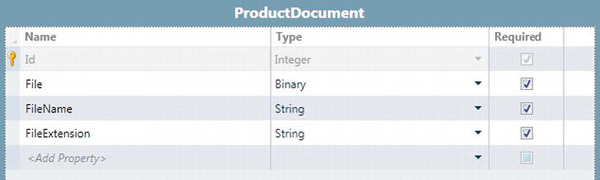
Figure 8-67. ProductDocument table schema
We’ll now show you what you’ll need to do to upload and retrieve a file.
The Silverlight file dialogs will only work in desktop applications—they won’t work in browser applications. If you attempt to use these file dialogs in a browser application, you’ll receive the error Dialogs must be user-initiated.
You’ll see this error message in a browser application when you attach the file open dialog code to a button. This message doesn’t make much sense, particularly given that a button click can only be user initiated.
The reason LightSwitch reports this error message is because it invokes all button logic asynchronously. Because of this, Silverlight doesn’t consider the code you’ve written to be user initiated.
If you really need to use the Silverlight file dialogs in a browser application, a work around is to write your own custom control. You can then wrap the file dialog operations inside your custom control.
How to Upload a File
To upload a file, create a new data screen based on the ProductDocument table. Now carry out the following steps in the screen designer:
- Click the Add Data Item button and add a new method called
UploadFileToDatabase.- The
UploadFileToDatabasemethod now appears in the Screen Members list. Create a button by dragging it onto the Screen Content Tree.- Now add the code as shown in Listing 8-24.
Listing 8-24. Uploading a file
VB:


File: OfficeCentralClientUserCodeProductDocumentDetails.vb


Imports System.Windows.Controls

Imports Microsoft.LightSwitch.Threading


Private Sub UploadFileToDatabase_Execute()


   Dispatchers.Main.Invoke( Sub()


      Dim openDialog As New Controls.OpenFileDialog

      openDialog.Filter = "All files|*.*"


      'Use this syntax to only allow Word/Excel files

      'openDialog.Filter = "Word Files|*.doc|Excel Files |*.xls"


      If openDialog.ShowDialog = True Then

         Using fileData As System.IO.FileStream =

             openDialog.File.OpenRead


            Dim fileLen As Long = filedata.Length


            If (fileLen > 0) Then

               Dim fileBArray(fileLen - 1) As Byte

               filedata.Read(fileBArray, 0, fileLen)

               filedata.Close()


               Me.ProductDocumentProperty.File = fileBArray
               Me.ProductDocumentProperty.FileExtension =

                 openDialog.File.Extension.ToString()

               Me.ProductDocumentProperty.FileName =

                 openDialog.File.Name


            End If


         End Using

      End If


   End Sub)

End Sub


C#:


File: OfficeCentralClientUserCodeProductDocumentDetails.cs


using System.Windows.Controls;

using Microsoft.LightSwitch.Threading;


partial void UploadFileToDatabase_Execute()

{


    Dispatchers.Main.Invoke(() =>

    {

        OpenFileDialog openDialog = new OpenFileDialog();

        openDialog.Filter = "Supported files|*.*";

        //Use this syntax to only allow Word/Excel files

        //openDialog.Filter = "Word Files|*.doc|Excel Files |*.xls";


        if (openDialog.ShowDialog() == true)

        {

            using (System.IO.FileStream fileData =

                openDialog.File.OpenRead())

            {

                int fileLen = (int)fileData.Length;


                if ((fileLen > 0))

                {

                    byte[] fileBArray = new byte[fileLen];

                    fileData.Read(fileBArray, 0, fileLen);

                    fileData.Close();


                    this.ProductDocumentProperty.File = fileBArray;

                    this.ProductDocumentProperty.FileExtension =

                        openDialog.File.Extension.ToString();

                    this.ProductDocumentProperty.FileName = openDialog.File.Name;

                 }

              }

          }
    });

}
Whenever you use the Silverlight file open or file save dialogs, the code that invokes the dialogs must be executed on the main UI thread. If you don’t invoke the dialog on the main UI thread, you’ll receive the error message This operation can only occur on the UI Thread.
The first line of code in the UploadFileToDatabase invokes the remaining code on the main dispatcher (UI thread). The file open dialog allows the user to choose a file. The file data are then read into a byte array using a FileStream object. Finally, the ProductDocumentProperty property is set to the byte array. We’ve also saved the file name and file extension of the uploaded document in the same section of code.
The file open dialog also allows you to restrict the files the user can select. You’d use the Filter property to do this. In our example, we’ve allowed all files to be selected by using the *.* filter.
The commented out line of code shows the syntax you would use if you only want to allow the user to select Word and Excel files.
How to Download a File
After uploading a file, you’ll need some way of downloading the file that was uploaded. We’ll now show you how to retrieve a file and save it locally using the file save dialog.
To demonstrate this feature, we’ll create a screen based on the Details Screen template. Once again, we’ll use the ProductDocument table as the data source. In the screen designer, you’ll now need to carry out the following steps:
- Click the Add Data Item button and add a new method called
SaveFileFromDatabase.- The
SaveFileFromDatabasemethod now appears in the Screen Members list. Create a button by dragging this onto your content tree.- Now write the code as shown in Listing 8-25.
Listing 8-25. Downloading a file
VB:


File: OfficeCentralClientUserCodeProductDocumentDetails.vb


Imports System.Windows.Controls

Imports Microsoft.LightSwitch.Threading


Private Sub SaveFileFromDatabase_Execute()


    Dispatchers.Main.Invoke( Sub()


        'Replace ProductDocument with the name of your entity

        Dim ms As System.IO.MemoryStream = New

            System.IO.MemoryStream(ProductDocument.File)


        Dispatchers.Main.Invoke(Sub()

            Dim saveDialog As New Controls.SaveFileDialog
            If saveDialog.ShowDialog = True Then

               Using fileStream As Stream = saveDialog.OpenFile

                  ms.WriteTo(fileStream)

               End Using

            End If

        End Sub)

    End Sub)

End Sub


C#:


File: OfficeCentralClientUserCodeProductDocumentDetails.cs


using System.Windows.Controls ;

using Microsoft.LightSwitch.Threading;


partial void SaveFileFromDatabase_Execute()

{

    Dispatchers.Main.Invoke(() =>

    {

        //Replace ProductDocument with the name of your entity

        System.IO.MemoryStream ms = new System.IO.MemoryStream(ProductDocument.File );


        Dispatchers.Main.Invoke(() =>

        {

            SaveFileDialog saveDialog = new SaveFileDialog();


            if (saveDialog.ShowDialog() == true)

            {

                using (Stream fileStream = saveDialog.OpenFile())

                {

                    ms.WriteTo(fileStream);

                }


            }


        });

    });


}
Just as before, the code needs to be invoked on the main UI thread for the save file dialog to work.
After the user selects the desired file location, a MemoryStream object is used to write the data into the file.
Opening Files in Their Application
Instead of saving the file using the save file dialog, you can choose to download the file and open it using the default application.
Once again, we’ll use the ProductDocument table as an example. Let’s imagine that a user has uploaded a Word document. In this example, we’ll create a button on a LightSwitch screen that starts Microsoft Word and opens the document. Once again, this example will only work in a desktop application.
The process we’ll carry out is as follows:
- Save the file to an interim file location.
- Use the shell execute method to start up Word and open the file that was saved above.
The first part of the process saves the file into a temporary location. There are some important points to consider when saving files using LightSwitch. The security restrictions applied by Silverlight mean that you can’t save files wherever you want. The limitations that are applied depend on the method you’ve chosen to save your file. These are described in Table 8-23.
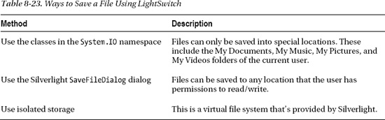
If you want to save a file to a temporary location without any user intervention, there are two options you can choose from. You can create the file in My Documents, or you can create the file in isolated storage.
Isolated storage is a virtual file system that’s provided by Silverlight. The isolated storage location is a hidden folder that exists on the end user’s machine. This makes it an ideal place to save temporary files.
However, the disadvantage of using isolated storage is that Silverlight imposes a default storage quota, and quotas can be additionally set by administrators. Therefore, there’s no guarantee there’ll be space for you to save your file.
In our example, we’ve chosen to save our temporary file in the My Documents folder. To run this example, you’ll need to carry out the following steps:
- Click the Add Data Item button and add a new method called
OpenFileFromDatabase.- The
OpenFileFromDatabasemethod now appears in the Screen Members list. Create a button by dragging this onto your content tree.- Now write the code as shown in Listing 8-26.
Listing 8-26. Opening files in their applications
VB:


File: OfficeCentralClientUserCodeProductDocumentDetails.vb
Imports System.Windows.Controls

Imports Microsoft.LightSwitch.Threading

Imports System.Runtime.InteropServices.Automation


Private Sub OpenFileFromDatabase_Execute()


    Try

        If (AutomationFactory.IsAvailable) Then

            'here's where we'll save the file

            Dim fullFilePath As String =

                System.IO.Path.Combine(

                    Environment.GetFolderPath(

                        Environment.SpecialFolder.MyDocuments),

                            ProductDocument.FileName)


            'replace ProductDocument with the name of your file property

            Dim fileData As Byte() = ProductDocument.File.ToArray()


            If (fileData IsNot Nothing) Then

                Using fs As New FileStream(

                       fullFilePath, FileMode.OpenOrCreate, FileAccess.Write)

                    fs.Write(fileData, 0, fileData.Length)

                    fs.Close()

                End Using

            End If


            Dim shell = AutomationFactory.CreateObject("Shell.Application")

            shell.ShellExecute(fullFilePath)


        End If

    Catch ex As Exception

        Me.ShowMessageBox(ex.ToString())

    End Try


End Sub


C#:


File: OfficeCentralClientUserCodeProductDocumentDetails.cs


using System.Runtime.InteropServices.Automation;


partial void OpenFileFromDatabase_Execute()

{


    try

    {

        if ((AutomationFactory.IsAvailable))

        {

            //this is where we'll save the file
            string fullFilePath = System.IO.Path.Combine(

                Environment.GetFolderPath(Environment.SpecialFolder.MyDocuments),

                ProductDocument.FileName);


            //replace ProductDocument with the name of your file property

                    byte[] fileData = ProductDocument.File.ToArray();


            if ((fileData != null))

            {

                using (FileStream fs =

                    new FileStream(fullFilePath, FileMode.OpenOrCreate, FileAccess.Write))

                {

                    fs.Write(fileData, 0, fileData.Length);

                    fs.Close();

                }

            }


            dynamic shell = AutomationFactory.CreateObject("Shell.Application");

            shell.ShellExecute(fullFilePath );

        }


    }

    catch (Exception ex)

    {

        this.ShowMessageBox(ex.ToString());

    }


}
When you run your screen, you’ll be able to open your document in the associated application by clicking the button you’ve assigned to the SaveFileFromDatabase method.
Summary
In this chapter, we’ve covered the following topics that relate to screen design:
- How to create screens and how to use the screen designer.
- How to write screen code.
- How to use the Modal Window and
AutoCompleteBoxcontrols.- Examples of common screens.
- Techniques to upload and download files.
When you create a screen, you can use one of the five built-in template types. If you want to create an empty screen that’s not based on any data, select a template type other than details screen and choose None using the screen data drop-down.
The Add Data Item dialog allows you to add local properties, queries, and methods. Local properties are particularly important because these are needed in order to add UI controls to your screen. For example, you can’t just add a text box or label onto a LightSwitch screen. Any LightSwitch control that appears on a screen must be backed by a property or entity.
Local properties are also important because they can be made into screen parameters using the properties window. This allows you to pass in values when you open a screen in code.
The Screen Members list is the section that appears in the left-hand side of the screen designer. If your screen uses a query, it’ll appear in this section. If there are any parameters defined in your query, they’ll appear in the Screen Members list in a group beneath the query. You can use the Properties pane to set the value of any query parameters.
LightSwitch raises events that you can handle in code. To write code, you’d click the Write Code button that you’ll find in the Screen Designer Command bar. This opens a drop-down that displays a list of events you can handle. If you want to handle an event that belongs to a collection (e.g., the SelectionChanged event), you have to make sure the collection is selected in the Screen Member list. If you don’t do this, the collection events won’t show up in the Write Code drop-down.
You can use the FindControl method to return an IContentItemProxy object for a control on your screen. This represents LightSwitch’s view model for the control, and you can use this to set the visibility or enabled state of a control.
After finding a control, you can create an event handler that handles the ControlAvailable event. This event will allow you to reference the underlying Silverlight control.
To make your UI react to changes in data, you can handle the events that are raised by the Silverlight controls or you can handle the PropertyChanged event of the entity you’ve used.
In the final part of this chapter, we’ve described how to use the AutoCompleteBox and Modal Window controls. We demonstrated how to create various screens including a home screen, custom search screen, and combined add/edit screen. We’ve also shown techniques for entering data based on many-to-many relationships and have shown you a technique that allows users to select multiple records in a data grid.
Finally, you’ve learned how to upload and download files. You’ve also seen how you can create a method that opens a file using its associated application.