
CHAPTER 3
The Rapid Risk Audit: Starting With a Simple Quantitative Risk Model
Build a little. Test a little. Learn a lot.
—Rear Admiral Wayne Meyer, Aegis Weapon System Program Manager
Since the publication of the first edition of this book, the authors have had the opportunity to consult with many dozens of CISOs and their security teams. While they often wanted detailed quantitative risk assessments for a complex organization, some just want to get started in the simplest way possible. Simple is the objective of this chapter.
In this chapter we will propose some first steps toward building a quantitative risk assessment, which shouldn't be much more complicated than qualitative risk registers or risk matrices. We've cut about as many corners as we could while still introducing some basic quantitative risk assessment concepts.
The first model we will describe in this chapter produces just a single monetary amount representing the average of possible losses. The next slightly more elaborate version we will describe introduces the Monte Carlo simulation—a powerful risk analysis tool. Instead of producing a single number, it can show a distribution of possible losses and their probabilities. Both of these tools and many others in this book require only an Excel spreadsheet. Excel templates for the examples explained in this chapter are already made for you and can be downloaded from this book's website:
Later, we will explore more detailed models (starting in Chapter 6) and more advanced statistical methods (starting in Chapter 8). But for now, we will start with a model that merely replaces the common risk matrix. It will simply be a way to capture subjective estimates of likelihood and impact but do so with unambiguous quantities.
The Setup and Terminology
Imagine it's your first day on the job as the new CISO of some mid‐sized organization. It has grown large enough to warrant establishing a security organization. You're the first hire. You have no staff. You have no budget. To build and fund a plan you need a rapid method of assessing your enterprise's cyber risk.
This is what the “Rapid Risk Audit” was made for. Its goal is to quickly assess significant risks that can be readily assessed. It could be the first step for the new CISO, with deeper technical and quantitative assessments to follow.
A rapid risk audit could take an hour or two to complete if you keep it simple. It will consist of some interviews and your job is to take the results of the interviews to create rough loss forecasts. Let's review some basic terminology you will use in the audit and then provide a list of steps for completing the audit.
There are six key terms used in this interview. Ultimately, they provide the backbone for the quantification of risk in support of security budgets, cyber insurance policies, and board reporting:
- Assets create value that threats may compromise—leading to financial impact. A whole enterprise can be an asset. A business unit or region can be an asset. Even an application or service can be an asset.
- Threats compromise the value of assets. Threats can be things such as extortion from ransomware, fraud from business email compromise, or disruption due to attacks on a vendor. From an enterprise risk perspective it can be anything that plausibly and materially impacts the business from meeting its goals. This term is sometimes defined differently in cybersecurity—for example, it may refer to specific categories of actors or even specific viruses. But we will use it to be synonymous with a “peril” as it is used in insurance. Here, we will define a threat as a combination of some cause or attack vector combined with a specific loss. A “threat event” is an instance of one of those losses occurring due to the stated cause. Table 3.1 shows a list of proposed basic threats you can use to get started. The same threats are provided in the Chapter 3 spreadsheets on the book's website.
- Likelihood measures the chance that a threat successfully compromises an asset's value leading to some amount of financial impact in a given period of time. Unless stated otherwise, our default likelihood will be the chance that the stated threat even will occur at least once in a 12‐month period. (Note that statisticians differentiate likelihood from probability, but the terminology is so ingrained in risk management that we'll just defer to the common usage.)
TABLE 3.1 List of Potential Cyber Threats for the Enterprise
(a spreadsheet with another version of this list is ready‐made at www.howtomeasureanything.com/cybersecurity)
Cause (Attack Vector) Type of Loss Ransomware Data breach Ransomware Business disruption Ransomware Extortion Business email compromise Fraud Cloud compromise Data breach Cloud compromise Business disruption SaaS compromise Data breach SaaS compromise Business disruption Insider threat Data breach Insider threat Business disruption Insider threat Fraud …and so on - Impact is the amount lost when a threat successfully compromises an asset's value. Impact is always eventually expressed in monetary terms. Even when impact involves reputation, quality, safety, or other nonfinancial damages, we express that pain in terms of equivalent dollar amounts. The authors have expressed all these forms of damage in monetary terms, and clients have always eventually accepted the practical necessity of it given that resources to reduce risks cost real money and decisions have to be made.
- Controls reduce the likelihood or impact of a threat event. It includes not just technologies such as multifactor authentication or encryption but also training and policy enforcement.
- Confidence Interval or Credible Interval (CI) represents your uncertainty about continuous quantities. In this model, we will use it for monetary impacts. Unless stated otherwise, we will always assume an interval is a 90% CI. This means we allow for a 5% chance the true loss could be below the lower bound and a 5% chance that the true loss is above the upper bound. We will also assume this is a “skewed” distribution of impacts. There is no chance the loss can be zero or negative but there is some small chance it could be far above our upper bound. Sometimes statisticians use the term “credible interval,” which refers to a subjective estimate of uncertainty to differentiate it from statistical inferences about a population. In probabilistic models, these are usually used in the same way, and since we will simply use the initials “CI,” we find no need to make any finer points about the distinction.
The Rapid Audit Steps
Like any audit, this rapid audit should follow a structured checklist. Again, we are keeping it very simple for now. Since you will probably rely on some other people for some of the inputs, we need to make it easy to explain. You can download a spreadsheet from the following website as an optional audit step. The math at this point is so simple you hardly need it worked out for you in a spreadsheet, but it should provide some structure. www.howtomeasureanything.com/cybersecurity.
- Identify your internal sources: These are the people you will interview to answer the following questions. The concepts will probably be a bit unfamiliar to them at first, so be patient and coach them through the process. You may need to rely on your own knowledge to estimate some items (e.g., likelihood of ransomware) but other questions need input from the business (e.g., the cost of business disruption). If they previously used a risk matrix, the same individuals who provided input for that may be the sources for this risk audit. If they prefer the existing list of risks they identified, you can skip the next two steps (define assets, define threats). Whether you use an existing list of risks or generate a new one, we call that a “one‐for‐one substitution” because each risk that would have been plotted on a risk matrix is converted to an equivalent quantitative model. If your risk matrix had 20 risks plotted on it, then you use those same 20 risks in the spreadsheet we provided, instead of defining a new set of threats for each asset, as we are about to do. But if you want to start with a clean slate, then follow the rest of the process below.
- Define your assets: The first issue your internal sources can address is how to classify assets. You can treat the entire enterprise as one big asset—which it is. Or you can break it up into a few separate parts, such as operational business units. This is an easy starting point for a rapid audit. You use the existing organizational chart as your guide. For a rapid risk audit, avoid a highly granular approach, such as listing every server. Keep it simple and limit it to no more than a dozen major business units. The methods and benefits of further decomposition will be addressed later in the book.
- Define your threats: A “starter” list of threats are provided in the spreadsheet (the same as Table 3.1) but you can change them or add more. There are a lot of possible ways to develop a taxonomy of threats, so the criteria you should use is what your sources feel makes sense to them. Again, if they have an existing risk register they prefer to use, then use that instead of a list they are unfamiliar with.
- Assess likelihoods: For each threat of each asset, assess the likelihood that the threat event will be experienced by that asset sometime within a one‐year period. If you have multiple assets and are using Table 3.1 for threats, you will repeat the process to estimate likelihoods for each threat/asset combination. For many analysts, this seems like the most challenging part of the process. Often, there will be at least some industry reports to use as a starting point. See a list of some sources later in this chapter. But if you feel you have nothing else to go on, just start with Laplace's rule of succession (LRS) based on your own experience, as described in the previous chapter. Remember, for the LRS just think of how many observations are in a “reference class” (your years of experience, other companies in a given year, etc.) and out of those observations how many “hits” (threat events of a given type) were observed.
- Assess impacts: For each of the threats for each asset, estimate a 90% CI for potential losses. This is a simple form of a “probability distribution,” which represents the likelihood of quantities. We will assume this distribution of potential losses is skewed (lopsided) in a way that is similar to a distribution commonly used to model losses. In this type of distribution, the average of all possible losses is not the middle of the range but closer to the lower bound. (This means that when we compute the mean loss in the next step, we don't just use the middle of the range.) For a primer on using subjective CIs, see the inset “Thinking about Ranges: The Elephant Example.”
- Compute Annual Expected Losses (AEL): We are going to compute the mean loss in this skewed distribution and multiply that value times the likelihood of the event. The spreadsheet you can download uses a more precise calculation for the mean of this skewed set of potential losses. But we can also just use the following simple equation:

See Table 3.2 for an example with computed AEL values.
- Add up all the AELs: When all asseet AELs are combined, you have an AEL for the entire organization.
- Use the output: The total AEL for the enterprise is itself informative. It provides a quick assessment of the scale of the problem. The AEL for each individual threat/asset combination also gives us a simple way to prioritize which risks are the biggest.
TABLE 3.2 Example of Rapid Risk Audit
Attack Vector | Loss Type | Annual Probability of Loss | 90% CI of Impact | Annual Expected Loss | |
|---|---|---|---|---|---|
| Lower Bound | Upper Bound | ||||
| Ransomware | Data breach | 0.1 | $50,000 | $500,000 | $20,750 |
| Ransomware | Business disruption | 0.05 | $100,000 | $10,000,000 | $178,250 |
| Ransomware | Extortion | 0.01 | $200,000 | $25,000,000 | $88,800 |
| Business email compromise | Fraud | 0.03 | $100,000 | $15,000,000 | $159,450 |
| Cloud compromise | Data breach | 0.05 | $250,000 | $30,000,000 | $533,125 |
| Etc. | Etc. | Etc. | Etc. | Etc. | Etc. |
Once you have completed this rapid risk audit, you have a total dollar amount that approximates the total probability‐weighted losses for all the listed threats. It gives you a sense of the real scale of your risks. The AEL for each risk also gives you some idea of which risks should be more concerning.
Again, this is not much more complicated than a risk matrix, which, according to our surveys, about half of organizations already use. We simply replaced each risk on a risk matrix, one for one. So how is any of this different from what many organizations do now?
Since we are still making some simple judgments about likelihoods and impacts, it may seem like we haven't changed much. After all, the reason we refer to our methods of replacing the risk matrix as a one‐for‐one substitution is because we can directly map the previous risks to the proposed model. However, even though the approach we described is very simple and may still be based mostly on subjective estimates, it introduces some basic quantitative principles the risk matrix excludes. The following table (Table 3.3) contrasts the two approaches.
TABLE 3.3 The Simple Substitutions of the Quantitative Model vs. the Risk Matrix
| Instead of: | We Substitute: |
|---|---|
| Rating likelihood on a scale of 1 to 5 or “low” to “high.” Example: “Likelihood of X is a 2” or “Likelihood of X is medium.” | Estimating the probability of the event occurring in a given period of time (e.g., 1 year). Example: “Event X has a 10% chance of occurring in the next 12 months.” For some items we can use industry data. If we feel stumped, we use LRS from Chapter 2 for guidance. |
| Rating impact on a scale of 1 to 5 or “low” to “high.” Example: “Impact of X is a 2” or “Impact of X is medium.” | Estimating a 90% CI for a monetized loss. Example: “If event X occurs, there is a 90% chance the loss will be between $1 million and $8 million.” |
| Plotting likelihood and impact scores on a risk matrix and further dividing the risk matrix into risk categories such as “low/medium/high” or “green/yellow/red” | Using the quantitative likelihood and impact to generate an annualized expected loss (AEL), and we can prioritize risks and controls. We can build on the AEL further when we use the same inputs in a very simple Monte Carlo simulation. |
In following chapters, we will describe in greater detail the problems that are introduced by the risk matrix and measurable improvements observed when using more quantitative methods, even if the quantitative assessments are subjective.
In the remainder of this chapter we will discuss the two sources of input for the initial estimates used in this simple model: actual data (from your own firm or the industry) and the judgments of your experts. We'll discuss both of these next. After that, we will cover how to use this simple model for decisions about controls and how to improve the output of the risk audit with simple simulations.
Some Initial Sources of Data
Recall a key point from the previous chapter; you have more data than you think. Using Laplace's rule of succession gives you some basis for interpreting what might seem like very limited observations. But you also have access to a wide variety of publicly available data. Here are just a few publicly available sources.
- Insurance premiums vs. total AEL: Insurance companies need to collect a lot of data on claims to price their policies competitively and still make a profit. This means that what they are willing to quote for cyber insurance tells us something about the likelihood and magnitude of potential losses. We can use this as a reality check on the total AELs in the rapid risk audit. Insurance companies generally hope to get a “claims payout ratio” of less than 60%. That's the amount of collected premiums paid out for claims. It excludes other business overhead, so it has to be a lot less than 100% to be profitable. However, actual losses experiences by clients could be higher than 60% because industry data indicates that about 20% of claims are denied. Claims paid out also exclude anything below the “retention” (i.e., the deductible the client is expected to cover on their own) and anything above the limit of the policy. So a rule of thumb would be that your insurer believes your real AEL will be something more than half your premium but no more than the whole premium assuming you have a small retention and large limit. If your AEL is far above or far below that range, you either have reason to believe your risks are different than what the insurer believes or you might reconsider likelihoods or CIs.
- Impact of ransomware extortion: Palo Alto Networks 2022 Unit 42 Ransomware Threat Report provides some basis for estimating extortion payments. The average payment for all of their cases was about $530,000. Demands ranged upward of $50 million, but $5 million is a more common upper bound, although such requests were met with relatively tiny payments. For your specific range, consider that extortion requests range from 0.7% to 5% of revenue. Actual payments are negotiated down to 0% to 90% of initial demands with most falling around 50%. So you might consider the upper bound of your CI to be closer to 2% or 3% of revenue.
- Impact‐data compromise: You should know something about the number of personal records maintained in various assets. That should give you an upper bound. This applies regardless of whether the compromise was due to an internal threat, or compromise of the cloud, a vendor, and so forth. The simplest way to convert that into a monetary loss is just to multiply the bounds for number of records lost times some fixed cost per record. The 2015 Verizon DBIR report recommended a cost of $0.58 per record. This particular “cost per record” metric was not updated in 2022 (although it could be adjusted for inflation), but there are more realistic methods. The 2022 report does give some indication of ranges of losses for various events where cost per record decreases with larger breaches. We don't recommend using sources that put the per record averages up in the multiple hundred per record. Such analysis isn't accounting for how the cost per records scale downward based on amount.
- Impact‐business disruption: This is an area where you should have data internal to your firm. Outages of specific systems are one part of cybersecurity risks where there are more immediate observations within the firm and some knowledge of their consequences. Someone in your firm should know something about orders taken per minute, service level agreements, and examples of lost business based on past outages. For small companies that can start at $100 a minute. For larger companies the average value is closer to $5,600 a minute although We have seen questionable research that puts it closer to an average of $9,000 a minute. These are just rough guesstimates with some stating that the cost of disruption is 50 times that of payment. This is why people pay ransoms: the need for availability far outweighs the current average cost of extortion.
If you want to dig deeper, there are other potential sources. These might be out of the scope of a rapid audit, but there are some sources that can give you some guidance if you are willing to spend some time and/or money on getting the estimates.
For example, many public sources estimate the total number of breaches in the industry, but if you want to turn that into a likelihood that a threat will damage your firm, you will need to estimate a baseline. If you are a major retailer, you will want to look up the number of breaches in that industry in a given year. Then, to convert that into a baseline likelihood, compare that to the total number of major retailers and apply LRS.
There are some sources that can do some work for you. Advisen LTD is a firm that tracks details on breaches. Firms like Cyentia Institute (which the authors have worked with) specialize in the analysis of this data. We will cover more of these sources in later chapters.
There is also new academic research coming out frequently about every risk. If you work for a large firm or have access to university resources, you may already have access to large databases of published research. Even without that, free sources such as Google Scholar can be useful. But this is a bit like prospecting for gold. You may have to search a while to find something that directly or indirectly informs what you need for estimating your firm's own risks.
The Expert as the Instrument
If you were using qualitative scoring methods or risk matrices before, you were relying on expert judgment. The rapid audit uses that, too. We only propose that instead of using scales such as “high, medium, low” or 1 to 5, experts learn how to subjectively assess the actual quantities behind those scales—that is, probability and dollar impact.
The method proposed is, like the risk matrix, really just another expression of your current state of uncertainty. It does not yet reflect a proper “measurement” in the sense that we have further reduced uncertainty based on additional observations. We are merely stating our prior uncertainty. But now we have expressed this level of uncertainty in a way that allows us to unambiguously communicate risk and update this uncertainty with new information.
Some may object to the idea of subjectively assessing probabilities. Some analysts who had no problem saying likelihood was a 4 on a scale of 1 to 5 or a medium on a verbal scale will argue that there are requirements for quantitative probabilities that make quantification infeasible. Somehow, the problems that were not an issue using more ambiguous methods are major roadblocks when attempting to state meaningful probabilities.
This is a common misunderstanding. As we first introduced in Chapter 2, it is a mathematically valid position to use a subjective probability to represent the prior state of uncertainty of a subject matter expert. In fact, there are problems in statistics that can only be solved by using a probabilistically expressed prior state of uncertainty, which may require a belief expressed in the form of a probability estimate. And these are actually the very situations most relevant to decision making in any field, including cybersecurity.
Later, we will discuss the sources supporting this approach, including some very large empirical studies demonstrating its validity. Additionally, we have a chapter dedicated to helping readers measure and improve their own skill at assessing probabilities using a short series of exercises that can help them continue to improve it over time. We call this “calibrated probability assessment,” and we will show that there is quite a bit of research backing up the validity of this approach. Most experts are consistently overconfident in estimates and calibration training reduces this error. We will also show methods for combining the estimates of multiple experts in a way that measurably outperforms the best individual expert.
For now, just recognize that most experts can be trained to subjectively assess probabilities and that this skill is objectively measurable (as ironic as that sounds). Remember, if the primary concern about using probabilistic methods is the lack of data, then you also lack the data to use nonquantitative methods. As we've stated, both methods are based on the same source of data so far—that is, the expert opinion of cybersecurity specialists. And we cannot assume that whatever errors you may be introducing to the decision by using quantitative probabilities without being trained are being avoided by using qualitative methods. In Chapter 5, we'll talk more about this among other common misconceptions and objections to quantitative methods.
In addition to correcting for overconfidence, the expert can also be improved by using methods that account for two other sources of error in judgment: the high degree of expert inconsistency and a tendency to make common inference errors when it comes to thinking probabilistically. These improvements will also be addressed in upcoming chapters. (Of course, these sources of error are not dealt with in the typical risk matrix at all.)
Supporting the Decision: Return on Controls
Ultimately, the point of risk analysis—even with the risk matrix we are replacing—is to support decisions. But the difficulty we had before was making specific resource‐allocation choices for specific controls. What is it worth, after all, to move one high risk to a medium? Is it $5,000 or $5 million? Or what if we have a budget of $8 million for cybersecurity and 80 lows, 30 mediums, and 15 highs? And what if we can mitigate ten lows for the same money as one medium?
If you have observed (as the authors have) someone asking a question such as, “If we spent another million dollars, can we move this risk from a red to a yellow?” then you may have felt the dissatisfaction from popular qualitative approaches. Clearly the traditional risk matrix offers little guidance once the CISO actually has to make choices about allocating resources. You might think that you may as well do without these methods altogether. But, as we will show later, the CISO should definitely not assume they handle these decisions well using their expert intuition alone.
What the CISO needs is a “return on control” calculation. That is the monetized value of the reduction in expected losses divided by the cost of the control. If we look only at the benefits in a single year (and ignore other time‐value considerations), we can show this as:

The difference in the loss before and after the control is the “reduction in expected losses” in the simple formula above. If the reduction in expected losses was exactly as much as the cost, then this formula would say the return on control (ROC) was 0%. This would be the convention for other forms of investment. Suppose we had an AEL of $100,000 for a given threat and we had a control that we estimated would reduce the chance of that loss by half. That would be a reduction in expected losses of $50,000. If the control cost $10,000, then the ROC is 50,000/10,000 – 1, or 400%
A ROC might have a benefit if it simply reduces the impact and not the chance that a threat event would occur. Methods to detect and stop attacks before they do more damage or methods to quickly recover after a business disruption may not reduce the chance the event would occur in the first place but reduce its impact. This particular type of control might be referred to as a risk mitigation. Regardless of whether it reduces likelihood, impact, or both, the calculation for ROC is the same.
In this example, we assumed that you paid for a risk reduction for one year only. If the control is an investment meant to provide risk reductions over multiple years, then you would also have to identify over what period of time this expected reduction in losses would occur. If the control was just an ongoing expense that could be started and stopped at any time, then this simple formula could just be applied to a year's worth of benefits (loss reduction) and a year's worth of costs. If the control is a one‐time investment that could provide benefits over a longer period of time, then follow the financial conventions in your firm for capital investments. You will probably be required then to compute the benefits as a “present value” of a stream of investments at a given discount rate. Or you may be asked to produce an “internal rate of return.” We won't spend time on those methods here, but there are fairly simple financial calculations that can, again, be done entirely with simple functions in Excel.
A note of caution is needed if you plan on decomposing our simple range for impact further into more variables that go into computing impact. In the example we have shown so far, computing the expected losses is a very simple calculation. We can just multiply the computed mean of the distribution for the impact times the probability of the event occurring (the spreadsheet we provide on the website does this for you). But if we decompose impact into multiple components that need to be multiplied together (e.g., records breached times cost per record, duration of outage times number of people affected times cost per person per hour), then working with the averages no longer becomes a reasonable estimation. We effectively have to run a separate simulation on each row. But in our simplest model we can ignore that for now. As we make the model more advanced, we can add more detail. Later chapters will describe how you can evolve the model by adding elements that incrementally improve realism.
The calculations for ROC are also provided in the example Excel spreadsheet you can download from www.howtomeasureanything.com/cybersecurity.
You have just reviewed how to run a very simple rapid audit of cybersecurity risks. We left out a lot of detail about probabilistic methods, but it is enough to get by for the first day of being a CISO. Now, before you continue on from this chapter, let's show what a simple simulation can do with the ranges and probabilities you already collected.
Doing “Uncertainty Math”
Using ranges and probabilities to represent your uncertainty instead of unrealistically precise point values clearly has advantages. When you allow yourself to use ranges and probabilities, you don't really have to assume anything you don't know for a fact. But precise values have the advantage of being simple to add, subtract, multiply, and divide in a spreadsheet. If you knew each type of loss exactly, it would be easy to compute the total loss.
In the previous rapid audit method, we asked for intervals, but we still boiled them down to a single point. We could have two ranges with the same mean but where one is far wider than the other. We lost something about the uncertainty when we converted that 90% CI to a single number. If multiple separate events occur in one year, how do we add up the ranges so that we have an aggregated range for the total? We would like to be able to answer questions such as “Given all the threats, what is the chance that the total losses will exceed $20 million in a single year?” We can't answer that by adding up AELs. We need to do the math with the entire range of possibilities.
So how do we add, subtract, multiply, and divide in a spreadsheet when we have no exact values, only ranges? Fortunately, there is a practical, proven solution, and it can be performed on any modern personal computer—the Monte Carlo simulation method. A Monte Carlo simulation uses a computer to generate a large number of scenarios based on probabilities for inputs. For each scenario, a specific value would be randomly generated for each of the unknown variables. Then these specific values would go into a formula to compute an output for that single scenario. This process usually goes on for thousands of scenarios.
In the 1940s, some mathematicians and scientists started using such simulations of thousands of random trials to help solve certain very hard mathematical problems. Stanislaw Ulam, John von Neumann, and Nicholas Metropolis had developed a way to use this method on the rudimentary computers available at the time to help solve math problems related to the development of the first atomic bomb in the Manhattan Project. They found that randomly running a large number of trials was a way to work out the probabilities of various outcomes when a model has a number of highly uncertain inputs. At the suggestion of Metropolis, Ulam named this computer‐based method of generating random scenarios after Monte Carlo, a famous gambling hotspot, in honor of Ulam's uncle, a gambler.1 Now, with the advantage of greater computing power (easily billions of times greater than what was available on the Manhattan Project, by almost any measure), Monte Carlo simulations have been used to simulate models on power plants, supply chains, insurance, project risks, financial risks, and, yes, cybersecurity.
If you have no experience with Monte Carlo simulations, they're probably easier than you think. The authors and many of their staff routinely apply Monte Carlo simulations on a variety of practical business problems. We have seen that many people who initially were uncomfortable with the idea of using Monte Carlo simulations eventually became avid supporters after tinkering with the tools themselves.
Let's start with the same likelihoods and 90% CIs you already gathered for the initial rapid audit. You have a set of possible events that could occur in a given one‐year period. Each event has an assigned probability and, if it occurs, a range of possible losses. You may have some events that have a probability of 1% and perhaps some have a probability of more than 10%. In any given year it is possible that no significant loss event occurs, and it is also possible that several events occur. It is even possible that the same event could happen multiple times in the same year. There is a solution to that, but for now we will keep it simple and just model an event as an either/or outcome that happens no more than once per year. The risk matrix doesn't make this distinction anyway (and it misses quite a few other issues we will introduce later), so this will help keep the example closer to a one‐for‐one substitution.
Just like the previous example, we have all the tools we are about to describe already set up as templates in Excel on the website www.howtomeasureanything.com/cybersecurity.
As stated earlier, we offer this in Excel to make it more accessible. But we've also been asked to provide solutions in Python and R. There are also existing tools specifically for Monte Carlo simulations in cybersecurity. Those tools might allow you to gloss over the basics on Monte Carlo simulations in the remainder of this chapter. But for those who want to understand some basics regardless of the tool or would like to see how the Excel spreadsheets work, read on through the rest of this chapter.
Armed with this information and some of the more detailed content of upcoming chapters, you should be able to model your uncertainty and answer questions such as “What is the chance we will lose more than X next year due to a cyberattack?”
An Introduction to Generating Random Events and Impacts in Excel
The prepared spreadsheets on the book's website will have all of the following set up so that you don't have to get into the details of how to run a simulation for risk assessment. But if you want to eventually make more elaborate models on your own, this will be a useful primer.
Monte Carlo can involve thousands of randomly generated scenarios. This can be done in any programming language the reader is probably familiar with, and it can even be done in an Excel spreadsheet. First, let's generate one random scenario for a single threat. Let's start with whether the event occurred for a single risk in a single scenario. To simulate whether a particular event occurs, we can randomly generate a “1” if it occurs and a “0” if it does not occur, where the probability of a “1” is equal to the stated probability of the event. In Excel, we can write this as
For example, if the event probability per year is .15, then this equation would produce a “1” (meaning the event occurred) in 15% of the scenarios. In Excel, every time you recalculate this (press F9), you will see a different result. If you did this a thousand times, you would see the event occurs about 150 times. Note that this would be for each individual risk you are listing in your simulation. So if you have 100 risks each with different probabilities and you run 1,000 scenarios, this little formula would have been executed 100,000 times.
One note we'll mention early is that we are using the Excel “rand()” function here as a shorthand for any random number generator. There actually is a rand() function in Excel, and the above equation will work exactly as described. But wherever we mention rand(), our spreadsheets will actually be using a different method for generating a random number. See the inset “HDR PRNG” for more details. This is explained further in the spreadsheets.
Now, for the impact, we need to generate not just a “0” or “1” but a continuum of values. We can do this using one of Excel's “inverse probability functions.” Some probability functions in Excel will tell you the probability of a given result in a particular probability distribution. For example, normdist(x, mean, standard deviation, 1) will tell you the probability that a normal distribution with a given mean and standard deviation will produce a value of x or less. The inverse probability function, on the other hand, tells you the value of x given a probability. In Excel, the inverse probability function for a normal distribution is
(Note: Recent versions of Excel also use “norm.inv()” but “norminv()” will still work.) If you use the Excel rand() function (or HDR PRNG) in place of the probability term, this will produce a normally distributed random value with the stated mean and standard deviation. The standard deviation is a sort of measure of the width of a probability distribution, but it is not really a very intuitive quantity for an expert to estimate. It will be better if we just ask the expert for a 90% CI as described earlier. This can be used to compute the required parameters such as mean and standard deviation based on an upper bound (UB) and lower bound (LB) of describing a range of potential losses provided by the expert.
We are going to turn that range into a probability distribution of a particular type that we will use often: the “lognormal” distribution. When we determined how to weight the bounds to compute the expected value in the simple rapid audit at the beginning of this chapter, this was the type of distribution we were assuming.
The lognormal distribution is a variation of the more familiar, bell‐shaped normal distribution. It is just a normal distribution on the log of a value we want to simulate and it is a distribution that is usually a much better representation of reality. Figure 3.1 illustrates an example of this distribution compared to the normal distribution. Notice how the lognormal distribution is lopsided or “skewed,” unlike the normal distribution. The lognormal distribution can't generate a zero or negative amount, but it has a tail to the right that allows for the possibility of extremely large outcomes. This is why it is often a realistic representation of losses that may be shockingly high. A normal distribution wide enough to capture some extreme events could also produce illogical negative results on the other end of the scale (you can't have a negative number of records breached or a negative downtime for a system). This is why the lognormal is also used to model a variety of quantities that can't be negative but could possibly (but rarely) be very large.

FIGURE 3.1 The Lognormal versus Normal Distribution
To generate a lognormal distribution, the tool provided on the book's website uses the following formula in Excel:
where:
| standard deviation of ln(X) | = | (ln(UB) − ln(LB))/3.29 |
| mean of ln(X) | = | (ln(UB) + ln(LB))/2 |
So if we had a 90% CI for an impact of $100,000 to $8 million, then the mean and standard deviation we need to use for lognorm.inv (which is the mean and standard deviation of the log of the original distribution) would be:
To generate the loss for an event with a 5% chance of occurrence and an impact of $1 million to $9 million, we would write

Most of the time (95%), this function would produce a zero. And just 5% of the time it would generate a value with a 90% chance of falling between $1 million and $9 million. Note that since this is a 90% CI, there is a 5% chance of being below the lower bound (but above zero, since the log normal distribution can only produce positive values) and a 5% chance of being above the upper bound and sometimes well above. If the event occurs in the example above, there is a 1% chance the loss could exceed $14.2 million.
Here is one note of caution in using lognormal distributions. The extreme losses for a given 90% CI may be unrealistic when the upper bound is many times the lower bound. This can happen when the expert estimating the value makes the mistake of believing the upper bound represents a worst‐case extreme, which it is not. The upper bound of a 90% CI allows for a 5% chance the value is higher. Extreme outcomes are also sensitive to the lower bound. If the 90% CI is $10,000 to $1 million, then the upper bound is 100 times as much as the lower bound. In this case there is a 1% chance the loss will exceed 2.6 times the stated upper bound ($2.6 million). If the 90% CI was $1,000 to $10 million, then there is a 1% chance the loss could be more than 6.7 times the upper bound ($67 million). If that seems like too much, then reconsider the width of the range or simply truncate the generated value to some maximum. If we wanted to say that $10 million was the maximum loss, then we could use the Excel function =min(loss,$10000000) to take the lesser of the loss or $10 million. Appendix A has more distributions that will be more appropriate for certain kinds of problems. It provides the Excel formulas for them, along with a description of when different distributions are appropriate. Later, we will review some considerations for choosing distributions.
Adding Up the Risks
For a large number of events and impacts, we could make a table like Table 3.2 to simulate all of the losses for all of the events. Table 3.4 is like Table 3.2 but with an additional column on the right showing a single randomly generated result. An example is provided for download at www.howtomeasureanything.com/cybersecurity.
The value of interest in this particular trial shown in Table 3.4 is the total losses: $23,345,193. All you have to do now is run a few thousand more trials to see what the distribution of losses will be. Every time you recalculate this table you would see a different value come up in the total. (If you are an MS Office user on a PC, “recalculate” should be your F9 key.) If you could somehow record every result in a few thousand trials, then you have the output of a Monte Carlo simulation.
The easiest way to do this in Excel is with a “data table” in the “What‐If Analysis” tools. You can run as many trials as you like and show each individual result without you having to copy the result in Table 3.4 thousands of times. The data table lets the Excel user see what a series of answers would look like in a formula if you could change one input at a time. For example, you might have a very big spreadsheet for computing retirement income that includes current savings rates, market growth, and several other factors. You might want to see how the estimate of project duration changes if you modified your monthly savings from $100 to $5,000 in $100 increments. A data table would automatically show all of the results as if you manually changed that one input each time yourself and recorded the result. The spreadsheet you can download at www.howtomeasureanything.com/cybersecurity uses this method.
TABLE 3.4 The One‐for‐One Substitution with Random Scenarios
| Attack Vector | Loss Type | Annual Probability of Loss | 90% CI of Impact | Random Result (zero when the event did not occur) | |
|---|---|---|---|---|---|
| Lower Bound | Upper Bound | ||||
| Ransomware | Data breach | 0.05 | $100,000 | $10,000,000 | $8,456,193 |
| Ransomware | Business disruption | 0.01 | $200,000 | $25,000,000 | 0 |
| Ransomware | Extortion | 0.03 | $100,000 | $15,000,000 | 0 |
| Business email compromise | Fraud | 0.05 | $250,000 | $30,000,000 | 0 |
| Cloud compromise | Data breach | 0.1 | $200,000 | $2,000,000 | 0 |
| Etc. | Etc. | Etc. | Etc. | Etc. | Etc. |
| Total: | $23,345,193 | ||||
TABLE 3.5 The Excel Data Table Showing 10,000 Scenarios of Cybersecurity Losses
(From the example provided in www.howtomeasureanything.com/cybersecurity.)
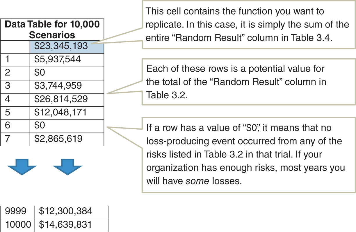
If you want to find out more about data tables in general, the help pages for Excel can take you through the basics, but we do make one modification in the example spreadsheet. Usually, you will need to enter either a “column input cell” or “row input cell” (we would just use “column input cell” in our example) to identify which value the data table will be repeatedly changing to produce different results. In this case, we don't really need to identify an input to change because we already have the rand() function that changes every time we recalculate. So our “input” values are just arbitrary numbers counting from 1 to the number of scenarios we want to run.
There is an important consideration for the number of trials when simulating cybersecurity events. We are often concerned with rare but high‐impact events. If an event likelihood is only 1% each year, then 10,000 trials will produce about 100 of these events most of the time, but this varies a bit. Out of this number of trials, it can vary randomly from an exact value of 100 (just as flipping a coin 100 times doesn't necessarily produce exactly 50 heads). In this case the result will be between 84 and 116 about 90% of the time.
Now, for each of these times the event occurs, we have to generate a loss. If that loss has a long tail, there may be a significant variation each time the Monte Carlo simulation is run. By “long tail,” what we mean is that it is not infeasible for the loss to be much more than the average loss. We could have, for example, a distribution for a loss where the most likely outcome is a $100,000 loss, but there is a 1% chance of a major loss ($50 million or more). The one‐percentile worst‐case scenario in a risk that has only a 1% chance per year of occurrence in the first place is a situation that would happen with a probability of 1/100 × 1/100, or 1 in 10,000, per year. Since 10,000 is our number of trials, we could run a simulation where this worst‐case event occurred one or more times in 10,000 trials, and we could run another 10,000 trials where it never occurred at all. This means that every time you ran a Monte Carlo simulation, you would see the average total loss jump around a bit.
The simplest solution to this problem for the Monte Carlo modeler who doesn't want to work too hard is to throw more trials at it. This simulation‐to‐simulation variation would shrink if we ran 100,000 trials or a million. You might be surprised at how little time this takes in Excel on a decently fast machine. We've run 100,000 trials in a few seconds using Excel, which doesn't sound like a major constraint. We have even run a million scenarios—in plain ol’ native Excel—of models with several large calculations in 15 minutes or less. As events get rarer and bigger, however, there are more efficient methods available than just greatly increasing the number of trials. But for now we will keep it simple and just throw cheap computing power at the problem.
Now we have a method of generating thousands of outcomes in a Monte Carlo simulation using native Excel—no add‐ins or Visual Basic code to run. Given that Excel is so widely used, it is almost certain any cybersecurity analyst has the tools to use this. We can then use this data for another important element of risk analysis—visualizing the risk quantitatively.
Visualizing Risk With a Loss Exceedance Curve
The risk matrix familiar to anyone in cybersecurity is widely used because it appears to serve as a simple illustration of likelihood and impact on one chart. In our proposed simple solution, we have simply replaced the likelihood scale with an explicit probability and the impact with a 90% CI representing a range of potential losses.
In our proposed solution, the vertical axis can still be represented by a single point—a probability as opposed to a score. But now the impact is represented by more than a single point. If we say that an event has a 5% chance of occurrence, we can't just say the impact will be exactly $10 million. There is really a 5% chance of losing something, while perhaps there is a 2% chance of losing more than $5 million, a 1% chance of losing more than $15 million, and so on.
This amount of information cannot be plotted with a single point on a risk matrix. Instead, we can represent this with a chart called a “loss exceedance curve,” or LEC. In the spirit of not reinventing the wheel (as risk managers in many industries have done many times), this is a concept also used in financial portfolio risk assessment, actuarial science, and what is known as “probabilistic risk assessment” in nuclear power and other areas of engineering. In these other fields, it is also variously referred to as a “probability of exceedance” or even “complementary cumulative probability function.” Figure 3.2 shows an example of an LEC.
Explaining the Elements of the Loss Exceedance Curve
Figure 3.2 shows the chance that a given amount would be lost in a given period of time (e.g., a year) due to a particular category of risks. This curve can be constructed entirely from the data generated in the previous data table example (Table 3.5). A risk curve could be constructed for a particular vulnerability, system, business unit, or enterprise. An LEC can show how a range of losses is possible (not just a point value) and that larger losses are less likely than smaller ones. In the example shown in Figure 3.2 (which, given the scale, would probably be enterprise‐level cybersecurity risks for a large organization), there is a 40% chance per year of losing $10 million or more. There is also about a 15% chance of losing $100 million or more. A logarithmic scale is used on the horizontal axis to better show a wider range of losses (but that is just a matter of preference—a linear scale can be used, too).

FIGURE 3.2 Example of a Loss Exceedance Curve
We can also create another variation of this chart by adding a couple of additional curves. Figure 3.3 shows three curves: inherent risk, residual risk, and risk tolerance. Inherent versus residual risk is a common distinction made in cybersecurity to represent risks before the application of proposed controls (i.e., methods of mitigating risks) and risks after the application of controls, respectively. Inherent risk, however, doesn't have to mean a complete lack of controls, since this is not a realistically viable alternative. Inherent risk might be defined instead as including only minimal required controls. Those are controls where it would be considered negligent to exclude them so there really is no dilemma about whether to include them. The differences between inherent and residual risks are only truly discretionary controls—the sorts of controls where it would be considered a reasonable option to exclude them. Examples of minimal controls may be password protection, firewalls, some required frequency of updating patches, and limiting certain types of access to administrators. The organization can make its own list of minimal controls. If a control is considered a required minimum, then there is no dilemma, and where there is no dilemma, there is no value to decision analysis. So it is helpful to focus our attention on controls where having them or not are both reasonable alternatives.
The LEC provides a simple and useful visual method for comparing a risk to our tolerance for risk. An LEC is compared to another curve, which represents what our management considers to be its maximum bearable appetite for risk. Like the LEC, the curve that represents our tolerance for risk is expressed unambiguously and quantitatively.
We will use the terms “risk appetite” and “risk tolerance” interchangeably. We should note that there is a large body of work in decision science that has some specific mathematical definitions for risk tolerance. Those slightly more advanced methods are very useful for making trade‐offs between risk and return. (Hubbard uses them routinely when he analyzes large, risky investments for clients.) But we will use this risk tolerance curve to express a kind of maximum bearable pain, regardless of potential benefits.
As Figure 3.3 shows, part of the inherent risk curve (shown in the thicker curve) is above the risk tolerance curve (shown as the dashed curve). The part of the inherent risk curve that is over the risk tolerance curve is said to “violate” or “break” the risk tolerance. The residual risk curve, on the other hand, is on or underneath the risk tolerance curve at all points. If this is the case, we say that the risk tolerance curve “stochastically dominates” the residual risk curve. This simply means that the residual risks are acceptable. We will talk about a simple process for defining a risk tolerance curve shortly, but first we will describe how to generate the other curves from the Monte Carlo simulation we just ran.
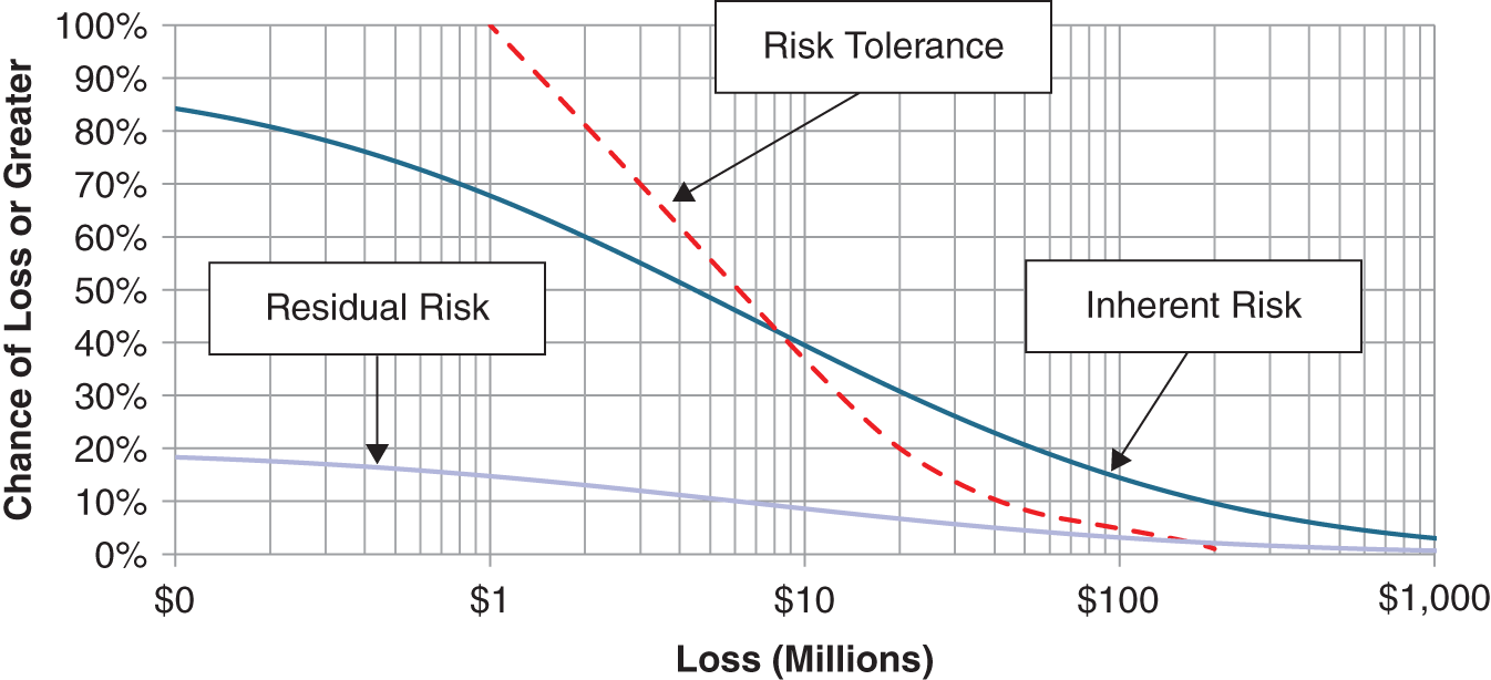
FIGURE 3.3 Inherent Risk, Residual Risk, and Risk Tolerance
Generating the Inherent and Residual Loss Exceedance Curves
Remember, as with the other methods used in this chapter, the downloadable spreadsheet at the previously mentioned website shows all the technical details. As Table 3.6 shows, the histogram has two columns, one showing a series of loss levels. These would be the values shown on the horizontal axis of an LEC. The second column shows the percentage of Monte Carlo results that generated something equal to or higher than the value in the first column. The simplest method involves using a “countif()” function in Excel. If we use “Monte Carlo Results” to stand for the second column of values in Table 3.5 and “Loss” to mean the cell in the spreadsheet in the loss column of the same row as the following formula, we get:
The countif() function does what it sounds like. It counts the number of values in a defined range that meet a stated condition. If countif() returns 8,840 for a given range and if “Loss” is equal to $2 million, then that means there are 8,840 values in the range greater than $2 million. Dividing by 10,000 is to turn the result into a value between 0 and 1 (0% and 100%) for the 10,000 trials in the Monte Carlo simulation. As this formula is applied to larger and larger values in the loss column, the percentage of values in the simulation that exceed that loss level will decrease.
Now, we simply create an XY scatterplot on these two columns in Excel. If you want to make it look just like the LEC that has been shown, you will want to use the version of the scatterplot that interpolates points with curves and without markers for the point. This is the version set up in the spreadsheet. More curves can be added simply by adding more columns of data. The residual risk curve, for example, is just the same procedure but based on your estimated probabilities and impacts (which would presumably be smaller) after your proposed additional controls are implemented.
TABLE 3.6 Histogram for a Loss Exceedance Curve
| Loss | Probability per Year of Loss or Greater |
|---|---|
| $ − | 99.9% |
| $500,000 | 98.8% |
| $1,000,000 | 95.8% |
| $1,500,000 | 92.6% |
| $2,000,000 | 88.4% |
| $2,500,000 | 83.4% |
| $3,000,000 | 77.5% |
| $24,000,000 | 3.0% |
| $24,500,000 | 2.7% |
One disadvantage of the LEC chart is that if multiple LECs are shown, it can get very busy‐looking. While in the typical risk matrix, each risk is shown as a single point (although an extremely unrealistic and ambiguous point), an LEC is a curve. This is why one organization that produced a chart with a large number of LECs called it a “spaghetti chart.” However, this complexity was easily managed just by having separate charts for different categories. Also, since the LECs can always be combined in a mathematically proper way, we can have aggregate LEC charts where each curve on that chart could be decomposed into multiple curves shown on a separate, detailed chart for that curve. This is another key advantage of using a tool such as an LEC for communicating risks. We provide a spreadsheet on the book's website to show how this is done.
Now, compare this to popular approaches in cybersecurity risk assessment. The typical low/medium/high approach lacks the specificity to say that “seven lows and two mediums are riskier than one high” or “nine lows add up to one medium,” but this can be done with LECs. Again, we need to point out that the high ambiguity of the low/medium/high method in no way saves the analyst from having to think about these things. With the risk matrix, the analyst is just forced to think about risks in a much more ambiguous way.
What we need to do is to create another table like Table 3.5 that is then rolled up into another Table 3.6, but where each value in the table is the total of several simulated categories of risks. Again, we have a downloadable spreadsheet for this at www.howtomeasureanything.com/cybersecurity. We can run another 10,000 trials on all the risks we want to add up, and we follow the LEC procedure for the total. You might think that we could just take separately generated tables like Table 3.6 and add up the number of values that fall within each bin to get an aggregated curve, but that would produce an incorrect answer unless risks are perfectly correlated (I'll skip over the details of why this is the case, but a little experimentation would prove it to you if you wanted to see the difference between the two procedures). Following this method we can see the risks of a system from several vulnerabilities, the risks of a business unit from several systems, and the risks across the enterprise for all business units.
Where Does the Risk Tolerance Curve Come From?
Ideally, the risk tolerance curve is gathered in a meeting with a level of management that is in a position to state, as a matter of policy, how much risk the organization is willing to accept. Hubbard has gathered risk tolerance curves of several types (LEC is one type of risk tolerance quantification) from many organizations, including multiple cybersecurity applications. The required meeting is usually done in about 90 minutes. It involves simply explaining the concept to management and then asking them to establish a few points on the curve. We also need to identify which risk tolerance curve we are capturing (e.g., the per‐year risk for an individual system, the per‐decade risk for the entire enterprise). But once we have laid the groundwork, we could simply start with one arbitrary point and ask the following:
| Analyst: | Would you accept a 10% chance, per year, of losing more than $5 million due to a cybersecurity risk? |
| Executive: | I prefer not to accept any risk. |
| Analyst: | Me too, but you accept risk right now in many areas. You could always spend more to reduce risks, but obviously there is a limit. |
| Executive: | True. I suppose I would be willing to accept a 10% chance per year of a $5 million loss or greater. |
| Analyst: | How about a 20% chance of losing more than $5 million in a year? |
| Executive: | That feels like pushing it. Let's stick with 10%. |
| Analyst: | Great, 10% then. Now, how much of a chance would you be willing to accept for a much larger loss, like $50 million or more? Would you say even 1%? |
| Executive: | I think I'm more risk averse than that. I might accept a 1% chance per year of accepting a loss of $25 million or more… |
And so on. After plotting three or four points, we can interpolate the rest and give it to the executive for final approval. It is not a technically difficult process, but it is important to know how to respond to some potential questions or objections. Some executives may point out that this exercise feels a little abstract. In that case, give them some real‐life examples from their firm or other firms of given losses and how often those happen.
Also, some may prefer to consider such a curve only for a given cybersecurity budget—as in, “That risk is acceptable depending on what it costs to avoid it.” This is also a reasonable concern. You could, if the executive was willing to spend more time, state more risk tolerance at different expenditure levels for risk avoidance. There are ways to capture risk‐return trade‐offs (see Hubbard's previous books, The Failure of Risk Management and How to Measure Anything, for details on this method). But most seem willing to consider the idea that there is still a maximum acceptable risk, and this is what we are attempting to capture.
It is also worth noting that the authors have had many opportunities to gather risk tolerance curves from upper management in organizations for problems in cybersecurity as well as other areas. If your concern is that upper management won't understand this, we can say we have not observed this—even when we've been told that management wouldn't understand it. In fact, upper management seems to understand having to determine which risks are acceptable at least as well as anyone in cybersecurity.
We will bring up concerns about adoption by management again in Chapter 5 when we discuss this and other illusory obstacles to adopting quantitative methods. In later chapters, we will also discuss other ways to think about risk tolerance.
Where to Go from Here
There are many models cybersecurity analysts could use to represent their current state of uncertainty. You could simply estimate likelihood and impact directly without further decomposition. You could develop a modeling method that determines how likelihood and impact are modified by specifying types of threat, the capabilities of threats, vulnerabilities, or the characteristics of systems. You can list applications and evaluate risk by application, or you can list controls and assess the risks that individual controls would address.
Ultimately, this book will be agnostic regarding which modeling strategy you use, but we will discuss how various modeling strategies should be evaluated. When enough information is available to justify the industry adopting a single, uniform modeling method, then it should do so. Until then, we should let different organizations adopt different modeling techniques while taking care to measure the relative performance of these methods.
To get started, there are some ready‐made solutions to decompose risks. In addition to the methods Hubbard uses, solutions include the methodology and tools used by the FAIR method, developed by Jack Jones and Jack Freund.3 In the authors’ opinion, FAIR, as another Monte Carlo–based solution with its own variation on how to decompose risks into further components, could be a step in the right direction for your firm. We can also build quite a lot on the simple tools we've already provided (and with more to come in later chapters). For readers who have had even basic programming, math, or finance courses, they may be able to add more detail without much trouble. So most readers will be able to extrapolate from this as much as they see fit. The website will also add a few more tools for parts of this, like R and Python for those who are interested. But since everything we are doing in this book can be handled entirely within Excel, any of these tools would be optional.
So far, this method is still only a very basic solution based on expert judgment—updating this initial model with data using statistical methods comes later. Still, even at this stage there are advantages of a method like this when compared to the risk matrix. It can capture more details about the knowledge of the cybersecurity expert, and it gives us access to much more powerful analytical tools. If we wanted, we could do any or all of the following:
- As we just mentioned, we could decompose impacts into separate estimates of different types of costs—legal, remediation, system outages, public relations costs, and so on. Each of those could be a function of known constraints such as the number of employees or business processes affected by a system outage or number of records on a system that could be compromised in a breach. This leverages knowledge the organization has about the details of its systems.
- We could make relationships among events. For example, the cybersecurity analyst may know that if event X happens, event Y becomes far more likely. Again, this leverages knowledge that would otherwise not be directly used in a less quantitative method.
- Where possible, some of these likelihoods and impacts can be inferred from known data using proper statistical methods. We know ways we can update the state of uncertainty described in this method with new data using mathematically sound methods.
- These results can be properly “added up” to create aggregate risks for whole sets of systems, business units, or companies.
We will introduce more about each of these improvements and others later in the book, but we have demonstrated what a simple rapid risk audit and one‐for‐one substitution would look like. Now we can turn our attention to evaluating alternative methods for assessing risk. Of all the methods we could have started with in this simple model and for all the methods we could add to it, how do we select the best for our purposes? Or, for that matter, how do we know it works at all?
Notes
- 1. Stanislaw Ulam, Adventures of a Mathematician (Berkeley: University of California Press, 1991).
- 2. D. W. Hubbard, “A Multi‐Dimensional, Counter‐Based Pseudo Random Number Generator as a Standard for Monte Carlo Simulations,” Proceedings of the 2019 Winter Simulation Conference.
- 3. Jack Freund and Jack Jones, Measuring and Managing Information Risk: A FAIR Approach (Waltham, MA: Butterworth‐Heinemann, 2014).