Chapter 11
Customizing SharePoint with Apps
IN THIS CHAPTER
 Understanding the concept of a SharePoint app
Adding apps to your site
Configuring a List app
Figuring out how apps fit in with the rest of SharePoint
The concept of an app is relatively new in SharePoint. An app in SharePoint is Microsoft’s attempt to help stem confusion because getting your head around lists and libraries is difficult, especially when you start customizing them. For example, say you start with a custom list and then add columns to make it specific to customers. Is it still just a custom list or is it a Customers list or what? Microsoft posed this question to a number of focus groups and found that people were more comfortable with the concept of an app than a list or library. The result is that every list and library is now called an app.
Apps don’t end at lists and libraries, though. Web developers can create apps that do all sorts of cool things. Because SharePoint is built using HTML standards, a web developer can take any web functionality and roll it into a SharePoint app. Third parties can put up their apps for sale on the online SharePoint App Store, which you access from within SharePoint.
In this chapter, you delve into apps. You find out how to add apps to your SharePoint site and how to configure apps. You find out that most apps are based on lists. And finally, you see how to configure these List-based apps.
Introducing SharePoint Apps
The concept of an app in general is nothing new. If you use a smartphone, you’re surely familiar with apps. Each type of smartphone has thousands and thousands of apps available. SharePoint has jumped on the app bandwagon and embraced the concept of an app. A SharePoint app can be simple or complex. For example, you might create an app by customizing the Custom List app. On the other hand, you might hire a web developer to build a complete accounting system as a SharePoint app.
 An app displays commands on the ribbon that provide additional configuration options. These commands are contextual because the commands that appear depend on the context of where you are in the site. For example, the Document Library app contains a Files tab and a Library tab in addition to the Browse tab.
Adding Apps to Your Site
When you create a new SharePoint site you choose a template. Depending on the template you choose, your site already has a number of apps by default. You can add more apps to your site, however. For example, you might want to add a Survey app to your site.
The SharePoint site you created in Chapter 1 uses the Team Site template.
You can add an app (for example, the Survey app) to your site by following these steps:
Click the Settings gear icon and choose Add an App.
The Your Apps page appears, showing all the apps you can add to your site. (See Figure 11-1.) There is a Noteworthy section at the top for the most common apps.
Scroll down and click the Survey app.
The Adding Survey dialog box appears.
Provide a name for your Survey app.
You can also click Advanced Options to set app specific options. In this case, you can choose to show usernames in the survey and also choose whether you want the Survey app to allow multiple responses.
Click Create to create the app and add it to your site.
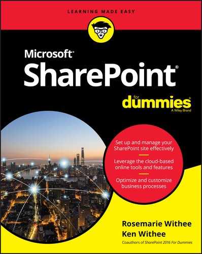
The Site Contents page is displayed, which shows all the apps on your site. Notice you now have a new Survey app with the title you provided in Step 3. Figure 11-2 shows the app on the Site Contents page.

FIGURE 11-1: Add a new app to your SharePoint team site.
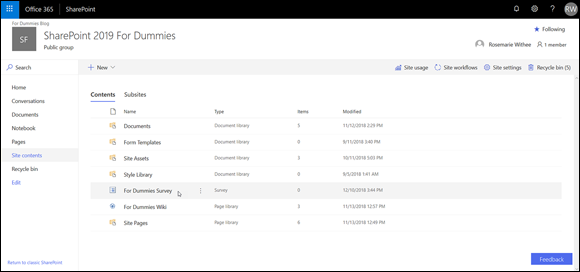
FIGURE 11-2: A Survey app on the Site Contents page.
You can access an app by clicking on it in the Site Contents page. If you click an app you just created, it will display on the screen.
Accessing App Settings
Most apps are based on a list or library. A list or library has a settings page where you can configure your app. To view or change the configuration settings of your Library app or List app, use the Library Settings page or the List Settings page. This page is the hub where you can find all the options for configuring and customizing your List or Library app to meet your business requirements.
Follow these steps to access the Library Settings or List Settings pages:
Navigate to your library app or list app by clicking the name of the library or list on the Site Contents page.
You can access the Site Contents page from the Settings gear icon.
Click the Gear icon (in the upper-right corner of the page) and select Library (or List) Settings, as shown in Figure 11-3.
The Library Settings page or the List Settings page appears. (You may have already accessed this page when completing the steps in other chapters in this book.)
The Library (or List) Settings page is divided into several sections. Each section contains many configuration choices, as shown in Figure 11-4. We suggest you spend some time browsing this page. Some of the sections you see include
List Information: Displays the library (or list) name, web address, and description.
You can change the list’s name and description by clicking the List Name, Description, and Navigation link in the General Settings column.
The web address is set to the list’s default view. Change the default view by scrolling down to the Views section of the Library (or List) Settings page.
When you link to a list or library, use the root of the web address. That way, you can change the default view any time you want without needing to change any links that target the list. For example, to create a link to the Shared Documents library, you would use the following:
http://intranet.portalintegrators.com/Shared Documents- General Settings: Includes list name and description as well as settings for Versioning, Advanced, Validation, Column Default Value, Rating, Audience Targeting, and Form. See Table 11-1 for a complete list of General Settings.
- Permissions and Management: Includes saving the library or list as a template as well as settings for Permissions, File Management, Workflow, Information Management Policy, and Enterprise Metadata and Keywords. You can also generate a file plan report from this section. (See Chapter 20 for more about security settings.)
- Communications: Configure RSS and incoming email settings for the library or list.
- Content Types: If you have configured your library or list to allow for content types, a Content Types section appears. Use this section to associate content types with your list or library. With content types, you can reuse columns across sites, as well as across lists and libraries. (See Chapter 13 for a more thorough discussion of content types.)
Columns: Create, view, add, and modify columns for the library or list.
You can create your own column for this list only, add a site column from the preconfigured SharePoint site columns, or create a new site column of your choosing that can be added to multiple lists.
- Views: Display and modify the library or list views. You can also create new views.

FIGURE 11-3: Select Library Settings to change your library’s configuration.

FIGURE 11-4: The Library Settings or List Settings page.
TABLE 11-1 General Settings Configuration Options
Setting Name |
What You Can Accomplish |
List Name, Description, and Navigation |
Just like it sounds! (See the section, “Changing the title, description, and navigation,” later in this chapter.) |
Versioning |
Configure item approval, versioning (major and minor), and require check-out. |
Advanced |
A plethora of options, including allowing for the management of content types, search visibility, allowing for folders, or datasheet view. |
Validation |
Allows you to create formulas that compare two or more columns in your library or list. |
Column Default Value |
Add or edit default values for columns indicated in the library or list Validation settings. |
Audience Targeting |
A Yes or No option that allows the library or list to use audience targeting. Enabling audience targeting creates a Targeting column for this list. Some Web Parts can use this data to filter list contents based on whether the user is in the audience. |
Rating |
A Yes or No option that allows items in the library or list to be rated. |
Form |
Available for lists only. You need InfoPath to utilize these settings. However, because Microsoft stopped shipping InfoPath in Office, your only option is to use an older version of InfoPath. Because InfoPath is on its way out, be prepared for this option to disappear in future versions of SharePoint. |
Many site owners never change the default settings options; some simply change the List name or delete the list. For others, this level of optional setting detail is what they want to know first! Microsoft supplies descriptions on the how and/or why to use the settings on each of the individual settings pages; however, this chapter may become one of the most dog-eared chapters in the book because there are so many options to remember!
Configuring the General Settings
The General Settings area of the Library or List app has recently been expanded to include multiple new settings, including Validation, Column Default Value (for libraries), Audience Targeting, Rating, and Form. See Table 11-1 for an overview to see what you can do with each of these options.
Changing the title, description, and navigation
The General Settings page is a simple, self-descriptive settings page. Most of these options are what you configure when you first create the Library or List app, including whether the app appears on the Quick Launch navigation.
 Changing the title does not change the web address (URL) of the app. If having the title match the URL is important, or less confusing to your team, consider re-creating a new app with the desired title and deleting the old one. Of course, this works better early in the process, before you upload documents or create apps!
If you already have many items in your app, you can copy documents from one Library app to another, or export an existing List app to Excel and re-import into a new one. However, this shouldn’t be taken lightly. Some column configuration settings, such as a Choice column, need to be re-created along with all the app settings we discuss in this chapter. If you’re unsure what you want to name an app when you create it, take some time to consider your terminology before creating the app.
Versioning settings
The Versioning Settings area contains some of the most sought-after settings in any app. Versioning settings cover most of the document management or content management choices. So your new document/content management mantra is approval, versioning, and check out. You can say it in your sleep. By default, Approval, Versioning, or Check Out Requirement settings are not turned on in a team site.
The reason versioning is turned off by default is that it takes up a large amount of space in the database. Each time a new version is created, the database grows. However, versioning is important for any real work, so we recommend you turn it on.
If you want to have these options enabled when your sites are configured, consider using a publishing site instead.
Before selecting these options, make sure you know the business processes of your team. If documents are thoroughly vetted and approved outside the SharePoint process, you may not want or need Approval settings or Check Out enforced. If your documents are images, you may or may not want to apply versioning if the versions don’t matter to you and you would not need to revert to an older version.
Consider using multiple Document Library apps and apply different settings based on need. For example, if you have 100 documents in a Library app and really only need versioning and approval on 5 of those documents, perhaps they can be placed in a Library app with extra configuration.
Versioning can be one of the most misunderstood features of SharePoint document management. Versioning is a helpful protection mechanism because you can revert to a previous version of the document if necessary. Versions in SharePoint are copies of the same document at different intervals during editing.
We suggest adding the Versions column to your views so that users can quickly see the version of the document. Otherwise, you end up with users appending versioning information to the document’s name or title, such as Employee Handbook v1.0, Employee Handbook v2.0, or my favorite, Client_Proposal_Final_v3.0_FINAL_KW-edited_RW-reviewed_FINAL-DO-NOT-REVISE_02-06-2019_ROSEMARIE-SIGNED-OFF-FINAL_FINAL.
Follow these steps to apply or modify Versioning settings:
Click the Versioning Settings link in the Library Settings or List Settings page.
The sections of the Versioning Settings page include Content Approval, Document Version History, Draft Item Security, and Require Check Out (Library apps only).
Next you need to choose whether you want to require content approval for submitted items. You make this selection by choosing the Yes or No radio button on the Versioning Settings page (accessed in Step 1).
If you selected Yes in answer to Require Content Approval for Submitted Items?, individuals with the Approve Items permissions can always see draft items.
Items that aren't approved yet (meaning they are draft versions) aren't visible to site members or visitors. You can designate who you want to view drafts in the Draft Item Security section. See Chapter 21 for details on content approval.
In the Document Version History section, select a radio button to indicate whether to use No Versioning, Create Major Versions, Create Major and Minor (Draft) Versions, or (optional) specify the Number of Versions to keep by entering a number.
The default for a List or Library app is No Versioning. You can select Major Versions (1.0, 2.0., 3.0, and so on) or Major and Minor Versions (1.0, 1.2., 1.3, 2.0, and so on). Selecting either of the last two options enables you to designate a limit for the number of versions of each type by entering a number up to 10,000.
Choose who can see draft items by selecting a Draft Item Security radio button in the Draft Item Security section.
This section is disabled unless you allow for minor (draft) versions or require content approval of your documents or list items. Here are the three options for who can see draft items — Any User Who Can Read Items, Only Users Who Can Edit Items, or Only Users Who Can Approve (and the Author).
Determine whether to require check out for users editing documents by selecting the Yes or No radio button.
Although it can sometimes be a hassle (We often forget we have checked out a document, sometimes months ago!), requiring check out is another good safety mechanism that makes sure the other users don’t see a document in mid-modification or have multiple users editing at the same time (last save wins).
Consider adding the Checked Out To column to your views so that users can quickly see who has an item checked out.Click OK.
After you click OK, your Versioning settings are applied. Go try them out!
When viewing documents in a Library app, you can click the ellipsis to see a contextual menu, as shown in Figure 11-5. This menu allows a document’s editor to check out/check in the document, approve, set off a workflow, and so forth. Because the menu is contextual, if approval isn’t set on the library or list, for example, Approve doesn’t appear on the menu. If a document is checked out, the option to Discard Check Out appears.

FIGURE 11-5: A document’s context menu.
In most cases, team members navigate to the site using a browser to work with list apps. However, think about how your team interacts with documents. They may be navigating to an app using the browser, but they may also be linking from a bookmark or opening the document directly from the editing application (such as Word, Excel, or PowerPoint). Although current versions of Office support and interact with SharePoint Library app settings, users may not know where to find these commands.
 Avoid frustration by taking a little time to review the settings and options with your team. Training on these document management options is one of my number one recommendations for SharePoint collaboration success, especially for teams with many members or contributors.
Advanced settings
Advanced settings include many powerful configuration options for Library and List apps:
- Content Types: Allows you to add and remove content types associated with the app. See Chapter 13 for details on creating your own content types.
Document Template (Library app only): Allows you to specify the default template, such as a Word, Excel, or PowerPoint template, that is used when someone clicks the New button to create a new document.
You can also associate document templates with content types, so you can use multiple content types with a library to associate multiple document templates. Sounds confusing, but in a nutshell, having multiple document types and templates enables you to have multiple options for creating a document when you click the New button. For example, you might have a Word template for expenses and a Word template for vacation requests. These can both show up in the New drop-down list (located in the ribbon on the Files tab) using content types.- Opening Documents in the Browser (Library app only): Enables you to determine the behavior of the browser when someone clicks on a document to open it. If you don’t want to use the Office Web apps, disable the opening of documents in the browser. This also allows users to send direct links to the documents if necessary.
- Custom Send to Destination (Library app only): This is a great option that lets you add your own web address to the Send To menu on a document’s Edit menu. Your SharePoint administrator can also add global addresses that appear in the Send To menu in every document library. The Send To command sends a copy of your file to another location, such as another team site where you want to share the document.
- Folders: Indicates whether users can create new folders in the Library app. We like to turn off this option so people don’t go folder crazy. You can always turn on the option so you can create folders when necessary and then turn it back off.
- Search: Specifies whether items in the app should appear in search results.
- Indexing: Options for indexing non-default views and re-indexing the document library. Indexing provides extra data for searches so that searching the library is faster. There is some overhead with indexing, though, so SharePoint makes available some options to control it.
- Offline Client Availability: Allows you to specify whether users of desktop client software, such as Outlook, can download content for offline viewing.
- Site Assets Library (Library app only): Allows you to designate the Library app as a Site Assets library, which makes it easier for users to browse to the Library app to find multimedia files.
- Quick Edit: Lets you specify whether Quick Edit can be used on this library. Quick Edit lets users open the view in a grid and make edits to metadata on the fly. This is much like editing the metadata (data about the documents in the library) on the fly in an Excel type interface.
- Dialogs: By default, list and library forms launch in a dialog box. This option lets you specify that forms should open in the browser window as a page instead of a dialog box.
In addition, List app advanced settings include item-level permissions and attachments.
Follow these steps to apply or modify Advanced settings:
Click the Advanced Settings link in the Library Settings or List Settings page.
The Advanced Settings page appears, as shown in Figure 11-6.
Choose whether to enable management of content types by selecting the Yes or No radio button.
If you select Yes, after applying, your Library Settings or List App Settings page will contain a new section for Content Types. The default is No.
Change the document template (Library app only) by specifying a template URL in the Template URL text box.
Library apps have a default template for new documents. Remember, you can create a new document in a Library app, as well as upload documents that have been created previously. For example, the document template for a Document Library app is the default Word template. You could change this to an Excel or PowerPoint template. You could also change it to a custom template you created in one of these applications.
If you’re working with content types, you can enable a different template for each document type. For example, your library may house contracts and have three content types for different contracts, all with a different template available on the New button.
If you opt for a different document template, upload the template to the Forms folder in Document Library app and change the Template URL in the Document Template section of the Advanced Settings page.Choose when to open documents in the browser (Library app only), the client application, or as the server default by selecting a radio button in the Opening Documents in the Browser section.
If the client application is unavailable, the document opens in the browser.
Add a Custom Send to Destination (Library app only) by entering the name that should display on the Send To menu and the URL destination.
Similar to Windows commands (for example, Send to Desktop), you can create an option to appear on the Edit menu for documents in this Library app to be sent to another SharePoint destination. Supply a short name to appear on the contextual menu and a URL for the destination in the Destination Name and URL text boxes.
Select whether folders can be created in this app by selecting the Yes or No radio button in the Folders section.
Selecting Yes or No determines whether the New Folder command is available on the New menu. The default is Yes.
We usually disable folders unless we have a good reason to use them. In our opinion, the only good reason to use folders is when you have a set of documents that require unique permissions but must remain in the same app. If you leave folders enabled, people will use them.Determine the search visibility for this app by selecting the Yes or No radio button in the Search section.
Selecting No for the Search option can keep the items in the app from being presented in search results, even if the site or app is included in Search settings. The default is Yes.
Enable offline client availability by selecting the Yes or No radio button in the Offline Client Availability section.
The Offline Client Availability option determines whether items in the app can be downloaded to offline client applications, such as Outlook. The default is Yes.
Add app location to the Site Assets Library (Library app only) by selecting the Yes or No radio button in the Site Assets Library section.
This new Site Assets Library option specifies whether this Library app appears as a default location when uploading images or other files to a Wiki page. This can be especially beneficial for Document Library apps that contain images or a Picture Library app. This keeps wiki editors from searching all over for the images they should be using. The default is No.
Determine whether the app can be edited using Quick Edit by selecting the Yes or No radio button in the Quick Edit section.
This option determines whether Quick Edit can be used to bulk-edit data on this app. The default is Yes.
Indicate whether forms should launch in a modal dialog box by selecting the Yes or No radio button in the Dialogs section.
Modal dialog boxes get old pretty quickly, so we suggest you select the No option on this section quite often.
- Click OK to apply your selections.
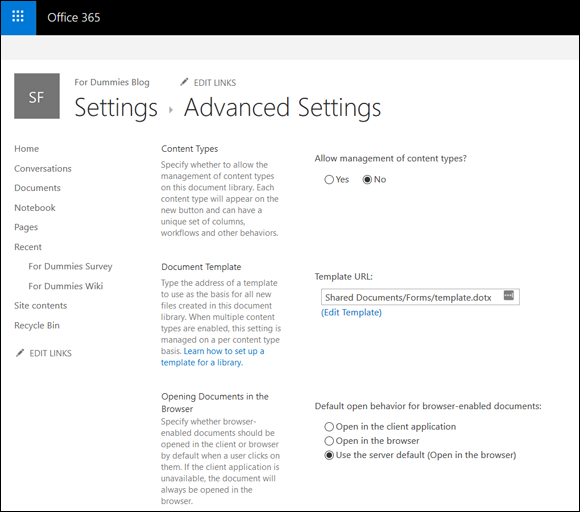
FIGURE 11-6: Configuring Advanced Settings.
Other advanced configuration settings available in a List app (not in the Library app) include a Yes/No option for allowing attachments for a list item (default is Yes) and item-level permissions. The default for item-level permissions in a List app is for all members (contributors) to be able to read and modify all items. You can adjust these settings for users to either read only their own items and/or edit only their own items.
Validation settings
Validation is a formula or statement that must evaluate to TRUE before data can be saved. SharePoint has two different types of validation: column-level and app-level validation. The difference between column and app validation is that column validation compares only the data in that single column to some test, such as whether a discount is less than or equal to 50 percent.
= [Discount] < = .50
On the other hand, validation settings in the app level compare two or more columns that must to evaluate to TRUE before the data can be saved. You can set a rule that [Discount] < [Cost] so customers don't get an item for free (or get money back!) because they buy an item with a discount.
To use validation settings, follow these steps:
Click the Validation Settings link in the Library Settings or List Settings page.
The Validation Settings page has two sections, Formula and User Message. The Formula section is the test your comparison of the columns must pass for the item to be valid. The User Message section is what the user receives if the test fails. Users can then adjust the values until the test passes.
Create a formula for the validation by entering it in the Formula field.
The formula needs to compare (or validate) one or more columns in your app. The App Settings page provides an example and a link to learning more about the proper syntax.
A selection list of columns in your app is available for use in your formula.
- In the User Message text box, enter a message to be shown to users who enter an invalid item.
- Click OK to apply your validation to your list.
Validations aren’t retroactive. They apply only to new and modified entries on the specified columns.
Audience Targeting settings
The Audience Targeting setting includes one section with a Yes/No option to enable Audience Targeting for the app. Selecting Yes creates a column called Target Audiences in the list or library app. Certain Web Parts, such as the Content Query Web Part, can use this column to filter list contents based on the user’s inclusion in a specific audience.
Audience Targeting isn’t the same thing as permissions. A user can still access content even if he or she isn’t included in an audience. Audience targeting is simply a way to filter the presentation of content to certain groups of people.
Rating settings
Rating settings is a simple Yes/No option to allow the items in the app to be rated by users. The Rating feature is a much-requested feature. When enabled on your app, a Rating field appears, as shown in Figure 11-7. The Rating field allows users to select a star rating.
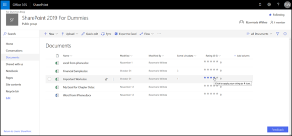
FIGURE 11-7: Rating a document.
In addition to rating items with a star rating, you can also approve of items by using a simple Like button. If you are familiar with social-networking sites like Facebook, then you’ll know how the Like button works. Changing from a star rating to a Like button is accomplished on the Rating Settings page when you enable ratings.
Form settings
The Form Settings option is available only for List apps. If InfoPath is installed on your machine, you can opt to allow customization of the list form using InfoPath by selecting the Customize the Current Form Using Microsoft InfoPath radio button.
Microsoft didn’t ship InfoPath with Office and even though this option is still available in SharePoint, you should expect it to go away in the future. Microsoft is moving away from using InfoPath for managing forms in SharePoint.
Developing a Custom App
SharePoint ships with a number of useful apps, including apps for calendars, tasks, pictures, links, announcements, contacts, discussions, issues, surveys, assets, and even reports, just to name a few. These apps are useful, but there comes a time when you need to create your own app for very specific data. To create a custom app based on a list, use the Custom List app.
Creating your very own SharePoint app may sound a little daunting. The good news is that creating and customizing an app couldn’t be easier. The easiest way to create your own app is to start with a Custom List app and then customize it for your particular need.
In this section, you find out how to create your own app. You see how to add columns to store data, create views into the data, validate data, and import data into your app. Finally, you explore the SharePoint Store, where you can search for and purchase third-party apps, and discover that your own organization can even have its own private SharePoint Store.
Planning Your App
Capturing information is nothing new. Ancient civilizations (millennia ago) used stone or clay tablets, pre-computer organizations (decades ago) used typewriters, and many organizations still use Excel. Often, the problem with data is not in collecting it but in sharing and aggregating it.
Excel does a great job with data aggregation but not such a great job with sharing. SharePoint is all about sharing (hence the name). A SharePoint app is a centralized container of data that is easy to manage and maintain. In addition, by the very nature of a centralized web portal, the data is easily shared and viewed by anyone in the organization with access.
Creating an app specifically for your data needs is important. You need to determine the columns of data you will capture and how the data will relate to each other. In addition, you need to determine which data will be valid and which should be rejected.
Planning a custom list is similar to starting a new spreadsheet in Excel or a table in Access. In all cases, a little up-front planning saves time in the long run. Plan ahead so you know what order you want the columns to be in and what options you want in drop-down lists.
Already have a spreadsheet that you think would make a good list in SharePoint? Make sure you check out the section “Importing a Spreadsheet as an App,” later in this chapter. That section can help you create a custom app in no time.
Columns can also be called fields (for those used to database terminology). When these columns are used to describe files (usually documents in a Document Library app), they’re also referred to as metadata or properties (of the file).
One of the neat features about SharePoint is the ability to add columns to the predefined apps. The process for adding columns is the same in Library and List apps. However, in a Library app, your columns capture information about a file, such as its category or author. List apps generally are all data columns and are used for tracking and communication.
Creating Your App
You create a custom app using the Custom List app. The Custom List app creates a basic list app that you can then customize for your particular scenario.
Follow these steps to create a custom app:
Click the Settings gear icon and select Add an App.
The Your Apps page is displayed.
Click the Custom List app on the Your Apps page, as shown in Figure 11-8.
The Adding Custom List dialog box appears.
Provide a name for the app in the Name text box.
To make things simple, you only need to give your new app a name. However, if you want to provide a description, you can click the Advanced Options link and then type the description int eh Description box on the page that appears.
The name you type here is used in the app’s web address. Avoid using spaces in the name when you create the app. You can change the app’s name to a friendlier name after you create it, as described earlier in the chapter.Click the Create button.
SharePoint creates your new app and takes you automatically to the Site Contents page.
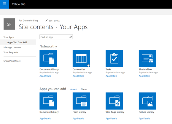
FIGURE 11-8: Selecting the Custom List app on the Your Apps page.
Adding columns to your app
A new custom app displays a single text Title column. The list also contains several behind-the-scenes columns that you can’t see, such as ID and Version. To make the custom app your own, you have to add columns to the app.
Columns are like fields in a database table. When you add a column to your app, a data entry field appears in the app’s New Form to give you a place to enter data into that column.
A little planning goes a long way. You created a plan for your custom app, right? Because now is when you start adding the columns to your app that you listed in your plan.
You can also add columns to the predefined SharePoint apps.
Follow these steps to add columns to your custom app:
- With your app open in the browser, click the gear icon and select List Settings.
Select Create Column in the Manage Views group (see Figure 11-9).
The Create Column window appears.
You can also add new columns with the List Settings page.
A new experience is coming to SharePoint List apps that allows you to create new columns directly from the view of the list. If you see a button to the very right of all the columns in your list app that says Create Column, then you have the new experience. You can still use the traditional experience as we describe here to create new columns.Type a name for your new column in the Column Name field.
The name you type is what users will see, so pick a name that’s concise but meaningful. We don’t recommend using spaces in your column names when you first create them. You can always add spaces later.
 Spaces entered in a column name become a permanent part of that column’s internal name in SharePoint. Some of these internal names can get quite lengthy and downright nonsensical, which makes referencing them a real pain.
Select the type of information you want to store in the column.
The options given here are fairly intuitive — Single Line of Text, Number, Date and Time, and so on. See the later section, “Getting to know column types,” for details on selecting the column type.
Make sure you determine what kind of data you have when you first create the column. Changing the data type later may result in loss of data, or you may not have as many options when you change the type.In the Additional Column Settings section, select the options that further define your column’s type.
The column type you select in Step 4 determines what options you have available for configuring the column.
- (Optional) If you want SharePoint to test the values entered into your column, use the Column Validation section to enter your formula.
Click OK.
SharePoint adds the column to your custom app.
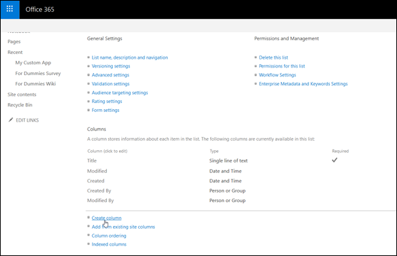
FIGURE 11-9: Add a new column to your list.
You can change the column properties later and rearrange the order of the columns by using the List Settings page.
After you first create a custom app, use the List or Library Settings page to modify your app, where you have all the commands at your fingertips to power through the column creation — you can pick site columns, create your own columns, and rearrange them, as shown in Figure 11-9. After your app has been created and you need to add more columns, the Create Column button on the List tab of the ribbon is a handy way to add one or two columns without leaving the main page.
Getting to know column types
Columns are used to store data, and unlike a spreadsheet, you need to define the type of column as you create it, as shown in Figure 11-10. For those who work with databases, this is a familiar concept. By defining the type of column, you gain extra functionality based on that type, and you help to control the type of information that can be entered into the column and how that information is presented onscreen. For example, users can enter only a number in a Number column; they can’t add miscellaneous text.
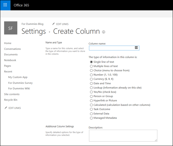
FIGURE 11-10: The Create Column page showing choices.
SharePoint provides a number of built-in column types that you can select for your apps, such as columns that know how to handle dates and URLs. Third-party companies and developers in your organization can also create custom column types that can be added to SharePoint. For example, if your company needs a column that handles a full zip code (the zip code plus four numbers), a developer could create it for you.
Table 11-2 lists common SharePoint column types and what they’re used for.
TABLE 11-2 SharePoint Column Data Types
Column Data Type* |
What It’s Used For |
Display on Form |
Single Line of Text |
Display text and numbers (such as phone or course numbers, or zip code) up to 255 characters. |
Single-line text box (the text box may not show all 255 characters). |
Multiple Lines of Text |
Display multiple lines of text. |
Select from Plain Text, Rich Text, or Enhanced Rich Text. Depending on the number of lines you select, this option shows as a text area of that size with additional toolbars to format text.** |
Choice*** |
A defined list of choices; for example, categories or departments. |
Drop-down list is the default and most common. |
Number |
Numerical values that can be used for calculations. |
You can identify a min/max value number with a choice of decimal options. |
Currency |
Numerical values that represent money. |
You can identify a min/max value currency. Includes options for decimal places and currency format. |
Date and Time |
Dates and times. |
Date and/or Time-Calendar Picker. |
Lookup |
Values from another list — for example, categories could be stored in a lookup list for document metadata. |
Drop-down list populated based on values from another list. |
Yes/No |
Boolean value of Yes or No. |
Check box. |
Person or Group |
Directory listing information from SharePoint. |
The person or group is shown as a hyperlink and can include presence information. |
Hyperlink or Picture |
Hyperlink (internal or external) or an image. |
Hyperlink or picture. |
Calculated |
Data that can be calculated by formula. |
Result of calculation; can be text or numerical. |
Task Outcome |
The outcome of a task such as Approved, Rejected, or Pending. |
The Task Outcome presents a list of choices that you can define when creating the item. |
External Data |
Data stored in a data source; for example, a table or view in an enterprise database. |
Usually filled in by the external source and not users. |
Managed Metadata |
Provides a common set of keywords and terms that can be used across the organization. |
Users can simply start typing, and the options will fill in based on their input. The options are pulled from the metadata managed by SharePoint. |
* Most columns also include property options for Required, Allow Duplicates, Default Values, and Add to the Default View.
** Although you may set a number of lines for editing, this isn't a defined limit. Users can type or cut/paste a large amount of text into this control. You may want to use column validation to restrict the length.
*** Choice can also be shown on the form as radio buttons for a single choice or check boxes for multiple choices.
In addition to the column data types in Table 11-2, other data types, such as Publishing HTML (an even richer form of text), can be selected when creating site columns in publishing sites. Publishing sites are beyond the scope of this book, but we would encourage you to dig further if you are in a large organization and need to have granular control on who can publish to which portions of a page.
When you’re creating columns for your custom app, you can change the order of the columns as they're shown in the Columns section of the List Settings page. Changing the column ordering in this section helps with organizing the app flow for owners and how they display on the app’s form. However, changing the order on the List Settings page doesn't change the order of columns in the default view — you must modify the view separately.
Don’t underestimate descriptions! Creators of lists often carry a lot of information in their heads about the content in the app. Users aren't mind readers. Make sure to type descriptions to help them understand the intent of the column and the data expected.
Validating data entry
Column validation options allow you to define additional limits and constraints for your data. For example, you may want to ensure that a value in one Date column occurs after another Date column. (So, for example, column validation can ensure that the date in the Date Finished column can’t be earlier than the date in the Date Started column — you can’t finish a project before it’s begun!)
To use column validation on your app:
- In your app where you want to validate data entry, click List Settings from the gear icon drop-down menu.
- Under General Settings, click the Validation Settings link.
Type a formula in the Formula text box, as shown in Figure 11-11.
The result of the formula must evaluate to
TRUEto pass validation. The formula syntax is the same as calculated columns, which is similar to Excel syntax.Enter a user message that you want to appear if the validation formula fails.
The message should give the user an idea of how the formula works and how to fix the problem. (See the example message in Figure 11-11.)
- Click the Save button.

FIGURE 11-11: Entering a formula for list validation.
When users enter data into your form, the validation formula is evaluated. If the formula evaluates to FALSE, your user message appears on the form, as shown in Figure 11-12.
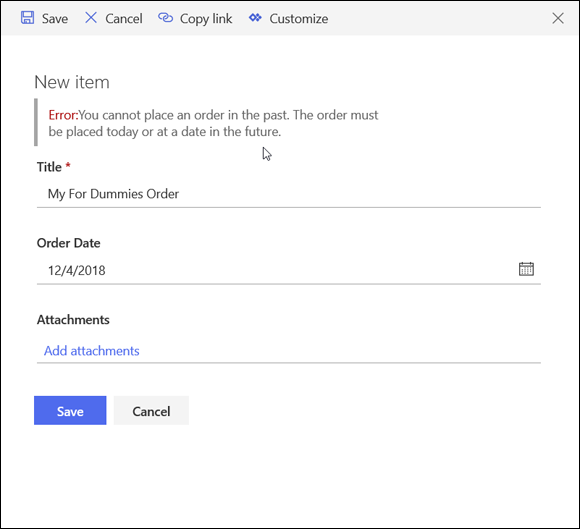
FIGURE 11-12: A user message appears when validation formula equals FALSE.
You can add column validation to columns created at the app or site level. Validation created for site-level columns applies everywhere that column is used, although the formula can be overridden at the app where the site-level column is used.
Working with the Title column
Unlike SharePoint’s predefined apps, your custom app has only one column when you first create it — the Title column. Unfortunately, you can’t delete the Title column or change its data type, but you can rename it, hide it, or make it not required.
To rename the Title column:
- Click List Settings from the gear icon drop-down menu.
- Under the Columns heading, click the Title hyperlink.
- Replace Title with your own title and make modifications to the other properties as desired.
The Title column is used by the list as a means to access the data entry forms to view and edit the list item. You can opt to hide the Title column so that it doesn’t appear on any of the app forms.
The hidden column will still appear in views unless you remove it from the view.
To hide the Title column:
- In your list, click List Settings from the gear icon drop-down menu.
- If the Content Types section isn’t visible, enable management of content types by following these steps:
- Click the Advanced Settings link on the List Settings page.
- Select the Yes radio button under Allow Management of Content Types, and then click OK. The Content Types section becomes visible on the List Settings page.
In the Content Types section of the List Settings page, click the Item content type.
The List Content Type information appears.
If you want to change the Title column in a document library, you click the Document content type. The Item content type applies to custom apps only. In a predefined app, such as a Tasks app, you click the Task content type.
Click the Title column.
The Title column’s properties appear.
Under Column Settings, select the Hidden (Will Not Appear in Forms) radio button, as shown in Figure 11-13, and click OK.
The Title column doesn’t appear on forms.
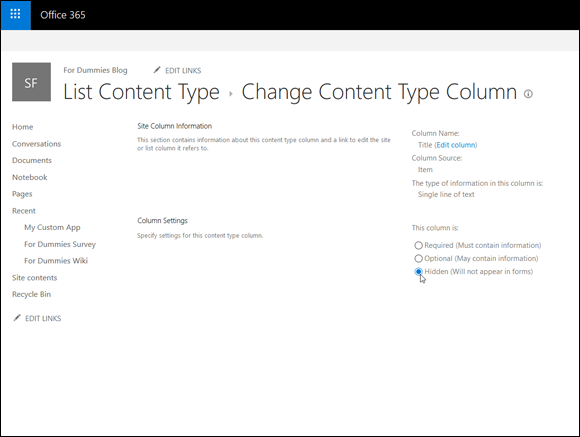
FIGURE 11-13: Hiding the Title column.
Importing a Spreadsheet as an App
Already have data in a spreadsheet that you want to be a SharePoint app? You’re halfway there! Before you start, make sure you do the following:
- Clean the spreadsheet. Make sure your spreadsheet looks like a table, with no blank columns or rows.
- Make sure your spreadsheet has headers. All columns in the SharePoint app need to have a column title.
- Make sure your data is consistent. For example, if a cell has a comment in it, but it should contain a date, remove the comment text.
- Make sure your column heading in the first row is representative of the data. SharePoint reads the headings in the first row and makes assumptions about the information in those columns.
Figure 11-14 shows an example of a clean spreadsheet ready for importing.

FIGURE 11-14: Cleaned spreadsheet ready for import into SharePoint.
SharePoint looks for what it believes is the first text column and uses it as the pseudo-title field (the primary field in the list that has the Edit menu attached to it). Therefore, try to place a text field with unique data in the first column position. Unfortunately, if your unique field is a number, such as a serial number, this can cause issues. To work around the problem, create the app and copy and paste the data from the spreadsheet. (A good example of a first column is a unique name of a person or an item, such as Event Name. A bad example of a first column is the category of an item or a department of an employee.)
To import your spreadsheet into a custom app:
Click the Settings gear icon and choose Add an App.
You can also click the Site Contents link on the Quick Launch toolbar and then click the Add an App icon.
This feature requires the use of a browser that supports ActiveX. If you run into issues with this feature, such as seeing an unexpected error, then ActiveX Controls are not working properly with your browser.- Select the Import Spreadsheet App from the list of apps you can add.
In the Name text box, enter a name for your app.
Follow the naming conventions outlined in this book for app names: Keep them short and eliminate spaces.
- (Optional) In the Description text box, enter a description of the app.
Click the Browse button, browse to your spreadsheet, select it, and click the Import button.
A dialog box appears that asks how your range is designated. The default is Table Range, but other options are Named Range or Range of Cells. If you haven't named the data as a range in Excel or set it as a table, select the Range of Cells option.
- If you chose the Range of Cells option, click the Select Range field in the dialog box, and then click your spreadsheet and highlight the desired cells.
- Click the Import button in the dialog box.
After you import your spreadsheet, verify the column types SharePoint chose for you. Generally, SharePoint assumes text, number, and dates. You may want to change some text fields to Choice, Yes/No, and so forth.
Don’t have the patience to create all your custom columns one by one — but you don’t have a current app in another format either? Create a spreadsheet with your column headers and at least one row of data, and then import this spreadsheet and modify the column properties as necessary.
Taking Your App to the Next Level: Calculated and Lookup Columns
Calculated columns are especially powerful for automatically generating data. Don’t be intimidated — the web is full of great formula examples for SharePoint calculated columns. Some common uses include
- Adding days to a Date column to calculate an Expired or Due Date column
- Adding Number or Currency columns to get a total
- Using the Me function to automatically add the username to a field
Creating a calculated column
To create a calculated column, follow these steps:
Select the Calculated column type in the Name and Type options in the Create Column dialog box.
The Additional Column Settings area changes to support entering a calculation (see Figure 11-15) and specifying column options.
Type your formula using the proper syntax in the Formula text box.
If you’re basing your calculation on another column in the app, you can reference that column using the square brackets reference syntax.
For example, to calculate a Shipping Deadline value, add five days to the Order Date value in another column by entering [Order Date]+5 in the Formula text box.
Select the proper data type for the returned value and other data type property options, if available, from the Additional Column Settings section of the page.
Not all return values are of the same data type as the input columns. For example, if you subtract one date from another, your returned value is a number (the number of days’ difference between the two dates).Other examples include
- Adding the current username to a field. Simply type the constant [Me] in the Formula text box.
- Using today as a date in a calculation to create a new date by entering [Today]+7 in the Formula text box.
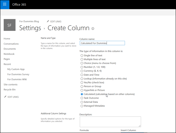
FIGURE 11-15: Column settings for a calculated column.
Using a lookup column
Maintaining all your options in a Choice field can be cumbersome and prone to error. SharePoint uses a similar model to relational databases by separating the lookup information from the transaction app. Think of all the lookup data that could be maintained in separate apps. For example, computer hardware inventory lookup apps could include hardware type, maintenance contract, and department location. These apps can be maintained independently of the transaction app — the inventory itself.
For example, you could create a Customer custom app with a single field — Title — and populate it with the names of customers. Then build an Order app (to track orders that customers place). Customer is a column in the Order app. Rather than build a Choice field, you could use the Lookup data type to connect to the Customer app and use the Title field as data for the Customer column in the Order app. The end result is that all your customers are separated from the orders. If a customer needs to change his or her name (maybe she got married, or his name was misspelled) you can just change the name in the Customer app instead of in every entry in the Order app.
You can also add other columns from the lookup app to the drop-down list to help users select the proper choice. When a user selects the value from the drop-down list, values for the additional columns also display. Figure 11-16 shows a scenario that uses a lookup column to display a customer’s sales territory. The customer’s name and sales territory are stored in one app and displayed in another app using a lookup column. Figure 11-16 also shows the use of inline editing in a Web Part.
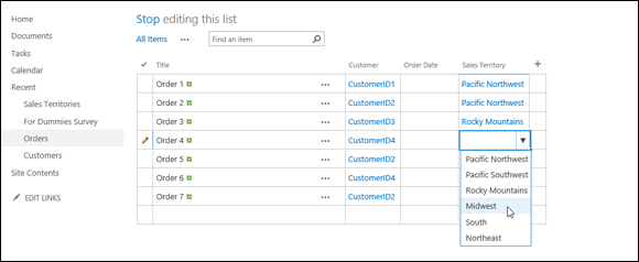
FIGURE 11-16: Selecting a value from a lookup column.
For users familiar with databases and referential integrity, SharePoint includes additional options to support this implementation. Lookup columns can also be used to create a chain of joined apps that can be used to query and display values from additional columns.
Keeping Track of Locations
SharePoint includes a column type specifically designed for keeping track of a geographic location. Have you ever browsed a mapping service such as Bing Maps or Google Maps and seen the pushpins marking specific locations? This is exactly the type of data the new column type is designed to store.
A scenario where this would be valuable would be when a field worker needs to track location information along with other data. For Ken’s graduate thesis (more than a decade ago), he developed a field biology application that collected data using a handheld GPS. At the time, SharePoint was not yet available, so he uploaded the data to an Excel spreadsheet. That same application today could store the data directly, and instantly, to a SharePoint list using a mobile device. (On one field trip with a biologist in the San Francisco wetlands, he nearly lost his leg to a muddy sinkhole and can remember dipping the device underwater. Having saved his leg, he didn’t really care much about the data until he made it back to campus.)
Ken spent months developing his application to collect data and store it. SharePoint, along with modern cellular technology and powerful smartphones, makes a similar scenario available right out of the box.
Downloading Apps from the SharePoint Store
In addition to the apps that come with SharePoint, you can also add apps from third parties. These third-party apps appear in the SharePoint Store. If you’re using SharePoint Online, then you have access to the full store. If you’re using SharePoint On-Premises, then your local IT administrators may have locked down the apps that you can add for security reasons.
The SharePoint Store can be found on the Your Apps page, as shown in Figure 11-17. You access the Your Apps page by clicking the Settings gear icon and then selecting Add an App. Take a look and see what SharePoint apps you have available in the store.
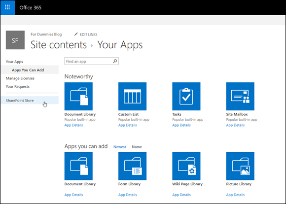
FIGURE 11-17: Accessing the SharePoint Store from the Your Apps page.
You can choose to view all apps or only those that are free by selecting the Price refiner on the left side of the page. You can also sort apps by clicking a category link. If you want to purchase an app, click it and then click the Buy It button. After you click the Buy It button, you have to log in with your Microsoft account. If you already have a credit card on file with your Office 365 subscription, then you can purchase and download the app. Otherwise, you are prompted to enter your credit card information.