 22. Styles and Themes
by Kristin Marsicano, Chris Stewart, Bill Phillips
Android Programming: The Big Nerd Ranch Guide, Third Edition
22. Styles and Themes
by Kristin Marsicano, Chris Stewart, Bill Phillips
Android Programming: The Big Nerd Ranch Guide, Third Edition
- Cover
- Learning Android
- The Necessary Tools
- 1. Your First Android Application
- 2. Android and Model-View-Controller
- 3. The Activity Lifecycle
- 4. Debugging Android Apps
- 5. Your Second Activity
- 6. Android SDK Versions and Compatibility
- 7. UI Fragments and the Fragment Manager
- The Need for UI Flexibility
- Introducing Fragments
- Starting CriminalIntent
- Hosting a UI Fragment
- Creating a UI Fragment
- Adding a UI Fragment to the FragmentManager
- Application Architecture with Fragments
- For the More Curious: Fragments and the Support Library
- For the More Curious: Why Support Fragments Are Superior
- 8. Displaying Lists with RecyclerView
- 9. Creating User Interfaces with Layouts and Widgets
- 10. Using Fragment Arguments
- 11. Using ViewPager
- 12. Dialogs
- 13. The Toolbar
- 14. SQLite Databases
- 15. Implicit Intents
- 16. Taking Pictures with Intents
- 17. Two-Pane Master-Detail Interfaces
- 18. Localization
- 19. Accessibility
- 20. Data Binding and MVVM
- 21. Unit Testing and Audio Playback
- Creating a SoundPool
- Loading Sounds
- Playing Sounds
- Test Dependencies
- Creating a Test Class
- Setting Up Your Test
- Writing Tests
- Data Binding Callbacks
- Unloading Sounds
- Rotation and Object Continuity
- For the More Curious: Whether to Retain
- For the More Curious: Espresso and Integration Testing
- For the More Curious: Mocks and Testing
- Challenge: Playback Speed Control
- 22. Styles and Themes
- 23. XML Drawables
- 24. More About Intents and Tasks
- 25. HTTP and Background Tasks
- Creating PhotoGallery
- Networking Basics
- Using AsyncTask to Run on a Background Thread
- You and Your Main Thread
- Fetching JSON from Flickr
- From AsyncTask Back to the Main Thread
- Cleaning Up AsyncTasks
- For the More Curious: More on AsyncTask
- For the More Curious: Alternatives to AsyncTask
- Challenge: Gson
- Challenge: Paging
- Challenge: Dynamically Adjusting the Number of Columns
- 26. Loopers, Handlers, and HandlerThread
- Preparing RecyclerView to Display Images
- Downloading Lots of Small Things
- Communicating with the Main Thread
- Assembling a Background Thread
- Messages and Message Handlers
- For the More Curious: AsyncTasks vs Threads
- For the More Curious: Solving the Image Downloading Problem
- For the More Curious: StrictMode
- Challenge: Preloading and Caching
- 27. Search
- 28. Background Services
- Creating an IntentService
- What Services Are For
- Looking for New Results
- Delayed Execution with AlarmManager
- Controlling Your Alarm
- Notifications
- Challenge: Notifications on Android Wear
- For the More Curious: Service Details
- For the More Curious: JobScheduler and JobServices
- Challenge: Using JobService on Lollipop
- For the More Curious: Sync Adapters
- 29. Broadcast Intents
- 30. Browsing the Web and WebView
- 31. Custom Views and Touch Events
- 32. Property Animation
- 33. Locations and Play Services
- Locations and Libraries
- Creating Locatr
- Play Services and Location Testing on Emulators
- Building Out Locatr
- Setting Up Google Play Services
- Using Google Play Services
- Flickr Geosearch
- Getting a Location Fix
- Asking for Permission at Runtime
- Find and Display an Image
- Challenge: Permissions Rationale
- Challenge: Progress
- 34. Maps
- 35. Material Design
- 36. Afterword
- Index
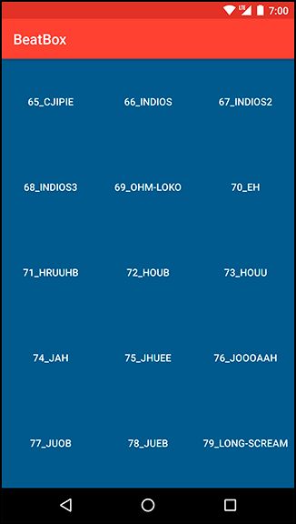
Now that BeatBox sounds intimidating, it is time to make it look intimidating, too.
So far, BeatBox sticks with the default UI styles. The buttons are stock. The colors are stock. The app does not stand out. It does not have its own brand.
We can restyle it. We have the technology.
Figure 22.1 shows the better, stronger, faster – or at least more stylish – BeatBox.
Begin by defining a few colors that you will use throughout the chapter. Edit your colors.xml file in res/values to match Listing 22.1.
Listing 22.1 Defining a few colors (res/values/colors.xml)
<resources>
    <color name="colorPrimary">#3F51B5</color>
    <color name="colorPrimaryDark">#303F9F</color>
    <color name="colorAccent">#FF4081</color>

    <color name="red">#F44336</color>
    <color name="dark_red">#C3352B</color>
    <color name="gray">#607D8B</color>
    <color name="soothing_blue">#0083BF</color>
    <color name="dark_blue">#005A8A</color>
</resources>
Color resources are a convenient way to specify color values in one place that you reference throughout your application.
-
No Comment